Jacques I. Mathematics for Economics and Business
Подождите немного. Документ загружается.


If we assume that investment is the same in all time periods then
I
t
= I*
for some constant, I*. Finally, if the flow of money is in balance in each time period, we also
have
Y
t
= C
t
+ I
t
Substituting the expressions for C
t
and I
t
into this gives
Y
t
= aY
t−1
+ b + I*
which we recognize as a difference equation of the standard form given in this section. This
equation can therefore be solved and the time path analysed.
Dynamics
560
Example
Consider a two-sector model:
Y
t
= C
t
+ I
t
C
t
= 0.8Y
t−1
+ 100
I
t
= 200
Find an expression for Y
t
when Y
0
= 1700. Is this system stable or unstable?
Solution
Substituting the expressions for C
t
and I
t
into
Y
t
= C
t
+ I
t
gives
Y
t
= (0.8Y
t−1
+ 100) + 200
= 0.8Y
t−1
+ 300
The complementary function is given by
CF = A(0.8)
t
and for a particular solution we try
Y
t
= D
for some constant D. Substituting this into the difference equation gives
D = 0.8D + 300
which has solution D = 1500. The general solution is therefore
Y
t
= A(0.8)
t
+ 1500
The initial condition,
Y
0
= 1700
gives
1700 = A(0.8)
0
+ 1500 = A + 1500
MFE_C09a.qxd 16/12/2005 10:49 Page 560

and so A is 200. The solution is
Y
t
= 200(0.8)
t
+ 1500
As t increases, (0.8)
t
converges to zero and so Y
t
eventually settles down at the equilibrium level of 1500. The
system is therefore stable. Note also that because 0.8 lies between 0 and 1, the time path displays uniform
convergence.
9.1 • Difference equations
561
Practice Problem
3 Consider the two-sector model:
Y
t
= C
t
+ I
t
C
t
= 0.9Y
t−1
+ 250
I
t
= 350
Find an expression for Y
t
when Y
0
= 6500. Is this system stable or unstable?
In the previous example, and again in Practice Problem 3, we noted that the model is stable
and that it displays uniform convergence. If we return to the general equation
Y
t
= aY
t−1
+ b + I*
it is easy to see that this is always the case for the simple two-sector model because the coeffici-
ent of Y
t−1
is the marginal propensity to consume, which is known to lie between 0 and 1.
9.1.2 Supply and demand analysis
In Section 1.3 we introduced a simple model of supply and demand for a single good in an iso-
lated market. If we assume that the supply and demand functions are both linear then we have
the relations
Q
S
= aP − b
Q
D
=−cP + d
for some positive constants, a, b, c and d. (Previously, we have written P in terms of Q and have
sketched the supply and demand curves with Q on the horizontal axis and P on the vertical axis.
It turns out that it is more convenient in the present context to work the other way round and
to write Q as a function of P.) In writing down these equations, we are implicitly assuming that
only one time period is involved, that supply and demand are dependent only on the price in
this time period, and that equilibrium values are attained instantaneously. However, for cer-
tain goods, there is a time lag between supply and price. For example, a farmer needs to decide
precisely how much of any crop to sow well in advance of the time of sale. This decision is made
on the basis of the price at the time of planting and not on the price prevailing at harvest time,
which is unknown. In other words, the supply, Q
St
, in period t depends on the price, P
t−1
, in the
preceding period t − 1. The corresponding time-dependent supply and demand equations are
Q
St
= aP
t−1
− b
Q
Dt
=−cP
t
+ d
MFE_C09a.qxd 16/12/2005 10:49 Page 561

If we assume that, within each time period, demand and supply are equal, so that all goods are
sold, then
Q
Dt
= Q
St
that is,
−cP
t
+ d = aP
t−1
− b
This equation can be rearranged as
−cP
t
= aP
t−1
− b − d (subtract d from both sides)
P
t
=− P
t−1
+ (divide both sides by −c)
which is a difference equation of the standard form. The equation can therefore be solved in
the usual way and the time path analysed. Once a formula for P
t
is obtained, we can use the
demand equation
Q
t
=−cP
t
+ d
to deduce a corresponding formula for Q
t
by substituting the expression for P
t
into the right-
hand side.
b + d
c
D
F
a
c
A
C
Dynamics
562
Example
Consider the supply and demand equations
Q
St
= 4P
t−1
− 10
Q
Dt
=−5P
t
+ 35
Assuming that the market is in equilibrium, find expressions for P
t
and Q
t
when P
0
= 6. Is the system stable
or unstable?
Solution
If
Q
Dt
= Q
St
then
−5P
t
+ 35 = 4P
t−1
− 10
which rearranges to give
−5P
t
= 4P
t−1
− 45 (subtract 35 from both sides)
P
t
=−0.8P
t−1
+ 9 (divide both sides by −5)
The complementary function is given by
CF = A(−0.8)
t
and for a particular solution we try
P
t
= D
for some constant D. Substituting this into the difference equation gives
MFE_C09a.qxd 16/12/2005 10:49 Page 562

D =−0.8D + 9
which has solution D = 5. The general solution is therefore
P
t
= A(−0.8)
t
+ 5
The initial condition, P
0
= 6, gives
6 = A(−0.8)
0
+ 5 = A + 5
and so A is 1. The solution is
P
t
= (−0.8)
t
+ 5
An expression for Q
t
can be found by substituting this into the demand equation
Q
t
=−5P
t
+ 35
to get
Q
t
=−5[(−0.8)
t
+ 5] + 35
=−5(−0.8)
t
+ 10
As t increases, (−0.8)
t
converges to zero and so P
t
and Q
t
eventually settle down at the equilibrium levels
of 5 and 10 respectively. The system is therefore stable. Note also that because −0.8 lies between −1 and 0,
the time paths display oscillatory convergence.
9.1 • Difference equations
563
Practice Problems
4 Consider the supply and demand equations
Q
St
= P
t−1
− 8
Q
Dt
=−2P
t
+ 22
Assuming equilibrium, find expressions for P
t
and Q
t
when P
0
= 11. Is the system stable or unstable?
5 Consider the supply and demand equations
Q
St
= 3P
t−1
− 20
Q
Dt
=−2P
t
+ 80
Assuming equilibrium, find expressions for P
t
and Q
t
when P
0
= 8. Is the system stable or unstable?
Two features emerge from the previous example and Practice Problems 4 and 5. Firstly,
the time paths are always oscillatory. Secondly, the system is not necessarily stable and so equi-
librium might not be attained. These properties can be explained if we return to the general
equation
P
t
=− P
t−1
+
The coefficient of P
t−1
is −a/c. Given that a and c are both positive, it follows that −a/c is
negative and so oscillations will always be present. Moreover,
if a > c then −a/c <−1 and P
t
diverges
if a < c then −1 <−a/c < 0 and P
t
converges.
b + d
c
D
F
a
c
A
C
MFE_C09a.qxd 16/12/2005 10:49 Page 563

We conclude that stability depends on the relative sizes of a and c, which govern the slopes of
the supply and demand curves. Bearing in mind that we have chosen to consider supply and
demand equations in which Q is expressed in terms of P, namely
Q
S
= aP − b
Q
D
=−cP + d
we deduce that the system is stable whenever the supply curve is flatter than the demand curve
when P is plotted on the horizontal axis.
Throughout this section we have concentrated on linear models. An obvious question to ask
is whether we can extend these to cover the case of non-linear relationships. Unfortunately, the
associated mathematics gets hard very quickly, even for mildly non-linear problems. It is usu-
ally impossible to find an explicit formula for the solution of such difference equations. Under
these circumstances, we fall back on the tried and trusted approach of actually calculating the
first few values until we can identify its behaviour. A spreadsheet provides an ideal way of doing
this, since the parameters in the model can be easily changed.
Dynamics
564
Example
Consider the supply and demand equations
Q
St
= P
0.8
t−1
Q
Dt
= 12 − P
t
(a) Assuming that the market is in equilibrium, write down a difference equation for price.
(b) Given that P
0
= 1, find the values of the price, P
t
for t = 1, 2,..., 10 and plot a graph of P
t
against t.
Describe the qualitative behaviour of the time path.
Solution
(a) If
Q
Dt
= Q
St
then
12 − P
t
= P
0.8
t−1
which rearranges to give
P
t
= 12 − P
0.8
t−1
Notice that this difference equation is not of the form considered in this section, so we cannot obtain
an explicit formula for P
t
in terms of t.
(b) We are given that P
0
= 1, so we can compute the values of P
1
, P
2
,...in turn. Setting t = 1 in the differ-
ence equation gives
P
1
= 12 − P
0
0.8
= 12 − 1
0.8
= 11
This number can now be substituted into the difference equation, with t = 2, to get
P
2
= 12 − P
1
0.8
= 12 − 11
0.8
= 5.190 52
and so on.
EXCEL
MFE_C09a.qxd 16/12/2005 10:49 Page 564
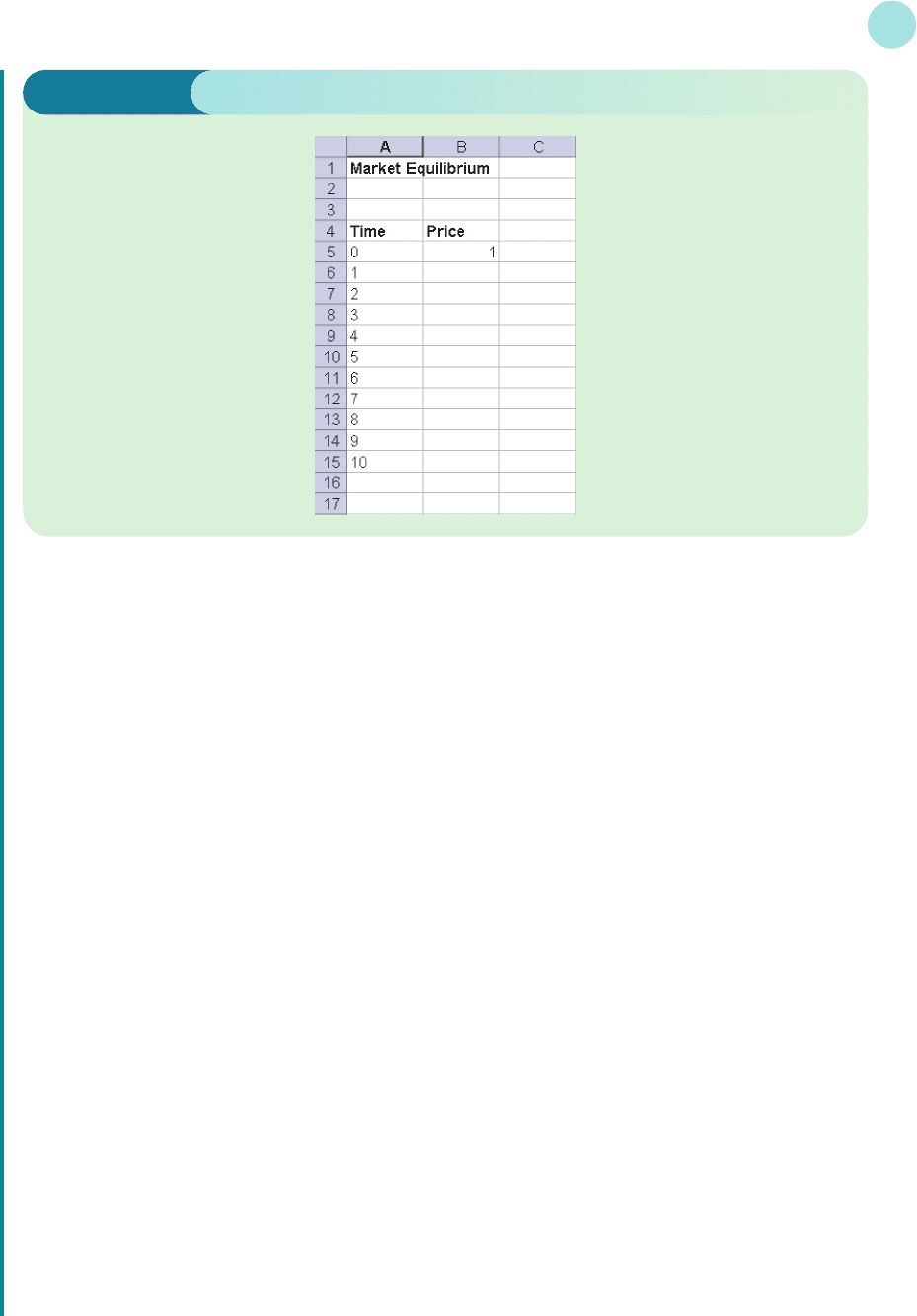
Excel provides an easy way to perform the calculations. We type in the values, 0, 1, 2, ..., 10 for each
time period down the first column, type in the value of the initial price, P
0
, in the second column, and then
copy the relevant formula down the second column to generate successive values of P
t
. Once this has been
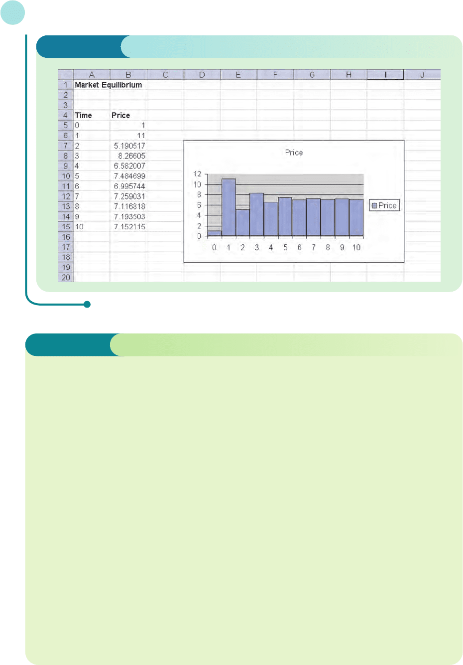
done, Chart Wizard can be used to draw the time path.
The most appropriate way of representing the results graphically is to use a bar chart. We would like the
numbers in the first column of the spreadsheet to act as labels for the bars on the horizontal axis.
Unfortunately, unless we tell Excel that we want to do this, it will actually produce two sets of bars on the
same diagram, using the numbers in column A as heights for the first set of bars, and the numbers in col-
umn B as heights for the second set. This can be avoided by entering the values down the first column as
text. This is done by first highlighting column A and then selecting Format: Cells from the menu bar. We
choose the Number tab, and click on Text and OK. We can now finally enter the values of 0, 1, 2, ..., 10 in
the first column, together with the headings and numerical value of P
0
in column 2 as shown in Figure 9.3.
The remaining entries in column B are worked out using the difference equation
P
t
= 12 − P
0.8
t−1
For example, the entry in cell B6 is P
1
which is calculated from
P
1
= 12 − P
0
0.8
The value of P
0
is located in cell B5, so we need to type the formula
=12−B5^0.8
into B6. Subsequent values are worked out in the same way, so all we need do is drag the formula down to
B15 to complete the table.
Chart Wizard can now be used to plot this time path. We first highlight both columns and then click on
Chart Wizard. The bar chart that we want is the one that is automatically displayed, so we just press the
Finish button. To close the gaps between the bars, click on any one bar. A square dot will appear on each
bar to indicate that all bars have been selected. We then choose Format: Selected data series for the menu
bar. Finally, click on the Options tab, reduce the Gap Width to zero and click OK. The final spreadsheet is
shown in Figure 9.4. It illustrates the oscillatory convergence and shows that the price eventually settles
down to a value just greater than 7.
9.1 • Difference equations
565
Figure 9.3
MFE_C09a.qxd 16/12/2005 10:49 Page 565
Dynamics
566
Complementary function of a difference equation The solution of the difference equa-
tion, Y
t
= bY
t−1
+ c when the constant c is replaced by zero.
Difference equation An equation that relates consecutive terms of a sequence of numbers.
Dynamics Analysis of how equilibrium values vary over time.
Equilibrium value of a difference equation A solution of a difference equation that does
not vary over time; it is the limiting value of Y
n
as n tends to infinity.
General solution of a difference equation The solution of a difference equation that
contains an arbitary constant. It is the sum of the complementary function and particular
solution.
Initial condition The value of Y
0
that needs to be specified to obtain a unique solution of
a difference equation.
Particular solution of a difference equation Any one solution of a difference equation
such as Y
t
= bY
t−1
+ c.
Recurrence relation An alternative phrase for a difference equation. It is an expression for
Y
n
in terms of Y
n−1
(and possibly Y
n−2
, Y
n−3
etc).
Stable (unstable) equilibrium An economic model in which the solution of the associated
difference equation converges (diverges).
Uniformly convergent sequence A sequence of numbers which progressively increases (or
decreases) to a finite limit.
Uniformly divergent sequence A sequence of numbers which progressively increases (or
decreases) without a finite limit.
Key Terms
Figure 9.4
MFE_C09a.qxd 16/12/2005 10:49 Page 566

9.1 • Difference equations
567
Practice Problems
6 Calculate the first four terms of the sequences defined by the following difference equations. Hence
write down a formula for Y
t
in terms of t. Comment on the qualitative behaviour of the solution in
each case.
(a)
Y
t
= Y
t−1
+ 2; Y
0
= 0 (b) Y
t
=−Y
t−1
+ 6; Y
0
= 4 (c) Y
t
= 0Y
t−1
+ 3; Y
0
= 3
7 Solve the following difference equations with the specified initial conditions:
(a)
Y
t
= Y
t−1
+ 6; Y
0
= 1 (b) Y
t
=−4Y
t−1
+ 5; Y
0
= 2
Comment on the qualitative behaviour of the solution as t increases.
8 Show, by substituting into the difference equation, that
Y
t
= A(b
t
) + D where D =
is a solution of
Y
t
= bY
t−1
+ c (b ≠ 1)
9 Consider the two-sector model:
Y
t
= C
t
+ I
t
C
t
= 0.7Y
t−1
+ 400
I
t
= 0.1Y
t−1
+ 100
Given that Y
0
= 3000, find an expression for Y
t
. Is this system stable or unstable?
10 Consider the supply and demand equations
Q
St
= 0.4P
t−1
− 12
Q
Dt
=−0.8P
t
+ 60
Assuming that equilibrium conditions prevail, find an expression for P
t
when P
0
= 70. Is the system
stable or unstable?
11 The Harrod–Domar model of the growth of an economy is based on three assumptions.
(1) Savings, S
t
, in any time period are proportional to income, Y
t
, in that period, so that
S
t
=αY
t
(α>0)
(2) Investment, I
t
, in any time period is proportional to the change in income from the previous
period to the current period so that
I
t
=β(Y
t
− Y
t−1
)(β>0)
(3) Investment and savings are equal in any period so that
I
t
= S
t
Use these assumptions to show that
Y
t
= Y
t−1
and hence write down a formula for Y
t
in terms of Y
0
. Comment on the stability of the system in the
case when α=0.1 and β=1.4, and write down expressions for S
t
and I
t
in terms of Y
0
.
D
F
β
β−α
A
C
c
1 − b
1
4
MFE_C09a.qxd 16/12/2005 10:49 Page 567

12 Consider the difference equation
Y
t
= 0.1Y
t−1
+ 5(0.6)
t
(a) Write down the complementary function.
(b) By substituting Y
t
= D(0.6)
t
into this equation, find a particular solution.
(c) Use your answers to parts (a) and (b) to write down the general solution and hence find the spe-
cific solution that satisfies the initial condition, Y
0
= 9.
(d) Is the solution in part (c) stable or unstable?
13 Consider the difference equation
Y
t
= 0.2Y
t−1
+ 0.8t + 5
(a) Write down the complementary function.
(b) By substituting Y
t
= Dt + E into this equation, find a particular solution.
(c) Use your answers to parts (a) and (b) to write down the general solution and hence find the spe-
cific solution that satisfies the initial condition, Y
0
= 10.
(d) Is the solution in part (c) stable or unstable?
14 (Excel) Consider the two-sector model
C
t
= 100 + 0.6Y
0.8
t−1
Y
t
= C
t
+ 60
(a) Write down a difference equation for Y
t
.
(b) Given that Y
0
= 10, calculate the values of Y
t
for t = 1, 2,...8 and plot these values on a dia-
gram. Is this system stable or unstable?
(c) Does the qualitative behaviour of the system depend on the initial value of Y
0
?
15 (Excel) An economic growth model is based on three assumptions:
(1) Aggregate output, y
t
, in time period t depends on capital stock, k
t
, according to
y
t
= k
t
0.6
(2) Capital stock in time period t + 1 is given by
k
t+1
= 0.99k
t
+ s
t
where the first term reflects the fact that capital stock has depreciated by 1%, and the second
term denotes the output that is saved during period t.
(3) Savings during period t are one-fifth of income so that
s
t
= 0.2y
t
(a) Use these assumptions to write down a difference equation for k
t
.
(b) Given that k
0
= 7000, find the equilibrium level of capital stock and state whether k
t
displays
uniform or oscillatory convergence. Do you get the same behaviour for other initial values of
capital stock?
Dynamics
568
MFE_C09a.qxd 16/12/2005 10:49 Page 568

section 9.2
Differential equations
A differential equation is an equation that involves the derivative of an unknown function.
Several examples have already been considered in Chapter 6. For instance, in Section 6.2 we
noted the relationship
= I
where K and I denote capital stock and net investment, respectively. Given any expression for
I(t), this represents a differential equation for the unknown function, K(t). In such a simple
case as this, we can solve the differential equation by integrating both sides with respect to t.
For example, if I(t) = t the equation becomes
= t
and so
K(t) =
t dt =+c
where c is a constant of integration. The function K(t) is said to be the general solution of the
differential equation and c is referred to as an arbitrary constant. Some additional information
t
2
2
dK
dt
dK
dt
Objectives
At the end of this section you should be able to:
Find the complementary function of a differential equation.
Find the particular solution of a differential equation.
Analyse the stability of economic systems.
Solve continuous time national income determination models.
Solve continuous time supply and demand models.
MFE_C09b.qxd 16/12/2005 10:49 Page 569