Stewart J. College Algebra: Concepts and Contexts
Подождите немного. Документ загружается.


134 CHAPTER 1
Collecting and Analyzing Data
OBJECTIVE To experience the process of first collecting data, then getting
information from the data.
In many of the exercises in this book, data are given, and we are asked to analyze the
data. Sometimes we are asked to search for data on the Internet. But the process of
gathering real-life data can be quite difficult or tedious. For example, obtaining sci-
entific data often requires complicated equipment. The U.S. Census Bureau employs
hundreds of agents to survey thousands of citizens to obtain demographic data.
Financial data are collected from hundreds of sources in order to measure the eco-
nomic health of the country.
Sometimes data collection can be an adventure. For example, to determine how
closely the earth resembles a sphere, the French Academy sent an expedition to Peru
in 1735 to obtain data on the length of a degree at the equator. The expedition, headed
by Charles-Marie de La Condamine, included an Atlantic crossing by boat, traveling
by mule and on foot, and working at high altitudes. It took over eight years to obtain
the needed data.
In this exploration we get some experience in data collection by obtaining data
within the classroom and from our classmates.
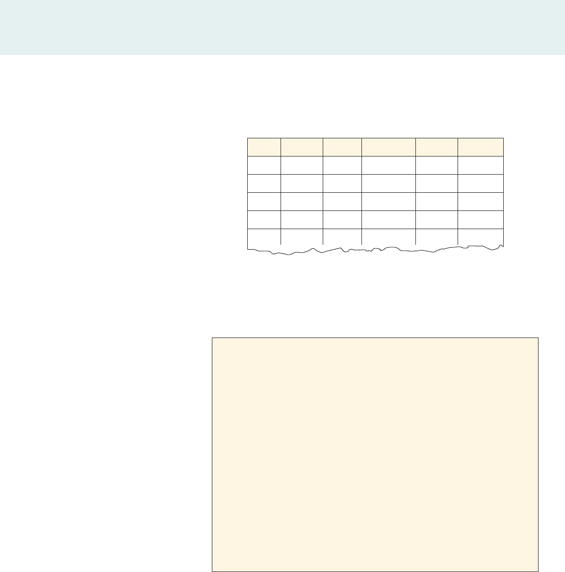
I. Collecting Data
To collect data from our classmates, we make measurements and take a survey.
1. Let’s make some measurements.
(a) For each student in the class, make the following measurements: height,
hand span, hat size, shoe size. Make these measurements using the same
unit (either inches or centimeters).
Hand span Hat size Shoe size
EXPLORATIONS
■
EXPLORATIONS
■
EXPLORATIONS
■
EXPLORATIONS
2
A drawing from the 1735 La
Condamine expedition to Peru
French School, (18th century)/Bibliotheque de I’Institut de France,
Pris, France/Lauros/Giraudon/The Bridgeman Art Library
EXPLORATIONS 135
Keep a record of these data. You’ll
need them for several exercises in
Section 2.5.
Name Gender Height Hand span Hat size Shoe size
Adam
Betty
Cathy
David
o
2. Let’s make a survey.
(a) Make a survey that asks the following questions of your classmates. Note
that the survey is anonymous; students do not need to put their names on
the survey sheet.
EXPLORATIONS
■
EXPLORATIONS
■
EXPLORATIONS
■
EXPLORATIONS
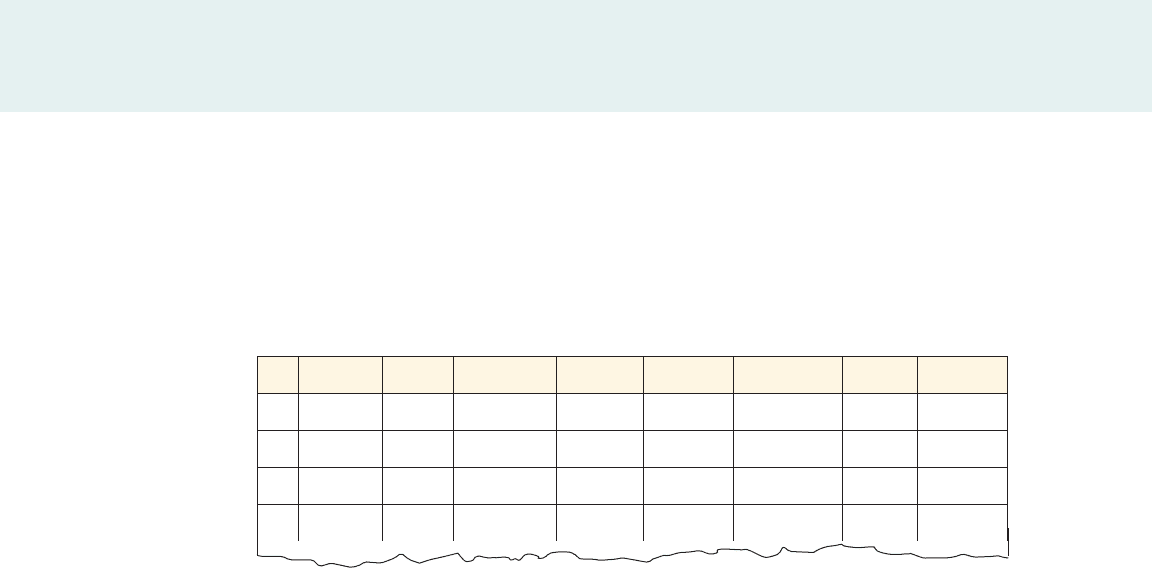
Measurement Data
Survey
1. Gender: Male ❑ Female ❑
2. What is the value (in cents) of the coins in your pocket or purse? _______
3. How far is your daily commute to school (in miles)? _______
4. How many siblings do you have (including yourself)? _______
5. How many hours a week do you spend on the Internet? _______
6. How many hours a week do you spend on homework? _______
7. Rate your happiness.
① not happy ② happy ➂ very happy
8. Rate your satisfaction with your school work.
① not satisfied ② satisfied ➂ very satisfied
(b) Enter the information you obtained in a table as shown. Note that the
information for each individual is entered in a row of the table.
136 CHAPTER 1
(b) After the survey sheets have been collected, give each sheet an ID
number—for example, 1, 2, 3, . . . . Now enter the information you
obtained in a table like the following. For the column headings let’s use
short descriptions (instead of the question number) so that we can quickly
recognize what each column represents.
EXPLORATIONS
■
EXPLORATIONS
■
EXPLORATIONS
■
EXPLORATIONS
ID Gender Coins Commute Siblings Internet Homework Happy Satisfied
1
2
3
o
Survey Data
3. Think of other measurements or survey questions that would help us get
useful data from the class.
II. One-Variable Data Analysis
Each column in the data tables we completed in Questions 1(b) and 2(b) above is a
set of one-variable data. The methods we’ve learned for getting information from
such data are to calculate the mean or the median.
1. Consider the “Height” column in the measurement data table.
(a) Make two sets of data: one for the heights of male students and one for the
heights of female students.
(b) Find the mean of each set of data. Compare the mean heights of males and
females in your class. What conclusions can you make?
(c) Find the median of each set of data. Compare the median heights of males
and females in your class. What conclusions can you make?
2. Consider the “Hand span” column in the measurement data table.
(a) Make two sets of data: one for the hand spans of male students and one for
the hand spans of the female students in the class.
(b) Find the mean of each set of data. Compare the mean hand spans of males
and females in your class. What conclusions can you make?
(c) Find the median of each set of data. Compare the median hand spans of
males and females in your class. What conclusions can you make?
3. Make an analysis similar to the one in Question 1 for one other set of one-
variable data from the measurement data table.
4. Consider the “Coins” column from the survey data table.
(a) Find the mean of the data.
(b) Do you suspect that there is a difference in the average value of the coins
carried by males and females? If you think there might be a difference, then
calculate the mean value of coins for men and women separately to find out.

EXPLORATIONS 137
EXPLORATIONS
■
EXPLORATIONS
■
EXPLORATIONS
■
EXPLORATIONS
5. Consider the “Happy” column in the survey data table.
(a) How do these data differ from the measurement data or the data in the first
five survey questions?
(b) Find the mean of the data. What does a mean of 1.5 represent? What does
the mean of your class tell you about the state of happiness of your class?
(c) A measure of central tendency that is sometimes used for subjective data
is the mode. The mode is the number that appears most often in the data.
So if there are more 2’s than 0’s or 1’s in the “Happy” column, then the
mode is 2. Find the mode for your class. Do you think the mode is a better
measure of central tendency than the mean in this case?
6. Make an analysis of one other set of one-variable data from the survey data
table.
III. Two-Variable Data
Each pair of columns in the tables we completed in Questions 1(b) and 2(b) above is
a set of two-variable data. For example, in the measurement data table let’s choose
the “Height” and “Hand span” columns. Then for each individual we form the or-
dered pair , where a is the height of the person and b is the hand span. In this
chapter we learned to get information from two-variable data by graphing.
1. Consider the “Height” and “Hand span” columns in the measurement data
table.
(a) Make a set of two-variable data for the height and hand span of male
students.
(b) Make a scatter plot of the data in part (a), with the horizontal axis repre-
senting height and the vertical axis representing hand span.
(c) Do you see any trends in the data? Do taller male students tend to have
larger (or smaller) hand spans?
(d) Repeat parts (a)–(c) for the “Height” and “Hand span” data of female
students.
2. Make a graphical analysis of the “Height” and “Shoe size” data by following
the steps in Question 1.
3. Consider the “Internet” and “Happy” columns in the survey data table.
(a) Make a scatter plot of the data, with the horizontal axis representing
“Internet” and the vertical axis representing “Happy.”
(b) Do you see any trends in the data? Do heavy Internet users tend to be
happier?
4. Consider the survey data table.
(a) Do you think that there may be a relationship between the “Commute” and
“Coins” columns? How about the “Homework” and “Satisfied” columns?
Or the “Commute” and “Homework” columns? Make a research hypothesis
stating whether or not you think there is a relationship.
(b) Test any research hypotheses you made in part (a) by making a scatter plot
and observing any resulting trends.
1a, b 2
138 CHAPTER 1
EXPLORATIONS
■
EXPLORATIONS
■
EXPLORATIONS
■
EXPLORATIONS
Every Graph Tells a Story
OBJECTIVE To learn how to give a verbal summary of a situation described by a
graph.
If a picture is worth a thousand words, then a graph is worth at least a few sentences
of prose. In fact, a graph can sometimes tell a story much more quickly and effec-
tively than many words. The devastating impact of the stock market crash of 1929
is immediately evident from a graph of the Dow Jones index (DJIA). Such graphs
were printed in the newspapers of the time as an effective way of conveying the mag-
nitude of the crash. No words are needed to convey the message in the cartoon be-
low. The graph tells a simple story: Something is way down—perhaps sales, profits,
or productivity—and the responsible person is very very worried.
3
In this exploration we read the stories that graphs tell, and we make graphs that tell
stories.
I. Reading a Story from a Graph
1. Four graphs of temperature versus time (starting at 7:00 A.M.) are shown
below, followed by three stories.
(a) Match each of the stories with one of the graphs.
(b) Write a similar story for the graph that didn’t match any story.
0
100
200
300
400
DJIA
Date
1/6/1929
1/6/1930
1/6/1931
1/6/1932
1/6/1933
Graph A
t
T
Graph C
t
T
Graph B
t
T
Graph D
7
A.M. 5 P.M.Noon 7 A.M. 5 P.M.Noon 7 A.M. 5 P.M.Noon 7 A.M. 5 P.M.Noon
t
T
Aardvark Marketing
EXPLORATIONS 139
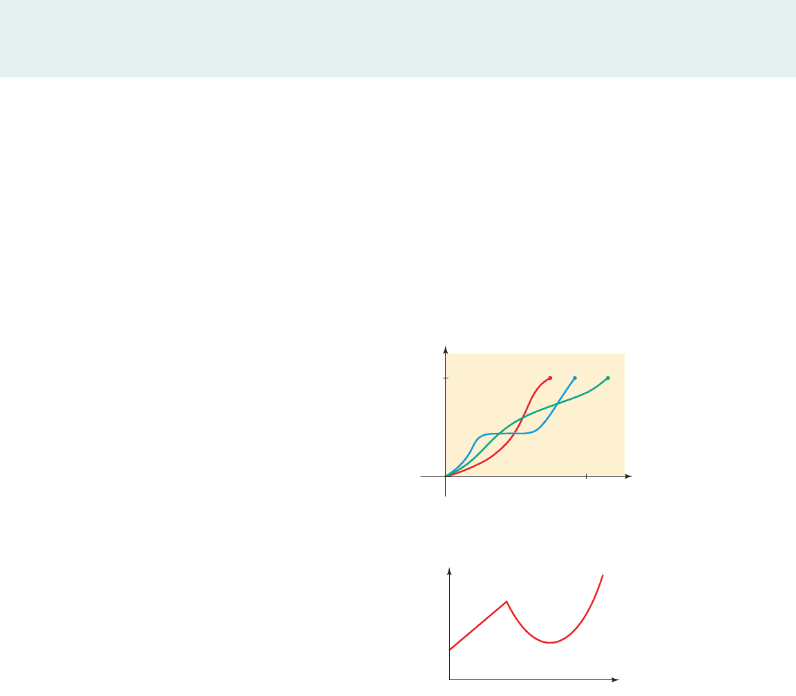
3. Make up a story involving any situation that would correspond to the graph
shown below.
I took a roast out of the freezer at noon and left it on the counter to thaw. Then
I cooked it in the oven when I got home.
I took a roast out of the freezer in the morning and left it on the counter to
thaw. Then I cooked it in the oven when I got home.
I took a roast out of the freezer in the morning and left it on the counter to
thaw. I forgot about it and went out for Chinese food on my way home from
work. I put the roast in the refrigerator when I finally got home.
2. Three runners compete in a 100-meter hurdle race. The graph shows the
distance run as a function of time for each runner. Describe what the graph
tells you about this race. Who won the race? Did each runner finish the race?
What do you think happened to Runner B?
t (sec)
y
(m)
100
0
20
AB C
x
y
EXPLORATIONS
■
EXPLORATIONS
■
EXPLORATIONS
■
EXPLORATIONS
Story 1
Story 2
Story 3
141
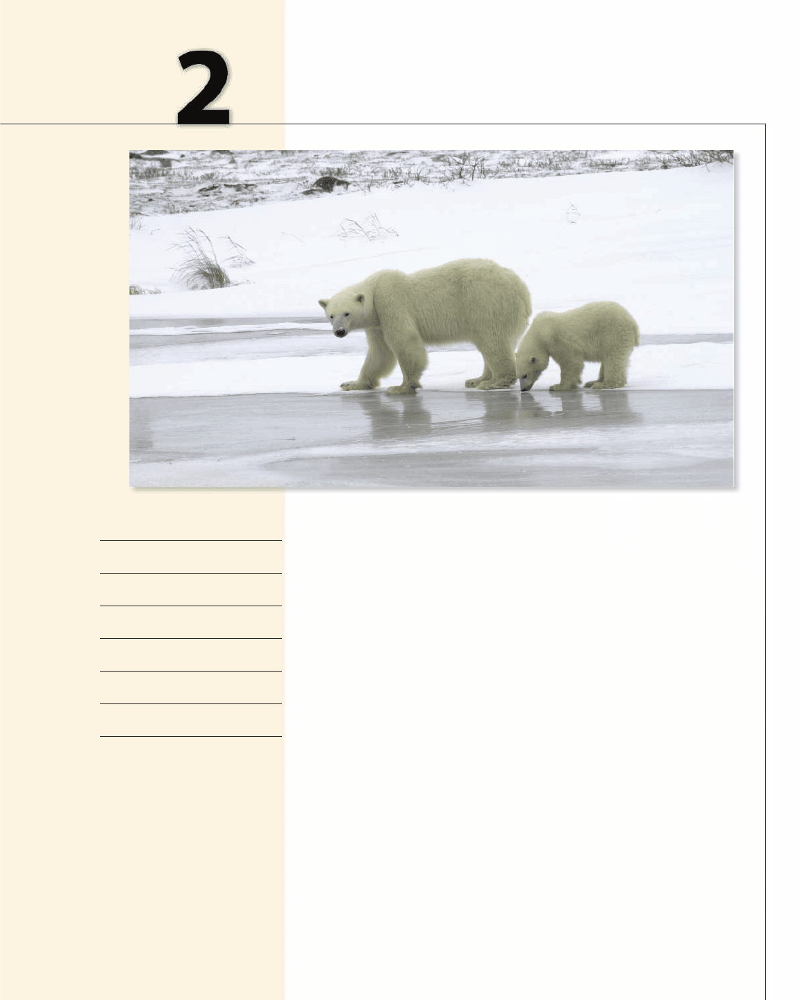
Global warming? Is the world getting hotter, or are we just having a
temporary warm spell? To answer this question, scientists collect huge
amounts of data on global temperature. A graph of the data can help to reveal
long term changes in temperature, but more precise algebra methods must be
used to detect any trend that is different from normal temperature fluctuations.
Significant global warming could have drastic consequences for the survival
of many species. For example, melting polar ice eliminates the ice paths polar
bears need to reach their feeding grounds, resulting in the bears’ starving or
possibly drowning. (See Section 2.5, Exercise 15, page 197.) Of course, any
changes in the global ecology also have implications for our own well-being.
2.1 Working with Functions:
Average Rate of Change
2.2 Linear Functions:
Constant Rate of Change
2.3 Equations of Lines:
Making Linear Models
2.4 Varying the Coefficients:
Direct Proportionality
2.5 Linear Regression:
Fitting Lines to Data
2.6 Linear Equations: Getting
Information from a Model
2.7 Linear Equations:
Where Lines Meet
EXPLORATIONS
1
When Rates of Change
Change
2 Linear Patterns
3 Bridge Science
4 Correlation and Causation
5 Fair Division of Assets
Linear Functions
and Models
Keith Levit/Shutterstock.com 2009
142 CHAPTER 2
■
Linear Functions and Models
2
2.1 Working with Functions: Average Rate of Change
■
Average Rate of Change of a Function
■
Average Speed of a Moving Object
■
Functions Defined by Algebraic Expressions
IN THIS SECTION… we consider the net change of a function on an interval. This leads
to the concept of average rate of change of a function.
GET READY… by reviewing the concept of net change from Section 1.5.
In Section 1.7 we used the graph of a function to determine where the function was
increasing and where it was decreasing. In this section we take a closer look at these
properties; namely, we ask, “How fast is the function increasing?” or “At what rate
is the function decreasing?” To answer these questions, we give a precise meaning
to the term how fast or at what rate.
2
■ Average Rate of Change of a Function
The rate at which a function increases or decreases can vary dramatically, as in the
case of the speed of a runner in a marathon or the rate at which books are added to a
library. However, a good approximation is the average rate of change of a function
over an interval.
A university library receives new books each month. The head librarian needs
to estimate how many books “on average” the library receives monthly. The data
listed in the margin give the number of books the library has on the last day of each
month in 2007.
Let’s find the average monthly increase in the number of books for the summer
months from the end of May to the end of August. First we find the net change (see
Section 1.5) in the number of books during these months:
net change in number of books ⫽ 127,754 ⫺ 127,187 ⫽ 567
To find the number of months over which this increase in books took place, we
subtract:
number of months ⫽ 8 ⫺ 5 ⫽ 3
So the average rate of change per month in the number of books is
/month
So from May to August the library added an average of 189 books per month.
=
567 books
3 months
= 189 books
average rate of change =
net change in number of books
change in time
Month
Month
number
Total
number
of books
Jan. 1 126,554
Feb. 2 126,672
Mar. 3 126,823
Apr. 4 127,003
May 5 127,187
June 6 127,523
July 7 127,634
Aug. 8 127,754
Sept. 9 127,896
Oct. 10 128,214
Nov. 11 128,415
Dec. 12 128,729
SECTION 2.1
■
Working with Functions: Average Rate of Change 143
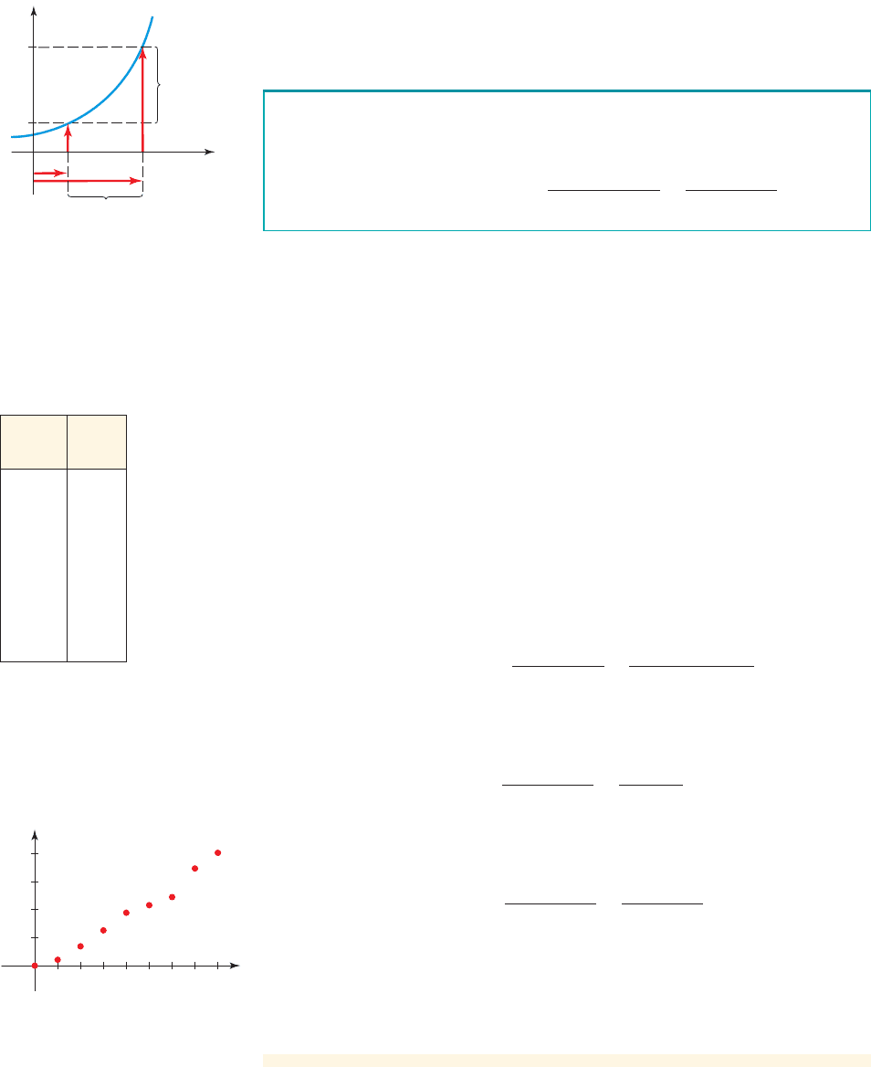
figure 1 Average rate of change
of a function f
The graph in Figure 1 shows that is the net change in the value of
f and is the change in the value of x. b - a
f 1b 2- f 1a2
example
1
Average Rate of Installation
Sima is installing new Italian ceramic flooring in her house. The table in the margin
gives the total number of tiles she has installed after working for x hours.
(a) Find the average rate of installation in the first hour.
(b) Find the average rate of installation for the first 4 hours.
(c) Find the average rate of installation from hour 6 to hour 8.
(d) Draw a graph of f and use the graph to find the hour in which Sima had the
fastest average rate of installation.
Solution
(a) We find the average rate of change of the function f between and :
/hour
So the average rate of installation for the first hour is 21 tiles per hour.
(b) We find the average rate of change of the function f between and :
/hour
So the average rate of installation for the first 4 hours is about 47 tiles per hour.
(c) We find the average rate of change of the function f between and :
/hour
So the average rate of installation for this time period is about 79 tiles per hour.
(d) A scatter plot is shown in Figure 2. We can see from the graph that the
steepest rise in the graph is during the seventh hour (from hour 6 to hour 7), so
the fastest average rate of installation occurred in the seventh hour.
■ NOW TRY EXERCISE 21 ■
average rate of change =
f 18 2- f 162
8 - 6
=
403 - 245
2
= 79 tiles
x = 8x = 6
average rate of change =
f 142- f 10 2
4 - 0
=
189 - 0
4
= 47.25 tiles
x = 4x = 0
average rate of change =
f 11 2- f 102
1 - 0
=
21 tiles - 0 tiles
1 hour
= 21 tiles
x = 1x = 0
f 1x 2
x
Hours
f(x)
Tiles
0 0
1 21
2 69
3 126
4 189
5 216
6 245
7 347
8 403
The average rate of change of the function between and
is
average rate of change =
net change in y
change in x
=
f 1b 2- f 1a2
b - a
x = b
x = ay = f 1x2
f(b)
f(a)
f(b)-f(a)
Net change
in y
b-a
Change in x
ba
x
y
200
300
400
100
24681357
0
x
y
figure 2
In general, we find the average rate of change of a function by calculating the
net change in the function values and dividing by the net change in the x-values.
Average Rate of Change of a Function