Stewart J. College Algebra: Concepts and Contexts
Подождите немного. Документ загружается.

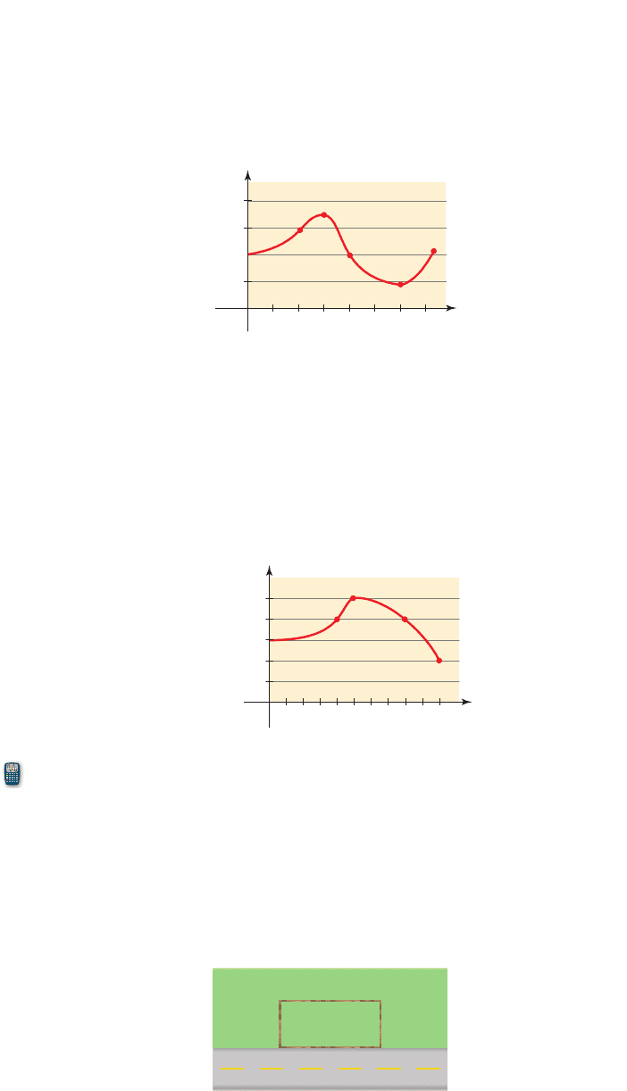
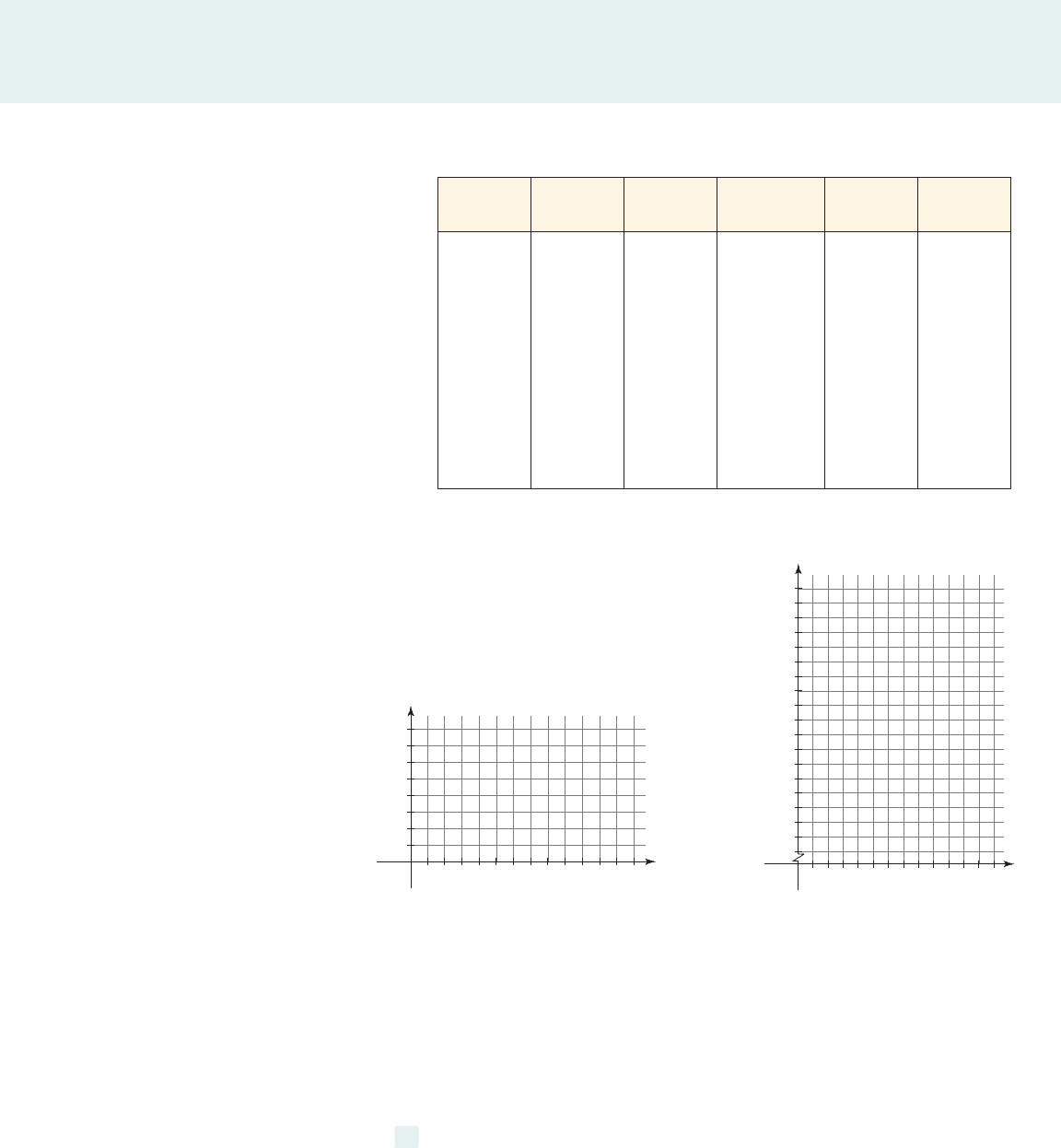
75. Depth of a Reservoir The graph shows the depth of water W in a reservoir over a
1-year period, as a function of the number of days x since the beginning of the year.
(a) What are the domain and range of W?
(b) Find the intervals on which the function W is increasing and on which it is
decreasing.
(c) What is the water level in the reservoir on the 100th day?
(d) What was the highest water level in this period, and on what day was it attained?
124 CHAPTER 1
■
Data, Functions, and Models
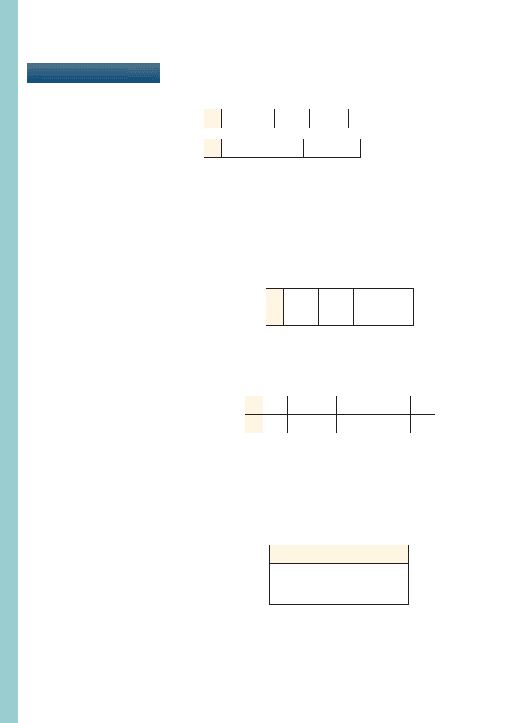
77. Fencing a Garden Plot A property owner wants to fence a garden plot adjacent to a
road, as shown in the figure. The fencing next to the road must be sturdier and costs $5
per foot, but the other fencing costs just $3 per foot. The garden is to have an area of
.
(a) Find a function C that models the cost of fencing the garden.
(b) Use a graphing calculator to find the garden dimensions that minimize the cost of
fencing.
(c) If the owner has at most $600 to spend on fencing, find the range of lengths he can
fence along the road.
1200 ft
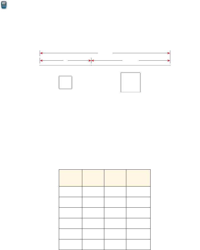
2
x
Years
P
(thousands)
0
10
20
30
40
50
10 20 30 40 50
x
x
Days
W (ft)
0
25
50
75
100
100 200 300
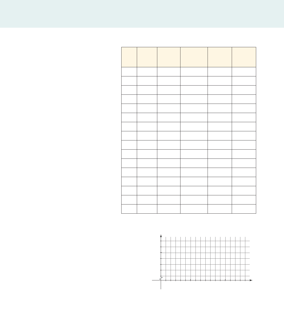
76. Population Growth and Decline The graph below shows the population P in a
small industrial city from 1950 to 2000. The variable x represents the number of
years since 1950.
(a) What are the domain and range of P?
(b) Find the intervals on which the function P is increasing and on which it is
decreasing.
(c) What was the largest population in this time period, and in what year was it
attained?
CHAPTER 1
■
Review Exercises 125
10 cm
x 10-x
Length
(in.)
Width
(in.)
Height
(in.)
Volume
(in
3
)
36 14
40 10
12 12
16 8
72 3
10 10
79. Mailing a Package One measure of the size of a package, used by the postal service
in many countries, is “length plus girth”—that is, the length of the package plus the
distance around it. So if a package has length l, width w, and height h, then its size S is
given by the formula
(a) The maximum size parcel that the U.S. Postal Service will accept has a length plus
girth of 84 in. What is the width of a package of this maximum size if its length is
64 in. and its width equals its height?
(b) Using the fact that the volume of a box is , complete the following table for
various packages that are all assumed to have a length plus girth equal to 84 in.
V = lwh
S = l + 2w + 2h.
78. Maximizing Area A wire 10 cm long is cut into two pieces, one of length x and the
other of length , as shown in the figure. Each piece is bent into the shape of a
square.
(a) Find a function A that models the total area enclosed by the two squares.
(b) Use a graphing calculator to find the value of x that minimizes the total area of the
two squares.
10 - x
126 CHAPTER 1
■
Data, Functions, and Models
TEST
1. Find the average and the median of the values of x given in the list.
(a)
(b)
2. A set of two-variable data is given.
(a) Express the data as a relation (a set of ordered pairs), using x as the input and y as
the output.
(b) Find the domain and range of the relation.
(c) Make a scatter plot of the data.
(d) Is the relation a function? Why or why not?
(e) Does there appear to be a relationship between the variables? If so, describe the
relationship.
(f) Which input(s) correspond to the output 5?
3. A set of two-variable data is given.
(a) Find a linear model for the data.
(b) Use the model to predict the outputs for the inputs 4.5 and 10.
(c) Sketch a graph of the model.
4. An equation in two variables is given. Does the equation define y as a function of x?
(a)
(b)
5. The function f has the verbal description “Square, subtract 4, then divide by 5.” Express
the function algebraically using function notation.
6. A car dealership is offering discounts to buyers of new cars, with the amount of the
discount based on the original price of the car, as indicated in the following table.
x
2
+ 3y = 9
3x + y
2
= 9
x 0 1 2 3 4 5 6
y 4.0 4.5 5.0 5.5 6.0 6.5 7.0
x 0 1 2 3 4 5 6
y 1 5 7 7 5 1
-5
x 1.2
-2.4
4.4
-5.1
3.9
x 7 1 6 6 2 10 4 0
CHAPTER
1
Original price x ($) Discount
x 6 20,000
20% of x
20,000 … x 6 40,000
$5000
x Ú 40,000
$8000
(a) Let be the discounted price of a car whose original price was x dollars.
Express the function f as a piecewise defined function.
(b) Evaluate , , , and .
(c) What two different values of x both give a discounted price of $34,000?
f 140,0002f 138,0002f 122,0002f 119,000 2
f 1x 2

7. Ella is an editor of gardening books. She is planning a reception at a bookstore to
promote a new book by one of her authors. Use of the facility costs $300, and
refreshments for the guests cost $4 per person.
(a) Find a function C that models the total cost of the reception if x guests attend.
(b) Sketch a graph of C.
(c) Evaluate C(50) and C(200). What do these numbers represent? Plot the points that
correspond to these values on your graph.
(d) If the total cost of the reception was $600, how many guests attended?
8. When a bullet is fired straight up with muzzle velocity 800 ft/s, its height above the
ground after t seconds is given by the function
(a) Use a graphing calculator to draw a graph of h.
(b) Use your graph to determine the maximum height that the bullet reaches and the
time when it reaches this height.
(c) When does the bullet fall back to ground level?
(d) For what time interval is h decreasing? What is happening to the bullet during this
time?
9. The surface area of a rectangular box with length l, width w, and height h is given by
the formula .
(a) Find the surface area of a box that is 30 cm long, 12 cm wide, and 4 cm high.
(b) Find a formula that expresses h in terms of the other variables.
A = 2lw + 2lh + 2wh
h1t 2= 800t - 16t
2
.
CHAPTER 1
■
Test 127
Bias in Presenting Data
OBJECTIVE To learn to avoid misleading ways of presenting data
In this chapter we studied how data can be used to discover hidden relationships in
the real world. But collecting and analyzing data are human activities, so they are not
immune from bias. When we are looking for trends in data, our goal should be to dis-
cover some true property of the thing or process we are studying and not merely to
support a preconceived opinion. However, it sometimes happens that data are pre-
sented in a misleading way to support a hypothesis that is not valid. This is some-
times called fudging the data, that is, reporting only part of the data (the part that
supports our hypothesis) or even simply making up false data. Mark Twain suc-
cinctly described these practices when he said, “People commonly use statistics like
a drunk man uses a lamppost; for support rather than illumination.”
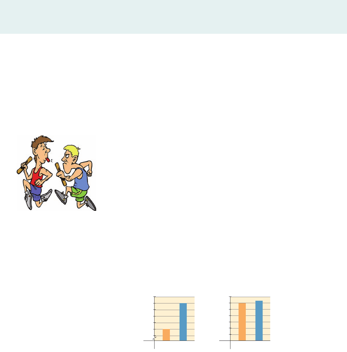
Here’s a simple example of how we may choose to present data in a biased fash-
ion. Tom and Harry compete in a two-man race, which Tom wins and Harry loses.
Harry tells his friends, “I came in second, and Tom came in next-to-last.” Although
correct, Harry’s statement gives a misleading impression of what actually happened.
But misrepresenting or misinterpreting data is not always just silly—it can be a
very serious matter. For example, if experimental data on the effectiveness of a new
drug are misrepresented to bolster the claim of its effectiveness, the result could be
tragic to patients using the drug. So in using data, as in all scientific activities, the
goal is to discover truth and to present the results of our discoveries as accurately and
as fairly as possible. In this exploration we investigate different ways in which data
can be misrepresented, as a warning to avoid such practices.
I. Misleading Graphs
Although graphs are useful in visualizing data, they can also be misleading. One
common way to mislead is to start the vertical axis well above zero. This makes small
variations in data look large. The following graphs show Tom’s and Pat’s annual
salaries. Does Pat make a lot more money than Tom, or do they make about the same?
Look carefully at the scale on the y-axis before answering this question.
EXPLORATIONS
■
EXPLORATIONS
■
EXPLORATIONS
■
EXPLORATIONS
1
60,000
59,000
61,000
62,000
63,000
64,000
65,000
Tom Pat
10,000
00
20,000
30,000
40,000
50,000
60,000
70,000
Tom Pat
1. The business manager of a furniture company obtains the following data
from the accounts department. She needs to present a report on the financial
state of the company to the executive board at their annual meeting.
128 CHAPTER 1
Winner: Tom; Loser: Harry
www.grinningplanet.com
(a) Plot the profit data on each of the axes shown below.
Month
Labor
(ⴛ $1000)
Materials
(ⴛ $1000)
Advertising
(ⴛ $1000)
Revenue
(ⴛ $1000)
Profit
(ⴛ $1000)
Jan. 320 247 14 709 122
Feb. 343 330 12 810 118
Mar. 332 330 16 806 123
Apr. 367 295 7 795 120
May 405 370 33 938 124
June 430 424 18 1002 123
July 440 407 13 992 126
Aug. 427 395 12 967 128
Sept. 392 363 21 912 130
Oct. 295 284 6 722 131
Nov. 288 260 28 714 132
Dec. 315 310 8 784 134
130
132
134
116
118
120
122
124
126
128
Profit
2468
Month
10 12
0
(b) The two graphs you sketched in part (a) display the same information. But
which gives the impression that profit increased dramatically? What graph
gives a more realistic impression of profit growth for this year?
(c) The business manager also wishes to give a graph of monthly revenue in
her report. Sketch two graphs of the monthly revenue: one that gives the
impression that revenues were dramatically higher in the middle of the
year and one that shows that revenue remained more or less steady
throughout the year.
2. The students at James Garfield College drink on average about 3 liters of beer
each per month. The rival college across town, William McKinley University,
has the reputation of being a “party school.” Its students drink about 6 liters of
beer each per month. In the following graph, each college’s average beer
consumption is represented by the height of a beer can.
200
150
100
50
Profit
2468
Month
10 12
0
x
y
EXPLORATIONS
■
EXPLORATIONS
■
EXPLORATIONS
■
EXPLORATIONS
EXPLORATIONS 129

Garfield
McKinley
Colle
ge
Beer
(
L
)
6
3
II. Are We Measuring the Right Thing?
Suppose we are told that one school district employs 50 science teachers while an-
other district has just 5. Can we assume that the parents in the first district care
more about science education than those in the second? Of course not. The rela-
tive sizes of the school districts must be taken into account before we can come to
any conclusions. If the population of the first district is ten times that of the sec-
ond, then both have the same relative proportion of science teachers. In many
cases data have to be properly scaled to understand their significance. Let’s ana-
lyze the following data about two of the leading causes of death in the United
States.
1. The following table gives the number of deaths from all forms of cancer and
the number of deaths from automobile accidents in the United States from
1988 to 2003, together with population data for those years.
130 CHAPTER 1
(a) Does the graph give the correct impression about the relative amount of
beer consumed at each college? Why is using images of three-dimensional
cans instead of just drawing a plain bar graph deceptive? [Hint: By what
factor does the volume of a cylindrical can increase if its height and radius
are doubled?]
(b) The table gives estimates of the daily oil consumption of four large
countries. Draw a bar graph of the data, using the height of a three-
dimensional oil barrel to represent oil consumption. How does the graph
give a misleading impression of the data?
Country
Oil consumption per day
(millions of barrels)
United States 20.7
China 7.9
Russia 2.7
Mexico 2.1
EXPLORATIONS
■
EXPLORATIONS
■
EXPLORATIONS
■
EXPLORATIONS
(a) Graph the cancer mortality data on the given axes.
Year
Cancer
deaths
Auto
fatalities
Population
(ⴛ $1000)
Cancer
mortality
rate
Auto
mortality
rate
1988 485,048 49,078 244,480
198.4 20.1
1989 496,152 47,575 246,819
1990 505,322 44,599 248,710
1991 514,657 41,508 252,177
1992 520,578 39,250 255,078
1993 529,904 40,150 257,783
1994 534,310 40,716 260,341
1995 538,455 41,817 262,755
1996 539,533 42,065 265,284
1997 539,577 42,013 267,636
1998 541,532 41,501 270,360
1999 549,838 41,611 272,737
2000 553,091 41,945 275,307
2001 553,768 42,196 284,869
2002 557,271 43,005 288,443
2003 556,902 42,884 290,810
(b) Describe the trend in the number of cancer deaths over this 16-year period.
Did the number of deaths per year increase, decrease, or hold steady?
450
500
550
600
Cancer deaths
(⫻ 1000)
1988
0
1990 1992 1994 1996 1998 2000
Year
2002 2004
EXPLORATIONS
■
EXPLORATIONS
■
EXPLORATIONS
■
EXPLORATIONS
EXPLORATIONS 131
132 CHAPTER 1
(c) Complete the column in the table headed “Cancer mortality rate” by
calculating the cancer mortality rates per 100,000 population. For
example, the cancer death rate for 1988 is
(d) Graph the cancer mortality rate data on the given axes.
485,048
244,480,000
* 100,000 = 198.4
Year
National debt
(ⴛ $ trillion)
GDP
(ⴛ $ trillion)
National debt as
percent of GDP
1986 2.13 4.55
46.8%
1988 2.60 5.25
1990 3.23 5.85
1992 4.06 6.48
1994 4.69 7.23
1996 5.22 8.00
1998 5.53 8.95
2000 5.67 9.95
2002 6.23 10.59
2004 7.41 11.97
2006 8.51 13.49
EXPLORATIONS
■
EXPLORATIONS
■
EXPLORATIONS
■
EXPLORATIONS
180
190
200
210
Cancer
mortality
rate
1988
0
1990 1992 1994 1996 1998 2000
Year
2002 2004
(e) Describe the general trend in the cancer mortality rate. Compare this to
the trend in the actual number of cancer deaths that you found in part (b).
Which do you think gives a better representation of the truth about cancer
deaths: the data on number of cancer deaths per year or the data on the
cancer mortality rate per year?
(f) Do the same analysis as in parts (a) to (e) for the automobile fatality data.
2. The U.S. public debt, usually referred to as the national debt, consists primarily
of bonds issued by the Department of the Treasury. Since it was founded in 1790,
the department has kept meticulous records of the national debt. The table below
gives the value of the national debt at 2-year intervals between 1986 and 2006.

(a) In which county were homicides most prevalent? Least prevalent? What
about burglaries?
(b) Of course, you know that Los Angeles has a lot more people than the other
counties in the table. What role does the population play in determining in
which county one would be least likely to be a victim of these crimes?
Use the population data below to determine a better measure of the
homicide rate and the burglary rate in each of these counties. Which
county has the highest homicide rate and which has the lowest? What
about burglary rates? Do you find your answers surprising?
Population data: Calaveras, 46,871; Humboldt, 128,376; Los Angeles, 9,935,475;
Monterey, 412,104; San Bernardino, 1,963,535; San Luis Obispo, 255,478;
Sonoma, 466,477; Stanislaus, 505,505.
EXPLORATIONS 133
County Homicides Burglaries
Calaveras 2 308
Humboldt 3 1334
Los Angeles 1068 58,861
Monterey 14 2809
San Bernardino 174 14,548
San Luis Obispo 4 1469
Sonoma 5 2340
Stanislaus 30 4836
EXPLORATIONS
■
EXPLORATIONS
■
EXPLORATIONS
■
EXPLORATIONS
(a) Sketch a graph of the national debt data. Describe any trends you see from
the graph.
(b) As the population of the United States grows, so does the economy. So it’s
probably not meaningful to compare the size of the national debt in 1790
(about 75 million dollars) to its current size (over 9 trillion dollars). To
take into account the overall size of the economy, economists calculate the
national debt as a percentage of gross domestic product (GDP). For
example, for 1986 we get
Use similar calculations to complete the rest of the table.
(c) Sketch a graph of the percentage data that you calculated in part (b). Compare
your graph to the graph you sketched in part (a). What information does your
new graph provide that was not apparent from your graph in part (a)?
(d) What other factors do you think should be taken into account in consid-
ering the impact of the national debt? For example, does inflation play a
part in the size of the debt?
3. The following table gives the numbers of homicides and burglaries committed
in some California counties in 2005.
4.55
2.13
* 100 = 46.8%