Heiman G. Basic Statistics for the Behavioral Sciences
Подождите немного. Документ загружается.


this. Instead, correlational research is used to simply describe how nature relates the
variables, without identifying the cause.
REMEMBER We should not infer causality from correlational designs, be-
cause may cause , may cause , or a third variable may cause both
and .
Distinguishing Characteristics of Correlational Analysis
There are four major differences between how we handle data in a correlational analy-
sis versus in an experiment. First, back in our coffee experiment, we would examine
the mean nervousness score ( ) for each condition of the amount of coffee consumed ( ).
With correlational data, however, we typically have a large range of different scores:
People would probably report many amounts of coffee beyond only 1, 2, or 3 cups.
Comparing the mean nervousness scores for many groups would be very difficult.
Therefore, in correlational procedures, we do not compute a mean score at each .
Instead, the correlation coefficient summarizes the entire relationship at once.
A second difference is that, because we examine all pairs of X–Y scores, correla-
tional procedures involve one sample: In correlational designs, N always stands for the
number of pairs of scores in the data.
Third, we will not use the terms independent and dependent variable with a correla-
tional study (although some researchers argue that these terms are acceptable here).
Part of our reason is that either variable may be called or . How do we decide?
Recall that in a relationship the scores are the “given” scores. Thus, if we ask, “For a
given amount of coffee, what are the nervousness scores?” then amount of coffee is ,
and nervousness is . Conversely, if we ask, “For a given nervousness score, what is
the amount of coffee consumed?” then nervousness is , and amount of coffee is .
Further, recall that, in a relationship, particular scores naturally occur at a particular .
Therefore, if we know someone’s , we can predict his or her corresponding . The
procedures for doing this are described in the next chapter, where the variable is
called the predictor variable, and the variable is called the criterion variable. As
you’ll see, researchers used correlational techniques to identify variables that are
“good predictors” of scores.
Finally, as in the next section, we graph correlational data by creating a scatterplot.
Plotting Correlational Data: The Scatterplot
A scatterplot is a graph that shows the location of each data point formed by a pair of
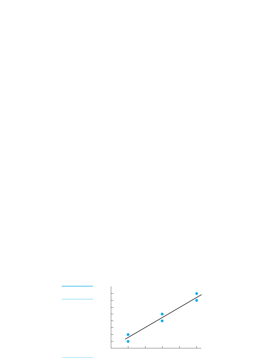
X–Y scores. Figure 7.1 contains the scores and resulting scatterplot showing the rela-
tionship between coffee consumption and nervousness. It shows that people drinking
1 cup have nervousness scores around 1 or 2, but those drinking 2 cups have higher
nervousness scores around 2 or 3, and so on. Thus, we see that one batch of data points
(and scores) tend to occur with one , and a different batch of data points (and thus
different scores) are at a different .
Real research typically involves a larger N and the data points will not form such
a clear pattern. In fact, notice the strange data point produced by and .
A data point that is relatively far from the majority of data points in the scatterplot is
referred to as an outlier—it lies out of the general pattern. Why an outlier occurs is
usually a mystery to the researcher.
Notice that the scatterplot does summarize the data somewhat. In the table, two peo-
ple had scores of 1 on coffee consumption and nervousness, but the scatterplot shows
Y 5 9X 5 3
XY
XY
Y
X
Y
X
YX
XY
YX
Y
X
X
YX
XY
X
XY
Y
XXYYX
138 CHAPTER 7 / The Correlation Coefficient
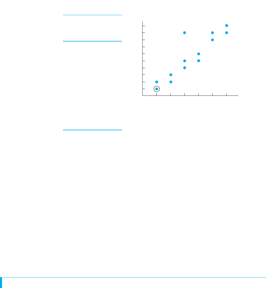
one data point for them. (As shown, some researchers circle such a data point to indi-
cate that points are on top of each other.) In a larger study, many participants with a par-
ticular score may obtain the same , so the number of data points may be
considerably smaller than the number of pairs of raw scores.
When you conduct a correlational study, always begin the analysis by creating a scat-
terplot. The scatterplot allows you to see the relationship that is present and to map out
the best way to summarize it. (Also, you can see whether the extreme scores from any
outliers may be biasing your computations.) Published reports of correlational studies,
however, often do not show the scatterplot. Instead, from the description provided, you
should envision the scatterplot, and then you will understand the relationship formed
by the data. You get the description of the scatterplot from the correlation coefficient. A
correlation coefficient communicates two important characteristics of a relationship:
the type of relationship that is present and the strength of the relationship.
REMEMBER A correlation coefficient is a statistic that communicates the
type and strength of relationship.
TYPES OF RELATIONSHIPS
The type of relationship that is present in a set of data is the overall direction in which
the scores change as the scores change. There are two general types of relation-
ships: linear and nonlinear relationships.
Linear Relationships
The term linear means “straight line,” and a linear relationship forms a pattern that fol-
lows one straight line. This is because in a linear relationship, as the scores increase,
the scores tend to change in only one direction. To understand this, first look at the
data points in the scatterplot on the left in Figure 7.2. This shows the relationship be-
tween the hours that students study and their test performance. A scatterplot that slants
Y
X
XY
YX
Types of Relationships 139
Cups of Nervousness
Coffee: Scores:
XY
11
11
12
22
23
34
35
39
45
46
58
59
69
6 10
FIGURE 7.1
Scatterplot showing
nervousness as a function
of coffee consumption
Each data point is created
using a participant’s coffee
consumption as the score
and nervousness as the
score.Y
X
0
Cups of coffee consumed
Nervousness scores
10
9
8
7
6
5
4
3
2
1
Scatterplot
123456
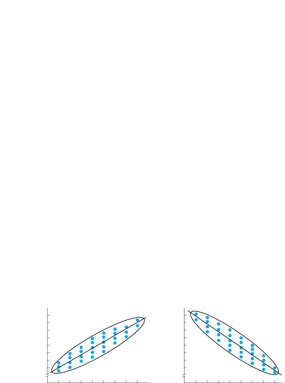
in only one direction like this indicates a linear relationship: it indicates that as students
study longer, their grades tend only to increase. The scatterplot on the right in Figure 7.2
shows the relationship between the hours that students watch television and their test
scores. It too is a linear relationship, showing that, as students watch more television,
their test scores tend only to decrease.
For our discussions, we will summarize a scatterplot by drawing a line around its
outer edges. (Published research will not show this.) As in Figure 7.2, a scatterplot that
forms an ellipse that slants in one direction indicates a linear relationship: by slanting,
it indicates that the scores are changing as the scores increase; slanting in one di-
rection indicates it is linear relationship.
Further, as shown, we can also summarize a relationship by drawing a line through
the scatterplot. (Published research will show this.) The line is called the regression
line. While the correlation coefficient is the statistic that summarizes a relationship, the
regression line is the line on a graph that summarizes the relationship. We will discuss
the procedures for drawing the line in the next chapter, but for now, the regression line
summarizes a relationship by passing through the center of the scatterplot. That is, al-
though all data points are not on the line, the distance that some are above the line
equals the distance that others are below it, so the regression line passes through the
center of the scatterplot. Therefore, think of the regression line as showing the linear—
straight line—relationship hidden in the data: It is how we visually summarize the gen-
eral pattern in the relationship.
REMEMBER The regression line summarizes a relationship by passing through
the center of the scatterplot.
The difference between the scatterplots in Figure 7.2 illustrates the two subtypes of
linear relationships that occur, depending on the direction in which the scores change.
The study–test relationship is a positive relationship. In a positive linear relationship,
as the scores increase, the scores also tend to increase. Thus, low scores are
paired with low scores, and high scores are paired with high scores. Any relation-
ship that fits the pattern “the more , the more ” is a positive linear relationship.YX
YXY
XYX
Y
XY
140 CHAPTER 7 / The Correlation Coefficient
FIGURE 7.2
Scatterplots showing positive and negative linear relationships
0
Hours of study time per day
100
90
80
70
60
50
40
30
100
90
80
70
60
50
40
30
Test scores
Test scores
0
Hours of TV time per day
12345678 12345678
Positive linear
study–test relationship
Negative linear
television–test relationship
(Remember positive by remembering that as the scores increase, the scores change
in the direction away from zero, toward higher positive scores.)
On the other hand, the television–test relationship is a negative relationship. In a
negative linear relationship, as the scores increase, the scores tend to decrease.
Low scores are paired with high scores, and high scores are paired with low
scores. Any relationship that fits the pattern “the more , the less ” is a negative linear
relationship. (Remember negative by remembering that as the scores increase, the
scores change toward zero, heading toward negative scores.)
Note: The term negative does not mean that there is something wrong with a rela-
tionship. It merely indicates the direction in which the scores change as the scores
increase.
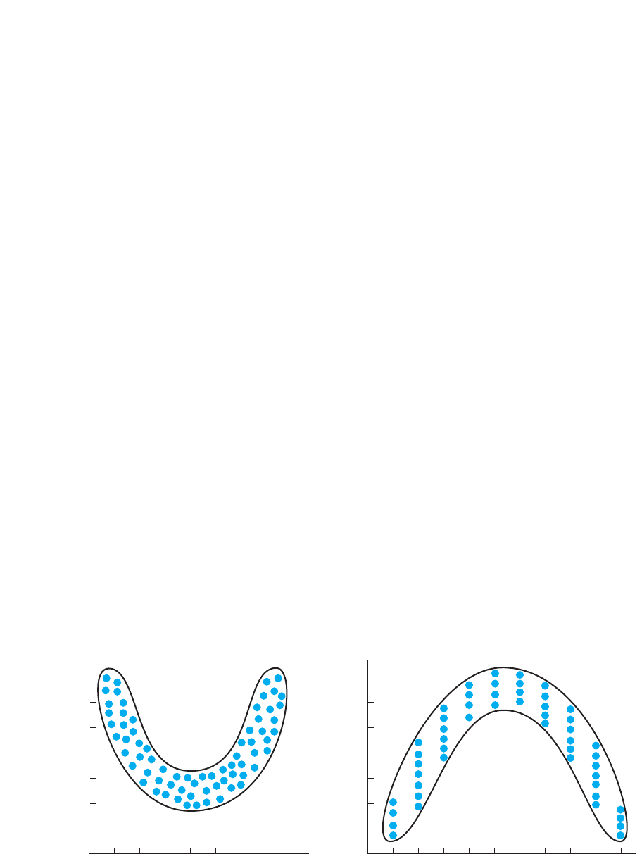
Nonlinear Relationships
If a relationship is not linear, then it is nonlinear. Nonlinear means that the data cannot
be summarized by one straight line. Another name for a nonlinear relationship is a
curvilinear relationship. In a nonlinear, or curvilinear, relationship, as the scores
change, the scores do not tend to only increase or only decrease: At some point, the
scores change their direction of change.
Nonlinear relationships come in many different shapes, but Figure 7.3 shows two
common ones. The scatterplot on the left shows the relationship between a person’s age
and the amount of time required to move from one place to another. Very young chil-
dren move slowly, but as age increases, movement time decreases. Beyond a certain
age, however, the time scores change direction and begin to increase. (Such a relation-
ship is called U-shaped.) The scatterplot on the right shows the relationship between
the number of alcoholic drinks consumed and feeling well. At first, people tend to feel
better as they drink, but beyond a certain point, drinking more makes them feel pro-
gressively worse. (Such a scatterplot reflects an inverted U-shaped relationship.)
Curvilinear relationships may be more complex than those above, producing a wavy
pattern that repeatedly changes direction. To be nonlinear, however, a scatterplot does
not need to be curved. A scatterplot might be best summarized by straight regression
YY
X
XY
YX
YX
YXYX
YX
YX
Types of Relationships 141
FIGURE 7.3
Scatterplots showing nonlinear relationships
0
Age in years
7
6
5
4
3
2
1
U-shaped function
Time for movement
01
10
Alcoholic drinks consumed
7
6
5
4
3
2
1
Inverted U-shaped function
Feeling of wellness
10 20 30 40 50 60 70 2 4 5 6 7 8 93

lines that form a V, an inverted V, or any other shape. It would still be nonlinear as long
as it does not fit one straight line.
Notice that the terms linear and nonlinear are also used to describe relationships
found in experiments. If, as the amount of the independent variable (X) increases, the
dependent scores (Y) also increase, then it is a positive linear relationship. If the de-
pendent scores decrease as the independent variable increases, it is a negative relation-
ship. And if, as the independent variable increases, the dependent scores change their
direction of change, it is a nonlinear relationship.
How the Correlation Coefficient Describes the
Type of Relationship
Remember that the correlation coefficient is a number that we compute using our data.
We communicate that the data form a linear relationship first because we compute a
linear correlation coefficient—a coefficient whose formula is designed to summarize a
linear relationship. (Behavioral research focuses primarily on linear relationships, so
we’ll discuss only them.) How do you know whether data form a linear relationship? If
the scatterplot generally follows a straight line, then linear correlation is appropriate.
Also, sometimes, researchers describe the extent to which a nonlinear relationship has
a linear component and somewhat fits a straight line. Here, too, linear correlation is
appropriate. However, do not try to summarize a nonlinear relationship by computing a
linear correlation coefficient. This is like putting a round peg into a square hole: The
data won’t fit a straight line very well, and the correlation coefficient won’t accurately
describe the relationship.
The correlation coefficient communicates not only that we have a linear relationship
but also whether it is positive or negative. Sometimes our computations will produce a
negative number (with a minus sign), indicating that we have a negative relationship.
Other data will produce a positive number (and we place a plus sign with it), indicating
that we have a positive relationship. Then, with a positive correlation coefficient we
envision a scatterplot that slants upward as the scores increase. With a negative coef-
ficient we envision a scatterplot that slants downward as the scores increase.
The other characteristic of a relationship communicated by the correlation coeffi-
cient is the strength of the relationship.
STRENGTH OF THE RELATIONSHIP
Recall that the strength of a relationship is the extent to which one value of is con-
sistently paired with one and only one value of . The size of the coefficient that we
compute (ignoring its sign) indicates the strength of the relationship. The largest value
you can obtain is 1, indicating a perfectly consistent relationship. (You cannot beat per-
fection so you can never have a coefficient greater than 1!) The smallest possible value
is 0, indicating that no relationship is present. Thus, when we include the positive or
negative sign, the correlation coefficient may be any value between and The
larger the absolute value of the coefficient, the stronger the relationship. In other
words, the closer the coefficient is to , the more consistently one value of is paired
with one and only one value of .
REMEMBER A correlation coefficient has two components: The sign indi-
cates either a positive or a negative linear relationship; the absolute value
indicates the strength of the relationship.
X
Y;1
11.21
X
Y
X
X
142 CHAPTER 7 / The Correlation Coefficient
Correlation coefficients do not, however, measure in units of “consistency.” Thus, if
one correlation coefficient is and another is we cannot conclude that one
relationship is twice as consistent as the other. Instead, we evaluate any correlation
coefficient by comparing it to the extreme values of 0 and . The starting point is a
perfect relationship.
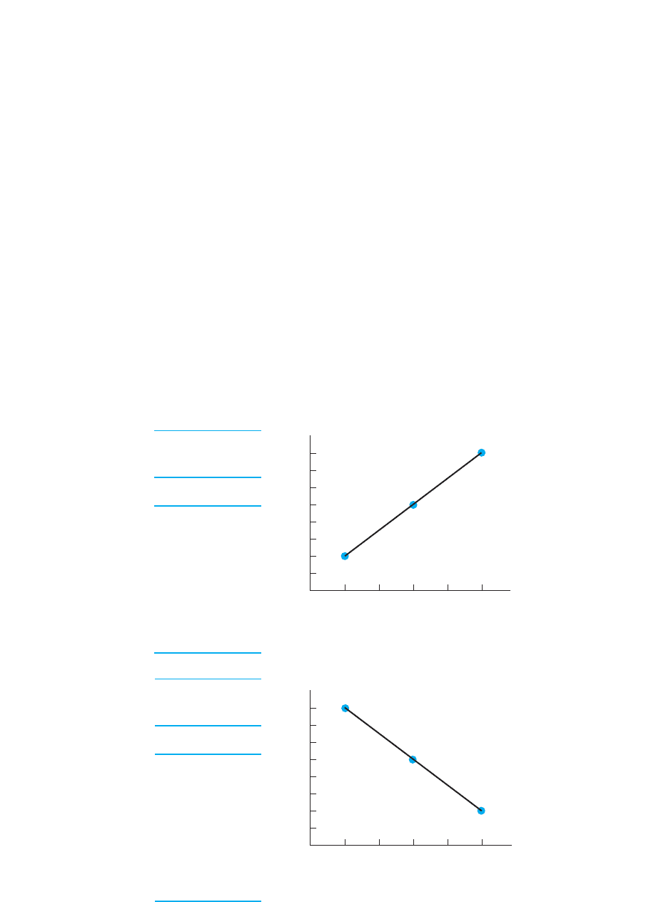
Perfect Association
A correlation coefficient of or describes a perfectly consistent linear relationship.
Figure 7.4 shows an example of each. (In this and the following figures, first look at the
scores to see how they pair up. Then look at the scatterplot. Other data having the same
correlation coefficient produce similar patterns, so we envision similar scatterplots.)
Here are four interrelated ways to think about what a correlation coefficient tells you
about the relationship. First, it indicates the relative degree of consistency. A coefficient
of 1 indicates that everyone who obtains a particular score obtains one and only one
value of . Every time changes, the scores all change to one new value.
Second, and conversely, the coefficient communicates the variability in the scores
paired with an . When the coefficient is , only one is paired with an , so there is
no variability—no differences—among the scores paired with each .
Third, the coefficient communicates how closely the scatterplot fits the regression
line. Because a coefficient equal to indicates zero variability or spread in the Y;1
XY
XY;1X
Y
YXY
X;
2111
;1
1.80,1.40
Strength of the Relationship 143
Perfect positive
coefficient 1.0
12
12
12
35
35
35
58
58
58
YX
Perfect negative
coefficient 1.0
18
18
18
35
35
35
52
52
52
YX
FIGURE 7.4
Data and scatterplots
reflecting perfect
positive and negative
correlations
02
X scores
8
7
6
5
4
3
2
1
02
8
7
6
5
4
3
2
1
Y scores
Y scores
X scores
3451
1345
scores at each , we know that their data points are on top of one another. And, because
it is a perfect straight-line relationship, all data points will lie on the regression line.
Fourth, the coefficient communicates the relative accuracy of our predictions
when we predict participants’ scores by using their scores. A coefficient of
indicates perfect accuracy in predictions: because only one score occurs with each
we will know every participants’ score every time. Look at the positive relation-
ship back in Figure 7.4: We will always know when people have a score of 2
(when they have an of 1), and we will know when they have a different of 5 or 8
(when they have an of 3 or 5, respectively). The same accuracy is produced in the
negative relationship.
Note: In statistical lingo, because we can perfectly predict the scores here, we
would say that these variables are perfect “predictors” of . Further, recall from
Chapter 5 that the variance is a way to measure differences among scores. When we
can accurately predict when different scores will occur, we say we are “accounting
for the variance in .” A better predictor (X) will account for more of the variance in .
To communicate the perfect accuracy in predictions with correlations of , we would
say that “100% of the variance is accounted for.”
REMEMBER The correlation coefficient communicates the consistency of the
relationship, the variability of the scores at each , the shape of the scatter-
plot, and our accuracy when using to predict scores.
Intermediate Association
A correlation coefficient that does not equal indicates that the data form a linear
relationship to only some degree. The closer the coefficient is to , however, the
closer the data are to forming a perfect relationship, and the closer the scatterplot is to
forming a straight line. Therefore, the way to interpret any other value of the correla-
tion coefficient is to compare it to .
For example, Figure 7.5 shows data that produce a correlation coefficient of
Again interpret the coefficient in four ways. First, consistency: A coefficient less than
indicates that not every participant at a particular had the same . However, a
coefficient of is close to so there is close to perfect consistency. That is, even
though different values of occur with the same , the scores are relatively close to
each other.
Second, variability: By indicating reduced consistency, this coefficient indicates that
there is now variability (differences) among the scores at each . However, becauseXY
YXY
11,1.98
YX;1
1.98.
;1
;1
;1
YX
XY
;1
YY
Y
YX
Y
X
YX
Y
YX
Y
;1XY
X
144 CHAPTER 7 / The Correlation Coefficient
FIGURE 7.5
Data and scatterplot
reflecting a correlation
coefficient of .981
11
12
12
34
35
35
57
58
58
YX
0
1
X scores
8
7
6
5
4
3
2
1
Y scores
2345
is close to (close to the situation where there is zero variability) we know that
the variability in our scores is close to zero and relatively small.
Third, the scatterplot: Because there is variability in the s at each , not all data
points fall on the regression line. Back in Figure 7.5, variability in scores results in a
group of data points at each that are vertically spread out above and below the regres-
sion line. However, a coefficient of is close to so we know that the data points
are close to, or hug, the regression line, resulting in a scatterplot that is a narrow, or
skinny, ellipse.
Fourth, predictions: When the correlation coefficient is not , knowing partici-
pants’ scores allows us to predict only around what their score will be. For exam-
ple, in Figure 7.5, for an of 1 we’d predict that a person has a around 1 or 2, but we
won’t know which. In other words, we will have some error in our predictions. How-
ever, a coefficient of is close to (close to the situation where there is zero
error). This indicates that our predicted scores will be close to the actual scores that
participants obtained, and so our error will be small. With predictions that are close to
participants’ scores, we would describe this variable as “a good predictor of .”
Further, because we will still know when scores around 1 or 2 occur and when differ-
ent s around, say, 4 or 5 occur, this variable still “accounts for” a sizable portion of
the variance among all scores.
The key to understanding the strength of any relationship is this:
As the variability—differences—in the Y scores paired with an X becomes
larger, the relationship becomes weaker.
The correlation coefficient communicates this because, as the variability in the s at
each becomes larger, the value of the correlation coefficient approaches 0. Figure 7.6
shows data that produce a correlation coefficient of only (The fact that this is a
negative relationship has nothing to do with its strength.) Here the spread in the
scores (the variability) at each is relatively large. This does two things that are con-
trary to a relationship. First, instead of seeing a different scores at different s, we
see very different s for individuals who have the same . Second, instead of seeing
one value of at only one , the scores at different s overlap, so we see one value
of paired with different values of . Thus, the weaker the relationship, the more the
scores tend to change when does not, and the more the scores tend to stay the
same when does change.
Thus, it is the variability in at each that determines the consistency of a relation-
ship, which in turn determines the characteristics we’ve examined. Thus, a coefficient
XY
X
YXY
XY
XYXY
XY
XY
XY
2.28.
X
Y
Y
XY
Y
YXY
YY
111.98
YX
YX
;1
11,1.98
X
Y
XY
Y
111.98
Strength of the Relationship 145
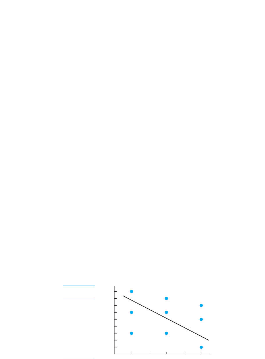
FIGURE 7.6
Data and scatterplot
reflecting a correlation
coefficient of .28.2
19
16
13
38
36
33
57
55
51
YX
0
X scores
9
8
7
6
5
4
3
2
1
Y scores
12345
of .28 is not very close to , so, as in Figure 7.6, we know that (1) only barely does
one value or close to one value of tend to be associated with one value of ; (2) con-
versely, the variability among the scores at every is relatively large; (3) the large
differences among scores at each produce data points on the scatterplot at each
that are vertically spread out, producing a “fat” scatterplot that does not hug the regres-
sion line; and (4) because each is paired with a wide variety of scores, knowing par-
ticipants’ will not allow us to accurately predict their . Instead, our prediction errors
will be large because we have only a very general idea of when higher scores tend to
occur and when lower scores occur. Thus, this is a rather poor “predictor” because
it “accounts” for little of the variance among scores.
REMEMBER Greater variability in the scores at each reduces the strength
of a relationship and the size of the correlation coefficient.
Zero Association
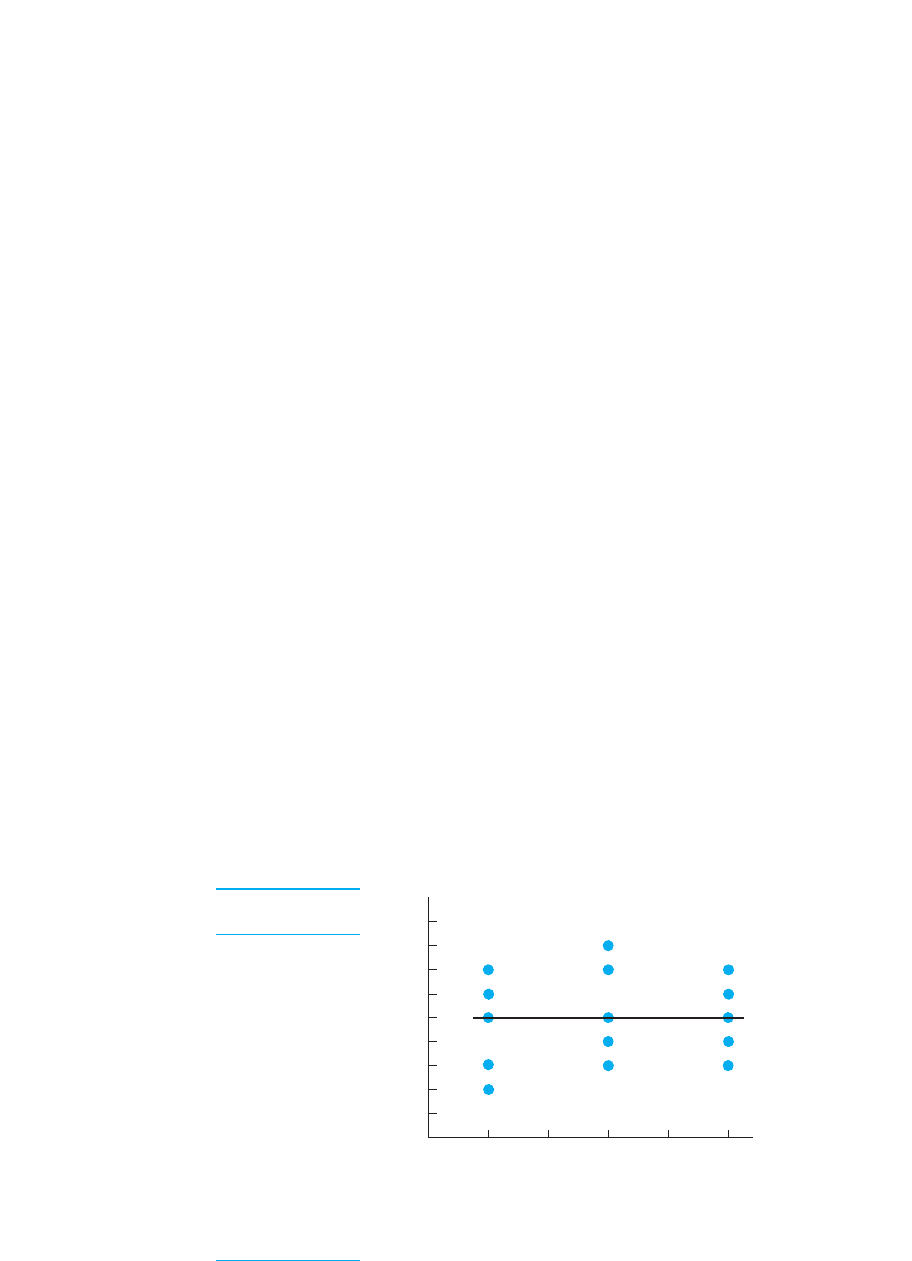
The lowest possible value of the correlation coefficient is 0, indicating that no relation-
ship is present. Figure 7.7 shows data that produce such a coefficient. When no rela-
tionship is present, the scatterplot is circular or forms an ellipse that is parallel to the
axis. Likewise, the regression line is a horizontal line.
A scatterplot like this is as far from forming a slanted straight line as possible, and a
correlation coefficient of 0 is as far from as possible. Therefore, this coefficient tells
us that no score tends to be consistently associated with only one value of . Instead,
the Ys found at one are virtually the same as those found at any other . This also
means that knowing someone’s score will not in any way help us to predict the corre-
sponding . (We can account for none of the variance in .) Finally, this coefficient in-
dicates that the spread in at any equals the overall spread of in the data, producing
a scatterplot that is a circle or horizontal ellipse that in no way hugs the regression line.
REMEMBER The larger a correlation coefficient (whether positive or nega-
tive), the stronger the linear relationship, because the less the are spread
out at each , and so the closer the data come to forming a straight line.X
Ys
YXY
YY
X
XX
XY
;1
X
XY
Y
XY
Y
YX
YX
XXY
XY
XY
;12
146 CHAPTER 7 / The Correlation Coefficient
FIGURE 7.7
Data and scatterplot
reflecting a correlation
coefficient of 0.
12
13
15
16
17
33
34
35
37
38
53
54
55
56
57
YX
0
X scores
9
8
7
6
5
4
3
2
1
Y scores
12 543
THE PEARSON CORRELATION COEFFICIENT
Now that you understand the correlation coefficient, we can discuss its computation.
However, statisticians have developed a number of correlation coefficients having dif-
ferent names and formulas. Which one is used in a particular study depends on the na-
ture of the variables and the scale of measurement used to measure them. By far the
most common correlation coefficient in behavioral research is the Pearson correlation
coefficient. The Pearson correlation coefficient describes the linear relationship be-
tween two interval variables, two ratio variables, or one interval and one ratio variable.
(Technically, its name is the Pearson Product Moment Correlation Coefficient.) The
symbol for the Pearson correlation coefficient is the lowercase r. (All of the example
coefficients in the previous section were rs.)
Mathematically r compares how consistently each value of is paired with each
value of . In Chapter 6, you saw that we compare scores from different variables by
transforming them into z-scores. Computing r involves transforming each score into
a z-score (call it ), transforming each score into a z-score (call it ), and then
determining the “average” amount of correspondence between all pairs of z-scores.
The Pearson correlation coefficient is defined as
r 5
a
1z
X
z
Y
2
N
z
X
Xz
Y
Y
X
Y
The Pearson Correlation Coefficient 147
A QUICK REVIEW
■
As scores increase, in a positive linear
relationship, the scores tend to increase, and in a
negative linear relationship, the scores tend to
decrease.
■
The larger the correlation coefficient, the more
consistently one occurs with one , the
smaller the variability in s at an , the more
accurate our predictions, and the narrower the
scatterplot.
MORE EXAMPLES
A coefficient of .84 indicates (1) as increases,
consistently increases; (2) everyone at a particular
shows little variability in scores; (3) by knowing an
individual’s , we can closely predict his/her score;
and (4) the scatterplot is a narrow ellipse, with the data
points lying near the upward slanting regression line.
However, a coefficient of .38 indicates (1) as in-
creases, somewhat consistently increases; (2) a wide
variety of scores paired with a particular ; (3) know-
ing an score does not produce accurate predictions of
the paired score; and (4) the scatterplot is a wide el-
lipse around the upward slanting regression line.
Y
X
XY
Y
X1
YX
Y
X
YX1
XY
XY
Y
Y
X
For Practice
1. In a ______ relationship, as the scores increase,
the scores increase or decrease only. This is not
true in a ______ relationship.
2. The more that you smoke cigarettes, the lower
is your healthiness. This is a ______ linear
relationship, producing a scatterplot that slants
______ as increases.
3. The more that you exercise, the better is your
muscle tone. This is a ______ linear relationship,
producing a scatterplot that slants ______ as
increases.
4. In a stronger relationship the variability among the
scores at each is ______, producing a scatter-
plot that forms a ______ ellipse.
5. The ______ line summarizes the scatterplot.
Answers
1. linear; nonlinear
2. negative; down
3. positive; up
4. smaller; narrower
5. regression
XY
X
X
Y
X