Heiman G. Basic Statistics for the Behavioral Sciences
Подождите немного. Документ загружается.


118 CHAPTER 6 / z-Scores and the Normal Curve Model
negative z-scores make up 50% of any distribution. Thus, the negative z-scores back
in Figure 6.3 constitute 50% of their respective distributions, which corresponds to a
relative frequency of . On any normal z-distribution, the relative frequency of the
negative z-scores is .
Having determined the relative frequency of the z-scores, we work backwards
to identify the corresponding raw scores. In the statistics distribution in Figure 6.3,
students having negative z-scores have raw scores ranging between 15 and 30, so the
relative frequency of scores between 15 and 30 is . In the English distribution,
students having negative z-scores have raw scores between 10 and 40, so the relative
frequency of these scores is .
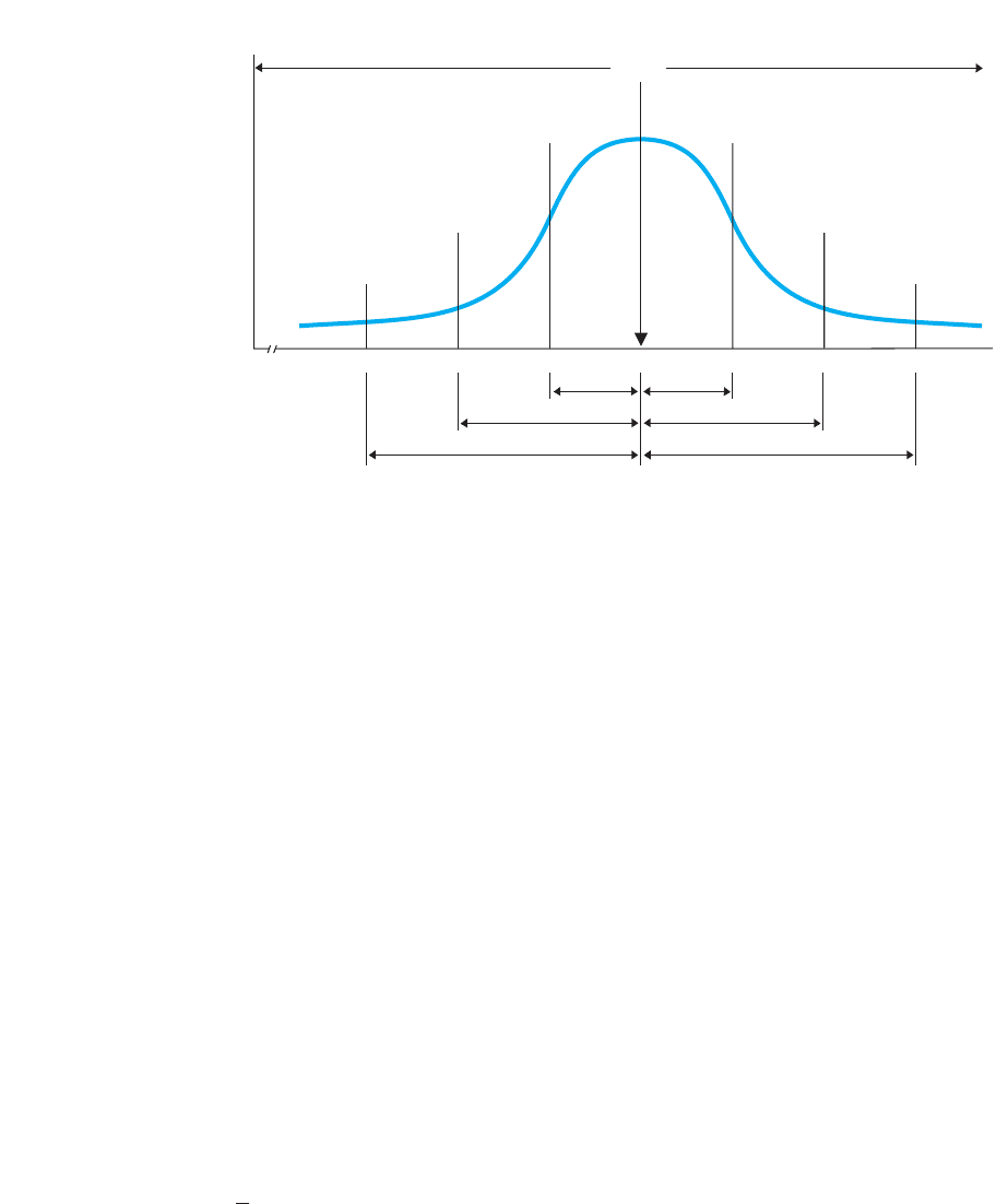
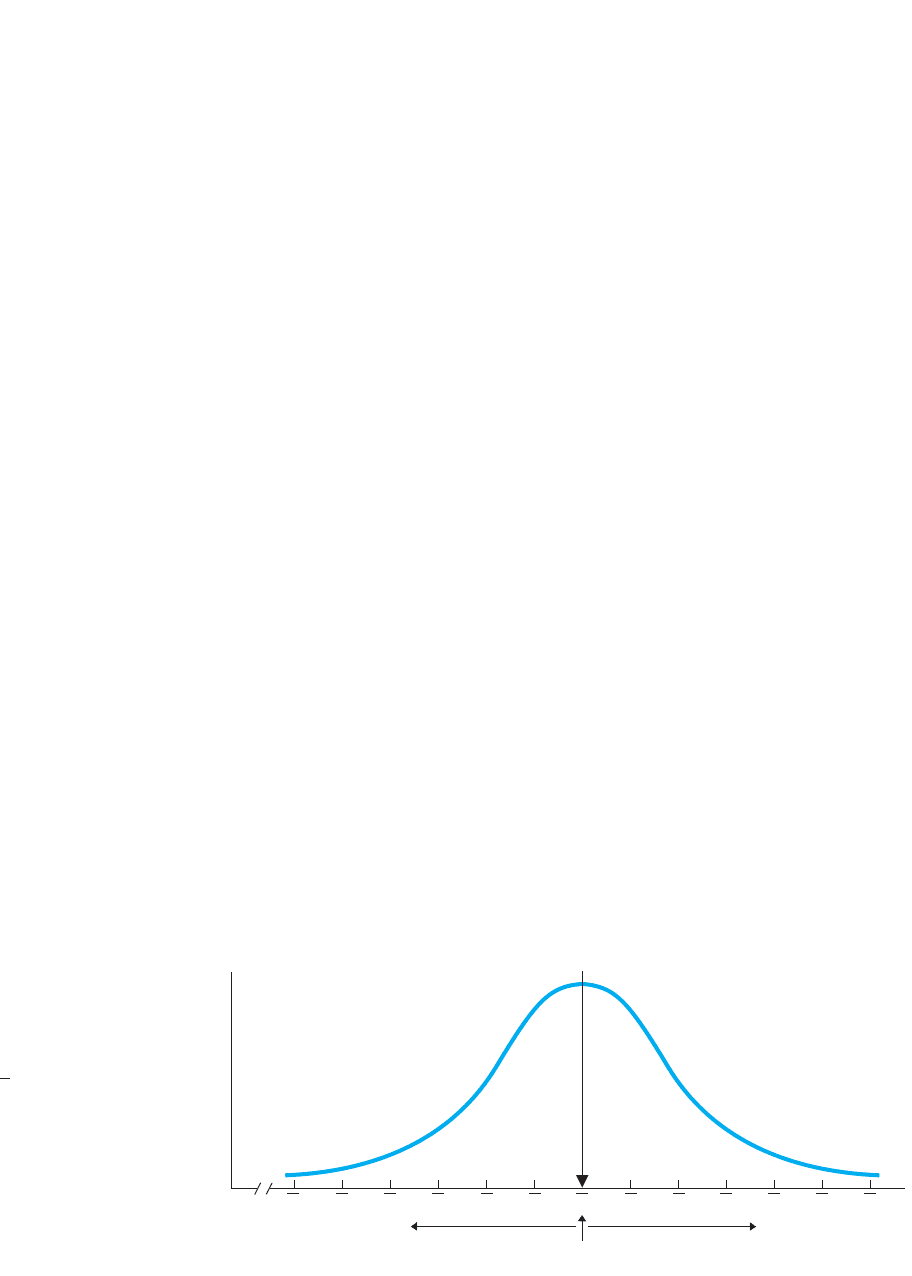
Similarly, approximately 68% of the scores always fall between the z-scores of
and . Thus, in Figure 6.3, students having z-scores between constitute approxi-
mately 68% of each distribution. Working backwards to the raw scores we see that sta-
tistics grades between 25 and 35 constitute approximately 68% of the statistics
distribution, and English grades between 30 and 50 constitute approximately 68% of
the English distribution.
In the same way, we can determine the relative frequencies for any set of scores.
Thus, in a normal distribution of IQ scores (whatever the and may be), we know
that those IQs producing negative z-scores have a relative frequency of .50, and that
about 68% of all IQ scores will fall between the scores at z-scores of . The same will
be true for a distribution of running speeds, a distribution of personality test scores, or
for any normal distribution.
We can also use z-scores to determine the relative frequency of scores in any other
portion of a distribution. To do so, we employ the standard normal curve.
The Standard Normal Curve
Because all normal z-distributions are similar, we don’t need to draw a different
z-distribution for every set of raw scores. Instead, we envision one standard curve that,
in fact, is called the standard normal curve. The standard normal curve is a perfect
normal z-distribution that serves as our model of any approximately normal z-distribu-
tion. It is used in this way: Most data produce only an approximately normal distribu-
tion, producing a roughly normal z-distribution. However, to simplify things, we
operate as if the z-distribution always fits one, perfect normal curve, which is the stan-
dard normal curve. We use this curve to first determine the relative frequency of partic-
ular z-scores. Then, as we did above, we work backwards to determine the relative
frequency of the corresponding raw scores. This is the relative frequency we would
expect, if our data formed a perfect normal distribution. Usually, this provides a reason-
ably accurate description of our data, although how accurate we are depends on how
closely the data conform to the true normal curve. Therefore, the standard normal curve
is most accurate when (1) we have a large sample (or population) of (2) interval or ratio
scores that (3) come close to forming a normal distribution.
The first step is to find the relative frequency of the z-scores and for that we look at
the area under the standard normal curve. Statisticians have already determined the pro-
portion of the area under various parts of the normal curve, as shown in Figure 6.4. The
numbers above the axis indicate the proportion of the total area between the z-scores.
The numbers below the axis indicate the proportion of the total area between the
mean and the z-score. (Don’t worry, you won’t need to memorize them.)
Each proportion is also the relative frequency of the z-scores—and raw scores—
located in that part of the curve. For example, between a z of 0 and a z of 1 is .34131
X
X
;1
S
X
X
;121
11
.50
.50
.50
.50
Using z-Scores to Determine the Relative Frequency of Raw Scores 119
Mean
.50
.0215 .1359 .3413 .3413 .1359 .0215 .0013.0013
–3 –2 –1
0+1+2+3
.4987 .4987
.4772.4772
.3413 .3413
.50
z-scores
f
FIGURE 6.4
Proportions of total
area under the standard
normal curve
The curve is symmetrical:
50% of the scores fall below
the mean, and 50% fall above
the mean.
(or 34.13%) of the area, so, as we’ve seen, about 34% of the scores are here. Or, scores
between a z of and a z of occur of the time, and this added to , gives
a total of 0.4772 of the scores between the mean and . Finally, with .3413 of the
scores between the mean and and of the scores between the mean and
, a total of of the area under the curve is between . (See, approxi-
mately 68% of the distribution really is between from the mean!)
We can also add together nonadjacent portions of the curve. For example, out in
the lower tail beyond is of the area under the curve (because
. Likewise, in the upper tail beyond is also
of the area under the curve. Thus, a total of .0456 (or 4.56%) of all scores fall in
the tails beyond .
Finally, notice that z-scores beyond or beyond occur only .0013 of the time,
for a total of .0026 (.26 of 1%!), which is why the range of z is essentially between .
This also explains why Chapter 5 said that the should be about one-sixth of the
range of the raw scores. The range is roughly between zs of , a distance of six times
the standard deviation. If the range is six times the standard deviation, then the stan-
dard deviation is one-sixth of the range.
REMEMBER For any approximately normal distribution, transform the raw
scores to z-scores and use the standard normal curve to find the relative fre-
quency of the scores.
We usually apply the standard normal curve in one of four ways. First, we can find
relative frequency. Most often we begin with a particular raw score in mind and then
compute its z-score (using our original z-score formula). For example, in our original
attractiveness scores, say that another man, Cubby, has a raw score of 80, which, with
and , is a z of . We can envision Cubby’s location as in Figure 6.5.
We might first ask what proportion of scores are expected to fall between the mean and
Cubby’s score. We see that of the total area falls between the mean and .
Therefore, we expect or 47.72%, of the attractiveness scores to fall between the
mean and Cubby’s score of 80. (Conversely, of the area under the curve—and
scores—are above his score.)
.0228
.4772
z 512.4772
12S
X
5 10X 5 60
;3
S
X
;3
2313
z 5 ;2
.0228z 512.0215 1 .0013 5 .02282
.0228z 522
;1S
X
;1.6826z 511
.3413z 521
z 512
.3413.13591211
120 CHAPTER 6 / z-Scores and the Normal Curve Model
Mean
.50
Cubby
.4772 .0228.50
.9772
.50
z-scores
Raw scores
–3 +1 +2 +3–2 –1
0
30 70 80
90
35 45 55 65 75
85
40 50
60
f
FIGURE 6.5
Location of Cubby’s score
on the z-distribution of
attractiveness scores
Cubby’s raw score of 80
is a z-score of .12
Second, we can find simple frequency. We might ask how many people scored
between the mean and Cubby’s score. Then we would convert the above relative fre-
quency to simple frequency by multiplying the N of the sample times the relative fre-
quency. Say that our was 1000. If we expect of the scores to fall here, then
, so we expect about 477 people to have scores between the
mean and Cubby’s score.
Third, we can find a raw score’s percentile. Recall that a percentile is the percent of
all scores below—graphed to the left of—a score. After computing the z-score for a raw
score, first see if it is above or below the mean. As in Figure 6.5, the mean is also the
median (the 50th percentile). A positive z-score is above the mean, so Cubby’s z-score
of is above the 50th percentile. In fact, his score is above the .4772 that fall between
the mean and his score. Thus, adding the .50 of the scores below the mean to the .4772
of the scores between the mean and his score gives a total of .9772 of all scores below
Cubby’s. We usually round off percentile to a whole number, so Cubby’s raw score of
80 is at the 98th percentile. Conversely, anyone scoring above the raw score of 80
would be in about the top 2% of scores.
On the other hand, say that Elvis obtained an attractiveness score of 40, producing a
z-score of . As in Figure 6.6, a total of .0228 (2.28%) of the distribution is below (to
the left of) Elvis’s score. With rounding, Elvis ranks at the 2nd percentile.
Fourth, we can find the raw score at a specific percentile. We can also work in the
opposite direction to find the raw score located at a particular percentile (or relative fre-
quency). Say that we had started by asking what attractiveness score is at the 2nd per-
centile (or we had asked below what raw score is .0228 of the distribution?). As in
Figure 6.6, a z-score of is at the 2nd percentile, or below is of the
distribution. Then to find the raw score at this z, we use a formula for transforming a
z-score into a raw score. For example, we saw that in a sample, . We’d
find that the corresponding attractiveness score is 40.
Using the z-Table
So far our examples have involved whole-number z-scores, although with real data a
z-score may contain decimals. However, fractions of z-scores do not result in propor-
tional divisions of the previous areas. Instead, find the proportion of the total area
X 5 1z21S
X
21 X
.0228z 52222
22
12
1.477221100025 477.2
.4772N
Using z-Scores to Determine the Relative Frequency of Raw Scores 121
Mean
.50
.0228
Elvis
.50
z-scores
Raw scores
–3
+1 +2 +3
–2 –1
0
30
70 80 90
35 45 55 65 75 85
40 50
60
f
FIGURE 6.6
Location of Elvis’s score on the z-distribution of attractiveness scores
Elvis is at approximately the 2nd percentile.
under the standard normal curve for any two-decimal z-score by looking in Table 1
of Appendix C. A portion of this “z-table” is reproduced in Table 6.1.
Say that you seek the area under the curve that is above or below a .
First, locate the z in column A, labeled “z.” Then column B, labeled “Area Between
the Mean and z,” contains the proportion of the area under the curve between the
mean and the z identified in column A. Thus, .4484 of the curve is between the mean
and the z of . Because this z is positive, we place this area between the mean
and the z on the right-hand side of the distribution, as shown in Figure 6.7. Column
C, labeled “Area Beyond z in the Tail,” contains the proportion of the area under the
curve that is in the tail beyond the z-score. Thus, .0516 of
the curve is in the right-hand tail of the distribution beyond
the z of (also shown in Figure 6.7).
Notice that the z-table contains no positive or negative
signs. You must decide whether z is positive or negative,
based on the problem you’re working. Thus, if our z had been
, columns B and C would provide the respective areas
on the left-hand side of Figure 6.7. (As shown here, always
sketch the normal curve, locate the mean, and identify the
portions of the curve you’re working with. This greatly sim-
plifies the problem.)
If you get confused when using the z-table, look at the nor-
mal distribution at the top of the table, like in Table 6.1. The
different shaded portions indicate the area under the curve
described in each column.
To work in the opposite direction to find the z-score that
corresponds to a particular proportion, read the columns in
the reverse order. First, find the proportion in column B or C,
that you seek, and then identify the corresponding z-score in
21.63
11.63
11.63
z 511.63
1.60 .4452 .0548
1.61 .4463 .0537
1.62 .4474 .0526
1.63 .4484 .0516
1.64 .4495 .0505
1.65 .4505 .0495
TABLE 6.1
Sample Portion of the
z-Table
Area Between
Mean and z
Area
Beyond z
in Tail
z
–z
+
z
CC
ABC
BB
X
–

122 CHAPTER 6 / z-Scores and the Normal Curve Model
If You Seek First, You Should Then You
Relative frequency of transform to z find its area in column B
*
scores between and
Relative frequency of transform to z find its area in column C
*
scores beyond in tail
that marks a given Find rel. f in column B transform its z to
rel. f between and
that marks a given find rel. f in column C transform its z to
rel. f beyond in tail
Percentile of an above transform to z find its area in column B
and add .50
Percentile of an below transform to z find its area in column C
*
To find the simple frequency of the scores, multiply rel. f times N.
XXX
XX
X
X
XX
X
X
XX
X
X
XX
X
TABLE 6.2
Summary of Steps When
Using the z-Tables
column A. For example, say that you seek the z-score corresponding to 44.84% of the
curve between the mean and z. Find .4484 in column B and then, in column A, the z-
score is 1.63.
Sometimes, you will need a proportion that is not given in the table, or you’ll need
the proportion corresponding to a three-decimal z-score. In such cases, round to the
nearest value in the z-table or, to compute the precise value, perform “linear interpola-
tion” (described in Appendix A.2).
Use the information from the z-tables as we have done previously. For example, say
that we want to examine Bucky’s raw score, which transforms into the positive z-score
of , located at the right-hand side back in Figure 6.7. If we seek the proportion of
scores above his score, then from column C we expect that of the scores are
above this score. If we seek the relative frequency of scores between his score and the
mean, from column B we expect that of the scores are between the mean up to
his raw score. Then we can also compute simple frequency or percentile as discussed
previously. Or, if we began by asking what raw score demarcates or of the
curve, we would first find these proportions in column B or C, respectively, then find
the z-score of in column A, and then use our formula to transform the z-score to
the corresponding raw score.
Table 6.2 summarizes these procedures.
11.63
.0516.4484
.4484
.0516
11.63
f
X
0.4484
0.05160.0516
Column B
Column C
z = +1.63z = –1.63
Column B
Column C
0.4484
FIGURE 6.7
Distribution showing the
area under the curve for
and z 511.63z 521.63
Statistics in Published Research: Using z-Scores 123
■
To find the relative frequency of scores above or
below a raw score, transform it into a z-score. From
the z-tables, find the proportion of the area under
the curve above or below that z.
■
To find the raw score at a specified relative
frequency, find the proportion in the z-tables and
transform the corresponding z into its raw score.
MORE EXAMPLES
With and ,
To find the relative frequency of scores above
45: Say-
ing “above” indicates in the upper tail, so from
column C the relative frequency is .
To find the percentile of the score of 41.5:
. Between this positive z
and in column B is . This score is at the 65th
percentile because
To find the proportion below : “Below”
indicates the lower tail, so from column C is .3520.
To find the score above the mean with 15% of the
scores between it and the mean (or the score at
the 65th percentile): From column B, the pro-
portion closest to is so . Then
.X 5 110.39214.021 40 5 41.56
z 510.39.1517.15
z 520.38
.1480 1 .50 5 .6480 5 .65.
.1480X
z 5 141.5 2 402>4 510.38
.1056
z 5 1X 2 X2>S
X
5 145 2 402>4 511.25.
S
X
5 4X 5 40
For Practice
For a sample: X
苶
65, S
X
12, and N 1000.
1. What is the relative frequency of scores
below 59?
2. What is the percentile of 75?
3. How many scores are between the mean and 70?
4. What raw score delineates the top 3%?
Answers
1. z (59 65)/12 .50; “below” is the lower tail, so
from column C is .3085.
2. z (75 65)/12 .83; between z and the mean, from
column B, is .2967. Then
percentile.
3. z (70 65)/12 .42; from column B is .1628;
(.1628)(1000) gives about 163 scores.
4. The “top” is the upper tail, so from column C
the closest to .03 is .0301, with z 1.88;
so X (1.88)(12) 65 87.56.
.7967 5 80th.2967 1 .50 5
A QUICK REVIEW
STATISTICS IN PUBLISHED RESEARCH: USING z-SCORES
A common use of z-scores is with diagnostic psychological tests such as intelligence or
personality tests. Often, however, test results are also shared with people who do not
understand z-scores; imagine someone learning that he or she has a negative personality
score! Therefore, z-scores are often transformed to more user-friendly scores. A famous
example of this is the Scholastic Aptitude Test (SAT). To eliminate negative scores and
decimals, sub-test scores are transformed so that the mean is about 500 and the standard
deviation is about 100. We’ve seen that z-scores are usually between 3, which is why
SAT scores are limited to between 200 and 800 on each part. (You may hear of higher
scores but this occurs by adding together the subtest scores.)
The normal curve and z-scores are also used when researchers create a “statistical
definition” of a psychological or sociological attribute. When debating such issues as
what a genius is or how to define “abnormal,” researchers often rely on relative standing.
For example, the term “genius” might be defined as scoring above a z of 2 on an intel-
ligence test. We’ve seen that only about 2% of any distribution is above this score, so we
have defined genius as being in the top 2% on the intelligence test. Or, “abnormal”
might be defined as having a z-score below 2 on a personality inventory. Such scores
are statistically abnormal because they are very infrequent, extremely low scores.
124 CHAPTER 6 / z-Scores and the Normal Curve Model
Finally, when instructors “curve grades” it means they are assigning grades based on
relative standing, and the curve they usually use is the normal curve and z-scores. If the
instructor defines A students as the top 2%, then students with z-scores greater than 2
receive As. If B students are the next 13%, then students having z-scores between 1
and 2 receive Bs, and so on.
USING z-SCORES TO DESCRIBE SAMPLE MEANS
Now we will discuss how to compute a z-score for a sample mean. This procedure is
very important because all inferential statistics involve computing something like a
z-score for our sample data. We’ll elaborate on this procedure in later chapters but, for
now, simply understand how to compute a z-score for a sample mean and then apply the
standard normal curve model.
To see how the procedure works, say that we give a part of the SAT to a sample of
25 students at Prunepit U. Their mean score is 520. Nationally, the mean of individual
SAT scores is 500 (and is 100), so it appears that at least some Prunepit students
scored relatively high, pulling the mean to 520. But how do we interpret the perform-
ance of the sample as a whole? The problem is the same as when we examined individ-
ual raw scores: Without a frame of reference, we don’t know whether a particular
sample mean is high, low, or in-between.
The solution is to evaluate a sample mean by computing its z-score. Previously, a
z-score compared a particular raw score to the other scores that occur in this situa-
tion. Now we’ll compare our sample mean to the other sample means that occur in
this situation. Therefore, the first step is to take a small detour and create a distribu-
tion showing these other means. This distribution is called the sampling distribution
of means.
The Sampling Distribution of Means
If the national average SAT score is 500, then, in other words, the of the population
of SAT scores is 500. Because we randomly selected a sample of 25 students and
obtained their SAT scores, we essentially drew a sample of 25 scores from this popula-
tion. To evaluate our sample mean, we first create a distribution showing all other pos-
sible means we might have obtained.
One way to do this would be to record all SAT scores from the population on slips of
paper and deposit them into a very large hat. We could then hire a statistician to sample
this population. So that we can see all possible sample means that might occur the stat-
istician would sample the population an infinite number of times: She would randomly
select a sample with the same size as ours (25), compute the sample mean, replace
the scores in the hat, draw another 25 scores, compute the mean, and so on. (She’d get
very bored, so the pay would have to be good.)
Even though the of individual SAT scores is 500, our “bored statistician” would
not obtain a sample mean equal to 500 every time. There are a variety of SAT scores in
the population and sometimes the luck of the draw would produce an unrepresentative
mix of them: sometimes a sample would contain too many high scores and not enough
low scores compared to the population, so the sample mean would be above 500 to
some degree. At other times, a sample would contain too many low scores and not
enough high scores, so the mean would be below 500 to some degree. Therefore, over
N
σ
X
Using z-Scores to Describe Sample Means 125
f
μ
XXX X X X XX X XX X X
Lower means
500
Higher means
FIGURE 6.8
Sampling distribution of
random sample means of
SAT scores
The axis is labeled to
show the different values of
we obtain when we sample
a population where the
mean in 500.
X
X
the long run, the statistician would obtain many different sample means. To see them
all, she would create a frequency polygon, which is called the sampling distribution of
means. The sampling distribution of means is the frequency distribution of all possi-
ble sample means that occur when an infinite number of samples of the same size are
randomly selected from one raw score population.
Our SAT sampling distribution of means is shown in Figure 6.8. This is similar to a
distribution of raw scores, except that here each score on the axis is a sample mean.
(Still think of the distribution as a parking lot full of people, except that now each per-
son is the captain of a sample, having the sample’s mean score.)
The sampling distribution is the population of sample means so its mean is symbol-
ized by and it stands for the average sample mean. (Yes, that’s right, it’s the mean of
the means!) Here the of the sampling distribution equals 500, which was also the
of the raw scores. To the right of are the sample means the statistician obtained that
are greater than 500, and to the left of are the sample means that were less than 500.
However, the sampling distribution forms a normal distribution. This is because most
scores in the population are close to 500, so most of the time the statistician will get a
sample containing scores that are close to 500, so the sample mean will be close to 500.
Less frequently, the statistician will obtain a strange sample containing mainly scores
that are farther below or above 500, producing means that are farther below or above
500. Once in a great while, some very unusual samples will be drawn, resulting in sam-
ple means that deviate greatly from 500. However, because the individual SAT scores
are balanced around 500, over the long run, the sample means created from those
scores will also be balanced around 500, so the average mean will equal 500.
The story about the bored statistician is useful because it helps you to understand
what a sampling distribution is. Of course, in reality, we cannot “infinitely” sample a
population. However, we know that the sampling distribution would look like Figure 6.8
because of the central limit theorem. The central limit theorem is a statistical principle
that defines the mean, the standard deviation, and the shape of a sampling distribution.
From the central limit theorem, we know that the sampling distribution of means always
(1) forms an approximately normal distribution, (2) has a equal to the of the
underlying raw score population from which the sampling distribution was created, and
(3), as you’ll see shortly, has a standard deviation that is mathematically related to the
standard deviation of the raw score population.
The importance of the central limit theorem is that with it we can describe the sam-
pling distribution from any variable without actually having to infinitely sample the
population of raw scores. All we need to know is (1) that the raw score population
12
X
N
126 CHAPTER 6 / z-Scores and the Normal Curve Model
forms a normal distribution of ratio or interval scores (so that computing the mean is
appropriate) and (2) what the and of the raw score population is. Then we’ll know
the important characteristics of the sampling distribution of means.
REMEMBER The central limit theorem allows us to envision the sampling
distribution of means, which shows all means that occur through exhaustive
sampling of a raw score population.
Why do we want to see the sampling distribution? Remember that we took a small
detour, but the original problem was to evaluate our Prunepit mean of 520. Once we
envision the distribution back in Figure 6.8, we have a model of the frequency distri-
bution of all sample means that occur when measuring SAT scores. Then we can
use it to determine the relative standing of our sample mean. To do so, we simply
determine where a mean of 520 falls on the axis of the sampling distribution in
Figure 6.8 and then interpret the curve accordingly. If 520 lies close to 500, then it is
a frequent, common mean when sampling SAT scores (the bored statistician fre-
quently obtained this result). But if 520 lies toward the tail of the distribution, far
from 500, then it is a more infrequent and unusual sample mean (the statistician
seldom found such a mean).
The sampling distribution is a normal distribution, and you already know how to
determine the location of any “score” on a normal distribution: We use—you guessed
it—z-scores. That is, we determine how far the sample mean is from the mean of the
sampling distribution when measured using the standard deviation of the distribution.
This will tell us the sample mean’s relative standing among all possible means that
occur in this situation.
To calculate the z-score for a sample mean, we need one more piece of information:
the standard deviation of the sampling distribution.
The Standard Error of the Mean
The standard deviation of the sampling distribution of means is called the standard
error of the mean. (The term standard deviation was already taken.) Like a standard
deviation, the standard error of the mean can be thought of as the “average” amount
that the sample means deviate from the of the sampling distribution. That is, in some
sampling distributions, the sample means may be very different from one another and,
“on average,” deviate greatly from the average sample mean. In other distributions, the
may be very similar and deviate little from .
For the moment, we’ll discuss the true standard error of the mean, as if we had
actually computed it using the entire sampling distribution. Its symbol is . The
indicates that we are describing a population, but the subscript indicates
that we are describing a population of sample means—what we call the sampling dis-
tribution of means. The central limit theorem tells us that can be found using the
following formula:
σ
X
X
σσ
X
Xs
X
σ
X
The formula for the true standard error of the mean is
σ
X
5
σ
X
1N
Using z-Scores to Describe Sample Means 127
Notice that the formula involves , the true standard deviation of the underlying raw
score population, and , our sample size.
The size of depends first on the size of . This is because with more variable raw
scores the statistician often gets a very different set of scores from one sample to the
next, so the sample means will be very different (and will be larger). But, if the raw
scores are not so variable, then different samples will tend to contain the same scores,
and so the means will be similar (and will be smaller). Second, the size of
depends on the size of . With a very small (say 2), it is easy for each sample to be
different from the next, so the sample means will differ (and will be larger). How-
ever, with a large , each sample will be more like the population, so all sample means
will be closer to the population mean (and will be smaller).
To compute for the sampling distribution of SAT means, we know that is 100
and our is 25. Thus, using the above formula we have
The square root of 25 is 5, so
and thus
A of 20 indicates that in our SAT sampling distribution, our individual sample
means differ from the of 500 by something like an “average” of 20 points.
Notice that although the individual SAT scores differ by an “average” of 100, their
sample means differ by only an “average” of 20. This is because the bored statisti-
cian will often encounter a variety of high and low scores in each sample, but they will
usually balance out to produce means at or close to 500. Therefore, the sample means will
not be as spread out around 500 as the individual scores are. Likewise, every sampling dis-
tribution is less spread out than the underlying raw score population used to create it.
Now, at last, we can calculate a z-score for our sample mean.
Computing a z-Score for a Sample Mean
We use this formula to compute a z-score for a sample mean:
1σ
X
2
1σ
X
2
σ
X
σ
X
5 20
σ
X
5
100
5
σ
X
5
σ
X
1N
5
100
125
N
σ
X
σ
X
σ
X
N
σ
X
NN
σ
X
σ
X
σ
X
σ
X
σ
X
N
σ
X
The formula for the transforming a sample mean into a
z-score is
z 5
X
2
σ
X
In the formula, stands for our sample mean, stands for the mean of the sampling
distribution (which equals the mean of the underlying raw score population) and
stands for the standard error of the mean. As we did with individual scores, this
formula measures how far a score is from the mean of a distribution, measured using
σ
X
X