Preiser W., Smith K.H. Universal Design Handbook
Подождите немного. Документ загружается.

42.2 EDUCATION AND RESEARCH
Guidepaths may be created by architectural elements, components, or markings that due to their
form, color, or texture aid people with cognitive or sensory disabilities as well as other groups of
users or individuals. People with reduced eyesight must be able to see the guidepaths; and blind
people should be able to feel or hear them. The markings should not hinder other users or impede
any building functions, and they should be aesthetically integrated.
The examples identified display considerable variety, particularly with regard to detailing (see
“Design Elements” later), and they fall broadly into four main categories, which stem from major
architectural elements:
1. Guidepaths as a main architectural feature or concept
2. Guidepaths in floor surfaces
3. Guidepaths on walls
4. Guidepaths in ceilings
Electronic guidance systems form a separate category, but are largely outside the scope of this
chapter, which was strictly limited to architectural design. To be meaningful, a separate study, and a
somewhat different approach, would be needed just to cover existing systems, if not the possibilities
for future developments. Electronic systems are therefore only briefly mentioned toward the end of
this chapter.
Guidepaths as a Main Architectural Feature or Concept
In two famous examples of twentieth-century architecture, the building layouts work as guidepaths.
Thus, no additional guidepath features are needed. One, the Guggenheim Museum in New York
City, is essentially a multistory spiraling guidepath. The other, the Louisiana Museum outside
Copenhagen, Denmark, is laid out as a meandering route through and past the exhibition areas.
Of more general architectural interest are solutions in which the spatial organization and, thus, the
circulation pattern follow the dominating architectural grid lines to the point of coinciding with
them. Obvious examples are Christian churches, in which the traditional central aisle is, in effect, a
guidepath, that runs without a break from the entrance to the altar.
Guidepaths in Floor Surfaces
Guidepaths in floor surfaces (see Fig. 42.1) may be tactile and thus provide a surface contrast that
can be felt through the soles of footwear or with a cane. Guidepaths may also be colored or give
off light to set them apart from the surrounding floor surface, or they may emit acoustic signals.
Likewise, all three strategies may be used in combination. An interesting development is the “tactile
block,” a type of floor tile that not only has tactile markings and comes in a variety of colors, but
also gives off a sound that differs from surrounding flooring materials when tapped with a cane.
The primary function of floor markings without tactile qualities, but only with contrasting colors,
is usually ornamental rather than an aid to orientation. Many such markings, however, appear to
give good indications of the direction of flow, turns, etc., and work well for many users with visual
impairments.
Guidelines on Walls
Although walls give people with severely reduced eyesight a crucial means of orientation, guidepaths
on walls (see Fig. 42.2) are a relative rarity. When used in the form of a handrail, a contrasting color,
or a different material than the rest of the wall, the primary function is support, decoration, or to
protect the wall surface from being damaged by knocks and blows. Examples are handrails, boards,
or strips of metal along the corridor walls of institutions such as nursing homes and hospitals.
GUIDEPATHS IN BUILDINGS 42.3
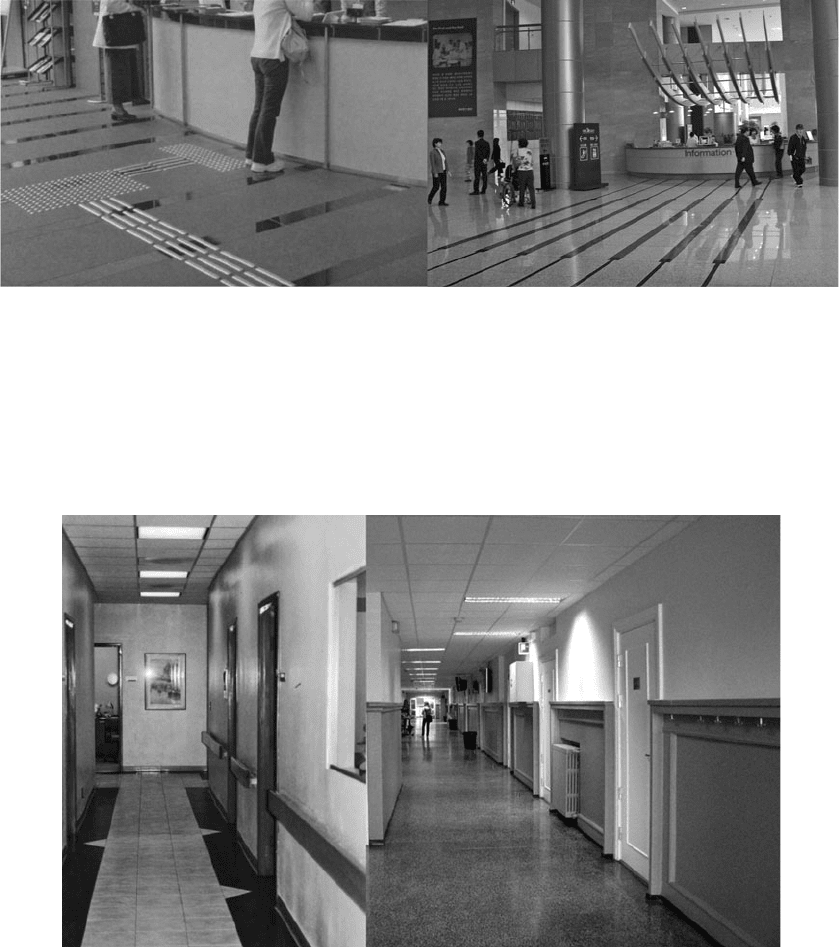
FIGURE 42.1 Guidepaths in floor surfaces. Left: Knobs attached to the flooring material. Cones signal a change of direction; tongues
indicate the line of flow. Right: Dark lines indicate the direction of the flow (Severance Hospital by Ellerbe Becket, Jung Lim Architects,
and Kesson International, Seoul, South Korea). [Photos: Ed Steinfeld (left), Jon Christophersen (right).]
Long description: The photos show guidepaths in floor surfaces, one tactile and one in color-contrast only. The tactile guidepath consists of
raised tongues and knobs. The tongues indicate flow, and the knobs serve as attention indicators that signal change of direction and the end
of the guidepath. The color-contrast guidepath is created by dark lines contrasting with light gray floor tiles.
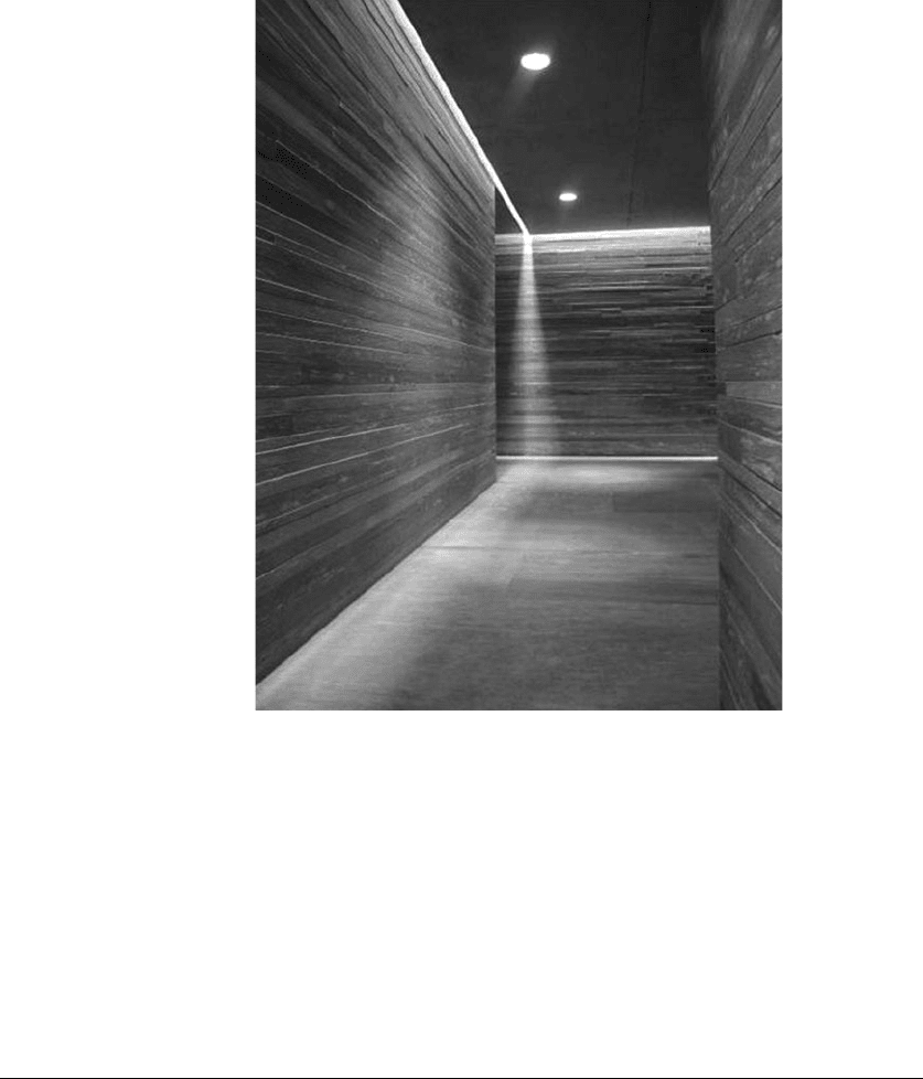
FIGURE 42.2 Left: A combination of wall and floor markings in San Diego Center for the Blind. Right: Markings on
the walls of a corridor in Ullern Finishing School, Oslo, Norway. [Photos: Roberta Null (left), Karine Denizou (right).]
Long description: Two photos of corridors. One, of San Diego Center for the Blind, has a strip of wood attached to the
wall to indicate the line of flow. The wooden strip is placed at about the same height as a handrail. There are, in addition,
contrast color floor markings along the walls. The other photo shows a main corridor in Ullern Finishing School, Oslo,
Norway. The sections of walls between each of the classroom doors have a darker color and timber decorations. Both
contribute to give the effect of a guidepath.
42.4 EDUCATION AND RESEARCH
Guidepaths in Ceilings
Ceiling lights, particularly in the form of strip lights in the direction of the traffic flow (see Fig. 42.3),
may provide some guidance for people who are able to distinguish between light and dark. However,
as most people with reduced eyesight usually focus their attention on the floor, the utility of ceiling
lights is probably limited. The most common feature is strip lighting placed in the direction of travel.
Acoustic features may well play a part, but such examples are not known to the authors.
42.4 BUILDING TYPES
Guidepaths are most common in large, public buildings and in special-purpose designs such as
institutions for older adults, schools for children with special needs, and workplaces with large
proportions of people with visual or cognitive impairments. A handful of countries, Japan is the best
known, require tactile and contrast colored floor markings in all public buildings.
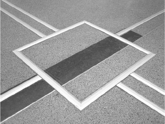
FIGURE 42.3 A strip of daylight can serve as a guidepath. (Vals, Switzerland.
Architect: Peter Zumthor. Photo: Karine Denizou.)
Long description: A strip of daylight in the ceiling creates a guidepath on the
floor and an attention indicator on the end wall of a corridor.

GUIDEPATHS IN BUILDINGS 42.5
Guidepaths are very common in transport terminals, particularly railway stations, where both
tactile and contrast colored paths are systematically applied. Guidepaths are also used in educational,
cultural, and health services buildings, but not always in a systematic manner and usually in contrast
colors only. In shopping malls, libraries, and museums, guidepaths appear to be designed mainly for
decoration rather than as an aid to orientation. Some big stores, such as IKEA, often employ a form
of guidepath that leads customers through the entire store, from the entrance area, throughout the
store, and to the checkout area.
42.5 DESIGNING GUIDEPATHS
Guidepaths may be planned as an integral part of the overall architectural solution, but are often
installed after a building is completed. The former, however, is becoming increasingly common for
public buildings, and many designers presently try out new materials and solutions, or rely on ready-
made products that can be bought on the market.
Design Elements
Advice from local and national user organizations has established two or three basic design ele-
ments. These include (1) raised stripes or tongues indicating direction of movement and (2) short col-
umns, cones, or a corduroy pattern as attention signals. In the Netherlands, Sweden, and Denmark,
however, a termination-of-movement indicator commonly serves as attention indicator. A third type
of marking, usually similar to the attention indicator, is often used to warn of a possible danger.
Some countries have legislation or standards that require danger markings, for instance, at the top
of stairs.
At the time of this writing, there is no internationally agreed upon guidepath standard, not even
within the European Union, but some national norms and standards exist. The Japanese system of
yellow floor tiles is the best known. The Danish accessibility standard (Danish Standard, 2001) is
under revision and will include specifications for guidepaths. A Norwegian standard for universal
design is in its final stage of development (Norwegian Standard, 2009 draft), and the EU is also
working on new accessibility and usability standards. Lack of standards allows freedom for experi-
mentation, but there is no record of results. Knowledge of user needs seems to be underdeveloped,
and according to literature on the subject, existing designs may be based on severely flawed test
methods. Planners and designers who were contacted as part of the study mentioned said that they
would like to see a wider range of products, but also had difficulties orienting themselves in a some-
what diverse market.
Basic Design Principles
First, changes of direction need to be considered. Several national user organizations maintain that
changes of direction should be right-angled. The Danish user organization, however, has recently
concluded that curves may be used when it is commensurate with the predominant direction of flow.
Second, obstructions must be avoided. The Danish user organization (Danish Society for the
Blind, 2004) recommends that clear space be at least 500 mm wide on either side of the guidepath.
Further recommendations include a hierarchy of guidepaths, e.g., wide markings for the main circu-
lation route and narrow strips (minimum of 20 mm) for secondary routes (see Fig. 42.4).
Third, contrast is an essential feature. The entire length of tactile guidepaths should have a sur-
face texture that differs significantly from the rest of the flooring material, and the texture must be
coarse enough to be felt through heavy winter boots. Contrast color is then not always essential, as
the texture makes the guidepath easy to detect. The height of the projecting tongues, columns, or
cones must, however, be balanced against the dangers of tripping, and the pattern must be spaced
42.6 EDUCATION AND RESEARCH
widely enough to avoid canes becoming stuck. Color contrast may be created by means of edge
markings alone.
Fourth, the widths of guidepaths need to be considered. There is no general standard for the
width of guidepaths; in fact, recommenda tions vary. However, there appears to be some consensus
that guidepaths inside buildings do not have to be as wide as guidepaths outdoors. The reason is
that acoustic and tactile signals are easier to detect, depending on the size of the space, noise levels,
and various acoustic factors. Both Japan and Holland use the same guidepath widths indoors and
outdoors. The recommendations from the Norwegian user organization (Norwegian Society for the
Blind, 2004) discriminate between “guide-field” and guidepath. The former should have a width of
800 mm (32 in.) and may be combined with narrower guidepaths to form a hierarchy. The minimum
width of a guidepath is quoted as 100 mm (4 in.).
Fifth, heights and locations of guidepaths are important. European and U.S. guidelines recom-
mend lower tactile indicators (3 to 5 mm or 1/8 in.) than the Asian (particularly Japanese) tiles of
about 5 mm (1/5 in.). The practical, built solutions vary—an example is that grooves about 2 mm
(1/12
t
in.) deep in the past have been used in some places in Europe. There are also recommendations
for open floor space of about 0.5 to 0.75 m (20 to 30 in.) on either side of the guidepath.
Sixth, attention markings need to be considered. They have to be designed differently from the
rest of the guidepath and should be found (1) at the stop and start of guidepaths, (2) at intersections
and where directions change, and (3) at points of interest or destinations, such as counters, informa-
tion boards, or machines.
Attention markings (see Fig. 42.5) vary considerably among countries. Some do not use attention
markings at all, to avoid confusion with tactile markings signifying danger. Others use a different
material from the rest of the guidepath. Yet others use cones or ribs at right angles to the direction of
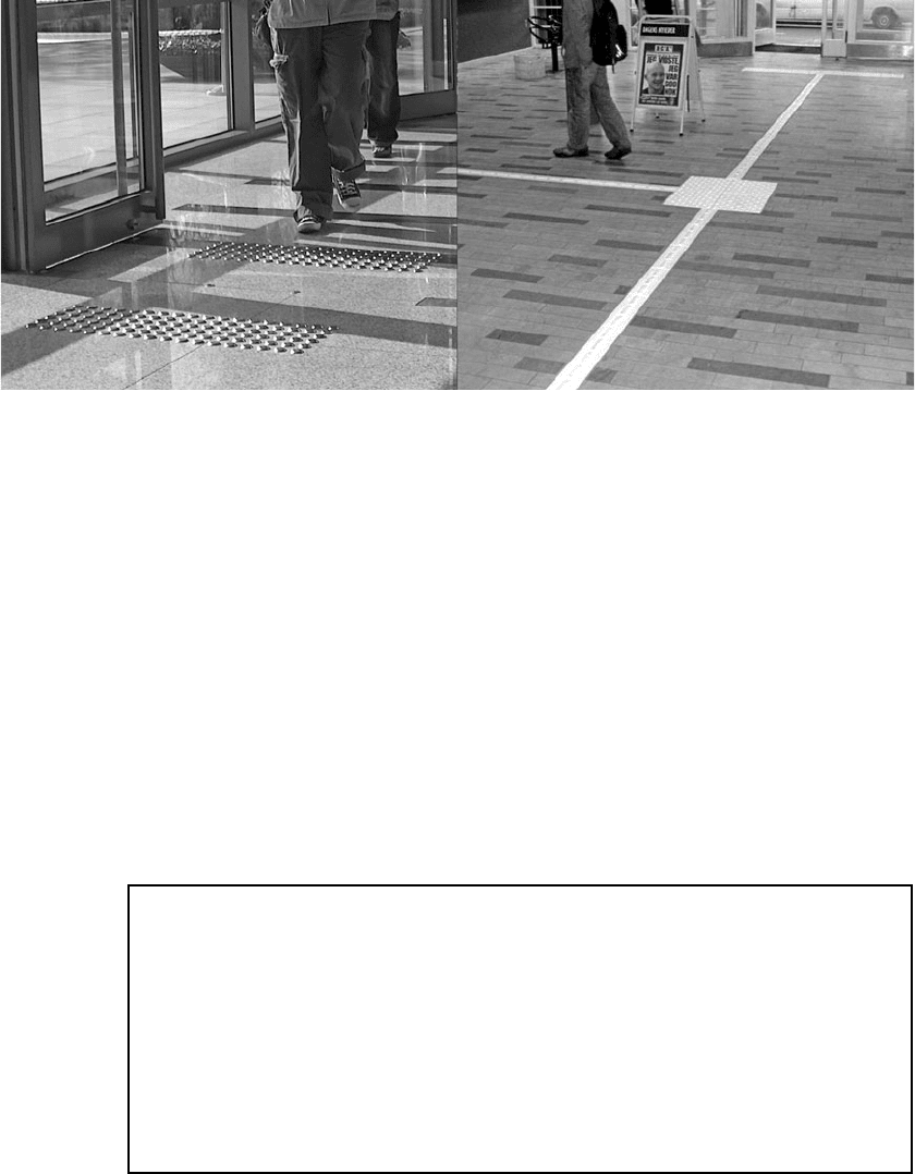
FIGURE 42.4 The outline of a square marks an intersection of two guidepaths at the
University of Agder, Norway. Double aluminum strips mark the main route; single strips signal
a secondary route, while the square serves as an attention signal. (Photo: Wibeke Knudsen.)
Long description: At the University of Agder, Norway, two types of tactile markers are used
to create a hierarchy of guidepaths. Both are made from narrow stainless steel strips, but the
main path is marked by a double line and the secondary route by a single line. Intersections are
outlined by a square.
GUIDEPATHS IN BUILDINGS 42.7
traffic. Swedish (Svensson, 2001) and Danish recommendations, notably the Danish railway (Danish
Railways, 2007), include a smooth area of 600 × 600 mm (24 × 24 in.). In Denmark this presupposes
a guidepath with two ribs and a totally smooth floor. Under other conditions, the Danes recommend
knobs over an area of 900 × 900 mm (36 × 36 in.).
Seventh, danger markings are crucial, but no consensus seems to exist as regards their use and
design. For instance, recommendations have been removed from the guidelines to the Americans
with Disabilities Act (ADA). The Norwegian Society for the Blind (2004) recommends knobs over
an area at least 600 mm (24 in.) deep. Danger markings will typically be found at the top of stairs,
at level changes, and at the end of guidepaths (see left half of Fig. 42.5).
FIGURE 42.5 Two types of markings. Steel knobs as found in front of the main entrance door to the Severance Hospital in Seoul (left) are
fairly common. The Danish solution (right) in Kalundborg Central Station, made from white steel tiles, uses both tactile and contrast color.
[Photos: Jon Christophersen (left); Dansk Blindesamfund (right).]
Long description: Photos showing two types of attention indicators. One is made from stainless steel knobs attached to a tiled floor and
warns that the main door to the Severance Hospital, Seoul, South Korea, is immediately ahead. The other is a square made from white floor
tiles and is intended to draw attention to an intersection between too narrow guidepaths.
Recommendations Box 42.1 Design Principles of Guidepaths
• Changes of direction should follow the general traffi c fl ow, but the number of changes
should be as low as possible.
• Avoid obstructions.
• Provide contrast, preferably both tactile and color.
• Consider the width of the guidepaths and possible needs for a hierarchy of guidepaths.
• Make sure that there is some free fl oor space on either side of the guidepath.
• Make tactile indicators suffi ciently high, but not so high as to induce a risk of tripping.
• Attention and danger markings need consideration. The former should be used at
changes of direction and at the start and end of the guidepath; the latter should be
found in front of doors, at the bottom and top of stairs, or at other level changes.

42.8 EDUCATION AND RESEARCH
42.6 TECHNICAL AIDS
Aids such as electronic guidance systems are sometimes combined with guidepaths in complex
buildings. The systems rely on electronic devices that give off auditory or tactile signals, usually in
the form of vibrations. The former is received through headphones or a telephone; the latter may
be handheld or attached to a cane. In principle, any electronic guidance system has three functional
components. One determines the user’s position in space, the second is a special database of the
environment, and the third is the user-controlled device.
Most of these systems are developed for outdoor environments; few can be used indoors. In
many cases, they appear to be based on good, solid research (e.g., Loomis et al., 1998; Loomis, n.d.;
Preiser, 1992). However, there remains the problem of knowing where to pick up the devices and
learning how the system works. Guidepaths avoid this type of problem, but international standardiza-
tion remains to be solved.
As with guidepaths, a variety of systems are in operation. Some recent developments utilize GPS
technology and may be operated through a normal mobile phone, but GPS is not yet reliable inside
buildings. Successful combinations of guidepaths and electronic guidance systems can be found in
Utrecht central station in the Netherlands and the new Oslo Opera House. A prototype of the system
described by Preiser (1992) was built at the University of New Mexico. Future developments may
include using the camera in mobile phones to read pictograms and written signage and to read them
out to the user (Helft, 2009). If this technology becomes widely available, it might render guidepaths
obsolete.
42.7 OTHER FUNCTIONAL ASPECTS
Finally, in addition to aiding orientation, guidepaths must meet other requirements such as easy
maintenance and cleaning, safety, and flexibility, and there are potential conflicts between these con-
siderations and the main design aims. The importance of the additional aspects will vary according to
the building type. For instance, there is a particular need for flexibility in many commercial buildings.
Offices, shops, and restaurants are subject to frequent alterations as the demands for office spaces
change, and displays and equipment are moved about, or the type of service changes (see Fig. 42.6).
In contrast, most guidepaths are parts of a highly durable flooring material with a fairly long life span.
Although guidepaths in floor surfaces must have a permanent contrast color, and preferably also be
tactile, it should be possible to move them about as other parts of the building change.
With regard to cleaning and maintenance, the main problems appear to be: removal of excess
water; cleaning between the tongues, cones, or columns; and damage caused by cleaning machines
and general wear (see Fig. 42.6). Machines avoid the problem of excess water, but it is not suffi-
ciently well known how far into the relief they are able to clean. They have also been known to rip
off strips and knobs attached to the flooring. New products have largely overcome these problems,
but the choice of cleaning methods and machines is important. Because it wears badly, the least
satisfying but possibly most common solution is contrasting colored tape or paint.
42.8 CONCLUSION
There is a clear need for evaluation and development of reliable methods that test how users orient
themselves inside buildings, how they may make use of guidepaths, and what information they might
gain from them. In addition, methods and studies need to be developed that test architectural proper-
ties, such as easily understandable solutions, clear and legible plans, etc. This might be of particular
interest at present, when planners and designers are experimenting with solutions, materials, and
products. The relationship between guidepaths and other systems for way-finding also needs to be
addressed. For best results, evaluation and testing should be done in actual buildings, rather than
GUIDEPATHS IN BUILDINGS 42.9
laboratory environments (see Steinfeld and Danford, 1999). It should include both first-time visitors
and regular users of the buildings, and it should test the usefulness of guidepaths for users with vari-
ous disabilities, including sensory, mobility, and cognitive impairments.
A fair amount of psychological literature on way-finding and advanced technical solutions exists,
but little is available on guidepaths in buildings. The articles by TG Lining (undated) and Steinfeld
and Danford (1999) are critical to establishing evaluation methods, but need to be augmented by a
more comprehensive means of testing.
42.9 BIBLIOGRAPHY
Translations of Scandinavian language titles are by the authors of this chapter.
Americans with Disabilities Act (ADA), Accessibility Guidelines for Buildings and Facilities, Washington: U.S.
Access Board, 2004.
Danish Society for the Blind (Dansk Blindesamfund), Tilgængelighed i detaljen—hæfte 3. Tilgængelighed
indendørs—Nybyggeri og tilbygninger (Details for Accessibility Booklet no. 3. Accessibility Indoors—New
construction and extensions), 2004.
Danish Standard, Tilgængelighet for alle (Accessibility for All), no. DC 3028, 2001.
Danish Railways, DSB Arkitekter, Vejledning for projekterende. Indvendige ledelinie—og opmærksomhedsflise
(Guidelines for designers. Guidepaths and attention tiles for use indoors), DSB (Danish State Railways),
2007.
Denizou, K., and J. Christophersen, Ledelinjer inne i bygninger (Guidepaths inside buildings), SINTEFByggforsk,
Project report no. 16, Oslo, 2008.
Helft, M., “For the Blind, Technology Does What a Guide Dog Can’t,” The New York Times, Jan. 3, 2009.
Lining, T. G., “Provisions on the Ground to Enable the Visually Impaired to Get Around Independently,” http://
www.tglining.nl/db/WAS46276e3e342f0/Toelichting_Wetenschapswinkel_ENG.doc.
Loomis, J. M., “UCSB Personal Guidance System (PGS),” n.d.; http://www.geog.ucsb.edu/pgs/main.htm.
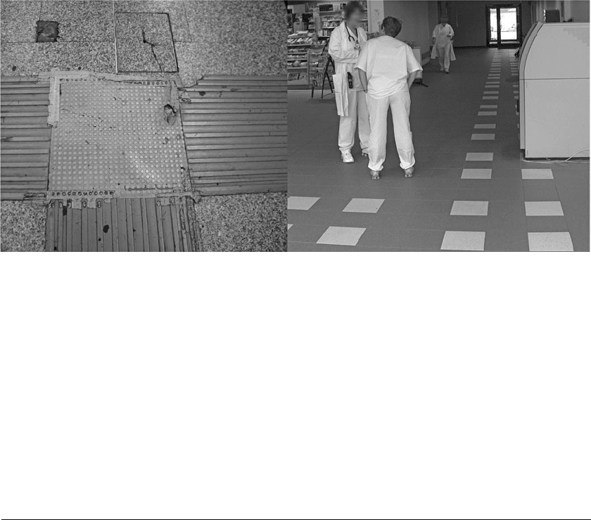
FIGURE 42.6 Guidepaths have to be properly maintained—not as in the left photograph. They must also be left unobstructed; conflicts
such as in the left photo must be avoided. [Photos: Karine Denizou (left); Jon Christophersen (right).]
Long description: Two photos showing building management problems. In one, there is a tripping hazard because damaged rubber floor
tiles have not been replaced and the attempts at repairing them are unsuccessful. In the other example, an ATM has been positioned so that
it obscures a part of the guidepath; there is thus a danger of collision.
42.10 EDUCATION AND RESEARCH
———, R. G. Golledge, and R. L. Klatzky, “Navigation System for the Blind: Auditory Display Modes and
Guidance,” Presence, 7(2):193–203, April 1998.
Norwegian Society for the Blind (Norges Blindeforbund), Et inkluderende samfunn: håndbok om synshemmedes
krav til tilgjengelighet (An Inclusive Society: Handbook for Visually Impaired People’s Requirements for
Accessibility), Oslo: Norges Blindeforbund, 2004.
Norwegian Standard, “Universell utforming av byggverk og tilliggende uteområder Del 1 og 2” (Universal
Design of Buildings and Adjacent Outdoor Areas Parts 1 and 2), draft, prNS 11001, 2009.
Preiser, W. F. E., “Locator System with Voice Guidance for Emergency Situations,” in Building Design for
Handicapped and Aged Persons, G. M. Haber and T. O. Blank (eds.), New York: McGraw Hill, 1992.
Steinfeld, E., and G. S. Danford (eds.), Detection and Discrimination of Tactile Warning Signals in Field
Conditions, New York: Kluwer Academic/Plenum, 1999.
Svensson, E., Bygg ikapp handikapp: att bygga för ökad tillgänglighet och användbarhet för personer med
funktionshinder (Build Away Handicaps: To Build for Improved Accessibility and Usability), BBR, Stockholm:
Hjälpmedelsinstitutet, 2001.

CHAPTER 43
REDEFINING DESIGN AND
DISABILITY: A PERSON-
ENVIRONMENT FIT MODEL
Jennifer Webb, Brent T. Williams, and Korydon H. Smith
43.1 INTRODUCTION
In 1962, Ed Roberts entered the University of California, Berkeley, against the protests of univer-
sity and state officials who claimed he could not be successful in school or later in the workplace.
“Special Ed” remembered one dean on campus, who stated: “We’ve tried cripples before and it
didn’t work” (Shapiro, 1994). Living in the university hospital, Roberts and 11 classmates with
severe disabilities fought to overcome an inaccessible campus and community, attitudinal barriers,
and stereotypes. Ed Roberts’ life story illustrates the important role that social customs and design
conventions play in activities of daily life, especially regarding persons with disabilities. More
importantly, Roberts and his classmates helped to transform the popular and political definitions of
disability locally and internationally. Through concepts such as universal design, the definition of
disability is still evolving.
At their foundation, universal design and parallel concepts call into question the complex,
dynamic, and reciprocal relationships between persons and the built environment. While theories
have attempted to explain various physical and social facets of this relationship (e.g., Altman and
Chemer, 1984; Bronfenbrenner, 2005; Gibson, 1977; Lawton and Nahemow, 1973), three primary
challenges remain. First, no single theory explains all the complexities of human-environment rela-
tionships. While some theories have focused on the psychosocial and behavioral aspects of the
person-environment (P-E) interaction, other theories have focused predominantly on ergonomic and
other physical factors. A synthesis of multiple theories is required. Second, the P-E construct is ever-
changing, as personal factors, e.g., aging, and environmental factors, e.g., moving, affect the overall
structure and hierarchy. Change, as a dynamic concept, is difficult to model. Third, technological,
economic, environmental, and sociological changes have led to innovations in design and shifts in
cultural ideologies. Capturing both the zeitgeist and the potentiality for change in the P-E relation-
ship is a challenge that needs to be addressed.
The purpose of this chapter, therefore, is to propose a new P-E Fit model that illustrates the com-
plex, dynamic, and reciprocal relationship between people and their environments. Central to this
discussion is the goal to eliminate the person-centric notion of disability. The P-E fit model undoes
categorical definitions of disability and instead illustrates that “ability” and “disability” overlap as
part of a continuum. This parallels the U.S. Census Bureau’s redefinition of race in 2000 to include
63 possible race combinations, reflecting the increased diversity of the population.
Society, however, has been slower to see it this way. Brubaker and Cooper (2006) argue that the
“reduction of American society into a multi-chrome mosaic of monochrome identity groups hinders
43.1