McInnes K. Rockstar Icon Designer
Подождите немного. Документ загружается.

View Points201
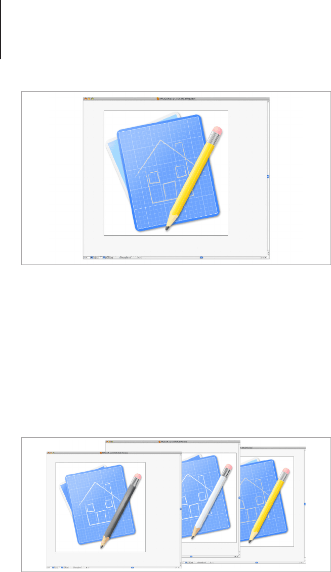
After I positioned the pencil, the color wasn’t standing out as much
as I wanted it to and it was a bit unconvincing that a standard HB
pencil was being used with a blueprint. After a few rendering tests
I decided that the icon would look better with some more contrast
between the elements. Because the pencil was made entirely from
Graphic Styles and Opacity Masks, I was able to change the color
from Yellow to white in a few minutes without losing the clarity
of color. If I needed to change the colors using hue sliders with
a regular ll in Photoshop, the colors can become muddy fairly
quickly and would need to be redrawn.
Use a brush to draw an image onto the blueprint page.
Graphic styles will allow you to change the colors of the icon quickly and
easily.
View Points202
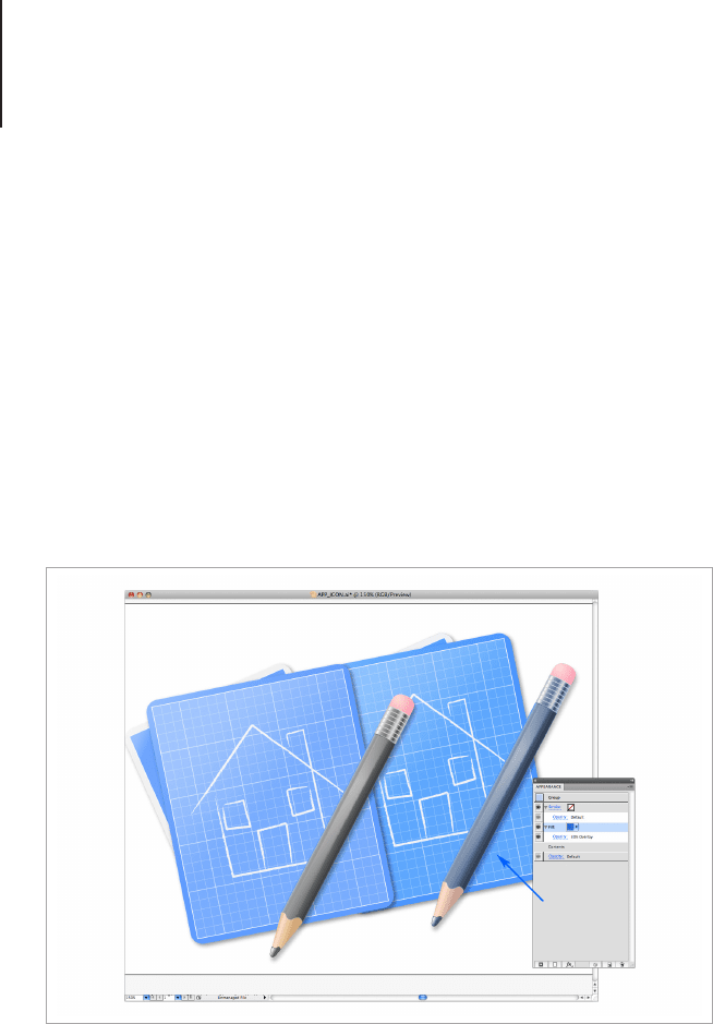
Once I was happy with the design and layout of the nal icon I
applied a layer style to harmonize the colors. By grouping the
shapes together, new Appearances can be applied to the group
without changing the effects added to the individual parts of the
object. This technique is used to harmonize the colors in a very
subtle way, but it’s amazing the difference that can be made with
this simple effect. Once the objects are grouped, add a new ll in
the Appearance panel, set the color to the main color used in the
icon, set the blending mode to Overlay, and reduce the opacity to
around 30%. The degree of the opacity will vary depending on the
tone of the color, the result should be a subtle hue shift that ties all
the colors of the icon together without dramatically changing them.
The icon is now ready for scaling and export. Adding and
subtracting details for the various output scales is fairly straight
forward, and pasting the object into Photoshop to add further
textures and details can be made easy with Smart Layers.
Group the entire icon and apply a overlay layer in the main color if the
icon. This will harmonize the color palette.

View Points203
Conclusion
As you have seen, there are many ways to render and view an
icon. It’s up to the designer to asses each method and apply the
one that’s best for the project at hand. Remember that it’s not the
software that creates a good icon, it’s the foresight and planning,
the knowledge of effects, the will to rene something that needs
tweaks, and the wisdom to quit the impossible to make a fresh
start.
The final result.


Popular Platforms – Guidelines and Style Tips205
Popular Platforms –
Guidelines and Style Tips
Icons are a balance between creativity and usability. When you
create icons for a program or application, you should always
follow the developer guidelines and style guides set out by the
operating system you will be using. Each OS has its own set of
design rules that are created to help designers create assets that
blend harmoniously into existing graphical user interface. The
following section is a closer look at the various platforms and a
simple explanation of the styles required for each. I’ll begin with
the two giants of the desktop computer world, take a look at two
smartphone platforms battling to be number one, and end with a
project that’s giving open-source software a facelift.
Designing Icons for Windows
Microsoft Windows uses a variety of icon sizes ranging from 16px
to 256px. Windows 95 to XP use 16 to 48px and Windows Vista
and above use a variety of icon sizes from 16 to 256px.
Their usage and scale is mostly unchanged through Windows
95, 98, Me, 2000, and XP. Windows Vista introduces a new uid
approach to icon sizes, allowing users to select a custom icon view
from 16x16 to 256x256. The scaling is done in-program by using
bi-cubic interpolation. This form of scaling allows Windows to map
the difference between the icon sizes and render an approximation
of a size in-between the two. This is how the scaling appears
to be uid rather than the stepped scaling you may see when
cycling though the actual icons. Because of this scaling method,
it is important that all of the icons you produce for the windows
platform are the same design, with the exception of the 16px icon,
Popular Platforms – Guidelines and Style Tips206
which can be a simplied version of the main design with no drop
shadow effects of perspective.
If you’re creating icons for Windows XP through to Windows 7 you
can use the following style guidelines.
Windows XP
With the release of Windows 7, the number of people using
Windows XP is on the decline, but with the reluctance for people
to change to Windows Vista for a variety of stability and usability
issues, there’s still a large number of people developing for and
using programs with Windows XP.
Icons from Windows XP are bright and stylized.

Popular Platforms – Guidelines and Style Tips207
Microsoft ofcially ended mainstream support for XP in 2009 with
extended support scheduled to end in 2014, so it’s unlikely that you
will need to create this style of icon. In any case, it’s useful to know
the restrictions relating to an older style platform. The following is
the main style to follow when creating icons for XP and the various
sizes and formats that you will need to create.
Background
The style of the Windows XP icons may look a bit too bold and
bright when compared to modern Windows icons or even icons
from Mac OS X 10 which was released the same year, but it’s
important to remember the time in which they were released.
Microsoft had a huge market share, the internet was being adopted
by households the world over and the computer interface was in
need of an update that differentiated it from the old work station
computers of the Windows 95 era. 32-bit icons were also new to
Windows and the XP design was formulated to show off the new
smooth edges that alpha cannels could create and the brighter,
more varied color palette that was also newly available to the icon
designers. Again, while the style may have fallen out of favor for a
more polished look, XP was hugely successful for the Microsoft
Corporation and has been installed on 400 million computers. As
of June 2011, Windows XP was the most widely used Computer
OS in the world with a 39.7% market share, closely followed by
Windows 7 with 37.8%
12
.
Style
If you take a look at the MSDN guidelines for XP icons, you will see
that the specied style is all about fun, color, and energy. Without a
visual example of this style you would be forgiven for believing that
the intended style was in-line with the old Copland Gizmo theme.
In actual fact, the style adopts a soft yet bright color scheme
12
http://www.w3schools.com/browsers/browsers_os.asp

Popular Platforms – Guidelines and Style Tips208
chosen to match the blue tones used in Microsoft branding and an
object style that’s rounded and more illustrative than representative
of the objects they depict. An outline in a slightly darker tone is
used to differentiate the various elements of the icon and to help
create a crisp outline. Because the majority of the icons were
32px and commonly viewed on CRT monitors, the outline was a
great way to use the color variance and transparency of the 32-bit
images without losing clarity.
The two main views for XP style icons are a fake isometric style
with a slight one-point perspective with the icons facing right and
a simplied front view version for the 16px icons. The guidelines
don’t go into much detail about the specic viewing angle to be
used, rather it provides a small picture with a grid over the top of
an existing icon. Looking at the icons provided by Microsoft, the
viewing angle doesn’t appear to be particularly consistent, so the
designer’s best judgment for the appropriate angle for a specic
object is probably the best guide to use.
Technical Breakdown
• Sizes: 48px for Desktop and Dialogue, 32px, 24px and 16px
for Programs and Explorer
.ICO les are required to have 48, 32 and 16px icons in 32, 8
and 4-bit color depths.
• Colors Used: Vibrant blue tones with gold and green
supporting colors. A more specic color table, including
RGB values can be found in the MSDN guidelines.
• Viewing Angles Used: An “isometric” style with the main
object facing to the right, a slight vanishing point can be
drawn to the right of the icon. Document Icons, Warning
Icons and Single Objects should be drawn with zero
perspective.
Popular Platforms – Guidelines and Style Tips209
• Light Source: Top left side of the object. 16px icons have no
drop shadow.
• Format: ICO, BMP
Aero – Windows Vista and 7
"The Aero aesthetic creates a high quality and elegant experience
that facilitates user productivity and even drives an emotional
response." - MSDN
The Aero style is light and glossy with plenty of glass effects.

Popular Platforms – Guidelines and Style Tips210
Aero is the name given to the default theme used in Windows Vista
and Windows 7. Created to be a more polished and professional
user environment than previous versions of Windows, Aero
includes large scale icons and an extensive use of transparency
and visual effects.
The size of the Aero icons range from 16px to 256px, but due to
their size, the 256px icons are rarely used with current computers.
The large scale icons are part of the specications as future
monitors and display devices are expected to support 240 to
320 DPI resolutions. Including the large scale icons will insure
that programs made for Windows 7 and Vista won't have to be
redesigned specically for new devices.
The 256 pixel icons are made from compressed PNGs to
greatly reduce the le size of the icon resource. Without the
compressed 256px PNG format, a typical icon le can be up
to three times larger than an uncompressed le. An icon editor
such as IconWorkshop and Microangelo will allow you to include
compressed PNGs as part of the .ico le, older editors may not
include this function.
Note: Windows 7 and Vista style compressed PNG icons are
compatible with windows versions 2000 to XP as the larger sizes
will be bypassed by the program leaving the smaller scale icons to
render as intended, in even earlier versions of windows, such as
Windows 98, the icon won't render at all and will be replaced by a
default system icon.
Technical Breakdown
• Sizes: Aero has a maximum icon size of 256px and required
icon sizes are 16, 32, and 256 pixels. Optional sizes are 24,
48, 64, 96, and 128. Windows platforms before Windows
2000 cannot process icon les that are larger than 72px in
size.