McInnes K. Rockstar Icon Designer
Подождите немного. Документ загружается.


Designer Interviews261
KM
What’s the main style of your icon work and what
process do you follow to create an icon from start to
finish?
TS
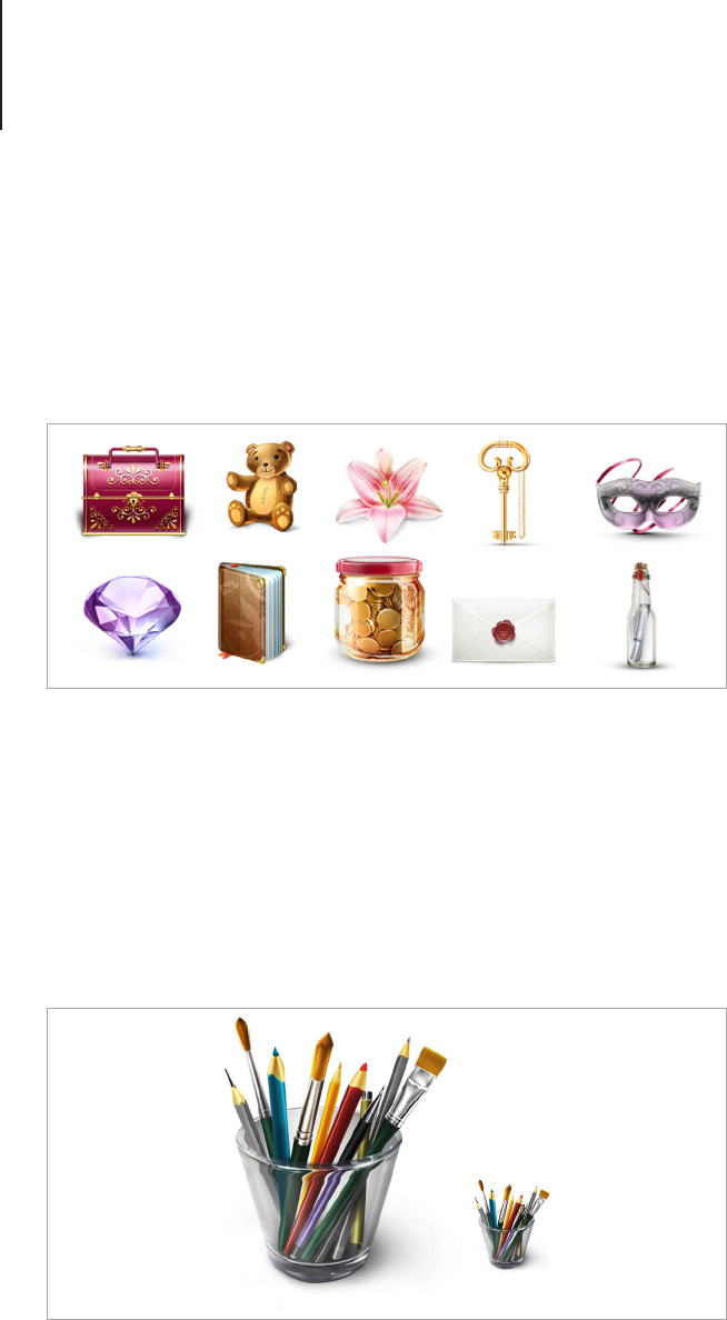
I, of course, like as much realism as possible in icons,
but without using any photos or additional materials.
The process of making icons is quite different, sometimes
if an icon is easy I don’t do any sketches, instead just make
the icon straight away. In some situations if the icon is hard
and I can’t imagine it well, I do some sketches directly in
Photoshop using a tablet. I have two types of icons: free
icons and icons for clients, but I am thinking of selling icons
on stock sites.

Designer Interviews262
KM
Do you have a source of inspiration? If so, how has it
contributed to your style?
TS
Sometimes I get inspiration by simply seeing stock
photos, or watching a movie, and of course by looking
at artwork of talented authors. My favorite author is Hirluf
Bidstrup.
KM
What’s the most difficult icon you’ve ever had to
create and why?
TS
Usually an icon gets difcult only when I don’t like the
result, and trying to make it better can take a long time.
Technically difcult icons are usually glass icons (diamonds)
and fur. I once had to make an icon of a white furry puppy.
I didn’t realize it was so hard to do! It took me around two
days to get results close to the fur.

Designer Interviews263
KM
Where do you see yourself and the field of icon
design in 5 to 10 years time?
TS
Actually I am not really in the race to be the best icon
designer in the world, I just do it because I love it. Maybe
I will nd something new for me in few years. I got a feeling
that future icons will be animated, which will also create
many opportunities. As for style, still think the photorealistic
icons still will be the leaders.

Designer Interviews264
KM
What’s the biggest mistake you can make when
creating icons and how can people avoid it?
TS
Biggest mistake - to do the same artwork twice. You can
make this mistake for different reasons, for example, an
icon must be bigger, and you can’t make it bigger without
losing quality, so you have to draw it again. To avoid this,
think carefully or ask your client if he will need a bigger
icon or not. A second mistake may be that you lose your
artwork because of technical problems (electricity goes out,
Photoshop crash) so Ctrl + S often!
To avoid bad design, don’t ever do big dark dir ty shadows
(most newbies do that), avoid ugly “MS Paint colors” (like
bright blue, red, green etc.). Pay attention to the form - it’s
very important, even a heart shape can have millions of form
variations.
KM
What’s the most important skill or trait to have for
people who want to make icons?
TS
An important skill is to understand how pixels work in
Photoshop, (if you do raster icons). It’s not as simple
as it sounds, especially for small icons. You have to be
somewhere in the middle between hard pixel icons, and soft
blurry icons.
For software, you should know Photoshop well. Actually icon
makers must have all skills as for any other artwork, you

Designer Interviews265
have to know how to draw, to have a good color sense, and
a good understanding of composition. To be able create a
good concept for an icon, you have to be able think broadly
and at the same time narrowly, in order to create a perfect
metaphor for icon symbolism.
KM
Do you have any advice or tips for people wanting to
break into the field of icon design?
TS
The best way to show many people your icons is to share
icons for free on websites like deviantART, or Behance.
When I did my rst icon pack, I didn’t even wait for any
feedback. I just did it because I thought it would be fun, but
I received a lot of emails with compliments and job offers. I
didn’t expect that. So there are two ways: if you are a newbie
in design, do icons and share them for free, but if you are
really good and a pro, and you don't want to give icons away
for free, then show them on a design website like Dribbble
(but your icons must be REALLY good). In both cases, you
will receive job offers.
Tatyana Suhodolska
artdesigner.lv
dribbble.com/lazycrazy
lazycrazy.deviantart.com
twitter.com/armanycat
facebook.com/verymadcat
APPENDIX

Appendix: Resources267
Appendix: Resources
Free Open-source Software
• GIMP (GNU Image Manipulation Program) - gimp.org
Raster based image creation and manipulation program.
Compatible with Linux, Windows and Mac OS X.
• Inkscape - inkscape.org
Vector based image creation and manipulation. Compatible
with Linux, Windows and Mac OS X.
Icon Creators
• Axialis Icon Workshop - axialis.com
Creates and converts ICO, ICN, Image Strips, Icon Libraries,
Android and iOS icons. Supports object layering for in-
program icon creation and has object libraries to help create
icons from premade drop shadows, shapes and objects.
Has added plugins for Adobe Photoshop and Illustrator for
importing and exporting image assets. Compatible with
Windows.
• Iconcool Studio - iconcool.com/studio.htm
Creates Cursors, ICO and iOS icons. Supports object
layering for in-program icon creation and has object libraries
to help create icons from premade drop shadows, shapes
and objects. Has an added plugin for Adobe Photoshop to
import and export image assets. Compatible with Windows.
• Microangelo Toolset - microangelo.us
Creates icons and cursors for Windows 95 – 7. Has drawing
and editing tools. Compatible with Windows.
• Microangelo Creation - microangelo.us
Creates icons and cursors for Windows XP – 7. Has drawing

Appendix: Resources268
and editing tools and supports object layering for in-
program icon creation.
• IconBuilder - iconfactory.com/software/iconbuilder
Filter for Adobe Photoshop and Fireworks for creating and
exporting icon. Has compatible versions for Windows and
Mac OS X.
Desktop Replacement and Icon Library
Creation
• CandyBar - panic.com/candybar
Changes system icons to user dened custom icons in Mac
OS X. Builds and saves icon libraries. Compatible with Mac
OS X.
• Microangelo On Display - microangelo.us
Changes system icons to user dened custom icons in
Windows. Compatible with Windows XP – 7.
• Stardock Icon Packager - stardock.com/products/
iconpackager
Changes system icons to user dened custom icons in
Windows. Compatible with Windows XP – 7.

Acknowledgements269
Acknowledgements
For my friends and family who have supported me through the
good and the bad. Who never discouraged me from following
my dreams (well, perhaps one or two times when it seemed like
freelance would eat me alive!). Who always know how to make
me laugh. Who never judge me, even if I’ve been working in my
pajamas for a week and forget to brush my hair, and who most of
all believe that I can achieve whatever I set my mind to. No matter
what people say, believing in yourself is not enough. Family and
friends are the unfair advantage we all need.
A super special thank you to Dad, Adrian and Sean, I would never
have nished this book without your help.
Illustration by Sean Kelly and Kate McInnes

About The Author270
About The Author
Kate McInnes specializes in Communication Design and Digital
Illustration. Based in Melbourne Australia, she is the Associate
Editor of Vectortuts+ and one half of the creative duo McKelly. Find
her on Twitter at twitter.com/bittenbypixels
