McInnes K. Rockstar Icon Designer
Подождите немного. Документ загружается.


Popular Platforms – Guidelines and Style Tips221
it and the slight drop shadow that’s applied to all icons by
the iOS.
• Format: PNG-24
Android 2.0
Background
Led by Google and developed by the Open Handset Alliance,
Android is an open-source operating system that runs on many
different models of smartphones, netbooks and tablet computers.
While it is often considered the alternative to iOS, Android has a
larger market share than the iPhone with 550,000 Android devices
activated by Google each day.
When Android was rst launched onto the market the application
icons had an isometric style similar to the Windows XP viewpoint,
which was extremely hard to specify for the wide variety of objects
that needed to be made into icons. In Android 2.0 the icon style
was changed to a user friendly front facing view that is much easier
to specify.
The icon style for Android is less constricted than iOS icons, and
gives designers the ability to use custom shapes for Launcher
icons which gives them the appearance of desktop icons viewed
front on. With this freedom comes specications, and you will nd
a comprehensive developers guide that explains how to create
icons that blends with the Android style in the Android Developers
Dev Guide.
Style
The style of Android application icons are rich in color with a soft
use of lighting effects. They have a viewpoint that is direct from the
Popular Platforms – Guidelines and Style Tips222
front of the object with a shape that is styled to take full advantage
of the clickable area. The rendering style is realistic, but not
hyper realistic with a focus on soft nishes and a tactile clickable
appearance over glossy effects and textures. Icons shouldn’t
be cropped, such as a zoomed in detail of an object, or have
perspective.
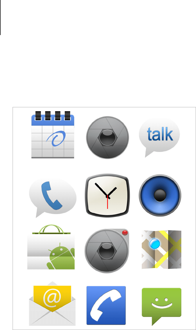
Android icons are designed to have the same visual weight so they appear
to be the same scale within the user interface. Android icon templates by
DsynFLO Creations.

Popular Platforms – Guidelines and Style Tips223
Technical Breakdown
This is where the Android platform can become confusing.
Because it runs on a range of devices with different screen sizes
and resolutions, developers are encouraged to supply three
versions of each icon to run on low, medium and high density
screens. Icons for each density should be designed to take
advantage of the scale they’re provided at with the small scale
icon designed to be as crisp as possible and the large scale icon
rendered to have a subtle use of textures and details to make them
look great on high resolution screens. Because the icon assets
are required at various densities, it’s best to create the design in
vector. Because the style is soft and illustrative, vector is also a
good choice because there’s no need to use special effects that
are sometimes easier to make with raster effects. The Developer
Guide also recommends that designers use guidelines to position
the icons on the artboard. Using guidelines will ensure that drop
shadows and ant aliasing isn’t clipped by the image boundaries
and each icon looks balanced in relation to the others. Below is a
rundown on the specications for each density of icon.
• Sizes:
• Low Density
• Launcher Icon – 36 x 36px within that size the icon
design should be 30 x 30px to balance the image and
allow for drop shadows (28px x 28 for square icons).
• Menu – 36 x 36px within that size the icon design
should be 24 x 24px to create visual balance in
context (22px x 22 for square icons).
• Status Bar - 12 x 19px within that size the icon
design should be 12 x 12px to create visual balance in
context.
• Tab – 24 x 24px within that size the icon design should
be 22 x 22px to create visual balance in context

Popular Platforms – Guidelines and Style Tips224
• Dialogue – 24 x 24px
• List View – 24 x 24px
• Medium Density
• Launcher Icon – 48 x 48px within that size the icon
design should be 40 x 40px to balance the image and
allow for drop shadows (38px x 38 for square icons).
• Menu – 48 x 48px within that size the icon design
should be 32 x 32px to create visual balance in
context (30px x 30 for square icons).
• Status Bar – 16 x 25px within that size the icon
design should be 16 x 16px to create visual balance in
context.
• Tab – 32 x 32px within that size the icon design should
be 28 x 28px to create visual balance in context
• Dialogue – 32 x 32px
• List View – 32 x 32px
• High Density
• Launcher Icon – 72 x 72px, within that size the icon
design should be 60 x 60px to balance the image and
allow for drop shadows (56px x 56 for square icons).
• Menu – 72 x 72px within that size the icon design
should be 48 x 48px to create visual balance in
context (44px x 44 for square icons).
• Status Bar – 24 x 38px within that size the icon
design should be 24 x 24px to create visual balance in
context
• Tab – 48 x 48px within that size the icon design
should be 42 x 42px to create visual balance in
context
• Dialogue – 48 x 48px

Popular Platforms – Guidelines and Style Tips225
• List View – 48 x 48px
• Colors Used: Android has provided a recommended color
palette and a materials guide, which can be downloaded as
an Icons Template Pack for PSD from the Developers Guide.
The main colors used on launcher icons are neutral shades
of grey, blue, green, yellow, orange and red. Materials
provided are chrome, satin nished plastic and colored
metal. Surfaces that don’t use a material effect should have
a subtle grain effect added to soften the appearance of at
colors.
Menu icons have a slight embossed effect and rounded 2px
corners. It has a 90 degree gradient ll from hexadecimal
color #8C8C8C to #B2B2B2 with a 2px 90 degree inner
shadow of 20% opaque white. The inner bevel has a depth
of 1% and an angle of 90 degrees with a 70% opaque white
highlight and a 25% opaque black shadow.
Tab icons are supplied with two states, unselected and
selected. An unselected icon is a mid grey (hex value
808080) with the counter shapes of the glyph set to be
transparent. The selected version is white with transparent
details and a 3px black drop shadow set to 25% opacity.
Status bar icons have a 90 degree gradient ll from
hexadecimal color #828282 to #919191 with the counter
shapes of the glyph set to be transparent and a 1px 90
degree inner shadow of 10% opaque white.
• Viewing Angles Used: Android icons use zero-point
perspective and should appear to be at against the surface
of the screen.
• Light Source: The light source for the Launcher icons is
top-lighting with a soft effect falling over the surface of
the icon that gradually fades to zero opacity. A black drop

Popular Platforms – Guidelines and Style Tips226
shadow set to 75% opacity and a 90 degree angle is also
used.
• Format: PNG-24
Tango
Background
The Tango Desktop Project was created to provide technical
and style guidelines that help designers and developers create a
consistent user experience for open source desktop environments
and software. With the aim to create a exible and coherent
collection of icons released under creative commons, The Tango
Desktop Project encourages community involvement in creating
clear and easy to use icon designs for a variety of open-source
programs and operating systems. You can nd the Tango style
guides online at tango.freedesktop.org.
Style
The main aim for the style of the Tango icon set is to create
icons that blend into both commercial and open-source desktop
environments. The icons have a clean appearance with a soft and
subtle use of gradients and neutral outlines, to help the designs
stand out on both dark and light backgrounds. The objects are
modern, simplied and slightly rounded on the corners.
Popular Platforms – Guidelines and Style Tips227
Technical Breakdown
• Sizes: Because the Tango icon guidelines is to help create
a library of icon assets rather than specic user interface
designs, each icon is rendered at four standard sizes, 22px,
32px, 48px and 256px.
Note that the 256px icons are optional and should be
designed with more detail than the main icon style. The
icons should have some added detail, thin strokes and
subtle highlights on key areas of the design.
Tango icons are designed to blend effortlessly into all major operating
systems.

Popular Platforms – Guidelines and Style Tips228
• Colors Used: The color palette for the Tango icon style
consists of nine main primary and secondary colors in three
shades. You can download swatches from the Tango Icon
Theme Guidelines. The overall color palette is muted with
a soft subtle use of color with darker outlines in a matching
hue. The colors shouldn’t be super saturated or have any
bright lighting effects. The style should be modern, soft
in appearance and harmonious alongside the main Tango
Library.
• Viewing Angles Used: Toolbar and document style icons
have zero-point perspective and should appear to be at
against the surface of the screen. Application icons are
drawn with table-op perspective with a subtle vanishing
point behind the object.
• Light Source: The light source is slightly above and to the
left of the object and casts a soft blurry shadow underneath.
• Format: PNG-24, SVG

Basic Steps to Plan and Create an Icon Set230
Basic Steps to Plan and
Create an Icon Set
Now that you have a better understanding of how to design and
render icons, you’re ready to make an icon set. The following is an
outline of how to plan and render a basic icon set.
Get the Specs
Whether you’re working as part of a development team or creating
an icon set for stock, each project should begin with a clear
understanding of the nal output. Knowing the format that the
icons will be required in will help you decide the software you will
use to make the icon in, and how many different scales and color
modes are needed.
If you’re working with developers ask them for a list of the icon
assets with the formats and the scales they are needed in. Once
the list is made, spend some time checking it over and have the
developer sign off on the nal list. You want to design the icons as
a single coherent set and output each asset only once, with the
developer signing off on the specication list you can be sure that
you get the best start to designing the icons as possible.
If you’re working on your own project, you should still make a list
of the assets and specications. Write down the icons you want to
make, the le format you want to output them in and the style you
intend to use. Creating a list will help keep you on track and focus
on the technical details of the icons so you can design quickly and
efciently.