McInnes K. Rockstar Icon Designer
Подождите немного. Документ загружается.

Designer Interviews251
JS
Although SVG is the ‘source’ format that Inkscape is built
upon, with the introduction of high resolution and highly
detailed icons, we don’t install the icons as SVGs anymore.
We use rendered PNGs at runtime. Getting rid of bitmaps
in the creation process however, meant it is much easier to
create derivative works. So the icon sets we have are also
asset libraries we can re-use easily. Another benet is that
SVG is pretty easily parseable so even a rookie script author
can do some basic transformations, toggling visibility of
layers, re-coloring, compositing, etc.
KM
On the topic of icon scales, it’s reported that
Mac OS Lion will have a maximum icon size of
1024px. Obviously this is going to cause more than a few
headaches for designers. Are there any plans to increase
the scale of the Tango icon set?
JS
All of our high res icons are vectors. So while we might
need to add a detail or two, the icons are pretty ne
rendered at 1024x1024px when the time comes it would
actually have some use.
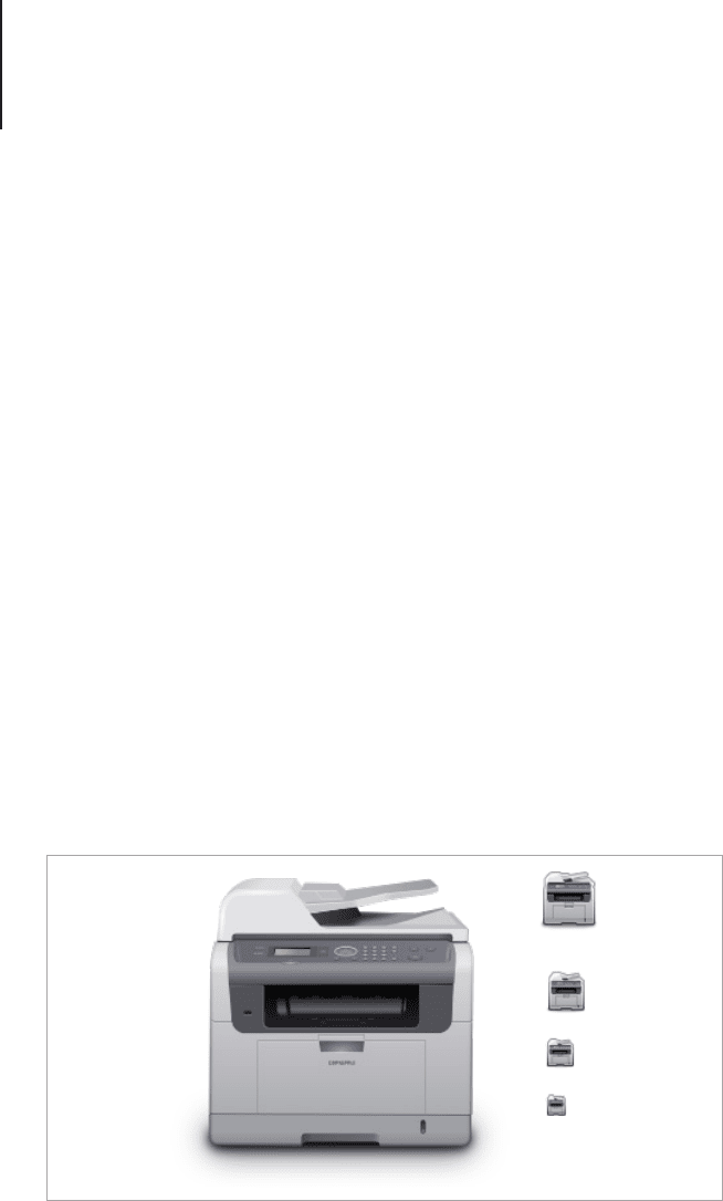
Title: Network Printer
Description: Device icon for a base theme. Inkscape
Designer Interviews252
KM
Do you have any advice or tips for people wanting to
break into the field of icon design?
JS
I started creating icons as a pure hobby. Today there is
a ton of super talented artists, so creating a convincing
portfolio today is probably a lot harder than it was 12 years
ago. Focusing on icon design alone would probably be too
narrow sighted today.
Looking around the Android marketplace or even the iOS
app store shows that there is still a huge need for icon
designers. My rule of thumb is to do what you enjoy and
what you feel like improving. A way to turn that into shiny
coins will come up eventually. :)
KM
If someone reading this interview wants to join the
Tango icon design community, how would they go
about it?
JS
Follow the guidelines, use the style! If you don’t have a
pet project that needs a facelift, drop by at #tango on irc.
freenode.net or #gnome-design on irc.gimp.org and we’ll
gure something out.
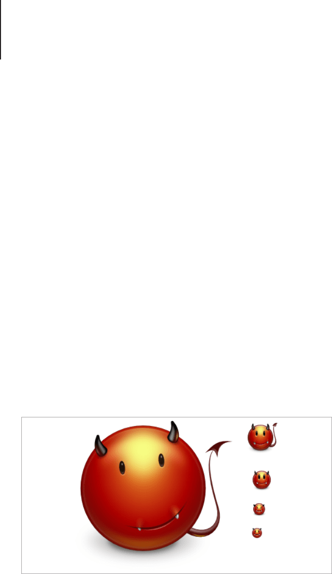
Title: Face-devilish
Description: Emoticon for a base theme. Inkscape
Designer Interviews253
Benjamin Nathan
Benjamin Nathan is a young aspiring designer with a passion for
icon and user interface design. With some great looking icons
already in his portfolio, Benjamin hopes to continue creating icons
in the future.
KM
How did you first get started in icon design and what
drives your work now?
BN
I believe I found out about icon design whilst looking
for ways to customize my desktop. Upon searching
for icons and wallpapers I stumbled upon a couple of Mac-
oriented customization websites where people also made
their own icons. I loved everything that had anything to do
with customization, with icon design and with graphic design
in general. From there on I joined these forums and websites
and slowly started to try and make my own.
KM
Are you self-taught or did you attend a class or
school?
Designer Interviews254
BN
I’m completely self-taught. I think if one wants to learn
icon design the most important thing is that you have
to enjoy it. If you truly love what you do, it never feels like
working. I never felt that I was teaching myself something
because I genuinely wanted to nd out how I could do
certain things, and over time you just know your program.
KM
Do you work freelance, in-house or are you part of a
team?
BN
Right now all my work is conducted through the internet.
I have recently set up my website and my rst clients are
rolling in now.
KM
Do you work exclusively in Icon Design or do you
work in different fields?
BN
I’d say I mainly do icon design but also love to work
on web design and UI design. I’m also trying to teach
myself HTML5 and CSS3.

Designer Interviews255
KM
What’s the main style of your icon work and what
process do you follow to create an icon from start to
finish?
BN
I’d say my style is semi-realistic when it comes to icon
design. I prefer making Application icons and these tend
to be kind of semi-realistic.
I usually just start with a pen and a piece of paper. I sketch
out all of my ideas and see what works best. When I think
I have the right one, depending on the icon, I usually do
a case study on the material. Say I have to make a wine
bottle icon, I would go on Google and whatnot and collect
a lot of examples of wine bottles, just to see how the glass
forms and how I would go about making such an effect in
Photoshop for example, just as reference images. When that
process if nished, I go into Photoshop and start the actual
icon.
KM
Do you have a source of inspiration? If so, how has it
contributed to your style?
BN
I try to surround myself with a lot of excellent design
work and design blogs. I think we can learn a lot from
each other and for me personally it really helps to know what
the best icon designers out there are putting out and how
they go about making something. But besides that it’s also
because I really enjoy visiting such websites. One I really like
is Dribbble (http://dribbble.com) where designers from all
around the world can showcase what they’re working on.
Clover Icon

Designer Interviews256
This 'Clover Icon' was done for training purposes, just for the
experience. I really enjoyed creating an icon that was quite
different than the usual icons I create.
KM
What’s the most difficult icon you’ve ever had to
create and why?
BN
I would say drawing a cog wheel was one of the hardest
things I’ve ever created, at least at the time I thought
it was rather difcult. It’s a very complex shape, and if you
want to have it correctly positioned and have it be scalable
you have to work a lot of magic with your shapes.
Looking in my application folder, I noticed that compared to
the other lovely application icons, the calculator one looked
rather dull. I set out to create a nice replacement icon and
this is what I came up with.
KM
Where do you see yourself and the field of icon
design in 5 to 10 years time?
BN
I hope to have improved signicantly and continue
to do so. As long as there is a form of progression in
everything I try to do, I’m happy.
Calculator Icon Replacement - Photoshop CS5.
Designer Interviews257
KM
What’s the biggest mistake you can make when
creating icons and how can people avoid it?
BN
I’d say using only raster when creating icons should be
avoided. When it comes to icon design you really need
to be able to scale your icon, so you need to use vector
shapes. This is most likely also the easier way to achieve
an effect you’re otherwise trying to achieve using raster
methods.
KM
What’s the most important skill or trait to have for
people who want to make icons?
BN
I’d say the rst thing you need is passion, a love for your
craft. If you love what you do, you’ll never feel you have
to work to get to know your program. Besides that I’d say an
eye for detail is denitely required. Patience however can be
learned.
KM
Do you have any advice or tips for people wanting to
break into the field of icon design?
Designer Interviews258
BN
Try to join communities and get as much feedback from
other designers as possible. And when you’re ready, be
sure to put out an online portfolio as soon as possible. It’s a
great way to get some experience in the eld.
Benjamin Nathan
twitter.com/benjaminnathan
dribbble.com/benjaminnathan
benjaminnathan.nl
Tatyana Suhodolska
Tatyana Suhodolska is an accomplished freelance icon and
interface designer based in Latvia. With a keen eye for realism,
Tatyana creates amazingly realistic icon sets that carry her own
signature style, aesthetic, and cheeky sense of humor.
KM
How did you first get started in icon design and what
drives your work now?
TS
Turns out I’ve been working with icons a long time ago,
only I didn’t know they were called “icons” ofcially.
:) I had created basically small images with transparent
backgrounds for some social networking websites, and only
later in 2009 I started to work on that more seriously.
Designer Interviews259
KM
Are you self-taught or did you attend a class or
school?
TS
I’m self-taught through to my bones. I learned software
by the trial and error method, I’m just that kind of person.
Only these days I've become a bit lazy to teach myself, so I
look for help and tutorials to get result faster, because time
is money. I think this is an individual choice to get education
or learn by yourself. If my country offered a good design
education, I would go learn there, but unfortunately we are
very behind in that area.
If you want to work with icons you have to love small details,
because icons are usually small. Also you have to be able to
see things - by “see things” I mean to see through the image.
If you really like someone’s artwork, you must be able to see
what exactly is so cool about it. Are the soft shadows really
good? Is it the colors? Or is it really good composition and
form? If you can “see” the strong parts of the artwork, you
will remember it (you will, believe me), and you will use it in
your work. Finally of course, you should have a general love
for icons, they’re small, they’re cute, and you want to touch
them.
Designer Interviews260
KM
Do you work freelance, in-house or are you part of a
team?
TS
Currently I am a freelancer, but with a company based
in France, so we work online and keep in contact via
chat during the working day, so I don’t work on weekends
with them, so I'm like a real worker but not sitting in their
ofce, and not even in their country. In my free time I work
with some other clients, and so it turns out that all my work
happens online, and not face to face.
KM
Do you work exclusively in icon design or do you
work in different fields?
TS
Icon design is a small part, but it's my favorite part. In the
beginning of my career I was positioned as an animator,
but later animation transformed into banners, then into small
gif images, than small static images, than big static images,
than websites, then icons, and here I am. Animation is still
my strong suit, so sometimes I do some banners or movies
for clients.