McInnes K. Rockstar Icon Designer
Подождите немного. Документ загружается.


Basic Steps to Plan and Create an Icon Set231
Create a Checklist
After you have a list of icons and specications, break the icons
down into categories based on function. If you’re creating a set of
icons for a program, break the icons down into categories such as
tools, functions, and alerts. Write each category into a spreadsheet
with the name, output, category and any other technical details,
plus a column to tick when the icon is complete. A checklist will
keep the project on track and it's a good place to keep notes and
technical details.
If you’re creating a set for a personal project, having a checklist
will help keep your focus on creating the icons. Once the list is
complete, be sure to stick to it. Adding designs that aren’t on the
list is a great way to become bogged down in the details rather
than moving forward and completing the end product.
Sketch Designs
Always sketch the icons before you start the nal designs. This
is especially important when you’re rendering in a complex style,
so you have a clear idea of the metaphor and the angle that you
want to render it in. Sketching can be as simple as pencil and
paper, or you can use a digital drawing tablet. The key is to keep
the sketches loose and rene them as you develop a clear idea of
the metaphor. Sketch out all of the designs and look at them as a
set. Does each design clearly communicate the function? If any
designs look too similar, make further design tweaks until the set is
coherent, precise, and ready to be digitized.

Basic Steps to Plan and Create an Icon Set232
If you’re creating an icon and you’re in doubt of the design you
have chosen, then try this simple test:
1. Draw or print your design on a piece of paper.
2. Find a group of people with varying computer skills (family
and co-workers are great for this).
3. Ask them what they think the design is for and take notes of
the response
If the feedback isn't good, then, tweak your design accordingly.
Peers and co-workers are usually pretty good for design
suggestions (welcome or not). You could easily ask online if you’re
working alone, but I nd watching expressions is a great indicator
of whether a user will learn the function in time – complex tools
or functions usually have to be remembered rather than instantly
recognized. If the tool or function is particularly confusing (I once
had to make an icon for “Folder-level JavaScript” in 16 x 16px) you
can add the tool text underneath.
Digital Rendering
Before you begin to create the icon assets, make a palette of
the color swatches you want as the basis of your set. If you’re
working on icons for a particular platform, research the interface
guidelines and download any template assets. Android and Tango
have downloadable assets, Windows, Mac OS and iOS have
general guidelines, but many 3rd party les, such as templates and
textures, can be downloaded from the internet. If you’re creating
your own layer styles remember to save them to the effects library
as you make them. If you’re using pictogram style assets save
them as graphics or Symbols for easy storage and use. Refer to
the section "Creating a Graphic Set for Adobe Illustrator and a

Basic Steps to Plan and Create an Icon Set233
Symbol Set for Adobe Photoshop" for detailed instructions on how
to create pictogram sets.
Asses the Final Designs
An icon design isn’t nished until every icon in the set is made.
Small errors such as alignment and mismatched colors will
become clear once all of the icons are assessed as a nished set.
If you’re creating icons for a particular interface, group the icons
together in the same way they will be viewed. If you’re creating
icons for an application, nd out if the developer can test the
icons for you. If you don’t have access to developers and want to
test your icons within an interface, it’s fairly easy to set one up in
Photoshop.
When I rst began designing icons for Windows the developers
I worked with were located away from the main ofce and had
icons from the previous build for their tests. Because they had
usable assets and didn’t require new icons until a later build, I
was given a deadline to create the icons by and left to work on the
task alone. I didn’t have many opportunities to work directly with
the development team apart from the occasional rendering test to
see if the technical specications were correct. When it was time
to test the icon designs, I took a screenshot of the application
interface and cleaned it up in Photoshop with the Clone tool. Using
the blank interface I was able to position the elements as they
would appear in the application without the need to request help
from the developers.
Remember, the earlier you spot any areas for improvement the
more time you will have to make the necessary changes.

Basic Steps to Plan and Create an Icon Set234
Name and Export the Assets
Once you're happy with the icons and they're all nished, it’s time
to export and save them. Make sure that each icon has a clear
and easy to understand le name, not only will it help you quickly
identify the icon, but it will also help you sort the icons for easy le
browsing. Certain platforms such as Android, will require specic
naming conventions and folder structures, so this is also a good
time to double check your specication notes.
If you don’t have a particular naming convention, a good one to use
is the icon type then the icon function. If you’re exporting single
size icons adding the size at the end is also useful, an example
would be “document-save.ico” or “document-save-32px.png”. If
you’re creating an icon set for download, you may separate the
icons into folders based on scale, so your folder structure may
be Social Icons then PNG and EPS then 64, 32, 16. Use your best
judgment, and if you’re looking for further guidance on le naming,
Freedesktop.org has some great documentation about this:
standards.freedesktop.org/icon-naming-spec/icon-naming-spec-
latest.html.
Depending on the format, you may need to use an icon creation
program. For more details on specic formats and le types,
refer to the "File Formats and Terminology" section in this book.
For a list of icon creation software and le managers, refer to the
"Appendix: Resources" section.

Troubleshooting236
Troubleshooting
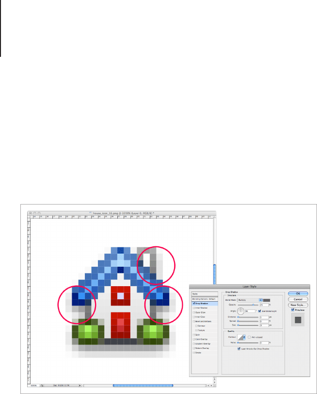
Problem: The drop shadow is creating a hazy
line around the icon.
This can sometimes happen if you’re applying a 90° drop shadow
to a small scale icon using layer effects.
As with all problems, there are a couple of ways to x it:
Solution 1:
Okay, here's a quick way to x the problem, but it’s not great if
you want to edit the effect later. Only use this technique if you’re
creating a Toolbar or web icon that won’t need any further editing.
First make a copy of the icon and apply the drop shadow effect to
the copy. Then make a blank layer above the icon copy and merge
it together with the copy of the icon, this attens the effect. After
An icon with a hazy drop shadow.
Troubleshooting237
you’ve merged the two layers together, make a layer mask for the
resulting layer and mask out the parts of the drop shadow you
don’t want in the design. It’s not a very professional way to tackle
the problem, but it’s quick and sometimes quick does the trick.
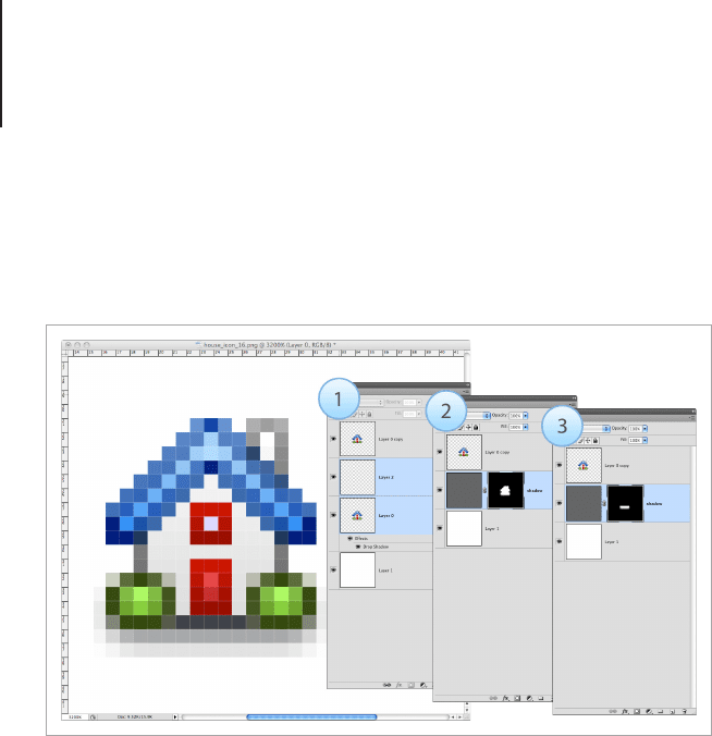
Solution 2:
This technique will take a bit longer for complicated designs, but it
will allow you to make unlimited changes without losing quality.
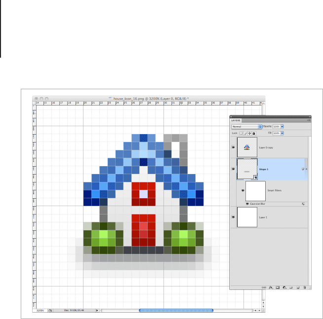
The best way to avoid rendering problems with shadow effects
is to create your shadow using vector shapes. If you’re using
Adobe Photoshop, draw the shape of the drop shadow using the
shape tools and convert it to a smart object. Once the shape is
converted, you can apply any style of blur you like from the Filter
menu and tweak it as much as you need. This is a good technique
to use if you’re creating a design that will be used to make a few
different sizes of your icon.
1. Make a copy of the icon and apply a drop shadow, merge the copied
layer with a blank layer above it. 2. Make a mask from the merged layer
and fill the layer with a mid grey. 3. In the mask, delete the parts of the
icon that shouldn't have a drop shadow.
Troubleshooting238
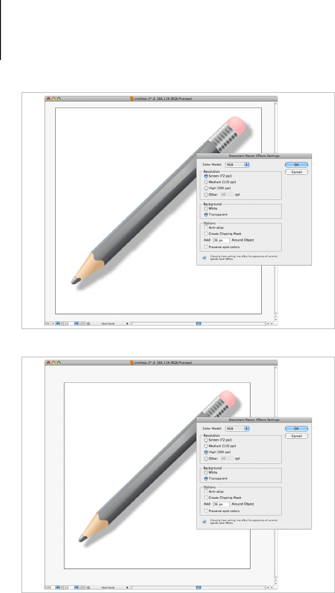
Problem: I’m creating an icon in Adobe
Illustrator and the Drop Shadow Effect looks
pixilated.
If you’ve applied a drop shadow effect in Adobe Illustrator and it
appears to be pixilated, you’ve more than likely come across a
common problem that happens when the document raster settings
are set too low.
Adobe Illustrator has a default setting of 72dpi on all raster effects,
and this is because the raster effects at full quality can signicantly
affect your computers processing power. If you’ve nished working
on your icon and you would like to change the effects to full quality,
go to Effect > Document Raster Effects Settings and change the
DPI from 72 to 300. If you’re still working on your design, then I
would recommend that you save the blocky looking effects for
when you've nished. This will keep illustrator running smoothly.
A custom created drop shadow using a shape layer.
Troubleshooting239
Raster effects at 72 dpi appear to be pixilated.
Raster Effects at 300dpi are smooth.
Troubleshooting240
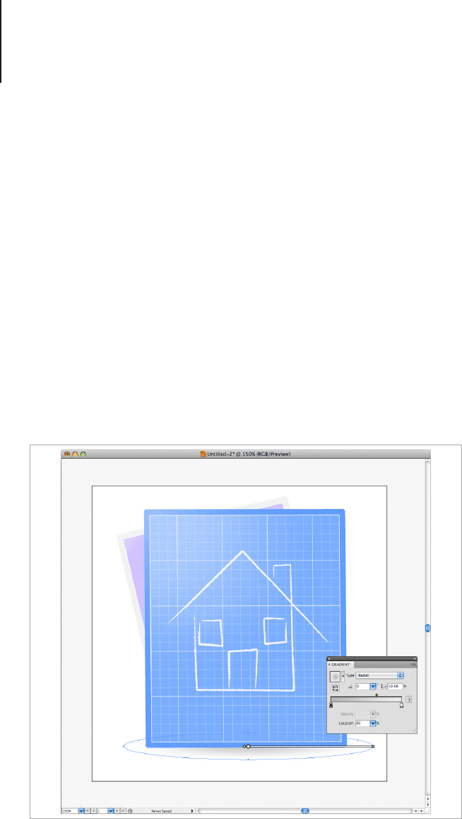
Problem: I’m creating a 100% vector icon and I
would like to avoid using bitmap drop shadows.
This one is pretty easy if you’re using Illustrator CS4 and above
as it has the ability to make a gradient from 100% opacity to 0%
opacity. If you’re using an older version of Illustrator, then you can
make a transparency mask, much like you do in Photoshop. I’ll
explain both methods:
Method 1: 100% Vector Drop Shadow with Adobe Illustrator
CS4 and Above
This is fairly simple. Create a shape of the drop shadow you would
like to create and apply a radial gradient from 25% black to 0%
white. This will make a soft shadow that is supported with formats
such as PNG, EPS, AI and PSD.
A radial gradient made with an ellipse from 25% black to 0% white.