McInnes K. Rockstar Icon Designer
Подождите немного. Документ загружается.


Popular Platforms – Guidelines and Style Tips211
.ICO les are required to have 48, 32 and 16px icons in 32, 8
and 4-bit color depths.
• Colors Used: Aero colors are less saturated than previous
Windows platforms and use a variety of gradient and
transparency effects. There’s no specic color sets to use
with this platform. Alert colors such as red, green and yellow
should be used sparingly in Toolbar and application icons.
• Viewing Angles Used: An isometric style with the main
object facing to the left, a slight vanishing point can be
drawn to the right of the icon. Document Icons, Warning
Icons and Single Objects should be drawn with Zero
perspective.
• Light Source: Icons drawn with perspective have a light
source from the top left side, slightly to the front of the
object and a 30 – 50% opacity drop shadow drawn slightly
behind and to the back of the object. For at style icons the
drop shadow is set to 130 degrees with an opacity between
20 – 50% black with a 0% spread and a distance of about
1 – 3px and a size of 1 – 3px depending on the size and
complexity of the icon. 16px icons have no drop shadow.
• Format: ICO, PNG
Popular Platforms – Guidelines and Style Tips212
Mac OS X
Since the release of Mac OS X, Apple has used a visual theme
called Aqua for its interface guidelines. Based on the concept of
a hyper realistic icon style and “lickable” interface elements (yes I
said "lickable" - Steve jobs wanted users to feel like they wanted to
lick the object), the main aesthetic of the Aqua theme has remained
relatively unchanged in the past 10 years. The Human Interface
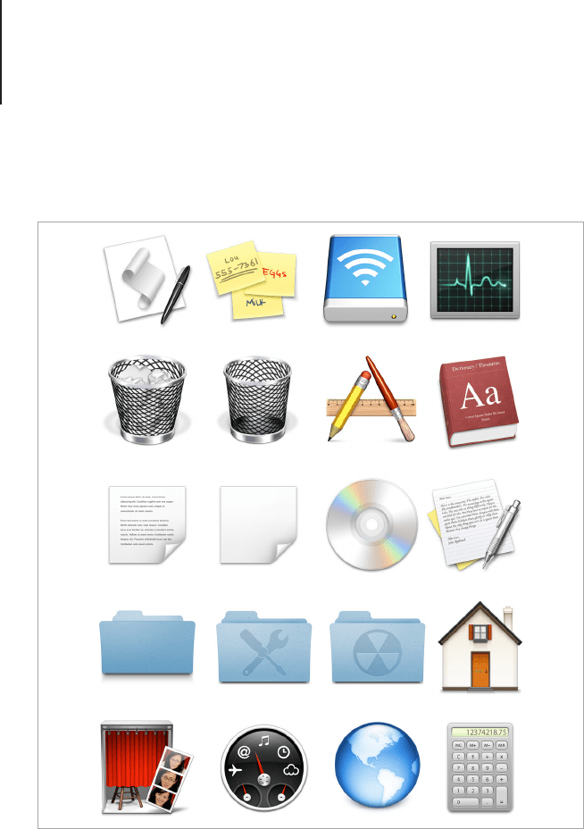
Mac OS X uses a theme called Aqua which has a highly realistic style.

Popular Platforms – Guidelines and Style Tips213
Guidelines, including a comprehensive style guide for Mac OS
icons, can be found in the online developer library.
The size of the Aqua icons have an impressive scale range starting
at 16px up to 1024px. Like the 256px Windows icons, the 512px
and 1024px icons are rarely used with current computers. The
large scale icons are intended to be graphical assets for the next
generation of iMacs that may include high resolution retina display
monitors. Including the large scale icons will insure that programs
made for current Macintosh products won't need to be redesigned
for new devices.
The 256px to 1024px icons are made from Jpeg 2000, which is
a le format with similar properties to the PNG format used by
Microsoft. Jpeg 2000 supports transparency and compresses les
into a lossless format. The main difference between PNG and Jpeg
2000 is the level of compression achieved with les containing
large areas of at color. Because icons are highly unlikely to
have these attributes, Jpeg 2000 performs just as well as PNG
for icon compression. An icon editor such as IconWorkshop and
Microangelo will allow you to include Jpeg 2000 as part of the .icn
le, but older editors may not include this function. To export Jpeg
2000 from a program such as Adobe Photoshop, you will need to
install a custom plug-in that’s available for free from Adobe.
Technical Breakdown
If you’re familiar with the Mac OS X Human Interface Guidelines,
you will nd a few updates with the release of OS X Lion. Most
notably the new 1024px maximum icon size for high resolution
devices. Essentially this is an icon that is larger than most
designers could ever have imagined just a few years ago. The
inclusion of this size is to future proof Lion and new Macintosh
computers which will have super high resolution retina displays.
Popular Platforms – Guidelines and Style Tips214
Another change you will nd is the new monochrome Sidebar
and Toolbar button icons. For those who are not familiar with the
Macintosh interface, the sidebar icons are found in the Finder
window, and in programs such as Mail and iTunes. The change
has brought the Macintosh OS closer to the visual style of the
iPhone and iPad iOS, this is generally seen as a step backwards
in usability as the absence of color makes it harder for icons to be
recognized, so this is where it becomes extremely important to
design sidebar icons with instantly recognized silhouettes.
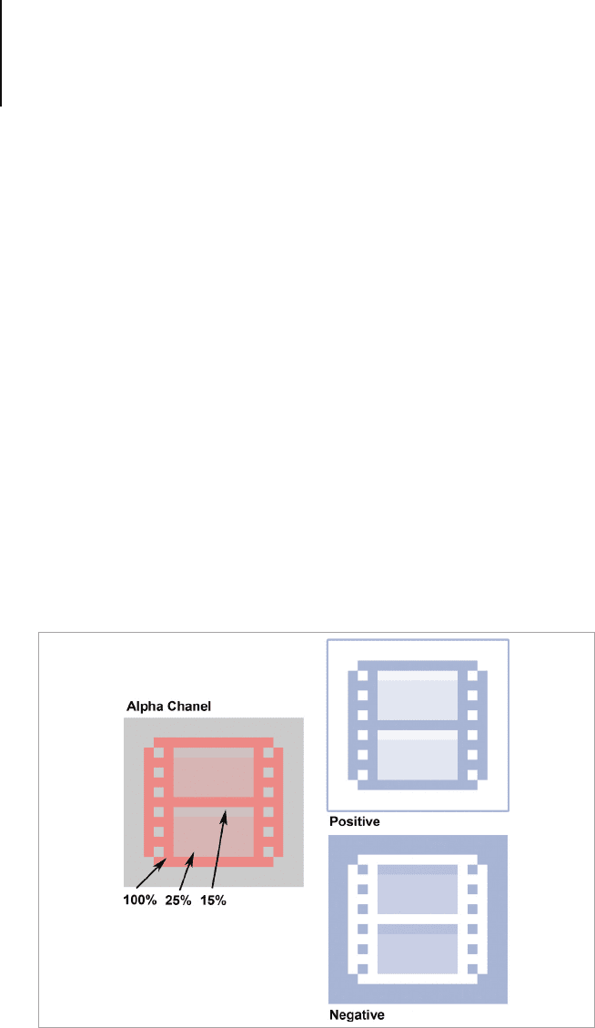
When rendering icons for the sidebar you should use various
opacities of black rather than black with shades of grey. This is
because the effects applied to the sidebar icons use the icon's
alpha channel to apply visual effects such as embossing and
rollover states. If your design doesn't look good in an inverse state
(which is the rollover state) then you will need to supply a second
version of the design, with the elements that need to change
transparency for this purpose.
When rendering icons for the sidebar you should use various opacities of
black rather than black with shades of grey.
Popular Platforms – Guidelines and Style Tips215
Regardless of these two changes, the technical specications are
almost identical to earlier versions of Mac OS.
• Sizes: 19px for Toolbar Button icons, 16, 24 and 32px for
Regular Toolbar icons and 16, 18 and 32px for Sidebar
icons.
.ICNS les are required to have 16, 32, 128, 256, 512 and
1024px in 32, 8 and 4-bit color depths.
• Colors Used: Vibrant tones for
application icons, more subtle
hues and chrome effects for
utilities and hardware icons.
While the choice of color is left
to the designer’s discretion, a
few harmonious colors are ideal.
Bright highly contrasting colors
or a use of many different colors
is likely to result in an icon that
doesn’t blend well with the rest
of the UI.
• Viewing Angles Used: There
are three main viewing styles
for Macintosh icons: Desk
View, Shelf View and Front
View. There’s an in-depth guide
for each of these in the "View
Points" and "Perspective"
chapters of this book. The
general rule to follow when
choosing a viewing angle for
your icon is simple: Utility icons
are viewed from the front,
Application icons are shown to
look like they’re resting on a desk
Icon Design for Mac OS
and iOS
If you’re creating an icon
for iPhone, iPod and Mac
OS you will need to create
two different designs.
One that uses the square
format of the touch screen
icons and another that is a
desktop style icon. While
the visual style of Mac OS
has some overlap with
iOS, the application icons
provide immediate visual
feedback for the platform
they’re intended for. If a
user is presented with two
icons, one square and the
other based on an object,
they will immediately know
the square one is from
a device based app and
the object one is from a
desktop based app. It’s
also important to relate the
two icons together with
shared design elements
and color scheme.

Popular Platforms – Guidelines and Style Tips216
that the viewer is looking down on, and Toolbar icons should
look like they’re resting on a shelf that is eye level with the
viewer.
• Light Source: All icons have a light source above and
slightly to the front of the item. 16px icons and sidebar icons
have no drop shadow. Drop reections are dynamically
generated by the OS, so there is no need to include one in
your design.
• Format: ICNS, PDF, JPG2000
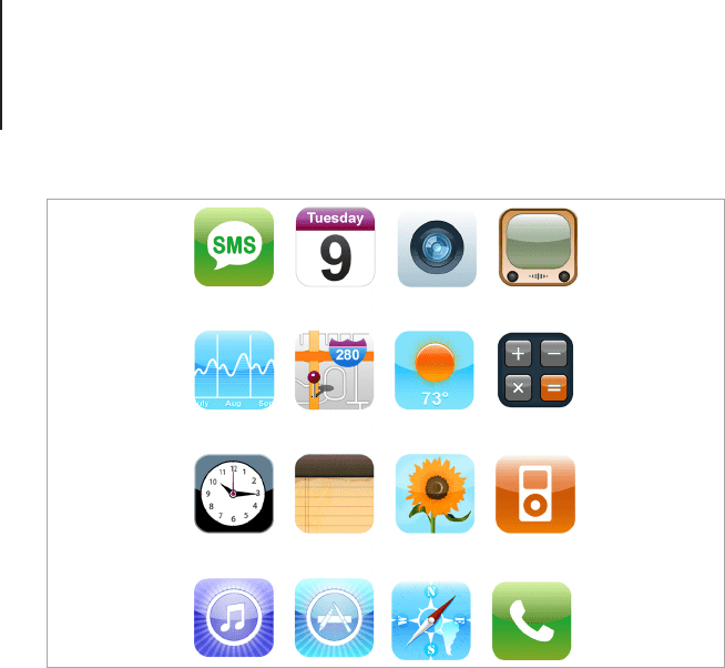
iOS
Background
Despite their seemingly simple appearance, icons for iPhone
and iPad ( collectively called iOS devices) have become an art
form for many contemporary icon designers. Based on a central
theme of pictographic icons for Toolbars and actions and rounded
squares for the Application icons, there’s more to iOS icons
than many people perceive. First off, the rounded corners and
reections on the application icons are applied in the OS, if you
intend on applying your own reection or special effects you will
need to disable the reection in the application itself. Secondly,
the application icon has to come in a variety of sizes so it can
be viewed on the App store and in searches when the device is
linked to a computer. One last thing to take note of is the resolution
differences between iPhone 4 and above and iPod Touch and
iPhone 3. If you’re creating an App for all three devices, you will
need to take special care in supplying the various scales required
to show the icons in both the regular resolution screens and the
retina display screens. Let’s take a closer look at the technical
requirements of an iOS icon.
Popular Platforms – Guidelines and Style Tips217
Style
Apple has a set of icon guidelines for iOS, which can be found in
the iOS Developer Library. While it’s fairly open when it comes
to artistic style, there are still a few considerations to be made in
regards to scale and technical requirements. Let’s begin with the
recommended art style.
First the icons should follow the general guidelines for all
successful icon designs and be crisp, uncluttered and related
to the application. Represent one concept or feature from the
application on the icon and draw the basic elements in a way
that’s easy to distinguish at the smallest scales. This means you
should avoid including text and small details that are important to
the meaning of the design but leave room to add details such as
texture and lighting effects for the larger scales. The application
will have to be rendered as large as 512px for the App Store listing
and as small as 57px for the regular sized application icon, so the
iOS icons by Nikola Adzic (vector.tutsplus.com/tutorials/icon-design/
create-a-detailed-vector-based-iphone-illustration-part-2).
Popular Platforms – Guidelines and Style Tips218
best way to approach the design is to make the main body of the
design in vector shapes, and make design tweaks to optimize the
design for each size.
With thousands of applications being submitted to the App Store,
it was hard for Apple to devote the resources needed for quality
control of icons. Therefore Apple made it so any image that
conformed to the icon dimensions could be automatically made
into an icon by the iOS. The default reection on an iOS icon can
be turned off by adding a snippet of code to the application, if
you’re working with a developer, ask them to include this feature if
you’re planning on creating an icon with its own custom reection
or lighting effects.
Crafting Icons for iOS
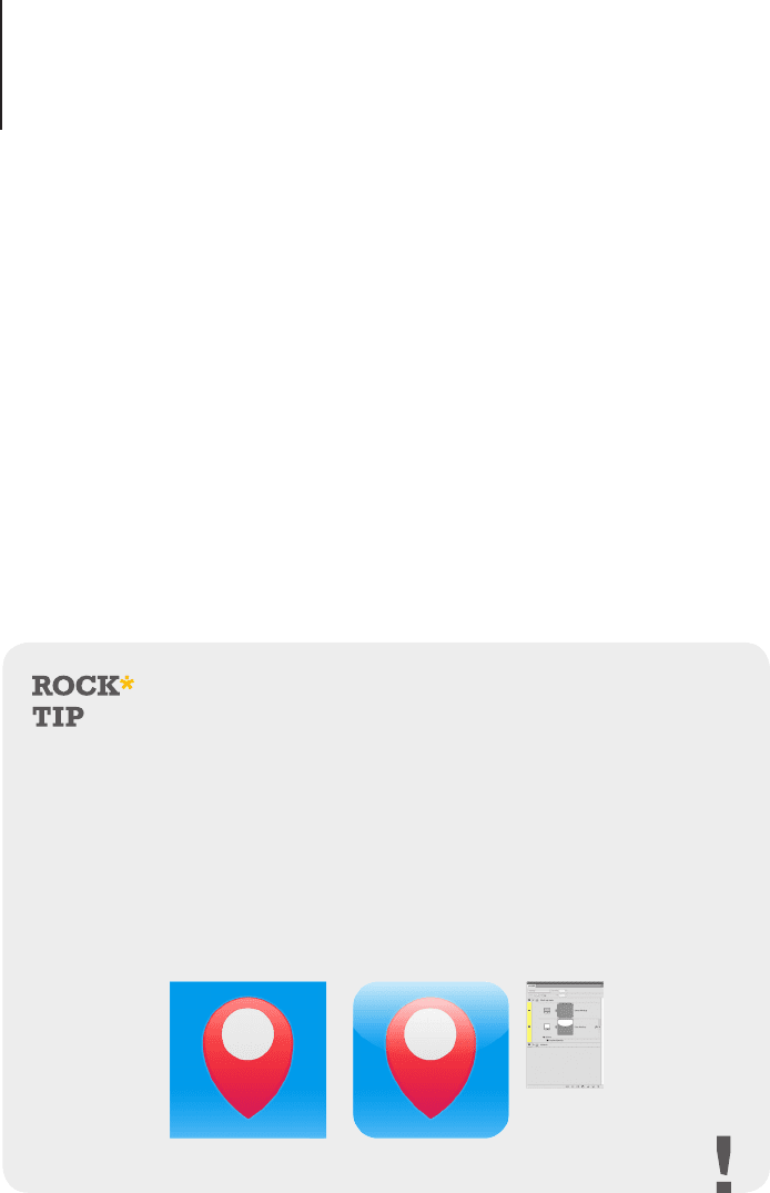
To ensure a consistent design the
highlight and corner style for iOS App
icons are not part of the icons itself,
instead it is applied by the operating
system.
Using a mock-up template is a good
way to judge the design before it’s
in use. iOS icon templates can be
freely downloaded at various design
sites or you can easily create your
own in Photoshop. Make sure that
the reflection and corner layers are
separate to each other so that the
highlight can be toggled on or off for
both the default and custom style
highlights.

Popular Platforms – Guidelines and Style Tips219
Technical Breakdown
• Sizes
Regular Screens: iPhone 3 and iPod Touch
Required Icons
• Application Icons: 57 x 57px
• App Store Icon: 512 x 512px
Recommended Icons
• Spotlight Search & Settings: 29 x 29px
• Web Clip Icon: 57 x 57px
• Document Icon: 22 x 29px
• Toolbar Icons: 20 x 20px
• Tab Bar Icons: 30 x 30px
Retina Display Screens: iPhone 4 +
Required Icons
• Application Icons: 114 x 114px
• App Store Icon: 512 x 512px
Recommended Icons
• Spotlight Search & Settings: 58 x 58px
• Web Clip Icon: 114 x 114px
• Document Icon: 44 x 58px
• Toolbar Icons: 40 x 40px
• Tab Bar Icons: 60 x 60px

Popular Platforms – Guidelines and Style Tips220
iPad 1 & 2
Required Icons
• Application Icons – 72 x 72px
• App Store Icon- 512 x 512px
Recommended Icons
• Spotlight Search – 50 x 50px
• Settings – 29 x 29px
• Web Clip Icon – 72 x 72px
• Document Icon – 64 x 64px and 320 x 320px
• Toolbar Icons – 20 x 20px
• Tab Bar Icons – 30 x 30px
• Image Format: PNG Files are required to have no alpha
transparency for Application icons, transparency is
permitted for toolbars and navigation.
• Colors Used: The choice of color should reect the colors
used in the application interface. Vibrant colors work well
and will help your design stand out in the App Store. To
make a harmonious design, chose one main color and two
or three supporting colors.
• Viewing Angles Used: The main body of the iOS icon
is drawn straight on, but you can play around with the
contents and draw objects in a variety of views. Remember
to keep it clear and easy to recognize, the rest is up to your
imagination.
• Light Source: iOS will apply a default reection to the top of
that icon that’s one third of the icons size. If you’re creating
an icon without this reection you should try and match the
direction of the light to complement the default icons around