McInnes K. Rockstar Icon Designer
Подождите немного. Документ загружается.

View Points181
Adding Filters
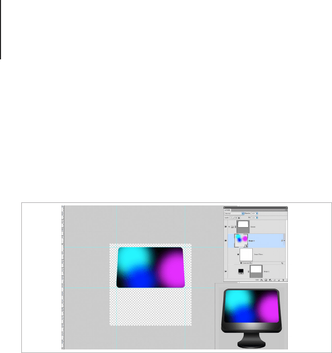
The great thing about Smart Objects is that they can be made
inside of other Smart Objects and have Masks, Layer Styles
and Adjustment Layers applied to them. I’m creating a blended
wallpaper effect by applying a Gaussian blur to the Smart Object
of the wallpaper design. The Layer Mask keeps the image inside of
the screen area so I can apply a fairly exaggerated blur.
Applying Effects to Multiple Layers
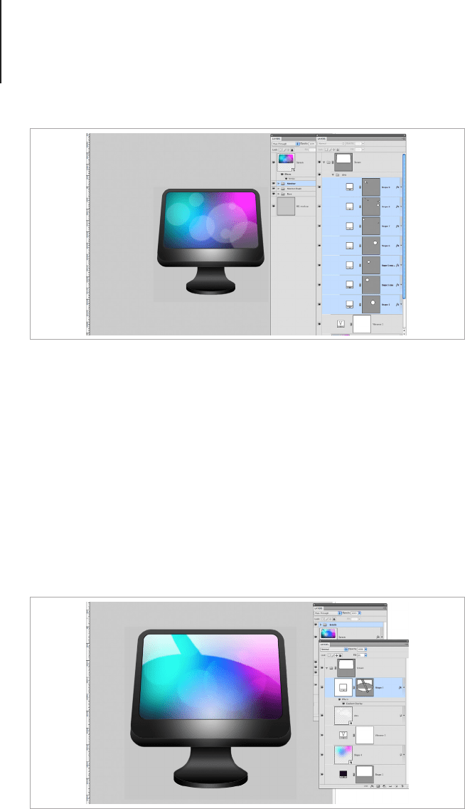
I want to add some blurry bokeh style circles to the wallpaper so
I clicked back into the monitor Smart Layer and added the circles
in layers that will blend and make some nice overlaid effects. Once
the shapes were made, I added a layer effect to the rst layer, and
copied it by right clicking the Fx icon at the side. I then selected
all of the layers I wanted to use the effect on, right clicked and
Applied the layer effect. Each layer then had the effect applied to it.
I then made the spots into a Smart Object and applied a subtle blur
and reduced the opacity. The same steps were repeated to make
the reection for the top of the screen.
Apply a Gaussian blur to the Smart Object of the wallpaper design.
View Points182
Applying a single Layer Effect to multiple layers at the same time is
a massive time saver if you’re working with lots of little details that
need the same effect, but cannot be part of a single shape layer.
Adding the Finishing Touches
Once the screen is nished, it’s time to go back to the main icon
and apply the nal layer effects. For this icon, the nishing effect is
a radial gradient to add a secondary highlight to the screen and an
outline to add denition to the shape.
Add some blurry bokeh style circles to the wallpaper and apply layer
effects to create circles of varying opacity and blending modes.
Add some more highlights to the screen to exaggerate the light source.
View Points183
As you can see, the large scale icon looks like it’s missing
something, so I added an embossed logo to the bottom and a LED
style light to create some focal points. When the design is scaled
below 256px, the layers with these details will be removed in order
to de-clutter the design.
Desk View Icons
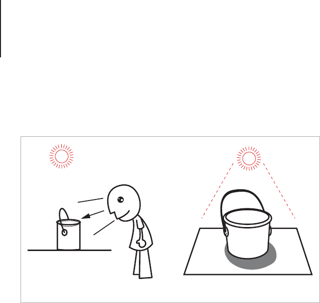
Items drawn in desk view can be drawn in any angle as long
as part of the top of the item is visible, and the lighting casts a
shadow underneath the object. Mac OS X species that the light
is from above, casting a soft shadow underneath the item, and
Microsoft Windows species that the light is from the top and
slightly to the left casting a shadow across the right side of the
design.
This is where the perspective of icons differs from actual
perspective in drawing theory. Loosely based on the concept of
different surface views, desk view is the common way of drawing
Mac and Windows application icons. In the Apple Human Interface
Guidelines, designers are simply asked to imagine looking down
Add an embossed logo to the bottom and a LED style light to create some
focal points.
View Points184
on an object that is placed on a surface that is light from above.
This seems simple enough, but special care should be taken with
perspective in order to achieve the illusion.
Desk view can be used for Toolbar or desktop icons depending
on the vanishing point. Icons with an exaggerated sense of
perspective are best used as application icons where icons with a
subtle sense of perspective are suitable for Toolbars.
There are no exact rules to this style of icon, except to make the
icon appear like it’s viewed from the front and slightly above the
item, like it’s resting on a desk. This can be confusing and will
take some time to become familiar with. Once again, sketching
out the design is a great way to rene the icon without spending
unnecessary rendering time.
Icons with this style of perspective can become blurry at smaller
scales. A common method of dealing with a smaller rendering size
is to make the large icons (anything above 25px) with perspective
and then change the design to Front View for the small scale icons.
Desk View
The viewing angle for desk view icons.

View Points185
It’s important to note that Microsoft Windows requires all icons
that are drawn with perspective to have a zero-point perspective
version for Toolbars and list view.
Tips for Creating a Realistic Desk View Icon
There’s a certain frustration that occurs when an icon design gets
off to a bad start and no matter how many tweaks you make, it
never seems to look right. I like to call this a “Tweaking Loop.”
Believe me, it can happen to anyone. When I was thinking of
objects for the following lesson, I spent an entire day rendering a
paint bucket. The textures and lighting effects looked great, but
no matter how hard I tried to get the handle right, I just couldn’t
achieve the correct perspective. Even the most experienced icon
designers can get off to a bad start with an image, especially ones
with a complicated perspective, so it’s extremely important not to
rush the planning stage, no matter how simple the design seems
to be. Let’s look at a few tips for planning and creating a desk view
icon.
Perspective
A desk view icon has no formal perspective, instead the icon's
perspective should be chosen to show the object in the best view
possible. If you look at icons from platforms such as Windows or
Mac OS, you will see that larger objects with balanced dimensions,
such as peripherals or animal mascots, are shown in a variation
of the isometric view point. Objects that are thinner or smaller in
appearance are shown with a smaller perspective view to create
the best view of the object's surface. Paper should be drawn like
it’s placed at on a surface, and objects should look like they’re
coming out from the picture plane.
View Points186
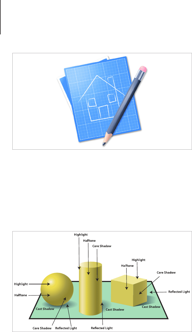
Lighting
There’s more to shading an object than simply adding some light to
a dark gradient, so let’s take a closer look at how to effectively use
light to turn shapes into forms. Once you’re condent with using
light and shade properly, you will notice a dramatic improvement in
the quality and realism of your work.
A desk view icon looks like it's viewed resting on an imaginary desk and
viewed from above.
To shade dif ferent objects, you need to apply a highlight, halftone, core
shadow and reflected light.

View Points187
• Highlight: This is the area where the light directly hits the
surface of the object. The intensity of the highlight will
depend on the material you’re drawing. Highly reective
surfaces will have super bright highlights, while porous
materials will absorb some of the light, making it a few
shades lighter than the other tones.
• Halftone: This is the area between the shade and the light.
On textured surfaces you will notice that the texture may
create little shadows and highlights depending on how
raised it is.
• Core Shadow: The core shadow is the darkest part of the
object with the least light, this doesn’t mean that it should
be de-saturated. Make the best use of the HSB color sliders
to subtract light without muting the tones.
• Cast Shadow: The cast shadow falls over the surface the
object is sitting on. The cast shadow is dened by the object
that’s forming it and becomes lighter and less dened the
further away from the object it’s drawn.
• Reflected Light: This is light that is reected from the
surface the object is sitting on. Reected light shouldn’t be
lighter than the Highlight.
When light is bounced off a surface it will change color but
it will not get darker. Colored light hitting an object from a
surface of the same color will enhance the saturation of the
reected light. Light bouncing off a dark surface will not be
bright enough to change the color of the light, rather the
dark surface will absorb it.
View Points188
Look at the object you want to create as an icon. What are the
surfaces like? Consider the shape of the object and how light will
move from one side to the other. Using photos as a reference
is a great place to start studying the play of light on an object,
but remember that it shouldn’t be used to trace and copy. Icons
should be brighter than a photograph and have an exaggerated
appearance. Images in photographs can also have perspective that
doesn’t necessarily look good in the context of icon design.
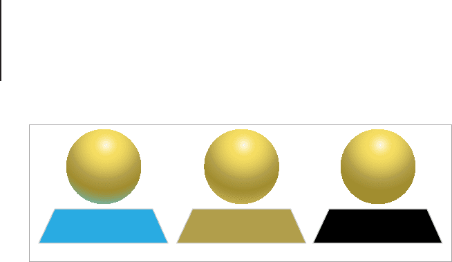
How Light Behaves on Different Surfaces
One you’ve chosen the perspective of the icon and have
established how light will move across the surface, you need
to think about the materials you want to render. Light behaves
differently depending on the object. For example soft and uffy fur
will absorb light and remain luminous, while chrome will bounce
light with super bright and blown out highlights and reected
tone from the objects around it. If you’re not familiar with creating
different nishes and effects, you should spend some time learning
the characteristics of various materials and render samples. It may
take a while to build your condence, but practicing rendering
without creating an icon will help you focus clearly on the effect
and pick out areas that could be improved or tweaked.
Reected Color Reected Saturated Light Absorbed Light
Light reflected from surfaces behaves differently depending on the
material the surface is made from.
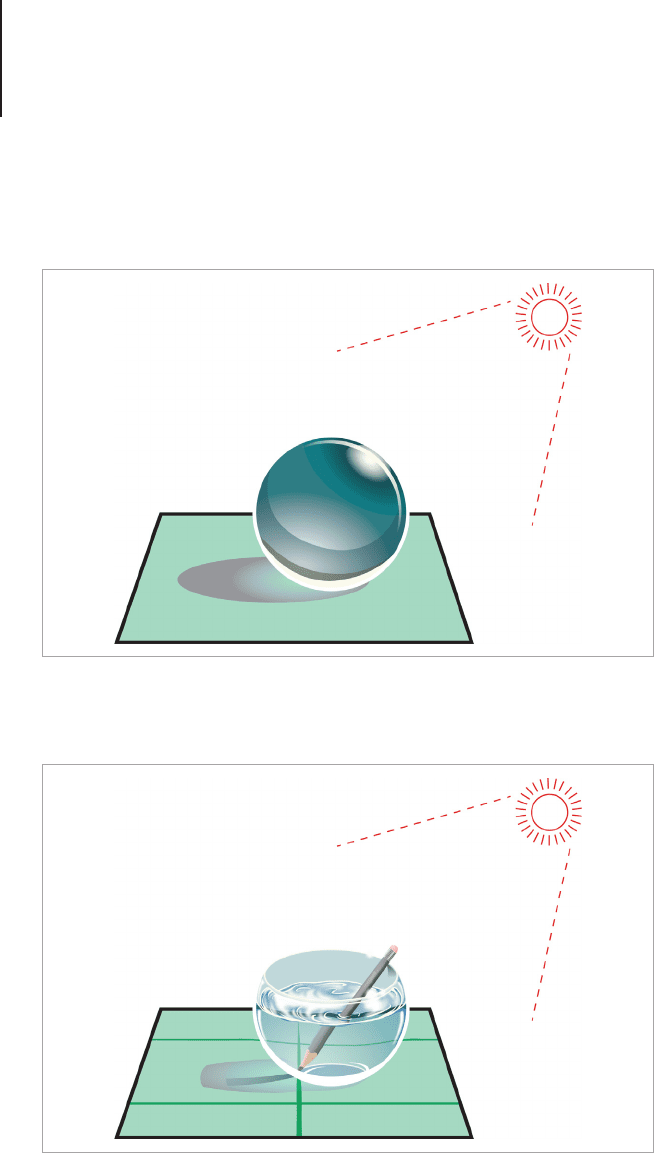
View Points189
• Glass: Can have bright light reections, objects in or under
appear darker where a shadow is cast, regular light will be
matte and cover most of the surface.
• Water: Sparkly highlights and ultra-glossy reective
transparent surface. Can distort objects under/in it.
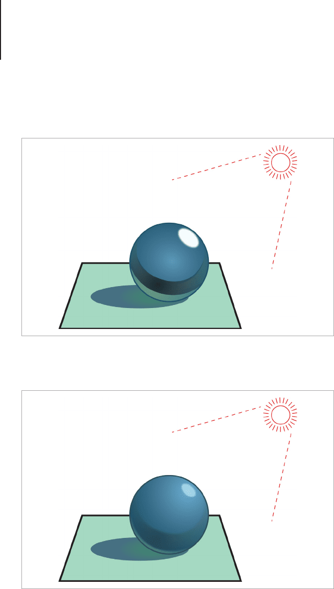
View Points190
• Metal: Chrome is ultra-glossy with subtle reected color in
it, other metals can be more textured than glossy. Gold and
silver are in-between these two.
• Plastic: Reective, bright colored reection of light rather
than white shiny reections