McInnes K. Rockstar Icon Designer
Подождите немного. Документ загружается.

View Points171
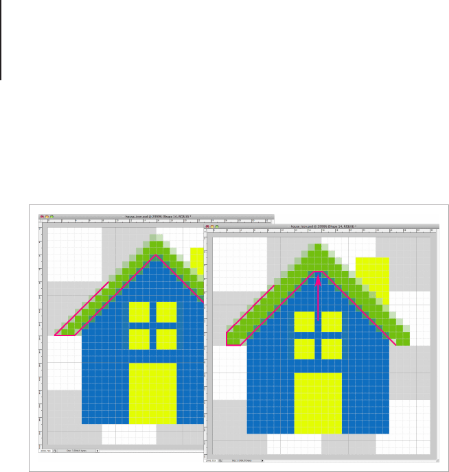
to change the roof so I can maintain a uniform line style for the
window and the door. If I was designing the icon for a larger scale,
such as a 96px icon, then the alignment wouldn’t be too much of
an issue.
With small scale icons, pixel alignment issues will occur from time
to time, but this shouldn’t be a worry as with time and experience
you’ll be able to anticipate it.
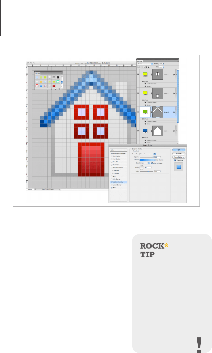
Add some Color and Outlines
Once you have the shapes blocked in, add some subtle gradients
from light at the top to dark at the bottom, with a matching outline
that’s the same colors, but darker than the ll. Because I’m using
Photoshop, the gradients I’m using are layer styles. I like this
method of coloring for smaller icons as I can save the styles in
the Graphic Styles palette for later use. Adobe Illustrator CS4 and
above has a similar feature which is useful if you’re creating icons
in vector.
Tweak the lines that need to align with other design elements.
View Points172
Adding Details
If you’re working with a small scale
icon, it doesn’t mean that it should
be simple and dull. Adding decorative
elements like patterns and highlights
will make the design stand out without
looking over complicated. For this
design I've added some very subtle
highlights and patterns, plus two cute
looking plants to give the house a more
homely feel and to add some more
color.
Saving styles, colors
and even elements to
use in further designs
or projects is one of the
most important things
to remember. As an icon
designer, the time you will
spend on creating designs
can be dramatically
reduced with a good
library of assets.
Use layer styles to color the different elements. As you make the styles,
save them to the styles palette.
View Points173
Remember to plan the colors for your icon set before you begin to
render the icons. Doing this will ensure that the entire set uses the
same tones and hues and works as a coherent set.
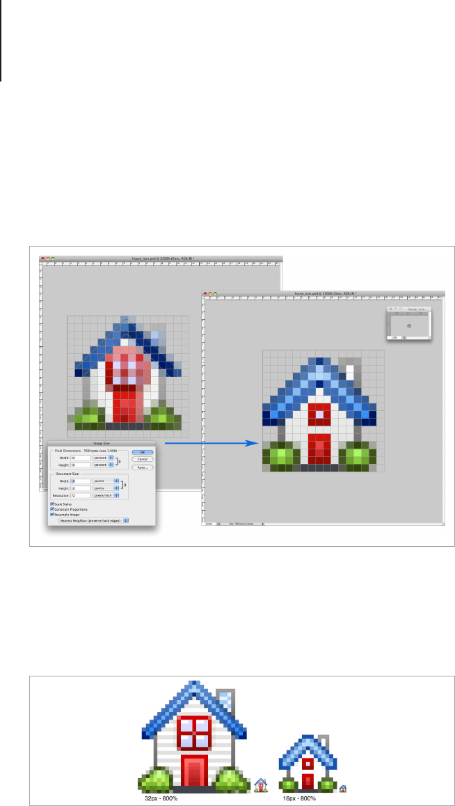
Scaling the Design
So here’s the trick I use to scale Toolbar icons. The handy thing
about icons is that they scale in percentages – i.e. 16px is 50%
of 32px and 64px is 200% of 32px and so on. Once you save
the source le of the main icon, go to the Image Size dialogue to
scale the design for the 16px icon. For this tip to work you need
to change the Pixel Dimensions from pixels to percent, the scaling
algorithm works much better with percentages and wont warp the
resulting image.
Type the percentage into the Pixel Dimensions and choose
“Nearest Neighbor” from the Sampling options at the bottom.
Add decorative elements like patterns and highlights to make the design
stand out without looking over complicated.
View Points174
Nearest Neighbor will snap the lines of the Shape Layers to a pixel
boundary. If all of your shapes are aligned with the pixel grid, the
icon should be clear and crisp after it’s scaled. If by some chance
there are some blurry lines, it'll still be far less than other scaling
methods. This method of scaling can also make some great large
scale pixel images from small pixel style sprites.
Because the icon is 100% vector shapes, if there are some
elements which need simplifying, it won’t take long to delete a few
detail layers and rene some of the shapes so that the design is
optimized for the smaller scale.
Scale the icon and then tweak the lines to create a crisp design.
The design is optimized to look crisp when zoomed in at each scale.
View Points175
Shelf View Icons
Shelf view is a style of icon mainly used in Mac OS X for utilities
and settings. Shelf view can also be used with three dimensional
objects that appear to be too distorted in desk view. Icons
rendered in this view should be drawn with a straight on view with
a drop shadow directly underneath and slightly towards the back
of the object. Icons with more than one object can take advantage
of the viewing angle by positioning elements to the front or back of
the viewing plane. This is how shelf view is different from a at view
icon.
The reason that many utilities icons are drawn at this angle is the
level of readability that is needed for these designs. These icons
help people change settings, x problems and generally work their
software and computers, so a very straight forward icon is needed.
The shelf view displays the icon design with a clear silhouette
which, on a crowded Toolbar or settings dialogue, is easier to see
than an icon drawn in desk view.
This isn’t to say that this style of icon needs to be overly bold or
plain, it’s just that the rate in which an icon is recognized can be
improved by using a single view. You may also nd that the Utility
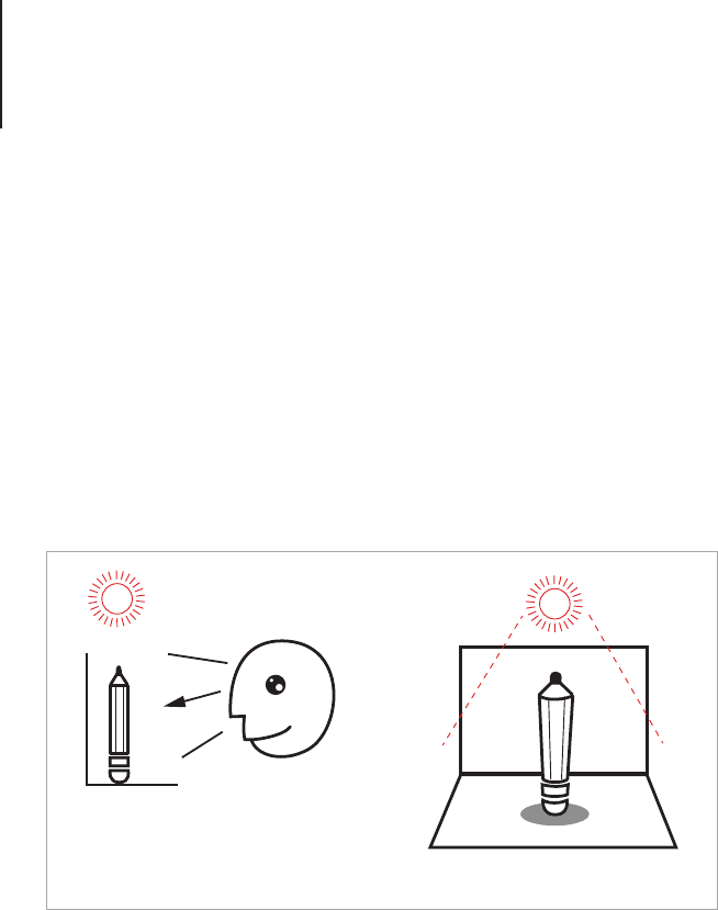
Shelf View
The viewing angle for shelf view icons.

View Points176
icons from the shelf view have pictographic versions made for
Toolbar processes, with the front on view the silhouette can be the
same no matter which style the icon is rendered in.
Another reason that shelf view icons are particularly useful for
settings and utilities is that they’re fairly adaptable to scaling
with only a small amount of editing required for designs under
32px in size. This means the design doesn’t change dramatically
depending on the size or style they’re being viewed in.
Tips for Creating a Glossy Shelf View Icon
For this design I will be creating a 512px sized glossy monitor icon
with Photoshop using Shapes and Smart Filters. When creating
icons that need both large and small scale, you should always
strive to create everything with as much editability as possible.
Shapes and Smart Filters will allow you to tweak the line weight
and effects for each design so that they’re as crisp and easy to
understand as possible. It took me some time to fully understand
the importance of editability, but when you have a large set of
icons to make in a short amount of time, every little bit of reusable
shapes and layer styles really help. The following exercise will
demonstrate how an icon that’s easy to edit and scale, can be
made in Photoshop.
Plan the Design
Think about the object you want to draw, what stand out features
does it have to make people recognize it? I’ll be drawing a
computer monitor. We all know that there are many buttons and
cords on a computer monitor but for the purpose of drawing an
icon, I will leave out the secondary details and focus on the screen
and the stand. The larger scale icons need some added details to
make the icon look more realistic, so I will also add an LED button
at the front and an embossed symbol. I will also be adding a bright
wallpaper to make the design stand out. Draw a sketch of the
View Points177
icon in the table top perspective. With this view, it should look like
you’re viewing it from the front with a drop shadow underneath.
Set the Canvas Size
With this technique I like to start with the large scale icon as the
details are added with smart lters so it’s easy to tweak or even
turn off the effects for the smaller icons. I’m creating a 512px icon
with a moderate drop shadow underneath so I’ll position the main
objects 1px from the top of the artboard and leave at least 6px at
the bottom for the shadow.
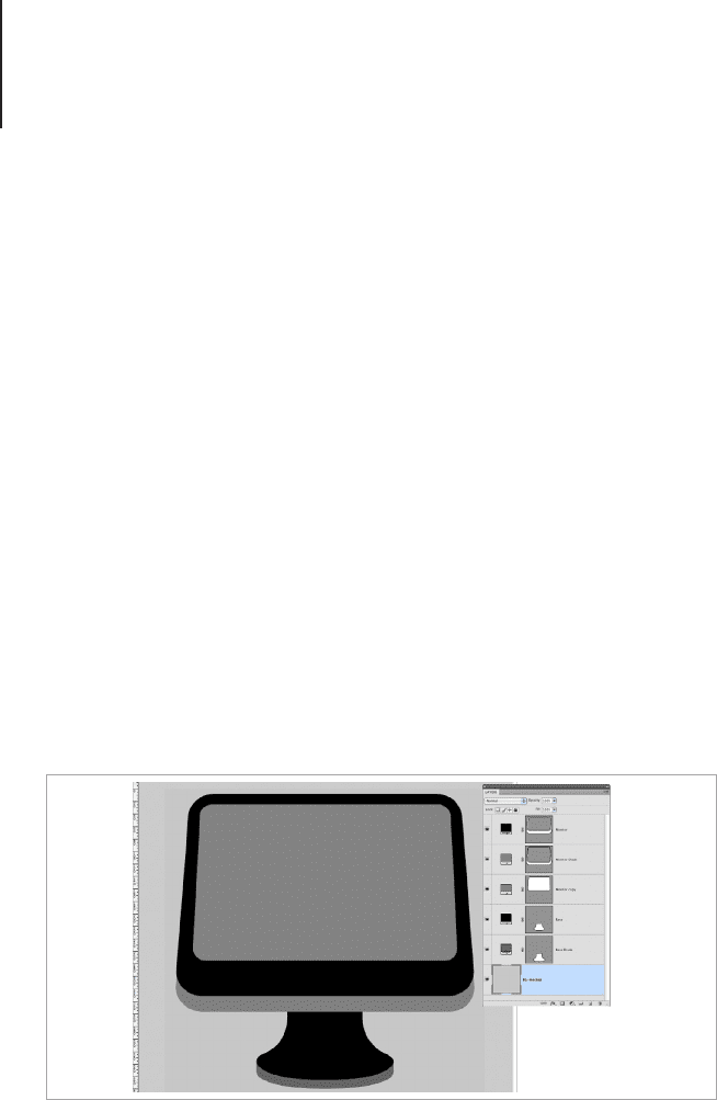
Block Out the Main Shapes
One of the most important things when designing icons that
require a moderate level of rendering is to block out the shapes
before you even think about adding the special nishes and small
details. Blocking out the details will help you distinguish what looks
right your designs, and change the things that may not look right.
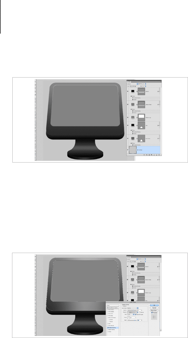
Apply some Base Layer Styles
Once the shape is drawn out you can begin to apply some basic
gradient and line effects. These will make up the base tone of the
icon. Set the effects with the Layer Styles and save them for later
Block out the main shapes of the design.
View Points178
use in the Styles panel. If you save Layer Styles as you work on
various projects, you will quickly build a valuable collection that
can be used in the future.
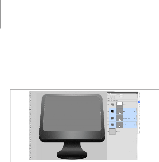
Apply some Secondary Layer Styles
Make copies of the shape layers above the rst shape and apply
the secondary layer effects. For this icon I’ve applied semi-
transparent gradients through the middle of the main shapes to
create a lighting effect. When you’re creating transparent layer
effects with Shape Layers, remember to set the Fill (located under
the Opacity settings) to 0%, as this will show the effect and hide
the shape.
Apply some basic gradient and line effects.
Make duplicate layers to apply the secondary layer effects.
View Points179
Tidy the Layers
Some icons can become fairly complex. Once you’ve made the
basic icon, take the time to group any layers together to keep the
Layers Panel tidy and easy to navigate. This step is especially
important if you’re creating an icon for sale or as part of a creative
team.
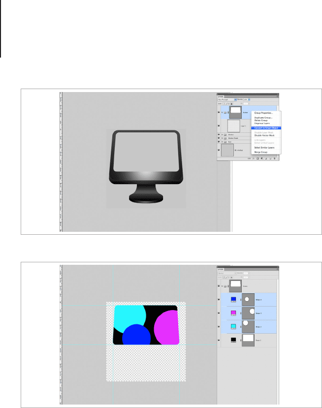
Layer Masks and Smart Objects
Another handy technique is using Vector Masks on Layer Groups.
I’ve made a Vector Mask for the “Screen” Layer Group by dragging
the Vector Mask from the Screen Shape onto the Layer Group.
Once the mask was applied to the Layer Group, I then Converted
it to a Smart Object and double clicked onto the Object to add
some colored circles to create the wallpaper of the screen. I then
selected the three circles and created another Smart Object. You
need to save the Smart Object documents to see any changes
to the main illustration. Save the screen and go back to the Layer
Group.
Group the layers together to keep the Layers Panel tidy.
View Points180
Smart Objects are layers that link to separate image assets that
can be edited the same as a regular Photoshop document. The
benet to this technique is that any effect from the Filters menu
can be added to the Smart Object and be toggled on or off and
edited. Traditionally Filters couldn’t be undone and they would
permanently alter the image, so this is a fantastic way to work and
it brings Photoshop much closer to Illustrator with regard to ease
of editability.
Apply a vector mask to the layer group of the screen.
Create a smart object from the colored circles.