Heiman G. Basic Statistics for the Behavioral Sciences
Подождите немного. Документ загружается.


48 CHAPTER 3 / Frequency Distributions and Percentiles
This says that to compute relative frequency, divide the frequency ( ) by the total num-
ber of scores ( ). For example, if a score occurred four times ( ) in a sample of 10
scores ( ), then filling in the formula gives
The score has a relative frequency of .40, meaning that the score occurred .40 of the
time in the sample.
As you can see here, one reason that we compute relative frequency is simply be-
cause it can be easier to interpret than simple frequency. Interpreting that a score has a
frequency of 4 is difficult because we have no frame of reference—is this often or not?
However, we can easily interpret the relative frequency of .40 because it means that the
score occurred .40 of the time.
REMEMBER Relative frequency indicates the proportion of the time (out of )
that a score occurred.
We can also begin with and compute the corresponding simple frequency. To
transform relative frequency into simple frequency, multiply the relative frequency
times . Thus, if is .4 and is 10, multiply .4 times 10 and the answer is 4; the
score occurs four times in this sample.
Finally, sometimes we transform relative frequency to percent. Converting relative
frequency to percent gives the percent of the time that a score occurred. To transform
relative frequency to percent, multiply the times 100. Above, the was .40, so
Thus, 40% of the sample had this score. Conversely, to transform
percent into relative frequency, divide the percent by 100. Thus 40% / 100 .40.
Presenting Relative Frequency in a Table or Graph
A distribution showing the relative frequency of all scores is called a relative frequency
distribution. To create a relative frequency table, first create a simple frequency table,
as we did previously. Then add a third column labeled “ ”
For example, look at Table 3.3. To compute , we need , which here is 20. Then
the score of 1, for example, has so its relative frequency is 4/20, or .20. And so on.
We can also determine the combined relative frequency of several scores by adding
their frequencies together: In Table 3.3, a score of 1 has a relative frequency of .20, and
a score of 2 has a relative frequency of .50, so together, their relative frequency is .20 1
.50, or .70; participants having a 1 or 2 compose .70 of our sample. (To check your
table, remember that, except for rounding error, the sum of all relative frequencies in a
distribution should equal 1: All scores together should constitute 100% of the sample.)
We graph a relative frequency distribution using the same rules as with simple fre-
quency: Create a bar graph if the scores involve a nominal or ordinal scale, and create a
f 5 4,
Nrel. f
rel. f.
5
1.402110025 40%.
rel. frel. f
Nrel. fN
rel. f
N
rel. f 5
f
N
5
4
10
5 .40
N
fN
f
Score f rel. f
6 1 .05
5 0 .00
4 2 .10
3 3 .15
2 10 .50
1 4 .20
Total: 20 1.00 100%5
TABLE 3.3
Relative Frequency
Distribution
The left-hand column identi-
fies the scores, the middle
column shows each score’s
frequency, and the right-hand
column shows each score’s
relative frequency.
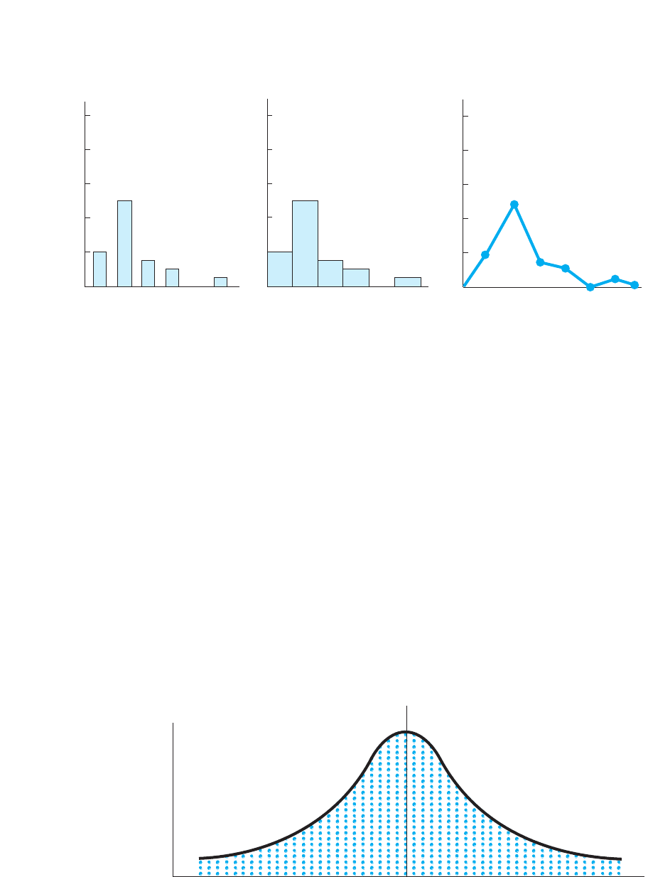
histogram or polygon if the scores involve an interval or ratio scale. Figure 3.9 presents
examples using the data from Table 3.3. The only novelty here is that the axis reflects
relative frequency, so it is labeled in increments between 0 and 1.0.
Finding Relative Frequency Using the Normal Curve
Although relative frequency is an important component of statistics, we will not emphasize
the previous formula. (You’re welcome.) Instead, most of the time our data will be nor-
mally distributed, and then we will use the normal curve to determine relative frequency.
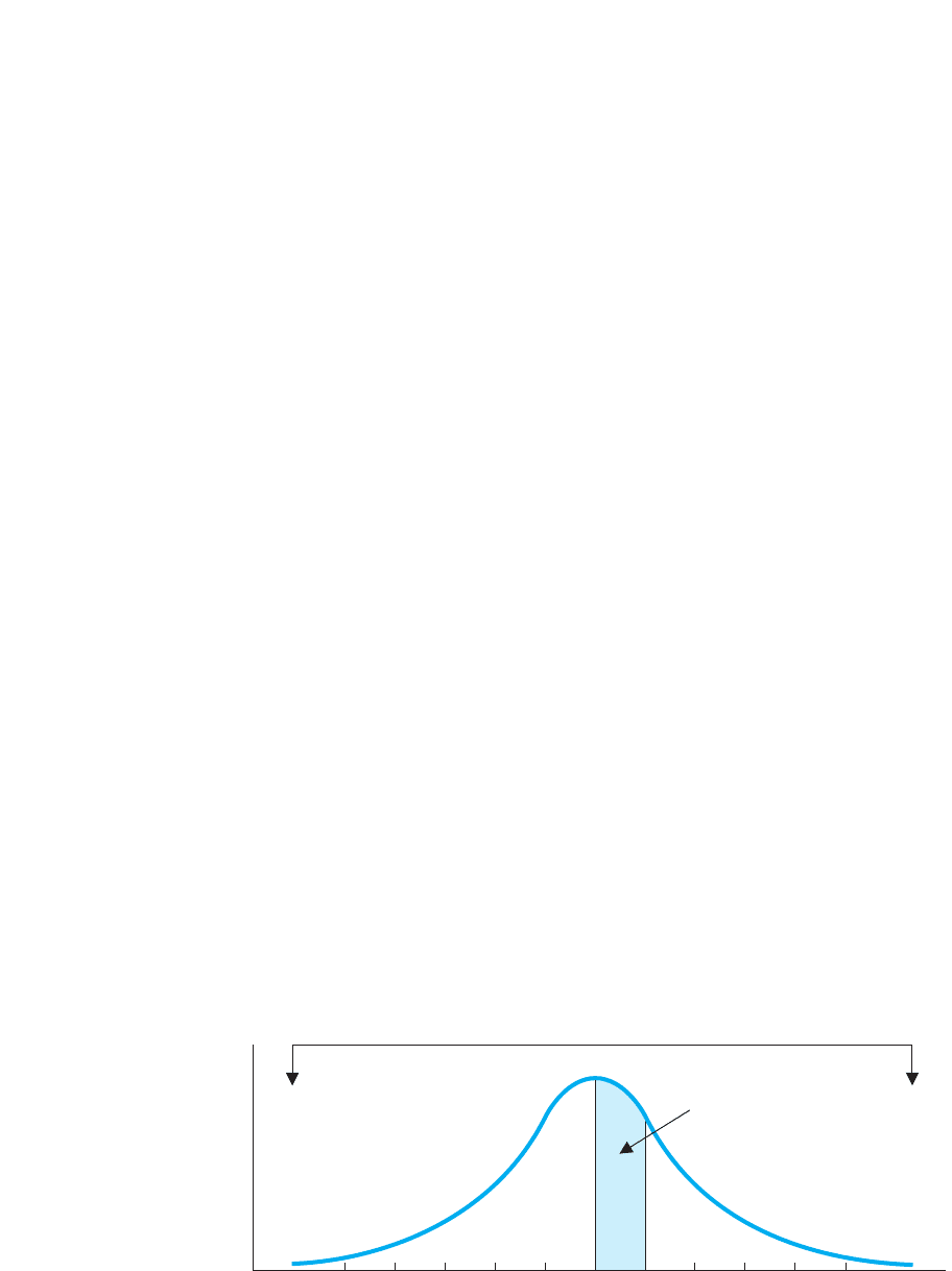
To understand this approach, think about a normal curve in a different way. Imagine
that you are flying in a helicopter over a parking lot. The and axes are laid out on
the ground, and the people who received a particular score are standing in line in front
of the marker for their score. The lines of people are packed so tightly together that,
from the air, you only see the tops of many heads in a “sea of humanity.” If you painted
a line that went behind the last person in line at each score, you would have the normal
curve shown in Figure 3.10.
From this perspective, the height of the curve above any score reflects the number of
people standing in line at that score. Thus, in Figure 3.10, the score of 30 has the highest
frequency because the longest line of people is standing at this score in the parking lot.
YX
Y
Relative Frequency and the Normal Curve 49
FIGURE 3.10
Parking lot view of the
ideal normal curve.
The height of the curve above
any score reflects the number
of people standing in line at
that score.
f
Scores
0101520253035404550555
. . . . . .
50%
50%
FIGURE 3.9
Examples of relative frequency distributions using the data in Table 3.3
Scores
1
rel.
f
1.0
.8
.6
.4
.2
0
1.0
.8
.6
.4
.2
0
1.0
.8
.6
.4
.2
0
Bar graph Histogram Polygon
234 65
1234 651234657
Scores Scores
50 CHAPTER 3 / Frequency Distributions and Percentiles
The reason for using this “parking lot view” is so that you think of the normal curve as a
picture of something solid: The space under the curve between the curve and the
axis has area that represents individuals and their scores. The entire parking lot contains
everyone in the sample and 100% of the scores. Therefore, any portion of the parking lot—
any portion of the space under the curve—corresponds to that portion of the sample.
For example, notice that in Figure 3.10 a vertical line is drawn through the middle
score of 30, and so .50 of the parking lot is to the left of the line. Because the complete
parking lot contains all participants, a part that is .50 of it contains 50% of the partici-
pants. (We can ignore those relatively few people who are straddling the line.) Partici-
pants are standing to the left of the line because they received scores of 29, 28, and so
on. So, in total, 50% of the participants received scores below 30. Now turn this around:
If 50% of the participants obtained scores below 30, then the scores below 30 occurred
50% of the time. Thus, the scores below 30 have a combined relative frequency of .50.
This logic is so simple it almost sounds tricky: if you have one-half of the parking
lot, then you have one-half of the participants and thus one-half of the scores, so those
scores occur .50 of the time. Or, if you have 25% of the parking lot, then you have 25%
of the participants and 25% of the scores, so those scores occur .25 of the time.
This is how we describe what we have done using statistical terminology: The total
space occupied by the everyone in the parking lot is called the total area under the nor-
mal curve. We identify some particular scores and determine the area of the correspon-
ding portion of the polygon above those scores. We then compare the area of this
portion to the total area to determine the proportion of the total area under the curve
that we have selected. Then, as we’ve seen,
The proportion of the total area under the normal curve that is occupied by a
group of scores corresponds to the combined relative frequency of those scores.
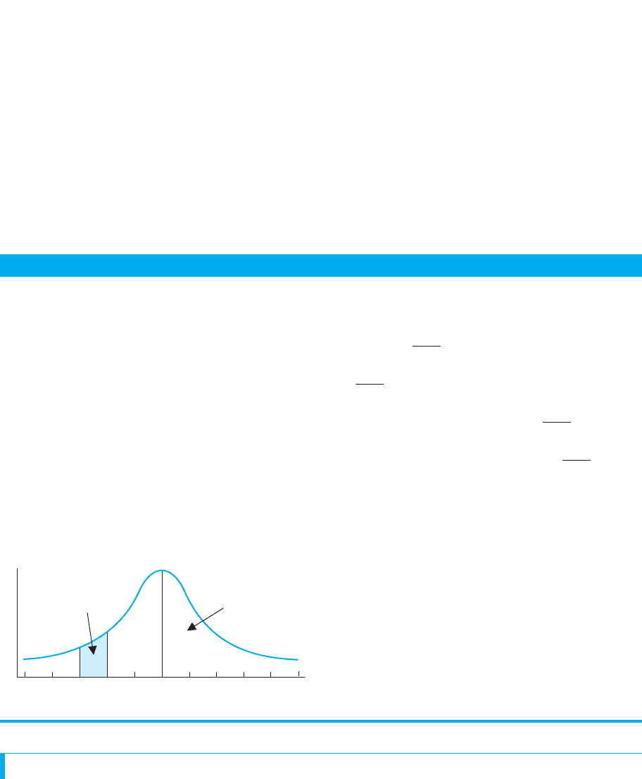
Of course, statisticians don’t fly around in helicopters, eyeballing parking lots, so here’s
a different example: Say that by using a ruler and protractor, we determine that in Figure
3.11 the entire polygon occupies an area of 6 square inches on the page. This total area cor-
responds to all scores, which is N. Say that the area under the curve between the scores of
30 and 35 covers 2 square inches. This area is due to the number of times these scores oc-
cur. Therefore, the scores between 30 and 35 occupy 2 out of the 6 square inches created
by all scores, so these scores constitute , or .33, of the entire distribution. Thus, the
scores between 30 and 35 constitute .33 of our N, so they have a relative frequency of .33.
We could obtain this answer by using the formula for relative frequency if, using
and each score’s , we computed the for each score between 30 and 35 and then
added them together. However, the advantage of using the area under the curve is that
we can get the answer without knowing or the simple frequencies of these scores.N
rel. ff
N
2>6
X
FIGURE 3.11
Finding the proportion of
the total area under the
curve
The complete curve occupies
6 square inches, with scores
between 30 and 35 occupying
2 square inches.
f
Scores
0 10152025303540455055
5 . . .. . .
2 square inches
6 square inches
COMPUTING CUMULATIVE FREQUENCY AND PERCENTILE
Researchers have one other approach for organizing the scores in addition to comput-
ing simple and relative frequency. Sometimes we want to know a score’s standing rela-
tive to the other scores. For example, it may be most informative to know that 30 people
scored above 80 or that 60 people scored below 80. When we seek such information,
the convention in statistics is to count the number of scores below the score, computing
either cumulative frequency or percentile.
Computing Cumulative Frequency and Percentile 51
A QUICK REVIEW
■
Relative frequency is the proportion of the time that
a score occurs.
■
The area under the normal curve corresponds to
100% of a sample, so a proportion of the curve will
contain that proportion of the scores, which is their
relative frequency.
MORE EXAMPLES
Below, the shaded area is .15 of the total curve (so
15% of people in the parking lot are standing at these
scores). Thus, scores between 55 and 60 occur .15 of
the time, so their combined relative frequency is .15.
Above the score of 70 is .50 of the curve, so scores
above 70 have a combined relative frequency of .50.
For Practice
1. If a score occurs 23% of the time, its relative fre-
quency is .
2. If a score’s relative frequency is .34, it occurs
percent of the time.
3. If scores occupy .20 of the area under the curve,
they have a relative frequency of .
4. Say that the scores between 15 and 20 have a rela-
tive frequency of .40. They make up of the
area under the normal curve.
Answers
1. 23%/100 5 .23
2. (.34)(100) 5 34%
3. .20
4. .40
f
Scores
50 55 60 65 70 75 80 85 9045
95
.50
.15
In fact, whatever the variable might be, whatever the might be, and whatever the ac-
tual frequency of each score is, we know that the area these scores occupy is 33% of
the total area, and that’s all we need to know to determine their relative frequency.
This is especially useful because, as you’ll see in Chapter 6, statisticians have created
a system for easily finding the area under any part of the normal curve. Therefore, we
can easily determine the relative frequency for scores in any part of a normal distribu-
tion. (No, you won’t need a ruler and a protractor.) Until then, simply remember this:
REMEMBER The total area under the normal curve corresponds to the times
that all scores occur, so a proportion of the total area under the curve corre-
sponds to the proportion of time some of the scores occur, which is their rel-
ative frequency.
N

52 CHAPTER 3 / Frequency Distributions and Percentiles
Computing Cumulative Frequency
Cumulative frequency is the frequency of all scores at or below a particular score. The
symbol for cumulative frequency is To compute a score’s cumulative frequency, we
add the simple frequencies for all scores below the score to the frequency for the score,
to get the frequency of scores at or below the score.
For example, Table 3.4 shows a “cumulative frequency distribution” created from a
simple frequency table to which we add a column. Begin with the lowest score. Here,
no one scored below 10, and one person scored 10, so we have a of 1 (one person
scored 10 or below 10). Next, there were two scores of 11. We add this to the previous
for 10, so the for 11 is 3 (three people scored at 11 or below 11). Next, no one
scored at 12, but three people scored below 12, so the for 12 is also 3. And so on,
each time adding the frequency for a score to the cumulative frequency for the score
immediately below it.
As a check, verify that the for the highest score equals : Here all 20 participants
obtained either the highest score or a score below it.
Nowadays, researchers seldom create graphs showing cumulative frequency, so we
won’t. In fact, cumulative frequency is not the most common way to summarize scores.
But cumulative frequency is the first step in computing percentiles, which are very
common.
Computing Percentiles
We’ve seen that the proportion of time a score occurs provides a frame of reference
that is easier to interpret than the number of times a score occurs. Therefore, our final
procedure is to transform cumulative frequency into a percent of the total. A score’s
percentile is the percent of all scores in the data that are at or below the score. Thus,
for example, if the score of 80 is at the 75th percentile, this means that 75% of the
sample scored at or below 80.
Usually, we will already know a score’s cf. Then
Ncf
cf
cfcf
f
cf
cf
cf.
Score f cf
17 1 20
16 2 19
15 4 17
14 6 13
13 4 7
12 0 3
11 2 3
10 1 1
TABLE 3.4
Cumulative Frequency
Distribution
The left-hand column identi-
fies the scores, the center col-
umn contains the simple
frequency of each score, and
the right-hand column con-
tains the cumulative
frequency of each score.
The formula for finding the percentile for a score with a
known cf is
Score’s Percentile 5 a
cf
N
b11002
This says to first divide the score’s by , which transforms the into a proportion of
the total sample. Then we multiply this times 100, which converts it into a percent of
the total. Thus, if a score has a of 5 and is 10, then so the score
is at the 50th percentile.
Table 3.5 shows the previous cumulative frequency table (where ) trans-
formed to percentiles. With one person scoring 10 or below, (1/20)(100) equals 5, so 10
is at the 5th percentile. The three people scoring 11 or below are at the 15th percentile
and so on. The highest score is, within rounding error, the 100th percentile, because
100% of the sample has the highest score or below.
N 5 20
15>102110025 50,Ncf
cfNcf
Score f cf Percentile
17 1 20 100
16 2 19 95
15 4 17 85
14 6 13 65
13 4 7 35
12 0 3 15
11 2 3 15
10 1 1 5
TABLE 3.5
Percentiles
The right-hand column
contains the percentile of
each score.
Computing Cumulative Frequency and Percentile 53
FIGURE 3.12
Normal distribution
showing the area under
the curve to the left of
selected scores
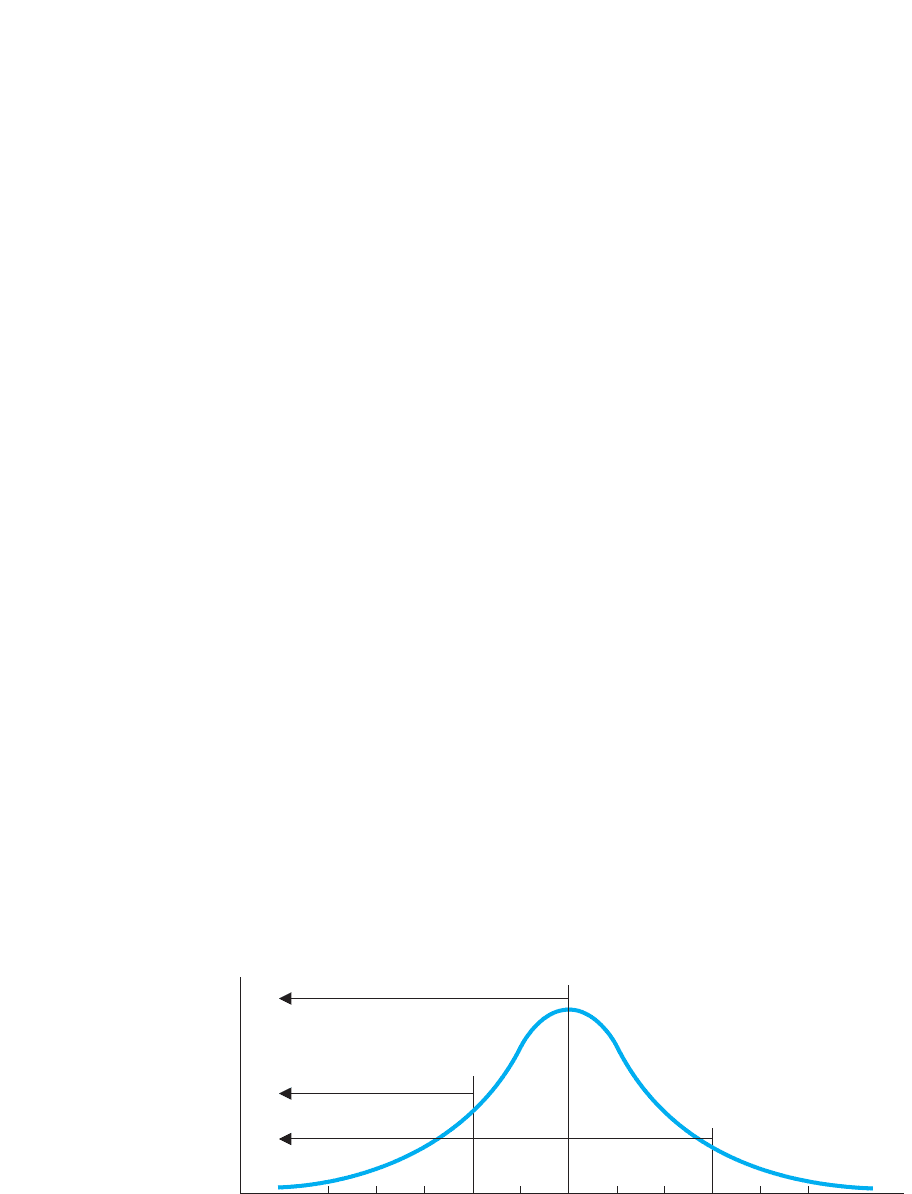
f
Scores
0 101520253035404550555 . . .. . .
.50 of curve
.15 of curve
.85 of curve
For finding the score at a percentile not shown in our table, the precise way is with a
computer program (such as SPSS). However, a quick way to find an approximate per-
centile is to use the area under the normal curve.
Finding Percentile Using the Area Under the Normal Curve
Percentile describes the scores that are lower than a particular score, and on the normal
curve, lower scores are to the left of a particular score. Therefore, the percentile for a
given score corresponds to the percent of the total area under the curve that is to the left
of the score. For example, on the distribution in Figure 3.12, 50% of the curve is to the
left of the middle score of 30. Because scores to the left of 30 are below it, 50% of the
distribution is below 30 (in the parking lot, 50% of the people are standing to the left of
the line and all of their scores are less than 30). Thus, the score of 30 is at the 50th per-
centile. Likewise, to find the percentile for the score of 20 in Figure 3.12, we would
find the percent of the total area that is to the left of 20. Say that we find that 15% of
the curve is to the left of 20; then 20 is at the 15th percentile.
We can also work the other way to find the score at a given percentile. Say that we
seek the score at the 85th percentile. We would measure over until 85% of the area
under the curve is to the left of a certain point. If, as shown in Figure 3.12, the score of
45 is at that point, then 45 is at the 85th percentile.
Notice that we make a slight change in our definition of percentile when we use the
normal curve. Technically, a percentile is the percent of scores at or below a score.
However, in everyday use, the at may be dropped. Then percentile becomes the percent
of scores below a particular score. This is acceptable if we are describing a large sam-
ple or a population because those participants at the score are a negligible portion of
the total (remember that we ignored those relatively few people who were straddling
the line). Thus, in Figure 3.12, the score of 30 is at the 50th percentile, so we say that
50% of the scores are below 30 and 50% are above it.
However, if we are describing a small sample, we should not ignore those at the
score, because those participants may actually constitute a sizable portion of the sam-
ple. Say that 10% have this score. If we conclude that 50% are above and 50% are be-
low, with 10% at the score, we have the impossible total of 110%! Therefore, with
small samples, percentile is calculated and defined as the percent of scores at or below
a particular score. Because of this distinction, you should use the area under the normal
curve to compute percentile when you have a large sample or a population that also fits
the normal curve.
54 CHAPTER 3 / Frequency Distributions and Percentiles
STATISTICS IN PUBLISHED RESEARCH: APA PUBLICATION RULES
The rules that we’ve used for creating tables and graphs are part of the procedures for cre-
ating research publications established by the American Psychological Association (APA).
We will also follow “APA format” when we discuss how to report various statistics. (Note:
Computer programs, such as SPSS, sometimes do not operate according to these rules.)
You won’t always see frequency tables and graphs in published reports, because they are
very expensive to print. Instead, often researchers simply state that “the scores were nor-
mally distributed” or whatever, and you are expected to mentally envision the distribution.
One way in which researchers shrink the size of published tables and graphs is to
create a grouped distribution.
A WORD ABOUT GROUPED FREQUENCY DISTRIBUTIONS
In the previous examples, we examined each score individually, creating ungrouped
distributions. When we have too many scores to produce a manageable ungrouped dis-
tribution, we create a grouped distribution. In a grouped distribution, scores are com-
bined to form small groups, and then we report the total , , , or percentile of all
scores in each group.
For example, look at the grouped distribution shown in Table 3.6. In the score col-
umn, “0-4” contains the scores 0, 1, 2, 3, 4, and “5–9” contains scores 5 through 9, and
so on. The for each group is the sum of the frequencies for the scores in that group.
Thus, the scores between 0 and 4 have a total of 7, while, for the highest scores be-
tween 40 and 44, the total is 2. Likewise, the combined relative frequency of scores
between 0 and 4 is .28, while for scores between 40 and 44 it is .08. Each cumulative
f
f
f
cfrel. ff
A QUICK REVIEW
■
Cumulative frequency ( ) indicates the number of
participants in a sample that scored at or below a
particular score.
■
Percentile indicates the percent of a sample that
scored at or below a particular score.
■
The proportion of the normal curve to the left of a
score is the proportion of participants scoring below
that score, which translates into the score’s percentile.
MORE EXAMPLES
If the score of 80 has a of 35, it means that 35 par-
ticipants had a score of 80 or below 80. If 80 is at the
90th percentile, it means that 90% of the sample had a
score of 80 or below 80 and, on a normal distribution,
80 is located over toward the right-hand tail, with 90%
of the curve located to the left of it.
For Practice
On an exam, 10 students scored 19, 15 students scored
20, no students scored 21, and everyone else scored 21.
cf
cf
1. The for the score of 20 is .
2. The for the score of 21 is .
3. If 60 students took the exam, the percentile for the
score of 20 is .
4. What does this percentile indicate?
5. In a normal curve showing these grades, how
much of the curve is to the right of (above) 20 and
how much is to the left of (below) 20?
Answers
1. 15
2. 15
3. Then percentile.
4. 25% of the class scored 20 or below 20.
5. 75% of the curve is above 20, and 25% of the curve is
below 20.
1.252110025 25th115>6025 .25.
cf
cf

frequency is the number of scores that are at 44 or below the highest score in the group.
Thus, 7 scores are at 4 or below while 25 scores are at 44 or below. (Because 44 is the
highest score, we know that is 25.) Finally, each percentile indicates the percent of
scores that are below the highest score in the group, so the score of 4 is at the 28th per-
centile, and the score of 44 is at the 100th percentile.
Appendix A.1 shows examples of graphs of grouped distributions (Figure A.1) with
the details of how to create grouped distributions.
N
Chapter Summary 55
Score f rel. f cf Percentile
40–44 2 .08 25 100
35–39 2 .08 23 92
30–34 0 .00 21 84
25–29 3 .12 21 84
20–24 2 .08 18 72
15–19 4 .16 16 64
10–14 1 .04 12 48
5–9 4 .16 11 44
0–4 7 .28 7 28
TABLE 3.6
Grouped Distribution
Showing f, rel.f, cf, and
Percentile
The left-hand column identi-
fies the lowest and highest
score in each group.
All of the procedures in this chapter indicate how often certain scores occur, but
each provides a slightly different perspective that allows you to interpret the data in
a slightly different way. Which particular procedure you should use is determined
by which provides the most useful information. However, you may not automati-
cally know which is the best technique for a given situation. So, understand that re-
searchers often explore their data, and you should too. Try different techniques and
then choose the approach that allows you to make the most sense out of your data.
Using the SPSS Appendix: Appendix B shows you how to use the SPSS computer
program to produce the distributions that we’ve discussed. As described in Appendix
B.1 you’ll first need to label your variables and input your raw scores. Then, as in
Appendix B.2, you can create frequency tables and plot bar graphs, histograms and
polygons. You can also compute percentiles.
CHAPTER SUMMARY
1. The number of scores in the data is symbolized by .
2. A simple frequency distribution shows the frequency of each score. The symbol
for simple frequency is .
3. When graphing a simple frequency distribution, if the variable involves a nominal
or an ordinal scale, create a bar graph. If the variable involves a few different
interval or ratio scores, create a histogram. With many different interval or ratio
scores, create a polygon.
4. In a normal distribution forming a normal curve, extreme high and low scores are
relatively infrequent, scores closer to the middle score are more frequent, and the
middle score occurs most frequently. The low-frequency, extreme low and
extreme high scores are in the tails of a normal distribution.
f
N
PUTTING IT
ALL TOGETHER

56 CHAPTER 3 / Frequency Distributions and Percentiles
5. A negatively skewed distribution contains low-frequency, extreme low scores,
but not low-frequency, extreme high scores. A positively skewed distribution
contains low-frequency, extreme high scores, but not low-frequency, extreme
low scores.
6. A bimodal distribution is symmetrical, with two areas showing relatively high-
frequency scores. In a rectangular distribution, all scores have the same
frequency.
7. The relative frequency of a score, symbolized by , is the proportion of time
that the score occurred. A relative frequency distribution is graphed in the same
way as a simple frequency distribution except that the axis is labeled in
increments between 0 and 1.0.
8. The proportion of the total area under the normal curve occupied by particular
scores equals the combined relative frequency of those scores.
9. The cumulative frequency of a score, symbolized by , is the frequency of all
scores at or below the score.
10. Percentile is the percent of all scores at or below a given score. On the normal
curve the percentile of a score is the percent of the area under the curve to the left
of the score.
11. In an ungrouped distribution, the , , , or percentile of each individual score
is reported.
12. In a grouped distribution, different scores are grouped together, and the , , ,
or percentile for each group is reported.
cfrel. ff
cfrel. ff
cf
Y
rel. f
KEY TERMS
bar graph 39
bimodal distribution 44
cumulative frequency 52
distribution 36
frequency 36
frequency polygon 40
grouped distribution 54
histogram 40
negatively skewed distribution 44
normal curve 42
normal distribution 42
cfrel. fNf
percentile 52
positively skewed distribution 44
proportion of the total area under the
curve 50
rectangular distribution 45
relative frequency 47
relative frequency distribution 48
simple frequency 37
simple frequency distribution 37
tail 43
ungrouped distribution 54
REVIEW QUESTIONS
(Answers for odd-numbered problems are in Appendix D.)
1. What do each of the following symbols mean? (a) ; (b) ; (c) ; (d) .
2. (a) What is the difference between a bar graph and a histogram? (b) With what
kind of data is each used?
cfrel. ffN
3. (a) What is the difference between a histogram and a polygon? (b) With what kind
of data is each used?
4. (a) What is the difference between a score’s simple frequency and its relative
frequency? (b) What is the difference between a score’s cumulative frequency
and its percentile?
5. (a) What is the advantage of computing relative frequency instead of simple
frequency? (b) What is the advantage of computing percentile instead of
cumulative frequency?
6. (a) What is the difference between a skewed distribution and a normal
distribution? (b) What is the difference between a bimodal distribution and
a normal distribution? (c) What does a rectangular distribution indicate about
the frequencies of the scores?
7. What is the difference between a positively skewed distribution and a negatively
skewed distribution?
8. (a) Why must the for the highest score in a sample equal ? (b) Why must the
sum of all s in a sample equal ?
9. What is the difference between graphing a relationship as we did in Chapter 2 and
graphing a frequency distribution?
10. What is the difference between how we use the proportion of the total area under
the normal curve to determine relative frequency and how we use it to determine
percentile.
11. What does it mean when a score is in a tail of a normal distribution?
12. (a) How is percentile defined in a small sample? (b) How is percentile defined for
a large sample or population when calculated using the normal curve?
APPLICATION QUESTIONS
13. In reading psychological research, you encounter the following statements.
Interpret each one. (a) “The IQ scores were approximately normally distributed.”
(b) “A bimodal distribution of physical agility scores was observed.” (c) “The
distribution of the patients’ memory scores was severely negatively skewed.”
14. From the data 1, 4, 5, 3, 2, 5, 7, 3, 4, and 5, Poindexter created the following
frequency table. What five things did he do wrong?
Nf
Ncf
Application Questions 57
Score f cf
110
211
323
425
538
719
N 5 6
15. The distribution of scores on your statistics test is positively skewed. What does
this indicate about the difficulty of the test?
16. (a) On a normal distribution of exam scores, Poindexter scored at the 10th
percentile, so he claims that he outperformed 90% of his class. Why is he correct
or incorrect? (b) Because Foofy’s score is in a tail of the distribution, she claims
she had one of the highest scores on the exam. Why is she correct or incorrect?