Heiman G. Basic Statistics for the Behavioral Sciences
Подождите немного. Документ загружается.


38 CHAPTER 3 / Frequency Distributions and Percentiles
Not only can we easily see the frequency of each score, but we can also determine
the combined frequency of several scores by adding together their individual s. For ex-
ample, the score of 13 has an of 4, and the score of 14 has an of 6, so their combined
frequency is 10.
Notice that, although there are 8 scores in the score column, is not 8. There are
18 scores in the original sample, so is 18. You can see this by adding together the fre-
quencies in the column: The 1 person scoring 17 plus the 4 people scoring 15 and so
on adds up to the 18 people in the sample. In a frequency distribution, the sum of the
frequencies always equals .
REMEMBER The sum of all frequencies in a sample equals N.
That’s how to create a simple frequency distribution. Such a distribution is also
called a regular frequency distribution or a plain old frequency distribution.
N
f
N
N
ff
f
A QUICK REVIEW
■
A frequency distribution shows the number of times
participants obtained each score.
MORE EXAMPLES
The scores 15, 16, 13, 16, 15, 17, 16, 15, 17, and 15,
contain one 13, no 14s, four 15s, and so on, producing
the following frequency table:
Scores f
17 2
16 3
15 4
14 0
13 1
For Practice
1. What is the difference between and ?
2. Create a frequency table for these scores: 7, 9, 6, 6,
9, 7, 7, 6, and 6.
Nf
3. What is the here?
4. What is the frequency of 6 and 7 together?
Answers
1. f is the number of times a score occurs; N is the total
number of scores in the data.
2. Scores f
92
80
73
64
3.
4. f 5 3 1 4 5 7
N 5 9
N
Graphing a Simple Frequency Distribution
When researchers talk of a frequency distribution, they often imply a graph. Essen-
tially, it shows the relationship between each score and the frequency with which it oc-
curs. We ask, “For a given score, what is its corresponding frequency?”, so we place
the scores on the axis and frequency on the axis.
REMEMBER A graph of a frequency distribution shows the scores on the
axis and their frequency on the axis.
Recall that a variable will involve one of four types of measurement scales—nominal,
ordinal, interval, or ratio. The type of scale involved determines whether we graph a
frequency distribution as a bar graph, a histogram, or a polygon.
Y
X
YX
Bar Graphs Recall that in nominal data each score identifies a category, and in or-
dinal data each score indicates rank order. A frequency distribution of nominal or ordi-
nal scores is graphed by creating a bar graph. In a bar graph, a vertical bar is centered
over each score on the axis, and adjacent bars do not touch.
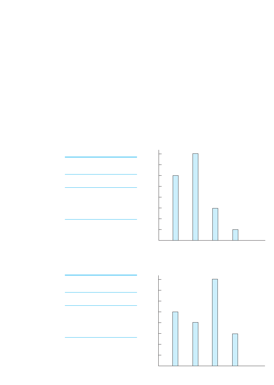
Figure 3.1 shows two bar graphs of simple frequency distributions. Say that the up-
per graph is from a survey in which we counted the number of participants in each cat-
egory of the nominal variable of political party affiliation. The axis is labeled using
the “scores” of political party, and because this is a nominal variable, they can be
arranged in any order. In the frequency table, we see that six people were Republicans,
so we draw a bar at a height (frequency) of 6 and so on.
Say that the lower graph is from a survey in which we counted the number of partic-
ipants having different military ranks (an ordinal variable). Here the axis is labeled
from left to right, which corresponds to low to high. Again, the height of each bar is the
score’s frequency.
REMEMBER Create a bar graph to show the frequency distribution of nomi-
nal or ordinal scores.
X
X
X
Simple Frequency Distributions 39
8
7
6
5
4
3
2
1
0
Rep. Dem. Soc. Comm.
Political affiliation
Military rank
f
8
7
6
5
4
3
2
1
0
Sgt.
f
Gen.Col.Lt.
FIGURE 3.1
Simple frequency bar
graphs for nominal and
ordinal data
The height of each bar
indicates the frequency of
the corresponding score on
the x axis.
Nominal Variable of
Political Affiliations
Party f
Communist 1
Socialist 3
Democrat 8
Republican 6
Ordinal Variable of
Military Rank
Party f
General 3
Colonel 8
Lieutenant 4
Sergeant 5
40 CHAPTER 3 / Frequency Distributions and Percentiles
The reason we create bar graphs with nominal and ordinal scales is because re-
searchers assume that both are discrete scales: You can be in one group or the next, but
not in-between. The space between the bars in a bar graph indicates this. Later we will
see bar graphs in other contexts and this same rule always applies:
Create a bar graph whenever the variable is discrete.
On other hand, recall that interval and ratio scales are assumed to be continuous:They
allow fractional amounts that continue between the whole numbers. To communicate
this, these scales are graphed using continuous figures.
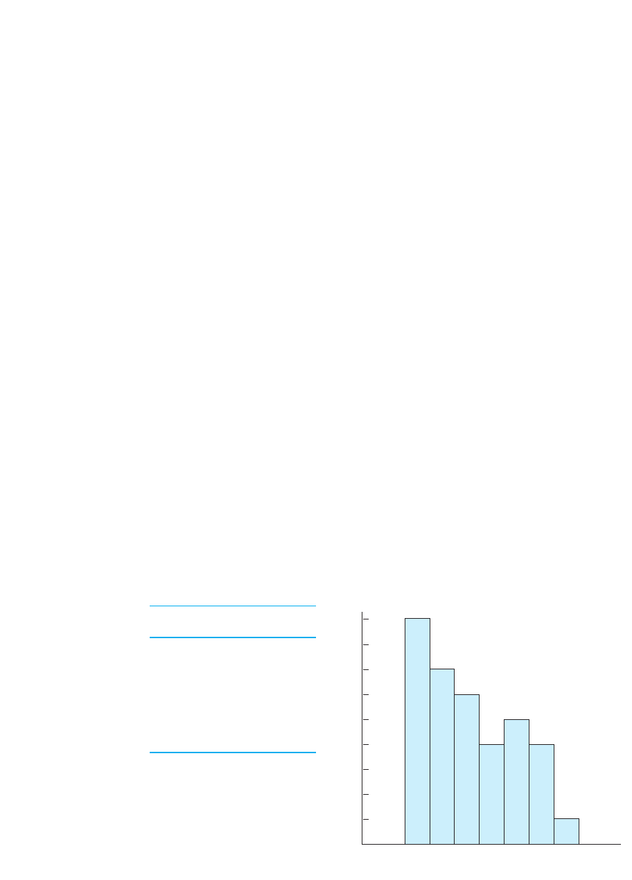
Histograms Create a histogram when plotting a frequency distribution containing a
small number of different interval or ratio scores. A histogram is similar to a bar graph
except that in a histogram adjacent bars touch. For example, say that we measured the
number of parking tickets some people received, obtaining the data in Figure 3.2. Again,
the height of each bar indicates the corresponding score’s frequency. Although you can-
not have a fraction of a ticket, this ratio variable is theoretically continuous (e.g., you
can talk about an average of 3.14 tickets per person). By having no gap between the bars
in our graph, we communicate that there are no gaps when measuring this variable.
Polygons Usually, we don’t create a histogram when we have a large number of dif-
ferent interval or ratio scores, such as if our participants had from 1 to 50 parking tick-
ets. The 50 bars would need to be very skinny, so the graph would be difficult to read.
We have no rule for what number of scores is too large, but when a histogram is unwork-
able, we create a frequency polygon. Construct a frequency polygon by placing a data
point over each score on the axis at a height corresponding to the appropriate fre-
quency. Then connect the data points using straight lines. To illustrate this, Figure 3.3
shows the previous parking ticket data plotted as a frequency polygon. Because each line
continues between two adjacent data points, we communicate that our measurements
continue between the two scores on the axis and therefore that this is a continuous
variable. Later we will create graphs in other contexts that also involve connecting data
points with straight lines. This same rule always applies:
Connect adjacent data points with straight lines whenever the variable
is continuous.
X
X
X
X
X
9
8
7
6
5
4
3
2
1
0
1
Number of parking tickets
f
234567
FIGURE 3.2
Histogram showing the
simple frequency of park-
ing tickets in a sample
Score f
71
64
55
44
36
27
19
Notice that a polygon includes on the axis the next score above the highest score
in the data and the next score below the lowest score (in Figure 3.3, scores of 0 and
8 are included). These added scores have a frequency of 0, so the polygon touches the
axis. In this way, we create a complete geometric figure—a polygon—with the axis
as its base.
REMEMBER Create a histogram or polygon to plot the frequency distribu-
tion for an interval or ratio variable.
Often in statistics you must a read a polygon to determine a score’s frequency, so be
sure you can do this: Locate the score on the axis and then move upward until you
reach the line forming the polygon. Then, moving horizontally, locate the frequency of
the score. For example, as shown by the dashed line in Figure 3.3, the score of 4 has an
equal to 4.
REMEMBER The height of the polygon above any score corresponds to that
score’s frequency.
Table 3.2 reviews the rules for constructing bar graphs, histograms, and polygons.
f
X
XX
X
Simple Frequency Distributions 41
9
8
7
6
5
4
3
2
1
0
1
Number of parking tickets
f
2345678
FIGURE 3.3
Simple frequency
polygon showing the
frequency of parking
tickets in a sample
Score f
71
64
55
44
36
27
19
Graph When Used? How Produced?
Bar graph With nominal or Adjacent bars
ordinal scores do not touch
Histogram With small range of Adjacent bars
interval/ratio scores do touch
Polygon With large range of Straight lines;
interval/ratio scores add points above and
below actual scores
TABLE 3.2
When to create a bar
graph, histogram, or
polygon
Consider the scale of
measurement of scores on
the axis. X
42 CHAPTER 3 / Frequency Distributions and Percentiles
TYPES OF SIMPLE FREQUENCY DISTRIBUTIONS
Research often produces scores that form frequency polygons having one of several
common shapes, and so we have names to identify them. Each shape comes from an
idealized distribution of a population. By far the most important frequency distribution
is the normal distribution. (This is the big one, folks.)
The Normal Distribution
Figure 3.4 shows the polygon of the ideal normal distribution. (Let’s say these are test
scores from a population of college students.) Although specific mathematical proper-
ties define this polygon, in general it is a bell-shaped curve. But don’t call it a bell
curve (that’s so pedestrian!). Call it a normal curve or a normal distribution or say
that the scores are normally distributed.
Because it represents an ideal population, a normal curve is different from the
choppy polygon we saw previously. First, the curve is smooth because a population
produces so many different scores that the individual data points are too close to-
gether for straight lines to connect them. Instead, the data points themselves form a
smooth line. Second, because the curve reflects an infinite number of scores, we can-
not label the axis with specific frequencies. Simply remember that the higher the
curve is above a score, the higher is the score’s frequency. Finally, regardless of how
high or low an score might be, theoretically it might sometimes occur. Therefore,
as we read to the left or to the right on the axis, the frequencies approach—but
never reach—a frequency of zero, so the curve approaches but never actually touches
the axis. X
X
X
Y
A QUICK REVIEW
■
Create a bar graph with nominal or ordinal scores,
a histogram with a few interval/ratio scores, and a
polygon with many different interval/ratio scores.
MORE EXAMPLES
After a survey, to graph (1) the frequency of males
versus females (a nominal variable), create a bar
graph; (2) the number of people who are first born,
second born, etc. (an ordinal variable), create a bar
graph; (3) the frequency of participants falling into
each of five salary ranges (a few ratio scores), create a
histogram; (4) the frequency for each individual
salary reported (many ratio scores), create a polygon.
For Practice
1. A has a separate, discrete bar above each
score, a contains bars that touch, and a
has dots connected with straight lines.
2. To show the number of freshmen, sophomores, and
juniors who are members of a fraternity, plot a .
3. To show the frequency of people who are above
average weight by either 0, 5, 10, or 15 pounds,
plot a .
4. To show the number of people preferring chocolate
or vanilla ice cream in a sample, plot a .
5. To show the number of people who are above av-
erage weight by each amount between 0 and 100
pounds, plot a .
Answers
1. bar graph; histogram; polygon
2. bar graph
3. histogram
4. bar graph
5. polygon
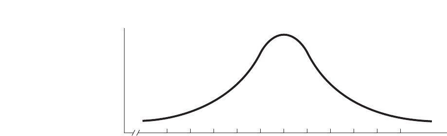
As you can see from Figure 3.4, the normal distribution has the following character-
istics. The score with the highest frequency is the middle score between the highest and
lowest scores. (Here it is the score of 30.) The normal curve is symmetrical, meaning
that the left half below the middle score is a mirror image of the right half above the
middle score. As we proceed away from the middle score either toward the higher or
lower scores, the frequencies at first decrease slightly. Farther from the middle score,
however, the frequencies decrease more drastically, with the highest and lowest scores
having relatively low frequency.
In statistics the scores that are relatively far above and below the middle score of the dis-
tribution are called the “extreme” scores. Then, the far left and right portions of a normal
curve containing the low-frequency, extreme scores are called the tails of the distribution.
In Figure 3.4, the tails are roughly below the score of 15 and above the score of 45.
The reason the normal curve is important is because it is a very common distribution
in psychology and other behavioral sciences: For most of the variables that we study, the
scores naturally form a curve similar to this, with most of the scores around the middle
score, and with progressively fewer higher or lower scores. Because of this, the normal
curve is also very common in our upcoming statistical procedures. Therefore, before you
proceed, be sure that you can read the normal curve. Can you see in Figure 3.4 that the
most frequent scores are between 25 and 35? Do you see that a score of 15 has a rela-
tively low frequency and a score of 45 has the same low frequency? Do you see that
there are relatively few scores in the tail above 50 or in the tail below 10? Above all,
you must be able to see this in your sleep.
On a normal distribution, the farther a score is from the central score of the
distribution, the less frequently the score occurs.
A distribution may not match the previous curve exactly, but it can still meet the mathe-
matical definition of a normal distribution. Consider the three curves in Figure 3.5. Curve
is generally what we think of as the ideal normal distribution. Curve is skinny relative to
the ideal because only a few scores around the middle score have a relatively high fre-
quency. On the other hand, Curve is fat relative to the ideal because more scores farther
below and above the middle have a high frequency. Because these curves generally have
that bell shape, however, for statistical purposes their differences are not critical.
Other Common Frequency Polygons
Not all data form a normal distribution and then the distribution is called nonnormal.
One common type of nonnormal distribution is a “skewed distribution.” A skewed dis-
tribution is similar to a normal distribution except that it has only one pronounced tail.
C
A
B
Types of Simple Frequency Distributions 43
FIGURE 3.4
The ideal normal curve
Scores farther above and be-
low the middle scores occur
with progressively lower
frequencies.
f
Test scores
Tail
Tail
0
10 15 20 25 30 35 40 45 50 55
5
. . .. . .

44 CHAPTER 3 / Frequency Distributions and Percentiles
As shown in Figure 3.6, a distribution may be either negatively skewed or positively
skewed.
A negatively skewed distribution contains extreme low scores that have a low fre-
quency but does not contain low-frequency, extreme high scores. The polygon on the
left in Figure 3.6 shows a negatively skewed distribution. This pattern might be found,
for example, by measuring the running speed of professional football players. Most
would tend to run at higher speeds, but a relatively few linemen lumber in at the slower
speeds. (To remember negatively skewed, remember that the pronounced tail is over
the lower scores, sloping toward zero, toward where the negative scores would be.)
On the other hand, a positively skewed distribution contains extreme high scores
that have low frequency but does not contain low-frequency, extreme low scores. The
right-hand polygon in Figure 3.6 shows a positively skewed distribution. This pattern
might be found, for example, if we measured participants’ “reaction time” for recogniz-
ing words. Usually, scores will tend to be rather low, but every once in a while a person
will “fall asleep at the switch,” requiring a large amount of time and thus producing a
high score. (To remember positively skewed, remember that the tail slopes away from
zero, toward where the higher, positive scores are located.)
REMEMBER Whether a skewed distribution is negative or positive corre-
sponds to whether the distinct tail slopes toward or away from zero.
Another type of nonnormal distribution is a bimodal distribution, shown in the left-
hand side of Figure 3.7. A bimodal distribution is a symmetrical distribution contain-
ing two distinct humps, each reflecting relatively high-frequency scores. At the center
FIGURE 3.5
Variations of bell-shaped curves
Curve B
f
Low . . . Middle . . . High
Low . . . Middle . . . HighLow . . . Middle . . . High
Curve A Curve C
scores scores scores
ff
FIGURE 3.6
Idealized skewed
distributions
The direction in which the
distinctive tail slopes
indicates whether the skew
is positive or negative.
f
Low . . . Middle . . . High
Negative skew
scores
f
Low . . . Middle . . . High
Positive skew
scores

of each hump is one score that occurs more frequently than the surrounding scores, and
technically the center scores have the same frequency. Such a distribution would occur
with test scores, for example, if most students scored at 60 or 80, with fewer students
failing or scoring in the 70s or 90s.
Finally, a third type of distribution is a rectangular distribution, as shown in the
right-hand side of Figure 3.7. A rectangular distribution is a symmetrical distribution
shaped like . . . are you ready? . . . like a rectangle! There are no discernible tails be-
cause the frequencies of all scores are the same.
Labeling Frequency Distributions
You need to know the names of the previous distributions because descriptive statistics
describe the characteristics of data, and one very important characteristic is the shape
of the distribution that the data form. Thus, although I might have data containing many
different scores, if, for example, I tell you they form a normal distribution, you can
mentally envision the distribution and quickly and easily understand what the scores
are like: Few scores are very low or very high, with the most common, frequent scores
in the middle. Therefore, the first step when examining any data is to identify the shape
of the simple frequency distribution that they form.
REMEMBER The shape of the frequency distribution that scores form is an
important characteristic of the data.
Recognize, however, that data in the real world will never form the perfect shapes
that we’ve discussed. Instead, the scores will form a bumpy, rough approximation to
the ideal distribution. For example, data never form a perfect normal curve and, at best,
only come close to that shape. However, rather than drawing a different, approximately
normal curve every time, we simplify the task by envisioning the ideal normal curve as
our one “model” of any distribution that generally has this shape. Likewise, we envi-
sion the ideal shape when discussing the other common curves that we’ve seen.
Thus, we apply the names of our ideal distributions to actual data as a way of sum-
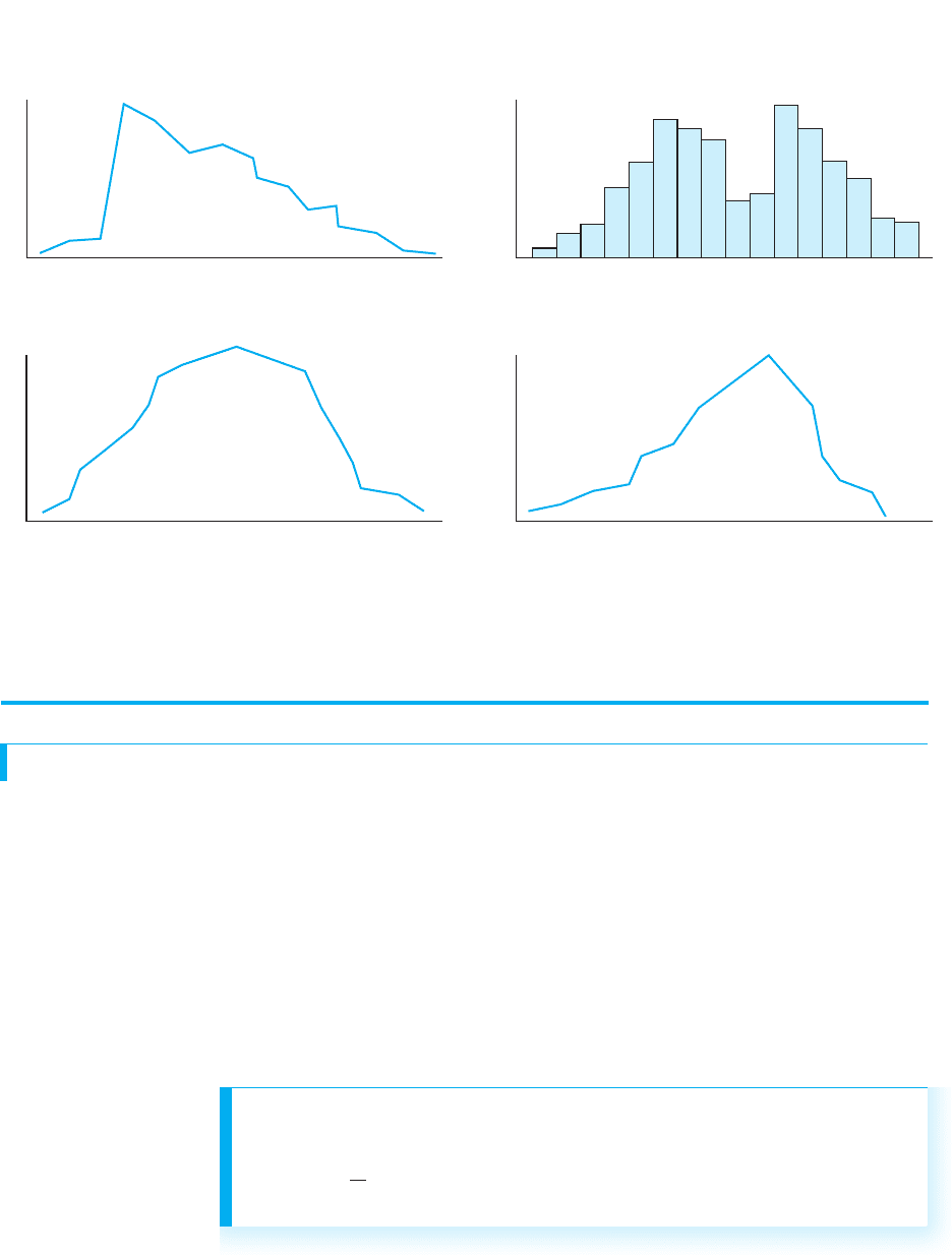
marizing and communicating their general shape. For example, Figure 3.8 contains
some frequency distributions that might be produced in research, and the correspon-
ding labels we might use. (Notice that we even apply these names to histograms or bar
graphs.) We assume that the sample represents a population that more closely fits the
corresponding ideal polygon: If we measure the population, the additional scores and
their corresponding frequencies should “fill in” the sample curve, smoothing it out to
be closer to the ideal curve.
Types of Simple Frequency Distributions 45
FIGURE 3.7
Idealized bimodal and
rectangular distributions
f
Low . . . Middle . . . High
Bimodal
scores
f
Low . . . Middle . . . High
Rectangular
scores

46 CHAPTER 3 / Frequency Distributions and Percentiles
A QUICK REVIEW
■
The most common frequency distributions are nor-
mal distributions, negatively or positively skewed
distributions, bimodal distributions, and rectangu-
lar distributions.
MORE EXAMPLES
The variable of intelligence (IQ) usually forms a
normal distribution: The most common scores are
in the middle, with higher or lower IQs occurring
progressively less often. If IQ was positively
skewed, there would be only one distinct tail, lo-
cated at the higher scores. If IQ was negatively
skewed, there would be only a distinct tail at the
lower scores. If IQ formed a bimodal distribution,
there would be two distinct parts of the curve con-
taining the highest-frequency scores. If IQ formed a
rectangular distribution, each score would have the
same frequency.
For Practice
1. Arrange the scores below from most frequent to
least frequent.
f
AB C D
FIGURE 3.8
Simple frequency distri-
butions of sample data
with appropriate labels
f
Low . . . Middle . . . High
Normal
scores
f
Low . . . Middle . . . High
Positively skewed
scores
f
Low . . . Middle . . . High
Bimodal
scores
f
Low . . . Middle . . . High
Negatively skewed
scores
continued
Relative Frequency and the Normal Curve 47
2. What label should be given to each of the following?
f f
f
f
Scores
(a)
Scores
(b)
Scores
(c)
Scores
(d)
Answers
1. C, B, A, D
2. a. positively skewed; b. bimodal; c. normal;
d. negatively skewed
RELATIVE FREQUENCY AND THE NORMAL CURVE
We will return to simple frequency distributions—especially the normal curve—throughout
the remainder of this course. However, counting the frequency of scores is not the only thing
we do. Another important procedure is to describe scores using relative frequency.
Relative frequency is the proportion of that is made up by a score’s simple frequency.
Recall that a proportion indicates a fraction of the total, so relative frequency indicates
the fraction of the entire sample that is made up by the times that a score occurs. Thus,
whereas simple frequency is the number of times a score occurs, relative frequency is the
proportion of time the score occurs. The symbol for relative frequency is
We’ll first calculate relative frequency using a formula so that you understand its
math, although later we’ll compute it using a different approach. Here is your first sta-
tistical formula.
rel. f.
N
The formula for computing a score’s relative frequency is
rel. f 5
f
N