Heiman G. Basic Statistics for the Behavioral Sciences
Подождите немного. Документ загружается.

338 CHAPTER 14 / The Two-Way Analysis of Variance
we do not need to perform post hoc comparisons (it must be that the mean for males
differs significantly from the mean for females). If, however, a significant factor B had
more than two levels, you would compute the HSD using the and in that factor and
compare the differences between these main effect means as we did above.
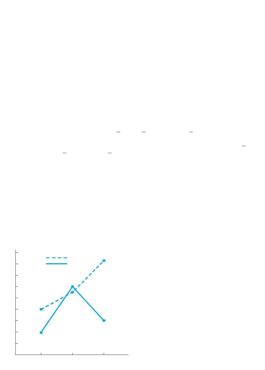
Graphing the Interaction Effect
An interaction can be a beast to interpret, so always graph it! As usual, place the
dependent variable along the axis. To produce the simplest graph, place the factor
with the most levels on the axis. You’ll show the other factor by drawing a separate
line on the graph for each of its levels.
Thus, we’ll label the axis with our three volumes. Then we plot the cell means.
The resulting graph is shown in Figure 14.2. As in any graph, you’re showing the rela-
tionship between the and variables, but here you’re showing the relationship
between volume and persuasiveness, first for males and then for females. Thus,
approach this in the same way that we examined the means back in Table 14.3. There,
we first looked at the relationship between volume and persuasiveness scores for males:
Their cell means are , , and Plot these three
means and connect the adjacent data points with straight lines. Then we looked at the
relationship between volume and scores for females: Their cell means are ,
, and Plot these means and connect their adjacent data points
with straight lines. (Note: Always provide a key to identify each line.)
The way to read the graph is to look at one line at a time. For males (the dashed line),
as volume increases, mean persuasiveness scores increase. However, for females (the
solid line), as volume increases, persuasiveness scores first increase but then decrease.
Thus, we see a linear relationship for males and a different, nonlinear relationship for
females. Therefore, the graph shows an interaction effect by showing that the effect of
increasing volume depends on whether the participants are male or female.
REMEMBER Graph the interaction by drawing a separate line that shows the
relationship between the factor on the axis and the dependent scores for
each level of the other factor.
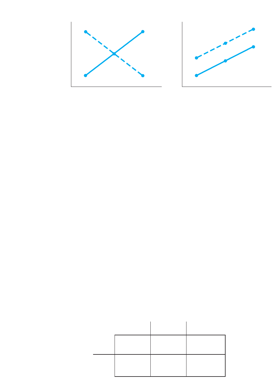
Note one final aspect of an interaction. An interac-
tion effect can produce an infinite variety of different
graphs, but it always produces lines that are not par-
allel. Each line summarizes a relationship, and a line
that is shaped or oriented differently from another line
indicates a different relationship. Therefore, when the
lines are not parallel they indicate that the relationship
between and changes depending on the level of
the second factor, so an interaction effect is present.
Conversely, when an interaction effect is not present,
the lines will be essentially parallel, with each line
depicting essentially the same relationship. To see this
distinction, say that our data had produced one of the
two graphs in Figure 14.3. On the left, as the levels of
A change, the mean scores either increase or decrease
depending on the level of B, so an interaction is pres-
ent. However, on the right the lines are parallel, so as
the levels of A change, the scores increase, regardless
YX
1Y2X
X
loud
5 6.X
medium
5 12
X
soft
5 4
X
loud
5 16.67.X
medium
5 11X
soft
5 8
YX
X
X
Y
kn
0
18
16
14
12
10
8
6
4
2
Soft
Volume of message
Male
Female
Mean persuasiveness
Medium Loud
FIGURE 14.2
Graph of cell means,
showing the interaction
of volume and gender
Interpreting the Two-Way Experiment 339
Interaction exists
Mean scores
A
1
No interaction exists
Mean scores
B
1
A
3
A
2
B
2
A
1
A
3
A
2
B
1
B
2
FIGURE 14.3
Two graphs showing
when an interaction is
and is not present
Factor A: Volume
A
1
:A
2
:A
3
:
Soft Medium Loud
B
1
:
Male X
苶
8 X
苶
11 X
苶
16.67
Factor B:
Gender
B
2
:
Female
X
苶
4 X
苶
12 X
苶
6
TABLE 14.10
Summary of Interaction
Means for Persuasiveness
Study
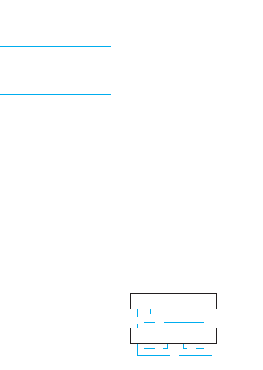
Horizontal and vertical lines
between two cells show
unconfounded comparisons;
diagonal lines show
confounded comparisons.
←⎯→
←⎯⎯⎯⎯⎯⎯⎯⎯⎯→
← ⎯ ⎯ ⎯ ⎯ ⎯ ⎯ ⎯ →
←⎯ ⎯→
←⎯⎯→
of the level of B. Therefore, this graph does not depict an interaction effect. (The fact
that, overall, the scores are higher in B
1
than in B
2
is the main effect of—difference due
to—factor B.)
Think of significance testing of the interaction as testing whether the lines are
significantly different from parallel. When an interaction is not significant, the lines
may represent parallel lines that would be found for the population. When an interac-
tion is significant, the lines we’d find in the population probably would not be parallel,
so there would be an interaction effect in the population.
REMEMBER An interaction effect is present when its graph produces lines
that are not parallel.
Performing Post Hoc Comparisons on the Interaction Effect
To determine which cell means in a interaction effect differ significantly, we usually
perform Tukey’s HSD procedure because we usually have equal cell ns. (Otherwise,
perform Fisher’s t-test.) However, we do not compare every cell mean to every other
cell mean. Look at Table 14.10. We would not, for example, compare the mean for
males at loud volume to the mean for females at soft volume. This is because we
would not know what caused the difference: The two cells differ in terms of both
gender and volume. Therefore, we would have a confused, or confounded, compari-
son. A confounded comparison occurs when two cells differ along more than one
factor. When performing post hoc comparisons on an interaction, we perform only
unconfounded comparisons, in which two cells differ along only one factor. There-
fore, compare only cell means within the same column because these differences
result from factor B. Compare means within the same row because these differences
F
A3B
Factor A: Volume
A
1
:A
2
:A
3
:
Soft Medium Loud
B
1
:
Male
8.0 11 16.67
Factor B:
3.0 5.67
Gender
4.0
8.67
1.0 10.67
B
2
:
Female
4.0 12 6
8.0 6.0
2.0
HSD 7.47
TABLE 14.12
Table of the Interaction
Cells Showing the
Differences Between
Unconfounded Means
340 CHAPTER 14 / The Two-Way Analysis of Variance
result from factor A. Do not, however, make any diagonal
comparisons because these are confounded comparisons.
We have one other difference when performing the HSD on
an interaction, and that involves how we obtain . Previously,
we found in Table 6 (Appendix C) using k, the number of
means being compared. Each in the table is appropriate for
making all possible comparisons between k means, as in a
main effect. However, in an interaction we make fewer com-
parisons, because we only make unconfounded comparisons.
Therefore, we compensate for fewer comparisons by using an
adjusted k. Obtain the adjusted from Table 14.11 (or at the
beginning of Table 6 of Appendix C). In the left-hand column,
locate the design of your study. Our study is a or a
design. As a double-check, confirm that the middle column contains the num-
ber of cell means in the interaction: we have 6. In the right-hand column is the
adjusted k: for our study it is 5.
The adjusted k is the value of to use to obtain . Thus, for our study, in Table 6
(Appendix C), we look in the column labeled for k equal to 5. With and
, the . This is appropriate for the number of unconfounded com-
parisons that we’ll actually make.
Now compute the HSD using the usual formula. Our is 8.22, and the n in each
mean that we’re comparing right now is 3. So
Thus, the HSD for the interaction is 7.47.
Now determine the differences between all cell means vertically within each column
and horizontally within each row. To see these differences, arrange them as in
Table 14.12. On the line connecting two cells is the absolute difference between their
means. Only three differences are larger than the HSD and thus significant: (1) between
the mean for females at the soft volume and the mean for females at the medium vol-
ume, (2) between the mean for males at the soft volume and the mean for males at the
loud volume, and (3) between the mean for males at the loud volume and the mean for
females at the loud volume.
HSD 5 1q
k
2a
B
MS
wn
n
b5 14.512a
B
8.22
3
b5 7.47
MS
wn
q
k
q
k
5 4.51df
wn
5 12
5 .05
q
k
k
2 3 3
3 3 2
k
q
k
q
k
q
k
TABLE 14.11
Values of Adjusted k
Design of Number of Cell Adjusted
Study Means in Study Value of k
2 24 3
2 36 5
2 48 6
3 39 7
3 412 8
4 416 10
4 520 12
Interpreting the Two-Way Experiment 341
Interpreting the Overall Results of the Experiment
We report each using the same format as in the one-way ANOVA. Typically
we report the , the means and their significant differences, and the effect size for the
main effect of A, then for the main effect of B, and then for the interaction. (Include
nonsignificant effects as well.) Then, to interpret the results of the study, focus on the
means that differ significantly in each main effect and interaction. All of these differ-
ences found in the persuasiveness study are summarized in Table 14.13. Each line con-
necting two means indicates that they differ significantly. (Note: You may also compute
the confidence interval for the represented by any significant main effect mean or cell
mean. Use the formula in Chapter 13.)
Usually, the interpretation of a two-way study rests with the interaction, even when
main effects are significant. This is because the conclusions about main effects are
contradicted by the interaction. For example, our main effect means for gender suggest
that males score higher than females. However, in the interaction, we see that gender
F
F
obt
■
The graph of an interaction shows the relationship
between one factor on and dependent scores on
for each level of the other factor.
■
When performing Tukey’s HSD test on an interac-
tion effect, determine the adjusted value of k and
make only unconfounded comparisons.
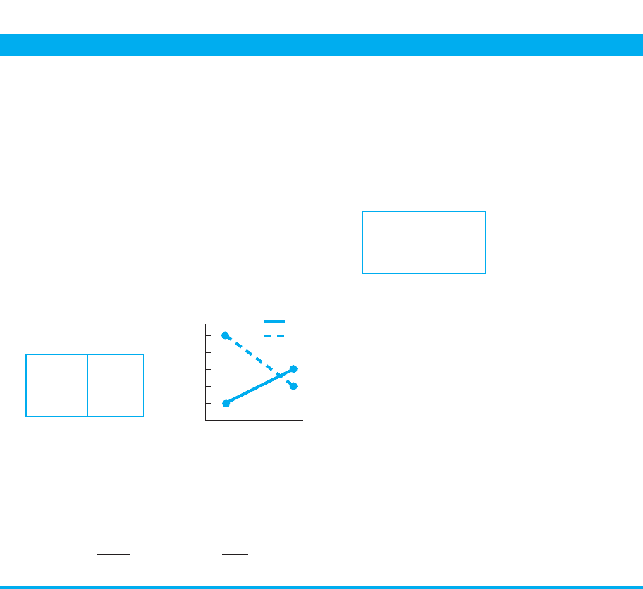
MORE EXAMPLES
We obtain the cell means on the left. To produce the
graph of the interaction on the right, we plot data
points at 2 and 6 for and connect them with the
solid line. We plot data points at 10 and 4 for and
connect them with the dashed line.
A
1
A
2
B
1
B
2
Say that , and the n per cell
is 5. For the HSD, from Table 14.11, the adjusted k is 3.
In Table 6 (Appendix C), at , the is 3.65.
Then
HSD 5 1q
k
2a
B
MS
wn
n
b5 13.652a
B
5.19
5
b5 3.72
q
k
5 .05
MS
wn
5 5.19df
wn
5 16
B
2
B
1
YX
The unconfounded comparisons involve subtracting the
means in each column and each row. All differences are
significant except when comparing 6 versus 4.
For Practice
We obtain the following data:
A
1
A
2
B
1
B
2
The , , and
1. The adjusted k is ___.
2. The is ___.
3. The HSD is ___.
4. Which cell means differ significantly?
Answers
1. 3
2. 3.77
3. 4.17
4. Only 12 versus 22 and 14 versus 22
q
k
n 5 4.MS
wn
5 4.89df
wn
5 12
A QUICK REVIEW
X
苶
2 X
苶
6
X
苶
10 X
苶
4
0
10
8
6
4
2
A
1
B
1
B
2
Mean score
A
2
X
苶
13 X
苶
14
X
苶
12 X
苶
22

342 CHAPTER 14 / The Two-Way Analysis of Variance
differences depend on volume: Only in the loud condition is there a significant differ-
ence between males and females. Therefore, because the interaction contradicts the pat-
tern suggested by the main effect, we cannot make an overall, general conclusion about
differences between males and females.
Likewise, the main effect of volume showed that increasing volume from soft to
medium and from soft to loud produced significant differences. However, the interac-
tion indicates that increasing the volume from soft to medium actually produced a sig-
nificant difference only for females, while increasing the volume from soft to loud
produced a significant difference only for males.
Thus, as above, usually you cannot draw clear conclusions about significant main
effects when the interaction is significant. After all, the interaction indicates that the
influence of one factor depends on the levels of the other factor and vice versa, so you
should not turn around and act like either factor has a consistent effect by itself. When
the interaction is not significant, then focus on any significant main effects. (For com-
pleteness, however, always perform the entire ANOVA for all main effects and the
interaction.)
REMEMBER The primary interpretation of a two-way ANOVA rests on the
interaction when it is significant.
Thus, we conclude that increasing the volume of a message beyond soft tends to
increase persuasiveness scores in the population, but this increase occurs for females
with medium volume and for males with loud volume. Further, we conclude that dif-
ferences in persuasiveness scores occur between males and females in the population
but only if the volume of the message is loud. (And, after all of the above shenanigans,
for all of these conclusions together, the probability of a Type I error in the study—the
experiment-wise error rate—is still )
Describing the Effect Size: Eta Squared
Finally, we again compute eta squared to describe effect size—the proportion of
variance in dependent scores that is accounted for by a variable. Compute a separate
eta squared for each significant main and interaction effect. The formula for eta
squared is
2
5
Sum of squares between groups for the effect
SS
tot
1
2
2
p 6 .05.
Factor A: Volume
Level A
1
: Level A
2
: Level A
3
:
Soft Medium Loud
Level B
1
:
Male
8.0 11 16.67
X
苶
11.89
Factor B:
Gender
Level B
2
:
Female
4.0 12 6
X
苶
7.33
X
苶
soft
6 X
苶
med
11.5 X
苶
loud
11.33
TABLE 14.13
Summary of Significant
Differences in the Persua-
siveness Study
Each line connects two
means that differ
significantly.

Summary of the Steps in Performing a Two-Way ANOVA 343
This says to divide the into the sum of squares for the factor, either , ,
or . Thus, for our factor A (volume), was 117.45 and was 412.28.
Therefore,
Thus, if we predict participants’ scores using the main effect mean of the volume con-
dition they were tested under, we can account for 28% of the total variance in persua-
siveness scores. Likewise, for the gender factor, is 93.39, so is : Predicting
the mean of their condition for male and female participants will account for 23% of
the variance in scores. Finally, for the interaction, is 102.77, so is : By
using the mean of the cell to predict a participant’s score, we can account for 25% of
the variance.
Recall that the greater the effect size, the more important the effect is in determin-
ing participants’ scores. Because each of the above has about the same size, they are
all of equal importance in understanding differences in persuasiveness scores in this
experiment. However, suppose that one effect accounted for only 1% of the total
variance. Such a small indicates that this relationship is very inconsistent, so it is
not useful or informative. Therefore, we should emphasize the other, larger signifi-
cant effects. In essence, if eta squared indicates that an effect was not a big deal in
the experiment, then we should not make a big deal out of it when interpreting the
experiment.
The effect size is especially important when dealing with interactions. The one
exception to the rule of always focusing on the significant interaction is when it has a
very small effect size. If the interaction’s effect is small (say, only .02), then although
the interaction contradicts the main effect, it is only slightly and inconsistently contra-
dictory. In such cases, you may focus your interpretation on any significant main
effects that had a more substantial effect size.
SUMMARY OF THE STEPS IN PERFORMING A TWO-WAY ANOVA
The following summarizes the steps in a two-way ANOVA:
1. Compute the : Compute ,,and for each main effect, the interaction, and
for within groups. Dividing each mean square between groups by the mean square
within groups produces each .
2. Find : For each factor or interaction, if is larger than , then there is a
significant difference between two or more means from the factor or interaction.
3. For each significant main effect: Perform post hoc tests when the factor has more
than two levels. Graph each main effect.
4. For a significant interaction effect: Perform post hoc tests by making only uncon-
founded comparisons. For the HSD, determine the adjusted k. Graph the effect by
labeling the axis with one factor and using a separate line to connect the cell
means from each level of the other factor.
5. Compute eta squared: Describe the proportion of variance in dependent scores
accounted for by each significant main effect or interaction.
6. Compute the confidence interval: This can be done for the represented by the
mean in any relevant level or cell.
X
F
crit
F
obt
F
crit
F
obt
MSdfSSFs
2
.25
2
A3B
SS
A3B
.23
2
B
SS
B
2
A
5
SS
A
SS
tot
5
117.45
412.28
5 .28
SS
tot
SS
A
SS
A3B
SS
B
SS
A
SS
tot

Recognize that, although there is no limit to the number of factors we can have in an
ANOVA, there is a practical limit to how many factors we can interpret. Say that we
added a third factor to the persuasiveness study—the sex of the speaker of the message.
This would produce a three-way ( ) ANOVA in which we compute an
for three main effects ( , , and ), for three two-way interactions ( , ,
and ), and for a three-way interaction ( )! (If significant, it indicates
that the two-way interaction between volume and participant gender changes, depend-
ing on the sex of the speaker.) If this sounds very complicated, it’s because it is very
complicated. Therefore, unless you have a very good reason for including many factors
in one study, it is best to limit yourself to two or, at most, three factors. You may not
learn about many variables at once, but what you do learn you will understand.
Using the SPSS Appendix As shown in Appendix B.8, SPSS will perform the com-
plete two-way between-subjects ANOVA. It also performs the HSD test, but only for
main effects. SPSS also computes the and for the levels of all main effects and
for the cells of the interaction, as well as computing the 95% confidence interval for
each mean. And, it graphs the means for the main effects and interaction.
s
2
X
X
A 3 B 3 CB 3 C
A 3 CA 3 BCBA
F
obt
3 3 2 3 2
PUTTING IT
ALL TOGETHER
344 CHAPTER 14 / The Two-Way Analysis of Variance
7. Interpret the experiment: Based on the significant main and/or interaction effects
and their values of , develop an overall conclusion regarding the relationships
formed by the specific means from the cells and levels that differ significantly.
Congratulations, you are getting very good at this stuff.
2
CHAPTER SUMMARY
1. A two-way, between-subjects ANOVA involves two independent variables, and all
conditions of both factors contain independent samples. A two-way, within-
subjects ANOVA is performed when both factors involve related samples. A two-
way, mixed-design ANOVA is performed when one factor has independent
samples and one factor has related samples.
2. In a complete factorial design, all levels of one factor are combined with all levels
of the other factor. Each cell is formed by a particular combination of a level from
each factor.
3. In a two-way ANOVA, we compute an for the main effect of A, for the main
effect of B, and for the interaction of .
4. The main effect means for a factor are obtained by collapsing across (combining
the scores from) the levels of the other factor. Collapsing across factor B produces
the main effect means for factor A. Collapsing across factor A produces the main
effect means for factor B.
5. A significant main effect indicates significant differences between the main effect
means, indicating a relationship is produced when we manipulate one indepen-
dent variable by itself.
6. A significant two-way interaction effect indicates that the cell means differ signifi-
cantly such that the relationship between one factor and the dependent scores
depends on the level of the other factor that is present. When graphed, an interac-
tion produces nonparallel lines.
A 3 B
F
obt

Review Questions 345
7. Perform post hoc comparisons on each significant effect having more than two
levels to determine which specific means differ significantly.
8. Post hoc comparisons on the interaction are performed for unconfounded compar-
isons only. The means from two cells are unconfounded if the cells differ along
only one factor. Two means are confounded if the cells differ along more than one
factor.
9. An interaction is graphed by plotting cell means on and the levels of one factor
on . Then a separate line connects the data points for the cell means from each
level of the other factor.
10. Conclusions from a two-way ANOVA are based on the significant main and inter-
action effects and upon which level or cell means differ significantly. Usually, con-
clusions about the main effects are contradicted when the interaction is significant.
11. Eta squared describes the effect size of each significant main effect and interaction.
X
Y
KEY TERMS
cell 320
collapsing 322
complete factorial design 320
confounded comparison 339
incomplete factorial design 320
main effect 321
MS
A3B
df
A3B
SS
A3B
MS
B
df
B
SS
B
MS
A
df
A
SS
A
F
A3B
F
B
F
A
main effect mean 322
two-way ANOVA 318
two-way, between-subjects
ANOVA 318
two-way interaction effect 325
two-way, mixed-design ANOVA 318
two-way, within-subjects ANOVA 318
unconfounded comparison 339
REVIEW QUESTIONS
(Answers for odd-numbered questions are in Appendix D.)
1. What are the two reasons for conducting a two-factor experiment?
2. Identify the following terms: (a) two-way design, (b) complete factorial, and (c) cell.
3. What is the difference between a main effect mean and a cell mean?
4. Which type of ANOVA is used in a two-way design when (a) both factors are
tested using independent samples? (b) One factor involves independent samples
and one factor involves related samples? (c) Both factors involve related samples?
5. (a) What is a confounded comparison, and when does it occur? (b) What is an
unconfounded comparison, and when does it occur? (c) Why don’t we perform
post hoc tests on confounded comparisons?
6. What does it mean to collapse across a factor?
7. For a ANOVA, describe the following in words: (a) the statistical hypothe-
ses for factor A, (b) the statistical hypotheses for factor B, and (c) the statistical
hypotheses for .
8. (a) What does a significant main effect indicate? (b) What does a significant
interaction effect indicate? (c) Why do we usually base the interpretation of a
two-way design on the interaction effect when it is significant?
A 3 B
2 3 2
346 CHAPTER 14 / The Two-Way Analysis of Variance
APPLICATION QUESTIONS
9. One more time, using a factorial design, we study the effect of changing the dose
for one, two, three, or four smart pills and test participants who are 10-, 15-, and
20-years old. We test ten participants in each cell. (a) Using two numbers,
describe this design. (b) When computing the main effect means for the factor of
dose, what will be the n in each group? (c) When computing the main effect
means for the factor of age, what will be the n in each group? (d) When perform-
ing Tukey’s HSD on the interaction, what will be the n?
10. (a) When is it appropriate to compute the effect size in a two-way ANOVA?
(b) For each effect, what does the effect size tell you?
11. Below are the cell means of three experiments. For each experiment, compute the
main effect means and decide whether there appears to be an effect of A, B,
and/or .
Study 1 Study 2 Study 3
A
1
A
2
A
1
A
2
A
1
A
2
B
1
B
1
B
1
B
2
B
2
B
2
12. In question 11, if you label the axis with factor A and graph the cell means,
what pattern will we see for each interaction?
13. After performing a ANOVA with equal ns, you find that all are signifi-
cant. What other procedures should you perform?
14. A design studies participants’ frustration levels when solving problems as a
function of the difficulty of the problem and whether they are math or logic prob-
lems. The results are that logic problems produce significantly more frustration
than math problems, greater difficulty leads to significantly greater frustration,
and difficult math problems produce significantly greater frustration than difficult
logic problems, but the reverse is true for easy problems. In the ANOVA in this
study, what effects are significant?
15. In question 14, say instead that the researcher found no difference between math
and logic problems, frustration significantly increases with greater difficulty, and
this is true for both math and logic problems. In the ANOVA in this study, what
effects are significant?
16. In an experiment, you measure the popularity of two brands of soft drinks (factor A),
and for each brand you test males and females (factor B). The following table shows
the main effect and cell means from the study:
Factor A
Level A
1
: Level A
2
:
Brand X Brand Y
Level B
1
:
Males
14 23
Factor B
Level B
2
:
Females
25 12
2 3 2
Fs3 3 4
X
814
82
10 5
510
24
12 14
A 3 B

Application Questions 347
(a) Describe the graph of the interaction when factor A is on the axis.
(b) Does there appear to be an interaction effect? Why? (c) What are the main
effect means and thus the main effect of changing brands? (d) What are the
main effect means and thus the main effect of changing gender? (e) Why will a
significant interaction prohibit you from making conclusions based on the main
effects?
17. A researcher examines performance on an eye–hand coordination task as a func-
tion of three levels of reward and three levels of practice, obtaining the following
cell means:
Reward
Low Medium High
Low 410 7
Practice Medium 5514
High 15 15 15
(a) What are the main effect means for reward, and what do they appear to
indicate about this factor? (b) What are the main effect means for practice, and
what do they appear to indicate? (c) Does it appear that there is an interaction
effect? (d) How would you perform unconfounded post hoc comparisons of the
cell means?
18. (a) In question 17, why does the interaction contradict your conclusions about the
effect of reward? (b) Why does the interaction contradict your conclusions about
practice?
19. A study compared the performance of males and females tested by either a male
or a female experimenter. Here are the data:
Factor A: Participants
Level A
1
: Level A
2
:
Males Females
68
Level B
1
: 11 14
Male Experimenter 917
10 16
919
Factor B: Experimenter
84
Level B
2
: 10 6
Female Experimenter 95
75
10 7
(a) Using , perform an ANOVA and complete the summary table.
(b) Compute the main effect means and interaction means. (c) Perform the
appropriate post hoc comparisons. (d) What do you conclude about the relationships
this study demonstrates? (e) Compute the effect size where appropriate.
5 .05
X