Heiman G. Basic Statistics for the Behavioral Sciences
Подождите немного. Документ загружается.

378 CHAPTER 15 / Chi Square and Other Nonparametric Procedures
■ ■ ■ SUMMARY OF
FORMULAS
1. The formula for chi square is
In a one-way chi square:
In a two-way chi square:
df 5 1Number of rows 2 121Number of columns 2 12
f
e
5
1Cell’s row total f
o
21Cell’s column total f
o
2
N
df 5 k 2 1
2
obt
5 © a
1f
o
2 f
e
2
2
f
e
b
2. The formula for the phi coefficient is
3. The formula for the contingency coefficient is
C 5
B
2
obt
N 1
2
obt
1C2
5
B
2
obt
N

Additional Statistical Formulas
A.1 CREATING GROUPED FREQUENCY DISTRIBUTIONS
In a grouped distribution, different scores are grouped together, and then the total
of each group is reported. For example, say that we measured the level of
anxiety exhibited by 25 participants, obtaining the following scores:
First, determine the number of scores the data span. The number spanned between
any two scores is
Thus, there is a span of 39 values between 41 and 3.
Next, decide how many scores to put into each group, with the same range of scores
in each. You can operate as if the sample contained a wider range of scores than is actu-
ally in the data. For example, we’ll operate as if these scores are from 0 to 44, spanning
45 scores. This allows nine groups, each spanning 5 scores, resulting in the grouped
distribution shown in Table A.1.
The group labeled 0–4 contains the scores 0, 1, 2, 3, and 4, the group 5–9 contains
5 through 9, and so on. Each group is called a class interval, and the number of scores
spanned by an interval is called the interval size. Here, the interval size is 5, so each
group includes five scores. Choose an interval size that is easy to work
with (such as 2, 5, 10, or 20). Also, an interval size that is an odd num-
ber is preferable because later we’ll use the middle score of the interval.
Notice several things about the score column in Table A.1. First, each
interval is labeled with the low score on the left. Second, the low score
in each interval is a whole-number multiple of the interval size of 5.
Third, every class interval is the same size. (Even though the highest
score in the data is only 41, we have the complete interval of 40–44.)
Finally, the intervals are arranged so that higher scores are located
toward the top of the column.
To complete the table, find the for each class interval by summing the
individual frequencies of all scores in the group. In the example, there
are no scores of 0, 1, or 2, but there are two 3s and five 4s. Thus, the 0–4
interval has a total of 7. For the 5–9 interval, there are two 5s, one 6, no
7s, one 8, and no 9s, so is 4. And so on.f
f
f
Number of scores 5 1High score 2 Low score21 1
3 4418 428
18223171226
2641540 4 65
4208153836
f, rel. f, or cf
A.1 Creating Grouped Frequency Distributions
A.2 Performing Linear Interpolation
A.3 The One-Way, Within-Subjects Analysis of Variance
379
ADDITIONAL STATISTICAL FORMULAS
A
The column on the left identifies the lowest
and highest score in each class interval.
Anxiety
Scores f rel. f cf
40–44 2 .08 25
35–39 2 .08 23
30–34 0 .00 21
25–29 3 .12 21
20–24 2 .08 18
15–19 4 .16 16
10–14 1 .04 12
5– 9 4 .16 11
0– 4 7 .28 7
㛬㛬㛬 㛬㛬㛬㛬
Total: 25 1.00
TABLE A.1
Grouped Distribution
Showing f, rel. f, and cf
for Each Group of
Anxiety Scores

Compute the relative frequency for each interval by dividing the for the interval
by . Remember, is the total number of raw scores (here, 25), not the number of class
intervals. Thus, for the 0–4 interval, equals 7/25, or .28.
Compute the cumulative frequency for each interval by counting the number of
scores that are at or below the highest score in the interval. Begin with the lowest inter-
val. There are 7 scores at 4 or below, so the for interval 0–4 is 7. Next, is 4 for the
scores between 5 and 9, and adding the 7 scores below the interval produces a of 11
for the interval 5–9. And so on.
Real versus Apparent Limits
What if one of the scores in the above example were 4.6? This score seems too large for
the 0–4 interval, but too small for the 5–9 interval. To allow for such scores, we consider
the “real limits” of each interval. These are different from the upper and lower numbers of
each interval seen in the frequency table, which are called the apparent upper limit and the
apparent lower limit, respectively. As in Table A.2, the apparent limits for each interval
imply corresponding real limits. Thus, for example, the interval having the apparent limits
of 40–44 actually contains any score between the real limits of 39.5 and 44.5.
Note that (1) each real limit is halfway between the lower apparent limit of one inter-
val and the upper apparent limit of the interval below it, and (2) the lower real limit of
one interval is always the same number as the upper real limit of the interval below it.
Thus, 4.5 is halfway between 4 and 5, so 4.5 is the lower real limit of the 5–9 interval
and the upper real limit of the 0–4 interval. Also, the difference between the lower real
limit and the upper real limit equals the interval size .
Real limits eliminate the gaps between intervals, so now a score such as 4.6 falls into
the interval 5–9 because it falls between 4.5 and 9.5. If scores equal a real limit (such
as two scores of 4.5), put half in the lower interval and half in the upper interval. If one
score is left over, just pick an interval.
The principle of real limits also applies to ungrouped data. Implicitly, each individ-
ual score is a class interval with an interval size of 1. Thus, when a score in an
ungrouped distribution is labeled 6, this is both the upper and the lower apparent lim-
its. However, the lower real limit for this interval is 5.5, and the upper real limit is 6.5.
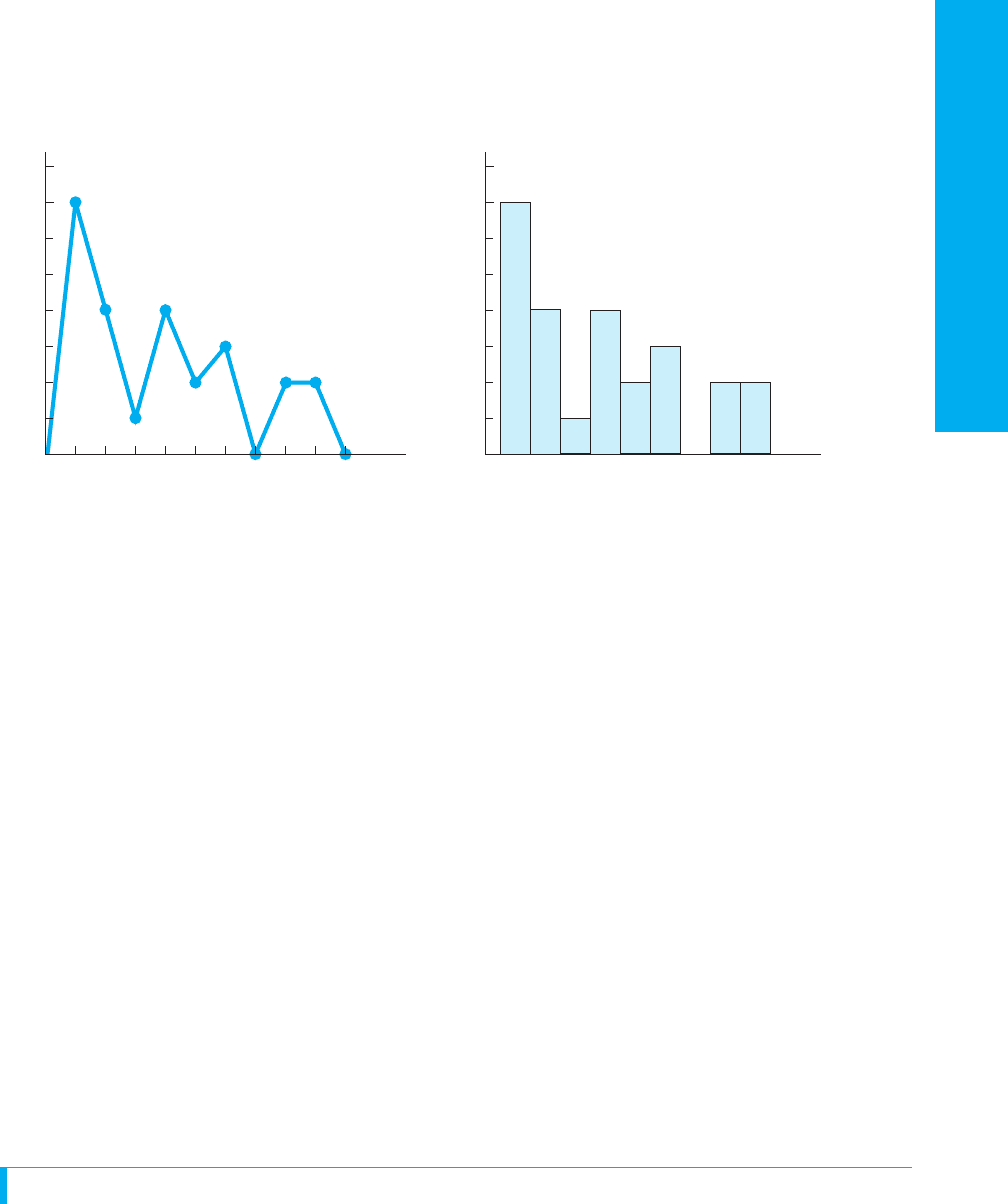
Graphing Grouped Distributions
Grouped distributions are graphed in the same way as ungrouped distributions, except
that the X axis is labeled differently. To graph simple frequency or relative frequency,
label the X axis using the midpoint of each class interval. To find the
midpoint, multiply times the interval size and add the result to the
lower real limit. Above, the interval size is 5, which multiplied
times is 2.5. For the 0–4 interval, the lower real limit is .
Adding 2.5 to yields 2. Thus, the score of 2 on the X axis iden-
tifies the class interval of 0–4. Similarly, for the 5–9 interval, 2.5
plus 4.5 is 7, so this interval is identified using 7.
As usual, for nominal or ordinal scores create a bar graph,
and for interval or ratio scores, create a histogram or polygon.
Figure A.1 presents a histogram and polygon for the grouped
distribution from Table A.1. The height of each data point or bar
corresponds to the total simple frequency of all scores in the class
interval. Plot a relative frequency distribution in the same way,
except that the Y axis is labeled in increments between 0 and 1.
2.5
2.5.5
.5
19.5 2 4.5 5 52
cf
fcf
rel. f
NN
f
380 APPENDIX A / Additional Statistical Formulas
The apparent limits in the column on the left
imply the real limits in the column on the right.
Apparent Limits Real Limits
(Lower–Upper) Imply (Lower–Upper)
40–44 → 39.5–44.5
35–39 → 34.5–39.5
30–34 → 29.5–34.5
25–29 → 24.5–29.5
20–24 → 19.5–24.5
15–19 → 14.5–19.5
10–14 → 9.5–14.5
5– 9 → 4.5– 9.5
0– 4 → ⫺0.5– 4.5
TABLE A.2
Real and Apparent Limits
Application Questions
(Answers for odd-numbered questions are in Appendix D.)
1. Organize the scores below into an ungrouped distribution showing simple
frequency, cumulative frequency, and relative frequency.
49 52 47 52 52 47 49 47 50
51 50 49 50 50 50 53 51 49
2. Using an interval size of 5, group these scores and construct a table that shows sim-
ple, relative, and cumulative frequency. The highest apparent limit is 95.
76 66 80 82 76 80 84 86 80 86
85 87 74 90 92 87 91 94 94 91
94 93 57 82 76 76 82 90 87 91
66 80 57 66 74 76 80 84 94 66
3. Using an interval size of 4, group these scores and construct a table showing
simple, relative, and cumulative frequency. The lowest apparent limit is 100.
122 117 116 114 110 109 107
105 103 102 129 126 123 123
122 122 119 118 117 112 108
117 117 126 123 118 113 112
A.2 PERFORMING LINEAR INTERPOLATION
This section presents the procedures for linear interpolation of z-scores as discussed in
Chapter 6 and of values of as discussed in Chapter 11.t
crit
A.2 Performing Linear Interpolation 381
ADDITIONAL STATISTICAL FORMULAS
0
Anxiety scores
(midpoints of class intervals)
Anxiety scores
(midpoints of class intervals)
8
7
6
5
4
3
2
1
f
8
7
6
5
4
3
2
1
f
Histogram
Polygon
2 7 12 17 22 27 32 37 42 47 0 2 7 12 17 22 27 32 37 42
FIGURE A.1
Grouped frequency polygon and histogram

Interpolating from the z-Tables
You interpolate to find an exact proportion not shown in the z-table or when dealing with
a z-score that has three decimal places. Carry all computations to four decimal places.
Finding an Unknown z-Score
Say that we seek a z-score that corresponds to exactly of the curve between
the mean and z. First, from the z-tables, identify the two bracketing proportions that are
above and below the target proportion. Note their corresponding z-scores. For ,
the bracketing proportions are at and at . Arrange
the values this way:
Known Unknown
Proportion under Curve z-score
Upper bracket .4505 1.6500
Target .4500 ?
Lower bracket .4495 1.6400
Because the “known” target proportion is bracketed by and , the
“unknown” target z-score falls between 1.6500 and 1.6400.
First, deal with the known side. The target of is halfway between and
. That is, the difference between the lower known proportion and the target
proportion is one-half of the difference between the two known proportions. We
assume that the z-score corresponding to is also halfway between the two
bracketing z-scores of 1.6400 and 1.6500. The difference between these z-scores is
, and one-half of that is . To go to halfway between 1.6400 and 1.6500, we
add to 1.6400. Thus, a z-score of 1.6450 corresponds to of the curve
between the mean and .
The answer will not always be as obvious as in this example, so use the following
steps.
Step 1 Determine the difference between the upper and lower known brackets. In the
example . This is the total distance between the two proportions.
Step 2 Determine the difference between the known target and the lower known
bracket. Above, .
Step 3 Form a fraction with the answer from Step 2 as the numerator and the answer
from Step 1 as the denominator. Above, the fraction is . Thus,
is one-half of the distance from to .
Step 4 Find the difference between the two brackets in the unknown column. Above,
. This is the total distance between the two z-scores that
bracket the unknown target z-score.
Step 5 Multiply the answer in Step 3 by the answer in Step 4. Above, .
The unknown target z-score is larger than the lower bracketing z-score.
Step 6 Add the answer in Step 5 to the lower bracketing z-score. Above,
. Thus, of the normal curve lies between
the mean and .z 5 1.645
.45001.640 5 1.645.005 1 1.640 5 1.645
.005
1.521.01025 .005
1.6500 2 1.6400 5 .010
.4505.4495
.4500.0005>.0010 5 .5
.4500 2 .4495 5 .0005
.4505 2 .4495 5 .0010
z
.4500.005
.005.010
.4500
.4505
.4495.4500
.4495.4505
z 5 1.6400.4495z 5 1.6500.4505
.4500
.45 1.45002
382 APPENDIX A / Additional Statistical Formulas

Finding an Unknown Proportion
Apply the above steps to find an unknown proportion for a known three-decimal
z-score. For example, say that we seek the proportion between the mean and a z of
1.382. From the z-tables, the upper and lower brackets around this z are 1.390 and
1.380. Arrange the z-scores and corresponding proportions as shown below:
Known Unknown
z-score Proportion under Curve
Upper bracket 1.390 .4177
Target 1.382 ?
Lower bracket 1.380 .4162
To find the target proportion, use the preceding steps.
Step 1
This is the total difference between the known bracketing z-scores.
Step 2
This is the distance between the lower known bracketing z-score and the target z-score.
Step 3
This is the proportion of the distance that the target z-score lies from the lower bracket.
A of 1.382 is of the distance between 1.380 and 1.390.
Step 4
The total distance between the brackets of and in the unknown column is
.
Step 5
Thus, of the distance separating the bracketing proportions in the unknown column
is .
Step 6
Increasing the lower proportion in the unknown column by takes us to the point
corresponding to of the distance between the bracketing proportions. This point is
, which is the proportion that corresponds to .
Interpolating Critical Values
Sometimes you must interpolate between the critical values in a table. Apply the same
steps described above, except now use degrees of freedom and critical values.
For example, say that we seek the corresponding to 35 (with , two-
tailed test). The -tables have values only for 30 and 40 , giving the following:
Known Unknown
df Critical Value
Upper bracket 30 2.042
Target 35 ?
Lower bracket 40 2.021
dfdft
␣ 5 .05dft
crit
z 5 1.382.4165
.20
.0003
.4162 1 .0003 5 .4165
.0003
.20
10.20210.001525 .0003
.0015
.4162.4177
.4177 2 .4162 5 .0015
.20z
.002
.010
5 .20
1.382 2 1.380 5 .002
1.390 2 1.380 5 .010
A.2 Performing Linear Interpolation 383
ADDITIONAL STATISTICAL FORMULAS

Because 35 is halfway between 30 and 40 , the corresponding critical value is
halfway between 2.042 and 2.021. Following the steps described for z-scores, we have
Step 1
This is the total distance between the known bracketing .
Step 2
Notice a change here: This is the distance between the upper bracketing and the
target .
Step 3
This is the proportion of the distance that the target lies from the upper known
bracket. Thus, the of 35 is of the distance from 30 to 40.
Step 4
The total distance between the bracketing critical values of 2.042 and 2.021 in the
unknown column is .
The of 35 is .50 of the distance between the bracketing , so the target critical
value is .50 of the distance between 2.042 and 2.021, or of .
Step 5
Thus, of the distance between the bracketing critical values is .0105. Because
critical values decrease as increases, we are going from 30 to 35 , so subtract
from the larger value, 2.042.
Step 6
Thus, is the critical value for 35 at for a two-tailed test.
The same logic can be applied to find critical values for any other statistic.
Application Questions
(Answers for odd-numbered questions are in Appendix D.)
1. What is the z-score you must score above to be in the top 25% of scores?
2. Foofy obtains a z-score of 1.909. What proportion of scores are between her score
and the mean?
3. For , what is the two-tailed for ?
4. For , what is the two-tailed for ?
A.3 THE ONE-WAY, WITHIN-SUBJECTS ANALYSIS OF VARIANCE
This section contains formulas for the one-way, within-subjects ANOVA discussed in
Chapter 13. This ANOVA is similar to the two-way ANOVA discussed in Chapter 14,
so read that chapter first.
Assumptions of the Within-Subjects ANOVA
In a within-subjects ANOVA, either the same participants are measured repeatedly or
different participants are matched under all levels of one factor. (Statistical terminol-
ogy still uses the old fashioned term subjects instead of the more modern partici-
pants.) The other assumptions here are (1) the dependent variable is a ratio or interval
variable, (2) the populations are normally distributed, and (3) the population variances
are homogeneous.
df 5 55t
crit
␣ 5 .05
df 5 50t
crit
␣ 5 .05
␣ 5 .05dft 5 2.0315
2.042 2 .0105 5 2.0315
.0105
dfdfdf
.50
1.5021.02125 .0105
.021.50
dfsdf
.021
2.042 2 2.021 5 .021
.50df
df
5
10
5 .50
df
df
35 2 30 5 5
dfs
40 2 30 5 10
dfdfdf
384 APPENDIX A / Additional Statistical Formulas

Logic of the One-Way, Within-Subjects ANOVA
As an example, say that we’re interested in whether a person’s form of dress influences
how comfortable he or she feels in a social setting. On three consecutive days, we ask
each participant to act as a “greeter” for other people participating in a different experi-
ment. On the first day, participants dress casually; on the second day, they dress semi-
formally; on the third day, they dress formally. We test the very unpowerful of 5. At
the end of each day, participants complete a questionnaire measuring the dependent
variable of their comfort level while greeting people. Labeling the independent vari-
able of type of dress as factor A, the layout of the study is shown in Table A.3.
To describe the relationship that is present, we’ll find the mean of each level (col-
umn) under factor A. As usual, we test whether the means from the levels represent dif-
ferent . Therefore, the hypotheses are the same as in a between-subjects design:
Elements of the Within-Subjects ANOVA
Notice that this one-way ANOVA can be viewed as a two-way ANOVA: Factor A (the
columns) is one factor, and the different participants or subjects (the rows) are a second
factor, here with five levels. The interaction is between subjects and type of dress.
In Chapters 13 and 14, we computed the F-ratio by dividing by the mean square within
groups . This estimates the error variance , the variability among scores in
the population. We computed using the differences between the scores in each cell
and the mean of the cell. However, in Table A.3, each cell contains only one score. There-
fore, the mean of each cell is the score in the cell, and the differences within a cell are
always zero. Obviously, we cannot compute in the usual way.
Instead, the mean square for the interaction between factor A and subjects (abbrevi-
ated ) reflects the inherent variability of scores. Recall that an interaction
indicates that the effect of one factor changes as the levels of the other factor change. It
is because of the inherent variability among people that the effect of type of dress will
change as we change the “levels” of which participant we test. Therefore,
is our estimate of the error variance, and it is used as the denominator of the -ratio.
(If the study involved matching, each triplet of matched participants would provide the
F
MS
A3subs
MS
A3subs
MS
wn
MS
wn
1σ
2
error
21MS
wn
2
H
a
: Not all s are equal
H
0
:
1
5
2
5
3
s
N
A.3 The One-Way, Within-Subjects Analysis of Variance 385
ADDITIONAL STATISTICAL FORMULAS
Factor A: Type of Dress
Level A
1
: Level A
2
: Level A
3
:
Casual Semiformal Formal
1XXX
2XXX
Su
Factor
bjects
3XXX
4XXX
5X
苶
XX
X
苶
A
1
X
苶
A
2
X
苶
A
3
TABLE A.3
One-Way Repeated-
Measures Study of the
Factor of Type of Dress
Each X represents a par-
ticipant’s score on the
dependent variable of
comfort level.

scores in each row, and the here would still show the variability among
their scores.)
As usual, describes the difference between the means in factor A, and it estimates
the variability due to error plus the variability due to treatment. Thus, the F-ratio here is
If is true and all s are equal, then both the numerator and the denominator will
contain only , so will equal 1. However, the larger the , the less likely it is
that the means for the levels of factor A represent one population . If is signifi-
cant, then at least two of the means represent different .
Computing the One-Way, Within-Subjects ANOVA
Say that we obtained these data:
Factor A: Type of Dress
Level A
1
: Level A
2
: Level A
3
:
Casual Semiformal Formal
1 491©X
sub
⫽ 14
2 6123©X
sub
⫽ 21
Subjects 3 844©X
sub
⫽ 16
4 285©X
sub
⫽ 15
5 10 7 2 ©X
sub
⫽ 19
Total:
©X ⫽ 30 ©X ⫽ 40 ©X ⫽ 15 ©X
tot
⫽ 30 ⫹ 40 ⫹ 15 ⫽ 85
©X
2
⫽ 220 ©X
2
⫽ 354 ©X
2
⫽ 55 ©X
2
tot
⫽ 220 ⫹ 354 ⫹ 55 ⫽ 629
n
1
⫽ 5 n
2
⫽ 5 n
3
⫽ 5 N ⫽ 15
X
苶
1
⫽ 6 X
苶
2
⫽ 8 X
苶
3
⫽ 3 k ⫽ 3
Step 1 Compute the , the , and the for each level of factor A (each column).
Then compute and . Also, compute , which is the for each partic-
ipant’s scores (each row). Notice that the and are based on the number of scores,
not the number of participants.
Then follow these steps.
Step 2 Compute the total sum of squares.
Nns
©X©X
sub
©X
2
tot
©X
tot
©X
2
X©X
s
F
obt
F
obt
F
obt
σ
2
error
H
0
Sample Estimates Population
F
obt
⫽
ᎏ
MS
M
A
S
⫻
A
subs
ᎏ
→
→
MS
A
MS
A3subs
386 APPENDIX A / Additional Statistical Formulas
σ
2
error
1 σ
2
treat
σ
2
error
The formula for the total sums of squares is
SS
tot
5 ©X
2
tot
2 a
1©X
tot
2
2
N
b

From the example, we have
Note that the quantity is the correction in the following computations.
(Here, the correction is 481.67.)
Step 3 Compute the sum of squares for the column factor, factor A.
1©X
tot
2
2
>N
SS
tot
5 629 2 481.67 5 147.33
SS
tot
5 629 2 a
85
2
15
b
A.3 The One-Way, Within-Subjects Analysis of Variance 387
Find in each level (column) of factor A, square the sum and divide by the n of the
level. After doing this for all levels, add the results together and subtract the correction.
In the example
Step 4 Find the sum of squares for the row factor, for subjects.
SS
A
5 545 2 481.67 5 63.33
SS
A
5 a
1302
2
5
1
1402
2
5
1
1152
2
5
b2 481.67
©X
Square the sum for each subject ( ). Then add the squared sums together. Next,
divide by , the number of levels of factor A. Finally, subtract the correction. In the
example,
Step 5 Find the sum of squares for the interaction. To do this, subtract the sums of
squares for the other factors from the total.
SS
subs
5 493 2 481.67 5 11.33
SS
subs
5
1142
2
1 1212
2
1 1162
2
1 1152
2
1 1192
2
3
2 481.67
k
©X
sub
The formula for the sum of squares between groups for factor A is
SS
A
5 © a
1Sum of scores in the column2
2
n of scores in the column
b2 a
1©X
tot
2
2
N
b
The formula for the sum of squares for subjects is
SS
subs
5
1©X
sub1
2
2
1 1©X
sub2
2
2
1
. . .
1 1©X
n
2
2
k
2
1©X
tot
2
2
N
The formula for the interaction of factor a by subjects is
SS
A3subs
5 SS
tot
2 SS
A
2 SS
subs
ADDITIONAL STATISTICAL FORMULAS