FTA (изд-во). Flexography: Principles And Practices. Vol.1-6
Подождите немного. Документ загружается.

Individual lines of type can be justified.
When using type, the designer should take
into account the aesthetics, as well as the
press characterization information provided.
The designer should consider the size of posi-
tive and reverse type, line weights of the type,
the number of colors used, registration toler-
ances and trapping type. Other factors to be
considered are the origin of fonts, text wrap,
outline or stroked type, attributes or styles
and special kerning specifications. Listed
below is an explanation of characteristics that
should be considered when selecting type.
Size. The minimum size of the type is based
on print segment and the press characteriza-
tion data. Six-point type for positive and 8 pt.
type for reverse or knockout copy are the
general industry standards for wide web.
Four-point type for positive copy and
six-point for reverse copy is commonly seen
in the narrow-web field. When dealing with
small type sizes, try to avoid typefaces with
serifs and delicate strokes.
Line Weight. The press characterization data
includes the minimum line weight that can
be printed and the minimum reverse line
that can be held open. Whether utilizing a
serif or sans serif font, these minimums can-
not be exceeded.
Color. Type should always be created with
the fewest possible number of colors. As a
rule, you should never use a combination of
more than three colors for type. Remember,
the looser the registration tolerances, the
fewer the colors; and the smaller the type,
the fewer the colors. Where colors overlap
to maintain register, related colors are
preferable to complementary colors because
the latter may produce an undesired third
color in the overlapping area. Where this
can’t be avoided, as when printing yellow
type matter within a solid blue field, the
undesirable discoloration around the letter-
ing may be minimized by printing the yellow
under the entire blue field if the color it cre-
ates is acceptable.
Logo colors are usually made up of spot
colors to achieve the customer’s color
requirements. If this approach is used, the
graphic file must have the logo color speci-
fied as a spot color and not a process color.
Registration. Although today’s sophisticated
presses are able to maintain fairly tight reg-
ister, it is still a good policy to avoid hairline
or butt register situations. Registration prob-
lems can occur anywhere that two or more
colors adjoin. Printing presses are not con-
sistently precise, due to the speed and force
with which the substrate is pulled through.
Even very small shifts in registration can
cause noticeable white gaps if not compen-
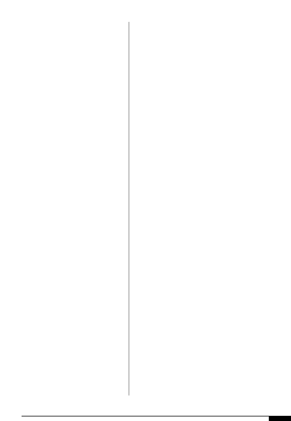
sated for (Figure
1*
). In wide web, 1/32" is
the accepted tolerance if a design is pre-
pared for a CI press. For a stack press, 1/16”
is preferred. Corrugated printers look for
1/4" whenever possible, while narrow-web
printers frequently work with less than 1/64".
If in doubt, the designer should talk to the
printer/converter’s production staff about
their equipment and personnel capabilities
(Table 4).
Trapping. It is very difficult to read type that
is made up of two or more colors and out of
register. With larger type sizes, a solid hold-
ing line is usually applied to the type to hide
any possible registration problems. Many
logos contain two words that are in different
colors. If these two colors are out of register,
the two words will overlap or misalign. A
distance that is at least twice the image trap
is recommended to separate different color
text (Figure
1(
). Applying a colored stroke
or outline to the type can trap computer-
generated fonts. The amount of the trap
applied to a font is dependent on the size of
the type, the kind of substrate being printed
on and other variables. As a rule, the smaller
the type, the smaller the trap that is required
to prevent distortion of the letterform
(Figure
2)
). The amount of trap required for
proper registration ordinarily depends on
• the type of printing press involved;
DESIGN 27
28 FLEXOGRAPHY: PRINCIPLES & PRACTICES
• the design intricacy;
• the substrate;
• the number of colors;
• the printability, flow, colors, and
• the opacity of the inks.
A central impression press may hold regis-
ter better than an in-line or stack press, espe-
cially on flexible webs and may need less
trap. A fine-line, six-color illustration on
coated stock might take a 0.030" trap, while
three or more times as much may be needed
in a poster-style illustration printed on kraft
stock. When printing related colors, a more
generous overlap may be acceptable than
when printing complementary colors.
Trapping complementary colors is likely to
cause an objectionable third color.
When transparent colors are overprinted
to produce second and third colors, butt reg-
ister is often necessary. In such cases, take
great care in handling color register. It’s
often wise to use outlines where the over-
printed colors touch to prevent the appear-
ance of misregister.
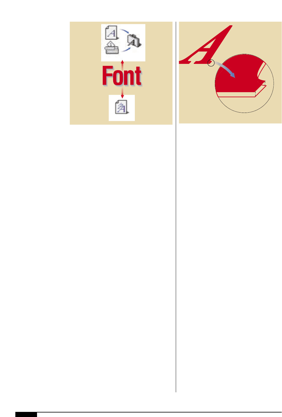
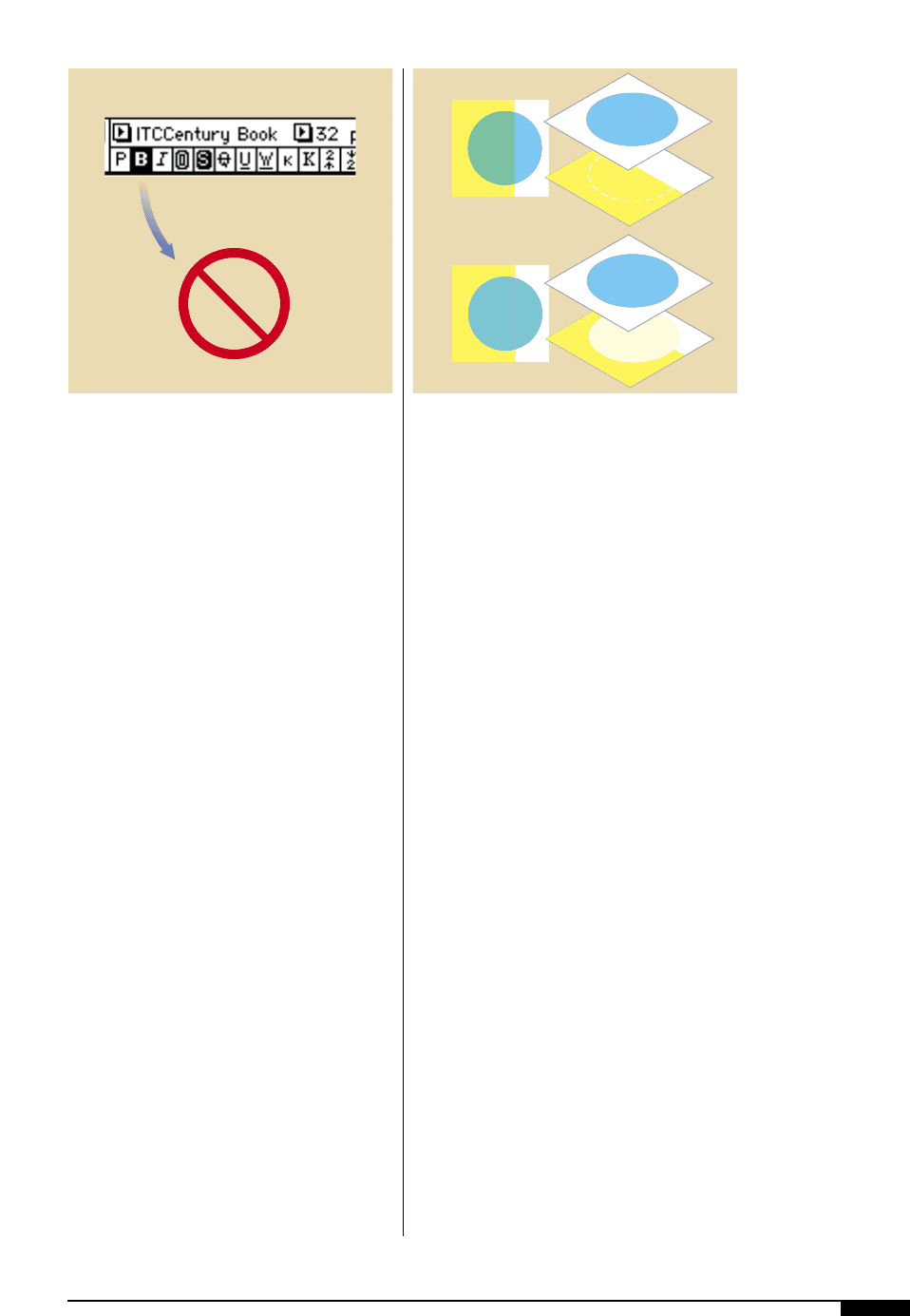
Origin of Fonts. There are thousands of type
fonts available in both TrueType and
PostScript formats. Though TrueType fonts
are prevalent in the desktop industry, they
do not always RIP (raster image process)
correctly, so they are generally not support-
ed and should be avoided. Type 1 PostScript
fonts are recognized as the industry stan-
dard and contain both an outline font (print-
er font) and screen font (bitmap font). When
using PostScript fonts, both files must be
installed on the output system. To ensure
that the fonts will output correctly, it is nec-
essary to include both the outline and screen
font with the file. If a design requires a
unique font, the designer should convert the
type to an outline. This is only recommend-
ed if it is a large type size and a minimal
amount of type (Figure
2!
).
Text Wrap. When automatic type wrap
options are on, text will reflow every time an
1*
Even if film is prepared
correctly, there are
often problems with
holding exact registra-
tion due to the substrate
stretching or shifting
during printing. Even
minute shifts can cause
visible problems.
No Trap
Misregistration
Good Registration
Trap
No Trap
Trap
1*
Table 4
DOES THE ARTWORK
REQUIRE TRAPPING
NO:
No colors
touch, or col-
ors that do
touch have a
common color
element (C,
M, Y or K).
DO-IT YOURSELF
OPTIONS:
■
Manual trapping:
Common controls
within graphic pro-
grams provide do-it-
yourself trapping,
once you’ve mas-
tered trapping con-
cepts.
■
Automatic trapping:
Some programs
include automatic
trapping features that
will make trapping
decisions for you.
While such programs
are sophisticated,
successful use of
these automatic fea-
tures requires some
knowledge of trap-
ping concepts and
familiarity with the
methods used by the
program. Also, they
cannot create traps in
art that has been
imported from anoth-
er application.
PREPRESS OPTIONS:
■
Manual trapping:
For a fee, the pre-
press provider will
prepare the traps
using the controls in
the graphics soft-
ware.
■
Automatic trapping
software: Many
prepress providers
use sophisticted
trapping software
that can automati-
cally trap artwork,
including imported
graphics.
■
Automatic trapping
during imageset-
ting: Some RIPS
automatically trap
files as they are out-
put, resulting in little
extra time or cost.
QUESTIONS TO ASK:
Which colors should spread
and which should choke?
Where do traps go?
How much trap is needed?
YES:
Colors that do
not share a
common ele-
ment (C, M, Y
or K) touch
each other in
this file
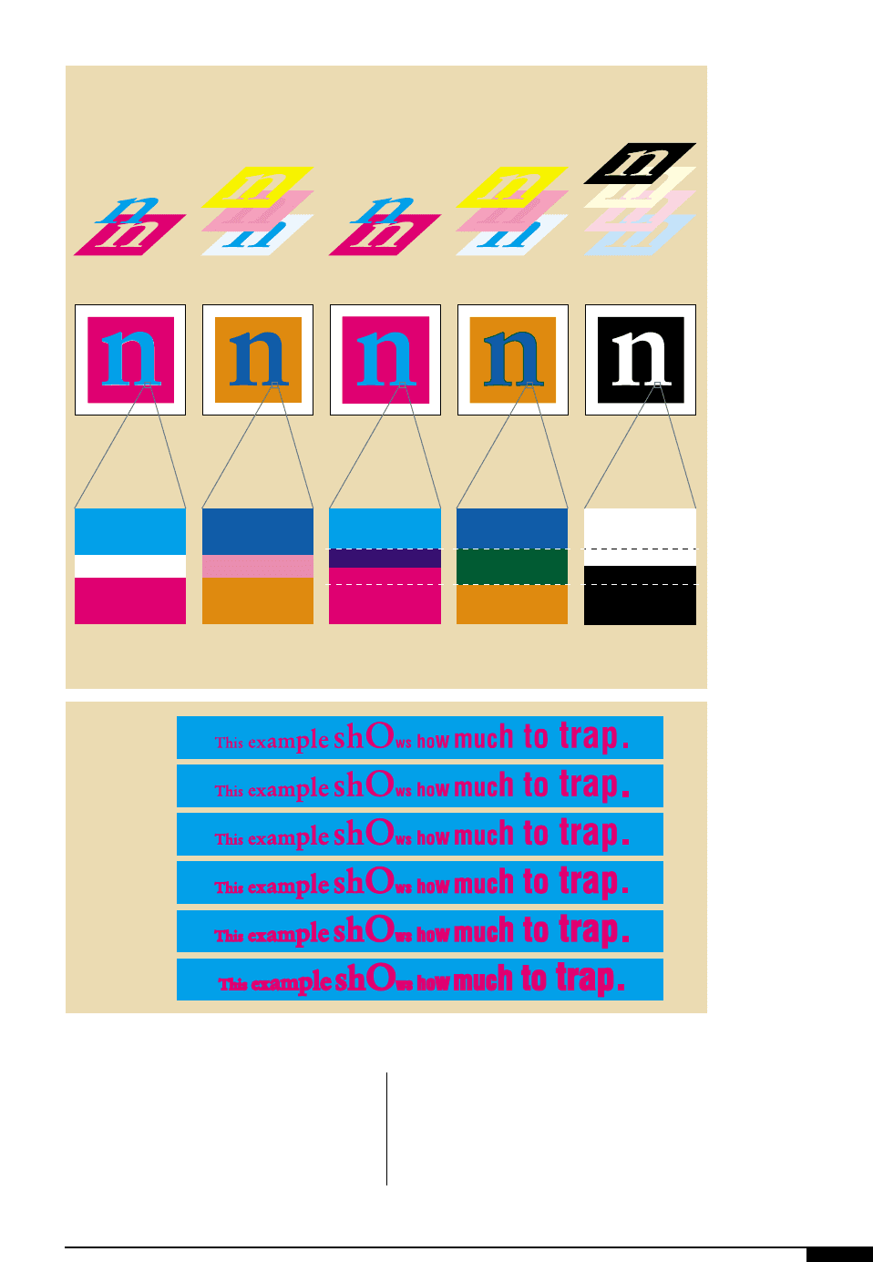
image is placed or replaced. If the image is an
FPO (for position only) and the separator
replaces it with the high-resolution image,
the text might reflow differently and the sep-
arator must then manually flow the text to
match the original design. Most software pro-
grams allow the user to create polygons for
the text to wrap around instead of the actual
image. When polygons are used, the text
does not reflow if the image is replaced.
DESIGN 29
1(
There are a variety
of ways that trapping
type can be handled
including top to bottom:
No trap, uncommon
colors; no trap,
common colors; trap,
uncommon colors; trap,
common colors; trap
with black.
2)
In the example shown
you can see how differ-
ent trap values affect the
serifs as the size of the
trap is increased.
100M
Paper
100C
No Trap,
Uncommon Colors
No Trap,
Common Colors
Trapping with
Uncommon colors
Trapping with
Common colors
Trapping with
Black
Full thickness of
the stroke traps
Half the thickness
of the stroke traps
8C 60M 100Y
100M
8C 60M
100C 100M
100C 60M
100C
30C 25M 20Y
100K
100K
Paper
8C 60M 100Y
100C 100M
100C 60M
1(
None
0.001 in.
.1 pt.
0.003 in.
.24 pt.
0.006 in.
.5 pt.
0.009 in.
.75 pt
0.012 in.
1.0 pt.
2)
30 FLEXOGRAPHY: PRINCIPLES & PRACTICES
Outline or Stroked Type. Thin outlines around
a tint should be in the same color as the tint
(Figure
2@
). If a trap outline is being creat-
ed, the line weight must be at least twice the
specified trap allowance because both the
background color and text color have to trap
to this outline. After the stroke has been
applied, it is important to verify that the
“counters” (holes in letters such as a, b, D
and R) or serif areas have not closed up. It is
best to not stroke large amounts of text as it
does make the file larger and slows down
the processing time.
It is recommended that when an artwork
file has an embedded EPS file containing
type, the text should be converted to paths
or outlines to avoid RIP conflicts. But con-
verting type to an outline is not recommend-
ed to resolve standard font conflicts. When a
typeface is converted to paths, the copy is no
longer editable and the conversion process
can degrade the quality of the text, especial-
ly small type sizes. If possible, it is better to
include all fonts (even those that reside in an
embedded EPS file) with the artwork file to
be output.
Attributes or Styles. The typefaces in a file
should never have an attribute or style
applied to them. Attributes and styles are
convenient tools available in most desktop
applications that can be used to modify type-
faces. When attributes are used on a font, it
will appear on the screen as a modified face,
and may even print to your proofing system
correctly, but it is not guaranteed that the
selected style will be applied to the typeface
upon output. It is always best to use the
actual fonts available in the software pro-
gram (Figure
2#
).
Special Kerning Specifications. Any modified
kerning, tracking tables or suitcases must be
supplied to the separator with the final
graphic file. Failure to do so will cause all of
the modified information to be ommited
from the final separated graphics.
Overprints
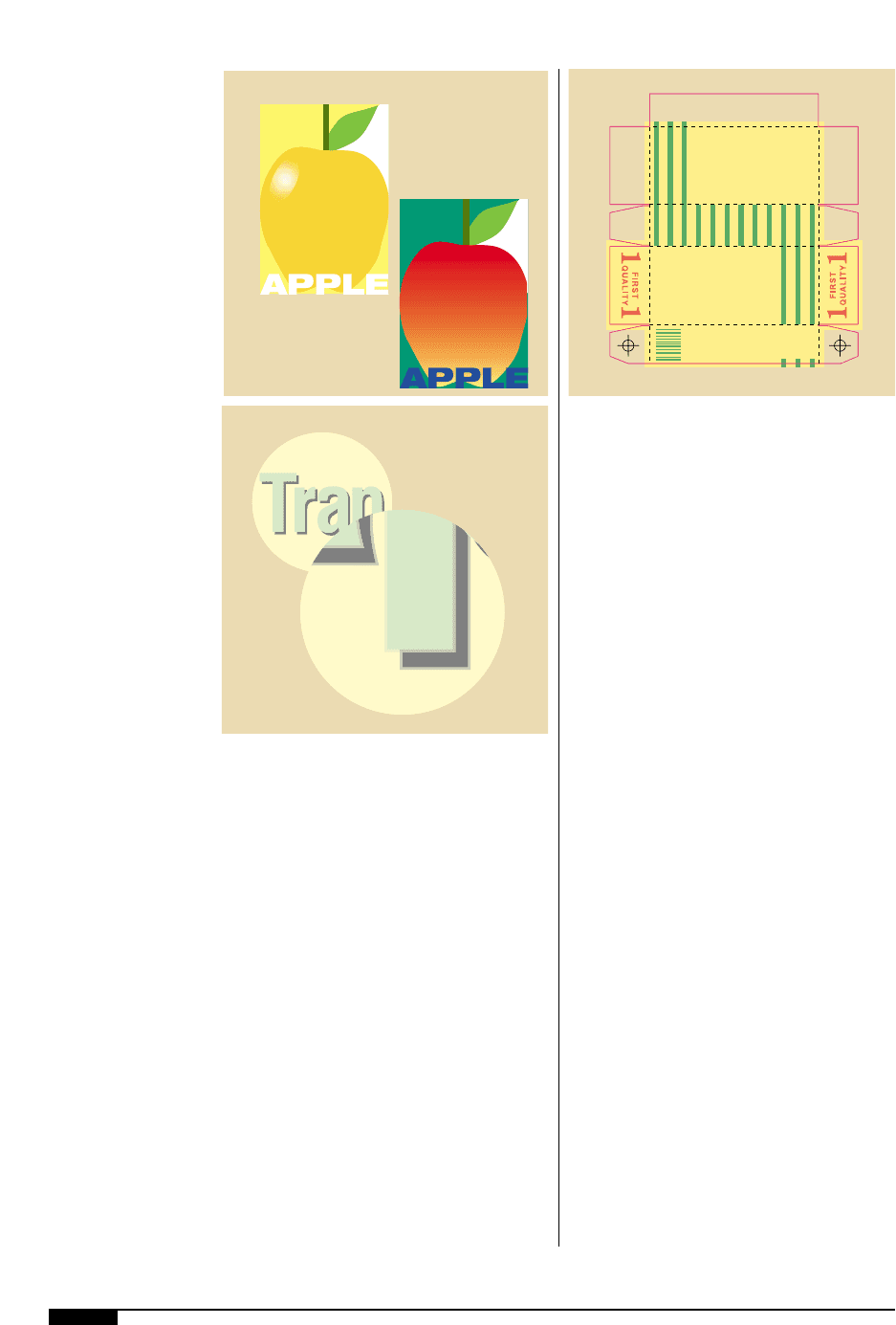
An overprint is when one solid color prints
on top of another solid color. Overprinting
graphic elements might seem like the perfect
solution for eliminating undesirable traps.
This is especially true when the designer
wants to use small graphics that are sur-
rounded by another color. The designer
should be aware of some overprint limita-
tions. Dark-colored graphics overprinting a
light color can work very well. On the other
hand, overprinting light colors on top of
darker colors can change the look and color
of the overprint to something undesirable –
think of a yellow printing on top of a cyan vs.
green overprinting cyan (Figure
2$
). When
2!
Font icons identify the
type of file (screen or
printer), the maker of
the font (foundry) and
whether it is TrueType
or PostScript.
2@
Outlines around type
should be the same
color as the body of
the text.
2@
PostScript Type 1 or 3
TrueType
2!
you overprint colors with shared inks, com-
mon ink values will not combine. Illustrator
has a filter called “trap hard” and trap soft”.
These filters can be used by the designer to
view a simulation of what an overprint will
look like when printed.
Trapping
Trapping is a major concern in the flexo-
graphic industry because of the unique reg-
istration tolerances on a flexographic press.
Trapping is used to compensate for any pos-
sible registration problems. The trapping
requirements used for flexography are often
larger than those used for an offset press.
Most designers are not required to build
traps into an artwork file and therefore are
unfamiliar with requirements for trapping.
However, it is important to be aware of how
much trap will be applied to the graphics so
that good design decisions can be made in
creating the graphics. Desktop application
software has tools or special features that
allow a designer to trap the artwork, but it is
usually the job of the separator to build trap-
ping into an artwork file.
Trapping is simply enlarging a print ele-
ment so that the edges that come into con-
tact with other elements overlap (overprint)
by a specified amount. The amount of trap-
ping required for an artwork file varies from
press to press. Each press has a set of toler-
ances and operating parameters. The trap
radius is one of the tolerances that a flexo-
graphic press should be characterized or fin-
gerprinted for and then applied to all art-
work that will be printed on that press.
Trapping is a necessary stage in the prepress
process that compensates for the registra-
tion tolerance of a printing press.
Trapping can change the appearance of art-
work. Some colors create dark lines where
they overprint another color (Figure
2%
).
This dark line, the trap, then becomes a visi-
ble element in the overall design and in some
cases can be distracting to the artwork’s
overall appearance. Sometimes the trap can
be modified to make it less obvious, but it
cannot be removed. It is in the basic design
of the artwork that trapping problems can be
avoided.
Vignettes and gradient fills can be difficult
to trap because of the gradual change of the
tint values that occur in a gradient fill. If the
vignette is trapping to an element that is a
100% solid color, the trap is easier to hide.
But if a design has a vignette abutting a sec-
ond vignette, the trapping can become much
more difficult and visually unappealing. With
some prepress systems, trapping vignettes
can even be impossible to do.
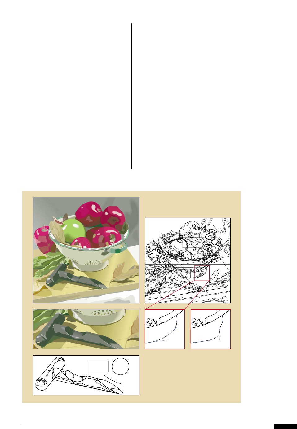
Drop shadows in a design are also difficult
DESIGN 31
2#
You should always
check to see that
typefaces do not have
an attribute or style
applied to them which
will modify the face
and could create prob-
lems upon output.
2$
Overprinting objects
without common ink
colors, combines the
ink values where the
objects overlap.
Overprinting objects
that share inks show
only the overprinted
color where the objects
overlap.
2#
50% M
60% C
20% Y
60% C
80% Y
80% Y
80% Y
60% C
80% Y
60% C
20% Y
2$
Design
32 FLEXOGRAPHY: PRINCIPLES & PRACTICES
to trap and tend to create some unusual
looking results on the final printed piece. An
example of unusual trapping would be a
bold typeface, colored in a pale green and
sitting on top of a 50% black drop shadow,
with the entire image on a background of a
pale yellow (Figure
2^
). The typeface would
be lighter than the drop shadow and would
have to spread into the shadow. The back-
ground yellow would have to spread into
both the shadow and the green type.
Die Lines
Most packaging graphics have to be
placed according to die-cut scores, cuts and
folds (Figure
2&
). Therefore, the final pack-
age must incorporate print-to-print and
print-to-cut (or fold) registration. Specifi-
cations for the positioning of graphics in
relation to the location of die-cut scores,
folds and cut line, will vary depending on the
press width and press type, and must be
adhered to by the designer.
Die lines can be requested from the die
maker’s CAD (computer-aided design) sys-
tem, usually as an EPS or Adobe Illustrator
file. The die lines from a CAD system will
accurately show all cuts, perforations and
score lines being made on the final project
from the die maker’s perspective. Die lines
require exact dimensional accuracy (for
example: 2.000, not 1.998 or 2.003 for a 2"
dimension).
Illustrations
Many tools available for a designer to cre-
ate illustrations. Many formats used to build
illustrations prove difficult to separate and
then print on press. Some of these difficul-
ties relate to the way the illustration was cre-
ated and some to the actual makeup of the
illustration. Thin lines, strokes, trapping,
gradations, pattern fills and other elements
can cause difficulty when trying to maintain
the integrity of the illustration on the flexo
press.
When selecting color for an illustration,
there is no limit. But a smart designer will
use one plate or a spot color to define the
2%
The trap line must be a
wider thickness and
overprint the original
object.
2^
Drop shadows are often
difficult to trap and can
create unusual looking
results on the final
package.
2&
Die lines provided by
the die maker will
ensure accurate
positioning of all
graphics to the cutting
and folding lines.
America’s Choice Butter
America’s
Choice
Butter
America’s
Choice
Butter
2&
2^
Page Designed
to Avoid Trapping
Page Which Will
Require Trapping
2%
stroke for the illustration. Two or more
plates can successfully define color areas
inside an illustration, but areas that are
defined in this manner should be chosen
carefully. Broad color areas that abut bold
strokes are more forgiving with press mis-
registration than small color areas that abut
thinner strokes. Another problem that can
occur when coloring an illustration is “gaps”.
Gaps can occur when a file is created in such
a way that an illustration’s strokes are
placed on top of color areas that contain
separate elements of the illustration. An area
that has an abutting or underlying color area
should be magnified to see that the elements
are flush with one another and that the color
areas are under the stroke.
Another culprit of gaps is an open path or
strokes with a color fill assigned to them.
Strokes should have no color fills assigned to
them. If the file is not void of gaps, problems
could occur during the trapping phase of the
artwork.
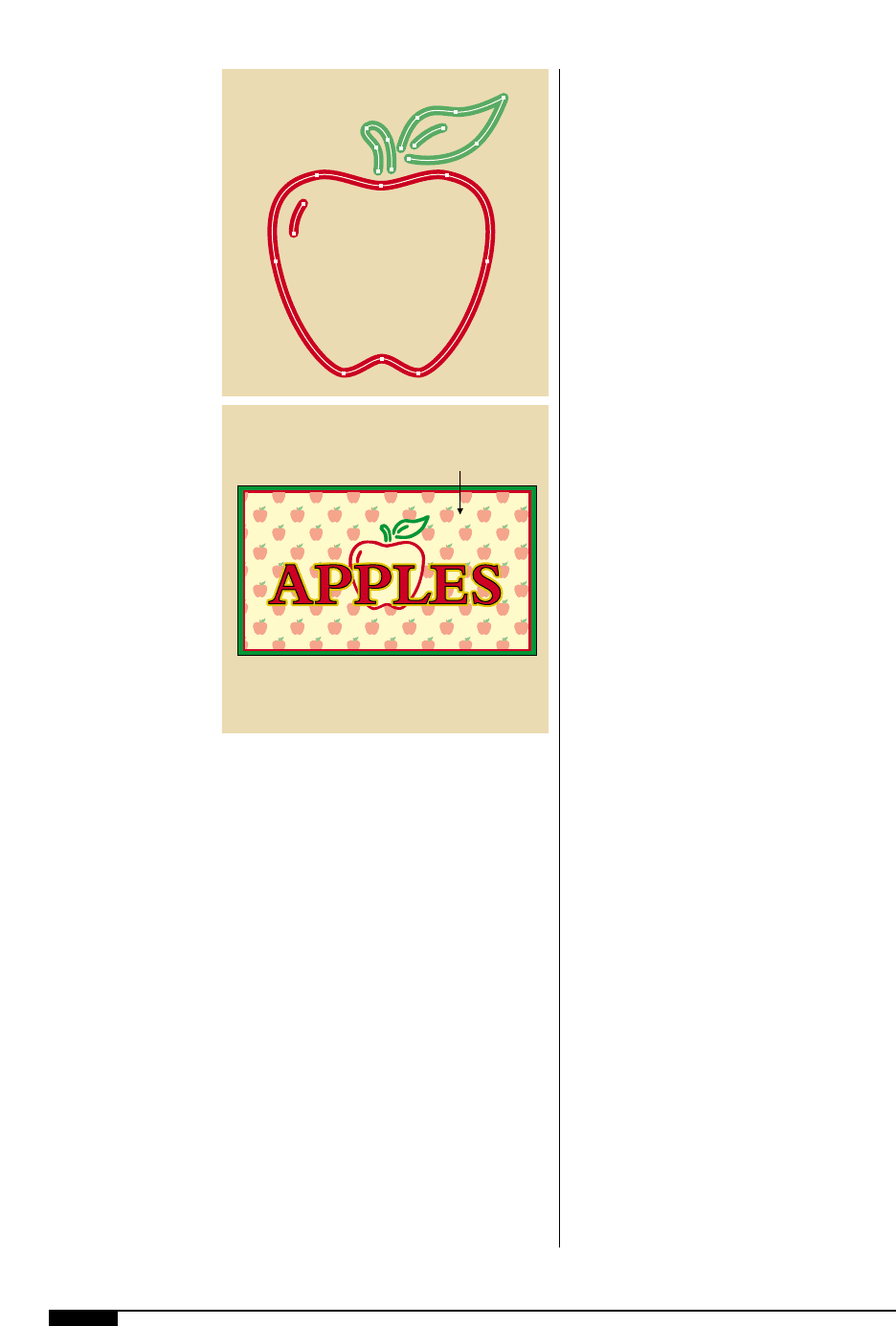
Object-oriented Artwork
Object-oriented graphics, also known as
vector graphics, are shapes such as curves
and line segments, mathematically defined
across an invisible grid. Simply using the
mouse to select and drag individual or
groups of control points can reshape object-
oriented graphics. Vector graphics are reso-
lution-independent, which means that they
can be printed or displayed at any resolution
that a printer or monitor is capable of
(Figure
2*
).
DESIGN 33
2*
Object-oriented images
are made up of drawn
objects such as circles,
squares, lines and
complex curves called
paths. Object-oriented
images are defined by
points which are used to
manipulate the image.
2*
34 FLEXOGRAPHY: PRINCIPLES & PRACTICES
Auto-trace and vector graphics. Should a
designer decide to create a design the “old-
fashioned” way by hand drawing with a pen
and ink or pencil, the illustration must be
scanned into the desktop environment. Once
scanned, the design is converted to line work
using a vector conversion application such as
Adobe Streamline or an autotracing feature
available in Adobe Illustrator or Macromedia
FreeHand. Autotracing and vector conver-
sions are not very accurate in recreating the
original image because additional points can
be added to a path. These additional points
can alter the shape of the original line, add
more data than is necessary and slow down
processing. It is crucial that settings are cor-
rectly used or the traced illustration may be
reproduced with an excessive amount of
control points along the illustration’s paths.
Artists should also try to avoid long, continu-
ous paths. Paths that are complex with many
points can cause problems during the pre-
press processing of the electronic file. The
cleanest lines are the lines created with the
fewest points (Figure
2(
).
Pattern Fill. A further consideration to be
taken into account when coloring an illus-
tration is pattern fill (Figure
3)
). Fills are
great looking, fun to work with, create
impressive results and are easy to use – truly
a designer’s dream come true! But, they can
be a production artist’s nightmare. Pattern
fills modify an electronic file’s integrity in
ways that are not evident to a designer. Still,
pattern fills make electronic files difficult, if
not impossible for many prepress systems to
process. Pattern fills should be avoided, or
before using, test the output of the pattern on
the output device. One of the processing
problems with pattern fills is that the RIP can
have difficulty interpreting the pattern data.
Sizing. At times, an illustration is reduced in
size after being created. For instance, an
illustration might be reduced to fit onto a
side panel of a package. This reduction can
cause problems with the printability of the
illustration. Line weights, type size and trap
areas may become smaller than the mini-
mum specifications.
Complexity. Some illustrations can be very
complex, containing many graphic elements
like patterns, gradations, colors, varying line
weights, text and more. When a separator is
working on this type of illustration, the lay-
ering of the elements can change, making it
very difficult for the separator to get all ele-
ments back into the correct layering order.
The illustrator should try to group “like”
objects together or elements within one
object together, to avoid this problem.
Bitmapped Graphics
A bitmapped image is defined pixel-by-
pixel and has a fixed resolution. (A pixel,
2(
To avoid problems
during the prepress
processing of electronic
files, the production
artist should simplify
paths.
3)
Fills are great looking,
fun to use and create
impressive results,
but they can cause
processing problems in
interpreting the pattern
data at the RIP.
2(
Pattern
Fill
3)
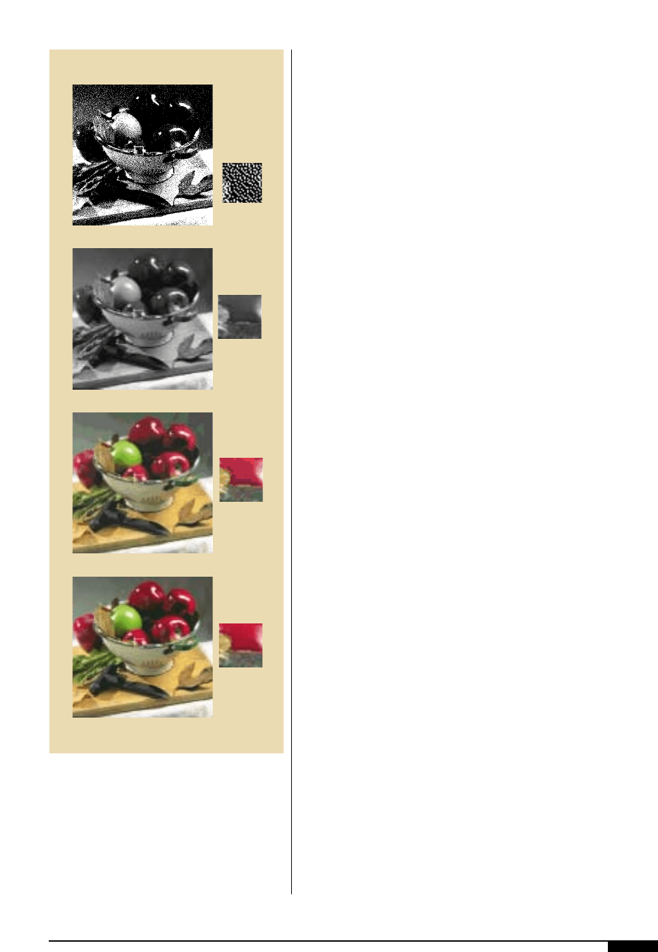
short for picture element, is a square of
color). Bitmapped artwork can be drawn,
painted or scanned onto the computer. The
simplest of computer graphics are defined by
one bit of data per pixel, which instructs the
computer to display a black dot or a white
dot. Color graphics utilize four to 24 bits of
data per pixel.
Resizing a bitmapped graphic changes the
size of the individual pixels. A 2" x 4" image
scanned at 72 dpi will look fine on the moni-
tor, but enlarging the image to fill the screen
will create an unsatisfying picture.
Printing bitmapped graphics can present
additional problems, which must be taken
into account during the preparation of the
file. Continuous-tone color or grayscale
images must be converted into halftones for
conventional printing. The final printed res-
olution and method of screening must be
known before a bitmapped image is created
(Figure
3!
).
Line Drawings and Clip Art
Drawings made up of solid lines are fre-
quently used in packaging design. The
designer can create the line drawings, hire
an illustrator for the job, or use clip art. Clip
art needs to be carefully evaluated and
selected if it is going to be used in the design.
Some clip art is of very good quality and is
saved in usable formats, while other types
can cause major problems. Before choosing
clip art the following should be checked:
• File format is one that can be easily
edited by the designer or separator,
such as a vector EPS.
• Pixel artwork saved at the correct reso-
lution, 300 dpi for printing.
• Artwork paths in clip art do not contain
an excessive number of points or prob-
lems could occur when the file is out-
put.
• Colors used in clip art can be easily com-
bined with the colors available on press.
Care must be taken to be certain that all
colors are converted to the color palette
available for the job.
Line Weight. Expect an increase in line
weight of positive lines and a decrease in
line weight of negative lines in the finer, nar-
DESIGN 35
3!
A 24-bit continuous-
tone image can be
depicted with up to 16.7
million colors, but the
size of the file will be
much larger than a
similar image created
with 8 bits per pixel.
3!
1-bit
8-bit (grayscale)
8-bit (indexed color)
24-bit (true color)
36 FLEXOGRAPHY: PRINCIPLES & PRACTICES
rower lines of illustrations, just as with
smaller type sizes. Compensate for this by
drawing positive fine lines slightly thinner
and reverse lines slightly heavier than the
line value desired in the final print. Line
thickness tolerances vary from press to
press, so it is necessary to refer to the press
characterization data for the line-weight
minimums (Figure
3@
). If you supply art
with a line weight less than the printers’
specifications, the separator will need to
make the line weights heavier to meet the
printers’ capabilities.
Dots. The same thing happens to dot sizes in
tints and screen values. According to your
own printing circumstances, compensate
about 10% to 20% for dot growth when
selecting screen values.
Be sure to consider the web direction and
linear direction of dots in tints, monotones
and duotones as they are applied to the art.
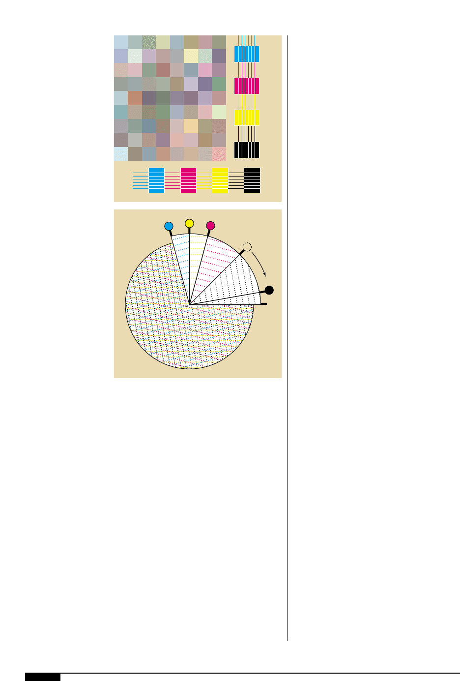
The cells of the anilox ink metering roll usu-
ally run 45° to the web direction. Therefore,
the direction of the dots in the screen should
be angled off those of the anilox roll to avoid
possible moiré patterns. A moiré pattern can
occur when two or more screen angles that
are too close to each other are used. When
screen angles conflict, they create a variety
of objectionable patterns instead of the tone
values you want (Figure
3#
).
PHOTOGRAPHY
When the designer takes part in planning
photography for the design, he/she can pro-
vide parameters that will ensure the suc-
cessful printing of any photograph.
Highlights. Offset photographers might try to
accentuate the highlight area of a product or
make the highlight a focal point of the image.
The same approach can be used with some
photos that will be printed flexo, but must be
carefully addressed. Remember that general-
ly, the smallest flexo dot that will print is 3%
and the 3% dot, with dot gain, will actually
print at around a 12% dot.
Shadow. The shadow area requires the same
considerations as the highlight area. Large
shadow areas could fill in. As a result, the
detail will be lost and the shadow area will
just appear dark.
Amount of detail. The clarity of the photo-
graph is directly related to the line screen at
which the photo will be printed. Clarity is
dependent upon the number and size of
objects and the amount of detail. For
instance, if an image is going to be printed at
175 lpi, the detail and small objects will have
clarity and look good. If the same image is
going to be printed at 100 lpi or 85 lpi, the
detail and small objects may not print as well.
Digital Photography. With digital photogra-
phy, the photographer can play the role of
3@
Typical line-weight
scale from a press
characterization target
used to determine
minimum capabilities.
3#
Examples of a moiré
pattern which occurs
when the angle of the
anilox roll is not taken
into consideration
before choosing
screen angles .
105°
90°
75°
10°
0°
3#
3@
