FTA (изд-во). Flexography: Principles And Practices. Vol.1-6
Подождите немного. Документ загружается.


or should at least influence, the product’s
position in the industry.
A Problem Solver
Training and an interest in problem solving
are both invaluable qualities. Obviously, the
design problem must be identified before it
can be solved. It’s at this point that curiosity
about the product, the marketplace and the
consumer generates the necessary input to
establish the client’s design requirements.
During this process, the designer must
thoughtfully sort the information obtained
from the client, sales and merchandising per-
sonnel, and from research material. Once this
is accomplished, and with visual priorities
established, the designer begins to translate
graphic needs into initial rough concepts.
Graphically Proficient
A designer with sound training in art and
education in design principles is well versed
in the terms and tools of the trade. The
designer must know and use various tech-
niques of artistic rendering, typography,
color theory and effective design concepts.
Today’s designer has many software pro-
grams available as tools to help with the cre-
ation of their ideas. There are programs for
three-dimensional product design, illustrat-
ing, photo retouching, painting and page lay-
out, just to name a few.
As in the past, all work should be pro-
duced with color separation, platemaking,
ink mixing and press operation in mind, if
the production art is to succeed. Familiarity
with all these production areas enables the
designer to intelligently present and discuss
the work with the production artist.
Client Oriented
The more a designer knows about the
client, along with product and sales objec-
tives, the easier it will be to organize the
design plan. Technical data about packaging
and labeling equipment, handling and dis-
play methods cut the time needed to arrive
at the best design solutions. Knowledge of
trade customs and competitive packaging
practices is also helpful in developing an
effective design concept.
Knowledge about the Consumer
Since the design’s goal is to gain the great-
est consumer acceptance of, and preference
for, the product, an intimate understanding
of the targeted consumer category is essen-
tial. Information is often supplemented by
“in-store” studies of behavior patterns and by
the use of focus groups.
DESIGN DEVELOPMENT
It is beneficial to establish ground rules and
procedures for creating and separating
designs before the actual production begins.
These ground rules need to take into account
production issues relating to the complexity
of potential graphics, prepress requirements,
press characteristics and other print methods
besides flexography that will be utilized.
Thorough planning greatly benefits the effi-
ciency, cost, quality and speed of transforming
a product idea into an “on the shelf” product.
Preproduction Meeting
Preproduction meetings should be planned
at the beginning stage of each project, with a
specific list of topics to be discussed. All of
the topics will require decision making at one
time or another during production. The most
productive and cost effective way to make
these decisions is early in the process in the
pre-production meeting. All portions of the
production process are addressed and
planned for during this meeting.
The designer should be thoroughly familiar
with the methods used by the production
artist and learn exactly how he/she plans to
prepare the finished electronic files for the
platemaker. Will the artwork be created in an
illustration program, or will photographic or
DESIGN 17

18 FLEXOGRAPHY: PRINCIPLES & PRACTICES
page layout software be used?
If process color is used, ink and color-
matching methods should be discussed to
avoid problems during the press run. Ask for
suggestions from the printer/converter’s art
and press personnel. Will there be color over-
prints? If tints and/or halftones are involved,
what screen count is the printer able to han-
dle and is his/her equipment outfitted prop-
erly? If tight color-to-color registration is
involved, can the printing presses hold it?
How many print stations and printing plate
cylinders are available (Table 2).
Press Characterization
Press characterization data encompasses
the process capabilities and requirements for
a specific press using certain materials and
settings. This information usually comes
from the printer or separator and varies from
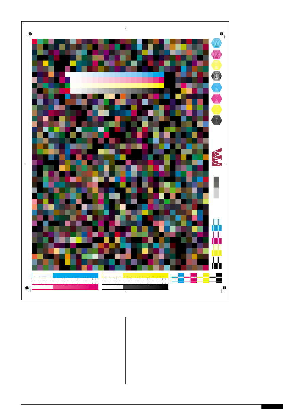
press to press. A press characterization tar-
get can be used to generate this information.
Many times a printer will utilize several
different combinations of materials (e.g. dif-
ferent plates, inks or substrates) on one
press and new press characterization data is
required each time the materials are varied.
The data provides a snapshot of the print
capabilities of the press utilizing those spe-
cific materials (Figure
1#
).
Once all the input has been evaluated, and
before the first line is drawn, the designer
must remember that the extent of the
design’s creative limits are governed by pro-
duction and equipment capabilities. Some of
these are:
• Print stations available on the flexo
press, which dictate the maximum num-
ber of colors needed to reproduce the
design.
• Effect of special printing procedures
such as web-reversal limits printing to
three-colors face and three-colors back
on a six-color printing press.
• Color sequence, especially when the
usual light-to-dark color progression is
changed for some reason.
• Hold-to-register tolerances that suit the
type of press to be used (CI, stack or
inline).
• Placement of large solid areas and fine
details such as small type, tints, fine fil-
igree or halftones in the same color
which should be avoided.
• Consideration of color-trap tolerances to
minimize color-to-color misregistration.
• If tight-registration is unavoidable, it
should be confined to a limited print
area whenever possible.
• Consideration of ink fill-in and distribu-
tion problems inherent in reverse print-
ing (copy reversed in a solid field).
• Use diagonal lines, curves, wavy and
irregular leading edges to minimize
press vibration and bounce, instead of
straight, hard-edged solids placed hori-
zontally across the web.
Packaging Specifications
Given their influence on the final result,
some other factors have to be taken into
account. These must meet exact specifica-
Table 2
The consumer product company’s representa-
tive usually calls this meeting but the design
firm, prepress provider(s), or the printer(s) can
also intitiate it. The meeting agenda should
include these items for discussion.
■ Design consideration
■ Design review
■ Specifications, dimensions
■ Number of colors
■ Film assembly
■ Trapping
■ Print control targets
■ Contract proof requirements
■ Timetable
■ On-press approvals
PREPRODUCTION MEETING
tions, preferably in a flat layout showing the
following design details:
• Location and size of package face, back,
gussets and/or any other surface to be
printed;
• Size and extent of folds, diecuts, slots,
perforations, seams and other impor-
tant features where they exist;
• Exact print areas;
• Product-fill height and/or contours
whenever they are essential to form;
• Color-matching names or numbers
and/or color swatches related to color
preference or standards where they
exist;
• Accurate package mock-up or complete
prototype; and
• Exact specifications on the size and
DESIGN 19
1#
The use of a characteri-
zation target can provide
a snapshot of the press-
es printing capabilities.
Pictured here is the
FIRST characterization
target available from the
Flexographic Technical
Association.
123456789101112131415161718192021222324252627282930313233343536373839404142
ABCDEFGHI JKLMNOP
3Electronic File Values 5 10 15 20 25 30 35 40
QRSTUVWX
45 50 55 60 70 80 90 100
3Cutback Values (film) 5 10 15 20 25 30 35 40 45 50 55 60 70 80 90 100
Y Z AA BB CC DD EE FF
M
C
Y
K
M
C
Y
K
024686 88 90 92 94 96 98 100 024686 88 90 92 94 96 98 100

20 FLEXOGRAPHY: PRINCIPLES & PRACTICES
location of all design units specified by
Federal Packaging and Labeling Acts
wherever they apply.
Substrates and Materials
Whether or not the design is to be pre-
pared on the actual substrate to be printed, a
sample of the material should be obtained so
colors and techniques can be evaluated
against the substrate. Since flexo printing is
done on paper, board, film, textiles, foil and
many other materials, the comprehensive
roughs can often be prepared on these sur-
faces, although they may require different
rendering techniques and art materials.
As far as substrates are concerned, the
designer must be alert to possible printing
problems. Some common substrate con-
cerns are listed in Table 3.
The designer familiar with the entire man-
ufacturing cycle will be able to use all of the
special features available only with flexo-
graphic printing.
The Point of Purchase
Many flexographic applications are for
consumer products sold at the retail level. A
valuable exercise for a designer, is a trip to a
display and sales area, which can provide
helpful insights. For example, notice the
type of retail outlet, location, the probable
shelf position and its height, lighting condi-
tions, store traffic and competitive practices.
In addition, the designer should sense the
store’s atmosphere, the shoppers’ tempo and
available time, and the benefit of advertising
recall in the area. This is where packaging
impact, identification and information are
measured.
If the package is meant for an industrial
item instead, such as 25- or 50-pound bags to
be packaged palletized and stockpiled in a
warehouse, the designer will benefit by visit-
ing the premises and personally checking
equipment and methods. The designer then
can determine whether product identifica-
tion through the use of names, color or sym-
bol coding should be placed in a conspicu-
ous location on the package so that items
can be more easily located. It also allows the
designer to visualize his or her proposed
design at work and will allow consideration
of intangibles that could give the design sub-
tle advantages.
The Consumer
Who will buy this product? What are the
buyer’s needs and preferences? Clients who
have already targeted a product for a particu-
lar market can provide some of this informa-
tion. But sometimes the designer may want to
go deeper. A natural curiosity about behav-
ioral patterns, buying habits and case histo-
ries from other projects often provides first-
hand information. Designers also can add
value to the design by projecting motivation
to the buyer.
Branded Products
Products are often part of a family of prod-
ucts or brands. If the intended design is sup-
posed to complement other items in the line,
Table 3
■ Images printed on thermoplastics should
usually be kept away from heat-seal areas.
■ Packages for certain food items frequently
require special inks; consider this in the
early stages.
■ Most plastics have a nonabsorbent surface
and may not readily accept and retain
printing ink.
■ Foil substrates present ink problems simi-
lar to those that occur when printing on
plastics.
■ Fine details should overprint solids (usual-
ly white) rather than on the bare plastic
surface. This leads to cleaner and crisper
print results and tends to minimize ink
problems such as fill-in and webbing.
PACKAGING SUBSTRATE
CONSIDERATIONS

or its package is a private label or national
brand, then that design has to be considered
in relation to the other products. Does it look
like another successful product line? Should
the newly designed product establish its own
image and value? The designer and client
must answer these questions together, based
on the overall merchandising program.
Graphic Objectives
After all the research is done, and after
reviewing the list of design requirements, it’s
helpful to think of the design project in
terms of some basic graphic objectives. This
can help to avoid undue concentration on
minor details and allow the designer to focus
attention on the more important principles.
Some objectives are:
Visual Message. At the outset, the designer
should know the primary design objectives.
• What must the design accomplish?
• Does the design motif suggest plea-
sure, excitement, celebration, good
taste, cleanliness, happiness, tradition
or other possible objectives?
• If the design is intended for a package
or label, will it best serve the product
by clearly identifying it?
• Is the design done in a style that will
appeal to the buyer? Is it sincere?
• Will the buyer select and use the prod-
uct with confidence because of the
newly designed package?
• If the design is used for packing cases
and shipping containers, will it function
well and be easy to handle?
• Does the design effectively identify the
manufacturer, producer or packer, and
does it discretely project the image that
this is another quality item from a
well-organized company?
Information and/or instructional copy for
pharmaceutical labels or packages is usually
brief, as is the case with just about any small
item. It’s imperative to keep the small type
legible. The choice of appropriate typefaces,
point sizes and layout can help promote
readable copy.
Product Personality. Projecting the true char-
acteristics and personality of the product
through thoughtful design is closely related
to the art of projecting a visual message.
Employing suitable graphic design, color
schemes, illustration techniques, photogra-
phy, typography and ink coverage in the
right balance and in the proper relationship
to the substrate emphasizes the true nature
of the product and its uses.
The design that takes advantage of all its
different parts can do a lot to help establish,
illustrate and describe the product. Carefully
selected elements can spell the difference
between an ordinary or extraordinary design.
Priority of Elements. Before making a final
choice on the design, the designer should
check the visual priorities of all the ele-
ments. In package, label or carton design, it’s
especially important that the viewer’s eye is
attracted to the most important elements.
There are many ways to emphasize these,
including color, size, space allocation, typog-
raphy, contrasting color values, shapes, illus-
trations, brand names and subject matter.
The ultimate design choice should have
the assurance that the parts are in proper
visual order and relate to each other under a
priority system. Elements should not com-
pete with one another for top billing.
A simple test of visual priority is to put
yourself in the buyer’s position and imagine
what information you most want to see.
Questions such as: What is it? What can it
do? Who makes it? How can I use it? Will it
fill my needs? What does it cost? Is it guar-
anteed or approved? will help establish the
right visual priorities. Of course, these prior-
ities will differ with each project.
DESIGN 21
22 FLEXOGRAPHY: PRINCIPLES & PRACTICES
Mechanics of
Design Preparation
U
ntil now, planning for the
design has been the main con-
cern. Obviously, the degree and
depth of planning is different
from one flexo application to
another. Some projects may
require less, while others may require more
intense and varied research before the
design concept is decided. The actual steps
in the preparation and presentation of the
design to the client are discussed below.
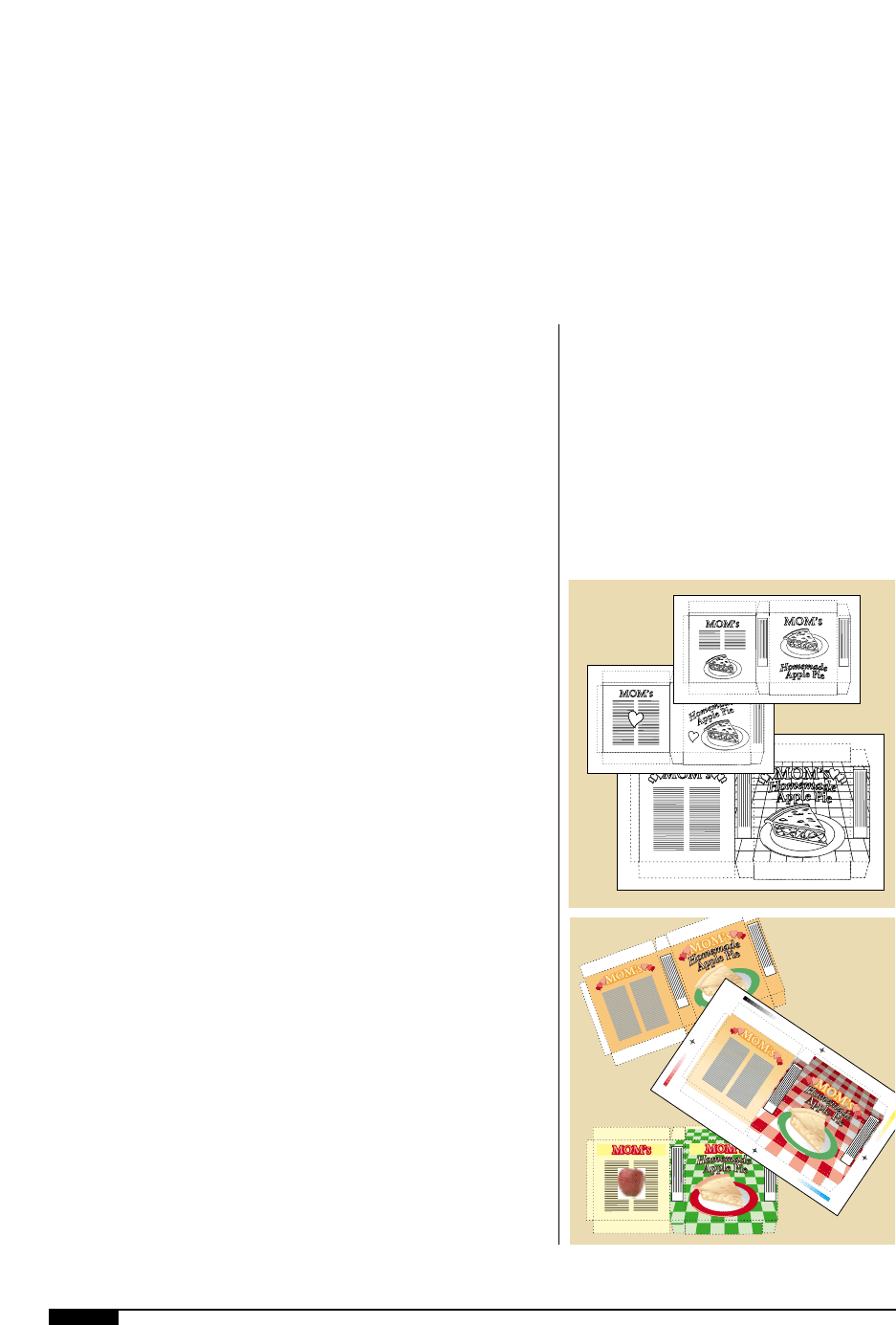
THUMBNAIL SKETCHES
The designer may start with some simple
thumbnail sketches, either drawn by hand or
done on the computer (Figure
1$
). For the
first time, the design ideas are in visual form.
Revisions and refinements are easily done at
this stage to meet any change in design
requirements. The designer will choose sev-
eral of these thumbnail sketches to work up
into comprehensive roughs (comps).
COMPREHENSIVE ROUGHS
Initial graphics can be roughed-in at low
resolution on the substrate or some similar
material. The roughs are reworked and
refined, until one layout plan emerges that
can be reviewed against the list of design
requirements. As this work continues, many
graphic decisions are made along with those
regarding colors and techniques. The graph-
ic plan is finally checked against specifica-
tions and other technical aspects.
RENDERING (FINISHED COMP)
Designs and comps should be prepared
with inks and color separations in mind and
a concern for line, tints and/or halftone
areas. The converter’s equipment limitation-
sre also has to be considered. If these ele-
ments are incorporated early in design plan-
ning, valuable time is saved in interpretation.
1$
The designer’s first step
after the planning stage
is to do a number of
thumbnail sketches.
The design concept is
finally in a visual form.
1%
A finished comprehen-
sive rendering of the
package is presented
to the client for
approval. It is only
after this approval that
the production stage
can start.
1$
1%
DESIGN 23
Also, problems are reduced for the
platemaker, ink personnel and press people.
The working layout is usually printed on
high-quality computer paper. A rendering, or
finished comp, is generally done on the actu-
al material to be printed or a reasonable sub-
stitute to which the colors can be applied.
How the rendering of the design comp is
handled depends on the substrate and the
proofing equipment to be used (Figure
1%
).
PRESENTATION
The wide range of methods of preparing
designs for presentation allows the designer
many techniques to work with. He or she has
the option of using a suitable rendering tech-
nique for the design project at hand and,
depending on time and cost, can tailor the
rendering phase to gain the most effective,
efficient and economical result.
To give the design a chance to express
itself, a three-dimensional mock-up should
be made. This ought to be done with care
and concern for ease of printing.
Once accepted, the design is ready for the
production artist. The production artist
needs to follow guidelines set by the client,
art director and printer/converter, in order to
create the electronic files with minimal pos-
sibility of error.
ELECTRONIC IMAGING AND
COMPUTER GRAPHICS
Over the past 20 years, many conceptual
and mechanical aspects of design for flexo-
graphic printing have changed dramatically.
Computer graphics have altered every aspect
of production. Design studios, prepress hous-
es, and printers all realize the profit potential
and enormous power of computer graphic
systems now available. A glance at the com-
puter-oriented environment reveals the many
changes. (Figure
1^
).
The Work Flow Process
Let’s suppose that a designer has the title,
copy matter and pertinent legal description of
a new wine about to debut. The client wants
flowers on the label, and market research
agrees. The designer pores over a file full of
photos, gleaned from many sources, and
chooses some. Then, the designer sends an
assistant out for a dozen roses.
With roses and pictures in hand, the flow-
ers are arranged nicely and some colored
paper is set up as a contrasting background.
The three-dimensional arrangement is pho-
tographed using a digital camera, and the
scene is captured on the computer screen
and the image is backed-up and stored on a
hard drive.
The designer’s next step is to put the title
and copy into the system. If the copy is some-
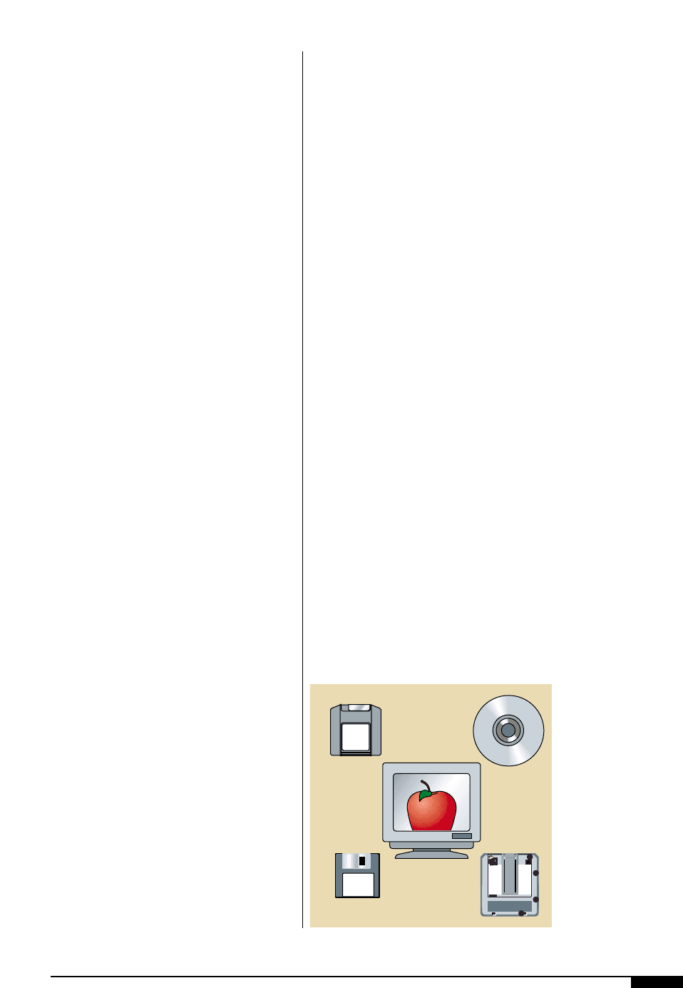
where other than in the designer’s computer, it
can be transferred directly into the designer’s
workstation by disk, CD-ROM, over a network
with other computers or by using a modem
(Figure
1&
). A modem receives and trans-
mits data over a telephone line to give the
designer access anywhere.
Experimentation
After gathering the elements of images and
text, the designer is ready to start experi-
menting. What was once a very costly and
1&
There are many types
of removable storage
available today. Be sure
to check compatibility
with your service
bureau.
1&
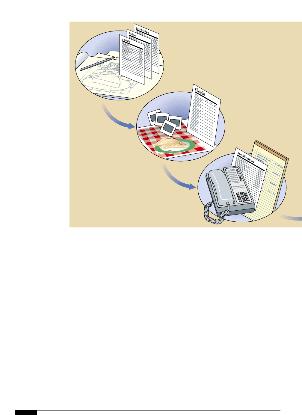
The Package Publishing Process
Define Project and
Quality Requirements
Choose Prepress Tasks
Select and Consult
Your Vendors
1^
24 FLEXOGRAPHY: PRINCIPLES & PRACTICES
time-consuming ordeal consisting of camera
work, typesetting and art is now quick and
cost-effective. Computer graphics provide
almost immediate and limitless variety. By
using the computer monitor as an electronic
canvas and the mouse as a paintbrush, the
designer can scale, crop or combine the
images and backgrounds in any combina-
tion. Red roses can be made yellow, a moun-
tain scene can be placed behind them or
they can be made to float among the clouds.
At every stage, a new view can be saved for
comparison. Images and type matter can be
twisted, stretched, turned and otherwise
modified in minutes, compared with hours,
perhaps days, using traditional methods.
With the increased control of the design,
the designer’s imagination is now allowed to
move freely and quickly. Essentially, the
designer assumes the role of typesetter, illus-
trator and cameraperson, but without a dis-
jointed sense of separate elements in the
process. Computers enable the designer to
maintain and refine the concept without the
high cost of yesterday’s technology.
Presentation and Approval
When it’s time for the presentation, the
computer allows the client to see the affect
of his/her input quickly and clearly, without
sending the artist back to the drawing board.
The client can decide then and there that
pink roses would add the necessary impact
to the label. Since the designer can make
on-the-spot changes, there’s no need for
another meeting.
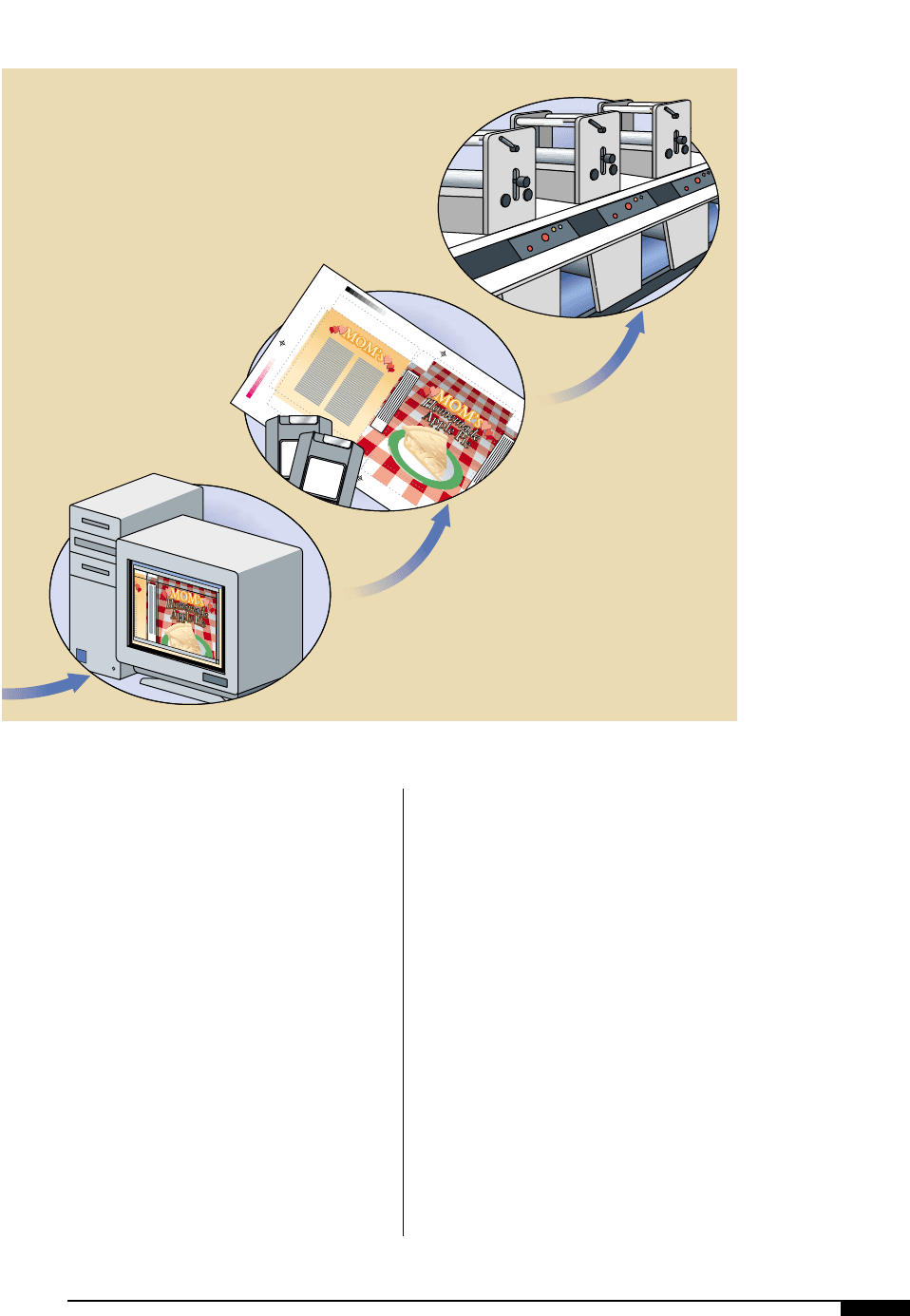
Create Your Package
Proof and Hand Off
Your Files
Check and Print
Your Package
If the client would like to see the new
design on the bottle and on the shelf next to
competitors, a trip to the local market to
shoot slides of the wine section is all that is
needed. The slides are scanned into the com-
puter and the new label is electronically
wrapped around one of the bottles by using
a three-dimensional imaging program.
If the client wants to show the designs to the
board of directors for final approval, all the
designer has to do is generate 35mm or 4" x 5"
transparencies from the computer or full-color
paper proofs from either a laser printer or
ink-jet printer of each composition. The
images can also be transferred to videotape.
In the case of our wine label, the client’s
approval simply tells the designer to print
out a final high-resolution set of negatives
from an imagesetter to be delivered to the
printer. This branch of the computer system
usually is at a printing facility. It does all the
color separations, which require only a final
review by the art director.
The growth of this technology has been
incredible and is sure to continue. It’s impor-
tant to remember that, while these tools
spur the creative process and boost produc-
tivity, they can’t replace the human element.
Indeed, people will always be the crucial
investment for any design studio that wants
to stay competitive.
DESIGN 25
1^
Successful packaging
requires several steps
including planning and
organization, design
and production, pre-
press, proofing, and
printing.

26 FLEXOGRAPHY: PRINCIPLES & PRACTICES
Production Art
B
y establishing a dialogue with
production artists who turn con-
cepts into electronic art files, the
designer can learn about the
flexo tolerances within which
the design must function during
production. This can save time between the
initial concept, the final digital file and the
film from which printing plates will be made.
Interruptions for clarification or revisions
can be costly. To avoid printing problems,
the designer should have a reasonable work-
ing knowledge of flexography’s production
art requirements. Communication with the
plant or production manager regarding the
limitations of the manufacturing equipment
will help the designer develop designs
specifically geared to the situation.
Guidance from the production artist, the
prepress shop and the printer is important.
Methods of producing the finished artwork,
color separation, prepress proofing devices
(digital proofs, color keys, matchprints,
etc.), and any other art preparation data
must be considered.
The production artist’s job is to take the cus-
tomer’s design and turn it into the final art file
from which printing plates can be made. The
finished artwork must, of course, fit the final
package, container or product, with all type
and illustrations properly positioned. The
copy and other design elements must be capa-
ble of clean, crisp reproduction on the sub-
strate being printed. In addition, it must main-
tain registration.
DESIGN ELEMENTS
There are many similar elements that are
included in all designs, including typogra-
phy, contrasting color values, shapes, illus-
trations, photographs, brand names and
descriptive subject matter. The overall
design should have the assurance that the
parts are in proper visual order and relate to
each other under a priority system.
Elements should not compete with one
another for top billing. An easy test of visual
priority is to put yourself in the buyer’s posi-
tion and imagine what information you most
want to see. Of course, these priorities will
differ with each project.
Typography
The length of a line of type is measured in
pica units and there are 12 points to a pica,
and 6 picas to an inch. The type character, or
face height, is measured in point units. A
point size is equal to the distance from the
top of the lower-case ascenders to the bot-
tom of the descenders.
The vertical spacing between lines of type
also is measured in points, but is referred to
as leading, or a given number of lead points.
Multiple lines of copy are expressed as a
combination of the actual point size of the
type and the lead point height. For many
texts, common settings are 9-point type on
11-point leading, or 10-point type on 12-point
leading and is said to be “9 on 11” (9/11) or
“10 on 12” (10 / 12) . Type set without leading
is described as being set “solid.” Although
type is generally designed to provide mini-
mum vertical line spacing when set solid,
there is a chance vertical alignment of low-
ercase ascenders and descenders may
touch. Lateral spacing of type that creates
lines of equal length is called justification.
