Whitbread D. The Design Manual (анг.яз.)
Подождите немного. Документ загружается.


The frame decision should be made before you create
the internal detail that identifies the icon’s specific role,
because designing an icon to fit a square does not mean it
will necessarily sit comfortably in a triangle if you later
decide to alter the frame.
When you start defining the image inside that will
identify specific features, again create the image with
shapes rather than lines. Lines tempt you to put too much
detail and nuance into the picture—you don’t have the
luxury of nuance in a 5 mm square graphic that is output
on a computer screen! Equally, you can’t achieve the detail
when you’re stitching the logo into a cloth badge or
corporate wardrobe. By concentrating on shape, you will
find it easier to create a successful icon.
You can certainly use curves, but on a Web-site the
graphic will probably be pixelated for the site to maintain its
speed of draw, so consider simplifying detail. Fortunately,
anti-aliassing (see page 249) can smooth the appearance of
curves on screen.
There are few standard icons that use type forms within
them: P for parking; i for information; $ for money. In
word-processing and page-layout programs, by necessity,
some more were created: B for bold, U
for underline, I for
italic. Letterforms imply language dependence and this is
why they are normally avoided. Even the $ for money is a
culturally specific icon, just as the £ (pound sign), e (euro
sign) and ¥ (yen sign) represent other currencies.
But you do not need to worry so much about incorpor-
ating letterforms into icons if you know that the person
reading the site, program or signage will be using English.
Individualising icons
To further customise icons and make them fit the feel of
the site, the style of the interface, or the corporate identity
you are designing, you can do some texture mapping and
apply colours that link the icons stylistically to the rest of
the screen display or stationery. But consider this a separate
issue—the icon should work with no texture and no colour.
Adding the texture and colour is a decision made on the
overall appearance of the interface or range.
Beware the icons becoming lost if they are integrated too
well. The user still needs to be able to find them quickly. A
soft shadow, for example, is often used to ‘lift’ the icon off
its background.
Corporate identity 61
DWD-DM04 4/5/01 3:45 PM Page 61

Symbols
Symbols have an inherent problem—time is needed to
establish association of the symbol with the organisation.
They are, by definition, abstract. They need to be presented,
explained or associated very strongly with a logo initially to
enable that ‘automatic’ association to develop. Symbols
nearly always have to be used in tandem with a logotype
until recognition is instant. Once that recognition is
achieved, the logotype can be dropped from many uses and
the symbol can stand alone.
Logotypes/logos
A logotype, as its name implies, incorporates letterforms.
Usually it is developed as a format in which the title of the
organisation will consistently appear. It can be an initial, an
acronym or an abbreviated version of the full title. There is
usually a limited range of options developed by the designer
for its use with the symbol.
Often the logotype has an ‘individualising’ feature—this
can be spacing, kerning, ligature or swash idiosyncrasy—
that will be a unique feature of the identity.
When considering the type characteristics, always look at
the words in capitals and in lower case as well. Sometimes,
looking at the optional letterforms that you can get in italic
letterforms is also advisable. For example, in some type-
faces, you can find a great f, g or & in italics. It is also quite
acceptable to mix these letterforms in a logotype, as the
mixture can provide that individualising feature.
Often the letterspacing and leading of the typography in
a logo will be more extreme than in text setting. Characters
might share a letterstroke; there might need to be a dotless
i for a descender on the line above to sit comfortably with
the line below; optical leading may mean that lines are
unevenly leaded. Avoid having text lines too close to the
logo or running off it—some designers recommend a
particular spatial relationship between logo and surround-
ing text and images.
Initials
Some organisations choose to use a single initial or a group
of initials that may or may not make an acronym. In these
cases, the letterform/s need to be carefully chosen and
applied. Usually, initials will also be used with a logotype of
the full name of the organisation.
62 Projects
The Australia Post logo
Designed in 1975 by Pieter Huveneers
DWD-DM04 4/5/01 3:45 PM Page 62

Monograms
Another technique of creating a logotype is to create a
monogram. This is a decorative interweaving or interlink-
ing of the initial letterforms of a person or company
name—look at the Volkswagon logo. This technique was
very popular in the 19th century and you can see extant
uses of it in the monograms for some unions, fire brigades
and municipalities.
Mascots/promotional characters
Where would Australian advertising history be without
Louie the Fly, Bertie the Aeroplane, Chesty Bond, the
Redheads, Leo the Paddle Pop Lion, Zig and Zag, the
St George Dragon and the Gobbledok? Corporate characters
can provide liveliness to advertising materials, and often
hired actors attend promotional events in character which
can be more successful than just a logo.
Characters often become a way for an organisation to
communicate to a junior audience. Junior audiences, of
course, have captive secondary audiences like parents,
guardians and older siblings that might get the message
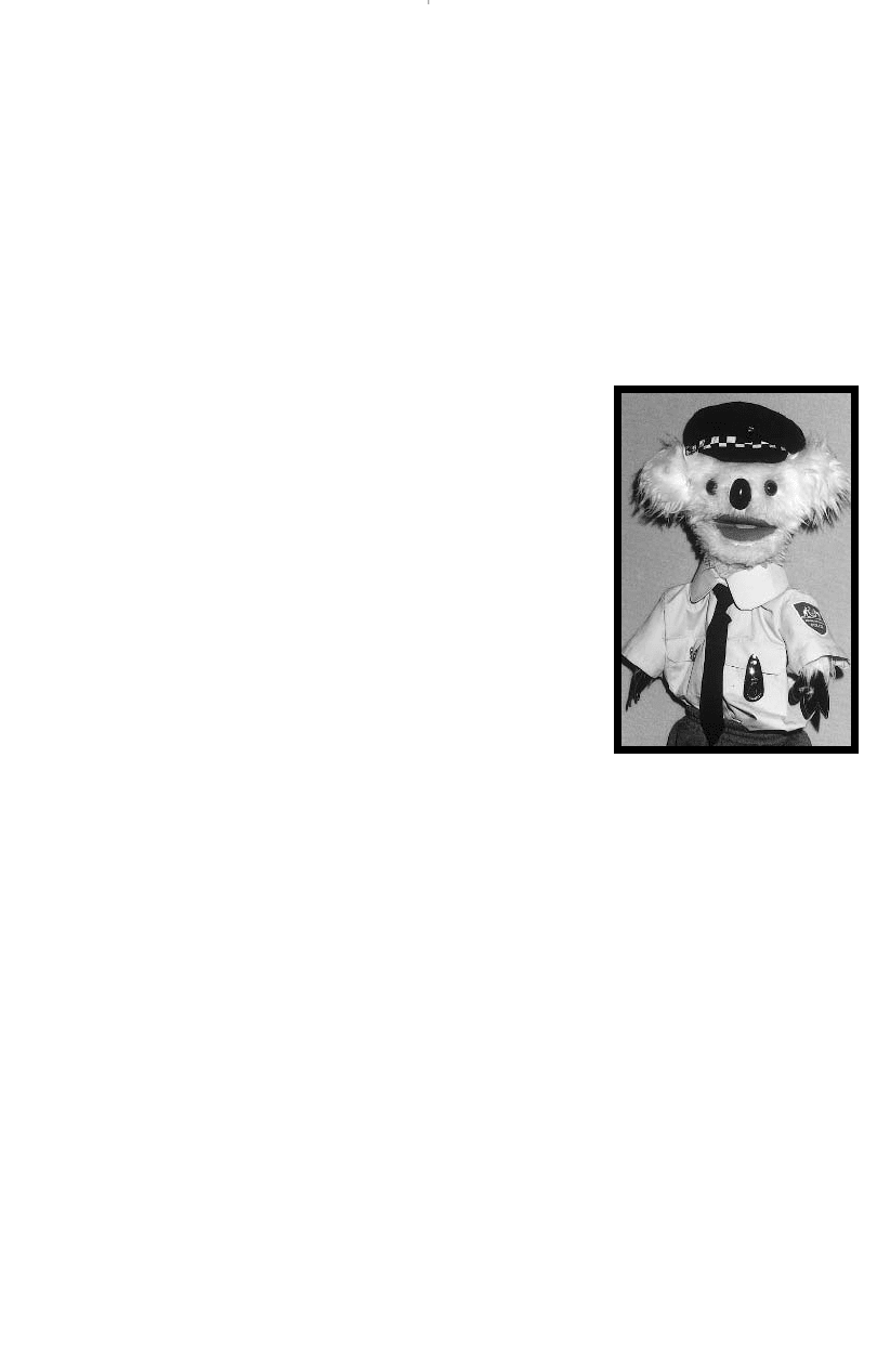
through the junior members of the household. Constable
Kenny Koala of the Australian Federal Police has had comic
strips and kids columns in local papers, a television career,
personal appearances at schools, fetes and community
events, appeared in colouring-in competitions and conveyed
many safety messages.
Corporate typefaces
A ‘support’ typeface that is a clear face for text or forms
setting—a face that is easy to read—is often selected to
complement the logotype and symbol. For this role, it is
usually best to stick to traditional faces, or faces that have
been developed from traditional matrices, to avoid dating
the identity when a face goes out of fashion.
This face should be used in all stationery: letterheads,
business cards, with compliments slips, forms and internal
memos. With cascading style sheets in Web documents, it
can continue into the Web site, too. It also should be used
with its various fonts in all publications: annual reports,
staff newsletters, corporate plan documents, reports,
product literature, brochures and pamphlets—in fact, any
publication that could be considered a corporate document.
Corporate identity 63
Constable Kenny Koala
Courtesy: Australian Federal Police
Museum
DWD-DM04 7/5/01 1:10 PM Page 63

Some organisations choose more than one ‘support’
typeface, but this can be an unnecessary complication, and
is more difficult to handle with success.
Corporate colour palette
Another significant association in a visual identity is the
colour or colours selected to represent an organisation.
Starting with the colours used in the symbol and logotype,
develop a suite or palette of colours that can be used for
different purposes.
Code separate parts of the organisation with colours:
stationery from Head Office can use the symbol with a
dark-blue stripe; Research and Development can use the
symbol with a bottle-green stripe; Marketing can use
maroon; Manufacturing can use burnt orange. Annual
report sections can then use the colour code to identify
responsibility in organisation charts and graphs. The
colours can also be used in signage for each of the sections,
or on nametags to identify which part of the organisation a
staff member represents.
There are colours that are considered trustworthy,
colours that attract attention, colours that employees will
wear and colours they won’t… You may need to create a
variation on the print and screen colour palette when it
comes to designing uniforms, because some palettes do not
translate well into clothing. This is why those print and
screen corporate colours are often relegated to ties, T-shirts,
pockets, caps, nametags and scarves, rather than suits,
shirts, skirts and jackets.
Attitude
An organisation which presents a consistent attitude to its
markets is well on the way to establishing an effective
corporate image. If the attitude is right, a more visually
diverse identity can be presented. There is great flexibility
with:
r attitude
r a colour palette
r a standard range of symbol and logotype applications.
An image can be projected in a more interesting way by
having some in-built flexibility, so ground rules for the use
of symbols, logotypes, typefaces and colours should be laid
down, thus giving a set of principles for picture selection
64 Projects
DOING IT SMARTER
Markets for identity
Choose a name for a nightclub such
as ‘Jitters Night Club’. Prepare three
designs using the same wording. The
market for each is different, but the
product is essentially the same—a
good night out on the town with
great music, dance floor and bar. You
need to differentiate the designs for
each nightclub by using appropriate
imagery, type, colour and style. The
nightclubs are:
q upstairs at the local football
club, next door to its bistro
q on the thirtieth floor of an
exclusive, five-star international
hotel in the CBD
q below street level in the most
alternative, counter-cultural area
just out of the city centre.
What you produce must
immediately communicate to the
target audience for each of these
venues. What age is the clientele?
What price do they expect to pay?
What style of dress should they
wear? What occasions would be
appropriate to celebrate there? What
time of night will things really start
happening? What style of music are
they likely to hear? Design can help
to identify all these characteristics by
manipulating the choice of type and
its layout, the style of illustration (if
illustration is needed at all) and the
colour palette chosen.
Ask a few people to identify
which is which. You’ll soon know
whether you succeeded.
This is a great exercise if you’re
developing corporate logotypes, or if
you’re working on book titles, CD
packaging, film titles and show
posters.
DWD-DM04 4/5/01 3:45 PM Page 64

and layout that define the attitude the organisation wishes
to project.
All this is dealing in intangibles and trying to make
them tangible. How do you project excitement and
dynamism consistently? How do you plan for it so it doesn’t
become stale and dated? How does the design maintain its
integrity with traditional markets but also encourage new
markets to discover it?
You can build an element of fashion awareness into the
identity, which enables you to portray fashionable images
and use fashionable patterns and colour combinations
while maintaining the presence of the corporate palette.
Even type treatments that are based on contemporary or
fashionable practices can fit if the corporate typeface/s are
used in contemporary ways. Leave room for the addition
of stand-alone typographic statements so that corporate
identification is made in body copy rather than in display
text setting.
Always maintain a level of respect for the organisation’s
investment, but this doesn’t mean you can’t allow some play
with the symbol and logotypes—don’t compromise them,
but have some fun with them. Can your symbol be
cropped? The Qantas kangaroo has been known to party…
Corporate identity manual
Creating a cohesive corporate styling across the corporate
identity means maintaining control and effectively manag-
ing each manifestation of that identity. To do that, many
organisations create an identity manual. It can be as simple
as a four-page pamphlet or a job file that contains bits and
pieces that enables the identity to be applied appropriately.
It can be a bound volume running, in some cases, to
hundreds of pages. All identity manuals cover the same
material to a greater or lesser extent, depending on the
complexity of the identity and the number of likely users
or people who will eventually apply the identity.
In the case of multinational corporations that wish to
project a cohesive identity in all their marketplaces
throughout the world, the answer has been to define all
elements of what is often termed a ‘monolithic’ corporate
identity. The idea is to keep it a practical document: if
something isn’t ‘useful’, it’s not in the manual!
Corporate identity 65
DWD-DM04 4/5/01 3:45 PM Page 65

Contents generally fall into three categories, though
these are of varying sizes:
r identifiers
r what to do
r what not to do.
There can be varying levels of detail from pernickety to
casual, broad-brush description.
Aside from the usual title pages and introductions
(preferably from the managing director, CEO, department
head, headmaster, priest or president), the first section is
usually on corporate identifiers. Corporate identifiers might
include a symbol, a logotype, typefaces and colour palette.
The symbol might be provided in both its solid form
and an outline form. It will be in black on white and white
on black (its ‘reverse’), single-colour forms and as full-
colour versions. It will be shown in conjunction with type
and on different coloured backgrounds.
The logotype might include various renditions of the
company name and its divisional identification. There
might be an initial format as well as the full name. The
divisions might appear under or to the right of the full
name in a particular way.
Corporate typefaces include the full font of the typeface
used in the logotype. All other corporate text might appear
in, say, only two other fonts, so those other fonts and the
principal weights would also be included. There might be a
description of when to use particular weights, sizes and
spacing guides.
The corporate colour palette might be more than just
the colours in the symbol and logo. There might be colour
coding for corporate divisions. There might be slight
variations in the colours when printing in Pantone inks,
CMYK inks and in screen colours for Web sites and
television advertising.
The section on identifiers gives all the standard
specifications for reproduction, and can include details
of various suppliers and bromides and digital files for
accurate reproduction.
The application section includes specifications for
individual pieces of the identity: print and digital appli-
cations for stationery, forms, publications, press advertising,
packaging, giftware, signage, uniforms, Web sites,
television graphics.
In the case of stationery, there are specifications for all
type and measurements for accurate positioning. Any grids
66 Projects
DWD-DM04 4/5/01 3:45 PM Page 66

used are described and specified in detail for accurate
drawing but are also usually supplied as templates on disk.
A sort of mini style manual might be included, indi-
cating not only typing guides for positioning text on the
letterhead, but also writing guides for different types of
letters, memos, minutes, e-mail headers and signature
blocks, and Web page content and writing style.
In the case of forms, standards are described in detail
and samples shown for signature blocks, section dividers,
colour coding, questions and instructional layout.
Press advertising standards include details of the
borders and symbol/logotype combinations used in
classified advertising and display advertising. Company
mottoes or positioning statements are specified in par-
ticular typefaces and positioned in various grids.
Publications might include annual reports, technical
manuals, newsletters, product literature, or any number
of brochures. Full style sheets and grid templates can
be included.
Signage can be for buildings (both internal and exter-
nal), car parks, exhibitions and displays, trade shows,
vehicles, equipment and machinery.
Uniforms can be for office staff, ushers, technical staff,
work crews. The accessories can be diverse and can include
some of the corporate giftware: cuff links, scarves, hard
hats, spray jackets, waistcoats, T-shirts, ties and tiepins,
caps, brooches, medallions.
For signage, packaging and uniforms, particular
materials and fabrics might be specified. Grids for
symbol/logo application and spacing in relation to building
or box corners can be devised. Suppliers can be noted and
combinations of colours and finishes can be specified.
In addition to including what should be done, it is
useful to have a section on what should not be done. Often
this will feature particular colour combinations that will not
work. For example, if a background colour is the same as
one of the stripes in the logo, it could cause an incorrect
reading of the logo.There are many mistakes that can be
made. There might be incorrect proportions used where the
logo swamps the symbol. Sometimes, cramming the logo or
allowing it to bleed off a page is inadvisable. This section is
usually a small but important section as it helps to further
define the corporate standards for consistent image control.
Corporate identity 67
DWD-DM04 4/5/01 3:45 PM Page 67

68 Projects
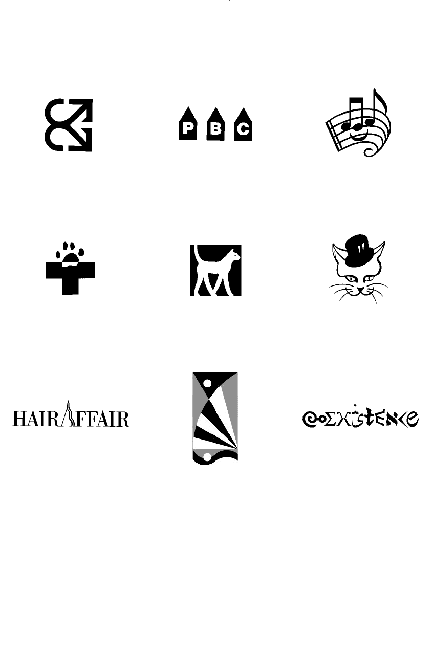
Corporate identifiers
Logo for a hairdressing salon
Client: John Martone
Logo for Maison de Parfum, a
perfume retail store
Client: Nina Gayne
Logo for Tuggeranong Veterinary
Hospital
Clients: Kym and Malcolm McKnown
Symbol for Priority One Consulting
Clients: Karen McKenzie, Sue Bennet
Logo for Canberra Couriers
Client: Rod Whitbread
Logo for a CD and concert
Client: Colin Hoorweg, Muzair Productions
Pictogram for the Canberra Area
Theatre (CAT) Awards
Clients: Kate Peters, Coralie Wood
Symbol for the Australian Amateur
Music Theatre Awards
Client: Coralie Wood
Logo for Proudman Building
Contractors
Clients: Sean and Brenda Proudman
All identities on this page designed by the author
DWD-DM04 7/5/01 1:11 PM Page 68

Corporate identity 69
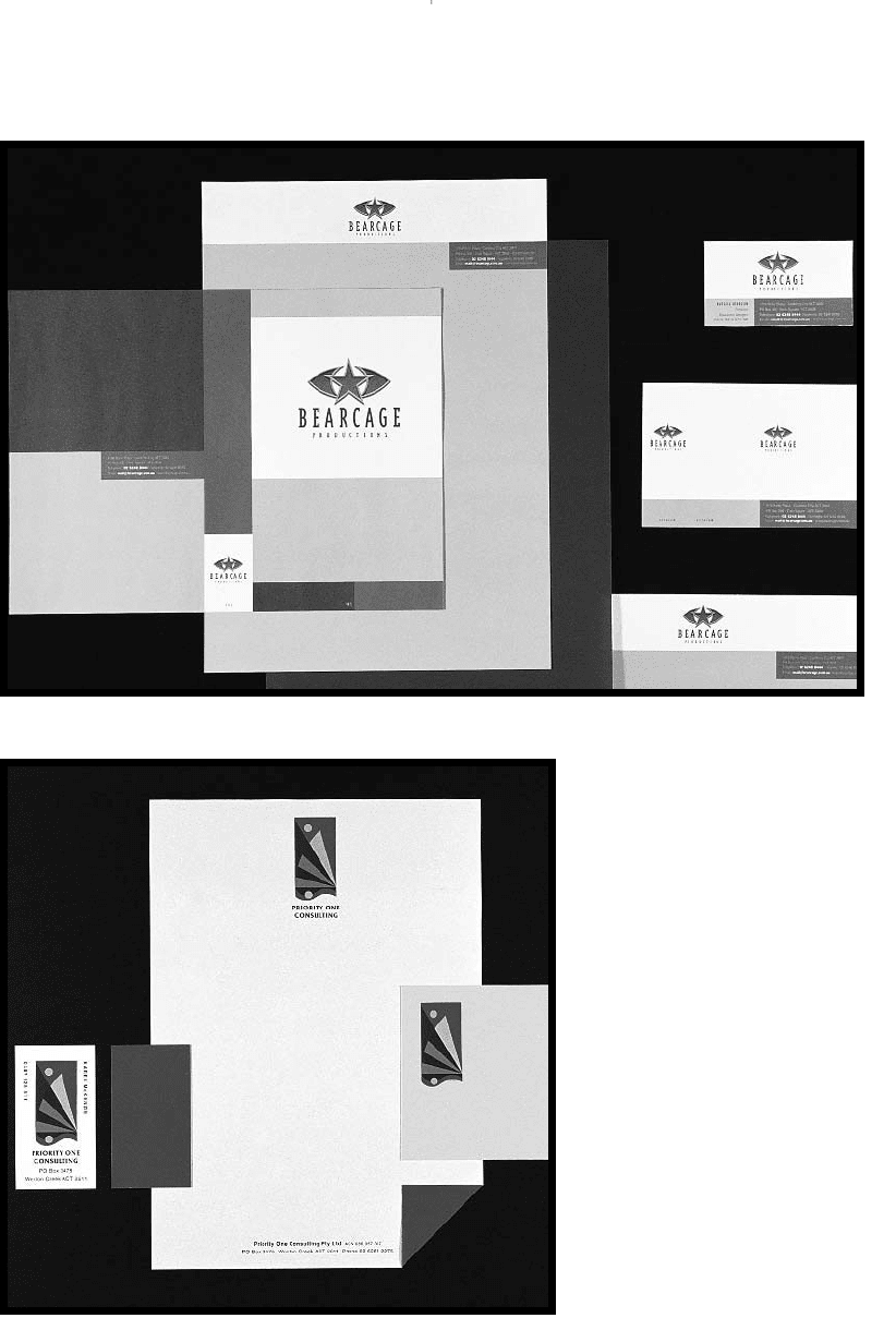
Stationery programs
Bearcage Productions stationery
(above) includes video labels and
covers.
Studio: Swell Design Group
Priority One Consulting (left) uses a
full-colour sticker for the logo to be
hand-applied to envelopes, business
cards and letterhead.
Clients: Karen McKenzie, Sue Bennet
Designer: David Whitbread
DWD-DM04 7/5/01 1:11 PM Page 69

Stationery
A4 is the standard sheet for laser printers and photocopiers.
But, of course, pieces of stationery can be any size, provided
they do what is needed of them. You can feed all sorts of
odd-shaped papers through a typewriter (triangular, square,
parallelograms, even circles), but there are fewer options
with laser printers—and with filing systems at the receiver’s
end—all accommodating the assumed A4 sheet. Optional
sizes, though, can provide interesting format options for
information and, consequently, can help a message stand
out from its competitors.
Many stationery items will be based on the letterhead
design which is usually printed on an A4 sheet.
Letterheads
A letterhead is normally A4 folded to 1/3 A4 and posted in a
DL envelope. But an alternative is to fold the long side of an
A4 letter in half to A5 and then fold the long side of that in
half again to A6. This fits another standard envelope, the
C6 envelope.
A letterhead is a preprinted sheet that contains all the
contact information that the receiver might need, presented
in an appropriate way to establish and maintain the
corporate image. This will often include the symbol and
logo printed in corporate colours. All the information and
corporate identification will appear in the margins sur-
rounding the text area.
These days, the back of the letterhead is often consid-
ered an appropriate place for some corporate identification
or imagery as well. It can distinguish the organisation if
there is an impressive look to the letterhead as it comes out
of an envelope.
The main text area for the overprinted letter usually
starts about one-third of the way down the page with a
generous left margin of about 30 mm or more (for filing
purposes at the receiver’s end and for the sender’s records)
and a narrow right margin. Often the address of the
receiver, the date of the letter and the salutation have
specific alignments that are determined to complement the
letterhead design.
Positioning is often defined in a typing guide sheet in
the corporate style manual, or even in a digital template that
is provided, so that anyone about to prepare a letter can
meet the standards. A small rule or even a dot at one of the
70 Projects
CHECK LIST
Letterhead
q A4
q Organisation/business name
q Corporate symbols/logos
q Postal address
q Location address
q Phone number/s
q Central fax number
q Central e-mail address
q Web site address
q Positioning statement/slogan
q Other locations
q Senior staff/board/partners
q Affiliates
q ACN (Australian Company
Number)
q ABN (Australian Business
Number)
CHECK LIST
Invoice or ‘Tax invoice’
As letterhead but with:
q ABN (Australian Business
Number, required for GST claims)
Depending on your business, it may
also feature:
q Product code and description
q Quantity
q Price (inclusive of GST)
q Total
q Any legal requirements
DWD-DM04 4/5/01 3:45 PM Page 70
