Tidwell J. Designing Interfaces (Second Edition)
Подождите немного. Документ загружается.

The Patterns 33
Figure 2-3.
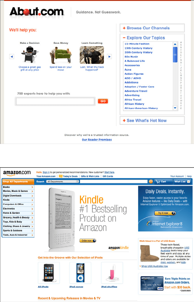
About.com
Figure 2-4.
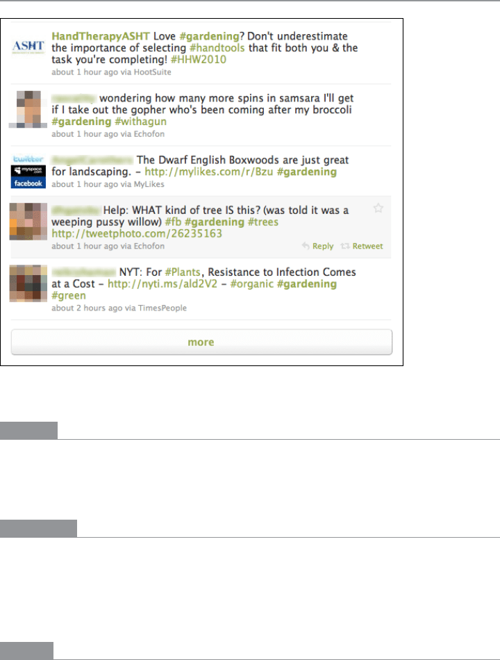
Amazon
34 Chapter 2: Organizing the Content: Information Architecture and Application Structure
News Stream
Figure 2-5.
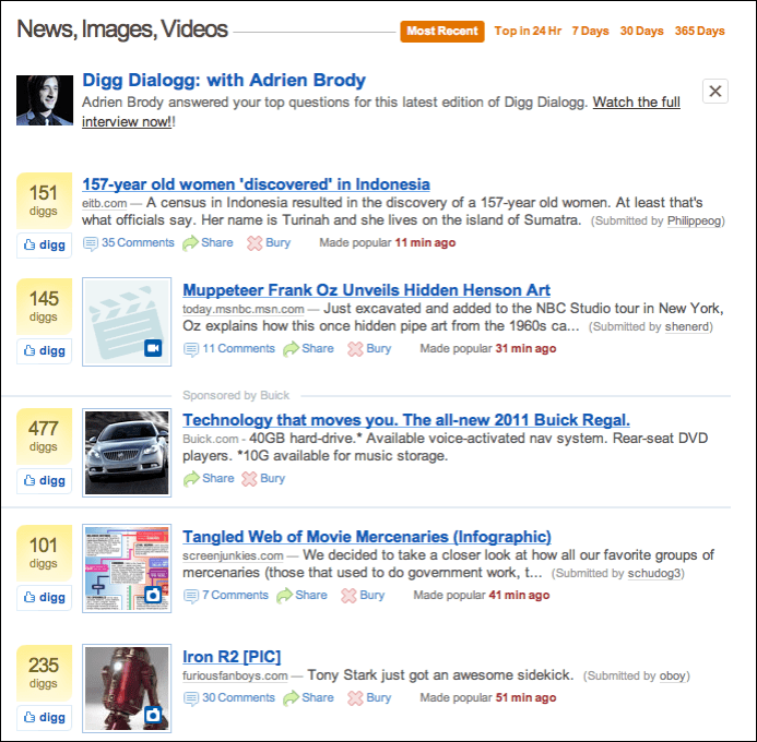
Twitter
What
Show time-sensitive items in a reverse chronological list, with the latest items at the top.
Update it dynamically, and combine the items from different sources or people into one
single stream.
Use when
Your site or app uses one or more communication channels, such as blogs, email, social
site updates, or news sites, to deliver timely content to users.
This channel may be personal—a user “owns” it, like an email client or Facebook friends
list—or public, such as a website or public Twitter stream.
Why
People can keep up with a news stream easily, since the latest items reliably appear on top
with no effort on the part of the user. They can check in often and be assured of seeing
what they need to see.

The Patterns 35
People go to many sites or apps each day to keep up with their friends’ activities, engage
in conversations, or follow topics or blogs of interest. When multiple “news” sources can
be blended in one place, it’s easier to keep track of it all.
This pattern supports the
Microbreaks behavior pattern in Chapter 1. A glance at a News
Stream
application can give a user lots of useful information (or entertainment) with very
little time or effort.
From the perspective of a publisher, such as a website, having a
News Box (Chapter 9)
or the equivalent on your main page lets visitors see what’s new and noteworthy at your
organization. Large organizations in particular may have many initiatives going on that
would interest visitors: new products, blog entries, videos, news articles, charity work, and
other content.
How
List incoming items in reverse chronological order. If the technology permits, “push” new
items onto the top of the list without waiting for the user to request an update, but offer a
way for the user to get an immediate update or refresh anyway.
Very busy streams can be split up into manageable substreams by topic, sender, source,
search terms, or other factors—you could let the user choose which one(s) to show.
Services such as Facebook, FriendFeed, Twitter, and some RSS readers show clickable
lists of these substreams to the left or right of the incoming content (thus implementing
the
Two-Panel Selector pattern). Others, such as Tweetdeck, use Many Workspaces to show
multiple parallel panels of incoming content.
Information shown with each item might include:
What
For short micro-updates, show the whole thing. Otherwise, show a title, a teaser that’s
a few words or sentences long, and a thumbnail picture if one is available.
Who
This might be the person who wrote an update, the blog where an article was posted,
the author of said article, or the sender of an email. Actual person names humanize
the interface, but balance this against recognition and authoritativeness—the names
of news outlets, blogs, companies, and so forth are important, too. Use both if that
makes sense.
When
Give a date or timestamp; consider using relative times, such as “Yesterday” and
“Eleven minutes ago.”
Where
If an item’s source is a website, link to that website. If it comes from one of your or-
ganization’s blogs, link to that. (But here’s another interpretation of “where”: can you
get geolocation data about the item, and show it on a map?)

36 Chapter 2: Organizing the Content: Information Architecture and Application Structure
When there’s more to an item than can be shown easily in the list display, show a “More”
link or button. You might design a way to show the entire contents of an item within
the
News Stream window. The News Stream is a list, so you can choose among Two-Panel
Selector
, One-Window Drilldown, and List Inlay. Examples abound of each model.
Give the user ways to respond immediately to incoming items. Stars, thumbs-up, liking,
and favoriting are available in some systems—these all provide low-effort feedback and
“handshaking” among people who don’t have time to write out long replies. But allow
those long replies to be written, too! By placing controls and text fields immediately next
to an item in a
News Stream, you encourage responsiveness and interaction. This is usually
a good thing in social systems.
Sharing of items, either privately via email or semipublicly via a provided social service, is
also common in these interfaces. See the
Sharing Widget pattern in Chapter 9.
News Stream designs for mobile devices are fairly straightforward as of this writing. Almost
all of them devote the full screen to a single list—often a
Thumbnail-and-Text List (Chapter
10) with richly formatted text—and users can drill down to an item by simply tapping or
clicking it in the list.
Many
News Stream services, including Twitter and Facebook, use the Infinite List pattern
(see Chapter 10) for both their mobile and full-screen designs. This pattern lets users
load a page or two of the most recent updates, and gives the option of loading more to go
“backward in time.”
Some resources use the term activity stream for a very closely related concept: the time-
ordered stream of actions (usually social actions) performed by a single entity such as an
individual, system, or organization. This is a useful concept, and it doesn’t really conflict
with the
News Stream pattern, which talks about the stream of activities that are of interest
to an individual or group of users, not generated by them.
News Streams will usually have
multiple diverse sources.
Examples
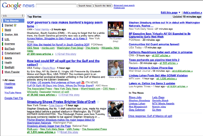
Digg (Figure 2-6) and Google News (Figure 2-7) are both public News Streams. Their
purposes and designs are very different, but they share some of the features talked about
in this pattern. Digg shows all incoming items in one large list; Google News splits them
The Patterns 37
into topics, within which the most recent news articles are shown first. (Drilling down
into the topic shows a page with a single list.) Both show comparable item information:
title, teaser, linked source, and a relative timestamp. They use human names: Digg shows
the submitter’s name, while Google News shows the article author’s name. And on both
sites, you can mark items of interest—with a “digg” in one, a star in the other—and share
them via email.
Figure 2-6.
Digg
38 Chapter 2: Organizing the Content: Information Architecture and Application Structure
Figure 2-7.
Google News
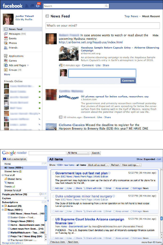
The previous two examples show public News Streams; the next two show personal News
Streams
.
Social networking services, news aggregators, and private communications (such as
email) provide plenty of examples of personal
News Streams. In Figures 2-8 and 2-9 we see
Facebook and Google Reader, which is an RSS-based aggregator. They both use a single
reverse chronological list of items, each of which shows a linked source, title and teaser
(when appropriate), author name, and relative timestamp. Users can “like” items, share
them, and follow links to read more.
But note the differences, too. Google Reader lets the user split a potentially huge com-
bined stream into substreams, based on source and topic; these are displayed in a select-
able tree list on the left, thus making the window a
Two-Panel Selector. Facebook doesn’t
give the user this option by default, as of this writing. Instead, it automatically (and un-
predictably) switches between a filtered “Top Stories” view, and a “Most Recent” view that
shows everything. However, Facebook excels at the immediate response. Posting a short
comment to a Facebook entry is almost as easy as thinking about it.
The Patterns 39
Figure 2-8.
Facebook
Figure 2-9.
Google Reader
40 Chapter 2: Organizing the Content: Information Architecture and Application Structure
Picture Manager
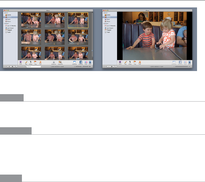
Figure 2-10.
Two views of iPhoto
What
Use thumbnails, item views, and a browsing interface to create a familiar structure for
managing photos, videos, and other pictorial items.
Use when
People use your software to work with lists or collections of pictorial things: photos, draw-
ings, video clips, and so on. The list might be in a web page, or in an application, or both.
It might allow editing by the owner of the content, or it might simply show the content to
the public for browsing, viewing, and comments.
Why
This is a distinct style of application that many people recognize. It is also a guild of patterns—
a set of patterns linked together and supporting each other in predictable ways. Once
someone sees a
Thumbnail Grid of images or videos in the right context, she knows what to
expect: browse, click to view, set up slideshows or playlists, and so on.
Patterns and other components that often play parts in this guild include:
•
Thumbnail Grid
• One-Window Drilldown
• Two-Panel Selector
• Pyramid
• Tabs and Collapsible Panels
• Button Groups
• Trees or outlines
•
Keyboard Only
• Sharing Widget
• Search box
• Social comments and discussion

The Patterns 41
How
Set up two principal views: a Thumbnail Grid of the items in the list, and a large view of a
single item. Users will go back and forth between these. Design a browsing interface and
associate it with the
Thumbnail Grid to let users explore a large collection easily.
The Thumbnail Grid
Use this pattern to show a sequence of items. Many Picture Managers show a small amount
of metadata with each item, such as its filename or author, but do this with care, as it clut-
ters the interface. You might offer a control to adjust the size of the thumbnails. There may
also be a way to sort the items by different criteria, such as date, label, or rating, or to filter
it and show only the starred items (for instance).
When a user clicks on an item, show it immediately in the single-item view. Applications
often let the user traverse the grid with the keyboard—for example, with the arrow keys
and space bar. (See the
Keyboard Only pattern in Chapter 1.)
If the user owns the items, offer ways to move, reorder, and delete items at this level in the
interface. This implies having a multiple-selection interface, such as Shift-select, check-
boxes, or lassoing a group of items with the pointer. Cut, copy, and paste should also work
in applications.
You can offer slideshow or playlist functionality to all users at the
Thumbnail Grid level.
The single-item view
Show a large view of the selected image (or a player, for a video). Display metadata—in-
formation about the item—next to it. This view can be next to the
Thumbnail Grid if the
window is large, or it might replace the area used by the grid. In practice, this means
choosing between a
Two-Panel Selector and a One-Window Drilldown. See Chapter 5 for
these list-related patterns.
If the interface is a website or is otherwise web-connected, you might choose to offer
social features at this level. Comments, liking or thumbs-up, and sharing might be here;
see the
Sharing Widget and other patterns in Chapter 9. Likewise, tagging or labeling can
also be done here, either privately or publicly. An “other items you may like” feature is
sometimes found in web-based public collections.
Editing features for individual items will live here, also. For instance, a photo manager
might offer simple functionality such as cropping, color and brightness adjustment, and
red-eye reduction. Metadata properties could be edited here, too. If a full editor is too
complex to present here, give the user a way to launch a “real” editor. (Adobe Bridge, for
example, lets the user launch Photoshop on a photo.) Use
Button Groups to maintain a
simple, comprehensible visual grouping of all these features.
Link the item to the previous and next items in the list by providing “previous” and “next”
buttons, especially if you use
One-Window Drilldown to display the single-item view (which
also requires a “back” button). See the
Pyramid navigational pattern in Chapter 3.

42 Chapter 2: Organizing the Content: Information Architecture and Application Structure
The browsing interface
The contents of the Thumbnail Grid should be driven by a browsing interface that might be
complex, simple, or nearly nonexistent, depending on the nature of the application.
At minimum, most interfaces should offer a search box, either to search an individual
user’s items or to search all public items (or both).
Private photo and video management interfaces—especially desktop apps such as Picasa
and iPhoto—should let the user browse the filesystem for images stored in different di-
rectories. If users can group items into albums, sets, projects, or other types of collections,
these should be available in a browsing interface, too. Most also permit favoriting or star-
ring of items.
Most apps and sites show the browsing interface above or to the left of the
Thumbnail Grid.
For highly interactive software, they relate to each other as a
Two-Panel Selector: when the
user selects a category or folder (or enters a search term), the contents immediately show
up in the
Thumbnail Grid next to the browsing interface.
Filters are sometimes found here. Adobe Bridge puts filters into its browsing interface;
more than 10 properties can be used to slice through a large collection of items, including
keywords, modification date, camera type, and ISO.
Websites that host public collections, such as YouTube and Flickr, sometimes use the en-
tire home page as a browsing interface. Sites such as these are faced with an interesting
choice: when a signed-in user who “owns” content visits the home page, should she see
her own personal collections, or the featured content that the rest of the public sees? Or
both?
Examples
Picasa and Adobe Bridge, along with iPhoto (shown in Figure 2-10), are desktop applica-
tions for managing personal collections of images. Their browsing interfaces—all
Two-
Panel Selectors
—vary in complexity from iPhoto’s very simple design to Adobe Bridge’s
numerous panels and filters. Picasa (Figure 2-11) and iPhoto use
One-Window Drilldown to
reach the single-item view, while Adobe Bridge (Figure 2-12) puts all three views together
on one page.