McInnes K. Rockstar Icon Designer
Подождите немного. Документ загружается.

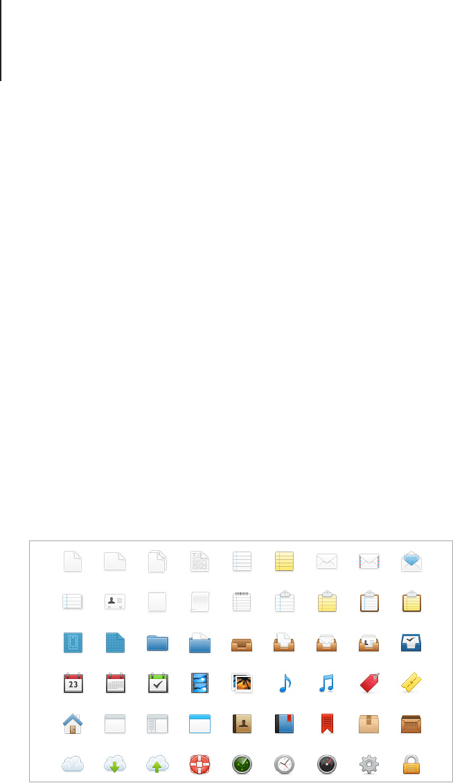
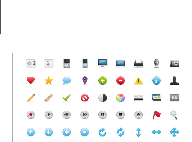
Rendering Styles81
• Divide a piece of paper into a grid of squares and use the
space to illustrate all of the designs side by side. Drawing
into the square will help you visualize the canvas space for
each design. Working like this will help balance the designs
when they appear next to one another.
• Use as much of the space as possible while keeping the
elements to a minimum. Remember that this style of icon is
commonly viewed at smaller scales.
• Choose a color palette before you begin to render the
nal designs. The use of a color palette will help to tie the
designs together, if you chose the colors as you work the
icons may gradually change and you will end up with a
mismatched set.
• If you need to make shades of a particular color, use the
HSB color sliders in your graphics program. HSB stands
for Hue, Saturation, Brightness, so when you use this
method you can keep the exact color your working with and
introduce light and shade in a way that doesn’t muddy the
image.
Freshy icons by Martin Karasek, continued on next page.
Rendering Styles82
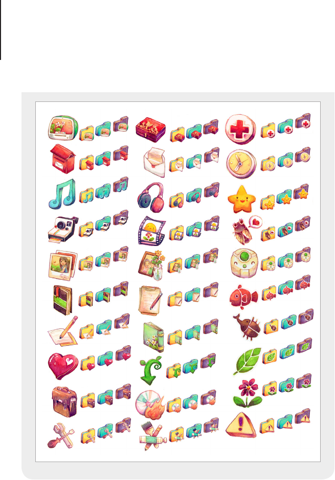
3. Creative and Informative
Icon replacement sets have grown in popularity over the years
and are often made by icon designers looking to break away from
traditional icon design. Websites such as deviantART support large
communities of icon designers who create free icon replacement
sets purely for the joy of icon design.
If you’re going to make an experimental or non-traditional icon
set, you can let your imagination run wild, but as always there are
a few rules that should be observed so the set is also suitable for
practical use.
• Carefully plan the style that you want to use and think
about how it would look at different scales. How small and
large will your icons appear? Before you start to create the
entire set, make a few rendering tests and rene the style
accordingly.
• Carefully chose the perspective the icons will be rendered in
and apply it to each design. Mixed perspective will confuse
the set.
• While creativity is a key factor for this kind of icon, you
need to make sure that the metaphors are still clearly
Rendering Styles83
understandable to the audience. An abstract icon is unlikely
to be used if it has no apparent function.
• Save time and make a list of all the icons and their
metaphors rst. Once you have a clear understanding of
the icons that you are drawing, apply the style. If you draw
stylistic icons from your mind without a plan you can often
end up with a mismatching set.
• Test, test, test! Be sure to test your icon set on various
colored backgrounds and screen resolutions. This applies to
all icon sets, but is particularly important for creative icons
as they stand out more than traditional designs and any
aws will be noticed quickly.
Summer, Love & Cicadas Icon Set by
Teekatas Suwannakrua
“
My previous two icon sets have a flaw; the icons have
too much of a ‘handmade’ feel, to the point that I think it
stands out too much in a polished environment like the
computer desktop screen. I need something more balanced
that can co-exist in digital environment well.
So I spent more time in this icon set, trying to polish
the outline and the coloring process. Although I’m
really satisfied with the result, I also learned another
lesson from this icon set: because I didn’t polish the
outer most outline of icons, the jagged edge of these
icons looked quite ugly on a dark background. Now
I always remember to double check the outer most
outline of each icon in my icon set.
”
Rendering Styles84
4. Pictograms
Pictograms are simplied icons that represent a real world
object. A language of their own, they are often used as signs and
illustrated instructions to reinforce meaning and signify important
information. More recently pictograms have been used for
smartphones and software to create clutter free interfaces that
quickly and clearly mark out points for user interaction.

Rendering Styles85
Pictograms may look like an easy style of icon to create but
looks can be deceiving. For a glyph icon to be perfect there are
guidelines to keep in mind. If you follow the guide below, you’ll be
off to a great start.
• Pictogram icons need to be as clear as possible and still
represent the item it stands for. Make the silhouette of the
item using basic shapes and lines, then embellish it with one
or two key features from the object. Try not to clutter the
pictogram with too much detail; remember, it’s not about the
object but its meaning.
• Pictograms are commonly a single color with cut out areas
added for the details. The best way to make this is with the
Pathnder options in Adobe Illustrator or the Shape Building
tools in Adobe Photoshop. Try and make the objects as
editable as possible before you export the nal designs. This
style of icon often requires lots of small tweaks before it’s
complete. Making sure that the shapes can be easily scaled
and moved will ensure that you don’t have to remake some
elements if a design change is necessary.
• A successful set of glyph icons should look crisp and clean.
This means pixel perfect shapes and a restrained use of
gradient lls (if any). Align all shapes to the pixel grid and try
not to use angles that will render and scale badly. Try to only
use straight lines and 45 degree angles with thick bold lines
and shapes. Fine shapes and details will blur and distort the
icon.
• Using a library of common elements will help to create a
harmonious set of pictograms. Building each icon with the
same size circles, lines and corner styles will help to visually
link each design and create an overall theme. Because the
only element used to make a pictogram is shape, it’s easy
to disrupt the harmony of a set with mismatching designs.
Rendering Styles86
Developer icon set by David Ferreira for wpzoom.com.

Perspective88
Perspective
I’m rst to admit that I was rubbish at drawing three dimensional
objects when I started in icon design. It takes a bit of practice, but
once you learn the basic principles you’ll be able to build on your
knowledge and become a master in no time.
In this chapter we will begin by looking at traditional perspective.
Learning how to draw perspective will help you focus your
attention on the form and construction of objects and give you the
skills to create effective three dimensional icons. Starting at zero
perspective and moving through two-point perspective to isometric
projection you will learn about the various forms of perspective
while gaining skills in traditional drawing skills with pencil and
paper, pixel pushing in Photoshop and shape building in Illustrator.
The learning process will guide you from basic to intermediate
rendering skills while you brush up on your perspective theory.
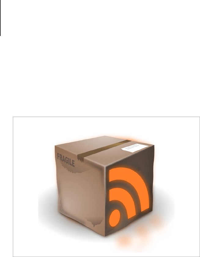
RSS icon made with Inkscape by Ambroise Coutand.

Perspective89
A Word on Perspective
In art and design, perspective is a way to draw objects that appear
to have the same three-dimensional qualities that can be seen in
real world objects and scenes. Perspective makes use of vanishing
points and horizon lines to dene the angle that an object is drawn
in and the way in which foreshortening and distance will change
the objects form.
The terms one-point, two-point and zero-point perspective relate
to the number of vanishing points in the drawing. Programs such
as Inkscape and Adobe Illustrator CS5 have the capability to
reproduce objects using a perspective grid, but as always, it’s best
to have a full understanding of the theory of perspective before you
re-create it digitally. In the following chapter I will explain the three
main forms of perspective used for icon design and how to draw
them.
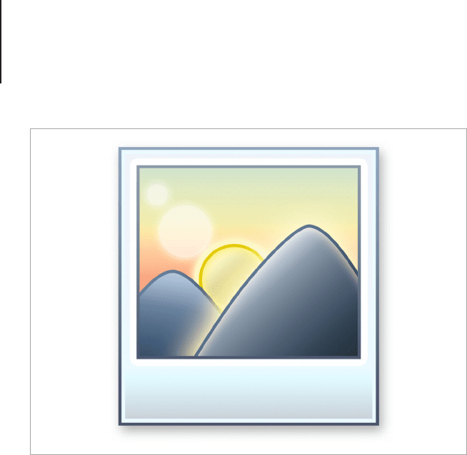
Zero-Point Perspective
Zero, no point or straight-on perspective, is a drawing or design
that is drawn with a straight on view with no apparent side or top
planes showing. Zero-point perspective is commonly used for
Toolbar and glyph style icons. Depth is created with the use of
scale and color rather than vanishing points. An example would be
a drawing of a mountain range. The illusion of depth is achieved
by gradually changing the color and shape of the mountains to
trick the viewer into perceiving perspective that isn’t drawn into the
image.
Perspective90
Zero-point perspective is easy to draw, works exceptionally well
with small icons, and allows designs to take full advantage of the
image grid. Even the most professional of icon designers will nd
some forms of perspective hard to apply to certain objects. If
you’re a beginner, using zero-point perspective will allow you to
work out the subtle rules of pixel rendering and scale restrictions
without having to worry about form and anti-aliasing on diagonal
shapes.
The most popular example of zero-point perspective is glyph-
style icons. You may see this style of icon design on Toolbars and
mobile devices. The best place to start when you’re making this
style of icon is to use vector shapes. By using editable shapes
you can tweak the proportions and form in a non-destructive way.
Adobe Photoshop is extremely popular among icon designers for
its precise pixel control, while Adobe Illustrator, Adobe Fireworks
and Inkscape are also suitable for the job.
Zero-point perspective has no vanishing points, the most common
example is a natural scene.