McInnes K. Rockstar Icon Designer
Подождите немного. Документ загружается.


Icon Categories and Conventions71
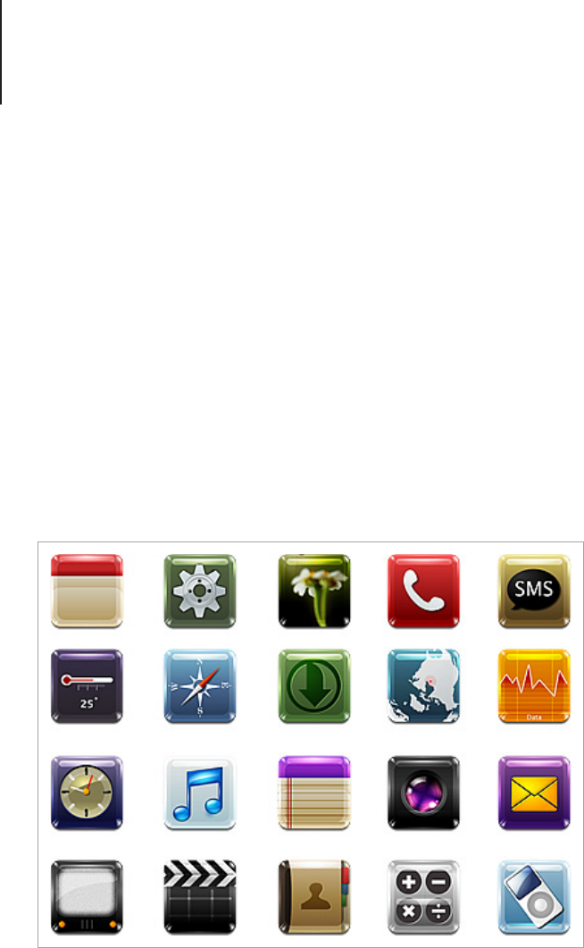
The high resolution screens of modern mobile devices versus
the small scale at which the icons are viewed at is an interesting
juxtaposition between the detail that can be seen and the detail
that can be added. This is where your good taste as a design
will come into play. Icons for mobile devices are a relatively new
addition to the world of icon design and conform to the same
constraints of a small viewing area. Depending on the device
you’re designing for, it’s likely that you will need to make icons in
either .SVG (for some mobile phones and Linux-based netbooks)
or .PNG (commonly used for touch screen devices such as iPod or
iPad) format.
Contrary to popular belief, the corners and shine of iOS icons are
not applied to the design, instead they are dynamically added by
the operating system.
I-Kid icons by “kidaubis”.

Icon Categories and Conventions72
Web-based Interfaces and Sites
Web-based icons can be found in many contexts, including cloud
applications, dashboards and social book-marking. While these
icons still need to be clear and easy to understand, the design
style is open.
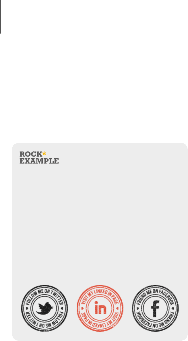
In the case of social networking icons, a little bit of creativity
can go a long way. The great thing about social icons is that the
designs are widely recognized and can be rendered in many
different styles without losing their meaning.
Stampaxx: A free social media stamp collection to brand
your work by Thomas and Mike
“
Stampaxx is a personal project. I (Thomas) made the
holding page for Mike, and for that design I made the first
stamp, which was the Twitter one. After posting a snapshot
to Dribbble, there were quite a few people who wanted me to
make a set of these stamps. So after making a few more, the
success seemed to only grow and I soon decided to create
a massive collection of social media stamps to offer for free.
I talked about the idea with Mike, and we both decided to
create a small website around these stamps, just to make it
into a real and complete project.
”

Icon Categories and Conventions73
Design Tips
A common format for web icons is transparent PNGs, but if
you chose to use this le format, remember to check your
target audience and the compatibility with older browsers. If a
transparent PNG isn’t compatible with a browser it will show the
transparent area as a solid background. Internet Explorer 6 can
show transparent PNGs with some extra coding but it isn’t an
ideal solution and can cause some compatibility issues across
browsers. Some developers don’t nd PNG to be a problem as
they have a very small percentage of users running incompatible
browsers, and others will nd it extremely important to design for
all audiences. If you want maximum compatibility across browsers
then the .GIF format is a good option as it has universal support
for its transparency, however it also has the drawback of only
rendering bit-transparency, which won’t allow you to use gradual
percentages of opacity.
With navigation icons, sometimes simple is best. Using a glyph
style is a good way to assist users without distracting them from
the main focus of the page. Be sure to make glyphs as clear and
precise as possible. Pixel blurring is even more obvious on a
symbol than it is on a regular icon. For more on precise rendering
techniques go to page 78.
With icons used as illustrative content for a webpage, carefully
chose the style that you want to use. Icons can often infer a
meaning that you may not be aware of. A common mistake is
websites using highly polished icons that use Mac or PC style
imagery. What can often happen when using icons in this way is
that you may lead viewers to believe that you’re selling software
or have software to accompany a product or service. This has
largely come about because of two factors. One is the popularity
of web design for the application and software markets, in the
uptake of this style some designers have also used the same style
icons without realizing why they were used in the original designs.

Icon Categories and Conventions74
The other factor is free stock icons with most of the popular sets
based on the Mac and PC style. I’m not saying that you cannot use
polished icons for your design, but you should be aware that if you
use images too similar to the ones that are already in use you will
be conveying the wrong message.
Emoticons
Emotion icons, commonly known as “emoticons” are used on
web forums, chat programs and even email correspondence.
Considered to be an informal form of communication, there’s no
denying that emoticons help to convey the meaning of text that
is otherwise left to the interpretation of the reader. Text-based
emoticons are over 100 years old, with the earliest use dating back
to 1881. Nowadays both text based and icon based emoticons are
used with programs such as Google Chat and Microsoft MSN that
have short-code features to insert corresponding icons into text.
Emoticons take inspiration from cartooning and use dramatic
and over-emphasized facial expressions to immediately convey
meaning. While the majority of an emoticon set is typically made
from expressions, additional item-based emoticons can be
included in a set to use as conversation markers, such as a coffee
cup for “break”, a shop sign for “be right back” and thumbs up and
thumbs down for “good” and “bad.”
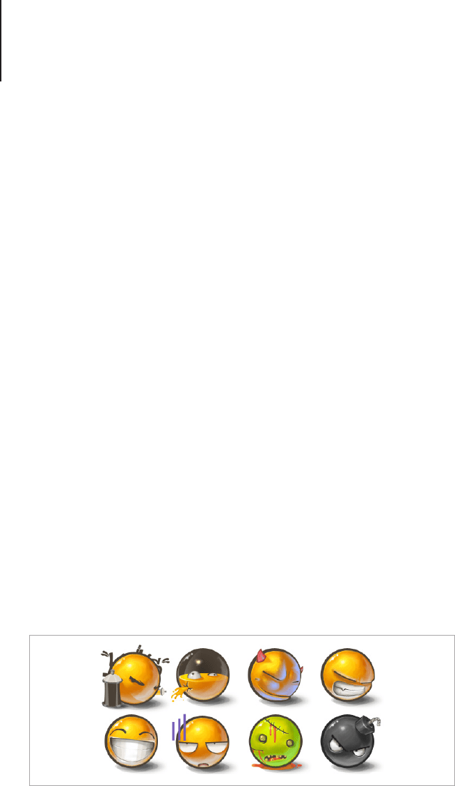
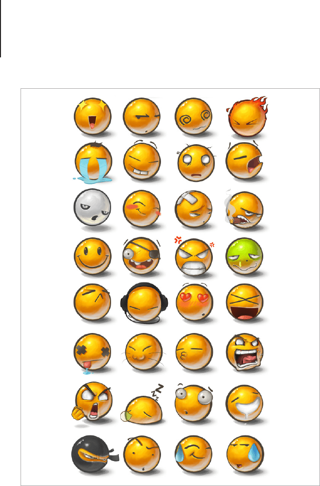
Yolks Emoticons by “Bad-Blood”, continued on next page.

Icon Categories and Conventions75
Design Tips
If you plan on creating a set of emoticons, start with a
“brainstorming tree.” This is a list of related words all linked
together. So you may start with “emotion,” then under that write
down the emotions you can think of. Emotions may be “happy”,

Icon Categories and Conventions76
“sad” and “angry.” From the sub list you would then add further
categories, so you may write “amused,” “excited” and “in love”
as an offshoot of happy. Continue on until you have a full list of
emotions you want to draw. If you’re including items in your set,
think of items people might use in conversation such as, a love
heart, ower, star and thumbs up symbol. Emoticons will need
a bit more planning and rening than regular icons as the key to
their communication is in the expressions. Draw your emoticons
on a piece of paper and ask your friends or family to tell you what
each one is. If people are having trouble guessing the meaning of a
particular icon it could mean that the expression isn’t exaggerated
enough and you will need to add some more personality to the
design. If you let your personality and creativity guide your work,
emoticons can be lots of fun to share and create.


Rendering Styles78
Rendering Styles
There are four main styles for icon rendering:
1. Hyper Realistic
2. Clear and Simple
3. Creative and Informative
4. Pictograms
Let’s take a look at these icon styles and the best way to approach
them in your workow.
1. Hyper Realistic
When reading style guides such as the Apple Human Interface
Guidelines or the MSDN Icon Design Guidelines, you will be asked
to render in a style that’s “Gorgeous [and] artistic” or “better than
photorealistic.” I like to call both of these styles “Hyper Realistic.”
What this essentially means is that anything that’s rendered should
appear to be “better” than real. If you look closely at a photo you
will notice that it looks real, but the tones become muddy in the
shadows and the texture may be uneven. Icons should be just as
real as photos without looking dull or “normal.” When you begin
to design an icon think of emotive words such as rich, delicious
and attractive. The icons from both Aqua and Aero have been
designed to create an emotional response in the viewer. Whether
this is achieved or not is up to your interpretation, but the theory is
a good place to begin.

Rendering Styles79
Seventy Seven by Luis F. Moreno
“
This retro replacement icon set was inspired by the
seventies, the decade I was born, 1977. References to pop
culture and strong communicative images to serve as a
replacement for some system icons.
”
A Hyper Realistic icon is easy to recognize, but there’s a few points
to take into consideration when creating your own.
• Keep the elements to a minimum. Remember that you’re
creating an icon, so the meaning should be clear and easy
to understand.

Rendering Styles80
• Taste applies to icons too. Don’t go crazy with the special
effects; one or two should be enough to make the icon look
great. Any more than that and it will look over-baked.
• Stick to the brief. Even if you love a particular aesthetic,
keep to the style of the platform you’re working on. Your
icons should be a balance between brilliant design and
matching the icons around it.
• A pixel in time saves nine. Don’t rush in and render before
the design is perfect, if changes need to be made it will cost
you time and effort.
• Don’t let reality get in the way of a great concept. Have
you ever looked at the transparent recycle bin in Windows 7
and thought, surely a bin such as this doesn’t exist! (perhaps
I’m the only one who thinks this much about icons, but I
digress.) You have come across one of the great rules of
Hyper Realistic icon design. Go with the “wow” and forget
about reality. If you need to render a padlock, why not make
it a super lock from the future with neon lights a massive
chrome dial and a halo of light? Surprising metaphors and
design concepts make the icon memorable — drawing in
this style is pretty exciting too.
2. Clear and Simple
One of the most successful styles of icon design is the clear and
simple approach. Each icon in a set is designed to have a visual
balance so that the icons look harmonious no matter which order
they are viewed in.
Clear and simple icons are best suited for use with Toolbars and
web designs. Points to take into consideration when creating a
clean style icon set are:
