Marjoribanks R. Geological Methods in Mineral Exploration and Mining
Подождите немного. Документ загружается.

170 10 Geographical Information Systems and Exploration Databases
a digitizer) along the lines of a hard-copy map, and using a software program to
convert the position of the cursor into a sequence of coordinates. The digitized points
along a curved line are normally sufficiently close to enable a line, undistinguishable
from the original curved line, to be drawn through the points. Automatic scanners
are also available which can identify and digitize lines on a map (Fig. 10.1a).
10.3.2 Polygon or Vector Format
A series of points can be manually defined, using a cursor, around the boundary
of each area of the map. The software then calculates the position and direction
of the straight lines between these points, thus defining a polygon. The informa-
tion is recorded as vectors lying in the horizontal map plane. A vector in the third
dimension can then be used to represent the attribute (e.g. sandstone, or colour
red, or number 346) that is represented by that polygon. The polygon system thus
characterizes and defines areas, rather than lines (Fig. 10.1c).
10.3.3 Raster Format
A fine grid (usually, but not always rectangular) is laid over the map, and those
squares or cells of the grid which have the same attribute are identified (Fig. 10.1b).
The process can be done manually, but usually a scanning device is used. Where a
grid cell covers areas with more than one attribute, the characteristic of the largest
area within the cell is recorded as the attribute for that cell. Scanned maps and
photographs that are stored and presented on the grid format are known as raster
maps. Like the polygon system, raster map information records the attributes of
areas of the map. Analog map data (printed maps, aerial photographs etc...) that are
scanned to digital format are raster maps.
10.4 Validation
Data that have been collected digitally and entered directly into the computer, or
read into the computer by some sort of scanning process, are likely to be relatively
error free. However, where manual entry of numbers has been involved in producing
computerized databases, errors can be expected. This problem applies particularly
to databases that contain a large amount of historical information that has been typed
in from old hard-copy files. Errors such as these in large databases can be a major
problem and are very hard to spot, particularly where the data have been computer-
processed in some way before use. Validation of digital databases is therefore a vital
part of any data entry process. There is really no easy way of doing this (at least the
author does not know of any). It is best done by comparing a hard-copy print-out
of the data, visually scanning for inconsistencies, and carefully, point by point, line
10.5 Georeferencing 171
by line and area by area, comparing the print-out with the original sources. A useful
technique is to display the data as a graph, map or section and to look for obvious
outliers. As an example, on a drill section, holes shown collared well above or below
ground level probably reflect a data entry error or an error in the original collection
or recording of the numbers.
Much historical exploration or mining data is based on locally established
grid systems which may not be tied in to universal grid coordinates such as
latitude/longitude or UTM (Sect. 10.5). In this case field work will have to be under-
taken to locate old grid pegs or drill hole collars that can be surveyed using a DGPS.
Collar coordinates are often quoted incorrectly in old reports, and field surveys may
also be necessary to correct these mistakes.
Data validation can take almost as long as the original data entry, but it is essential
that it be done.
10.5 Georeferencing
10.5.1 Geographical Coordinates
A geographical coordinate system defines each point on the surface of the globe
with two numbers, each based on an angle measured from the centre of the earth.
The familiar geographic coordinates are latitude and longitude. Latitude measures
degrees (0–90
◦
) north or south of the equator. Each degree of latitude is approxi-
mately 111 km and is much the same anywhere on the globe. Longitude measures
degrees (0–180
◦
) east and west of an arbitrarily defined (but universally accepted)
“prime meridian” (0
◦
) running N–S through Greenwich in the United Kingdom.
Unlike latitude, the length of a degree of longitude varies according to position.
At the equator a longitude degree is the same as a latitude degree (approximately
111 km) but its length progressively decreases both north and south to become zero
at the poles.
Geographical coordinates are the most fundamental system of coordinates avail-
able, but they have many drawbacks. Measuring the distance between two points is
difficult if they are defined by lat/long coordinates and have a large N–S separation
(it involves spherical trigonometry). Also, since a degree is normally subdivided into
60 minutes (60
), and a minute into 60 seconds (60
), they are rather inconvenient
to units to use when measuring or plotting a position on a map.
10.5.2 Cartesian Coordinates
Cartesian coordinates are based on linear distance from a defined point of origin and
generally provide a more user friendly system of coordinates than latitude and longi-
tude. Distances between points can be determined by simple trigonometry. The most
widely used Cartesian coordinate system in use today is called Universal Transverse

172 10 Geographical Information Systems and Exploration Databases
Mercator (UTM) and was developed by the US Army in the 1940s. Nowadays UTM
coordinates
2
appear on almost all published medium and large scale topographic
maps alongside the more traditional latitude and longitude system. In the UTM sys-
tem, the earth between latitudes 80
◦
S and 84
◦
N is divided into 60 numbered zones
each of which is 6
◦
longitude in width. Zone 1 is centred on longitude 177
◦
W (i.e. it
extends from 174 to 180
◦
W): successive zone numbers then increase in an easterly
direction.
3
In each zone, the east coordinate (called the easting) of a point is based on its
distance in meters from the central meridian (longitude) of the zone. To avoid neg-
ative numbers, the central meridian is given a “false easting” of 500,000 m – thus
anything west of the central meridian will have an easting of less than 500,000 m.
At the equator, each Zone is 666 km wide: in each Zone, UTM eastings thus range
from 167,000 to 833,000 m – the range of eastings decreases progressively towards
the poles.
The north coordinate (or northing) of a point is based on its distance in meters
from the equator. In the northern hemisphere the equator is given an initial nor-
thing of 0 m and northings increase from there to the north. At 84
◦
N latitude (the
maximum extent of UTM Zones), the northing is 9,328,000 m. In the southern hemi-
sphere, to avoid negative values, the equator is given a “false northing” value of
10,000,000 m. Northings then decrease to the south. The equator is thus either 0 m N
or 10,000,000 N, depending on your point of view.
Where the boundary between two UTM zones falls on a particular map, the coor-
dinates for both zones are normally shown for 40 km either side of the boundary.
This enables distances between points located on either side of the boundary to be
measured using the coordinates of only one zone.
10.5.3 Map Datums
A map is a two-dimensional representation of a portion of the 3-dimentional curved
surface of the earth. The means by which 3-dimentional objects are shown on the
map surface is known as the map projection. All map projections create some degree
of distortion. UTM coordinates are plotted on a map using the transverse merca-
tor
4
projection. This projection is chosen because it creates minimal distortion over
2
Although it may not be called UTM on your map. In Australia, for example, the UTM coordinate
system is referred to as Map Grid of Australia ’94 (MGA94).
3
Zones 10–19 cover the contiguous states of mainland USA; zones 17–24 cover South America,
zones 28–38 Africa, zones 46–50 East Asia and zones 50–46 cover Australia.
4
Named after the sixteenth century Flemish cartographer, Gerardus Mercator. The Mercator pro-
jection has the feature of preserving angular relationships (and hence approximate shape) but
distorts distance and area. A bearing measured on a Mercator projection will correspond to a bear-
ing on the ground. Most medium and large scale maps employ the Mercator projection. However,
smaller scale maps (the kind you might find in a regional atlas) may use a variety of different map
projections.

10.6 Manipulation of GIS Data 173
regions with small E–W width and large N–S extent. A separate transverse Mercator
projection is used for each UTM Zone.
5
The shape of the earth varies from a perfect sphere by a small amount. It is
slightly asymmetrical, flattened from north to south and bulges a bit in the southern
hemisphere. This shape is known as the geoid. Map projections are dependent upon
the mathematical geoid model used to describe the shape of the globe. Today the
most commonly used geoid model is known as the World Geodetic System 84 or
simply WGS84. This is the standard adopted for plotting UTM coordinates, and it
is the standard used for satellite based GPS applications.
For any map, the projection plus the geoid model used in its construction are
known as the map datum. Information on the datum will normally be found printed
on the margins of any published topographic map. Although WGS84 and UTM are
widely used standards, historical maps, and other maps that may be available from
different parts of the world may show different coordinate systems and map datums.
Software programs are available which can convert coordinates from one map datum
to another. This software is a standard component of GPS instruments and is usually
also available in commercial GIS software packages.
10.5.4 Map Registering
If GIS data from different sources are to be combined and manipulated by computer,
they must be converted to the same coordinate system and map datum. This process
is known as registering. Many geology, geophysical or geochemical maps or remote
sensed images carry no coordinates or show only locally defined coordinates. To
register these maps a series of control points have to be selected on each map or
image and the UTM coordinates (or latitude and longitude) for these points entered
into the software. Usually at least four points (one near each corner and one near
the centre) are required for each map. The GIS software will then automatically
georeference each point or raster cell in the map/image. For this process, points are
selected that can be easily matched with known UTM coordinates. Sometimes a
special ground survey will be necessary to obtain this information.
10.6 Manipulation of GIS Data
Once in digital format and georeferenced, GIS software allows map data to be
manipulated in a number of ways. Searches can be done for different attributes.
Selected ranges of numbers can be highlighted. The position, size and attitude of
different map areas can be compared, either within the same layer or between differ-
ent layers. By selecting the appropriate presentation format, different layers of data
5
The nomenclature is a little confusing here. Transverse Mercator (TM) is a map projection.
Universal Transverse Mercator (UTM) is a system of cartesian coordinates.

174 10 Geographical Information Systems and Exploration Databases
can be combined into the one image. The types of data which are often combined in
this way are regional geophysical or geochemical surveys with geology; geology or
geophysics data with satellite or radar imagery; geology mapping with surface spot
heights (the latter in the form of a digital elevation model or DEM). The purpose of
such composite images is to facilitate visual recognition of key correlations between
the data sets.
Finally, the GIS program will be used to select an appropriate image for printing
a hard-copy map at an appropriate scale and within selected boundaries.
10.7 Presentation of GIS Data
The computer can do a lot of essential processing of digital data but, once this
is done, qualitative interpretation requires conversion of the data to map format.
Map presentation, whether on a monitor or paper print, makes use of the power
of the linked eye and brain system to distinguish meaningful patterns and spatial
relationships in complex data sets.
Geochemical and geophysical data are normally collected along closely spaced
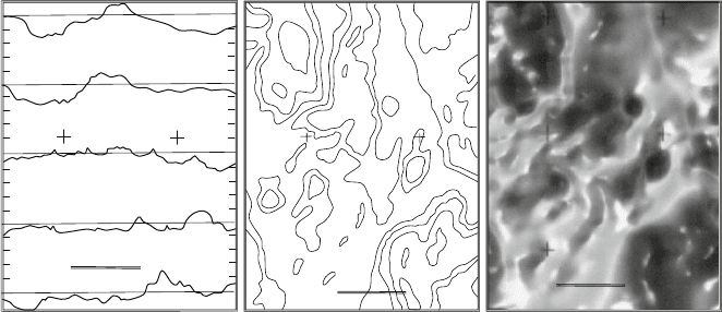
grids or s can lines and are traditionally shown as contour maps (Fig. 10.2b).
Contouring is still a widely used and valuable technique but it can only present a
relatively small sample of the data (the numbers selected for the contour intervals).
Much of the information contained in a data set is not used by a contouring program
and, as a result, subtle features can be smoothed over and lost. This can be overcome
by using more closely-spaced contour lines, but in areas of strong gradients this can
lead to lines piling up on top each other in an inky mess.
Where the data are collected along regular scan lines (e.g. magnetometer read-
ings, or soil sampling lines), measurements along each of these lines can be
presented as a two-dimensional graph or section. By correctly positioning (stack-
ing) such sections in parallel rows across a map base, all of the measured survey
data can be shown and some impression gained of the spatial relationships between
successive scan lines (Fig. 10.2a).
Because of their ability to present the full range of the measured attribute, stacked
sections are widely used by geophysicists and geochemists for quantitative interpre-
tation of regularly scanned data. However, the product is still only a set of two
dimensional slices and stacking such sections in parallel rows offers only minimal
help to the eye in discerning the correlations between sections, especially if they are
widely spaced. On the other hand, if the stacked sections are closely spaced they will
overlap and create a confusing jumble of lines (this has been avoided in Fig. 10.2a
by showing only one section in five).
A powerful technique, now widely used, overcomes the problem of three-
dimensional map presentation by visually representing the value of the measured
attribute as a point on an infinitely variable
6
colour range or grey tone. The tone
6
In fact, there is a limit to the range of tonal and colour variation that the human eye can distinguish,
but this is still great enough to represent very fine detail.
10.7 Presentation of GIS Data 175
500 meters
(a)
500 meters
(b)
500 meters
(c)
Fig. 10.2 Three different ways of representing two dimensional data on a three-dimensional plane:
an example from an air magnetic survey with 100 m spaced, E–W flight lines. In (a) the magnetic
readings along each flight line are shown as stacked sections arranged across the map (to simplify,
only a few sections are shown). This format preserves all the original magnetic data, but it can be
hard for the eye to make spatial correlations. In (b) a computer program has distributed the linear
flight line data across the two-dimensional map, and the results shown as contours. This facilitates
qualitative interpretation, but some of the original magnetic detail has been lost. More contour
intervals can recover some, but not all, of this detail. In (c) software has again distributed the linear
data over the 2D map area. Presentation is in raster format with magnetic intensity represented by
allocating a range of grey tones to each pixel (the original of this map is in a range of colours from
blue (low values) to red (high values)). Some information is still lost, but this type of presentation is
an excellent compromise between preserving the original range of measurement and presentation
in a form that facilitates geological interpretation. Once in Raster format maps can be manipulated
mathematically to enhance particular features of the data set
or colour is then printed on the map to characterize the area considered to have
influenced that measurement (Fig. 10.2c). Each area of a single tone is known
as a pixel (from picture element). Provided the pixels are sufficiently small (this
depends on the closeness in space of the original measurements and the scale at
which the map is presented), such computer-generated images have the appearance
of a photographic print and are relatively easy for a geologist to interpret. Original
measurements collected along regular sampling lines such as the data from most
geochemical and geophysical surveys, can be presented in analog map format
by conversion to a pixel map. Pixel maps are similar to raster maps – the only
difference is in the way they are prepared. Some remote sensed data such as satellite
reflectance imagery is already collected in a pixel based raster format.
The key step in the process of producing a contour or pixel map is the conversion
of a series of one-dimensional data streams – i.e. the numbers collected along the
traverse or flight lines of the survey – into a two-dimensional data array. Computer
software does this by calculating a value for all those sub-areas or pixels of the
map that were not measured in the survey. The most common way of doing this
is by triangulation. The software constructs lines between all adjacent known data
points to form a network of adjacent triangles across the area. This is done so that no
176 10 Geographical Information Systems and Exploration Databases
(b) (a)
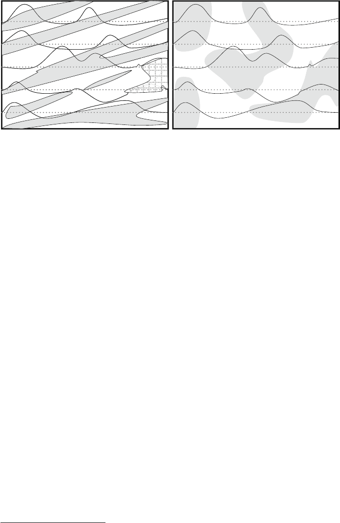
Fig. 10.3 (a) Is a geological map of an ENE trending sequence of rock units. Magnetic intensity
has been measured by close-spaced readings along a series of E–W lines – these values are shown
on the map as a series of stacked sections. In (b), computer software has constructed a pixel map of
the area based on the magnetic measurements. The spurious patterns of the pixel map result from
a bias i n the software for trends at a high angle to the survey lines
triangles intersect.
7
The values along the sides of each triangle are then calculated on
the assumption that the attribute is distributed in a linear way between any two data
points (this is illustrated in the simple hand contouring example of Fig. C.1). The
triangulated data can then be used as a basis for positioning contour lines or allo-
cating values to the cells of a raster grid. Smoothing programs are then employed if
necessary to remove any angular patterns created by the triangulation. This proce-
dure works well provided the spacing of the sample/flight lines is small relative to
the spacing of the real-world map-scale patterns of the attribute that is being mea-
sured. The process is inevitably biased in favour of those patterns in the data that lie
at a high angle to the sample lines. If the distribution of data in the real world has
strong directional trends that lie at a low angle to the direction of the sample lines,
and the sample lines are widely spaced relative to the spacing of the real world pat-
terns, then the software can produce a completely spurious and misleading 2D map,
as illustrated in Fig. 10.3. Fortunately, even if you know nothing about the geology
of the area being surveyed, it is often possible to spot where this has occurred.
Where the data has been collected along lines at a low angle to real world linear
anomalies, the computer generated 2D map typically shows a distinctive pattern of
irregularly-distributed, “blobby” anomalies, with lengths equivalent to one or two
line spacings, and trends that are at a high angle to the survey direction.
Since pixel maps are based on a net of geographically referenced numbers, these
numbers can be manipulated mathematically by computer to enhance features of the
map in a variety of ways. For example, boundaries between domains can be empha-
sized (a process known as edge enhancement). Greater or lesser emphasis can be
7
This method of covering space with a tesseract of adjacent triangles is known as Delauney
triangulation.

10.7 Presentation of GIS Data 177
placed on particular ranges of numbers by allocating more colours or tones to that
range. Extreme values, or outliers, can be removed form the data sets. By using the
value of the attribute as a third dimension, computer processing can display georef-
erenced data as a complex surface which, when rotated and viewed on a monitor
from different angles, gives the visual impression of a three dimensional surface
similar to a topographic surface. The pixel data from one image can be used to cre-
ate a second image in which each pixel is displaced to the east by a small amount
depending on the value of the attribute. This creates parallax difference between the
images so that they can be viewed with a stereoscope to recreate the 3-D effect. The
3-D effect can also be enhanced by a false “illumination” of the surface from any
particular angle. Different viewing directions or different illumination angles can be
useful in enhance particular trends within the data.
The processing power, memory capacity and graphics ability of modern comput-
ers
8
combined with available software packages mean that processing GIS data can
be now be done on relatively cheap lap top computers. New data can be seamlessly
integrated to existing data bases and presentations of data can be queried, compared
and analysed quickly and in real time.
8
Almost certainly the result of the demands from gaming applications.
Appendix A
Notes on the Use of Graphical Scale Logging
Because some explorationists are unfamiliar with graphical logging, this appendix
goes into some detail on how to use this style of core logging. It should be read in
conjunction with the comments in Sect. 7.8.2. The description refers to the partic-
ular logging form illustrated in Fig. 7.16. The comments, however, apply to most
graphical scale log forms and serve to illustrate the concepts behind this style of
logging.
The form illustrated was designed at A4 size for convenience of use in the field
(it has been photo-reduced to fit the page size of this book). Some geologists might
prefer to work with an original A3 size form. However it is important to realise that
the amount of detail that can be shown is a function of the scale chosen, not the
size of the logging sheet. The original of the form is printed on heavy-duty paper
to withstand outdoor use and frequent erasing. The labelling of the various columns
on the form reflects the type of information which experience suggests should be
acquired when drilling many mineralized areas. However, particular projects may
require particular types of information to be recorded, and the columns can be re-
labelled or re-allocated as found necessary.
If the forms are completed in colour (and this is strongly recommended), some
information will be lost unless scanned copies are also made in colour.
The form is designed to be used in conjunction with a diamond drill hole sum-
mary form. This is a single sheet that accompanies the geological log and records
summary assay data, summary geological data and survey information.
A very important part of such a summary form is the provision for a state-
ment setting out the purpose and justification of the hole and what it is expected
to encounter. To be of any value, this statement should be written down in advance
of drilling (see Sect. 7.3).
The graphical scale logging form of Fig. 7.16 is divided into columns. In order
to describe how to record drill core observations on to the form, the columns will be
referred to in numbered order from left to right
179
R. Marjoribanks, Geological Methods in Mineral Exploration and Mining, 2nd ed.,
DOI 10.1007/978-3-540-74375-0,
C
Springer-Verlag Berlin Heidelberg 2010
180 Appendix A
A.1 Column 1 (Hole Depth)
The hole depth in metres is marked off along this column according to the scale
chosen. A scale of 1:100 will allow 20 m to be logged per A4 page; a s cale of 1:50
will allow 10 m to be logged per page, and so on. It is recommended that the entire
hole be logged initially at a semi-detailed scale (1:100 has been found by practice to
be a good general scale). If necessary, areas of interest can be separately re-logged
at a more detailed scale such as 1:50 or 1:10.
A.2 Column 2 (Core Recovery)
This column is used to mark the advance of each barrel of core. The actual core
recovered for this advance is measured and recorded in this interval as a percentage.
A.3 Column 3 (Core Quality)
This column is provided for recording measurements of core quality such as RQD
(Rock quality designator). If no RQD is required, the column is available to be
relabelled for some other parameter.
A.4 Column 4 (Sample No.)
This column is used to record the identification number of the sample taken for
assay. It also enables the geologist to record the intervals chosen for assay as she
logs the core, and facilitates the subsequent transferral of assay information onto
the form.
A.5 Column 5 (Assay Results)
These columns are designed so that important assay data relevant to the mineral-
ization can be shown in juxtaposition with other related geological elements. The
purpose in entering key assay numbers on the log sheet is to assist in drawing geo-
logical conclusions about the meaning of the assay data. There is only room only to
write a few significant assays on to the form: the full assay data for the hole would
of course normally be stored elsewhere in a computer retrieval system.
A.6 Column 6 (Mapping Logs)
This is the pictorial log and provides a map of the core. By dividing the columns as
shown, it is possible to provide up to four parallel maps. In this example, these maps
are chosen to show lithology, structure, mineralization and alteration (the analogy