Jackson S.L. Research Methods and Statistics: A Critical Thinking Approach
Подождите немного. Документ загружается.


102
■ ■
CHAPTER 4
6. A tally sheet on which attributes that will not
change are recorded utilizes
items.
a. static
b. action
c. narrative
d. nonnarrative
7. Personal interview surveys have the concern of
but have the advantage of .
a. low return rate; eliminating interviewer bias
b. interviewer bias; high return rate
c. sampling bias; eliminating interviewer bias
d. both b and c
8. Of the three survey methods discussed in the
text,
surveys tend to have the lowest
response rate and the
expense.
a. mail; highest
b. personal interview; highest
c. telephone; lowest
d. mail; lowest
9. Poor response rate is to
as interviewer
bias is to .
a. mail surveys; personal interview surveys
b. mail surveys; mail surveys
c. personal interview surveys; mail surveys
d. telephone surveys; mail surveys
10. Rich is conducting a survey of student opinion of
the dining hall at his university. Rich decided to
conduct his survey by using every tenth name on
the registrar’s alphabetical list of all students at
his school. The type of sampling technique that
Rich is using is:
a. representative cluster sampling.
b. cluster sampling.
c. stratified random sampling.
d. random sampling.
11. Imagine that you wanted to assess student opin-
ion of the dining hall by surveying a subgroup of
100 students at your school. In this situation, the
subgroup of students represents the
, and
all of the students at your school represent the
.
a. sample; random sample
b. population; sample
c. sample; population
d. cluster sample; sample
12. A question including nonneutral or emotionally
laden terms is a
question.
a. loaded
b. leading
c. double-barreled
d. open-ended
13. An open-ended question is to
question as
a closed-ended question is to
question.
a. multiple choice; short answer
b. short answer; multiple choice
c. short answer; essay
d. multiple choice; essay
14. Consider the following survey question: “Most
Americans consider a computer to be a necessity.
Do you agree?” This is an example of a
question.
a. leading
b. loaded
c. rating scale
d. double-barreled
10017_04_ch4_p078-102.indd 102 2/1/08 1:15:35 PM

103
Data Organization and
Descriptive Statistics
5
CHAPTER
Organizing Data
Frequency Distributions
Graphs
Bar Graphs and Histograms • Frequency Polygons
Descriptive Statistics
Measures of Central Tendency
Mean • Median • Mode
Measures of Variation
Range • Average Deviation and Standard Deviation
Types of Distributions
Normal Distributions • Kurtosis • Positively Skewed Distributions •
Negatively Skewed Distributions
z-Scores
z-Scores, the Standard Normal Distribution, Probability, and Percentile Ranks
Summary
10017_05_ch5_p103-139.indd 103 2/1/08 1:18:54 PM

104
■ ■
CHAPTER 5
Learning Objectives
• Organize data in either a frequency distribution or class interval fre-
quency distribution.
• Graph data in either a bar graph, histogram, or frequency polygon.
• Differentiate measures of central tendency.
• Know how to calculate the mean, median, and mode.
• Differentiate measures of variation.
• Know how to calculate the range, average deviation, and standard
deviation.
• Explain the difference between a normal distribution and a skewed dis-
tribution.
• Explain the difference between a positively skewed distribution and a
negatively skewed distribution.
• Differentiate the types of kurtosis.
• Describe what a z-score is, and know how to calculate it.
• Use the area under the normal curve to determine proportions and
percentile ranks.
I
n this chapter, we’ll begin to discuss what to do with the observations
made in the course of a study—namely, how to describe the data set
through the use of descriptive statistics. First, we’ll consider ways of
organizing the data by taking the large number of observations made during
a study and presenting them in a manner that is easier to read and under-
stand. Then we’ll discuss some simple descriptive statistics. These statistics
allow us to do some “number crunching”—to condense a large number of
observations into a summary statistic or set of statistics. The concepts and
statistics described in this chapter can be used to draw conclusions from data
collected through descriptive, predictive, or explanatory methods. They do
not come close to covering all that can be done with data gathered from a
study. They do, however, provide a place to start.
Organizing Data
Two methods of organizing data are frequency distributions and graphs.
Frequency Distributions
To illustrate the processes of organizing and describing data, let’s use the data
set presented in Table 5.1. These data represent the scores of 30 students on an
introductory psychology exam. One reason for organizing data and using sta-
tistics is to draw meaningful conclusions. The list of exam scores in Table 5.1
is simply that—a list in no particular order. As shown here, the data are not
especially meaningful. One of the first steps in organizing these data might be
to rearrange them from highest to lowest or from lowest to highest.
TABLE 5.1
Exam Scores for
30 Students
56 74
69 70
78 90
80 74
47 59
85 86
82 92
74 60
95 63
65 45
54 94
60 93
87 82
76 77
75 78
10017_05_ch5_p103-139.indd 104 2/1/08 1:18:55 PM
Data Organization and Descriptive Statistics
■ ■
105
TABLE 5.2 Exam
Scores Ordered from
Lowest to Highest
45 76
47 77
54 78
56 78
59 80
60 82
60 82
63 85
65 86
69 87
70 90
74 92
74 93
74 94
75 95
TABLE 5.3 Frequency and Relative Frequency Distributions of Exam Data
SCORE f (FREQUENCY) rf (RELATIVE FREQUENCY)
45 1 .033
47 1 .033
54 1 .033
56 1 .033
59 1 .033
60 2 .067
63 1 .033
65 1 .033
69 1 .033
70 1 .033
74 3 .100
75 1 .033
76 1 .033
77 1 .033
78 2 .067
80 1 .033
82 2 .067
85 1 .033
86 1 .033
87 1 .033
90 1 .033
92 1 .033
93 1 .033
94 1 .033
95 1 .033
N = 30 1.00
After the scores are ordered (see Table 5.2), you can condense the data
into a frequency distribution—a table in which all of the scores are listed
along with the frequency with which each occurs. You can also show the
relative frequency, which is the proportion of the total observations included
in each score. When a relative frequency is multiplied by 100, it is read as a
percentage. For example, a relative frequency of .033 would mean that 3.3%
of the sample received that score. A frequency distribution and a relative
frequency distribution of the exam data are presented in Table 5.3.
The frequency distribution is a way of presenting data that makes the pat-
tern of the data easier to see. You can make the data set even easier to read
frequency distribution
A table in which all of the
scores are listed along with
the frequency with which each
occurs.
frequency distribution
A table in which all of the
scores are listed along with
the frequency with which each
occurs.
10017_05_ch5_p103-139.indd 105 2/1/08 1:18:56 PM
106
■ ■
CHAPTER 5
(especially desirable with large data sets) by grouping the scores and creating
a class interval frequency distribution. In a class interval frequency distribu-
tion, individual scores are combined into categories, or intervals, and then
listed along with the frequency of scores in each interval. In the exam score
example, the scores range from 45 to 95—a 50-point range. A rule of thumb
when creating class intervals is to have between 10 and 20 categories (Hinkle,
Wiersma, & Jurs, 1988). A quick method of calculating what the width of
the interval should be is to subtract the lowest score from the highest score
and then divide the result by the number of intervals you want (Schweigert,
1994). If we want 10 intervals in our example, we proceed as follows:
95 45
_______
10
50
___
10
5
Table 5.4 is the frequency distribution using class intervals with a width
of 5. Notice how much more compact the data appear when presented in a
class interval frequency distribution. Although such distributions have the
advantage of reducing the number of categories, they have the disadvantage
of not providing as much information as a regular frequency distribution.
For example, although we can see from the class interval frequency distribu-
tion that five people scored between 75 and 79, we do not know their exact
scores within the interval.
Graphs
Frequency distributions provide valuable information, but sometimes a pic-
ture is of greater value. Several types of pictorial representations can be used
to represent data. The choice depends on the type of data collected and what
the researcher hopes to emphasize or illustrate. The most common graphs
class interval frequency
distribution A table in
which the scores are grouped
into intervals and listed along
with the frequency of scores in
each interval.
class interval frequency
distribution A table in
which the scores are grouped
into intervals and listed along
with the frequency of scores in
each interval.
TABLE 5.4 A Class Interval Distribution of the Exam Data
CLASS INTERVAL f rf
45–49 2 .067
50–54 1 .033
55–59 2 .067
60–64 3 .100
65–69 2 .067
70–74 4 .133
75–79 5 .166
80–84 3 .100
85–89 3 .100
90–94 4 .133
95–99 1 .033
N = 30 1.00
10017_05_ch5_p103-139.indd 106 2/1/08 1:18:56 PM
Data Organization and Descriptive Statistics
■ ■
107
used by psychologists are bar graphs, histograms, and frequency polygons
(line graphs). Graphs typically have two coordinate axes: the x-axis (the
horizontal axis) and the y-axis (the vertical axis). Most commonly, the y-axis
is shorter than the x-axis, typically 60–75% of the length of the x-axis.
Bar Graphs and Histograms. Bar graphs and histograms are frequently
confused. If the data collected are on a nominal scale, or if the variable is a
qualitative variable (a categorical variable for which each value represents
a discrete category), then a bar graph is most appropriate. A bar graph is a
graphical representation of a frequency distribution in which vertical bars
are centered above each category along the x-axis and are separated from
each other by a space, indicating that the levels of the variable represent
distinct, unrelated categories. If the variable is a quantitative variable (the
scores represent a change in quantity), or if the data collected are ordinal,
interval, or ratio in scale, then a histogram can be used.
A histogram is also a graphical representation of a frequency distribution
in which vertical bars are centered above scores on the x-axis; however, in a
histogram, the bars touch each other to indicate that the scores on the varia-
ble represent related, increasing values. In both a bar graph and a histogram,
the height of each bar indicates the frequency for that level of the variable on
the x-axis. The spaces between the bars on the bar graph indicate not only
the qualitative differences among the categories but also that the order of the
values of the variable on the x-axis is arbitrary. In other words, the categories
on the x-axis in a bar graph can be placed in any order. The fact that the bars
are contiguous in a histogram indicates not only the increasing quantity of
the variable but also that the values of the variable have a definite order that
cannot be changed.
A bar graph is illustrated in Figure 5.1. For a hypothetical distribution,
the frequencies of individuals who affiliate with various political parties are
indicated. Notice that the different political parties are listed on the x-axis,
whereas frequency is recorded on the y-axis. Although the political parties
qualitative variable
A categorical variable for which
each value represents a discrete
category.
qualitative variable
A categorical variable for which
each value represents a discrete
category.
bar graph A graphical
representation of a frequency
distribution in which vertical
bars are centered above each
category along the x-axis and
are separated from each other
by a space, indicating that the
levels of the variable represent
distinct, unrelated categories.
bar graph A graphical
representation of a frequency
distribution in which vertical
bars are centered above each
category along the x-axis and
are separated from each other
by a space, indicating that the
levels of the variable represent
distinct, unrelated categories.
quantitative variable
A variable for which the scores
represent a change in quantity.
quantitative variable
A variable for which the scores
represent a change in quantity.
histogram A graphical
representation of a frequency
distribution in which vertical
bars centered above scores
on the x-axis touch each other
to indicate that the scores on
the variable represent related,
increasing values.
histogram A graphical
representation of a frequency
distribution in which vertical
bars centered above scores
on the x-axis touch each other
to indicate that the scores on
the variable represent related,
increasing values.
0
2
4
6
8
10
12
14
Com.Soc.Ind.Dem.Rep.
Political Affiliation
Frequency
FIGURE 5.1
Bar graph repre-
senting political
affiliation for a
distribution of
30 individuals
10017_05_ch5_p103-139.indd 107 2/1/08 1:18:57 PM
108
■ ■
CHAPTER 5
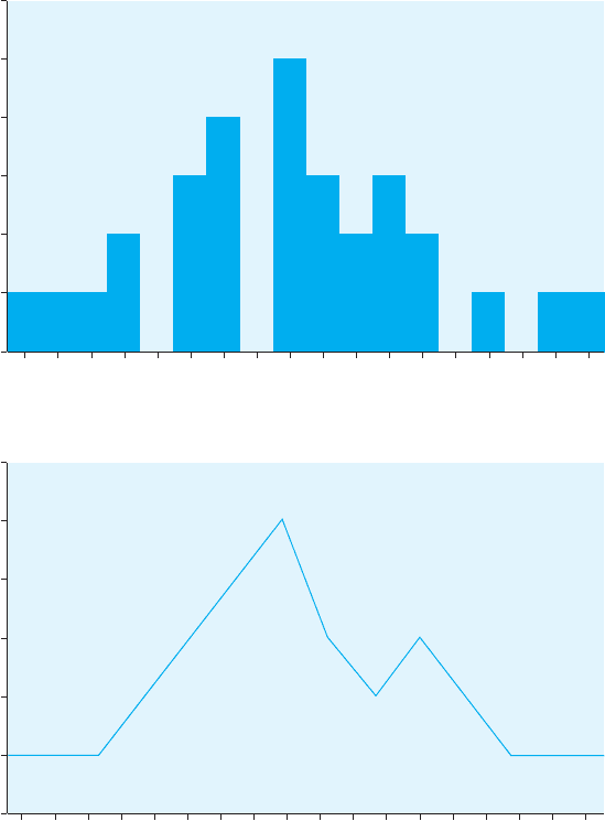
FIGURE 5.2
Histogram
representing IQ
score data for
30 individuals
0
1
2
3
4
5
6
IQ Score
83 86 89 92 95 98 101 104 107 110 113 116 119 122 125 128 131 134
Frequency
FIGURE 5.3
Frequency polygon
of IQ score data for
30 individuals
0
1
2
3
4
5
6
Frequency
IQ Score
83 86 89 92 95 98 101 104 107 110 113 116 119 122 125 128 131 134
are presented in a certain order, this order could be rearranged because the
variable is qualitative.
Figure 5.2 illustrates a histogram. In this figure, the frequencies of intelli-
gence test scores from a hypothetical distribution are indicated. A histogram
is appropriate because the IQ score variable is quantitative. The values of the
variable have a specific order that cannot be rearranged.
Frequency Polygons. You can also depict the data in a histogram as a
frequency polygon—a line graph of the frequencies of individual scores
or intervals. Again, scores (or intervals) are shown on the x-axis and fre-
quencies on the y-axis. After all the frequencies are plotted, the data points
are connected. You can see the frequency polygon for the intelligence score
data in Figure 5.3. Frequency polygons are appropriate when the variable
frequency polygon A line
graph of the frequencies of
individual scores.
frequency polygon A line
graph of the frequencies of
individual scores.
10017_05_ch5_p103-139.indd 108 2/1/08 1:18:58 PM

Data Organization and Descriptive Statistics
■ ■
109
is quantitative, or the data are ordinal, interval, or ratio. In this respect,
frequency polygons are similar to histograms. Frequency polygons are espe-
cially useful for continuous data (such as age, weight, or time), in which it
is theoretically possible for values to fall anywhere along the continuum.
For example, an individual may weigh 120.5 pounds or be 35.5 years old.
Histograms are more appropriate when the data are discrete (measured in
whole units)—for example, number of college classes taken or number of
siblings.
TYPES OF ORGANIZATIONAL TOOLS
Frequency Distribution Bar Graph Histogram Frequency Polygon
Description A list of all scores A pictorial graph A pictorial graph A line graph represent-
occurring in the with bars representing with bars represent- ing the frequency of
distribution along with the frequency of ing the frequency of occurrence of items
the frequency of each occurrence of items occurrence of items for quantitative
for qualitative variables for quantitative variables variables
Use with Nominal, ordinal, Nominal data Typically ordinal, Typically ordinal,
interval, or ratio data or ratio data; most interval, or ratio data;
appropriate for discrete most appropriate for
data continuous data
Data Organization IN REVIEW
CRITICAL
THINKING
CHECK
5.1
1. What do you think might be the advantage of a graphical represen-
tation of data over a frequency distribution?
2. A researcher observes driving behavior on a roadway, noting the
gender of the drivers, the types of vehicle driven, and the speeds at
which they are traveling. The researcher wants to organize the data
in graphs but cannot remember when to use bar graphs, histograms,
or frequency polygons. Which type of graph should be used to
describe each variable?
Descriptive Statistics
Organizing data into tables and graphs can help make a data set more
meaningful. These methods, however, do not provide as much information
as numerical measures. Descriptive statistics are numerical measures that
describe a distribution by providing information on the central tendency
of the distribution, the width of the distribution, and the distribution’s
shape.
descriptive statistics
Numerical measures that de-
scribe a distribution by provid-
ing information on the central
tendency of the distribution, the
width of the distribution, and
the shape of the distribution.
descriptive statistics
Numerical measures that de-
scribe a distribution by provid-
ing information on the central
tendency of the distribution, the
width of the distribution, and
the shape of the distribution.
10017_05_ch5_p103-139.indd 109 2/1/08 1:18:59 PM
110
■ ■
CHAPTER 5
Measures of Central Tendency
A measure of central tendency is a representative number that character-
izes the “middleness” of an entire set of data. The three measures of central
tendency are the mean, the median, and the mode.
Mean. The most commonly used measure of central tendency is the mean—
the arithmetic average of a group of scores. You are probably familiar with
this idea. We can calculate the mean for our distribution of exam scores by
adding all of the scores together and dividing the sum by the total number
of scores. Mathematically, this is
X
___
N
where
(pronounced “mu”) represents the symbol for the population mean;
represents the symbol for “the sum of”;
X represents the individual scores; and
N represents the number of scores in the distribution.
To calculate the mean, we sum all of the Xs, or scores, and divide by the
total number of scores in the distribution (N). You may have also seen this
formula represented as
X
X
___
N
This is the formula for calculating a sample mean, where
X represents the
sample mean, and N represents the number of scores in the sample.
We can use either formula (they are the same mathematically) to calcu-
late the mean for the distribution of exam scores. These scores are presented
again in Table 5.5, along with a column showing the frequency ( f ) and
another column showing the frequency of the score multiplied by the score
( f times X or fX). The sum of all the values in the fX column is the sum of
all the individual scores (X). Using this sum in the formula for the mean,
we have
X
___
N
2,220
_____
30
74.00
The use of the mean is constrained by the nature of the data: The mean is
appropriate for interval and ratio data but not for ordinal or nominal data.
Median. Another measure of central tendency, the median, is used in situa-
tions in which the mean might not be representative of a distribution. Let’s
use a different distribution of scores to demonstrate when it is appropriate
to use the median rather than the mean. Imagine that you are consider-
ing taking a job with a small computer company. When you interview for
the position, the owner of the company informs you that the mean sal-
ary for employees at the company is approximately $100,000 and that the
company has 25 employees. Most people would view this as good news.
Having learned in a statistics class that the mean might be influenced by
measure of central
tendency A number that
characterizes the “middleness”
of an entire distribution.
measure of central
tendency A number that
characterizes the “middleness”
of an entire distribution.
mean A measure of central
tendency; the arithmetic average
of a distribution.
mean A measure of central
tendency; the arithmetic average
of a distribution.
10017_05_ch5_p103-139.indd 110 2/1/08 1:18:59 PM
Data Organization and Descriptive Statistics
■ ■
111
extreme scores, however, you ask to see the distribution of the 25 salaries.
The distribution is shown in Table 5.6. The calculation of the mean for this
distribution is
X
___
N
2,498,000
_________
25
99,920
Notice that, as claimed, the mean salary of company employees is very
close to $100,000. Notice also, however, that the mean in this case is not very
representative of central tendency, or “middleness.” The mean is thrown off
center or inflated by one extreme score of $1,800,000 (the salary of the com-
pany’s owner, needless to say). This extremely high salary pulls the mean
TABLE 5.5 Frequency Distribution of Exam Scores, Including an fX Column
X f fX
45 1 45
47 1 47
54 1 54
56 1 56
59 1 59
60 2 120
63 1 63
65 1 65
69 1 69
70 1 70
74 3 222
75 1 75
76 1 76
77 1 77
78 2 156
80 1 80
82 2 164
85 1 85
86 1 86
87 1 87
90 1 90
92 1 92
93 1 93
94 1 94
95 1 95
N 30 X 2,220
10017_05_ch5_p103-139.indd 111 2/1/08 1:19:00 PM