Blank L., Tarquin A. Engineering Economy (McGraw-Hill Series in Industrial Engineering and Management)
Подождите немного. Документ загружается.

Of
the 50 sample points, how many fall
within these two ranges?
19
.
15
(a) Use the relations
in
Section 19.4 for
continuous variables to determine the
expected value and standard deviation
for the distribution
of
f(Dy)
in Problem
19
.
7.
(b)
It
is
possible to calculate the
probability
of
a continuous variable X be-
tween two points
(a, b) using the follow-
ing integral?
Pea
:::;
X
:::;
b)
=
ff(X)
dx
a
Determine the probability that Dy
is
within 2 standard deviations
of
the ex-
pected value.
19.16
(a) Use the relations
in
Section 19.4 for
continuous variables to determine the
expected value and variance for the
distribution
of
DM
in Problem 19.7.
(b) Determine the probability that
DM
is
within two standard deviations
of
the expected value. Use the relation
in
Problem 19.
15
.
19.17 Calculate the expected value for the vari-
able
N in Problem 19.5.
19.18 A newsstand manager
is
tracking Y, the
number
of
weekly magazines left on the
shelf when the new edition
is
delivered.
Data collected over a 30-week period
are summarized by the following proba-
bility distribution.
Plot the distribution
and the estimates for expected value and
one standard deviation on either side
of
E(Y) on the plot.
Y c
op
ies
7
P(Y)
1/ 4
PROBLEMS
695
Simulation
19
.
19
Carl, an engineering colleague, estimated
net cash flow after taxes (CFAT) for the
project he
is
working on. The additional
CFAT
of
$2800 in year 10 is the salvage
value
of
capital assets.
Year
CFAT,
$
0
- 28,800
1- 6 5,400
7-10
2,040
10
2,800
The
PW
value at the current MARR
of
7% per year
is
PW =
-28,800
+ 5400(P/A,7%,6)
+ 2040(P/A,7
%,
4)(P/F,7%,6)
+ 2800(P/ F,7
%,
1O)
= $2966
Carl believes the MARR will vary over a
relatively narrow range, as will the
CFAT,
especially during the out years
of
7 through 10.
He
is willing to accept the
other estimates
as
certain. Use the fol-
lowing probability distribution assump-
tions for
MARR
and CFAT to perform a
simulation- hand- or computer-based.
MARR.
Uniform distribution over
the range 6% to 10
%.
CFAT,
years
7 through 10. Uni-
form distribution over the range
$1600 to $2400 for each year.
Plot the resulting
PW
distribution. Should
the plan be accepted using decision mak-
ing under certainty? Under risk?
19.20 Repeat
Problem 19.19, except use the
normal distribution for the CFAT
in
years 7 through 10 with an expected
value
of
$2040 and a standard deviation
of
$500.
696
CHAPTER
19
More on Variation and Decision Making Under Risk
EXTENDED EXERCI
SE
USING SIMULATION AND THE EXCEL RNG
FOR SENSITIVITY ANALYSIS
Note: This exercise requires you
to
learn about and use the Random Number
Generation (RNG) Data Analysis Tool package
of
Microsoft Excel.
The
online help
function explains how
to
initiate and use the RNG to generate random numbers
from a variety
of
probability distributions: normal, uniforn1 (continuous variable),
binomial, Poisson, and discrete. The discrete option is used to generate random
numbers from a discrete variable distribution that you specify on the worksheet.
This option is the one
to
use below for the discrete uniform distribution.
Reread the situation in Example 18.3 in which three mutually exclusive alter-
natives are compared. The parameters
of
salvage value
S,
annual operating cost
(AOe),
and life n are varied using the three-estimate approach to sensitivity
analysis. Set up a simulation by answering the following questions using the data
provided.
Questions
I. Become familiar with the RNG Data Analysis Tool in Excel by clicking on
the help button and reading about it, how to install it (if necessary), and
apply
it.
2.
Develop a sample
of
10 random numbers from each
of
the following distri-
butions:
• Normal with a mean
of
100 and a standard deviation
of
20.
•
Uniform (continuous) between 5 and 10.
• Uniform (discrete) between 5 and 10 with a probability
of
0.2 for 5
through 7,
0.05 for 8 and 9, and 0.3 for
10.
3. Develop a simulation
of
50 sample points
of
AW values at a
MARR
of
12%
per year for the three alternatives described
in
Example 18.3. Use the speci-
fied probability distributions below. Do the results
of
your simulation indi-
cate that alternative B
is
still the clear choice?
If
not, what
is
the better choice?
Alternative
Parameter
A B
C
AOC Normal
Normal Normal
Mean:
$8000 Mean: $3000 Mean: $6000
Std. dey.: $1000 Std. dey.: $500 Std. dey.: $700
S
Uniform
Uniform
Fixed at
o
to
$]000
$500
to
$2000
$3000
n Discrete uniform Discrete uniform
Discrete uniform
3
to
8 years with 3 to 7 years with 5 to 8 years with
equal probability equaJ probability equal probability
APPENDIX
~
USING SPREADSHEETS
AND
MICROSOFT
EXCEL ©
Thjs appendix explains the layout
of
a spreadsheet and the use
of
Microsoft
Excel (hereafter called Excel) functions in engineering econom
y.
Ref
er to the
User's Guide and Excel help system for your particular computer and version
of
Excel.
A.1 INTRODUCTION
TO
USING EXCEL
Run
Excel on
Windows
After booting up the computer, click on the Microsoft Excel icon to start it.
If
the
icon does not show, left-click the Start button located
in
the lower left corner
of
the screen.
Move
the mouse pointer to Programs, and a submenu will appear on
the right. Move to the Microsoft Excel icon, and left-click to run.
If
the Microsoft Excel icon is not on the Programs submenu, move to the
Microsoft
Office icon a
nd
highlight the Microsoft Excel icon. Left-click to run.
Enter a
Formula
Some exam
pl
e computations are detailed below. The = sign
is
necessary to
perform any formula or function computation
in
a ce
ll.
1.
Move the mouse pointer to ce
ll
B4 and l
ef
t-click.
2.
Type =
4+3,
touch < Enter> , and 7 appears
in
B4.
3.
To
edit, use the mouse or < arrow keys> to return to
B4
, touch <
F2
>,
or
use the mouse to move to the Formula Bar
in
the upper section
of
the
spreadsheet.
4.
In either location, touch < Backspace> twice to delete
+3.
5. Type - 3 and touch < Enter> .
6.
The answer 1 appears in ce
ll
B4.
7. To dele
te
the cell entirel
y,
move to cell B4 and touch
th
e < Del
ete>
key
once.
8.
To
exit, move
th
e mouse pointer to the top left corner and l
ef
t-click on File
in
the top bar menu.
9.
Move
th
e mouse down the File subme
nu
, highlight Exit, and left-click.
]
O.
When the Save Changes box appears, left-click "No" to exit without
sav
in
g.
11.
If
you
wi
sh to save your work, l
ef
t-click "
Yes
."
1
2.
Type in a file name (e.g., cales 1) and click on "Save."
698
APPENDlXA
Using Spreadsheets a
nd
Microsoft Excel©
The formulas and functions on the worksheet can be displayed
by
pressing Ctrl
and
'.
The
symbol'
is
usually
in
the upper left
of
the keyboard with the - (tilde)
symbol.
Pressing Ctrl +' a second time hides the formulas and functions.
Use Excel Functions
I. Run Excel.
2. Move
to
cell C3. (Move the mouse pointer to
C3
and left-click
.)
3. Type = PV(S
%,
12
,10) and < Enter
>.
This function will calculate the present
value
of
12
payments
of
$10 at a S% per year interest rate.
Another use:
To
calculate the future value
of
12
payments
of
$10 at 6% per year
interest, do the following:
1.
Move
to
cell B3, and type INTEREST.
2.
Move to cell
C3
, and type 6% or
=6
/ 100.
3. Move to cell B4, and type
PAYMENT.
4. Move to cell C4, and type
10
(to represent the size
of
each payment).
S. Move to cell
BS
, and type NUMBER
OF
PAYMENTS.
6.
Move to cell
CS
, and type
12
(to represent the number
of
payment
s)
.
7. Move to cell B7, and type
FUTURE VALUE.
8. Move
to
cell C7, and type =FV(C3,CS,C4) and hit < Enter> . The answer
will appear
in
cell C7.
To edit the values in cells (this feature is used repeatedly
in
sensitivity analysis
a
nd
breakeven analysis),
1.
Move
to
cell
C3
and type
=S/100
(the previous value will be replaced).
2.
The value
in
cell C7 will change its answer automatically.
Cell References
in
Formulas and Functions
If
a cell reference is used
in
lieu
of
a specific number, it is possible
to
change
th
e
number once and perform sensitivity analysis on any variable (entry) that is ref-
erenced
by
the cell number, such
as
CS. This approach defines the referenced cell
as a
global variable for the worksheet. There are two types
of
cell references-
relative and absolute.
Relative References
If
a cell reference
is
entered, for exam'ple,
AI,
into a for-
mula or function that
is
copied or dragged into another cell, the reference is
changed relative to the movement
of
the original cell.
If
the formula
in
CS
is
=
Al
, and it is copied into cell C6, the formula is changed
to
=A2
. This feature
is used when dragging a function through several cells, and the source entries
must change with the column or row.
Absolute References
If
adjusting cell references is not desired, place a $ sign
in
front
of
the part
of
the cell reference that is not to be
adjusted-the
column,
row,
or both. For example, = $A$1 will retain the formula when it is moved
SECT
ION A.I int.roduc
ti
on to Us
in
g
Exce
l
anywhere on
th
e workshee
t.
Similarly,
=$
Al
will retain the column A, but the
relative
ref
erence on I will adjust
th
e row number upon movement around the
worksheet.
Absolute references are used
in
engineering economy for sensitivity analysis
of parameters such as MA
RR
,
fir
st cost, and annual cash flow
s.
In these cases, a
change in
th
e absolute-reference ce
ll
entry can help determine the
se
nsitivity
of
a result, such as
PW
or AW.
P
ri
nt
the
Spreadshee
t
First de
fin
e the portion (
or
a
ll
) of the spreadshe
et
to be printed.
1.
Move the mouse pointer to the top l
ef
t corner
of
y
our
spreadsheet.
2. Hold down the le
ft
click button. (Do not release
th
e left click button
.)
3.
Dr
ag the mouse to the lower
ri
ght corner of your spreadsheet
or
to wherever
you want to stop printing.
4. Release
th
e left click button.
(It
is
ready to print.)
5. L
ef
t-click the File top bar menu.
6. Move
th
e mouse down to select Print and lef
t-
c
li
ck.
7. In
th
e Print
di
alog box, l
ef
t-c
li
ck the option Selec
ti
on in the Print What box
(or similar command
).
8. Left-c
li
ck the
OK
button to start printin
g.
Depending on your computer environment, you may have to select a network
printer and queue your printout through a se
rv
e
r.
Save t
he
Spreadsheet
You
can save your spreadsheet at any time during
or
after
comp
leting your work.
It is rec
omm
e
nd
ed that you save your work regularly.
I. L
ef
t-click
th
e F
il
e top bar me
nu
.
2. To save
th
e spreadsheet the
fir
st time, l
ef
t-click the Save As
..
. option.
3.
Type the
fil
e name, e.g
.,
calcs2, and l
ef
t-click the Save button.
To save the spreadsh
ee
t after it has been saved the first time, i.e., a
fi
le name has
been assigned to it, left-c
li
ck the File top bar menu, move the mouse pointer
down, and left-click on Save.
Create
a
Co
l
umn
Cha
rt
j.
Run
Exce
l.
2.
M
ove
to ce
ll
Al
and type j . M
ove
down to ce
ll
A2 and type 2. Type 3 in
ce
ll
A3, 4
in
ce
ll
A4, and 5
in
ce
ll
AS.
3. Move to ce
ll
Bl
and type 4. Type 3.5
in
cell
B2
; 5 in ce
ll
B3; 7 in cell B4;
a
nd
12
in
cell B5.
4. Move
th
e mouse pointer to ce
ll
AI
, le
ft
-click and hold, while dragg
in
g the
mouse to ce
ll
B5. (A
ll
the ce
ll
s with numbers should
be
high
li
ghted.)
699
700
APPENDIX
A
Using Spreadsheets and Microsoft Excel©
S.
Left-click on the Chart Wizard button on the toolbar.
6. Select the Column option
in
step I
of
4 and choose the first sUbtype
of
column chart.
7. Left-click and hold the
Press and Hold to View Sample button to determine
you have selected the type and style
of
chart desired. Click Next.
8.
Since the data were highlighted previously, step 2 can be passed. Left-click
Next.
9.
For
step 3
of
4, click the Titles tab and the Chart Title box. Type
Sample
I.
10
. Left-click Category
eX)
axis box and type Year, then left-click Value (Y)
axis box and type Rate
of
return. There are other options (gridlines, legend,
etc.) on additional tabs. When finished, left-click Next.
11.
For step 4
of
4, left-click As Object In; Sheet I
is
highlighted.
12.
Left-click Finish, and the chaIt appears on the spreadsheet.
13.
To adjust the size
of
the chart window, left-click anywhere inside the chart
to display small dots on the sides and corners.
The
words Chart Area will
appear immediately below the arrow.
Move
the mouse to a dot, left-click
and hold, then drag the dot to change the size
of
the chart.
14.
To move the chart, left-click and hold within the chart frame, but outside
of
the graphic itself. A small cross hairs indicator will appear as soon as any
movement in the mouse takes place. Changing the position
of
the mouse
moves the entire chart to any location on the worksheet.
I
S.
To adjust the size
of
the plot area (the graphic itself) within the chart frame,
left-click within the graphic.
The
words Plot Area will appear. Left-click
and hold any corner
or
side dot, and move the mouse to change the size
of
the graphic up to the size
of
the chart frame.
Other features are available to change the specific characteristics
of
the chart.
Left-click within the chart frame and click the Chart button on the toolbar at
the top
of
the screen. Options are to alter Chart Type, Source Data, and Chart
Options. To obtain detailed help on these, see the help function,
or
experiment
with the sample Column Chart.
Create an
xy
(Scatter)
Chart
This chart is one
of
the most commonly used
in
scientific analysis, including en-
gineering economy. It plots pairs
of
data and can place multiple series
of
entries
on the
Y axis. The
xy
scatter chart is especially useful for results such as the
PW vs. i graph, where i
is
the X axis and the Y axis displays the results
of
the
NPV function for several alternatives.
1.
Run Excel.
2.
Enter the following numbers in columns A, B, and C, respectively.
Column
A,
cell
Al
through A6: Rate i%, 4, 6, 8, 9, 10
Column B, cell
Bl
through B6: $ for A, 40,
55
,
60
,45,10
Column C, cell
Cl
through C6: $ for B, 100, 70,
65
,
SO,
30
.
3.
Move
the mouse to A 1, left-click, and hold while dragging to cell
C6.
All
cells wi
ll
be highlighted, including the title cell for each column.

SECTION A.2 Organization (Layout)
of
the Spreadsheet
4.
If
all the columns for the chart are not adjacent to one another, first press
and hold the Control key on the keyboard during the entirety
of
step
3.
After dragging over one column
of
data, momentarily release the left click,
then move
to
the top
of
the next (nonadjacent) column for the chart. Do not
release the Control key until all columns to be plotted have been high-
lighted.
5.
Left-click on the Chart Wizard button on the toolbar.
6.
Select the xy (scatter) option
in
step 1
of
4, and choose a subtype
of
scatter
chart.
The
re
st
of
the steps (7 and higher) are the same as detailed earlier for the Col-
umn chart.
The
Legend tab
in
step 3
of
4
of
the Chart Wizard process displays the
series labels from the highlighted columns.
(Only the bottom row
of
the title can
be highlighted.)
If
titles are not highlighted, the data sets are generically identi-
fied as Series
I, Series 2, etc. on the legend.
Obtain Help While Using Excel
I.
To
get general help information, left-click on the Help top bar menu.
2.
Left-click on Microsoft Excel Help Topics.
3. For example, if you want to know more about how to save a file, type the
word Save
in
box I.
4.
Select the appropriate matching words in box
2.
You
can browse through
the selected words
in
box 2
by
left-clicking on suggested words.
5.
Observe the listed topics in box 3.
6.
If you find a topic listed in box 3 that matches what you are looking for,
double-left-click the selected topic in box 3.
A.2 ORGANIZATION (LAYOUT)
OF
THE SPREADSHEET
A spreadsheet can be used
in
several ways to obtain answers to numerical ques-
tions. The first is as a rapid solution tool, often with the entry
of
only a few num-
bers or one predefined function. In the text, this application is identified using the
Q-solv icon
in
the margin.
1.
Run Excel.
2.
Move the mouse to cell
Al
and type
=SUM(45,15,
-20).
The answer
of
40
is
displayed
in
the cell.
3. Move the mouse to cell
B4
and type = FV(8%,5,
-2500).
The
number
$
14
,666.50
is
displayed as the 8%
per
year future worth at the end
of
the
fifth year
of
five payments
of
$2500 each.
The
second application
is
more formal.
The
spreadsheet with the results may
serve as documentation
of
what the entries mean; the sheet may be presented to
a coworker, a boss, or a professor; or the final sheet may be placed into a report
to
management. Thjs type
of
spreadsheet is identified by the e-solve icon
in
the
text. Some fundamental guidelines useful in setting up the spreadsheet follow.
701
Q-Solv
m
E-Solve
702
APPENDlX
A Using
Spread
sheets and Microsoft Excel©
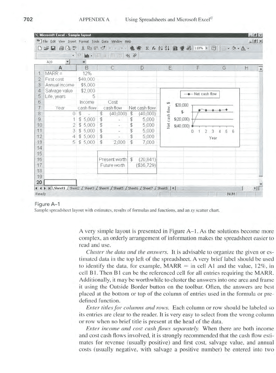
A20
A
MARR=
First cost
A
nn
ua
l income
Salvage
va
l
ue
-+-
Net c
ash
fiow
I
Life, years 5
Income Cost
Year cash flow cash
fl
ow Net cash
fl
ow
!::,:~
F
igure
A- 1
o $ $
1 $ 5,000 $
2 $ 5,000 $
3 $ 5,000 $
4 $ 5,000 $
5 $ 5,000 $
(40,000) $ (40,000)
$ 5,000
$ 5,000
$ 5,000
$ 5,000
2,000
$ 7,000
Present
worth $ (20,84
1)
Future worth ($36,729)
~
$
(40
,
000)
it::=::=.
o
123
4
56
Year
Sam
pl
e spreadsheet
la
yout with estimat
es
, results of formulas and functions, and an
xy
scatter chart.
A very simple layout is presented in Figure
A-I.
As the solutions become more
complex, an orderly arrangement
of
information makes the spreadsheet easier to
read and use.
Cluster the data
and
the answers. It
is
advisable to organize the given
or
es-
timated data
in
the top left
of
the spreadsheet. A very
brief
label should be used
to identify the data, for example,
MARR
=
in
cell A 1 and the value, 12%,
in
cell B
1.
Then B 1 can be the referenced cell for all entries requiring the MARR.
Additionally, it may be worthwhile to cluster the answers into one area and frame
it
using the Outside Border button on the toolbar. Often, the answers are best
placed at the bottom
or
top
of
the column
of
entries used
in
the formula
or
pr
e-
defi ned function.
Enter titles
for
columns
and
rows. Each column
or
row should be labeled so
its entries a
re
clear to the reader. It is very easy to select from the wrong column
or row when no
brief
title is present at the head
of
the data.
Enter income
and
cost cash flows separately. When there are both income
and cost cash flows involved, it is strongly recommended that the cash flow esti-
mates for revenue (usually positive) and first cost, salvage value, and annual
costs (usually negative, with salvage a positive number) be entered into two
SECTION A
.3
Excel Functions Important
to
Engineering Economy
adjacent columns. Then a formula combining them in a third column displays the
net cash flow. There are two immediate advantages to this practice: fewer
enors
are made when performing the summation and subtraction mentally, changes for
sensitivity analys
is
are more easily made.
Use cell re
fer
enc
es.
The use
of
absolute and relative cell references is a must
when any changes in entries are expected. For example, suppose the
MARR
is entered
in
cell B 1, and three separate references are made to the
MARR
in
functions on the spreadsheet. The absolute cell reference entry
$B$1 in the three
functions allows the
MARR
to be changed one time, not three.
Obtain a final ans
we
r through summing and embedding. When the formulas
and functions are kept relatively simple, the final answer can be obtained using the
SUM function. For example,
if
the present worth values (PW)
of
two columns
of
cash flows are determined separately, then the total PW
is
the
SUM
of
the sub-
totals. This practice
is
especially useful when the cash flow series are complex.
Although the embedding
of
functions
is
allowed in Excel, this means more
opportunities for entry errors. Separating the computations makes it easier for the
reader to understand the entries. A common application in engineering economy
of this practice is in the
PMT
function that finds the annual worth
of
a cash flow
series. The
NPV function can be embedded as the present worth (P) value into
PMT. Alternatively, the NPV function can be applied first, after which the cell
with the
PW answer can be referenced in the
PMT
function. (See Section 3.1 for
further comments
.)
Pr
e
par
e
for
a chart.
If
a chart (graph) will be developed, plan ahead by leav-
ing sufficient room on the
ri
ght
of
the data and answers. Charts can be placed on
the same worksheet
or
on a separate worksheet when the Chart Wizard is used,
as
discussed
in
Section A.I on creating charts. Placement on the same worksheet
is
recommended, especially when the results
of
sensitivity analysis are plotted.
A.3
EXCEL FUNCTIONS IMPORTANT
TO
ENGINEERING
ECONOMY
(alphabetical
order)
DB (Declining Balance)
Calculates
th
e depreciation amount for an asset for a specified period n using
the declining balance method.
The
depreciation rate,
d,
used in the computation
is determined from asset values 5 (salvage value) and B (basis or first cost)
as
d = I - (
5/B)I
/
II
. This
is
Equation [16.11]. Three-decimal-place accuracy
is
used for
d.
cost
salvage
life
pe
ri
od
month
=DB
(cost, salvage, life, period, month)
First cost
or
basis
of
the asset.
Salvage value.
Depreciation life (recovery period
).
The period, year, for which the depreciation is to be
calculate
d.
(optional entry)
If
this entry is omitted, a full year is
assumed for the first year.
703

704
APPENDIX A
Using Spreadsheets
and
Mi
crosoft Excel©
Example A new machine costs $100,000 and is expected
to
last 10 years. At
the end
of
10 years, the salvage value
of
the machine is $50,000. What
is
the de-
preciation
of
the machine in the first year and the fifth year?
Depreciation for the first year:
=DB(l00000,50000,l0,1)
Depreciation for the fifth year: =DB(lOOOOO,50000,1O,5)
DDB (Double Declining Balance)
Calculates the depreciation
of
an asset for a specified period n using the double
declining balance method. A factor can also be entered for some other declining
balance depreciation method by specifying a factor in the function.
=DDB(cost, salvage, life, period, factor)
cost
sa
lv
age
li
fe
period
First cost or basis
of
th
e asset.
Salvage value
of
the asse
t.
Depreciation life.
The period, year, for which the depreciation is to
be calculated.
factor (optional entry)
If
this entry
is
omitted, the function
will use a double declining method with 2 times
th
e
straight line rate.
If
, for example, the entry
is
1.5, the
150% declining balance method will be used.
Example A new machine costs $200,000 and is expected
to
la
st
10
years. The
salvage va
lu
e is $10,000. Calculate the depreciation
of
the machine for the first
and the eighth years. Finally, calculate the depreciation
fo
r the fifth year using
the
175
% declining balance method.
Depreciation for the first year:
=DDB(200000,10000,l0,1)
Depreciation for the eighth year: = DDB(200000, 10000,10,
8)
Depreciation for the fifth year using
175
% DB:
= DDB(200000, 1 0000,
10
,5,1.75)
FV (Future Value)
Calculates the future value (worth) based on periodic payments at a specific
in
-
terest rate.
=FV(rate, nper, pmt, pv, type)
rate Interest rate per compounding period.
np
er Number
of
compounding period
s.
pmt Constant payment amount.
pv The present value amount.
If
pv is not specified,
th
e function will assume it
to
be
O.
type (optional entry) Either 0 or
1.
A 0 represents payments
made at the end
of
the period, and 1 represents payments
at
th
e beginning
of
the period.
If
omitted, 0
is
ass
um
ed.