Ware C. Information Visualization: Perception for Design
Подождите немного. Документ загружается.

asked to reposition them—a task the subjects did quite well. In another condition, subjects were
asked to repeat a nonsense syllable, such as blah, while in the learning phase; in this case they
did much worse. However, saying blah did not disrupt memory for the locations themselves; it
only disrupted memory for what was at the locations. This was demonstrated by having subjects
place a set of disks at the positions of the original objects, which they could do with relative
accuracy. In other words, when blah was said in the learning phase, subjects learned a set of
locations but not the objects at those locations. This technique is called articulatory suppression
(Postma and DeHaan, 1996; Postma et al., 1998).
Presumably, the reason why saying blah disrupted memory for the objects is that this
information was translated into a verbal-propositional coding when the objects were
attended.
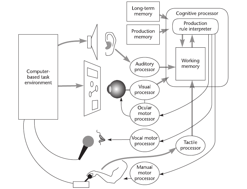
354 INFORMATION VISUALIZATION: PERCEPTION FOR DESIGN
Figure 11.2 A unified extended cognitive model containing both human and machine processing systems. Adapted
from Kieras and Meyer, (1997).
ARE11 1/20/04 4:56 PM Page 354

Visual Working Memory Capacity
Position is not the only information stored in visual working memory; some abstract shape, color,
and texture information is also retained. Visual working memory can be roughly defined as the
visual information retained from one fixation to the next. This appears to be limited to about
three to five simple objects (Irwin, 1992; Xu, 2002; Luck and Vogel 1997; Melcher, 2001). The
exact number depends on the task and the kind of pattern. Figure 11.3(a) illustrates the kinds
of patterns used in a series of experiments by Vogel et al. (2001). In these experiments, one set
of objects was shown for a fraction of a second (e.g., 400msec), followed by a blank of more
than 0.5sec. After the blank, the same pattern was shown, but with one attribute of an object
altered—for example, its color or shape. The results from this and a large number of similar
studies have shown that about three objects can be retained without error, but these objects can
have color, shape, and texture. If the same amount of color, shape, and texture information is
distributed across more objects, memory declines for each of the attributes.
Only quite simple shapes can be stored in this way. For example, each of the mushroom shapes
shown in Figure 11.3(b) uses up two visual memory slots (Xu, 2002). Subjects do no better if the
stem and the cap are combined than if they are separated. Intriguingly, Vogel et al. (2001) found
that if colors were combined with concentric squares, as shown in Figure 11.3(c), then six colors
could be held in visual working memory, but if they were put in side-by-side squares, only three
colors could be retained. Melcher (2001) found that more information could be retained if longer
viewing was permitted: up to five objects after a four-second presentation.
What are the implications for data glyph design? (A glyph, as discussed in Chapter 5, is a
visual object that displays one or more data variables.) If it is important that a data glyph be
held in visual working memory, then it is important that its shape allows it to be encoded accord-
ing to visual working memory capacity. For example, Figure 11.4 shows two ways of representing
the same data. One consists of an integrated glyph containing a colored arrow showing orien-
tation, by arrow direction; temperature, by arrow color; and pressure, by arrow width. A second
representation distributes the three quantities among three separate visual objects: orientation by
Thinking with Visualizations 355
a
b
c
Figure 11.3 Patterns used in studies of the capacity of visual working memory. (a) From Vogel et al. (2001). (b) From
Xu (2002). (c) From Vogel et al. (2001).
ARE11 1/20/04 4:56 PM Page 355

an arrow, temperature by the color of a circle, and air pressure by the height of a rectangle. The
theory of visual working memory and the results of Vogel et al. (2001) suggest that three of the
former glyphs could be held in visual working memory, but only one of the latter.
Object Files, Coherence Fields, and Gist
What exactly is held in working memory? Kahneman et al. (1992) coined the term object file
to describe the temporary grouping of a collection of visual features together with other links
to verbal-propositional information. They hypothesized that an object file would consist of a
neural activation pattern having the equivalent of pointers reaching into the part of the
brain where visual features are processed, as well as pointers to verbal working memory struc-
tures and to stored motor memories concerned with the appropriate body movements to make
in response.
What we perceive is mostly determined by the task at hand, whether it is finding a path over
rocks or finding the lettuce in a grocery store. Perception is tuned by the task requirements to
give us what is most likely to be useful. In the first example we see the rocks immediately in front
of us. In the second we see green things on the shelves. We can think of perception as occurring
through a sequence of active visual queries operating through a focusing of attention to give us
what we need. The neural mechanism underlying the query may be a rapid tuning of the pattern
perception networks to respond best to patterns of interest (Dickinson et al. 1997). Rensink
(2002, 2000) coined the term nexus to describe this instantaneous grouping of information by
attentional processing.
Another term sometimes used to describe a kind of summary of the properties of an object
or a scene is gist. Gist is used mainly to refer to the properties that are pulled from long-term
memory as the image is recognized. Visual images can activate verbal-propositional information
in as little as 100msec (Potter, 1976). Gist consists of both visual information about the typical
structure of an object and links to relevant verbal-propositional information. We may also store
356 INFORMATION VISUALIZATION: PERCEPTION FOR DESIGN
Integrated
glyphs
Nonintegrated
glyphs
Direction Arrow direction
T
emperature Arrow color
Pressure Arrow width
Direction Arrow direction
Temperature Circle color
Pressure Bar height
Figure 11.4 If multiple data attributes are integrated into a single glyph, more information can be held in visual
working memory.
ARE11 1/20/04 4:56 PM Page 356
the gist of a whole environment, so that when we see a familiar scene, the interior of a car, for
example, a whole visual framework of the typical locations of things will be activated. We can
think of an object file as the temporary structure in working memory, whereas gist is a longer-
term counterpart.
Change Blindness
One of the consequences of the very small amount of information held in visual working memory
is a phenomenon known as change blindness (Rensink, 2000). Because we remember so little, it
is possible to make large changes in a display between one view and the next and people gener-
ally will not notice, unless the change is to something they have recently attended. If a change is
made while the display is being fixated, the inevitable blink will draw attention to it. But if
changes are made mid–eye movement, midblink, or after a short blanking of the screen (Rensink,
2002), the change generally will not be seen. Iconic memory information in retinal coordinates
decays within about 200msec (Phillips, 1974). By the time 400msec have elapsed, what little
remains is in visual working memory.
An extraordinary example of change blindness is a failure to detect a change from one person
to another in midconversation. Simons and Levin (1998) carried out a study in which an unsus-
pecting person was approached by a stranger holding a map and asking for directions. The con-
versation that ensued was interrupted by two workers carrying a door and during this interval
another actor, wearing different clothes, was substituted to carry on the conversation. Remark-
ably, most people did not notice the substitution.
To many people, the extreme limitation on the capacity of visual working memory seems
quite incredible. How can we experience a rich and detailed world, given such a shallow inter-
nal representation? The answer to this dilemma is that the world “is its own memory” (O’Regan,
1992). We perceive the world to be rich and detailed, not because we have an internal detailed
model, but simply because whenever we wish to see detail we can get it, either by focusing atten-
tion on some aspect of the visual image at the current fixation or by moving our eyes to see the
detail in some other part of the visual field. We are unaware of the jerky eye movements by which
we explore the world; we are only aware of the complexity of the environment detail being
brought into working memory on a need-to-know, just-in-time fashion (O’Regan, 1992; Rensink,
2002; Rensink et al., 1997). This is in agreement with the idea of visual queries being basic to
perception.
Spatial Information
For objects acquired in one fixation to be reidentified in the next requires some kind of buffer
that holds locations in egocentric coordinates as opposed to retina-centric coordinates (Hochberg,
1968). This also allows for the synthesis of information obtained from successive fixations. Figure
11.5 illustrates the concept. Neurophysiological evidence from animal studies suggests that the
lateral interparietal area near the top of the brain (Colby, 1998) appears to play a crucial role
in linking eye-centered coordinate maps in the brain with egocentric coordinate maps.
Thinking with Visualizations 357
ARE11 1/20/04 4:56 PM Page 357

Egocentric-spatial location memory also holds remarkably little information, although prob-
ably a bit more than the three objects that Vogel et al. (2001) suggest. It may be possible to
remember some information about approximately nine locations (Postma et al., 1998). Three of
these may contain links to object files, whereas the remaining ones specify only that there is some-
thing at a particular region in space, but very little more. Some evidence suggests that fixation
of a particular object may be essential for that object and its location to be held from one fixa-
tion to the next (Hollingworth and Henderson, 2002).
Some visual information is retained over several seconds and several fixations. Potter (2002)
provided evidence for this. Subjects viewed a rapid serial presentation of 10 pictures at the
rate of six per second and afterwards were able to identify whether a particular picture was in
the set about 60% of the time. This suggests that some residual gist is retained over many
visual changes in scene. A recent and very intriguing study by Melcher (2001) suggests that
we can build up information about several scenes that are interspersed. When the background
of a scene was shown, subjects could recall some of the original objects, even though
several other scenes had intervened. This implies that a distinctive screen design could help with
visual working memory when we switch between different views of a data space. We may be
able to cognitively swap in and swap out different data “scenes,” albeit each with a low level of
detail.
An interesting question is how many moving targets can be held from one fixation to the
next. The answer seems to be about four or five. Pylyshyn and Storm (1988) carried out exper-
iments in which visual objects moved around on a display in a pseudo-random fashion. A subset
of the objects was visually marked by changing color, but then the marking was turned off. If
there were five or fewer marked objects, subjects could continue to keep track of them, even
though they were now all black. Pylyshyn coined the term FINST, for fingers of instantiation,
to describe the set of pointers in a cognitive spatial map that would be necessary to support this
task. The number of individual objects that can be tracked is somewhat larger than the three
found by Vogel et al. (2001), although it is possible that the moving objects may be grouped per-
ceptually into fewer chunks (Yantis, 1992).
358 INFORMATION VISUALIZATION: PERCEPTION FOR DESIGN
Object file
Egocentric coordinate map
Object file
Object file
Figure 11.5 A spatial map of objects that have recently been held by attention is a necessary part of visual working
memory.
ARE11 1/20/04 4:56 PM Page 358
Attention
The studies showing that we can hold three or four objects in visual working memory required
intense concentration on the part of the participants. Most of the time, when we interact with
displays or just go about our business in the everyday world, we will not be attending that closely.
In a remarkable series of studies, Mack and Rock (1998) tricked subjects into not paying atten-
tion to the subject of the experiment, although they wanted to make sure that subjects were at
least looking in the right direction. They told subjects to attend to a cross pattern for changes in
the length of one of the arms; perfect scores on this task indicated they had to be attending. Then
the researchers presented a pattern that the subject had not been asked to look for. They found
that even though the unexpected pattern was close to, or even on, the point of fixation, most of
the time it was not seen. The problem with this kind of study is that the ruse can only be used
once. As soon as you ask subjects if they saw the unexpected pattern, they will start looking for
unexpected patterns. Mack and Rock therefore used each subject for only one trial; they used
literally hundreds of subjects in a series of studies.
Mack and Rock called the phenomenon inattentional blindness. It should not be considered
as a peculiar effect only found in the laboratory. Instead this kind of result probably reflects
everyday reality much more accurately than the typical psychological experiment in which sub-
jects are paid to closely attend. Most of the time we simply do not register what is going on in
our environment unless we are looking for it. The conclusion must be that attention is central
to all perception.
Although we are blind to many changes in our environment, some visual events are
more likely to cause us to change attention than others are. Mack and Rock found that although
subjects were blind to small patterns that appeared and disappeared, they still noticed larger
visual events, such as patterns larger than one degree of visual angle appearing near the point of
fixation.
Jonides (1981) studied ways of moving a subject’s attention from one part of a display to
another. He looked at two different ways, which are sometimes called pull cues and push cues.
In a pull cue, a new object appearing in the scene pulls attention toward it. In a push cue, a
symbol in the display, such as an arrow, tells someone where a new pattern is to appear. It appears
to take only about 100msec to shift attention based on a pull cue but can take between 200 and
400msec to shift attention based on a push cue.
Visual attention is not strictly tied to eye movements. Although attending to some particu-
lar part of a display often does involve an eye movement, there are also attention processes oper-
ating within each fixation. The studies of Triesman and Gormican (1988) and others (discussed
in Chapter 5) showed that we process simple visual objects serially at a rate of about one every
40–50msec. Because each fixation typically will last for 100–300msec, this means that our visual
systems process two to six objects within each fixation, before we move our eyes to attend visu-
ally to some other region.
Attention is also not limited to specific locations of a screen. We can, for example, choose
to attend to a particular pattern that is a component of another pattern, even though the
Thinking with Visualizations 359
ARE11 1/20/04 4:56 PM Page 359

patterns overlap spatially (Rock and Gutman, 1981). Thus, we can choose to attend to the curved
pattern or to the rectangular shape in Figure 11.6. We can also choose to attend to a particular
attribute if it is preattentively distinct (Treisman 1985). For example, on a field of black text with
parts highlighted in red, we can choose to attend only to the red items. Having whole groups
of objects that move is especially useful in helping us to attend selectively (Bartram and Ware,
2002). We can attend to the moving group or the static group, with relatively little interference
between them.
The selectivity of attention is by no means perfect. Even though we may wish to focus on
one aspect of a display, other information is also processed, apparently to quite a high level. The
well known Stroop effect illustrates this (Stroop, 1935). In a set of words printed in different
colors, as illustrated in Figure 11.7, if the words themselves are color names that do not match
the ink colors, subjects name the colors more slowly than if the colors match the words. This
means that the words are processed automatically; we cannot entirely ignore them even when
we want to. More generally, it is an indication that all highly learned symbols will automatically
invoke verbal-propositional information that has become associated with them.
The Role of Motion in Attracting Attention
As we conduct more of our work in front of computer screens, there is an increasing need for
signals that can attract a user’s attention. Often someone is busy with a primary task, perhaps
filling out forms or composing email, while at the same time events may occur on other parts of
the display, requiring attention. These user interrupts can alert us to an incoming message from
360 INFORMATION VISUALIZATION: PERCEPTION FOR DESIGN
Figure 11.6 We can attend to either the curved orange shape or the black rectangle, even though they overlap in
space.
RED GREEN YELLOW BLUE BLACK GREEN PURPLE BLUE BLACK
ORANGE GREEN RED GREEN YELLOW BLUE BLACK GREEN PURPLE
BLUE BLACK ORANGE BLACK GREEN RED
GREEN RED BLUE YELLOW PURPLE RED BLACK BLUE BLACK GREEN
ORANGE BLUE RED PURPLE YELLOW RED BLACK YELLOW GREEN
ORANGE BLACK GREEN RED GREEN
Figure 11.7 As quickly as you can, try to name the colors of the words in the set at the top. Then try to name the
colors in the set below. Even though both tasks involve ignoring the words themselves, people are
slowed down by the mismatch. This is called the Stroop effect.
ARE11 1/28/04 4:08 PM Page 360
a valued customer or a signal from a computer agent that has been out searching the Internet
for information on the latest flu virus. There are four basic visual requirements for a user
interrupt:
•
A signal should be easily perceived, even if it is outside of the area of immediate focal
attention.
•
If the user wishes to ignore the signal and attend to another task, the signal should
continue to act as a reminder.
•
The signal should not be so irritating that it makes the computer unpleasant to use.
•
It should be possible to endow the signal with various levels of urgency.
Essentially, the problem is how to attract the user’s attention to information outside the central
parafoveal region of vision (approximately the central six degrees). For a number of reasons, the
options are limited. We have a low ability to detect small targets in the periphery of the visual
field. Peripheral vision is color blind, which rules out color signals (Wyszecki and Stiles, 1982).
Saccadic suppression during eye movements means that some transitory event occurring in the
periphery will generally be missed if it occurs during an eye movement (Burr and Ross, 1982).
Taken together, these facts suggest that a single, abrupt change in the appearance of an icon is
unlikely to be an effective signal.
The set of requirements suggests two possible solutions. One is to use auditory cues. In certain
cases, these are a good solution, but they are outside the scope of this book. Another solution is
to use blinking or moving icons. In a study involving shipboard alarm systems, Goldstein and
Lamb (1967) showed that subjects were capable of distinguishing five flash patterns with approx-
imately 98% reliability and that they responded with an average delay of approximately 2.0
seconds. But anecdotal evidence indicates that a possible disadvantage of flashing lights or blink-
ing cursors is that users find them irritating. Unfortunately, many Web page designers generate a
kind of animated chart junk: small, blinking animations with no functional purpose are often used
to jazz up a page. Moving icons may be a better solution. Moving targets are detected more easily
in the periphery than static targets (Peterson and Dugas, 1972). In a series of dual task experi-
ments, Bartram et al. (2003) had subjects carry out a primary task, either text editing or playing
Tetris or Solitaire, while simultaneously monitoring for a change in an icon at the side of the
display in the periphery of the visual field. The results showed that having an icon move was far
more effective in attracting a user’s attention than having it change color or shape. The advantage
increased as the signal was farther from the focus of attention in the primary task.
Another advantage of moving or blinking signals is that they can persistently attract atten-
tion, unlike a change in an icon, such as the raising of a mailbox flag, which fades rapidly from
attention. Also, although rapid motions are annoying, slower motions need not be and they can
still support a low-level of awareness (Ware et al., 1992).
Interestingly, more recent work has suggested that it may not be motion per se that attracts
attention, but the appearance of a new object in the visual field (Hillstrom and Yantis, 1994;
Thinking with Visualizations 361
ARE11 1/20/04 4:56 PM Page 361
Enns et al., 2001). This seems right; after all, we are not constantly distracted in an environment
of swaying trees or people moving about on a dance floor. It also makes ecological sense; when
early man was outside a cave, intently chipping a lump of flint into a hand axe, or when early
woman was gathering roots out on the grassland, awareness of emerging objects in the periph-
ery of vision would have had clear survival value. Such a movement might have signaled an immi-
nent attack. Of course, the evolutionary advantage goes back much further than this. Monitoring
the periphery of vision for moving predators or prey would provide a survival advantage for
most animals. Thus, the most effective reminder might be an object that moves into view, dis-
appears, and then reappears every so often. In a study that measured the eye movements made
while viewing multimedia presentations, Faraday and Sutcliffe (1997) found that the onset of
motion of an object generally produced a shift of attention to that object.
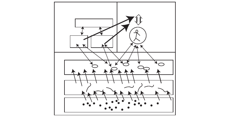
Rensink’s Model
Rensink (2002) has recently developed a model that ties together many of the components we
have been discussing. Figure 11.8 illustrates. At the lowest level are the elementary visual fea-
tures that are processed in parallel and automatically. These correspond to elements of color,
edges, motion, and stereoscopic depth. From these elements, prior to focused attention, low-level
precursors of objects, called proto-objects, exist in a continual state of flux. At the top level, the
mechanism of attention forms different visual objects from the proto-object flux. Note that
Rensink’s proto-objects are located at the top of his “low-level vision system.” He is not very
specific on the nature of proto-objects, but it seems reasonable to suppose that they have char-
362 INFORMATION VISUALIZATION: PERCEPTION FOR DESIGN
Layout
Gist
Scene schema
Focused
attention
Coherent
object nexus
Edges
Proto-objects
Pixels
Object system
Setting system
Low-level vision system
(attentional)
Figure 11.8 A model of visual attention. Adapted from Rensink (2002).
ARE11 1/20/04 4:56 PM Page 362
acteristics similar to the mid-level pattern perception processes in the three-stage model laid out
in this book.
Rensink uses the metaphor of a hand to represent attention, with the fingers reaching down
into the proto-object field to instantiate a short-lived object. After the grasp of attention is
released, the object loses its coherence and the components fall back into the constituent proto-
objects. There is little or no residue from this attentional process. Other components of the model
are a layout map containing location information and the rapid activation of object gist.
The central role of attention in Rensink’s model suggests a way that visual queries can be
used to modify the grasp of attention and pull out the particular patterns we need to support
problem solving. For example, we might need to know how one module connects to another in
a software system. To obtain this information, a visual query is constructed to find out if lines
connect certain boxes in the diagram. This query is executed by focusing visual attention on those
graphical features.
The notion of proto-objects in a continuous state of flux suggests, also, how visual displays
can provide a basis for creative thinking, because they allow multiple visual interpretations drawn
from the same visualization. Another way to think about this is that different patterns in the
display become cognitively highlighted, as we consider different aspects of a problem.
Eye Movements
We constantly make eye movements to seek information. Moving our eyes causes different parts
of the visual environment to be imaged on the high-resolution fovea, where we can see detail.
These movements are frequent. For example, as you read this page, your eye is making between
two and five jerky movements, called saccades, per second.
Here are the basic statistics describing three important types of eye movement:
1. Saccadic movements: In a visual search task, the eye moves rapidly from fixation to
fixation. The dwell period is generally between 200 and 600msec, and the saccade takes
between 20 and 100msec. The peak velocity of a saccade can be as much as 900deg/sec
(Hallett, 1986; Barfield et al., 1995).
2. Smooth-pursuit movements: When an object is moving smoothly in the visual field, the
eye has the ability to lock onto it and track it. This is called a smooth-pursuit eye
movement. This ability also enables us to make head and body movements while
maintaining fixation on an object of interest.
3. Convergent movements (also called vergence movements): When an object moves toward
us, our eyes converge. When it moves away, they diverge. Convergent movements can be
either saccadic or smooth.
Saccadic eye movements are said to be ballistic. This means that once the brain decides to switch
attention and make an eye movement, the muscle signals for accelerating and decelerating the
Thinking with Visualizations 363
ARE11 1/20/04 4:56 PM Page 363