Vidakovic B. Statistics for Bioengineering Sciences: With Matlab and WinBugs Support
Подождите немного. Документ загружается.


2.7 Multivariate Samples and Their Summaries* 35
A simple representation for S uses matrix notation:
S
=
1
n −1
µ
X
0
0
0
X −
1
n
X
0
0
0
J X
.
Here J
= 11
0
is a standard notation for a matrix consisting of ones. If one
defines a centering matrix H as H
= I −
1
n
J, then S =
1
n−1
X
0
0
0
H X . Here I is the
identity matrix.
X = [1 2 3; 4 5 6];
[n p]=size(X);
J = ones(n,1)
*
ones(1,n);
H = eye(n) - 1/n
*
J;
S = 1/(n-1)
*
X’
*
H
*
X
S = cov(X) %built-in command
An alternative definition of the covariance matrix, S
∗
=
1
n
X
0
0
0
H X , is coded
in MATLAB as
cov(X,1). Note also that the diagonal of S contains sample
variances of variables since s
ii
=
1
n−1
¡
P
n
k
=1
x
2
ki
−nx
i
2
¢
=
s
2
i
.
Matrix S describes scattering in data matrix X . Sometimes it is convenient
to have scalars as measures of scatter, and for that purpose two summaries of
S are typically used: (i) the determinant of S,
|S|, as a generalized variance
and (ii) the trace of S, trS, as the total variation.
The sample correlation coefficient between the ith and jth variables is
r
i j
=
s
i j
s
i
s
j
,
where s
i
=
q
s
2
i
=
p
s
ii
is the sample standard deviation. Matrix R with el-
ements r
i j
is called a sample correlation matrix. If R = I, the variables are
uncorrelated. If D
= diag(s
i
) is a diagonal matrix with (s
1
, s
2
,... , s
p
) on its
diagonal, then
S
=DRD, R =D
−1
RD
−1
.
Next we show how to standardize multivariate data. Data matrix Y is a
standardized version of X if its rows y
0
i
are standardized rows of X,
Y
=
y
1
0
y
2
0
.
.
.
y
n
0
, where y
i
=D
−1
(x
i
−x), i =1,..., n.
Y has a covariance matrix equal to the correlation matrix. This is a multi-
variate version of the z-score For the two-column vectors from Y , y
(i)
and y
( j)
,
the correlation r
i j
can be interpreted geometrically as the cosine of angle ϕ
i j
between the vectors. This shows that correlation is a measure of similarity

36 2 The Sample and Its Properties
because close vectors (with a small angle between them) will be strongly pos-
itively correlated, while the vectors orthogonal in the geometric sense will be
uncorrelated. This is why uncorrelated vectors are sometimes called orthogo-
nal.
Another useful transformation of multivariate data is the Mahalanobis
transformation. When data are transformed by the Mahalanobis transforma-
tion, the variables become decorrelated. For this reason, such transformed
data are sometimes called “sphericized.”
Z
=
z
1
0
z
2
0
.
.
.
z
n
0
, where z
i
=S
−1/2
(x
i
−x), i =1,..., n.
The Mahalanobis transform decorrelates the components, so
Cov(Z) is an
identity matrix. The Mahalanobis transformation is useful in defining the dis-
tances between multivariate observations. For further discussion on the mul-
tivariate aspects of statistics we direct the student to the excellent book by
Morrison (1976).
Example 2.5.
The Fisher iris data set was a data matrix of size 150×4, while
the size of the body fat data was 252
×19. To illustrate some of the multivariate
summaries just discussed we construct a new, 5 dimensional data matrix from
the body fat data set. The selected columns are
broz, densi, weight, adiposi,
and
biceps. All 252 rows are retained.
X = [broz densi weight adiposi biceps];
varNames = {’broz’; ’densi’; ’weight’; ’adiposi’; ’biceps’};
varNames =
’broz’ ’densi’ ’weight’ ’adiposi’ ’biceps’
Xbar = mean(X)
Xbar = 18.9385 1.0556 178.9244 25.4369 32.2734
S = cov(X)
S =
60.0758 -0.1458 139.6715 20.5847 11.5455
-0.1458 0.0004 -0.3323 -0.0496 -0.0280
139.6715 -0.3323 863.7227 95.1374 71.0711
20.5847 -0.0496 95.1374 13.3087 8.2266
11.5455 -0.0280 71.0711 8.2266 9.1281
R = corr(X)

2.7 Multivariate Samples and Their Summaries* 37
R =
1.0000 -0.9881 0.6132 0.7280 0.4930
-0.9881 1.0000 -0.5941 -0.7147 -0.4871
0.6132 -0.5941 1.0000 0.8874 0.8004
0.7280 -0.7147 0.8874 1.0000 0.7464
0.4930 -0.4871 0.8004 0.7464 1.0000
% By ‘‘hand’’
[n p]=size(X);
H = eye(n) - 1/n
*
ones(n,1)
*
ones(1,n);
S = 1/(n-1)
*
X’
*
H
*
X;
stds = sqrt(diag(S));
D = diag(stds);
R = inv(D)
*
S
*
inv(D);
%S and R here coincide with S and R
%calculated by built-in functions cov and cor.
Xc= X - repmat(mean(X),n,1); %center X
%subtract component means
%from variables in each observation.
%standardization
Y = Xc
*
inv(D); %for Y, S=R
%Mahalanobis transformation
M = sqrtm(inv(S)) %sqrtm is a square root of matrix
%M =
% 0.1739 0.8423 -0.0151 -0.0788 0.0046
% 0.8423 345.2191 -0.0114 0.0329 0.0527
% -0.0151 -0.0114 0.0452 -0.0557 -0.0385
% -0.0788 0.0329 -0.0557 0.6881 -0.0480
% 0.0046 0.0527 -0.0385 -0.0480 0.5550
Z = Xc
*
M; %Z has uncorrelated components
cov(Z) %should be identity matrix
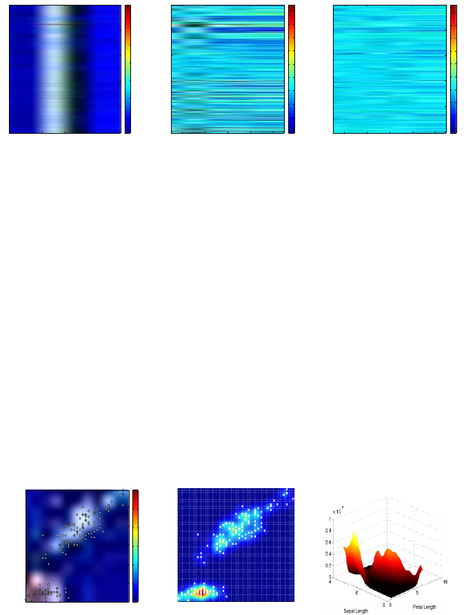
Figure 2.13 shows data plots for a subset of five variables and the two
transformations, standardizing and Mahalanobis. Panel (a) shows components
broz, densi, weight, adiposi, and biceps over all 252 measurements. Note
that the scales are different and that
weight has much larger magnitudes
than the other variables.
Panel (b) shows the standardized data. All column vectors are centered and
divided by their respective standard deviations. Note that the data plot here
shows the correlation across the variables. The variable
density is negatively
correlated with the other variables.
Panel (c) shows the decorrelated data. Decorrelation is done by centering
and multiplying by the Mahalanobis matrix, which is the matrix square root
of the inverse of the covariance matrix. The correlations visible in panel (b)
disappeared.
38 2 The Sample and Its Properties
1 2 3 4 5
50
100
150
200
250
0
50
100
150
200
250
300
350
1 2 3 4 5
50
100
150
200
250
−3
−2
−1
0
1
2
3
4
5
6
1 2 3 4 5
50
100
150
200
250
−6
−4
−2
0
2
4
6
8
10
12
(a) (b) (c)
Fig. 2.13 Data plots for (a) 252 five-dimensional observations from Body Fat data where
the variables are
broz, densi, weight, adiposi, and biceps. (b) Y is standardized X, and
(c) Z is a decorrelated X .
2.8 Visualizing Multivariate Data
The need for graphical representation is much greater for multivariate data
than for univariate data, especially if the number of dimensions exceeds three.
For a data given in matrix form (observations in rows, components in
columns), we have already seen a quite an illuminating graphical represen-
tation, which we called a data matrix.
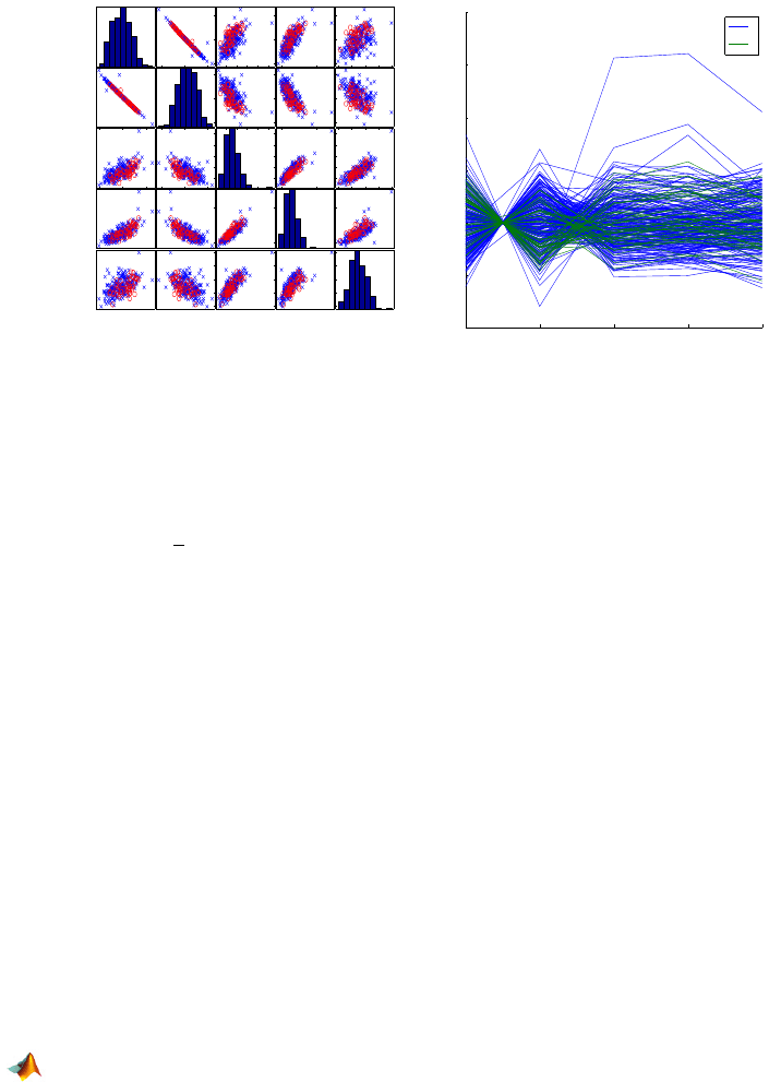
One can extend the histogram to bivariate data in a straightforward man-
ner. An example of a 2-D histogram obtained by m-file
hist2d is given in
Fig. 2.14a. The histogram (in the form of an image) shows the sepal and petal
lengths from the
fisheriris data set. A scatterplot of the 2-D measurements
is superimposed.
Sepal Length
Petal Length
4.5 5 5.5 6 6.5 7 7.5
1
2
3
4
5
6
0
2
4
6
8
10
12
4.5 5 5.5 6 6.5 7 7.5
1
2
3
4
5
6
Sepal Length
Petal Length
(a) (b) (c)
Fig. 2.14 (a) Two-dimensional histogram of Fisher’s iris sepal (X) and petal (Y ) lengths. The
plot is obtained by
hist2d.m; (b) Scattercloud plot – smoothed histogram with superimposed
scatterplot, obtained by
scattercloud.m; (c) Kernel-smoothed and normalized histogram
obtained by
smoothhist2d.m.

2.8 Visualizing Multivariate Data 39
Figures 2.14b-c show the smoothed histograms. The histogram in panel
(c) is normalized so that the area below the surface is 1. The smoothed his-
tograms are plotted by
scattercloud.m and smoothhist2d.m (S. Simon
and E. Ronchi, MATLAB Central).
If the dimension of the data is three or more, one can gain additional in-
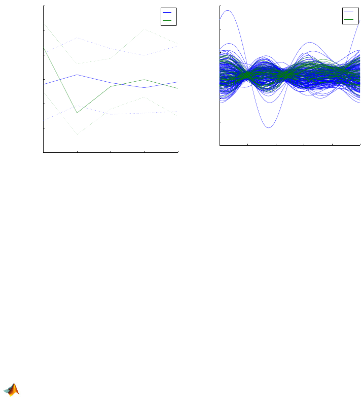
sight by plotting pairwise scatterplots. This is achieved by the MATLAB com-
mand
gplotmatrix(X,Y,group), which creates a matrix arrangement of scat-
terplots. Each subplot in the graphical output contains a scatterplot of one
column from data set X against a column from data set Y .
In the case of a single data set (as in body fat and Fisher iris examples),
Y is omitted or set at
Y=[ ], and the scatterplots contrast the columns of X.
The plots can be grouped by the grouping variable
group. This variable can be
a categorical variable, vector, string array, or cell array of strings.
The variable
group must have the same number of rows as X . Points with
the same value of
group appear on the scatterplot with the same marker
and color. Other arguments in
gplotmatrix(x,y,group,clr,sym,siz) specify the
color, marker type, and size for each group. An example of the
gplotmatrix
command is given in the code below. The output is shown in Fig. 2.15a.
X = [broz densi weight adiposi biceps];
varNames = {’broz’; ’densi’; ’weight’; ’adiposi’; ’biceps’};
agegr = age > 55;
gplotmatrix(X,[],agegr,[’b’,’r’],[’x’,’o’],[],’false’);
text([.08 .24 .43 .66 .83], repmat(-.1,1,5), varNames, ...
’FontSize’,8);
text(repmat(-.12,1,5), [.86 .62 .41 .25 .02], varNames, ...
’FontSize’,8, ’Rotation’,90);
Parallel Coordinates Plots. In a parallel coordinates plot, the compo-
nents of the data are plotted on uniformly spaced vertical lines called compo-
nent axes. A p-dimensional data vector is represented as a broken line con-
necting a set of points, one on each component axis. Data represented as lines
create readily perceived structures. A command for parallel coordinates plot
parallelcoords is given below with the output shown in Fig. 2.15b.
parallelcoords(X, ’group’, age>55, ...
’standardize’,’on’, ’labels’,varNames)
set(gcf,’color’,’white’);
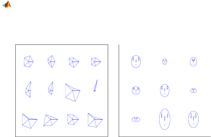
Figure 2.16a shows parallel cords for the groups age > 55 and age <= 55
with 0.25 and 0.75 quantiles.
parallelcoords(X, ’group’, age>55, ...
’standardize’,’on’, ’labels’,varNames,’quantile’,0.25)
set(gcf,’color’,’white’);
Andrews’ Plots. An Andrews plot (Andrews, 1972) is a graphical repre-
sentation that utilizes Fourier series to visualize multivariate data. With an
40 2 The Sample and Its Properties
broz densi weight adiposi biceps
brozdensiweightadiposibiceps
253035404520 401502002503003501 1.05 1.10 20 40
25
30
35
40
45
20
40
150
200
250
300
350
1
1.05
1.1
0
20
40
broz densi weight adiposi biceps
−4
−2
0
2
4
6
8
Coordinate Value
0
1
(a) (b)
Fig. 2.15 (a)
gplotmatrix for broz, densi, weight, adiposi, and biceps; (b)
parallelcoords plot for X , by age>55.
observation (X
1
,... , X
p
) one associates the function
F(t)
= X
1
/
p
2 + X
2
sin(2πt) +X
3
cos(2πt) +X
4
sin(2 ·2πt) +X
5
cos(2 ·2πt) +...,
where t ranges from
−1 to 1. One Andrews’ curve is generated for each multi-
variate datum – a row of the data set. Andrews’ curves preserve the distances
between observations. Observations close in the Euclidian distance sense are
represented by close Andrews’ curves. Hence, it is easy to determine which
observations (i.e., rows when multivariate data are represented as a matrix)
are most alike by using these curves. Due to the definition, this representa-
tion is not robust with respect to the permutation of coordinates. The first few
variables tend to dominate, so it is a good idea when using Andrews’ plots
to put the most important variables first. Some analysts recommend running
a principal components analysis first and then generating Andrews’ curves
for principal components. The principal components of multivariate data are
linear combinations of components that account for most of the variability in
the data. Principal components will not be discussed in this text as they are
beyond the scope of this course.
An example of Andrews’ plots is given in the code below with the output in
Fig. 2.16b.
andrewsplot(X, ’group’, age>55, ’standardize’,’on’)
set(gcf,’color’,’white’);
Star Plots. The star plot is one of the earliest multivariate visualization
objects. Its rudiments can be found in the literature from the early nineteenth
2.8 Visualizing Multivariate Data 41
broz densi weight adiposi biceps
−1.5
−1
−0.5
0
0.5
1
1.5
Coordinate Value
0
1
0 0.2 0.4 0.6 0.8 1
−15
−10
−5
0
5
10
15
t
f(t)
0
1
(a) (b)
Fig. 2.16 (a) X by
age>55 with quantiles; (b) andrewsplot for X by age>55.
century. Similar plots (rose diagrams) are used in Florence Nightingale’s Notes
on Matters Affecting the Health, Efficiency and Hospital Administration of the
British Army in 1858 (Nightingale, 1858).
The star glyph consists of a number of spokes (rays) emanating from the
center of the star plot and connected at the ends. The number of spikes in the
star plot is equal to the number of variables (components) in the corresponding
multivariate datum. The length of each spoke is proportional to the magnitude
of the component it represents. The angle between two neighboring spokes is
2
π/p, where p is the number of components. The star glyph connects the ends
of the spokes.
An example of the use of star plots is given in the code below with the
output in Fig. 2.17a.
ind = find(age>67);
strind = num2str(ind);
h = glyphplot(X(ind,:), ’glyph’,’star’, ’varLabels’,...
varNames,’obslabels’, strind);
set(h(:,3),’FontSize’,8); set(gcf,’color’,’white’);
Chernoff Faces. People grow up continuously studying faces. Minute and
barely measurable differences are easily detected and linked to a vast catalog
stored in memory. The human mind subconsciously operates as a super com-
puter, filtering out insignificant phenomena and focusing on the potentially
important. Such mundane characters as
:), :(, :O, and >:p are readily
linked in our minds to joy, dissatisfaction, shock, or affection.
Face representation is an interesting approach to taking a first look at mul-
tivariate data and is effective in revealing complex relations that are not vis-
ible in simple displays that use the magnitudes of components. It can be used
42 2 The Sample and Its Properties
to aid in cluster analysis and discrimination analysis and to detect substantial
changes in time series.
Each variable in a multivariate datum is connected to a feature of a face.
The variable-feature links in MATLAB are as follows: variable 1 – size of face;
variable 2 – forehead/jaw relative arc length; variable 3 – shape of forehead;
variable 4 – shape of jaw; variable 5 – width between eyes; variable 6 – vertical
position of eyes; variables 7–13 – features connected with location, separation,
angle, shape, and width of eyes and eyebrows; and so on. An example of the
use of Chernoff faces is given in the code below with the output in Fig. 2.17b.
ind = find(height > 74.5);
strind = num2str(ind);
h = glyphplot(X(ind,:), ’glyph’,’face’, ’varLabels’,...
varNames,’obslabels’, strind);
set(h(:,3),’FontSize’,10); set(gcf,’color’,’white’);
78 79 84 85
87 246 247 248
249 250 251 252
6 12 96
109 140 145
156 192 194
(a) (b)
Fig. 2.17 (a) Star plots for X; (b) Chernoff faces plot for X .
2.9 Observations as Time Series
Observations that have a time index, that is, if they are taken at equally
spaced instances in time, are called time series. EKG and EEG signals, high-
frequency bioresponses, sound signals, economic indices, and astronomic and
geophysical measurements are all examples of time series. The following ex-
ample illustrates a time series.

2.9 Observations as Time Series 43
Example 2.6. Blowflies Time Series. The data set blowflies.dat con-
sists of the total number of blowflies (Lucilia cuprina) in a population under
controlled laboratory conditions. The data represent counts for every other
day. The developmental delay (from egg to adult) is between 14 and 15 days
for insects under the conditions employed. Nicholson (1954) made 361 bi-daily
recordings over a 2-year period (722 days), see Fig. 2.18a.
In addition to analyzing basic location, spread, and graphical summaries,
we are also interested in evaluating the degree of autocorrelation in time se-
ries. Autocorrelation measures the level of correlation of the time series with
a time-shifted version of itself. For example, autocorrelation at lag 2 would
be a correlation between X
1
, X
2
, X
3
,... , X
n−3
, X
n−2
and X
3
, X
4
, . .., X
n−1
, X
n
.
When the shift (lag) is 0, the autocorrelation is just a correlation. The concept
of autocorrelation is introduced next, and then the autocorrelation is calcu-
lated for the blowflies data.
Let X
1
, X
2
,... , X
n
be a sample where the order of observations is impor-
tant. The indices 1,2,..., n may correspond to measurements taken at time
points t, t
+∆t, t +2∆t,.. . , t +(n −1)∆t, for some start time t and time incre-
ments
∆t. The autocovariance at lag 0 ≤ k ≤ n −1 is defined as
ˆ
γ(k) =
1
n
n−k
X
i=1
(X
i+k
−X )(X
i
−X ).
Note that the sum is normalized by a factor
1
n
and not by
1
n−k
, as one may
expect.
The autocorrelation is defined as normalized autocovariance,
ˆ
ρ(k) =
ˆ
γ(k)
ˆ
γ(0)
.
Autocorrelation is a measure of self-affinity of the time series with its own
shifts and is an important summary statistic. MATLAB has the built-in func-
tions
autocov and autocorr. The following two functions are simplified ver-
sions illustrating how the autocovariances and autocorrelations are calcu-
lated.
function acv = acov(ts, maxlag)
%acov.m: computes the sample autocovariance function
% ts = 1-D time series
% maxlag = maximum lag ( < length(ts))
%usage: z = autocov (a,maxlag);
n = length(ts);
ts = ts(:) - mean(ts); %note overall mean
suma = zeros(n,maxlag+1);
suma(:,1) = ts.^2;
for h = 2:maxlag+1
suma(1:(n-h+1), h) = ts(h:n);
44 2 The Sample and Its Properties
suma(:,h) = suma(:,h) .
*
ts;
end
acv = sum(suma)/n; %note the division by n
%and not by expected (n-h)
function [acrr] = acorr(ts , maxlag)
acr = acov(ts, maxlag);
acrr = acr ./ acr(1);
100 200 300 400 500 600 700
2000
4000
6000
8000
10000
12000
14000
Day
Number
0 5 10 15 20 25
−0.2
0
0.2
0.4
0.6
0.8
Lag
Autocorrelation
(a) (b)
Fig. 2.18 (a) Bi-daily measures of size of the blowfly population over a 722-day period, (b)
The autocorrelation function of the time series. Note the peak at lag 19 corresponding to the
periodicity of 38 days.
Figure 2.18a shows the time series illustrating the size of the population
of blowflies over 722 days. Note the periodicity in the time series. In the auto-
correlation plot (Fig. 2.18b) the peak at lag 19 corresponding to a time shift of
38 days. This indicates a periodicity with an approximate length of 38 days in
the dynamic of this population. A more precise assessment of the periodicity
and related inference can be done in the frequency domain of a time series,
but this theory is beyond the scope of this course. Good follow-up references
are Brillinger (2001), Brockwell and Davis (2009), and Shumway and Stoffer
(2005). Also see Exercise 2.12.
2.10 About Data Types
The cell data elaborated in this chapter are numerical. When measurements
are involved, the observations are typically numerical. Other types of data
encountered in statistical analysis are categorical. Stevens (1946), who was
influenced by his background in psychology, classified data as nominal, ordi-
nal, interval, and ratio. This typology is loosely accepted in other scientific cir-
