Tidwell J. Designing Interfaces (Second Edition)
Подождите немного. Документ загружается.

The Patterns 503
Figure 11-15.
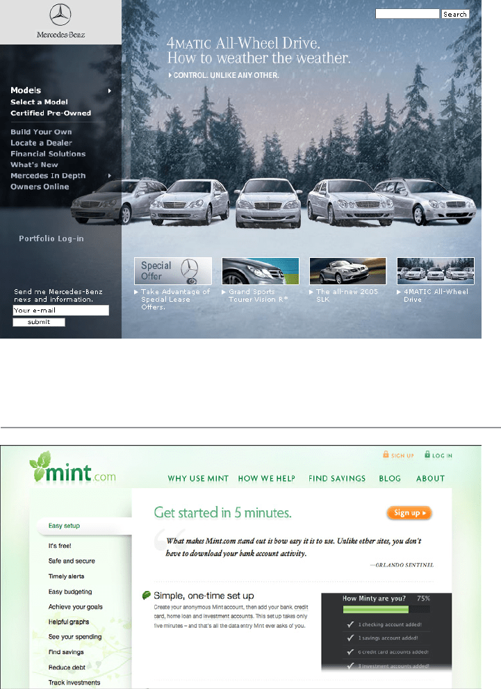
Mercedes-Benz
Few Hues, Many Values
Figure 11-16.
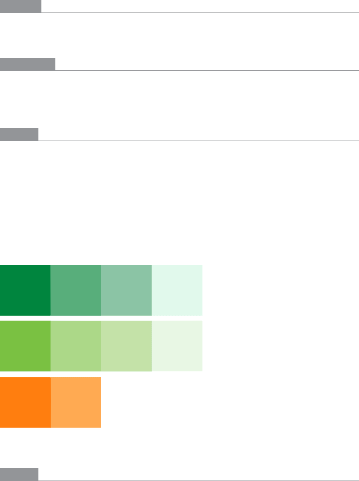
Mint
504 Chapter 11: Making It Look Good: Visual Style and Aesthetics
What
Choose one, two, or at most three major color hues to use in the interface. Create a color
palette by selecting assorted values (levels of brightness) from within those few hues.
Use when
You want a relatively conservative color scheme for an application or site. You want to
avoid a flashy, rainbow-colored, “angry fruit salad” look, but you still want the interface
to have some character.
Why
Where colors are concerned, sometimes less is better. Too many color hues scattered
throughout the interface, especially when they’re bright and saturated, can potentially
make a design noisy and cluttered. The colors compete for the user’s attention.
But when you use many subtle variations on a single color, you can create a design that has
depth and dimension. Consider the blue-green, yellow-green, and orange colors used in the
example in Figure 11-16 and reproduced in the color strips in Figure 11-17. Notice how the
more saturated colors move forward, while the paler colors appear to recede. (Grayer tones
will tend to recede as well, hence the drop-shadow effect seen in the Mint page.)
Figure 11-17.
Colors used in Mint’s interface
How
As mentioned earlier, pick one, two, or even three main hues. You get black and white for
free, but gray counts. In fact, gray works very well in multiple values and brightness levels;
it’s very versatile, especially if you add a little color to make it more blue (cool) or more
beige (warm).
The Patterns 505
Within those hues, vary the color value to get a range of bright and dark shades. You also
can vary the saturation at the same time; this can produce subtler color combinations
than you would get by varying just the value. Use as many of these colors as you want to
compile a color palette for the application.
You can, of course, use other colors in the interface besides these hues; just use them
sparingly. Icons, ads, and other features that take up relatively small spaces don’t have to
fit this restricted color scheme. You might want to choose only one or two accent colors
too, such as using red or cyan to mark points of interest. In fact, using a single hue for the
“background” of the UI actually emphasizes these minor colors because they don’t get lost
in a sea of color hues.
Examples
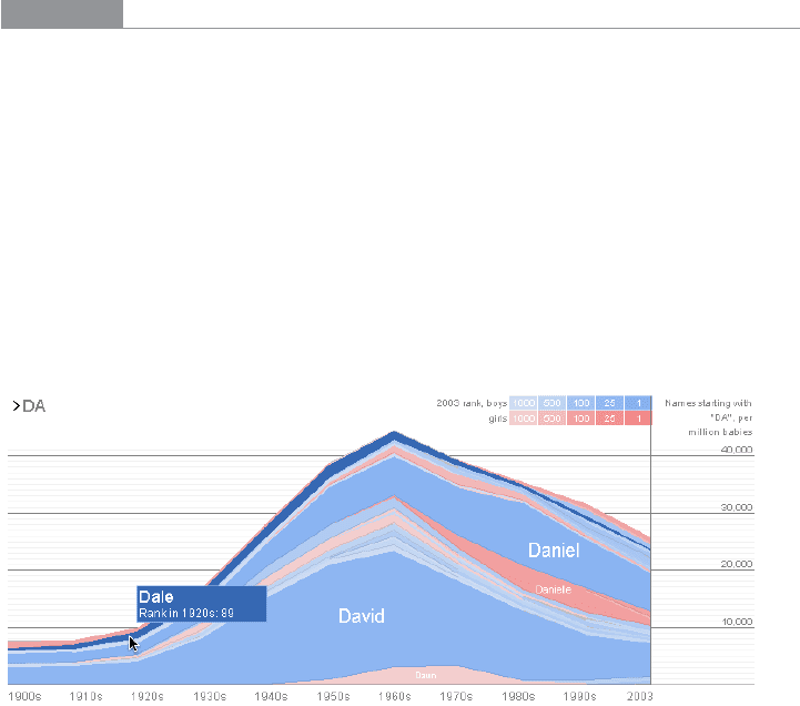
The graph in Figure 11-18 uses two hues, blue and pink, to show its data. Blue represents
boys’ names and pink represents girls’ names. Within those colors, the color value rep-
resents the popularity of those names in 2003. A third color, dark gray, shows the frame
around the data—the grid lines, the numbers, and the title—and a dark blue highlights
the selected name (“Dale”).
This color combination is very effective, both cognitively and aesthetically. The hues and
values mean something with respect to the data, and the coding is very easy to follow—
you hardly even need the legend after you’ve looked at it once. Aesthetically, the whole
thing has a layered richness that isn’t garish, as rainbow hues would have been. And in U.S.
culture, people understand light blues and pinks as “baby” colors, so the emotional and
cultural connection is there, too. See http://babynamewizard.com.
Figure 11-18.
Baby Name Wizard
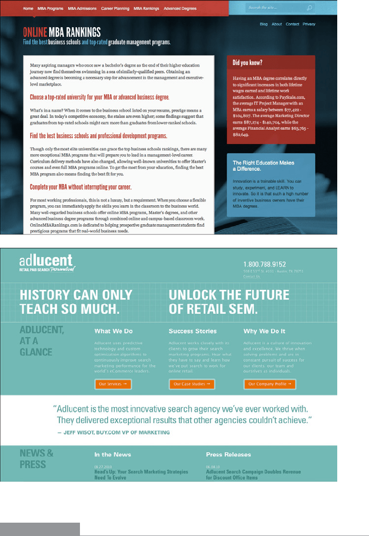
Figure 11-19 shows two websites that make very restrained use of color. The first balances
hot and cool colors, while the second uses a single color for most of the design, reserving
the hot orange color to accent the call-to-action buttons.
506 Chapter 11: Making It Look Good: Visual Style and Aesthetics
Figure 11-19.
OnlineMBARankings.com and AdLucent.com
In other libraries
http://quince.infragistics.com/Patterns/Few%20Hues.aspx
The Patterns 507
Corner Treatments
Figure 11-20.
JetBlue
What
Instead of using ordinary right angles, use curves or diagonals for some of the interface’s
box corners. Make these corner treatments consistent across the interface.
Use when
The interface uses rectangular elements such as boxes, buttons, menus, and tabs.
Why
The repetition of visual motifs helps unify a design. When you devise a single “corner”
motif and use it consistently in many places, it gives a distinctive look to the whole design.
It’s certainly less boring than ordinary right-angled corners.
How
Many websites use curved corners. Others use diagonal lines, and a few use cutouts. What
you choose depends on the overall look of your site. Do you have a logo, an image, or a
font that has eye-catching visual elements to it? Use one of those visual elements. Are you
going for something soothing (as curves often are), edgy, or energetic? Try out several
different ideas.
508 Chapter 11: Making It Look Good: Visual Style and Aesthetics
Not all of the rectangular elements in the interface need to use corner treatments—don’t
use too much of a good thing. But group boxes or panels usually do, and tabs commonly
are done this way, too. If you use corner treatments on one element in a repeated group,
do them all for consistency.
Furthermore, not every corner on a given box needs to use a corner treatment. Sometimes
two opposing corners get it, such as the upper right and lower left. Sometimes it’s just one
corner, usually the upper left or upper right.
Everywhere the element is repeated, make sure it resembles the others. In other words,
curved corners should use the same type of curve (though not necessarily the same ra-
dius). Angles should all be the same angle—don’t mix a 45-degree angle motif with a
20-degree angle, for instance. Also, curved and right angles tend to mix badly on visually
busy sites. Use
Corner Treatments this with care.
Examples
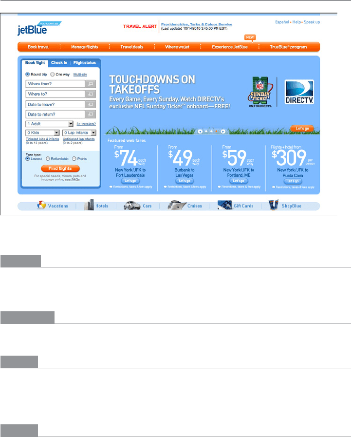
The JetBlue website in Figure 11-20 at the top of the pattern repeats its curved corners all
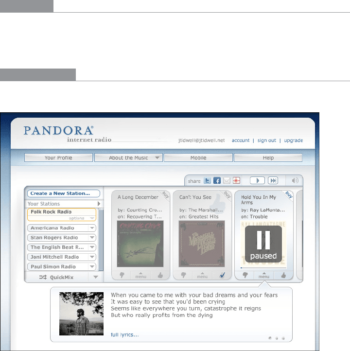
over the site: in menu bars, the main content box, tabs, and buttons. Pandora, shown in
Figure 11-21, does the same, even for “callout” pop ups containing lyrics.
In other libraries
http://quince.infragistics.com/Patterns/Corner%20Treatments.aspx
Figure 11-21.
Pandora
The Patterns 509
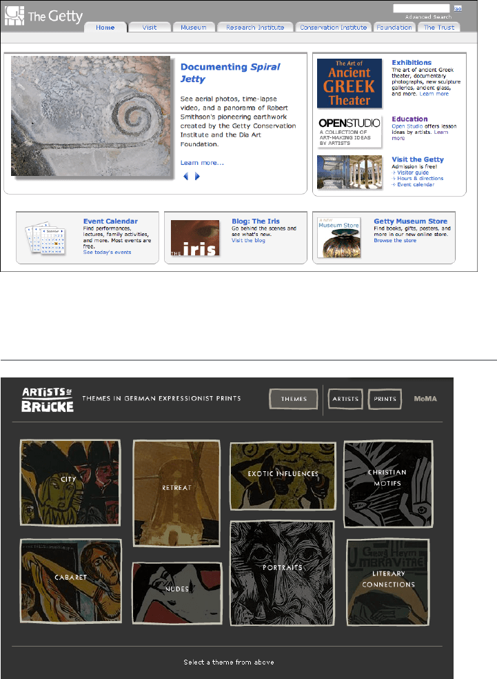
The Getty Museum’s site in Figure 11-22 uses bars across the tops of its content boxes,
and curves on the bottom corners. (The tabs also use curved corners, which is common.)
Figure 11-22.
Getty.org
Borders That Echo Fonts
Figure 11-23.
A MoMA online exhibit from 2002
Do wnl oa d fr om W ow! e Bo ok < ww w.w ow eb oo k. co m>
510 Chapter 11: Making It Look Good: Visual Style and Aesthetics
What
When drawing borders and other lines, use the same color, thickness, and curves used by
one of the design’s major fonts.
Use when
Your design contains a font carefully chosen for its visual effect, such as the font used in
headlines, a title, or a logotype.
Why
The repetition of visual motifs helps unify a design. Fonts and borders work at similar
scales in a design—only a few pixels wide—and when they reinforce each other visually,
their effect is magnified. When they clash (especially if you use many different kinds of
borders), their contributions are weakened.
How
First, pick a font from your design. Title and headline fonts often work well, as do fonts
used in logotypes, but sometimes body text works, too. Observe its formal properties:
color, primary line thickness, texture, curve radius, angles, and spacing.
Now try to draw borders and lines that use some of those same properties. The color
should be the same as the font’s, though you can cheat on thickness and make borders
a bit thinner than the font’s strokes. If the font has pronounced circular curves, as many
modern sans-serif fonts do, try using that same curve radius on the border corners.
If it’s a particularly interesting font, ask yourself what makes it interesting. See if you can
pull those visual elements from the font into the rest of the design.
You don’t need to do this with all the borders in your interface, of course; just a few will
do, especially if the lines are thick. Be careful not to make borders too thick or coarse.
Thick borders make a strong statement, and after a point, they overwhelm whatever’s
inside them. Images usually can handle a thicker border than lightweight body text, for
instance. You can use single-pixel lines effectively in combination with heavier borders.
The Patterns 511
Examples
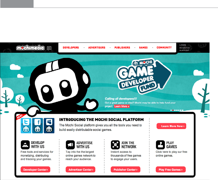
In Figure 11-24, Mochimedia uses its logotype’s “fat curves” all over the design. The heavy
black border strongly echoes the logotype; so do the icons, the headline, the top menu bar,
and the cartoon character itself.
Figure 11-24.
Mochimedia
Many sites use very thin borders and separator lines that reflect the visual qualities of a
body font. In Good’s website, shown in Figure 11-25, the one-pixel dotted lines echo the
delicate serifed body font in the sidebar. (A sans-serif font might be better echoed by a
solid line.)
512 Chapter 11: Making It Look Good: Visual Style and Aesthetics
Figure 11-25.
Detail of Good’s site
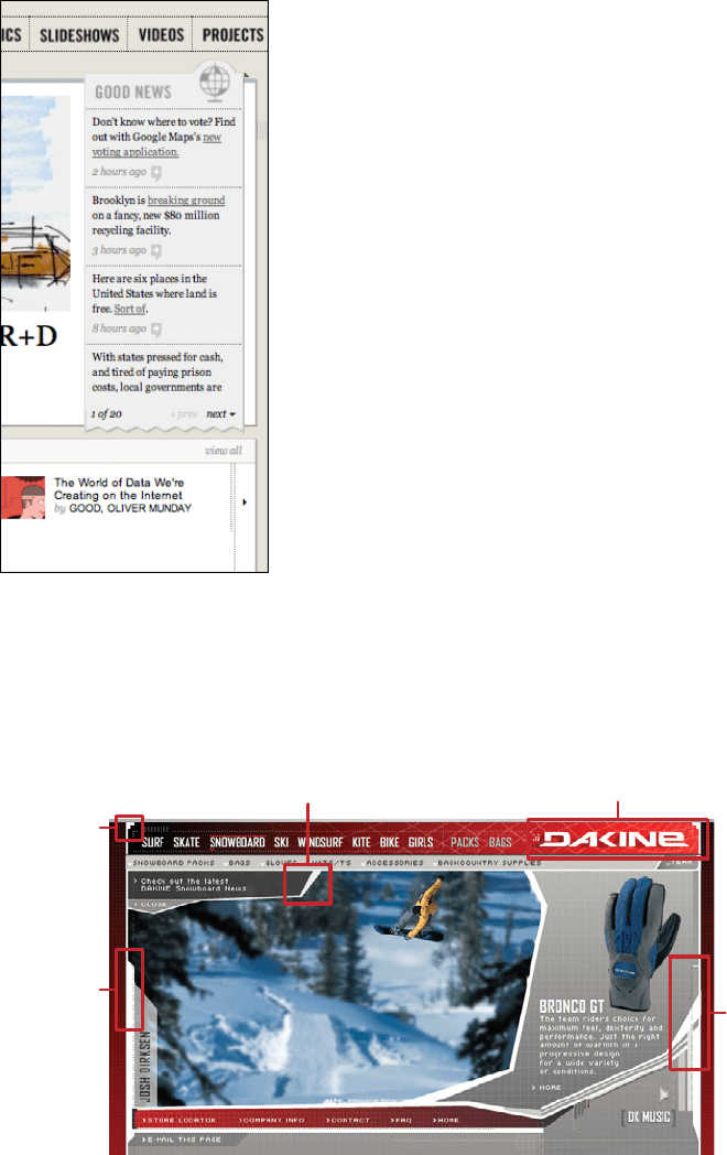
Dakine’s website from several years ago mixes it up a bit. In Figure 11-26, it uses many var-
ied design elements, but the jagged white lines do in fact echo the logo font. All together,
they lend a feeling of motion, tension, and edginess to the page, which was undoubtedly
what its designers were after—Dakine sells sports equipment to a young demographic.
Right angles in
corners
Thick lines with
diagonals
Thick diagonals around picture
Logo uses diagonals and right angles
Yet more
diagonals
Figure 11-26.
Dakine