Tidwell J. Designing Interfaces (Second Edition)
Подождите немного. Документ загружается.


The Basics of Visual Design 493
Wherever two curves intersect, notice what the geometrical tangents to those curves are
doing. Are the tangents at right angles? That results in a calmer, more still composition;
if they cross at a more acute angle, the design has more tension and apparent motion.
(Again, these aren’t hard-and-fast rules, but they’re generally true.)
When using angles, curves, and nonrectangular shapes, think about where the focal points
are: at sharp angles, where lines cross, and where multiple lines converge, for instance. Use
these focal points to draw the viewer’s eye where you want it to go.
Texture and Rhythm
Texture adds richness to a visual design. As described in the “Typography” section, text
forms its own texture,
*
and you can control the look of that texture by choosing good
fonts. For many pages and interfaces, fonts are the most important texture element.
But other kinds of textures deserve attention, too. Blank regions, such as the strips of
empty space down the sides of a web page, can look much better when filled with a tex-
ture. You also can use textures to surround strong visual elements and set them off, as
done in Designs 6 and 7. Textures add visual interest, and depending on what they look
like, they can add warmth, richness, excitement, or tension. The most effective textures
in interface design are subtle, not vivid checkerboards of eye-hurting colors. They use
gentle color gradations and very tiny details. When spread over large areas, their impact
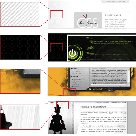
is greater than you might think. Figure 11-10 shows some of the margin textures in the
CSS designs. Single-pixel dots, parallel lines, and finely drawn grids are nice geometric
textures; they’re easy to generate and render, and they add refinement to a design. See the
Hairlines pattern.
Be careful when using textures behind words on a computer screen—it rarely works. All
but the subtlest textures interfere with the readability of small text. You can put them be-
hind large text, but watch the way the edges of the letterforms interact with the different
colors in the texture, as that can visually distort the letters. Try fading a texture into a solid
color as it approaches a block of text.
* On an interesting etymological note, the English words text, texture, and textile all derive from the same Latin
root, texere, meaning “to weave.” Isn’t that evocative?
494 Chapter 11: Making It Look Good: Visual Style and Aesthetics
Figure 11-10.
Details of textures in four CSS designs
Images
Each of the CSS Zen Garden designs reproduced here uses imagery. Some of the images
are photographs; others are iconic semi-abstract pictures. In all cases, the images exist
purely to set the mood of the design. These particular designs can go as far as they need
to set that mood, since in the CSS Zen Garden, design is more important than content.
Your situation is probably different. In most web pages and applications, content and ease
of use are more important than style. You should use purely decorative images sparingly
and with great care on functional GUIs, since they tend to be distracting.
That being said, you should look at the functional icons and images in your design—
such as toolbar icons and website image links—and see if they make the emotional state-
ment you want the whole design to make. Use the same criteria listed here: color, texture,
angles, curves, spacing, and so on. Specifically, color schemes, angles, and curves should
be consistent across an icon set. Don’t make them look too much alike, though, or users
won’t see the differences easily. Larger icons usually “feel” better than small ones, partly
because you can draw them more generously and partly because of the crowding and
space issues discussed earlier.
The Basics of Visual Design 495
Back to decorative imagery. Photographs are extraordinary tools for evoking emotion-
al responses. How many web pages have you seen showing happy, smiling faces? Kids
flying kites? Competent-looking businesspeople in crisp suits? How about roads wind-
ing through beautiful mountain scenery? Sunsets or beaches? Rolling grassy hills under
sunny blue skies?
These kinds of pictures appeal to our deepest human instincts, and they all predispose the
viewer to respond positively—as long as the context is right. If you try to put powerful
images like these on an unassuming little utility application, users might laugh or criticize
it as marketing overkill. This is a delicate area, so if you’re not sure something works, test
it with users.
Cultural References
A design might remind you of something cultural—a brand, movie, art style, historical
era, literary genre, or inside joke. A familiar reference may evoke memories or emotions
strong enough to trump all these other design factors, though the best designs make cul-
tural references work in concert with everything else.
Design 7 might remind you of 1970s pop art. That’s almost certainly deliberate. The feel
of the page is informal, lively, and playful—note the angles, color, typography, and denim
texture. The emotional reaction from most American adults probably will be “silly,” “nos-
talgic,” “retro cool,” or something like that. Everything in this design works together to
produce a specific gut reaction. Some other CSS Zen Garden designs that are not shown
here replicate the styles of Bauhaus, art nouveau, Dadaism, comic books, and even Soviet-
era Communist propaganda posters.
Obviously, if you make overt cultural references, consider your audience. A 10-year-old
will not get the 1970s pop-art reference. Chances are good that a young adult in India
won’t either. But if your audience is sufficiently well defined for you to know that a cul-
tural reference will be familiar to them, it can be a good “hook” to engage a viewer emo-
tionally with your design.
Cultural references rarely are used in functional application designs, but you can see them
in
Skins and Themes for platforms and individual applications. You also can find cultural
references in applications like QuickBooks, in which some pages are designed to look like
checks and bills. They actually move beyond a stylistic treatment and become an interac-
tion metaphor, but the metaphor still is entirely cultural—someone who has never seen a
checkbook wouldn’t respond in the same way as someone who has.
Repeated Visual Motifs
A good design has unity: it hangs together as one entity, with each element supporting the
others structurally and viscerally. That’s a hard goal to achieve. I can’t give you hard-and-
fast rules on how to do it; it takes skill and practice.
496 Chapter 11: Making It Look Good: Visual Style and Aesthetics
But one thing that contributes greatly toward visual unity is the repetition of visual ele-
ments or motifs. We’ve already talked about angles and curves; you can use diagonal lines
of the same angle, or lines with similar curvature, as repeated elements in a design. The
Corner Treatments pattern talks about a common way to do this.
Also consider typography. Use only one main body-text font, though other fonts can work
very effectively in small areas such as sidebars or navigation links. (Their contrast to the
main font makes them stand out.) If you have several headlines or titled sections, use the
same headline font for them. You also can pull smaller graphic elements—line width and
color, for instance—out of your fonts into the rest of the design. See the
Borders That Echo
Fonts
pattern.
When similar groupings of text or controls repeat along a line, a visual rhythm results. You
can see this especially in the “Select a Design” sections of Designs 3, 4, and 8. They show
each design name/author pair in a well-defined grouping, and then repeat that grouping
along a column. You easily could accomplish the same effect with form fields, palette but-
tons, and other UI elements.
Rhythms like these can be powerful design tools. Use them with care, and apply them to
groups of comparable things—users will assume that similarity in form means similarity
in function. Chapter 4 discusses element repetition as part of a visual hierarchy; see the
Grid of Equals pattern there. Repetition also lies at the heart of other layout patterns such
as
Thumbnail Grid (Chapter 5), Thumbnail-and-Text List (Chapter 10), and Small Multiples
(Chapter 7).
What This Means for Desktop Applications
Those of you who work on websites might already be familiar with everything discussed
so far. People expect websites—and by extension, web applications—to have strong
graphic styling, and you rarely will find them looking completely plain and neutral.
But what if you work on desktop applications? If you try to apply these principles just to
the controls’ look-and-feel—how the controls are drawn—you may not have many choic-
es. Java applications get to choose from a few look-and-feel options, most of which are
native looking or fairly neutral. Linux applications have some nice choices too, such as
GNOME’s application themes. But native Windows or Mac applications generally use the
standard platform look-and-feel, unless you’re willing to work hard to develop a custom
one.
Given the situation, you can be forgiven for just using the platform look-and-feel stan-
dards, and concentrating your graphic design attentions elsewhere.

What This Means for Desktop Applications 497
But some applications now look more “web-ish” or “designer-y” than they used to, and
they generally look better for it. Microsoft Money 2000 was one of the first mainstream
applications to break the mold. Its designers chose to use background images in the top
margins, gradient fills, anti-aliased headline fonts, and an unusual color scheme. Other
applications have since done similar things.
Even if you do use a neutral look-and-feel for your actual widgetry, there still are ways to
be creative.
Backgrounds
Unobtrusive images, gradient fills, and subtle textures or repeated patterns in large
background areas can brighten up an interface to an amazing extent. Use them in
dialog or page backgrounds; tree, table, or list backgrounds; or box backgrounds (in
conjunction with a box border). See the
Deep Background pattern for more.
Colors and fonts
You often can control overall color schemes and fonts in a native-looking UI, too. For
instance, you might draw headlines in an unusual font at several point sizes larger
than standard dialog text, and maybe even on a strip of contrasting background color.
Consider using these if you design a page layout with
Titled Sections (Chapter 4).
Borders
Borders offer another possibility for creative styling. Again, if you use
Titled Sections
or any other kind of physical grouping, you might be able to change how box borders
are drawn. Solid-color boxes of narrow widths work best; beveled borders look very
1990s now. See
Corner Treatments and Borders That Echo Fonts.
Images
In some UI toolkits, certain controls let you replace their standard look-and-feel with
custom images on a per-item basis. Buttons often allow this, for instance, so your but-
tons, including their borders, can look like anything you want. Tables, trees, and lists
sometimes permit you to define how their items are drawn (in Java Swing, you have
complete control over item rendering, and several other toolkits at least let you use
custom icons). You also can place static images on UI layouts, giving you the ability
to put images of any dimension just about anywhere.
The biggest danger here is accessibility. Operating systems such as Windows let users
change desktop color/font themes, and that’s not just for fun—visually impaired users
use desktop themes with high-contrast color schemes and giant fonts just so they can see
what they’re doing. Make sure your design works with those high-contrast themes. It’s the
right thing to do.
*
* And, depending on who buys your software, it may also be the legal thing to do. The U.S. government, for
example, requires that all software used by federal agencies be accessible to people with disabilities. See http://
www.section508.gov for more information.
498 Chapter 11: Making It Look Good: Visual Style and Aesthetics
Along the same lines, you might replace ordinary text labels with images containing
unusual fonts, maybe with halos, drop-shadow effects, or complex backgrounds. This
is common in web pages. If you insist on using an image for text, you need to provide
enough information with that image to let a screen reader such as JAWS read it aloud.
(How exactly you do that depends entirely upon the UI technology you’re using.)
Another danger is fatiguing your users. If you design an application meant to be used at
full size or for a long time, tone down the saturated colors, huge text, high contrast, and
eye-catching textures—make the design quiet, not loud. More importantly, if your ap-
plication is meant to be used in high-stress situations, such as a control panel for heavy
machinery, strip out anything superfluous that might distract users from the task. Here,
cognitive concerns are far more important than aesthetics.
The Patterns
All of these patterns (except Skins and Themes) draw on the concepts described in the in-
troduction. They talk about specific ways to apply those concepts;
Corner Treatments, for
instance, captures one kind of repeated visual motif, and
Borders That Echo Fonts captures
another.
Deep Background and Hairlines touch on texture choice, and fonts are discussed in
Contrasting Font Weights.
1.
Deep Background
2. Few Hues, Many Values
3. Corner Treatments
4. Borders That Echo Fonts
5. Hairlines
6. Contrasting Font Weights
The Skins and Themes pattern is different. It deals more with metadesign—it says nothing
about how you design the specific look-and-feel of your application, but how you design
your application to let others replace your look-and-feel with their own designs.
7.
Skins and Themes
The Patterns 499
Deep Background
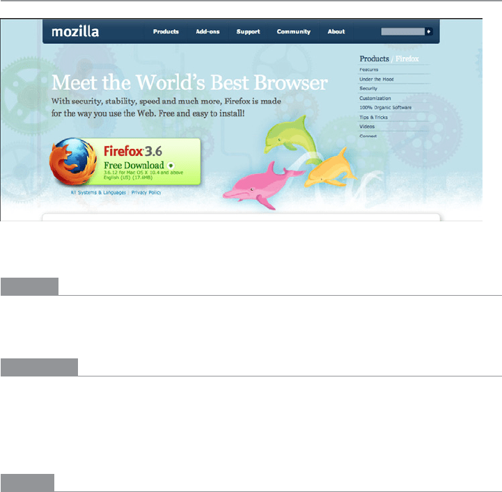
Figure 11-11.
Firefox download page
What
Place an image or gradient into the page’s background that visually recedes behind the
foreground elements.
Use when
Your page layout has strong visual elements (such as text blocks, groups of controls, or
windows), and it isn’t very dense or busy. You want the page to look distinctive and attrac-
tive; you may have a visual branding strategy in mind. You’d like to use something more
interesting than flat white or gray for the page background.
Why
Backgrounds that have soft focus, color gradients, and other distance cues appear to re-
cede behind the more sharply defined content in front of them. The content thus seems to
“float” in front of the background. This pseudo-3D look results in a strong figure/ground
effect—it attracts the viewer’s eye to the content.
Fancy explanations aside, it just looks good.
Do wnl oa d fr om W ow! e Bo ok < ww w.w ow eb oo k. co m>
500 Chapter 11: Making It Look Good: Visual Style and Aesthetics
How
Use a background that has one or more of these characteristics:
Soft focus
Keep lines fuzzy and avoid too much small detail—sharp lines interfere with read-
ability of the content atop it, especially if that content is text or small icons. (You can
kind of get away with sharp lines if they are low-contrast, but even then, text doesn’t
work well over them unless the text contrasts strongly with the background.)
Color gradients
Bright, saturated colors are OK, but again, hard lines between them are not. Allow
colors to blend into each other. In fact, if you don’t have an image to use in the back-
ground, you can create a simple color gradient in your favorite drawing tool—it still
looks better than a solid color. (You don’t need to store or download pure gradients as
images, either. On the Web, you can create them by repeating one-pixel-wide strips,
either horizontally or vertically. In systems where you can use code to generate large
areas of color, gradients generally are easy to program.)
Depth cues
Fuzzy detail and vertical color gradients are two features that tell our visual systems
about distance. To understand why, imagine a photograph of a hilly landscape—the
farther away something is, the softer and hazier the color is. Other depth cues include
texture gradients (features that get smaller as they get farther away) and lines radiat-
ing from vanishing points.
No strong focal points
The background shouldn’t compete with the main content for the user’s attention.
Diffuse (weak) focal points can work, but make sure they contribute to a balanced
composition on the whole page, rather than distracting the viewer from seeing the
parts of the page he should look at instead. See Figure 11-12.
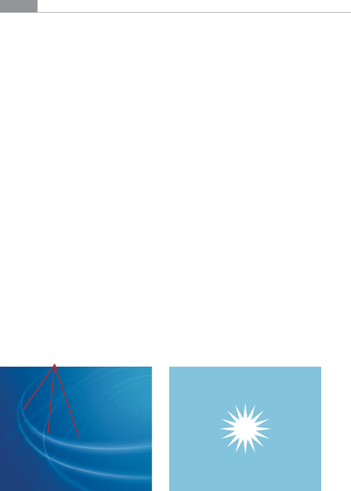
Diffuse focal points Strong focal point
Figure 11-12.
Diffuse versus strong focal points
The Patterns 501
As you design an interface with a Deep Background, consider what happens when the user
changes the size of the page. How will the background accommodate a larger (or smaller)
size? Will it rescale to fit, or will the window just clip an unscaled image? Clipping is prob-
ably less unsettling to the user; it’s how most web pages behave, and it feels more stable.
Besides, you don’t have to worry about changing aspect ratios, which is problematic with
many images.
Examples
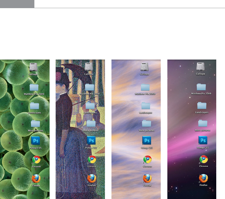
In Figure 11-13, four Mac OS background images illustrate the relative difficulties of
reading text and icons over complex backgrounds. The first two make it quite hard to
distinguish the folders and application shortcuts; the third is easier, and the fourth is the
easiest by far. Note the characteristics of these four backgrounds: high versus low contrast
with the text, hard versus soft focus, and general “noisiness.”
Figure 11-13.
Four Mac OS backgrounds of varying readability
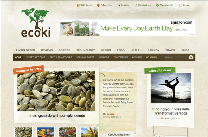
Some websites make heavy use of textures that lend the whole site a distinctive look. In
the example from Ecoki, shown in Figure 11-14, the textures are everywhere; but because
they are lightweight and low-contrast, they don’t interfere with the readability of the text.
502 Chapter 11: Making It Look Good: Visual Style and Aesthetics
Figure 11-14.
Ecoki home page
The version of the Mercedes-Benz website shown in Figure 11-15 uses an image as a back-
ground. This image has some very strong focal points—the cars, of course—and they are
the central features of the page. But the outer parts of the image, which are much softer,
are
Deep Backgrounds for other content: the search box, the four small images at the bot-
tom, and the “4MATIC All-Wheel Drive” tag line.
The most interesting aspect of this figure is the darker band running down the lefthand
side. The site needed a navigation bar with small text, but layering those links directly
over the background image wouldn’t have worked—the words may have been unreadable
over small detail, and would have gotten lost in the composition. A translucent smoked-
glass background highlights those white links by increasing contrast; it balances the page
(which otherwise is right-weighted); it doesn’t obscure the nice background image; and it
adds a sense of layered depth.