Tidwell J. Designing Interfaces (Second Edition)
Подождите немного. Документ загружается.

Same Content, Different Styles 483
Figure 11-4.
Design 4
484 Chapter 11: Making It Look Good: Visual Style and Aesthetics
Figure 11-5.
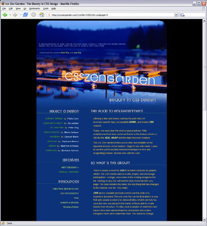
Design 5
Same Content, Different Styles 485
Figure 11-6.
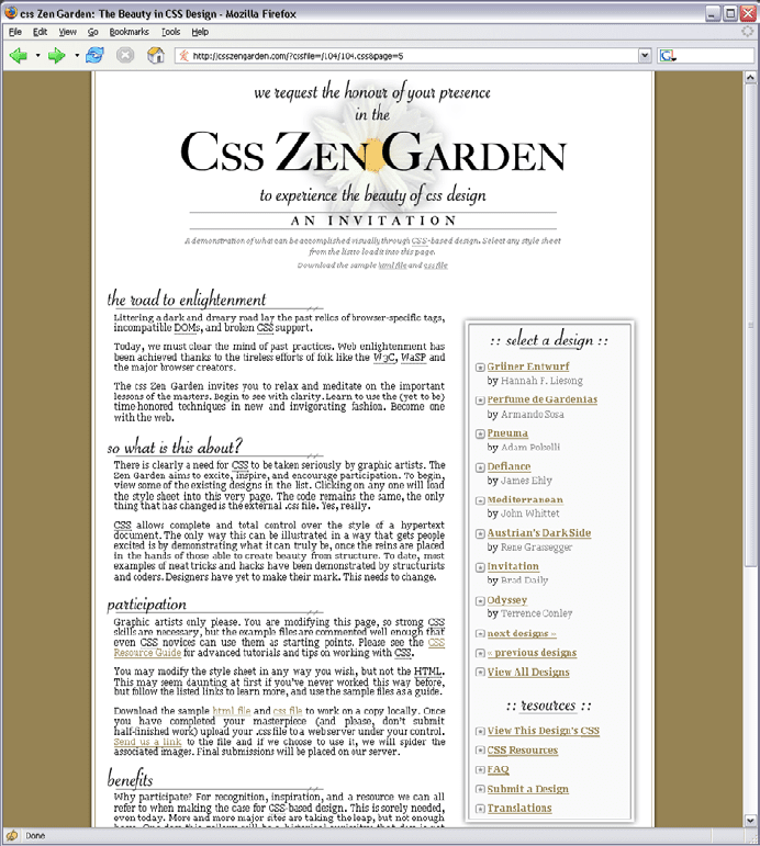
Design 6
486 Chapter 11: Making It Look Good: Visual Style and Aesthetics
Figure 11-7.
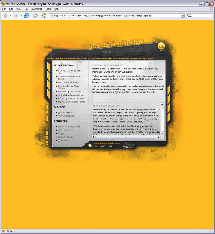
Design 7
Same Content, Different Styles 487
Figure 11-8.
Design 8
488 Chapter 11: Making It Look Good: Visual Style and Aesthetics
The Basics of Visual Design
As you looked at the Zen Garden examples, you might have observed how they achieve
such different impressions—a page’s color scheme may cause you to either smile or cringe,
for example. Using these examples as a touchstone, we can talk about some of the prin-
ciples of good visual design.
You might recall that we already covered some visual design principles in Chapters
4 and 7. Those chapters explored how the human visual system responds cognitively to
certain inputs. The time it takes for someone to click on an orange square out of a field
of blue squares, for example, doesn’t depend upon a user’s aesthetic sense or cultural
expectations.
But now we’re talking about emotional and visceral reactions—does a single orange square
add tension to a design, brightness, balance, or nothing at all? The answer depends on so
many factors that it’s genuinely hard to get it “right” without a lot of practice. The cogni-
tive aspects of these design choices certainly play a part; for starters, you can make a page
hard or easy to read (a cognitive effect). But each person is unique. Each person has a
different history of experiences, associations, and preferences; and each person is part of
a culture that imposes its own meanings on color, typography, and imagery.
Furthermore, the context of the design affects the user’s response. Users see your design
as part of a genre (such as office applications, games, or e-commerce sites), and they
will have certain expectations about what’s appropriate, trite or original, and dull or in-
teresting. Branding also sets expectations. So here’s the problem: as soon as you learn a
“rule” for evoking an emotional reaction using a design principle, you can find a million
exceptions.
That being said, if you know your audience well, visceral and emotional responses are
surprisingly predictable. For example, most readers of this book probably thought that
the first CSS example was a calm, soothing design, but that the second one was noisier
and tenser. Why is that?
The answer lies in a combination of many factors working in concert: color, typogra-
phy, spaciousness, angles and shapes, repeated visual motifs, texture, images, and cultural
references.
Color
Color is immediate. It’s one of the first things you perceive about a design, along with
basic forms and shapes. Yet the application of color to art and design is infinitely subtle—
master painters have studied it for centuries. We can only scratch the surface here.
When devising a color scheme for an interface, first rule out anything that makes the text
difficult to read:
• Always put dark foregrounds against light backgrounds, and vice versa—to test, pull
the design into an image tool such as Photoshop and desaturate it (make it grayscale).
The Basics of Visual Design 489
• Never use red versus green as a critical color distinction, since many colorblind peo-
ple won’t be able to see the difference. Statistically, 10% of men have some form of
colorblindness, as do about 1% of women.
• Never put bright blue, small text on a bright red or orange background or vice versa,
because human eyes quickly get fatigued when reading text written in complemen-
tary colors (colors on opposite sides of the color wheel).
With that out of the way, here are some very approximate rules for color usage:
Warm versus cool
Red, orange, yellow, brown, and beige are considered “warm” colors. Blue, green,
purple, gray (in large quantities), and white are considered “cool.” The yellow CSS
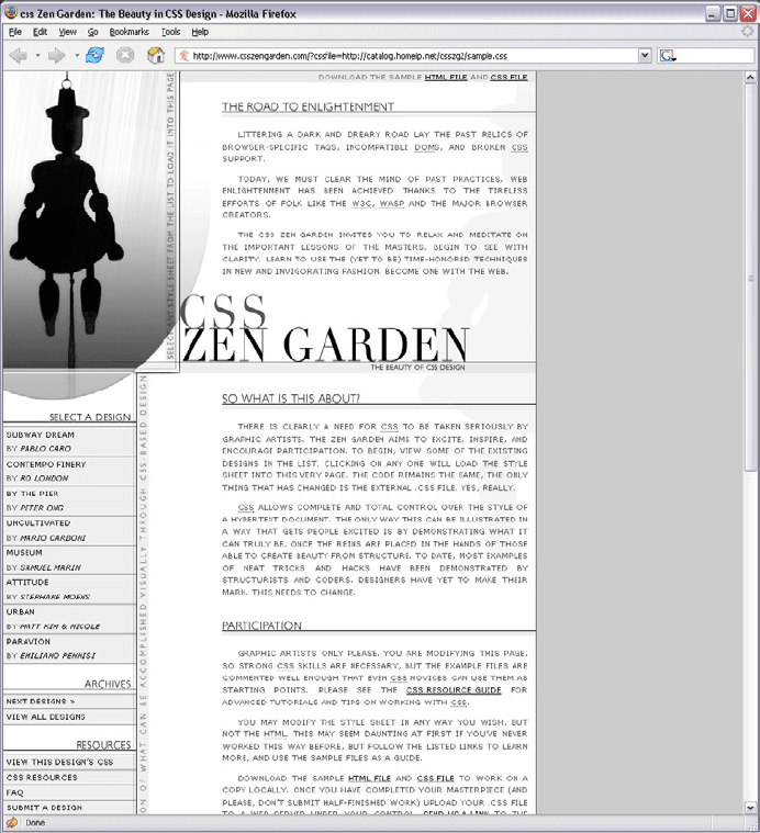
Zen Garden in Design 6 (Figure 11-6) feels vividly “hot,” despite the cool gray metal-
lic surface used behind the content itself. Sites and interfaces that need to connote
respectability and conservativeness often use predominantly cool colors (especially
blue). Still, warm and cool colors can combine very effectively to achieve a balanced
look—and they frequently do, in classic paintings and poster designs.
Dark versus light background
The pages with light backgrounds—white, beige, and light gray—feel very different
from the ones with very dark backgrounds. Light is more typical of computer inter-
faces (and printed pages); dark pages can feel edgier, more somber, or more energetic,
depending on other design aspects.
High versus low contrast
Whether the background is dark or light, the elements on that background might
have either high or low contrast against it. Strong contrast evokes tension, strength,
and boldness; low contrast is more soothing and relaxing.
Saturated versus unsaturated
Highly saturated, or pure, colors—brilliant yellows, reds, and greens, for example—
evoke energy, vividness, brightness, and warmth. They are daring; they have char-
acter. But when overused, they can tire the eyes, so most UI designs use them spar-
ingly; they often choose only one or two. Muted colors, either dark or light (tones or
tints, respectively), make up the bulk of most color palettes. The green and blue Zen
Garden design gets away with two saturated colors by using white borders, white text,
and dark halos to separate the green and blue. (Even so, you probably wouldn’t want
to stare at that green all day long in a desktop application.)
Combinations of hues
Once you start combining colors, interesting effects happen. Two saturated colors
can evoke far more energy, motion, or richness than one alone. A page that combines
one saturated color with a set of muted colors directs attention to the saturated color
and sets up “layers” of color—the brighter and stronger ones appear closer to the
viewer, while the grayer and paler colors recede. Strong dimensionality can make a
design dramatic. Flatter designs, with more muted or lighter colors, are calmer. See
the
Few Hues, Many Values pattern for more discussion.
490 Chapter 11: Making It Look Good: Visual Style and Aesthetics
Typography
By choosing a font (properly called a typeface) for a piece of text, you decide what kind
of voice that text is “spoken” in. The voice might be loud or soft, friendly or formal, col-
loquial or authoritative, hip or old-fashioned.
As with color, readability—the cognitive part—comes first when choosing type. Small
text—or what’s called “body text” in print and on websites—demands careful choice. The
following considerations for body text also apply to “label fonts” in GUIs, used to caption
text fields and other controls:
• On computer displays, sans-serif fonts often work better at very small point sizes,
unlike print, in which the serifed fonts tend to be more readable as body text. Pixels
aren’t big enough to render tiny serifs well. (Some serifed fonts, such as Georgia, do
look OK, though.)
• Avoid italicized, cursive, or otherwise ornamental fonts; they are unreadable at small
sizes.
• Highly geometric fonts tend to be difficult to read at small point sizes, as the circular
letters (e, c, d, o, etc.) are hard to differentiate. Futura, Univers, and some other mid-
20th-century fonts are like this.
• All-caps is too hard to read for body text, though it works fine for headlines and short
texts. Capital letters tend to look similar, and are hard for a reader to differentiate.
• Set large amounts of text in a medium-width column when possible—say, around 10
to 12 English words on average. Don’t right-justify narrower columns of text; let it be
“ragged right.”
Now for the visceral and emotional aspects. Fonts have distinctive voices—they have dif-
ferent graphic characteristics, textures, and colors on the page. For instance, some fonts
are dense and dark, while others are more open—look at the thickness of strokes and the
relative sizes of letter openings for clues, and use the “squint test” if you need a fresh and
objective look at the font. Some fonts have narrower letters than others, and some font
families have “condensed” versions to make them even narrower. The separation between
lines of text (the leading) might be distant or close, making the block of text look either
more open or more solid.
Serifs and curves add another dimension to font color and texture. Serifs add a level of
scale that’s much smaller than the letterform itself, and that adds refinement to the font’s
texture—the thick sans-serif fonts look blunt, strong, or even coarse in comparison (espe-
cially Helvetica). The curves and angles used in each letterform, including those that form
the serifs, combine to form an overall texture. Compare an old-fashioned typeface such
as Goudy Old Style to another classic serifed font such as Didot; they look very different
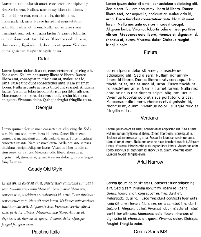
on the page. See Figure 11-9.
The Basics of Visual Design 491
Figure 11-9.
Eight fonts, as rendered on Mac OS X; notice the different sizes, densities, textures, and
formalities
Though it’s not always easy to explain why, some fonts speak with a formal voice, while
others speak with an informal voice. Comic Sans and other playful fonts are certainly
informal, but so is Georgia, when compared to Didot or Baskerville. All-caps and capital-
ized words speak more formally than lowercase; italics speak informally. In the CSS Zen
Garden designs shown earlier, Design 8 (Figure 11-8) uses an all-caps, sans-serif font
to speak in a cool and removed voice. Meanwhile, Design 5 (Figure 11-5), which uses
Georgia, speaks in a warm and informal voice.
492 Chapter 11: Making It Look Good: Visual Style and Aesthetics
Cultural aspects come into play here, too. Old-fashioned fonts, usually with serifs, tend to
look—wait for it—old-fashioned, although anything set in Futura (a sans-serif font) still
looks like it came from a 1963 science textbook. Verdana has been used so much on the
Web that it’s now standard for that medium. And Chicago always will be the original Mac
font, no matter what context it’s used in.
Spaciousness and Crowding
Some of the CSS Zen Garden designs use plenty of whitespace, while others crowd the
page elements together. Spaciousness on a page gives an impression of airiness, openness,
quiet, calmness, freedom, or stateliness and dignity, depending on other design factors.
Crowded designs can evoke urgency or tension under some circumstances. Why? Because
text and other graphic elements need to “breathe”—when they’re colliding against each
other or against the edges or borders of the page, they cause visual tension. Our eyes
want to see margins around things. We get slightly disturbed by designs such as CSS
Zen Garden Design 2 (Figure 11-2), which shoves the headlines right against the text.
Likewise, the compact layout of Design 6 (Figure 11-6) somehow contributes to the busy,
industrial feel of the page, though it doesn’t have collisions like Design 2.
However, not all crowded designs evoke that kind of tension. Some connote friendliness
and comfort. If you give the text and other elements just enough space and reduce the
interline spacing (leading) to the smallest amount that is comfortably readable, you might
achieve a friendlier and less rarified look. Design 5 (Figure 11-5) illustrates this well.
Angles and Curves
A page composed of straight up-and-down lines and right angles generally looks calmer
and more still than a page containing diagonal lines and nonrectangular shapes. Likewise,
a page with many different angles has more apparent motion than a page with a single
repeated angle on it; see Design 7 (Figure 11-7) for a dramatic example. Design 6 uses
angles to create uneasiness and visual interest.
Curves can also add motion and liveliness, but not always. A design made with a lot of
circles and circular arcs can be calming and restful. But a curve swooping through a page
sets the whole design in motion, and a few carefully chosen curves in an otherwise rectan-
gular design add sophistication and interest. Design 8 (Figure 11-8) uses a single large el-
liptical curve for a dramatic effect—it contrasts strongly against the otherwise recti linear
design, so its impact is high.