Tidwell J. Designing Interfaces (Second Edition)
Подождите немного. Документ загружается.

The Patterns 73
• Informal community support. This applies only to the most heavily used and in-
vested software—the likes of Photoshop, Linux, Mac OS X, or MATLAB—but users
may consider it a highly valuable resource. Use social networking resources for these,
or more traditional online forums.
Examples
Firefox is “merely” a web browser, and a free one at that, but its help systems are stellar.
Help is offered at most of the levels described in the preceding list, so both beginners and
experts are well supported. All of the following examples come from Firefox so that you
can see the range of help that can be offered for one product.
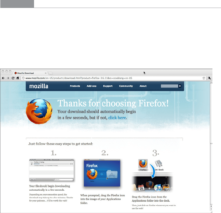
When you visit Firefox’s site in order to download the browser, you are greeted by an out-
line of the install process and a very clear call to action, as shown in Figure 2-41.
Figure 2-41.
Firefox download page
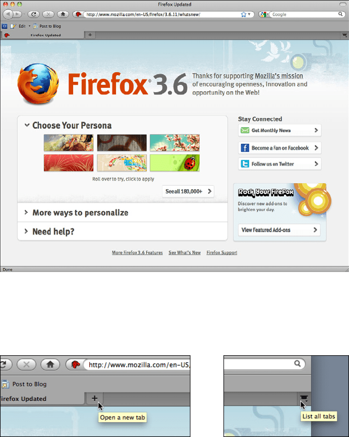
When you launch it for the first time, you see an introductory screen that may intrigue
the user: easy ways to customize the Firefox look, connections to social media, and links
to help resources (see Figure 2-42). The page also confirms for the user that the install
was successful; if the user needs to do anything more, such as get security updates, the
introductory page will say so.
74 Chapter 2: Organizing the Content: Information Architecture and Application Structure
Figure 2-42.
Firefox startup page
Each tool on the browser window has a tool tip (see Figure 2-43). The basic buttons—
back, next, reload, home—will be familiar to almost all users, but the more obscure items
may need to be explained.
Figure 2-43.
Firefox tool tips
The main text fields use Input Prompts to describe themselves (see Figure 2-44). This is a
more appropriate choice than
Input Hints (which would be displayed beside the text fields)
because it keeps the window clean and uncluttered. Furthermore, not much knowledge
is lost when a user starts typing into the text field, erasing the prompt. See the pattern
descriptions for
Input Hints and Input Prompt in Chapter 8.
The Patterns 75
Figure 2-44.
Firefox input prompts
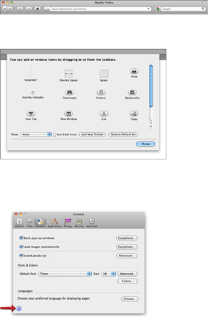
Some dialogs attempt to describe themselves, as shown in Figure 2-45.
Figure 2-45.
Firefox toolbars dialog
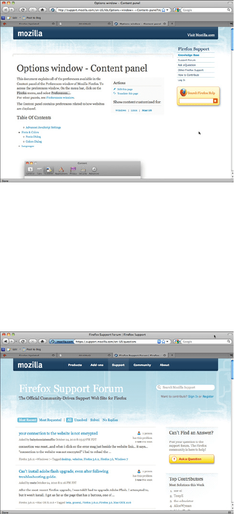
Other dialogs offer links to the formal help system; an appropriate help page is displayed
in a browser window when the user clicks the round purple button in the lower-left cor-
ner (see Figures 2-46 and 2-47).
Figure 2-46.
Firefox preferences dialog
76 Chapter 2: Organizing the Content: Information Architecture and Application Structure
Figure 2-47.
Firefox preferences dialog help page
Finally, if all other sources of help are exhausted, a user can turn to the wider user com-
munity for advice. We’ve now moved beyond the realm of software design per se, but this
is still product design—the user experience extends beyond the bits installed on users’
computers. It includes the interactions they have with the organization, its employees or
other representatives, and its website (see Figure 2-48).
Community building like this happens only for products in which users become deeply
invested, perhaps because they use the product every day at work or at home—as is the
case with Firefox—or because they have some emotional attachment to it.
Figure 2-48.
Firefox support forums

Chapter 3
Getting Around:
Navigation, Signposts, and Wayfinding
The patterns in this chapter deal with the problem of navigation. How do users know
where they are now, where to go next, and how to get there from here?
I call navigation a “problem” because navigating around a website or application is like
commuting. You have to do it to get where you need to go, but it’s dull, it’s sometimes
infuriating, and the time and energy you spend on it just seems wasted. Couldn’t you be
doing something better with your time, such as playing a game or getting some actual
work done?
The best kind of commuting is none at all. Having everything you need right at your fin-
gertips without having to travel somewhere is pretty convenient. Likewise, keeping most
tools “within reach” on an interface is handy, especially for intermediate-to-expert users
(i.e., people who have already learned where everything is). Sometimes you do need to
put lesser-used tools on separate screens, where they don’t clutter things up; sometimes
you need to group content onto different pages so that the interface makes sense. All this
is fine, as long as the “distances” that a user must travel remain short.
So, less is better. Let’s talk terminology for a minute and come back to this concept.
Staying Found
Let’s say you’ve built a large website or application that you’ve had to break up into sec-
tions, subsections, specialized tools, pages, windows, wizards, and so forth. How do you
help users navigate?
Signposts are features that help users figure out their immediate surroundings. Common
signposts include page and window titles, web page logos and other branding devices,
tabs, and selection indicators. Patterns and techniques such as good global and local navi-
gation links,
Sequence Map, Breadcrumbs, and Annotated Scrollbar—all described in this
chapter—tell users where they currently are, and often where they can go with only one
more jump. They help a user to stay “found” and to plan his next steps.
78 Chapter 3: Getting Around: Navigation, Signposts, and Wayfinding
Wayfinding is what people do as they find their way toward their goal. The term is pretty
self-explanatory. But how people actually do it is quite a research subject—specialists
from cognitive science, environmental design, and website design have studied it. These
common-sense features help users with wayfinding:
Good signage
Clear, unambiguous labels anticipate what you’re looking for and tell you where to
go; signs are where you expect them to be, and you’re never left standing at a decision
point without guidance. You can check this by walking through the artifact you’re
designing and following the paths of all the major use cases. Make sure that each
point where a user must decide where to go next is signed or labeled appropriately.
Use strong “calls to action” on the first pages that a user sees.
Environmental clues
You’d look for restrooms in the back of a restaurant, for instance, or a gate where a
walkway intersects a fence. Likewise, you would look for an “X” close button at the
top right of a modal dialog and logos in the upper-left corner of a web page. Keep
in mind that these clues are often culturally determined, and someone new to the
culture (e.g., someone who’s never used a given operating system before) will not be
aware of them.
Maps
Sometimes people go from sign to sign or link to link without ever really knowing
where they’re going in a larger frame of reference. (If you’ve ever found your way
through a strange airport, that’s probably what you did.) But some people might pre-
fer to have a mental picture of the whole space, especially if they’re there often. Also,
in badly signed or densely built spaces, such as urban neighborhoods, maps may be
the only navigational aids people have.
In this chapter, the
Clear Entry Points pattern is an example of careful signage combined
with environmental clues—the links should be designed to stand out on the page. A
Sequence Map, obviously, is a map; you can use Overview Plus Detail (Chapter 7) to show
maps for virtual spaces, too.
Modal Panel sort of qualifies as an environmental clue, since
the ways out of a modal panel take you right back to where you just were.
I’ve compared virtual spaces to physical ones here. But virtual spaces have the unique abil-
ity to provide a navigational trump card, one that physical spaces can’t (yet) provide: the
Escape Hatch. Wherever you are, click on that link, and you’re back to a familiar page. It’s
like carrying a wormhole with you. Or a pair of ruby slippers.
The Cost of Navigation
When you walk into an unfamiliar room, you look around. In a fraction of a second, you
take in the shape of the room, the furnishings, the light, the ways out, and other clues; very
quickly, you make some assumptions about what this room is and how it relates to why
The Cost of Navigation 79
you walked in. Then you need to do what you came in to do. Where? How? You might be
able to answer immediately—or not. Or maybe you’re just distracted by other interesting
things in the room.
Similarly, bringing up a web page or opening a window incurs a cognitive cost. Again, you
need to figure out this new space: you take in its shape, its layout, its contents, its exits, and
how to do what you came to do. All of this takes energy and time. The “context switch”
forces you to refocus your attention and adjust to your new surroundings.
Even if you’re already familiar with the window (or room) you just went into, it still incurs
a cost. Not a large cost, but it adds up—especially when you figure in the actual time it
takes to display a window or load a page.
This is true whether you’re dealing with web pages, application windows, dialog boxes, or
device screens. The decisions that users make about where to go are similar—labels still
need to be read or icons decoded, and the users will still make leaps of faith by clicking on
links or buttons they’re not sure about.
Furthermore, loading time affects people’s decisions. If a user clicks through to a page that
takes too long to load—or fails to load altogether—he may be discouraged, and may just
close the page before he finds what he came for. (So, how many viewers is that sidebar
video player costing you?) Also, if a site’s pages take a chronically long time to load, users
will be less likely to explore that site.
There’s a reason that companies like Google work very hard to keep page loads as fast as
possible: latency costs viewers.
Keep Distances Short
Knowing that there’s a cost associated with jumping from page to page, you can under-
stand now why it’s important to keep the number of those jumps down. When a common
task requires many page jumps, try to reduce it to one or two.
But the real efficiency gains come from the structure of the application. One of the nasti-
est things a designer can do is force a user to go into multiple levels of subpages, dialogs,
and so forth every time he needs to accomplish a simple and everyday task. (Worse is to
lead him there, tell him he can’t accomplish it because of some missing precondition, and
send him back to square one.)
Can you design your application so that the most common 80% of use cases can be done
in one page, without any context switches? (Or perhaps only one?)
This is hard to do with some kinds of applications. Is a certain tool too big to put on your
main page? Try shrinking it: eliminate controls, shorten labels, turn words into pictures,
or use specialized form controls that save space. Is it too distracting when combined with
everything else on the main page? Again, try shrinking it, isolating it with whitespace, or
putting it in an out-of-the-way spot. Can you use progressive disclosure to gradually show
more content on the same page? Can you use
Module Tabs or an Accordion to hide some
content by default?
80 Chapter 3: Getting Around: Navigation, Signposts, and Wayfinding
Sometimes it’s appropriate to bury functionality inside pages that take more than one
jump to get to, such as that extra 20% of tasks left over from the 80% you made easily
available. It could also be that on your application, simplicity of presentation is more im-
portant than saving one or two jumps. You could put little-used functionality behind an
extra “door” (also using the 80/20 rule). As always, experiment with different designs, and
usability-test them if you have any doubts.
Navigational Models
What is the navigational model for your site or app? In other words, how do the different
screens (or pages, or spaces) link to each other, and how do users move between them?
First, some more terminology.
Global navigation is what’s found on every main screen. It usually takes the form of
menus, tabs, and/or sidebars, and this is how users move around the formal navigational
structure of the site. (In an earlier version of this book, global navigation was defined as a
pattern. But by now, it’s so common and well understood that it really doesn’t need to be
called out as such anymore.)
Utility navigation, also found on every main screen, contains links and tools related to
noncontent aspects of the site or application: sign-in, help, print,
Settings Editors (see
Chapter 2), language tools, and so on.
Associative and inline navigation embed links in or near the actual content. As the user
reads or interacts with the site, these links present options that might be immediately
relevant to the user. They tie content together thematically.
Now let’s look at a few models found in typical sites and apps:
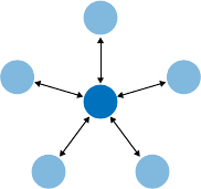
Hub and spoke
Most often found on mobile devices, this architecture (Figure 3-1) lists all the major
parts of the site or app on the home screen, or “hub.” The user clicks or taps through
to them, does what she needs to do, and comes back to the hub to go somewhere else.
The “spoke” screens focus tightly on their jobs, making careful use of space—they
may not have room to list all the other major screens. The iPhone home screen is a
good example; the
Menu Page pattern found on some websites is another.
Figure 3-1.
Hub and spoke
Navigational Models 81
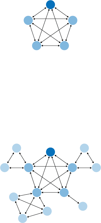
Fully connected
Many websites follow this model. There’s a home page or screen, but it and every
other page link to all the others—they each have a global navigation feature, such as
a top menu. The global navigation may be a single level (as shown in Figure 3-2, with
only five pages), or it might be deep and complex, with multiple levels and deeply
buried content. As long as the user can reach any page from any other with a single
jump, it’s fully connected.
Figure 3-2.
Fully connected
Multi-level
This is also common among websites (see Figure 3-3). The main pages are fully con-
nected with each other, but the subpages are only connected among themselves (and
usually to the other main pages, via global navigation). You’ve seen this on sites that
have subpages listed only in sidebars or subtabs—users see these on menus that only
show up after they’ve clicked the link for the main page or category. It takes two or
more jumps to get from one arbitrary subpage to another. Using drop-down menus,
the
Fat Menus pattern, or the Sitemap Footer pattern with a multi-level site converts it
to a fully connected one, which is preferable.
Figure 3-3.
Multi-level
82 Chapter 3: Getting Around: Navigation, Signposts, and Wayfinding
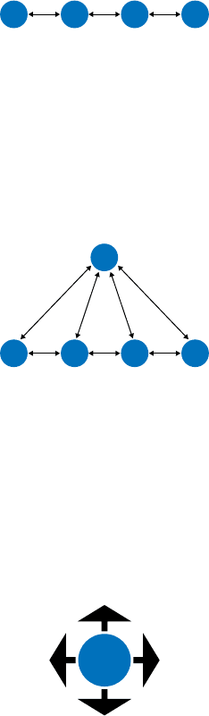
Stepwise
Slideshows, process flows, and
Wizards (see Chapter 2) lead the user step by step
through the screens in a prescribed sequence (see Figure 3-4). Back/Next links are
prominent on the page.
Figure 3-4.
Stepwise
Pyramid
A variant on the stepwise model, a pyramid uses a hub page or menu page to list an
entire sequence of items or subpages in one place (see Figure 3-5). The user picks out
any item, jumps to it, and then has the option to use Back/Next links to step through
other items in order. He can go back to the hub page anytime. See the
Pyramid pattern
in this chapter for more.
Figure 3-5.
Pyramid
Pan-and-zoom
Some artifacts are best represented as single large spaces, not many small ones. Maps,
large images, large text documents, information graphics, and representations of time-
based media (such as sound and video) fall into this category. Chapter 7 discusses
these in more detail. Panning and zooming are still navigation—so offer controls for
panning (moving horizontally or vertically), zooming in and out, and resetting to a
known position and state. Figure 3-6 shows an example of pan-and-zoom.
Figure 3-6.
Pan-and-zoom