Foster J. Effective Writing Skills for Public Relations
Подождите немного. Документ загружается.


forget to include a short ‘standfirst’ saying in a few words what the piece
is all about. This encourages the reader to read on. (See Chapter 7 for more
detail on standfirsts.)
All illustrations should of course be captioned unless they are simply
for decoration. The reader will often ignore the text and only look at the
photograph or drawing. Captions are read twice as much as the text and
turn glancers and page-flippers into readers. Annual reports are a typical
example of this.
Break up the monotony of long blocks of copy by using the ornaments
and symbols provided by most software packages. If there is a series of
facts it is better to number them rather than trying to interconnect them.
Always try to think of ways to attract the reader’s eye, in ways appro-
priate to the content.
JUSTIFIED OR RAGGED RIGHT?
Both styles have their advantages, and all designers have their own ideas
on whether the one is more readable than the other. It depends largely on
the style of publication: if it is a ‘newsy’ one then the justified style would
probably be better for that is the way most newspapers set their type. On
the other hand, brochures and leaflets usually look more attractive and
are easier for the reader to follow when set ragged right. But there are no
firm rules and it is up to the designer to produce an acceptable style
directed at the target audience and within the house style pattern of the
publishing organisation.
PUTTING ON THE STRESS
Bold type helps the reader to identify subject changes and gives the
printed page visual interest. It provides focal points among roman and
non-bold typefaces. But again it is a case of everything in moderation: too
much bold type destroys the impact of a few carefully positioned
subheadings. As a general rule do not use bold type in any great quantity,
except perhaps for a display panel. Nearly all typefaces will have fonts in
boldface, and computer software has the facility to change from ‘plain’
type to bold or italics, and to some other type styles as well.
Individual words in a run of text should not be set in bold just for
stress, for that is the job of italics. But if too many words are italicised, or
even whole sentences or complete paragraphs, this method of providing
emphasis ceases to work. Fowler is scornful of overuse: ‘Printing a
Is it easy to read?
55
Effective writing skills for public relations
56
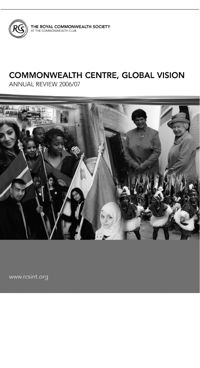
Figure 6.4 Clean design and prominent website address for front cover of the
Royal Commonwealth Society annual review 2006/07. Design and photography:
RCS/Hitesh Chauhan (Publications UK)

passage in italics, like underlining one in a letter, is a primitive way of
soliciting attention’, says the second edition.
Bold to the rescue
Likewise, boldface is easy to produce on your PC from any font. Use it to
give weight to a quote or announcement. Put titles of seminars or confer-
ences in roman (or plain) unless it’s a promotional leaflet. Use bold for
headings, captions and draw-down quotes. But over-bolding fails to add
force. Its best use is for limited runs of text especially if reversed out of a
strong colour. It is easiest to read when white out of black, worst when
white out of a pale tint.
Main uses for italics
Long, italicised paragraphs are out of place and look dated. In a release,
troubles start: subeditors will not attach more importance to passages in
bold or italics. Let the words, not typographical tricks, make the point.
Too many italicised words together upset word-flow and, at worst,
confuse the reader. An otherwise neat newsletter can easily be spoilt this
way. Excessive use of underlining, too, fails to add stress or emphasis.
Underlining is the traditional mark for italics and looks awful when
printed.
Foreign words and phrases not fully naturalised in English are usually
italicised, but commonly used phrases like ad hoc, de rigueur and en
masse are set in roman type nowadays. Once a foreign word gains wide
currency in English, italics usage diminishes. This is particularly notice-
able in titles of foreign publications.
For media titles carrying the definite article, write The Daily Telegraph,
The Times, The Economist, The Mirror, The Sun but Daily Mail, Daily Express,
Evening Standard. If there is The in the masthead, italicise that too. If in
doubt check your media guide. When used adjectivally, drop the definite
article as in ‘Telegraph reporters investigated…’. For textual references to
titles of house magazines, use italics; the same goes for releases. Use spar-
ingly everywhere.
The main uses of italic include titles of books, names of ships, news-
papers and magazines, titles of TV and radio programmes and films.
Check for others in your style manuals. As a general guide, try to avoid
overuse of italics and bold in texts simply because the more there is, the
less the impact. When you want to use bold and italics, let your designer
decide where they will work best.
Is it easy to read?
57

CHOOSING AND USING YOUR DESIGNER
Choice of designer is crucial: use the wrong one and you have wasted
valuable time and possibly spent money you could ill afford. It largely
depends on building a friendly, warm relationship so that you both work
together harmoniously and bounce ideas off each other. There is no finer
working partnership than a writer and designer who each appreciates the
other’s experience and skills. You, as the writer, will have a basic knowl-
edge of communicating to the reader. The graphic designer provides the
expertise, the creativity, to get your message across in the most effective
manner.
Start by collecting company brochures and annual reports in a similar
product or service area. First impressions count: before a single word is
read, the layout, the colours, typeface and style must entice and excite the
eye.
Seek out a designer who will be sympathetic to your objectives. Don’t
use someone who just sees your words as lumps of grey typematter to be
balanced with illustrations and white space. Go for a graphics artist who
understands typography and the printing processes and who has a flair
for words; someone who has the ability to meld text, pictures and display
type into an imaginative and satisfying whole.
He or she must be aware of the principles of branding and able to
develop a consistent visual identity that will work throughout the
communications spectrum, from letterheads and corporate brochures to
the annual report and sales leaflet, from press and TV ads to vehicles and
uniforms. It must go on presentation slides and appear on all kinds of
materials and applications, paper, plastics or metal in a range of sizes
from badges to shop displays. If these demands are satisfied, you have
found the right one.
Basic knowledge of words is essential
The designer must be properly briefed on the objective, tone of the
message and target audience of the publication, brochure or leaflet – no
matter what it is. If the typography and layout reflect and support the
message conveyed then the text stands a much better chance of being
read. A ‘busy’ layout, possibly with a combination of complementary
typefaces, would be suitable for a leaflet des cribing a new product;
whereas a brochure describing an expensive management training course
would project a more ‘up market’ image by using a sans serif typeface
printed on high quality paper with plenty of white space.
Effective writing skills for public relations
58

A page of text without headings is uninviting and disorientating to the
reader. Signpost headings in a different typeface or bullet points are effec-
tive in directing the reader to changes of thought or subject.
Readability is probably the most important factor in the design of any
publication no matter how it is printed. Paying attention to it is the
communicator’s first priority.
NOW IT’S PROOF MARKING TIME...
The job of the PR professional is to spot the mistake, or ‘literal’, everyone
else misses. Diligent proof-reading spells well-produced, fault-free print-
work. And that largely depends on using the proper correction marks.
You can avoid printing errors, usually known as ‘typos’, by marking
proofs in the standard way universally understood by printers and their
keyboard operators. Non-standard corrections only confuse and lead to
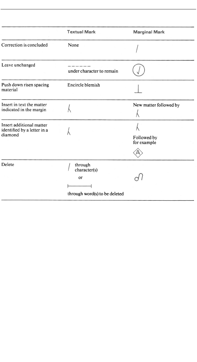
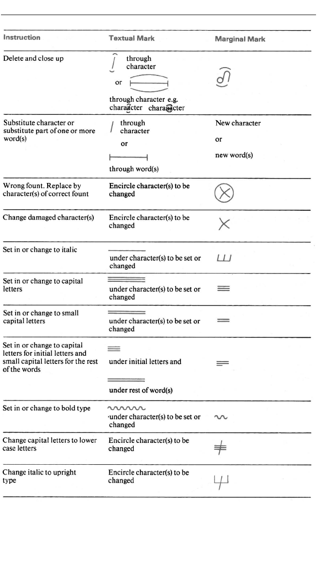
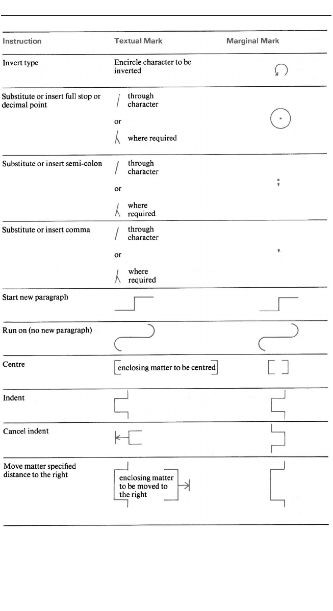
more errors. Follow the marks approved by the British Standards
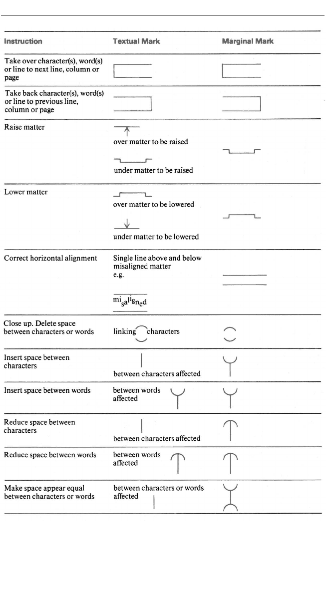
Institution (BS 5261) – see Figure 6.5.
Typical typos: misspellings, wrong punctuation and transposed words
or sentences; end-of-line breaks where a hyphen wrongly divides a word;
layout faults such as mispositioned text, headings, captions; style slips
like italics or bold instead of roman, capitals instead of lower case.
Mark all corrections clearly in ink, preferably by ballpoint pen. Use
different colours to distinguish between errors made by the printer and
your own corrections – red for printer’s errors and blue or black for yours.
Printers usually charge heavily for alterations, or alts for short; ensure
you are not charged for theirs.
Put the change in the adjacent margin and a text mark showing the
position. Where there are several marginal marks these should go from
left to right in the same order as the textual marks. Put a diagonal stroke
( / ) after each marginal mark to show the end of the correction.
Where new copy replaces existing text line-for-line, count the number
of printed characters in a line (including spaces) for the number of type-
script characters needed to fill it. Get someone to read the copy while you
check and mark the proof. Mark alphabetically each additional item of
copy; check cross-references and the contents lists against page numbers.
Take special care with headings and captions.
For heavy corrections, retype and attach a separate sheet clearly
marked for position. Read and re-read, checking as you go. Remember
that you read what you want to read. If you are checking proofs on your
computer screen, all kinds of typos, poor sentence constructs and gram-
matical errors tend to be invisible. But if they are hard-copy proofs,
Is it easy to read?
59

mistakes like these tend to jump out at you. So, if you are sending copy by
email or via web page, be sure to print it out first for a final check. That
extra step is well worth it.
Another way to check what you have written is to read it out aloud.
The ear will pick up any repetitions, clichés, jargon or awkward construc-
tions the eye may miss. This applies just as much to proofs in front of you
as it does to new copy.
The more time you spend on proof-reading, the better. It pays to look at
every piece of print you see to check if there are any typos or style faults. I
bet you will find something wrong or that could be improved. The main
marks follow.
Standard proof correction marks
Extracts from BS 5261 Part 2: 1976 (1995) are reproduced with permission
of the British Standards Institution under licence number 2001SK/0003.
Complete standards can be obtained from BSI Customer Services, 389
Chiswick High Road, London W4 4AL (tel: 020 8996 9001). These extracts
are also reproduced by permission of the the British Printing Industries
Federation.
Effective writing skills for public relations
60
Is it easy to read?
61
Figure 6.5 Standard symbols for correcting proofs
Effective writing skills for public relations
62
Figure 6.5 continued
Is it easy to read?
63
Figure 6.5 continued
Effective writing skills for public relations
64
Figure 6.5 continued
