Foster J. Effective Writing Skills for Public Relations
Подождите немного. Документ загружается.

Is it easy to read?
45
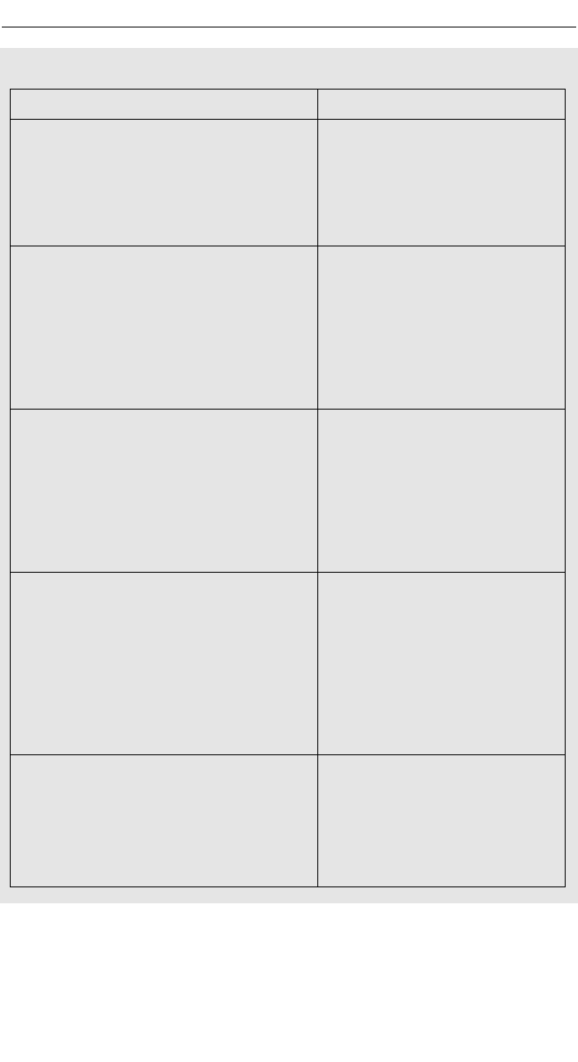
Figure 6.1 Spot-on advice from Derby City Council’s Plain English Guide,
available on request from Andrew Auld, head of communications and
consultation (andrew.auld@derby.gov.uk)
PLAIN ENGLISH EDITING EXAMPLES
Before After plain English editing
For the purpose of working with patients Please use the interpreting
whose first language is not English a services when working with
recommendation of good practice involves people whose first language is
the utilisation of interpreting services. not English.
From social worker guidance
Consideration should be given to the We must identify or recruit
identification of an individual to orchestrate someone to access funds and
access to funding and to develop develop programmes that
programmes that contribute to the aims of contribute to the aims of our
specific regeneration initiatives. regeneration initiatives.
From a sports strategy document, written
by external consultants
A co-ordinated approach to all marketing for We should co-ordinate marketing
sport and leisure in Derby is required sport and leisure in Derby in a
incorporating innovative ways of marketing creative way, using language and
sports facilities and opportunities and use of publicity that attracts the groups
language ‘appropriate’ for relevant target we’re targeting.
markets.
From the same sports strategy document
A charge is not normally made for the use of The Council does not normally
parks and open spaces if the event is for charge for the use of parks or
Charity or Fund Raising purposes but if the open spaces if the event is for
event is of a commercial nature the hirer will charity or fund-raising. If the
be advised of the hire charge after their event is commercial, we will
application has been received. contact you about the hire charge
once we receive your application.
From the Council’s Hire Conditions
Evidence of Public Liability Insurance You must send details of your
covering the event must be provided to the Public Liability Insurance covering
Council at least 3 weeks prior to the event. the event to us at least three
weeks beforehand.
From the same hire conditions
Effective writing skills for public relations
46
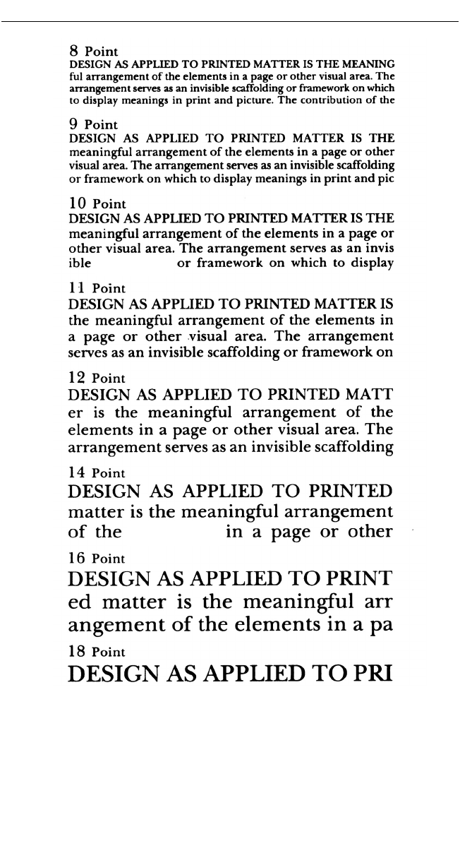
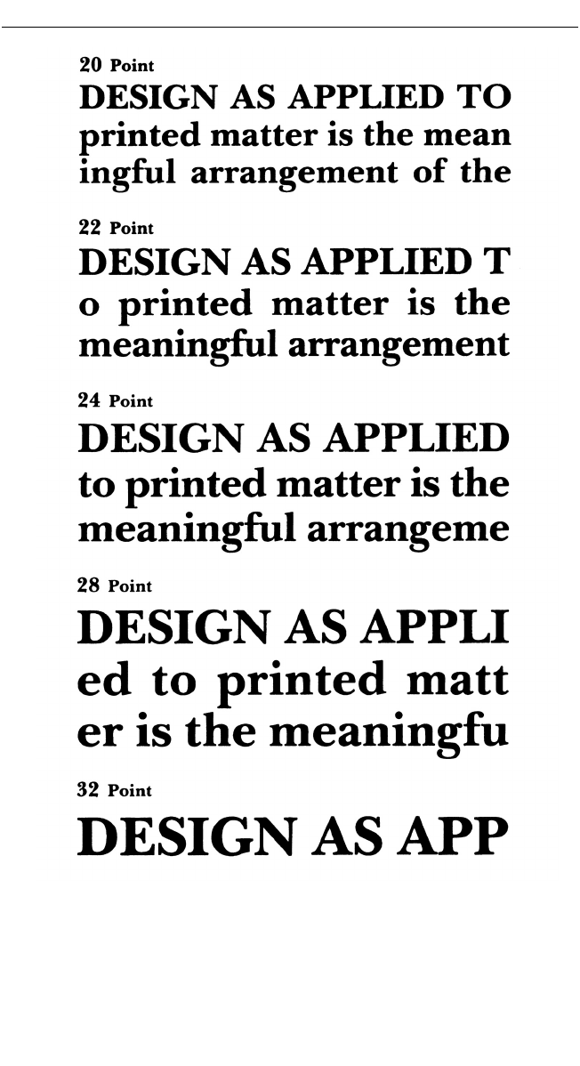
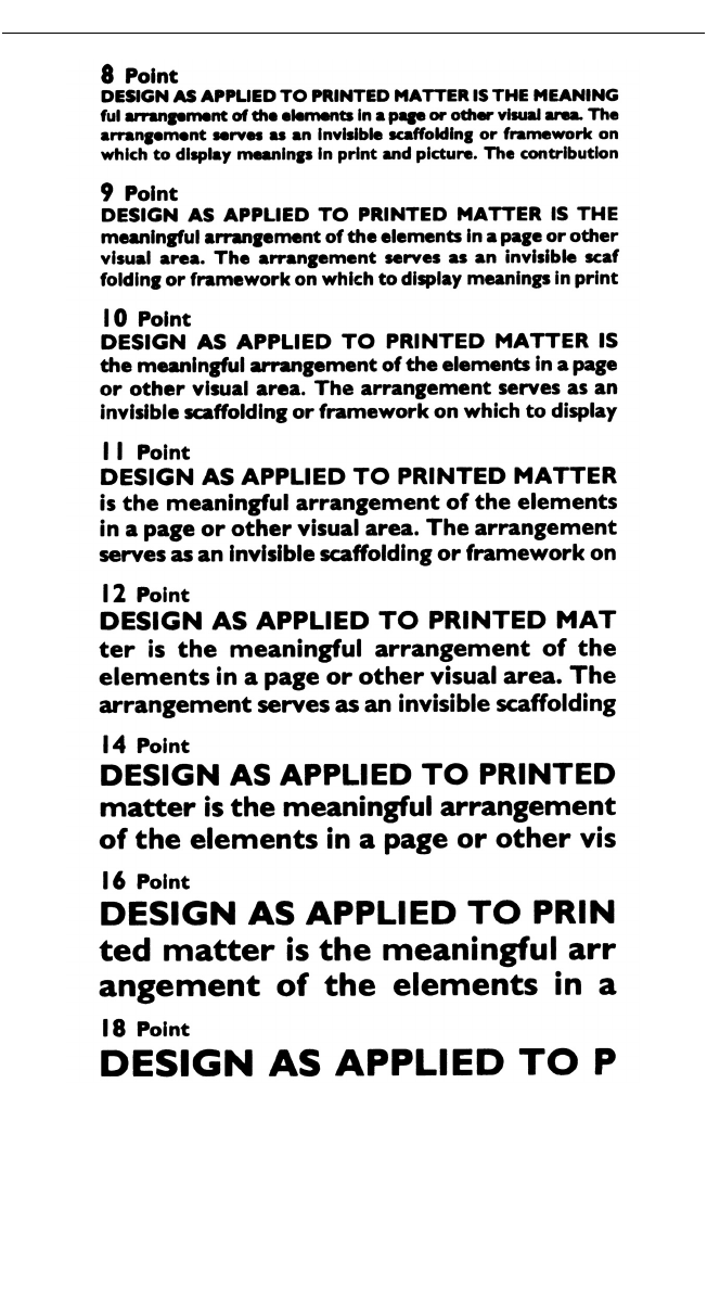
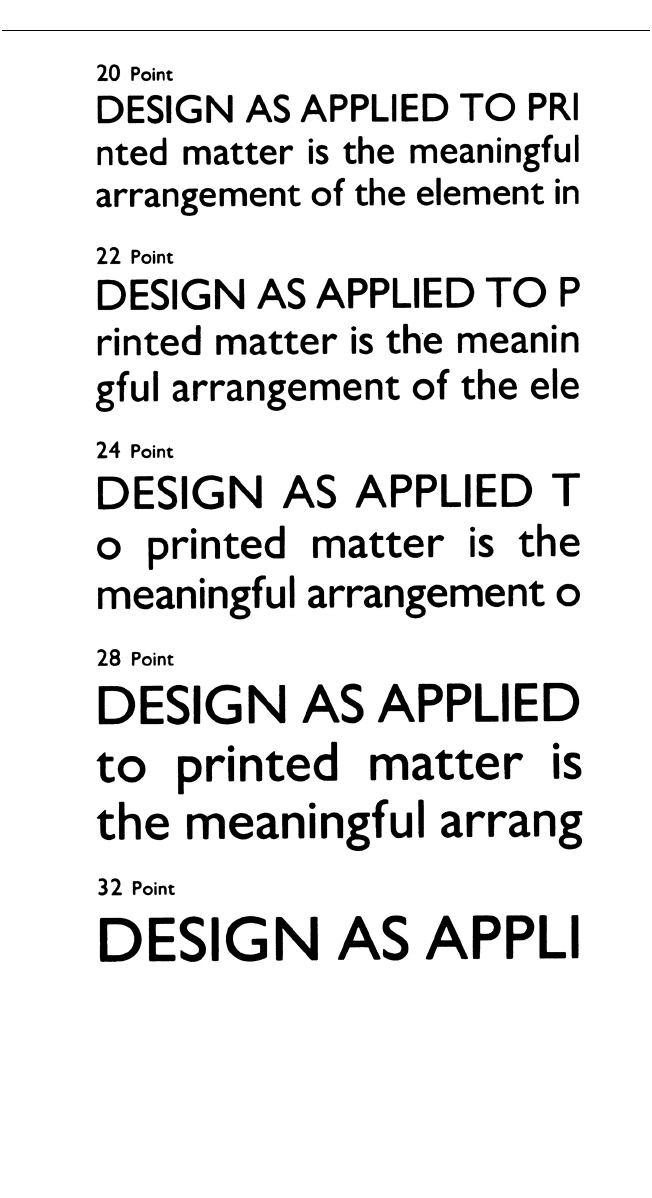
Figure 6.2 Comparison between a serif type (Baskerville) and non-serif (Gill
Sans) in medium and bold styles, 8pt to 32pt sizes
scaffolding
elements
Is it easy to read?
47
Figure 6.2 continued
Effective writing skills for public relations
48
Figure 6.2 continued
Is it easy to read?
49
Figure 6.2 continued

LINE WIDTH AND TYPE SIZE
As for column width, try not to have more than 45 characters per line,
including spaces and punctuation in double-column format; anything
above that tends to give a ‘stringy’ look. If the copy is set across the page,
aim for between 70 and 80 characters per line. But remember that lines
with only a few characters, those that run round a photograph or display
heading for example, will be awkward to read and look messy.
Be careful when considering the relationship between line length and
type size. Much will depend on your design objectives and the purpose of
your printwork. As a general guide for ease of reading, type should not be
much smaller than 10pt, or perhaps 9pt at a pinch if well line-spaced. A
line of 45 characters of 10pt Times, for example, gives a very readable
70mm column width.
The eyes have it
Sadly, we do not all have the eyesight of youth, and for some, reading can
be hard work. It is therefore crucial that the printed word can be read
easily by the elderly as well as by the young. David Coates of the com -
pany ‘to the point’, the CIPR’s design consultants, says that the easiest
print to read has good contrast against the background, and ideally that
type should not be smaller than 11pt. ‘An unfussy, plain typeface is pre -
ferable to an ornate one and should be printed black on a matt, off-white
paper since shiny stock causes reflections and making reading difficult.
And never allow line after line of capitals: they are almost unreadable.’
It is obvious that the bigger the type, the better the readability. But there
are limits: if it is too big, say much above 12pt as recommended by the DTI
in its booklet Read me, the print begins to look like a child’s big-print word
book. The Royal Institute for the Blind advises that a minimum of 12pt
should be used ‘at all times’.
Doyen print journalist Pincus Jaspert says he is appalled by ‘computer
obsessed typographic dilettantes’ who print green on blue or the reverse,
even harder to read. ‘A single blotch of colour designed to catch the eye
instead confuses and irritates the reader.’
There is no single, clear-cut answer to what constitutes good legibility.
So much depends on typeface, the size chosen, the column or page width
and line spacing. It is the job of the designer to specify what is most
appropriate for a given audience and print medium: magazine, book,
leaflet or poster. It is the designer who is skilled in typographic principles
and knows what the printer can do who knows best.
Effective writing skills for public relations
50

CROSSHEADS AND SUBHEADS
If you want to divide off copy into sections, if you are short of a line or
two at the bottom of a page, or if there is a mass of grey text then you’ll
need the humble crosshead – probably several. For an A4 page in two
columns, four or five are usually enough. But all depends on the style and
layout.
Solid lumps of type will put the reader off. If for some reason you
cannot break up the text with par breaks and/or illustrations, insert
subheadings (also called crossheadings). These are of inferior weight to
the main heading or title and give the eye a break from line after line of
characters. They also add interest to the piece by flagging up new points
the writer wishes to bring out.
Subheadings should be either in a larger size and/or perhaps in bold so
as to stand out from the rest of the text. Make sure there are not too many
on a page. If they are scattered about willy-nilly they look untidy, and
might even look as if they are just there to fill space (which they might
well be!). When you insert headings, balance them so as to avoid
‘rivering’ with one adjacent to another. In news-style publications, one-
word subheadings look best, preferably of not more than seven or eight
characters.
The best time to insert subheadings is at first proof stage; if they go in
too early you will not know where they will fall when the type has been
set and the layout completed. If the job carries a second colour, you can
use it for crossheads at no extra cost.
Avoid having a subhead above the last line of a column: put it in higher
up or cut it out. Headlines can also go in at proof stage. It is useful to have
a working heading when the copy is written to help with identification
later on.
LINE AND LETTER SPACING
Space between lines is called ‘leading’ (pronounced ledding) from the time
when a strip of metal – usually a casting in lead – was inserted between
each line of hand-composed type, or automatically added to the line in
machine typesetting. Leading is said to increase readability by 12 per cent
as it introduces what the designer calls ‘air’ into the solid text, making it
easier on the eye.
But avoid too much space between lines: that can be as bad as not
enough, for the text will be harder, not easier, to read. And the wider the
text is set, the more leading is needed for good readability. Where there is
Is it easy to read?
51

no leading at all, the text is said to be ‘set solid’. The spacing is specified in
point sizes (for example, 1pt or 2pt, with 72 points to the inch). Make sure
that this line-by-line spacing is consistent; this is particularly important
when setting text for reproduction.
Software packages enable the computer operator to select line spacing
leading in point sizes and to perform many other typographical settings
like line justification and widths, variable type sizes and a wide selection
of typefaces, as well as extended and condensed styles. Underlining is
another option, but care is needed in order to avoid it ‘colliding’ with the
line underneath.
Pay close attention to the spacing between characters, or what the
printer would call letterspacing. This is another software option and some
computers and word processors will insert letterspacing automatically in
order to fill out the line, particularly when copy is set justified with both
edges aligned. Letterspacing can be adjusted for readability and aesthetics
or to fill a certain area, and is most often used for lines of capitals for
display. Special typographic effects can be obtained by removing or
adding space between characters to produce what is known as ‘kerning’.
WHERE TO BREAK
End-of-line word division often causes trouble, and words can get
misread if they are broken at the wrong place. Once the prerogative of the
compositor, word breaks are now mostly computer controlled but they
can still go wrong: at worst a single character gets turned over; at best a
typographical eyesore. When the copy is keyed in, the operator tells the
com puter to hyphenate and take over a set number of characters for a
given line width. Some software options allow the operator to override
automatic hyphenation and insert word breaks manually.
Computers sometimes get it right but more often do not. And then the
operator shuts off the automatic mode and goes to hyphen search, relying
on fading memories of how to break words at the right place. Avoid word
breaks if possible: one way is to set copy ranged left and ragged right;
this will mean fewer word breaks than if the type matter is justified with
both margins aligned and with the ends of the lines ranged with one
another.
Unless you have lines ending with longish words (10 or more charac-
ters) there is seldom any need for a break when using ragged right setting.
At proof stage avoid hyphenated line endings by simply taking a word
over to the next line. Avoid uneven word spacing, when the computer
struggles to complete a line and thus breaks where it can.
Effective writing skills for public relations
52
Where word breaks are unavoidable, etymology and pronunciation are
the main determinants. Divide words at obvious syllable breaks, as in
atmo-sphere or trans-port, or where two consonants come together like
forget-ting, minis-ter and estab-lish. If there is one consonant at the break
point, that character is normally taken over as with Euro-pean, popu-lar.
Do not divide two consonants forming one sound (calm-est, fea-ther).
The endings -ism, -ist, and -istic are usually taken over and so are -ing
present participles like target-ing. (But note puz-zling, trick-ling.) Do not
carry over -ted or -ded. Be careful to reject divisions that could confuse or
change the meaning: le-gends not leg-ends, re-adjust not read-just. A
divided word should never end a page, especially a right hand one. A
word should not be broken at the end of a paragraph to leave the last line
Is it easy to read?
53
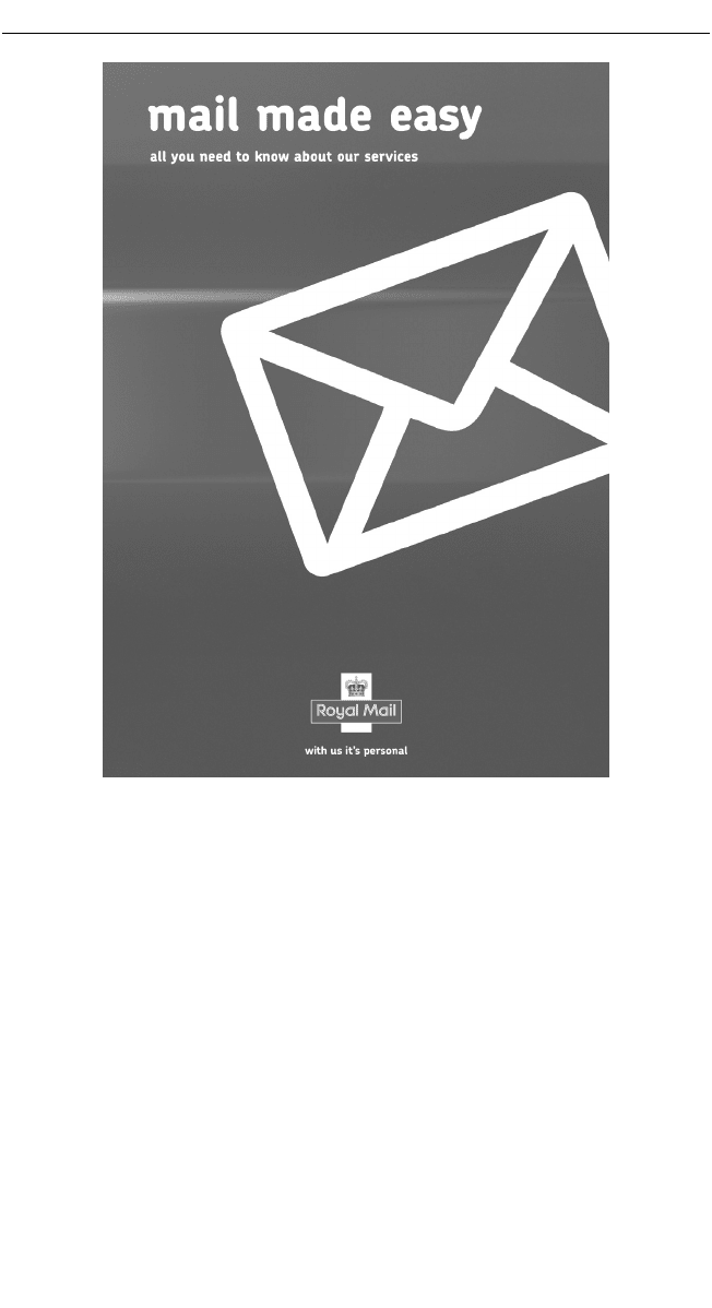
Figure 6.3 Good, clean design for a Royal Mail leaflet. It
communicates well; note the lower case, sans serif type throughout

with a hyphen and a few characters. Many more examples will be found
in the Oxford Style Manual and in its A–Z reference section (also avail-
able separately as the New Oxford Dictionary for Writers and Editors,
New Hart’s Rules, and in the Collins Gem Dictionary of Spelling and Word
Division.
CHOICE OF TYPEFACE
Choosing the appropriate typeface is quite complex as much depends on
the subject matter and style of the work. However, here are some ground
rules worth considering: one is that serif types (those where the letter
strokes are finished off like Times or Bodoni) are easier to read line after
line than sans serif typefaces such as Gill and Helvetica.
Set type so that it reads with the minimum of effort and eyestrain; each
job presents different problems depending on the type style being used.
The professional designer or typographer will gauge the most appro-
priate typeface for any given job by taking into account the target audi-
ence and subjects covered.
PRINTING CONSIDERATIONS
Without going into the broad – and subjective – subject of design, it is
important to remember that ideas that might look great on a visual some-
times fail to work when they get into print. For instance, it is next to
useless reversing large amounts of text out of a solid colour (say white out
of black) or out of a photograph as this guarantees non-readability.
A few lines of display type set fairly large can be read without diffi-
culty, but when it comes to lines of text set solid in 10pt or smaller, there
will be an immediate switch-off. The eye quickly tires and the reader
turns to something else.
Similarly, don’t try to print a light typeface over a tinted page of equal
strength. And don’t try to print yellow type on white paper, or any pastel
shades on white for that matter. Tinted papers often give readability prob-
lems and it is generally better to stick to black on white, using colour
either as solids or as tints for headings and display panels.
If the job is text-intensive and in danger of looking ‘stodgy’ it is advis-
able to include illustrations – either line drawings, photo graphs or
perhaps explanatory panels which can be overprinted in colour. You can
always liven up a page with a bold draw-down quote from the text of just
a few words. When printing a feature article or long news story, don’t
Effective writing skills for public relations
54
