Deitz J.E., Southam J.L. Contemporary Business Mathematics for Colleges
Подождите немного. Документ загружается.

Burger King has sold billions of hamburgers. Housing prices are higher in Boston than
in Atlanta. The United States has a trade deficit, which means that the country has been
importing more goods than it has been exporting. Families tend to spend more money
in retail stores during December than during any other single month of the year. These
examples are based on collections of information about businesses. The information is
called business statistics. The word statistics also refers to a field of study that includes
the collection, organization, analysis, and presentation of data. Businesses use statistics for
two primary purposes: (1) to summarize and report the performance of the business
and (2) to analyze their options in making business decisions.
Individuals and groups who want information about the business performance of a
company include the company’s management, board of directors, investors, and govern-
ment agencies like the IRS. Once statistics have been reported, individuals and groups
use the statistics to make business decisions. For example, depending on the amount of
profits, the board of directors decides how much dividend to pay the shareholders. Like-
wise, after hearing about current profits and projected profits, investors decide whether
to purchase or sell shares of the company’s stock. After studying sales figures for its prod-
ucts and those of competitors, management makes decisions about which markets to en-
ter, what products to emphasize, and how to advertise.
If a Burger King analyst wants to report data on sales of hamburgers, she could list
the number of hamburgers sold at every restaurant. But Burger King has so many restau-
rants that there would be too many numbers to be meaningful. To make the data mean-
ingful, the analyst can make some summary calculations and/or organize the data in
tables. To make her presentations of the data more meaningful and easier to interpret,
she may draw charts, diagrams, and/or graphs.
494 Part 6 Corporate and Special Applications
24.1 This chapter is independent of all
other chapters except Chapter 8 where
cost of goods sold, expenses,and profit
were mentioned.
24.2 You might remind students that
the word data is the plural of datum.
It is worth mentioning because of the
effect that it has on grammar.
The objective in reporting statistics is to summarize the data in a simple, yet meaningful,
manner. One way to simplify data is to compute an average. An average is a single num-
ber that is supposed to be “typical” or “representative” of a group of numbers. One
common way to find an average is to add all the data values and divide by the number
of values. In statistics, this particular average is called the mean. When the mean isn’t
typical or representative of an entire group of data, another average might be more rep-
resentative. We also discuss two other averages: the median and the mode.
The mean of a group of values is computed by dividing the sum of the group of
values by the number of values in the group.
EXAMPLE A
Find the mean salary of five employees whose actual salaries are $51,500, $54,400,
$57,600, $62,000, and $64,500.
Sum 5 $51,500 1 $54,400 1 $57,600 1 $62,000 1 $64,500 5 $290,000
Mean 5 $290,000 4 5 5 $58,000
Statistical Averages: Computing the Mean
1
Learning Objective
Compute the mean.
24.3 The word average is often used
in an imprecise way as a synonym for
the word typical,as in “What kind of
calculator does the average student
use?”The word average has many
meanings,three of which are mean,
median,and mode.
24.4 Bring in—or have students
bring in—examples of news articles
that discuss salaries or housing prices.
Most often the article will mention
the median rather than the mean.One
or two very expensive homes can make
the mean home price too high to be
typical for the average home.
Chapter 24 Buisness Statistics 495
Find the mean for the following set of numbers: 14, 11, 12, 15, 10, 16, 15, 12, 13, 11, 15, 17, 13,
14, 15, 12, 18
There are 17 numbers. The mean equals their sum divided by 17.
Sum 5 233
Mean 5 233 4 17 5 13.706, or 13.7 rounded to one decimal place
✔
CONCEPT CHECK 24.1
Determine the median.
2
Learning Objective
The median of a group of numbers is determined by arranging the numbers in numeri-
cal order and finding the middle number. The median is useful when one value in the
group is much larger or much smaller than the rest of the numbers.
EXAMPLE B
Find the median salary of five employees whose salaries are $51,500, $54,400, $57,600,
$62,000, and $254,500.
The salaries are already in numerical order; the median is $57,600 because it is the
middle number of the five numbers arranged in order.
In example B, the mean is $480,000 4 5 5 $96,000, but $96,000 is not representative of
the salaries of the five employees. The mean is very large because one employee (perhaps
the owner) has a very large salary compared to the rest of the group. The median salary,
$57,600, is more typical of the group.
If the number of values is even, the median will be halfway between the two middle
values. The median will be the mean of the middle two values.
EXAMPLE C
Find the median salary of six employees whose salaries are $57,600, $64,500, $51,500,
$254,500, $62,000, and $54,400.
Rearranged in numerical order, the salaries are $51,500, $54,400, $57,600, $62,000,
$64,500, and $254,500.
The median is halfway between the middle two numbers, $57,600 and $62,000. The
median is ($57,600 1 $62,000) 4 2, or $119,600 4 2 5 $59,800.
Determining the Median
Find the median for the following set of numbers: 14, 11, 12, 15, 10, 16, 15, 12, 13, 11, 15, 17,
13, 14, 15, 12, 18
The median is the middle number, after all the numbers have been arranged by order of size:
10, 11, 11, 12, 12, 12, 13, 13, 14, 14, 15, 15, 15, 15, 16, 17, 18
The median is the ninth number, or 14.
✔
CONCEPT CHECK 24.2
The mode of a group of numbers is the number that occurs most often. None of exam-
ples A, B, and C has a mode because each number occurs only once. The mode is useful
when the word average implies “most typical” or “happening most often.” Retail busi-
nesses keep track of the items that sell most frequently so that they can avoid shortages
of those items.
EXAMPLE D
Find the mode shoe size of 12 pairs of cross trainer running shoes, sizes 6, 6, , , 8, ,
9, 9, 9, 9, 9, and .
The mode is size 9, because 9 occurs most frequently.
In example D neither the mean nor the median makes any sense. The mean is 98 4 12 5
8.17, or . The median is halfway between sizes and 9, which would be 8.75, or . The
store owner could not buy any shoes in either size or size because those shoe sizes
do not exist. However, the store owner does want to stock several shoes in size 9.
8
3
4
8
1
6
8
3
4
8
1
2
8
1
6
9
1
2
8
1
2
7
1
2
7
1
2
496 Part 6 Corporate and Special Applications
Determining the Mode
3
Learning Objective
Determine the mode.
4
Learning Objective
Construct frequency tables.
Find the mode for the following set of numbers: 14, 11, 12, 15, 10, 16, 15, 12, 13, 11, 15, 17, 13,
14, 15, 12, 18
The mode is the number that occurs most often. It is easier to find if you arrange the numbers
by size first:
10, 11, 11, 12, 12, 12, 13, 13, 14, 14, 15, 15, 15, 15, 16, 17, 18
There are four 15s, so the mode is 15.
✔
CONCEPT CHECK 24.3
The data in examples A–D are sometimes called ungrouped data because the numbers
are listed individually. Business applications, such as sales results for all Burger King
restaurants, often involve hundreds or thousands of numbers. Interpreting data that
are literally pages of raw numbers is impossible. To make sense of such data, we organize
the individual values into groups called classes of data or data classes. Adjacent classes
“touch each other,” but cannot overlap, not even by one cent. Also, classes are normally
the same width. In example E, the width of each class is $5,000. The number of values
in each class, called the frequency of the class, is summarized in a table called a
frequency table.
Constructing Frequency Tables

EXAMPLE E
Listed below are the salaries of 25 full-time office employees of a large insurance company.
Make a frequency table with five classes: $40,000 up to but not including $45,000, $45,000
up to but not including $50,000, and so on.
$42,500 $41,300 $53,500 $62,400 $47,500
45,400 54,600 41,000 44,400 59,100
48,000 52,000 57,500 62,500 44,000
53,600 46,200 53,500 51,800 56,400
55,500 46,000 45,200 46,000 60,800
The frequency table for these salaries appears in Figure 24-1.
Chapter 24 Business Statistics 497
to Develop a Frequency Table
1. Determine the classes of data, and list the classes in one column.
2. Tally the data by making one mark for each data item in the column next
to the appropriate class.
3. Count the tally marks for each class and write the number in the column
next to the tally marks.
STEPS
24.5 Continue to emphasize the exact
words of example E:“$40,000 up to
$45,000”means “from $40,000 up to
but not including $45,000.”The class
could also be defined as “$40,000.00
up to and including $44,999.99.”This,
however,is somewhat more awkward
and appears more complicated.We will
try to avoid difficulties by not using
data values,like $45,000 or $50,000,
which are exactly on the boundaries.
Class Tally Frequency (F)
$40,000 up to $45,000 5
$45,000 up to $50,000 7
$50,000 up to $55,000 6
$55,000 up to $60,000 4
$60,000 up to $65,000 13
Total 25
III
IIII
IIII
I
IIII II
IIII
Figure 24-1 Frequency Table
COMPUTING THE MEAN OF LARGE DATA SETS
When a data set contains many numbers, as in example E, a computer spreadsheet is
usually used to compute the mean. If you use a calculator, be sure to check your work.
One way to do so is to add all the numbers twice. One method to add them twice, but in
two different orders, is shown in the following steps.
to Compute the Mean for a Large Data Set
1. Add all the numbers in each column.
2. Add all the numbers in each row.
3. Compute the grand total by adding all the column totals.
4. Check the grand total by adding all the row totals.
5. Divide the grand total by the number of values to get the mean.
STEPS
EXAMPLE F
Compute the mean of the 25 salaries in example E.
$ 42,500 $ 41,300 $ 53,500 $ 62,400 $ 47,500 $ 247,200
45,400 54,600 41,000 44,400 59,100 244,500
48,000 52,000 57,500 62,500 44,000 264,000
53,600 46,200 53,500 51,800 56,400 261,500
1 55,500 1 46,000 1 45,200 1 46,000 1 60,800 1 253,500
$245,000 $240,100 $250,700 $267,100 $267,800 $1,270,700
The sum of the row totals and the sum of the column totals are both $1,270,700.
Mean 5 $1,270,700 4 25 5 $50,828
498 Part 6 Corporate and Special Applications
24.6 In statistics textbooks,authors
often distinguish between class limits
and class boundaries.We do not
mention either.Class limits are the
smallest and largest possible values in
a class.In the first class,the lower class
limit is $40,000.00;the upper class
limit is $44,999.99.The class boundary
is the number that separates two con-
secutive classes.The class boundary
between the first two classes is
$44,999.995,which is halfway
between the upper class limit of
$44,999.99 and the adjacent lower
class limit of $45,000.00.
2,550 3,275 3,410 2,650 3,140
3,480 3,400 2,860 3,810 3,480
1,660 3,280 2,940 2,480 3,325
1,975 4,270 3,520 2,440 2,325
4,110 3,300 2,290 4,140 3,990
2,570 2,150 2,840 4,325 2,720
✔
Make a frequency table for the following set of data. Use the classes 1,500 up to 2,000, 2,000 up to 2,500, and so on.
CONCEPT CHECK 24.4
Class Tally Frequency
1,500 up to 2,000 2
2,000 up to 2,500 5
2,500 up to 3,000 7
3,000 up to 3,500 9
3,500 up to 4,000 3
4,000 up to 4,500 + 4
Total 30
IIII
III
IIII
IIII
IIII II
IIII
II
COMPLETE ASSIGNMENT 24.1.
In business, statistical information is first summarized clearly in tables. For presentation,
the results are then often displayed in charts or graphs. Popular graphs include the his-
togram, the bar graph, the line graph, and the pie chart (circle graph). Histograms, bar
graphs, and line graphs all have perpendicular axes. Labels are placed at the left (the ver-
tical axis) and bottom (the horizontal axis).
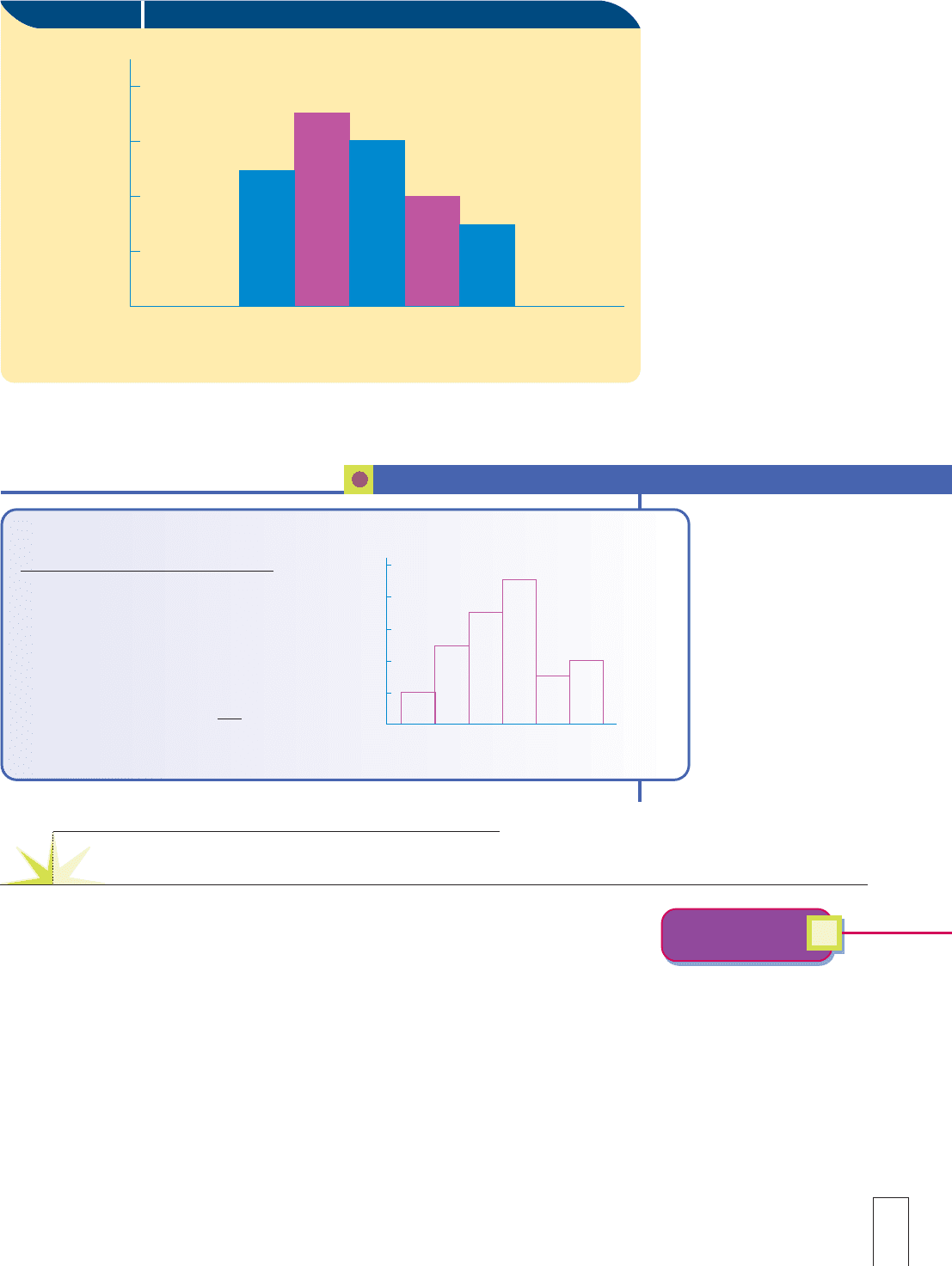
A histogram is a diagram that presents the grouped data from a frequency table. The
classes are positioned adjacent to each other along the horizontal axis, and the frequen-
cies are written along the vertical axis. Figure 24-2 shows the histogram for the frequency
table in Figure 24-1. The numbers on the horizontal axis increase from left to right. The
numbers on the vertical axis increase from bottom to top.
Charts and Graphs: Constructing Histograms
5
Learning Objective
Construct histograms.
24.7 Remind students of the old adage
“A picture is worth a thousand words.”
There are over 100,000 references to it
on Google.Many students will claim
they are not “math-oriented.”Explain
to them that graphs are the artistic
method of conveying the numeric
information from the tables.Some
people who are less “number-oriented”
may be more “graph-oriented.”
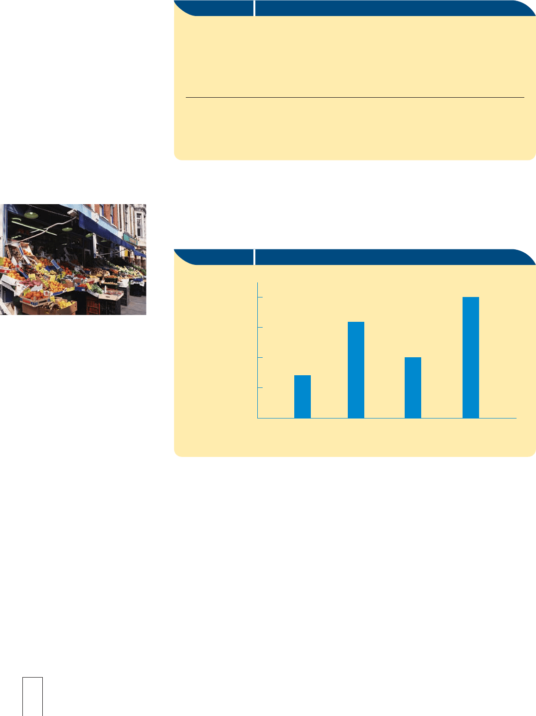
A bar graph, or bar chart, resembles the histogram except that there may not be a numeric
scale on the horizontal axis and the bars normally do not touch each other. Sosa’s Markets
has grocery stores in four different towns: Davis, Hubbard, Bay View, and Easton, although
the Davis store just opened last year in July. The table in Figure 24-3 shows the annual sales
revenue, cost of goods sold, operating expenses, and net profits for both the current year
and the previous year. The bar graph in Figure 24-4 illustrates the data from the current
year. Data from the table in Figure 24-3 are used in various examples throughout the
remainder of this chapter.
Note: It does not make sense to have the vertical bars “touch each other” as in a his-
togram. The four stores are distinct objects. If the horizontal axis were “time,” like con-
secutive months of the year, then you could make a bar graph. But it would also make
Chapter 24 Business Statistics 499
24.8 Remind students that in a his-
togram,adjacent classes “touch,”but
do not overlap.Technically the number
that actually separates the first two
rectangles in Figure 24-2 is the ”class
boundary,”$44,999.995.(See Note
24.6.) However,it is more effective and
less confusing on a graph to use simply
a “45.”The label at the bottom explains
that 45 represents $45,000.
C
lass Frequenc
y
1,500 up to 2,000 2
2,000 up to 2,500 5
2,500 up to 3,000 7
3,000 up to 3,500 9
3,500 up to 4,000 3
4,000 up to 4,500 1 4
Total 30
✔
Construct a histogram from the following frequency table.
CONCEPT CHECK 24.5
Figure 24-2 Histogram
8
6
4
2
35 40 45 50 55 60 65 70
Number of
Employees
Employee Salaries (thousands of dollars)
Construct bar graphs.
6
Learning Objective
Constructing Bar Graphs
24.9 Bar graphs can be drawn
horizontally.Vertical bars are more
common,especially in comparative or
component bar graphs.
10
8
6
4
2
0
1,500 2,000 2,500 3,000 3,500 4,000 4,500
Histogram
sense to use a histogram because last year could touch this year at midnight on December 31.
However, as you will see, we can make some useful variations of bar graphs that we really
cannot do with histograms.
500 Part 6 Corporate and Special Applications
SOSA’S MARKETS SALES DATA FOR THE
CURRENT YEAR (IN MILLIONS OF DOLLARS)
Sales Cost of Operating Net Profit Net Profit
Location Revenue Goods Sold Expenses (This Year) (Last Year)
Davis 1.50 0.75 0.50 0.25 0.15
Hubbard 3.25 1.75 1.00 0.50 0.75
Bay View 2.00 1.00 0.75 0.25 0.50
Easton 4.00 2.00 1.25 0.75 0.50
Figure 24-3 Revenues, Expenses, and Net Profits (in millions of dollars)
Figure 24-4 Bar Graph
4.0
3.0
2.0
1.0
Davis
Dollars
(millions)
Hubbard
Sosa's Markets Sales Revenues—Current Year
Bay View
Easton
© ANDREW WARD-LIFE FILE/PHOTODISC/
GETTY IMAGES
COMPARATIVE BAR GRAPH
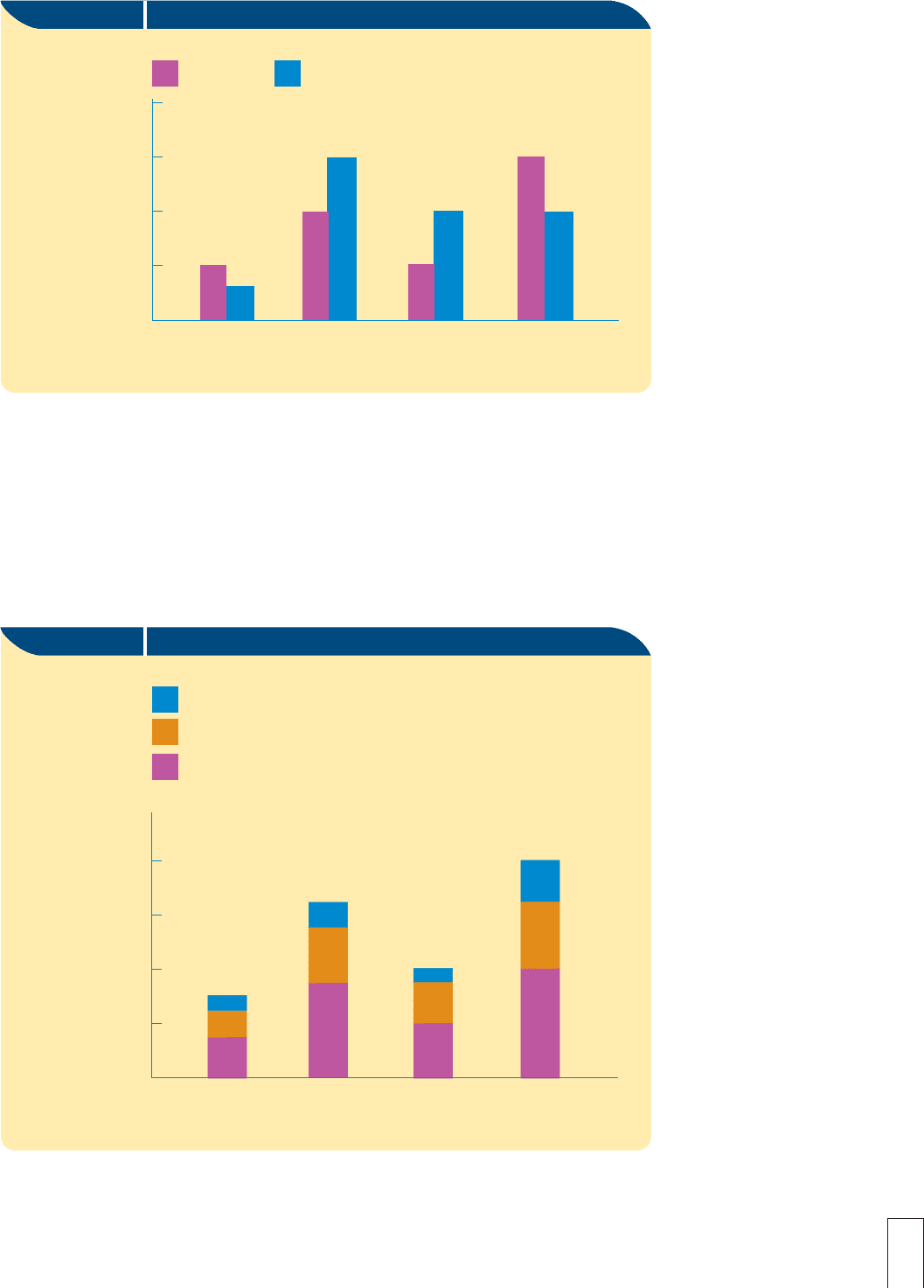
Two bar graphs can be combined on one grid to make a comparative bar graph. This
permits the statistician to make a graph that will compare two different sets of data. The
graph for Sosa’s Markets in Figure 24-5 compares each store’s net profit this year with its
net profit last year. Each store has one pair of bars and the two bars in each pair need to
be colored or shaded differently to help the reader distinguish between the two years.
COMPONENT BAR GRAPH
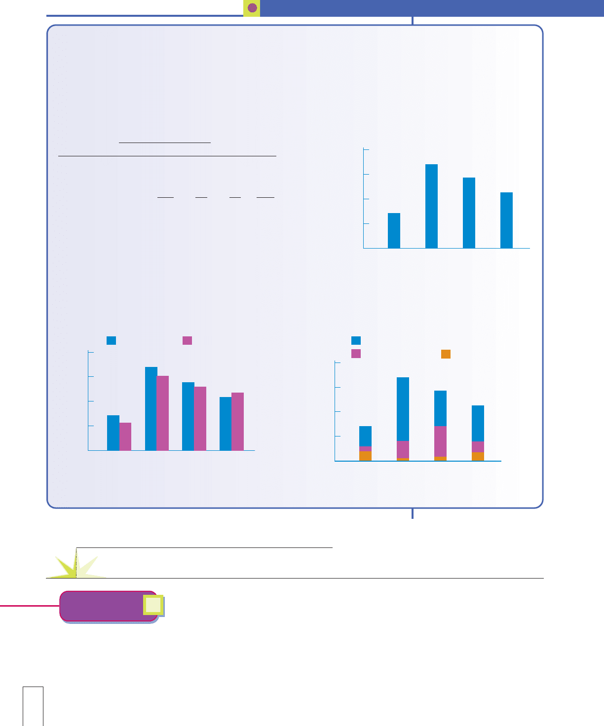
A bar graph constructed to show how certain data are composed of various segments is a
component bar graph. Figure 24-6 shows how the current sales revenue is composed of
cost of goods sold, operating expenses, and net profit. As in the comparative bar graph,
the component parts are colored or shaded differently to permit easier reading.
Chapter 24 Business Statistics 501
Figure 24-5 Comparative Bar Graph
Davis
Dollars
(millions)
Hubbard
Sosa's Markets Net Profits—Current Year and Last Year
Bay View
Easton
Last Year
This Year
1.0
0.75
0.50
0.25
Figure 24-6 Component Bar Graph
Davis
Dollars
(millions)
Hubbard
Sosa's Markets Sales Revenues—Current Year
Bay View
Easton
Net Profit
Cost of Goods Sold
Operating Expenses
4.0
3.0
2.0
1.0
24.10 Discuss with students how
difficult,misleading,or confusing it
would be to try to use a histogram to
illustrate the same information as
either a comparative bar graph or a
component bar graph.
502 Part 6 Corporate and Special Applications
Home Sales L
ast Year
Quart
er 1st 2nd 3rd 4th
Shopping Mall Office 20 60 40 30
Downtown Office 5 20 25 10
Mountain Office 110 13 15 112
Total sales last year 35 83 70 52
Total sales prior year 30 75 65 55
a. Construct a bar graph showing total home sales for each quarter
last year. Make the vertical scale from 0 to 100, and mark the four
quarters on the horizontal scale.
✔
A real estate agency has three offices, all of which sell some homes.The Shopping Mall Office sells homes almost
exclusively; last year it sold 150 homes.The Downtown Office handles mostly commercial property, but it sold
60 homes last year. The Mountain Office primarily manages various resort properties, but it did sell 30 homes.
Following are the numbers of homes sold in each quarter of last year. The first quarter is January through March;
the second quarter is April through June; the third quarter is July through September; and the fourth quarter is
October through December.
CONCEPT CHECK 24.6
100
75
50
25
0
1
st 2nd
Home Sales by Quarter—Last Year
3
rd 4th
b. Construct a comparative bar graph showing total home
sales for each quarter, both last year and the prior year.
c. Construct a component bar graph showing quarterly
home sales for each office last year.
100
75
50
25
0
1
st 2nd
Home Sales Last Year vs. Prior Year
3
rd 4th
Last Year Prior Year
100
75
50
25
0
1
st 2nd
Home Sales by Office—Last Year
3
rd 4th
Shopping Mall
Downtown
Mountain
Businesses often analyze data over time, perhaps monthly or annually. As we mentioned
earlier, both a histogram and a bar graph can be used when time is on the horizontal axis.
Another useful graph for illustrating data over time is the line graph. Plot the heights with
single points above each month (or year). Then connect the consecutive points with straight
line segments. Notice that it would not make sense to put time on the vertical axis.
Constructing Line Graphs
7
Learning Objective
Construct line graphs.
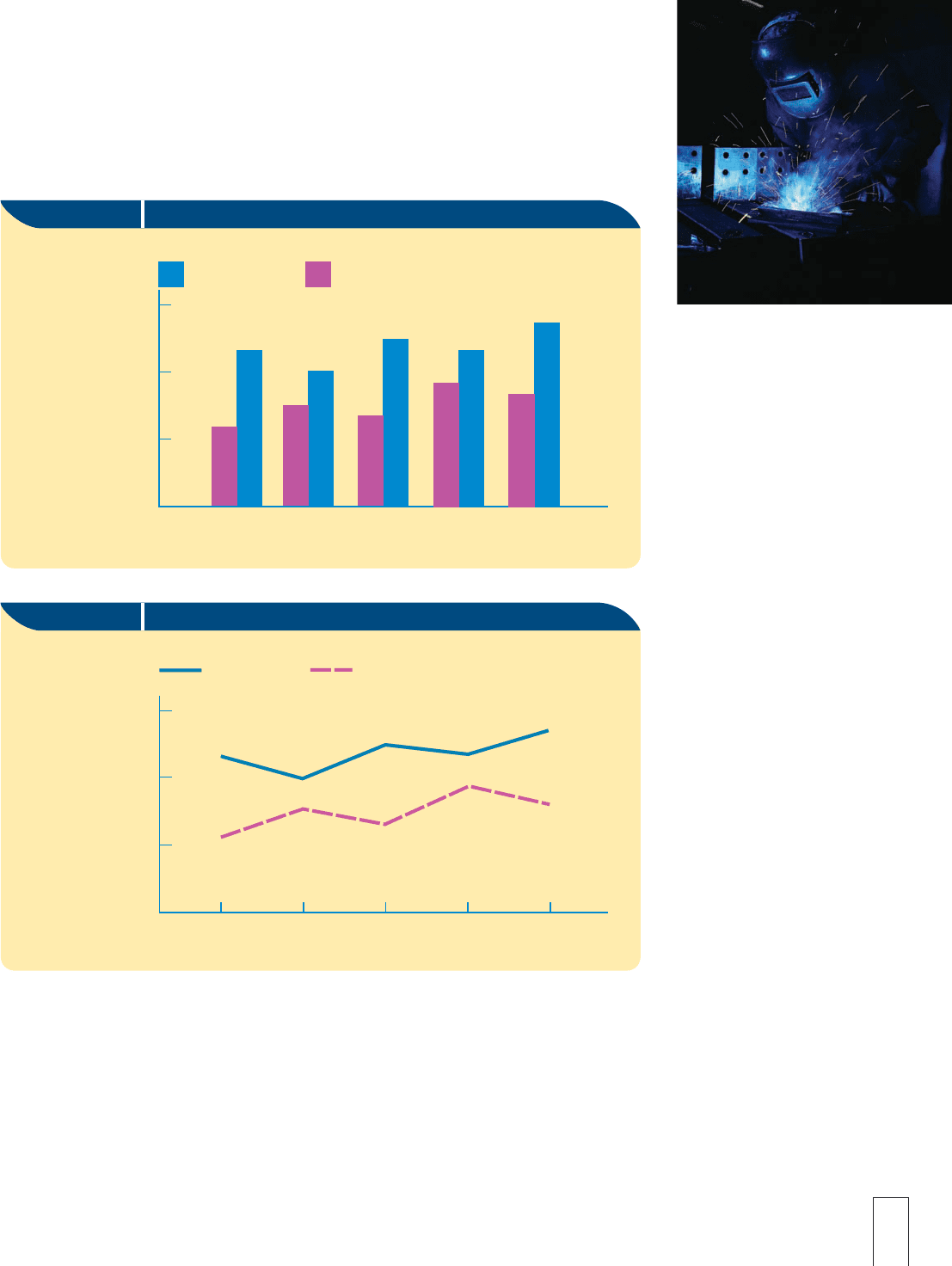
Following are five months of expenses for materials for the residential and commer-
cial divisions of Solar Metals, Inc., a custom metal-fabricating business.
Jan. Feb. Mar. Apr. May
Residential 24,000 30,000 26,000 36,000 32,000
Commercial 46,000 40,000 50,000 46,000 54,000
Figure 24-7 shows a comparative bar graph for this data. Figure 24-8 shows two line graphs
with one line for the Residential Division and the other for the Commercial Division.
Chapter 24 Business Statistics 503
© NIGEL SHUTTLEWORTH-LIFE FILE/PHOTODISC/GETTY IMAGES
Figure 24-7 Comparative Bar Graph
Residential
Commercial
Jan. Feb. Mar.
Apr.
May
60
40
20
Dollars
(thousands)
Solar Metals—Materials Expense
Figure 24-8 Line Graph
Jan. Feb. Mar.
April
May
Solar Metals—Materials Expense
Commercial
Residential
Dollars
(thousands)
60
40
20
As we mentioned earlier, there is not a convenient, unconfusing method to make one
histogram show all of the information. If you simply take the comparative bar graph, but
draw the vertical bars all adjacent, the result is NOT a histogram. Histograms are simply
not normally used for this kind of data. Histograms for the Residential and Commercial
Divisions are shown in Figures 24-9 and 24-10. Their only purpose here is for you to see
that the line graph and the comparative bar graph are much better suited to illustrate the
differences in the data.
