CIMA - C3 Fundamentals Of Business Mathematics
Подождите немного. Документ загружается.

270 10: Correlation and linear regression ⏐ Part E Inter-relationships between variables
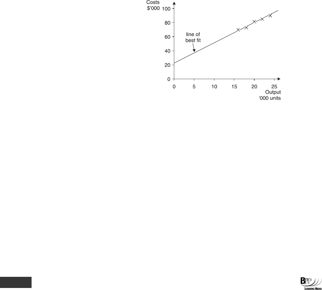
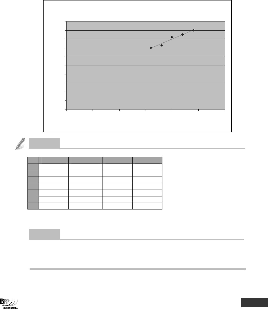
5.1 Example: The scattergraph method
Suppose we have the following pairs of data about output and costs.
Month
Output Costs
'000 units $'000
1 20 82
2 16 70
3 24 90
4 22 85
5 18 73
(a) These pairs of data can be plotted on a scattergraph (the horizontal axis representing the independent
variable and the vertical axis the dependent) and a line of best fit might be judged as the one shown below.
It is drawn to pass through the middle of the data points, thereby having as many data points below the line
as above it.
(b) A
formula for the line of best fit can be found. In our example, suppose that we read the following data
from the graph.
(i) When X = 0, Y = 22,000. This must be the value of
a in the formula Y = a + bX.
(ii) When X = 20,000, Y = 82,000. Since Y = a + bX, and a = 22,000, 82,000 = 22,000 + (b × 20,000)
b × 20,000 = 60,000
b = 3
(c) In this example the estimated equation from the scattergraph is Y = 22,000 + 3X.
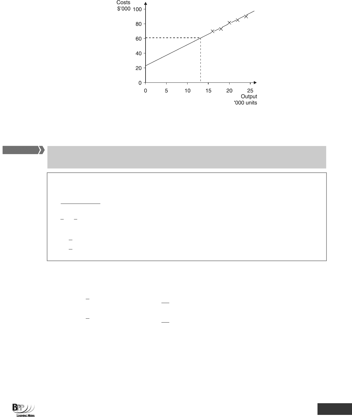
5.2 Forecasting and scattergraphs
If the company to which the data in Paragraph 5.1 relates wanted to predict costs at a certain level of output (say
13,000 units), the value of 13,000 could be substituted into the equation Y = 22,000 + 3X and an estimate of costs
made.
If X = 13, Y = 22,000 + (3 × 13,000)
∴ Y = $61,000
Predictions can be made directly from the scattergraph, but this will usually be less accurate.
Part E Inter-relationships between variables ⏐ 10: Correlation and linear regression 271
The prediction of the cost of producing 13,000 units from the scattergraph is $61,000.
6 Linear regression analysis
Linear regression analysis (the least squares method) is one technique for estimating a line of best fit. Once an
equation for a line of best fit has been determined, forecasts can be made.
The least squares method of linear regression analysis involves using the following formulae for a and b in Y = a
+ bX.
b =
22
nXY XY
nX (X)
∑−∑∑
∑−∑
a =
Y
– b
X
Where n is the number of pairs of data
X
is the mean X value of all the pairs of data
Y
is the mean Y value of all the pairs of data
6.1 Some helpful hints
(a) The value of b must be calculated first as it is needed to calculate a.
(b)
X
is the mean of the X values =
X
n
Σ
Y is the mean of the Y values =
Y
n
Σ
(c) Remember that X is the independent variable and Y is the dependent variable
(d) Set your workings out in a table to find the figures to put into the formulae.
Assessment
formula
FA
S
T F
O
RWAR
D

272 10: Correlation and linear regression ⏐ Part E Inter-relationships between variables
6.2 Example: Linear regression analysis
(a) Given that there is a fairly high degree of correlation between the output and the costs detailed in Paragraph
5.1 (so that a linear relationship can be assumed), calculate an equation to determine the expected level of
costs, for any given volume of output, using the least squares method.
(b) Prepare a budget for total costs if output is 22,000 units.
(c) Confirm that the degree of correlation between output and costs is high by calculating the correlation
coefficient.
Solution
(a) Workings
X
Y
XY
X
2
Y
2
20
82
1,640
400
6,724
16
70
1,120
256
4,900
24
90
2,160
576
8,100
22
85
1,870
484
7,225
18
73
1,314
324
5,329
∑X =
100
∑Y =
400
∑XY =
8,104
∑X
2
=
2,040
∑Y
2
=
32,278
n = 5 (There are five pairs of data for x and y values)
b =
()
2
2
XXn
YXXYn
∑−∑
∑∑−∑
=
2
1002,040)(5
400)(1008,104)(5
−×
×−×
=
10,00010,200
40,00040,520
−
−
=
200
520
= 2.6
a =
Y
– b
X
=
5
400
– 2.6 ×
⎟
⎠
⎞
⎜
⎝
⎛
5
100
= 28
Y = 28 + 2.6X
Where Y = total cost, in thousands of pounds
X = output, in thousands of units
Compare this equation to that determined in Paragraph 5.1.
Note that the fixed costs are $28,000 (when X = 0 costs are $28,000) and the variable cost per unit is $2.60.
(b) If the output is 22,000 units, we would expect costs to be
28 + (2.6 × 22) = 85.2 = $85,200.
(c) r =
)400278,325(200
520
2
−××
=
390,1200
520
×
=
3.527
520
= + 0.986
In an assessment, you might be required to use the linear regression analysis technique to calculate the values of a
and b in the equation y = a + bx. This type of task is ideally tested by objective test questions.
Assessment
focus point
Part E Inter-relationships between variables ⏐ 10: Correlation and linear regression 273
Question
Linear regression analysis
If Σx = 79, Σy = 1,466, Σx
2
= 1,083, Σy
2
= 363,076, Σxy = 19,736 and n = 6, then the value of b, the gradient, to two
decimal places, is:
A 10.12
B 111.03
C 13.62
D –8.53
Answe
r
A
r =
2
(6× 19,736)-(79 ×1,466)
(6 ×1,083)- 79
=
118,416 -115,814
6,498 - 6,241
=
2,602
257
= 10.12
Question
Forecasting
In a forecasting model based on y = a + bx, the intercept is $262. If the value of y is $503 and x is 23, then the value
of the gradient, to two decimal places, is:
A –20.96
B –10.48
C 10.48
D 20.96
Answe
r
C y = a + bx
503 = 262 + (b × 23)
241 = b × 23
b = 10.48
7 Using spreadsheets
Excel has a built-in formula =FORECAST for the calculation of the regression (least squares) line.
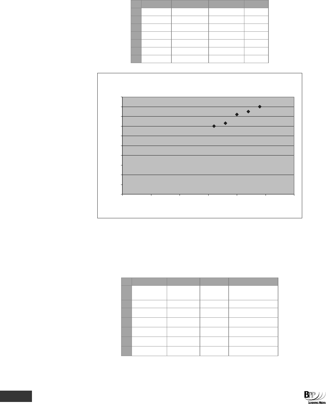
7.1 The scattergraph
We have already seen how to use the chart wizard to produce charts and graphs in Excel. One of the chart options
available is the scattergraph. Using the data from paragraph 5.1, the following spreadsheet and chart can be
produced.
FA
S
T F
O
RWAR
D
274 10: Correlation and linear regression ⏐ Part E Inter-relationships between variables
A B C
D
1 Month Output Costs
2 '000 units $'000
3 1 20 82
4 2 16 70
5 3 24 90
6 4 22 85
7 5 18 73
A scattergraph
0
10
20
30
40
50
60
70
80
90
100
0 5 10 15 20 25 30
Ouput '000 units
Costs $'000
7.2 The FORECAST function
We can use the FORECAST function to plot the regression line. The formula
=FORECAST(B3,$C$3:$C$7,$B$3:$B$7) is entered in cell D3 and copied down the column. Note how
absolute cell
references
are used to ensure that each observation is compared with the entire range.
A B C D
1 Month Output Costs Regression line
2 000 units $'000
3 1 20 82
80
4 2 16 70
70
5 3 24 90
90
6 4 22 85
85
7 5 18 73
75
Part E Inter-relationships between variables ⏐ 10: Correlation and linear regression 275
To plot this forecast data on the chart, select the range D3:D7, click copy then click on the chart and click paste. In
order to create a joined up line as shown in the chart below, right click and format the data series to set the line to
'automatic' and the marker to 'none'.
A scattergraph
0
10
20
30
40
50
60
70
80
90
100
0 5 10 15 20 25 30
Ouput '000 units
Costs $'000
Question
Forecast function
A B C D
1 Output Costs
2 Units $
3 280 46,500
4 350 49,100
5 200 36,700
6 160 32,000
7 240 44,500
What formula should be entered into cell C3 to forecast the costs for a given level of output if the formula is to be
copied into cells C4 to C7?
Answe
r
The FORECAST
function should be used with absolute cell references for the cells marking the range of data to be
used.
=FORECAST(A3,$B$3:$B$7,$A$3:$A$7)

276 10: Correlation and linear regression ⏐ Part E Inter-relationships between variables
Chapter Roundup
• When the value of one variable is related to the value of another, they are said to be correlated.
• Two variables might be perfectly correlated, partly correlated or uncorrelated. Correlation can be positive or
negative.
• The degree of correlation between two variables is measured by the Pearson's correlation coefficient, r. The
nearer r is to +1 or –1, the stronger the relationship.
• The coefficient of determination, r
2
, measures the proportion of the total variation in the value of one variable that
can be explained by variations in the value of the other variable.
• Spearman's rank correlation coefficient is used when data is given in terms of order or rank, rather than actual
values.
• The scattergraph method involves the use of judgement to draw what seems to be a line of best fit through plotted
data.
• Linear regression analysis (the least squares method) is one technique for estimating a line of best fit. Once an
equation for a line of best fit has been determined, forecasts can be made.
• Excel has a built-in formula =FORECAST for the calculation of the regression (least squares) line.
Part E Inter-relationships between variables ⏐ 10: Correlation and linear regression 277
Quick Quiz
1 correlation means that low values of one variable are associated with low values of the
other, and high values of one variable are associated with high values of the other.
2 correlation means that low values of one variable are associated with high values of the
other, and high values of one variable with low values of the other.
3 • Perfect positive correlation, r =
• Perfect negative correlation, r =
• No correlation, r =
The correlation coefficient, r, must always fall within the range to
4 If the correlation coefficient of a set of data is 0.95, what is the coefficient of determination?
5 If Y = a + bX, it is best to use the regression of Y upon X where X is the dependent variable and Y is the
independent variable.
True
F
False F
6 Which Excel function can be used to calculate a future value by using existing values?
7 If Σx = 30, Σy = 62, Σx
2
= 238, Σy
2
= 1,014, Σxy = 485, n = 4
What is the correlation coefficient? (to 2 decimal places)
278 10: Correlation and linear regression ⏐ Part E Inter-relationships between variables
Answers to Quick Quiz
1 Positive correlation
2 Negative correlation
3 • r = +1
• r = –1
• r = 0
The correlation coefficient, r, must always fall within the range –1 to +1.
4 Correlation coefficient = r = 0.95
Coefficient of determination = r
2
= 0.95
2
= 0.9025 or 90.25%
This tells us that over 90% of the variations in the dependent variable (Y) can be explained by variations in the
independent variable, X.
5 False. When using the regression of Y upon X, X is the independent variable and Y is the dependent variable (the
value of Y will depend upon the value of X).
6 =FORECAST
7 r =
])y(yn][)x(xn[
yxxyn
2222
Σ−ΣΣ−Σ
ΣΣ−Σ
=
]621,014) x [(4 x ]30238) x [(4
62) x (30485) x (4
22
−−
−
=
212 x 52
1,860 - 1,940
=
104.995
80
= 0.76
Now try the questions below from the Exam Question Bank
Question numbers Pages
79-88 344-347
0
.7
6

279
Part F
Forecasting