Pavlidis I. (ed.) Human-Computer Interaction
Подождите немного. Документ загружается.


Multi-Device Design in Contexts of Interchange and Task Migration
83
According to Table 2, both input and output devices of a standard desktop have relevant
differences in size compared to those available for the pocket PC and smartphone. Also, the
pocket PC rotation on the palm of the hand to adjust its orientation regarding the desktop
display has undesirable ergonomic implications, pointing the shape as another perceptual
attribute to be considered for the interface adaptation. Thus, we expect to focus on visibility
and mapping during the Consistency Priorities implementation for these target devices.
4.5 Implementation
Task Perception and Task Execution
The task perception consistency aims to preserve size, shape, color and relative localization
of control mechanisms and information units available on interfaces. On the other side, the
task execution consistency demands the same actions’ flow to execute the user’s tasks. A
useful baseline to start implementing these consistency priorities is the Direct Migration
approach, which consists of the desktop interface presented on the handheld device without
any adaptation. According to the results obtained with the devices’ restriction analysis in
section 4.4, size and shape were the attributes with the most relevant differences between
target devices, indicating that visibility and mapping shall be the design principles to focus on
this consistency level (see section 3.2). The violation of these principles in the Direct
Migration can be perceived by the intense interaction required with both vertical and
horizontal scrolling to access information throughout the interface. If tasks are not visible,
many usability attributes can be compromised, like utility, efficiency and safety of use.
A common solution to adapt desktop interfaces to the pocket PC screen is the Single
Column feature, which is able to analyze and partition the web page structure presenting its
content without the horizontal scrolling. However, this proposal can violate many task
perception consistency requirements by changing relative localization of side menus and
content area, losing visibility of the user’s tasks and generating ambiguities on semantic
mapping by reorganizing information units. These side effects are due to the fact that Single
Column considers only the shape as an attribute with relevant difference between target
devices. Therefore, we must also consider adaptations on size.
Among the information visualization techniques focusing on this attribute, we highlight the
focus+context and the thumbnail (reduced replica of the desktop interface). Belonging to the
latter, Smartview (Milic-Frayling & Sommerer, 2002) and Gateway (MacKay et al., 2004) are
examples of proposals that let users first scan the thumbnail and then explore regions of
interest. The main advantage is that visual mapping remains consistent with the user’s
previous experience, but the zoom-out rate makes content unreadable, as it can be noticed
comparing Fig. 3 and Fig. 5a. In order to support visibility, the Gateway prototype presents
readable texts of the thumbnail regions touched by the user, overlapping the readable
region on the thumbnail (see Fig. 5b). However, data comparison tasks on the same interface
might demand excessive memorization, besides the additional touch interaction for multiple
regions of the same thumbnail. Also, mapping of table structures can be compromised as
readable columns will be shown one at a time, losing the correlation between lines and
columns.

Human-Computer Interaction
84
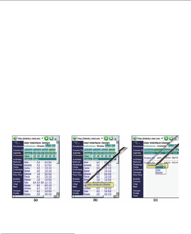
Fig. 5. – Example of the Gateway proposal applied for the TelEduc‘s participants’ grades
screen (see Fig. 3). In (a), a reduced non-functional replica of the desktop page; in (b), the
TelEduc’s side menu overlapped on the thumbnail after touching its region in (a).
We argue that these problems arise because only the attribute size was considered for
adaptation. According to the devices’ restriction analysis, both size and shape shall be
adapted, thus requiring special focus on the visibility and mapping design principles. In this
sense, the Summary Thumbnail (Lam & Baudisch, 2005) proposes a more adequate solution
by improving the latter prototypes with text font increase and content summarization for
the thumbnail. Fig. 6 shows an example of this adaptation for the TelEduc.
Fig. 6. – Example of the Summary Thumbnail proposal applied for the TelEduc’s
participants’ grades screen (see Fig. 3). In (a), a reduced functional replica of the desktop
page with readable and summarized texts; in (b), the detailed view of the region touched by
the user’s pen (full text and real size images as in the Direct Migration approach).
The interface presented in Fig. 6a reveals good similarity to its desktop equivalent (see Fig.
3) and also enhances the thumbnail legibility obtained with the Gateway (see Fig. 5a). Still,
Summary Thumbnail fails to preserve mapping and consistency on task execution.
The mapping failure can be verified in the summarization of links “View Previous
Evaluations” and “View Future Evaluations”, resulting in two labels called “View” (menu
Multi-Device Design in Contexts of Interchange and Task Migration
85
on top of Fig. 6a). This was due to the automatic summarization process, which crops
characters from right to left until text fits within the available space. This methodology
might lead to other unexpected results, especially for languages in which adjectives come
after nouns (e.g. Portuguese, Spanish). This problem could be fixed using a conversion table
built statically by the designers and containing every control mechanism label related to its
most appropriate summarized form (non-hyperlink texts could still be summarized using
the right to left cropping approach). A more dynamic solution could be based on a domain
oriented summarization approach that would rip terms not relevant to the given page (low
frequency on the page and high frequency in the database) and preserve only the important
ones (high frequency on the page and low frequency in the database).
The task execution inconsistency comes from the ability to activate any navigation structure
by pointing over it directly on the thumbnail. As the user needs to perform the same action
to reveal its full text on the detailed view before deciding if that’s the appropriate hyperlink
to activate, there will always be an interaction ambiguity. This problem can be fixed
substituting the Direct Migration detailed view by an overlapped window (thus avoiding
many inconsistencies of such method as presented before) and eliminating the navigation
ambiguity with a non-functional thumbnail. In this case, navigation could be provided by
activating the full text hyperlink in the detailed view. This way, task execution remains
consistent
3
by always revealing the detailed view whenever the user touches the thumbnail.
Fig. 7 shows an example of how these adaptations can be implemented to preserve the first
two levels of the Consistency Priorities hierarchy.
Fig. 7. – Example of the Consistency Priorities (first two levels) applied to the TelEduc’s
participants’ grades screen (see Fig. 3). In (a), the Summary Thumbnail approach adapted to
preserve visibility and mapping principles; in (b), the detailed view overlapped on the
thumbnail avoiding context loss while switching views; and in (c), an example of navigation
by activating the hyperlink inside the detailed view.
3
Although task execution claims the interface to be consistent with both task model and actions‘ flow
developed in sections 4.2 and 4.3, we argue that these changes to the Summary Thumbnail (including
an extra interaction with the hyperlink inside the detailed view) don’t break consistency at this level
because it constitutes a new approach for handheld navigation. The concept implies that every object
activated by the user reveals a detailed view with full text for summarized texts or real-size images for
reduced images; but if the object is a hyperlink, an additional activation is required to actually follow
the hyperlink (see Fig. 7c). Therefore, we state that the task model wasn’t changed, but the navigation
concept implicit on its tree nodes.

Human-Computer Interaction
86
Task Personalization
This third level of the Consistency Priorities hierarchy focuses on users that won’t access the
application in contexts of interchange and task migration. In other words, they plan to
access the application using only one device. Therefore, the concern with consistency in the
first two levels of the hierarchy loses its relevance for this group of users. In this case, we
suggest personalizing the interface with an active position for the user during interaction,
which can be implemented in two ways:
• Customization: Ability to change perceptual aspects of control mechanisms’ (e.g. enlarge
fonts, shrink side menu, change structures’ attributes like shape, color, etc.) and to
reorganize information (e.g. hide images, menu items, table columns; add shortcuts;
reveal full texts and/or descriptions; etc.);
• Pre-built Interface Patterns: Design of alternative interfaces with improved efficiency for
tasks considered more relevant to a group of users. The original task model must be
adapted towards reducing the actions’ flow for such tasks, which could be done by
removing leaf nodes, sub trees, or via a hierarchical rearrangement of child nodes as a
result of their parent removal. The users’ choice over pre-built interface patterns can be
implemented by checking their profile on first interactions with the application.
The customization approach demands higher motivation to be accessed during interaction,
reason why we encourage designers to build interface patterns that will require less effort
by the users and still delegate them an active role in design. This personalization can be
exemplified for the TelEduc’s Evaluation tool considering the task of checking the students’
grade for a given evaluation y (see Table 1):
1. execute perceive Evaluations
2. execute perceive Participants’ Grades
3. c store perceive Evaluation[name=y]
4. aval store perceive Evaluation
[code=c]
5. stud store perceive Student[name=x]
6. return perceive Grade
(stud, aval)
If this task was considered the most relevant to the mobile user, than it should be
personalized to reduce complexity and improve efficiency. The first step is to identify
changes imposed by the context of use that could simplify the way tasks are currently
executed. In the given example, we could assume that the mobile user is not interested in
comparing grades, but rather prefer having a faster way to access his/her personal
information. This assumption reduces the actions’ flow to four simpler steps:
1. execute perceive Evaluations
2. execute perceive Participants’ Grades
3. aval store perceive Evaluation
[name=y]
4. return perceive Grade(aval)
The newer actions’ flow removes search and memorization tasks from two information
units: the evaluation (which used to associate a code to the evaluation’s name) and the
student (which required the identification of the adequate row on the students grades table).
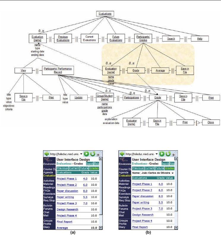
Fig. 8 shows how these changes reflect on the original task model (see Fig. 4) and Fig. 9a
shows the interface obtained with this personalization.
Multi-Device Design in Contexts of Interchange and Task Migration
87
Fig. 8. – Personalization of the original task model (Fig. 4) for the TelEduc’s Evaluation tool.
The main focus was efficiency on the task of checking personal grades.
Fig. 9. – Interfaces obtained with the task personalization consistency priority for the
TelEduc’s Evaluation tool. While both screens consider the task of checking personal grades
as the most relevant, in (a) the focus is restricted to the user, and in (b) grade comparison is
enabled to balance interaction continuity and efficiency gain for the task.
As expected, the proposed interface for the mobile context described previously focus only
on the user’s personal information, thus preventing access to other students’ grades (see Fig.
9a). However, many authors reinforced the idea that interaction continuity is a key element
for multi-device design (Denis et al., 2004; Florins et al., 2004; Pyla et al., 2006; Hajdukiewicz,
2006). Hence, balancing interaction continuity and efficiency gain plays an important role in
task personalization. Considering the TelEduc example, this could be done by preserving

Human-Computer Interaction
88
the sub tree Student[name]
(present in the original task model in Fig. 4) and implementing it
as a choice structure, like a combo box (see Fig. 9b).
In this third consistency priority, almost every design decision conflicts with those taken in
the previous levels. Basically, this happens due to the fact that task personalization means
no compromise with the user’s previous experience accessing the application via other
devices. Additionally, if there isn’t enough information to build personalized interface
patterns, customization should be another important resource to enhance user experience.
5. Experiment
5.1 Domain, Application and Tasks
The motivation to choose Distance Learning as the experiment domain and TelEduc as the
e-learning application was already presented in section 4.1. In order to choose one of its 21
tools as the experiment focus (i.e. agenda, evaluations, portfolio, etc.), we established the
following requirements: the tool should have (1) higher access frequency in the computer
science course taken by the population sample and (2) more relevant visualization
information challenges for the desktop-handheld adaptation. While the first criterion was
applied through an investigation of TelEduc’s records, the second was based in the system’s
analysis, considering as challenges: the variable number of columns and rows inside tables,
the need to show popup windows, the deeper menu hierarchy inside each tool and complex
visual representations (e.g. graphs). Finally, the score combining both criteria for each tool
revealed the Evaluations and the Portfolio as the most relevant ones. Therefore, the
Evaluations tool was chosen to be the experiment focus because one of its challenges is very
appropriate to highlight limitations in pocket PC’s shape and size (i.e. the extensive matrix
containing every students’ grades on each test).
5.2 Participants
The experiment had 18 male computer science undergraduate students, ranging in age from
19 to 29 (
22=x
). They all had relevant experience with computers and the TelEduc e-
learning system (used before in other seven courses in average). None had used it via a
handheld, being their experience restricted to desktop/laptop/tablet PCs. When questioned
about the devices they would like to use with TelEduc, only six showed interest in using
more than one, which reveals an apparent indifference for task migration activities. On the
other side, six subjects chose to access it solely by a desktop/laptop/tablet PC, pointing
mobile interfaces as of the majority’s interest to access the system (12 subjects). Participants
were also questioned about their most frequent task with TelEduc’s Evaluation tool. From a
total of 15 answers, 12 indicated the checking of grades (two mentioning explicitly the
comparison of grades) while three pointed the search for the evaluations’ details.
5.3 Material
The experiment was conducted in a computer lab with wireless Internet connection and 18
tablet PCs available in individual desks. During evaluation, all the tablets remained laid or
inclined on the desks and the pocket PC pen-based interaction was simulated by the tablet
pen. Also, the pocket browser was reproduced in the tablet and equipments were connected
to power outlets, which prevented interruptions by battery discharge.

Multi-Device Design in Contexts of Interchange and Task Migration
89
5.4 Treatments and Procedures
The following treatments were applied to the experiment participants while executing a set
of tasks to evaluate their effects and contribute to the investigation of the most appropriate
multi-device design approach in a context of task migration:
• Direct Migration: Applied as a baseline, this treatment proposes a TelEduc pocket PC
interface that is exactly like the desktop interface. Although consistency in task
perception and execution is preserved, it can’t guarantee usability principles like
visibility, mapping and/or feedback (see Fig. 10a).
• Linear Transformation: A TelEduc pocket PC interface that adapts the desktop version to
the handheld constraints, aiming efficiency in tasks of major interest to the user besides
the preservation of task model characteristics. This approach loses consistency in task
perception and keeps it partially for task execution, like many current approaches (e.g.
most adaptive interfaces in the related work). Undesirable automatic transformation
residues were avoided by manually designing the screens (see example in Fig. 10b).
• Overview Transformation applying Consistency Priorities: Adaptation of the TelEduc
desktop interface for the pocket PC preserving the first two levels of the Consistency
Priorities to focus in contexts of interchange and task migration (see Fig. 10c).
Fig. 10. – Experiment interfaces to visualize the TelEduc participants’ grades using the three
available treatments: (a) Direct Migration, (b) Linear Transformation and (c) Overview
transformation applying Consistency Priorities.
Sample Partition
The 18 participants were fully distributed in six groups of three participants and each group
followed a different treatments’ application sequence, covering every possible combination.
Thus, the residual effects of every treatment application over the other were balanced.
Studied Variables
In order to contrast pros and cons of each treatment applied in each task execution, we
studied quantitative (execution time and task accuracy) and qualitative variables (easiness,
efficiency and safety subjectively compared to the desktop interface). After finishing each

Human-Computer Interaction
90
task with the three approaches, users identified the best and the worst interfaces for that
task. At last, after the execution of all tasks, they also filled a satisfaction questionnaire
identifying their favorite interface and the reasons for that.
Tasks
Subjects had to execute a set of three tasks using each of the available interfaces (Direct
Migration, Linear and Overview) in a context of task migration. Initially, the task
description was presented and its execution process started on the TelEduc desktop
interface to be further completed on the pocket PC simulator (the quantitative variables
mentioned before were observed only during the pocket PC simulation). Tasks were chosen
based on the subjects indication of the most frequently executed, in which 80% (12 subjects)
said it was the checking of grades and 20% (three subjects) pointed the search for
evaluations’ details (e.g. date, criteria, etc.). Therefore, we implied that the checking of
grades was the most relevant task, which led us to improve its efficiency in the Linear
transformation approach (the grades matrix was replaced by a simpler table with only the
user’s grades, as shown in Fig. 10b). Table 3 compares actions’ flow between treatments.
Treatments
Steps
Direct Migration/Overview Linear
1 c store perceive Evaluation[name=y] aval store perceive Evaluation[name=y]
2 aval store perceive Evaluation[code=c] return perceive Grade(aval)
3 stud store perceive Student
[name=x]
4 return perceive Grade
(stud, aval)
Table 3. Task 1 actions’ flow (x: student’s name; y: evaluation’s name).
We also wanted to investigate the implications of such improvement in related tasks, like
the comparison of grades (two out of the 12 subjects explicitly mentioned it as the most
frequently executed task). Thus, we created a second task in which subjects had to count the
number of colleagues with a higher grade than his/her in a certain evaluation. While Task 1
should point the Linear interface as the most efficient due to its actions’ flow simplification,
Task 2 could help us investigate the implications of this consistency loss for a related task.
Finally, the third task was to go after the details of a certain evaluation (elected by three
subjects as the most frequent task). As the second most executed task, a common scenario
would be the user checking his/her grade in a certain evaluation and only then searching
for details of the next evaluations to perform. In this sense, we implemented Task 3 with the
same interface presented by the end of Task 1. This way, we provided both the adequate
scenario according to the subjects’ preferences (Task 3 stimulated by Task 1 or 2) and the
means to investigate implications of a mental trace loss (incapacity to suppose the actions
taken with device x to reach its current state due to a task migration started with device y).
Precautions with Tasks’ Initial State
The following decisions were taken to make the task’s initial state as real as possible and
avoid particular cases that could benefit any of the evaluated treatments: (1) a standard user
name was chosen to guarantee homogeneity for the subjects’ search effort and also consider

Multi-Device Design in Contexts of Interchange and Task Migration
91
an average case for the user’s name position inside the grades’ matrix (Direct Migration and
Overview transformation) and the combo box (Linear transformation); (2) evaluations and
students’ numbers, as well as the evaluations’ names, were taken from a previous course;
and (3) the students’ grades in each evaluation were different to avoid users memorizing
solutions with one treatment and reusing for the following.
5.5 Statistical Analysis
In order to adjust the residual effects in the task execution time continuous variable (due to
the application of one treatment after the other), we opted for a parametric analysis of
variance using latin square balanced for immediate residual effect (Cochran & Cox, 1992).
The comparison between paired treatments was performed by the Tukey post-hoc test. As for
the non-normal Likert scale discrete variables (easiness, efficiency and safety subjectively
compared to the desktop TelEduc interface), the Friedman test was chosen according to its
suitability for nonparametric analysis with three or more treatments and paired samples.
Also, each pair of treatments was compared by the Wilcoxon signed rank test due to its
adequacy on checking differences between medians of two groups with paired samples.
5.6 Results and Discussion
Task 1: User’s Most Relevant Task
The checking of grades was considered the most executed task by 12 subjects out of 15 (not
all the 18 subjects answered this question). Table 4 summarizes the observed data.
Treatments
Observed Variables
Direct Migration Linear Overview
Efficacy (task response accuracy) 18 (100%) 18 (100%) 18 (100%)
Efficiency (average execution time)* 50.93a 33.92b 45.32ab
Easiness compared to the TelEduc desktop* 3c 6a 4b
Efficiency compared to the TelEduc desktop* 2c 5a 4b
Safety compared to the TelEduc desktop** 3b 5a 4b
Best treatment’s choice 0 (0%) 16 (89%) 2 (11%)
Worst treatment’s choice 14 (78%) 1 (5%) 3 (17%)
* Treatments with different letters in the same line diverge significantly for p < 0.05
** Treatments with different letters in the same line diverge significantly for p < 0.005
Table 4. Task 1 results.
According to Table 4, all treatments had a perfect score for the task response accuracy,
meaning that the consistency breaking, present in the Linear approach, didn’t lead to errors.
On the other side, although this approach has reduced considerably the required actions
and their complex to perform the task, no significant difference was identified between its
average execution time and the one obtained with the Overview treatment (p < 0.05). This
result wasn’t expected since the Linear transformation’s major advantage is the efficiency
gain by means of device oriented adaptations. Thus, we conclude that executing a reduced
number of simple non-expected actions can take as much time as a greater number of complex

Human-Computer Interaction
92
expected actions due to the user’s mental model influence. Although such conclusion is in
agreement with the measured data, it can’t be confirmed by the perceived data, which
pointed the Linear approach as the most efficient one. This divergence can be explained by
the fact that the efficiency subjective evaluation was realized after the task execution, when
users eventually understood how to accomplish it. As the demanded cognitive adaptation
wasn’t relevant, users had the impression that an approach requiring a reduced number of
simpler actions to perform the same task would take less time. We don’t argue against this
assumption (which is the reason why our proposal gives support to the third level of
consistency on task personalization), but a context of task migration may prove the contrary,
as verified by the measured efficiency.
Another important observation concerns the seven point Likert scale, in which the number
four means no difference between handheld and desktop interfaces for the evaluated
attribute (i.e. easiness, efficiency or safety). In this sense, the Overview transformation was
the only approach able to maintain median four for every attribute, besides the significant
differences to the Linear transformation’s results (p < 0.05). Thus, we conclude that the interface
proposed using the first two levels of Consistency Priorities preserved the user’s mental model by
attending to his/her expectations. We are confident that such goal has more important
implications to multi-device design in order to smooth the transition between devices in
contexts of interchange and task migration.
Finally, the user’s choice for the best interface confirmed that this task’s optimization in the
Linear transformation was the key to get the users satisfaction.
Task 2: A Variation of the User’s Most Relevant Task
The comparison of grades was explicitly mentioned by two subjects out of the 12 voters of
Task 1 as the most relevant task. In this sense, Task 2 demanded the count of students with a
higher grade than the user’s in a certain evaluation. Table 5 summarizes the observed data.
Treatments
Observed Variables
Direct Migration
Linear Overview
Efficacy (task accuracy) 17 (94%) 3 (33%) 17 (94%)
Efficiency (average execution time)* 69.48a 75.28a 30.15b
Easiness compared to the TelEduc desktop* 2b 2b 4.5a
Efficiency compared to the TelEduc desktop** 2b 2b 4a
Safety compared to the TelEduc desktop** 2b 3ab 4a
Best treatment’s choice 2 (11%) 2 (11%) 14 (78%)
Worst treatment’s choice 6 (33%) 12 (68%) 0 (0%)
* Treatments with different letters in the same line diverge significantly for p < 0.05
** Treatments with different letters in the same line diverge significantly for p < 0.007
Table 5. Task 2 results.
According to Table 5, while 94% of the subjects realized Task 2 correctly with both Direct
Migration and Overview approaches, only 33% did it using the Linear interface. This result
exemplifies how an interface adaptation privileging a certain task and breaking consistency