Griffiths D. Head First Statistics
Подождите немного. Документ загружается.


you are here 4 21
visualizing information
Here’s a reminder of the data for Manic Mango.
See if you can use the class boundaries to create a histogram for this data.
Remember, the frequency goes on the vertical axis.
Score Frequency
0–199 5
200–399 29
400–599 56
600–799 17
800–999 3
20
10
30
0 100 200 300 400 500 1000600 700 800 900
50
40
60
22 Chapter 1
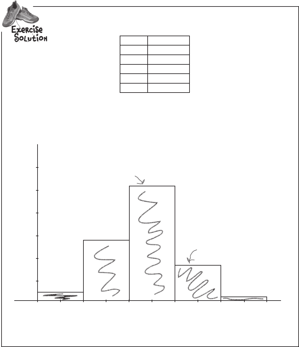
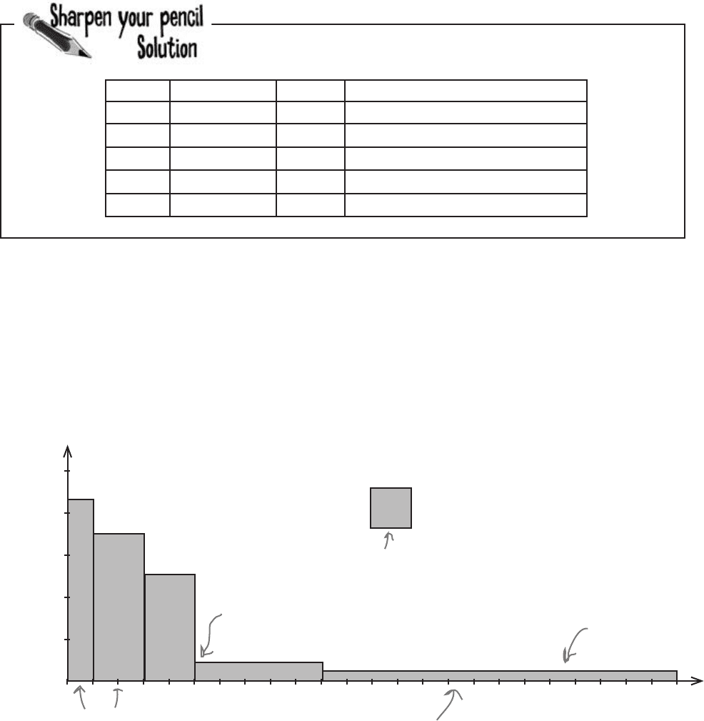
Here’s a reminder of the data for Manic Mango.
Score Frequency
0–199 5
200–399 29
400–599 56
600–799 17
800–999 3
See if you can use the class boundaries to create a histogram for this data.
Remember, the frequency goes on the vertical axis.
Frequency
Score
Scores per game
You use the boundaries of every
interval to give you the bar widths.
The bar for scores 600-799 goes
from 599.5 to 799.5.
The frequency gives you
the height of each bar.
20
10
30
0 100 200 300 400 500 1000600 700 800 900
50
40
60
exercise solution

you are here 4 23
visualizing information
The frequency is a statistical way of saying how many
items there are in a category.
Pie charts are good for showing basic proportions.
Bar charts give you more flexibility and precision.
Numerical data deals with numbers and quantities;
categorical data deals with words and qualities.
Horizontal bar charts are used for categorical data,
particularly where the category names are long.
Vertical bar charts are used for numerical data, or
categorical data if the category names are short.
You can show multiple sets of data on a bar chart,
and you have a choice of how to do this. You can
compare frequencies by showing related bars side-
by-side on a split-category bar chart. You can show
proportions and total frequencies by stacking the bars
on top of each other on a segmented bar chart.
Bar chart scales can show either percentages or
frequencies.
Each chart comes in a number of different varieties.
Q:
So is a histogram basically for grouped numeric data?
A: Yes it is. The advantage of a histogram is that because
its numeric, you can use it to show the width of each interval as
well as the frequency.
Q:
What about if the intervals are different widths? Can
you still use a histogram?
A: Absolutely. It’s more common for the interval widths to be
equal size, but with a histogram they don’t have to be. There
are a couple more steps you need to go through to create a
histogram with unequal sized intervals, but we’ll show you that
very soon.
Q:
Why shouldn’t histograms have gaps between the
bars?
A: There are at least two good reasons. The first is to show
that there are no gaps in the values, and that every value is
covered. The second is so that the width of the interval reflects
the range of the values you’re covering. As an example, if we
drew the interval 0–199 as extending from value 0 to value 199,
the width on the chart would only be 199 – 0 = 199.
Q:
So why do we make the bars meet midway between
the two?
A: The bars have to meet, and it’s usually at the midway
point, but it all comes down to how you round your values. When
you round values, you normally round them to the nearest whole
number. This means that the range of values from -0.5 to 0.5 all
round to 0, and so when we show 0 on a histogram, we show it
using the range of values from -0.5 to 0.5.
Q:
Are there any exceptions to this?
A: Yes, age is one exception. If you have to represent the age
range 18–19 on a histogram, you would normally represent this
using an interval that goes from 18 to 20. The reason for this is
that we typically classify someone as being 19, for example, up
until their 20th birthday. In effect, we round ages down.

24 Chapter 1
Hours Frequency
0–1 4,300
1–3 6,900
3–5 4,900
5–10 2,000
10–24 2,100
This is the number of
hours people play for
Manic Mango needs another chart
The CEO is very pleased with the histogram you’ve created for him—so
much so, that he wants you to create another histogram for him. This time,
he wants a chart showing for how long Manic Mango players tend to play
online games over a 24-hour period. Here’s the data:
This is frequency with
which people play for this
lengh of time
There’s something funny
about that data. It’s
grouped like last time, but
the intervals aren’t all the
same width.
He’s right, the interval widths aren’t all equal.
If you take a look at the intervals, you can see that they’re different widths.
As an example, the 10–24 range covers far more hours than the 0–1 range.
If we had access to the raw data, we could look at how we could construct
equal width intervals, but unfortunately this is all the data we have. We
need a way of drawing a histogram that makes allowances for the data
having different widths.
For histograms, the frequency is proportional to the
area of each bar. How would you use this to create
a histogram for this data? What do you need to be
aware of?
a problem with unequal interval widths
you are here 4 25
visualizing information
I think we can just create this in the same way
we did before—it’s no big deal. We draw bars
on a numeric scale; it’s just that this time the
bars are different widths.
Do you think she’s right?
Here’s a sketch of the chart, using frequency on the vertical scale
and drawing bar widths proportional to their interval size. Do you
see any problems?
The problem with this chart is that making the width of each bar
reflect the width of each interval has made some of the bars look
disproportionately large. Just glancing at the chart, you might be left
with a misleading impression about how many hours per day people
really play games for. As an example, the bar that takes up the largest
area is the bar showing game play of 10–24 hours, even though most
people don’t play for this long.
As this is a histogram, we need to make the bar area proportional to the
frequency it represents. As the bars have unequal widths, what should
we do to the bar height?
A histogram’s bar area must be proportional to frequency
Hours Spent Gaming per Day
Hours
Frequency
2000
1000
3000
5000
4000
6000
7000
23
0
2421 2219 2017 1815 1613 1411 129 1086 74 52 30 1
Why is this
column so BIG?
26 Chapter 1
Up until now, we’ve been able to use the height of each bar to
represent the frequency of a particular number or category.
This time around, we’re dealing with grouped numeric data where
the interval widths are unequal. We can make the width of each bar
reflect the width of each interval, but the trouble is that having bars
of different widths affects the overall area of each bar.
We need to make sure the area of each bar is proportional to its
frequency. This means that if we adjust bar width, we also need to
adjust bar height. That way, we can change the widths of the bars so
that they reflect the width of the group, but we keep the size of each
bar in line with its frequency.
Let’s go through how to create this new histogram.
Step 1: Find the bar widths
We find how wide our bars need to be by looking at the range of values
they cover. In other words, we need to figure out how many full hours
are covered by each group.
Let’s take the 1–3 group. This group covers 2 full hours, 1–2 and 2–3.
This means that the width of the bar needs to be 2, with boundaries of
1 and 3.
Hours Frequency Width
0–1 4,300 1
1–3 6,900 2
3–5 4,900 2
5–10 2,000 5
10–24 2,100 14
For histograms,
the frequency is
represented by
bar area
Here’s the 1-3 group; it covers 2
full hours so the width is 2.
If we calculate the rest of the widths, we get:
Now that we’ve figured out the bar widths, we can
move onto working out the heights.
Make the area of histogram bars proportional to frequency
100 200 300
adjusting bar area
you are here 4 27
visualizing information
Step 2: Find the bar heights
Now that we have the widths of all the groups, we can use these to find the
heights the bars need to be. Remember, we need to adjust the bar heights
so that the overall area of each bar is proportional to the group’s frequency.
First of all, let’s take the area of each bar. We’ve said that frequency and
area are equivalent. As we already know what the frequency of each group
is, we know what the areas should be too:
Area of bar = Frequency of group
We were given these right at the start,
so we know what area we’re aiming for.
Now each bar is basically just a rectangle, which means that the area of
each bar is equal to the width multiplied by the height. As the area gives
us the frequency, this means:
Frequency = Width of bar
×
Height of bar
We found the widths of the bars in the last step, which means that we
can use these to find what height each bar should be. In other words,
Height of bar = Frequency
W
idth of bar
The height of the bar is used to measure how concentrated the
frequency is for a particular group. It’s a way of measuring how
densely packed the frequency is, a way of saying how thick or thin
on the ground the numbers are. The height of the bar is called the
frequency density.
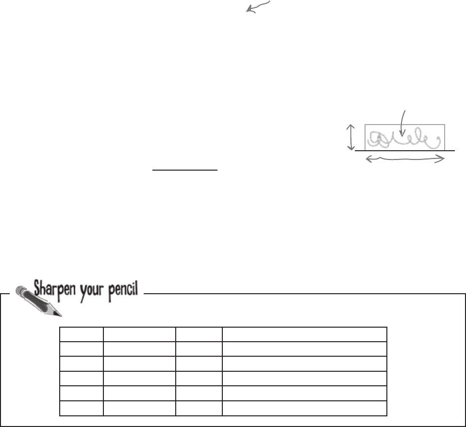
What should the height of each bar be? Complete the table.
Hours Frequency Width Height (Frequency Density)
0–1 4,300 1 4,300 ÷ 1 = 4,300
1–3 6,900 2
3–5 4,900 2
5–10 2,000 5
10–24 2,100 14
Area = frequency
Height
Width
28 Chapter 1
What should the height of each bar be? Complete the table.
Hours Frequency Width Height (Frequency Density)
0–1 4,300 1 4,300 ÷ 1 = 4,300
1–3 6,900 2
6,900 ÷ 2 = 3,450
3–5 4,900 2
4,900 ÷2 = 2,450
5–10 2,000 5
2,000 ÷ 5 = 400
10–24 2100 14
2,100 ÷ 14 = 150
Step 3: Draw your chart—a histogram
Now that we’ve worked out the widths and heights of each bar, we
can draw the histogram.We draw it just like before, except that this
time, we use frequency density for the vertical axis and not frequency.
Here’s our revised histogram.
Hours
Frequency Density
Hours Spent Gaming per Day
Represents 1000 Days
2000
1000
3000
5000
4000
0
2410530 1
Look, no gaps
between the bars.
The bars are drawn on the
continuous numeric scale.
The amount of space the
bars take up are now in
proportion to the data.
This legend makes it easier
to see what the area
represents. It’s optional.
Even though the bar for 1-3
has a higher frequency, the
frequency density is actually
lower than for 0-1.
draw the histogram
you are here 4 29
visualizing information
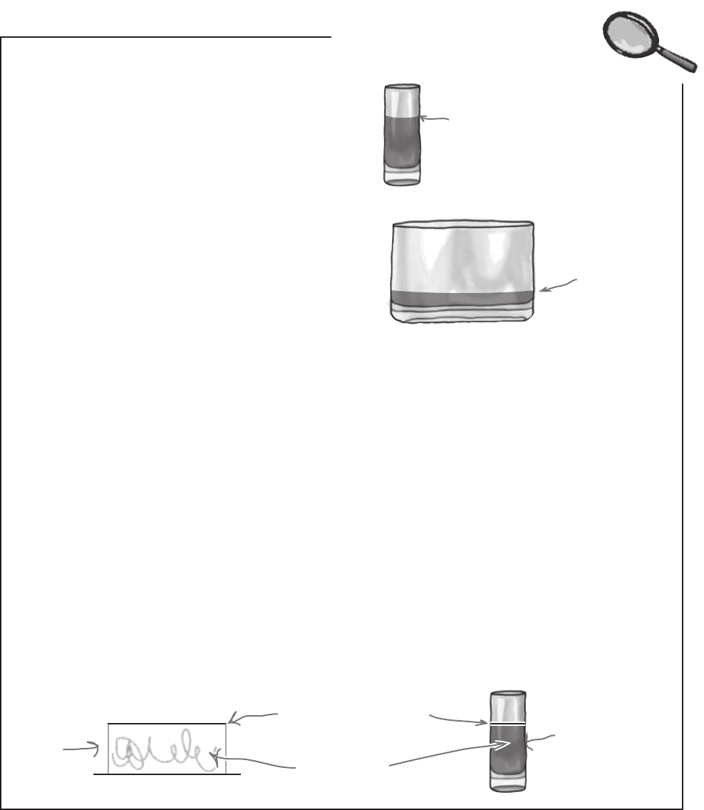
Frequency density refers to the concentration of values in
data. It’s related to frequency, but it’s not the same thing.
Here’s an analogy to demonstrate the relationship between
the two.
Imagine you have a quantity of juice that you’ve poured
into a glass like this:
Here’s all your juice in the glass.
It comes up to this level.
What if you then pour the same quantity of juice into a
different sized glass, say one that’s wider? What happens to the
level of the juice? This time the glass is wider, so the level
the juice comes up to is lower.
The level of the juice varies in line with the width of the
glass; the wider the glass, the lower the level. The converse is
true too; the narrower the glass, the higher the level of juice.
The glass
is wider, so
the level
isn’t as high.
Juice = Frequency
Imagine that instead of pouring juice into glasses, you’re “pouring”
frequency into the bars on your chart. Just as you know the width of the
glass, you know what width your bars are. And just like the space the juice
occupies in the glass (width x height) tells you the quantity of juice in the
glass, the area of the bar on the graph is equivalent to its frequency.
The frequency density is then equal to the height of the bar. Keeping
with our analogy, it’s equivalent to the level your juice comes to in each
glass. Just as a wider glass means the juice comes to a lower level, a wider
bar means a lower frequency density.
Bar
Juice
Frequency
Frequency Density
So what does juice have to do with frequency density?
Frequency Density Up Close
30 Chapter 1
Q:
Why do we use area to represent frequency when
we’re graphing histograms?
A: It’s a way of making sure the relative sizes of each group
stay in proportion to the data, and stay honest. With grouped
data, we need a visual way of expressing the width of each
group and also its frequency. Changing the width of the bars is
an intuitive way of reflecting the group range, but it has the side
effect of making some of the bar sizes look disproportionate.
Adjusting the bar height and using the area to represent
frequency is a way around this. This way, no group is
misrepresented by taking up too much or too little space.
Q:
What’s frequency density again?
A: Frequency density is a way of indicating how
concentrated values are in a particular interval. It gives you a
way of comparing different intervals that may be different widths.
It makes the frequency proportional to the area of a bar, rather
than height.
To find the frequency density, take the frequency of an interval,
and divide it by the width.
Q:
If I have grouped numeric data, but all the intervals
are the same width, can I use a normal bar chart?
A: Using a histogram will better represent your data, as
you’re still dealing with grouped data. You really want your
frequency to be proportional to its area, not height.
Q:
Do histograms have to show grouped data? Can
you use them for individual numbers as well as groups of
numbers?
A: Yes, you can. The key thing to remember is to make sure
there are no gaps between the bars and that you make each
bar 1 wide. Normally you do this by positioning your number in
the center of the bar.
As an example, if you wanted to draw a bar representing the
individual number 1, then you’d draw a bar ranging from 0.5 to
1.5, with 1 in the center.
Frequency density relates to how concentrated the
frequencies are for grouped data. It’s calculated using
Frequency density = Frequency
Group width
A histogram is a chart that specializes in grouped
data. It looks like a bar chart, but the height of each bar
equates to frequency density rather than frequency.
When drawing histograms, the width of each bar is
proportional to the width of its group. The bars are
shown on a continuous numeric scale.
In a histogram, the frequency of a group is given by the
area of its bar.
A histogram has no gaps between its bars.
bullet points and no dumb questions