Griffiths D. Head First Statistics
Подождите немного. Документ загружается.

you are here 4 11
visualizing information
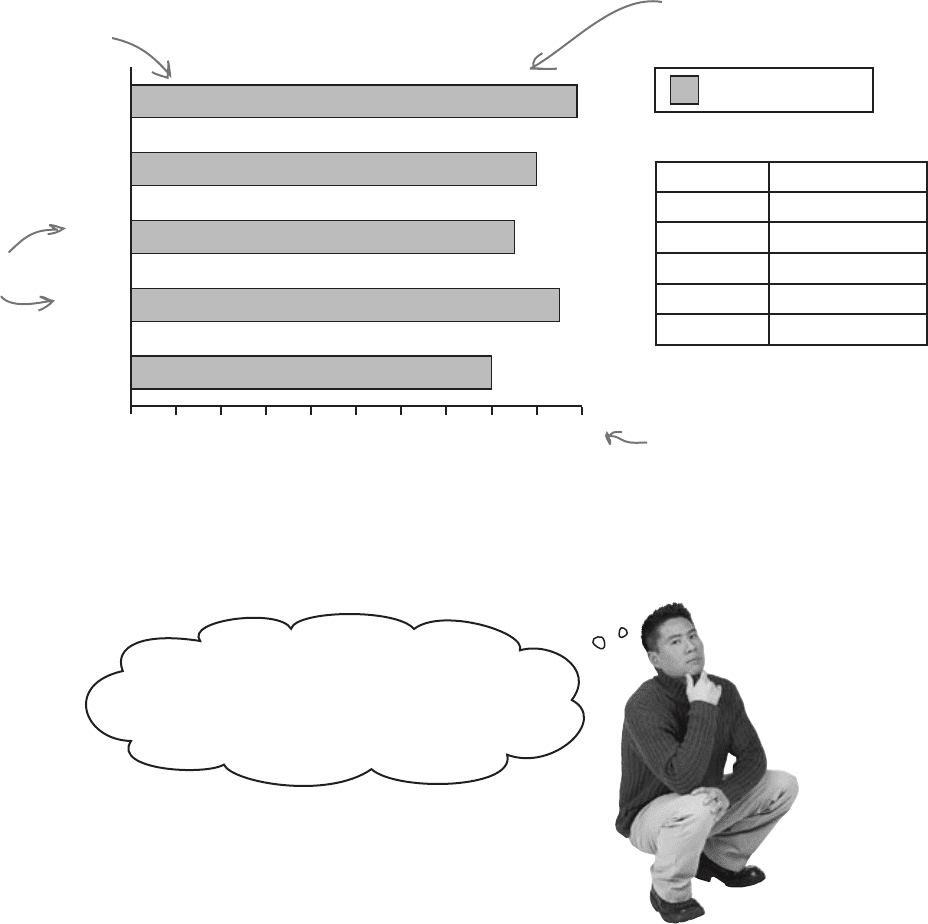
Horizontal bar charts
Horizontal bar charts are just like vertical bar charts except that the axes
are flipped round. With horizontal bar charts, you show the categories on
the vertical axis and the frequency or percentage on the horizontal axis.
Here’s a horizontal bar chart for the CEO’s genre data from page 9.
As you can see, it’s much easier to quickly gauge which category has the
highest value, and which the lowest.
Vertical bar charts tend to be more common, but horizontal bar charts
are useful if the names of your categories are long. They give you lots of
space for showing the name of each category without having to turn the
bar labels sideways.
It depends on what message you want to convey.
Let’s take a closer look.
% Players Satisfied per Genre
Percent Satisfied
Genre % Satisfied
Sports 99%
Strategy 90%
Action 85%
Shooter 95%
Other 80%
10 20 30 40 50 60 70 80 90 1000
Other
Action
Sports
Shooter
Strategy
Each bar’s length
represents the
percentage of satisfied
players for the genre.
Each bar
represents
a genre.
The percentages
are shown on a
horizontal scale.
All the bars are
drawn horizontally.
% Satisfied
The vertical bar chart shows frequency,
and the horizontal bar chart shows
percentages. When should I use frequencies
and when should I use percentages?
12 Chapter 1
It’s a matter of scale
Understanding scale allows you to create powerful bar charts that pick out the
key facts you want to draw attention to. But be careful—scale can also conceal
vital facts about your data. Let’s see how.
Using percentage scales
Let’s start by taking a deeper look at the bar chart showing player satisfaction
per game genre. The horizontal axis shows player satisfaction as a percentage,
the number of people out of every hundred who are satisfied with this genre.
Be very wary if you’re given percentages with no frequencies, or a
frequency with no percentage.
Sometimes this is a tactic used to hide key facts about the underlying data, as just
based on a chart, you have no way of telling how representative it is of the data. You
may find that a large percentage of people prefer one particular game genre, but that
only 10 people were questioned. Alternatively, you might find that 10,000 players like sports games
most, but by itself, you can’t tell whether this is a high or low proportion of all game players.
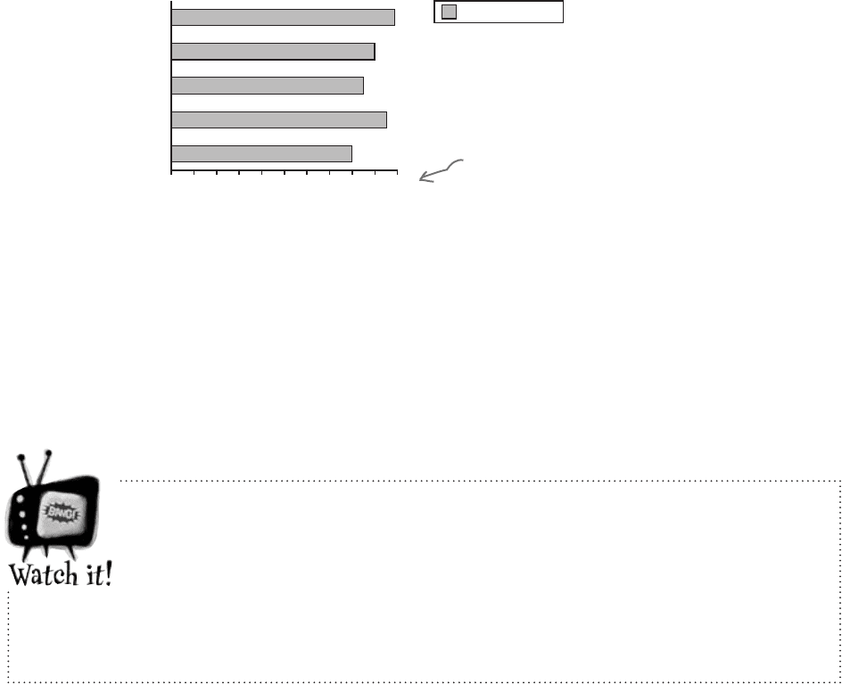
Here are the percentages.
% Players Satisfied per Genre
Percent Satisfied
10 20 30 40 50 60 70 80 90 1000
Other
Action
Sports
Shooter
Strategy
% Satisfied
The purpose of this chart is to allow us to compare different percentages and
also read off percentages from the chart.
There’s just one problem—it doesn’t tell us how many players there are for
each genre. This may not sound important, but it means that we have no idea
whether this reflects the views of all players, some of them, or even just a
handful. In other words, we don’t know how representative this is of players as a
whole. The golden rule for designing charts that show percentages is to try and
indicate the frequencies, either on the chart or just next to it.
a look at scale

you are here 4 13
visualizing information
Using frequency scales
You can show frequencies on your scale instead of percentages. This
makes it easy for people to see exactly what the frequencies are and
compare values.
So are you telling
me that I have to
choose between showing
frequency or percentages?
What if I want both?
There are ways of drawing bar charts that give
you more flexibility.
The problem with these bar charts is that they show either the
number of satisfied players or the percentage, and they only show
satisfied players.
Let’s take a look at how we can get around this problem.
This chart reflects how
many people are satisfied
rather than the percentage..
Normally your scale should start at 0, but watch out! Not every chart does
this, and as you saw earlier on page 6, using a scale that doesn’t start at
0 can give a different first impression of your data. This is something to
watch out for on other people’s charts, as it’s very easy to miss and can give
you the wrong impression of the data.
Satisfied
Number of Players Satisfied per Genre
5000 10000 15000 20000 25000 300000
Other
Action
Sports
Shooter
Strategy
Number Satisfied
14 Chapter 1
The split-category bar chart
One way of tackling this is to use one bar
for the frequency of satisfied players and
another for those dissatisfied, for each genre.
This sort of chart is useful if you want to
compare frequencies, but it’s difficult to
see proportions and percentages.
The segmented bar chart
If you want to show frequencies and
percentages, you can try using a segmented
bar chart. For this, you use one bar for each
category, but you split the bar proportionally.
The overall length of the bar reflects the
total frequency.
This sort of chart allows you to quickly see
the total frequency of each category—in
this case, the total number of players for
each genre—and the frequency of player
satisfaction. You can see proportions at a
glance, too.
Dealing with multiple sets of data
With bar charts, it’s actually really easy to show more than one set of data on
the same chart. As an example, we can show both the percentage of satisfied
players and the percentage of dissatisfied players on the same chart.
Player Satisfaction per Genre
5000 10000 15000 20000 25000 300000
Other
Action
Sports
Shooter
Strategy
Frequency
Dissatisfied
Satisfied
Player Satisfaction per Genre
5000 10000 15000 20000 25000 300000
Other
Action
Sports
Shooter
Strategy
Frequency
Satisfied
Dissatisfied
two data sets on one bar chart
you are here 4 15
visualizing information
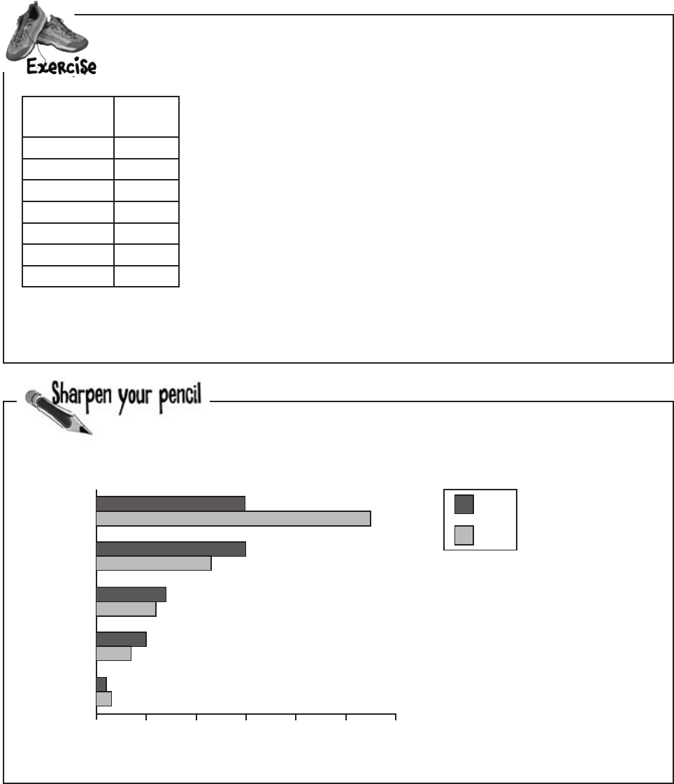
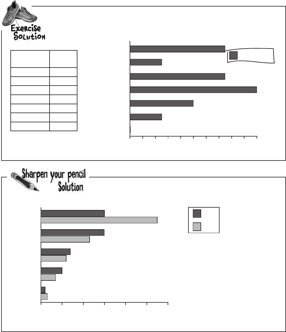
The CEO needs another chart for the keynote presentation. Here’s the data; see if you
can sketch the bar chart.
Here’s another chart generated by the software. Which genre sold
the most in 2007? How did this genre fare in 2006?
Continent Sales
(units)
North America 1,500
South America 500
Europe 1,500
Asia 2,000
Oceania 1,000
Africa 500
Antarctica 1
Sales
5000 10000 15000 20000 25000 300000
Other
Action
Sports
Shooter
Strategy
Genre
Sales per Genre
2006
2007
16 Chapter 1
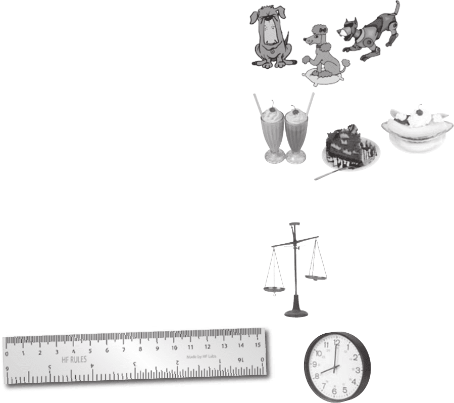
The CEO needs another chart for the keynote presentation. Here’s the data, see if you
can create the chart.
Here’s another chart generated by the software. Which genre sold
the most in 2007? How did this genre fare in 2006?
Continent Sales
(units)
North America 1,500
South America 500
Europe 1,500
Asia 2,000
Oceania 1,000
Africa 500
Antarctica 1
5000 10000 15000 20000 25000 300000
Other
Action
Sports
Shooter
Strategy
Sales
Genre
Sales per Genre
2006
2007
The Sports genre sold the most in 2007.
It sold 27,500 units.
In 2006 it only sold 14,000, so not as
many. In 2006, the Strategy genre sold
more units than any other genre.
Sales
200 600 1400 1600 1800 20000
Sales per Continent
Sales (units)
400 800 1000 1200
South America
Oceania
Antarctica
Europe
Africa
Asia
North America
Continent
exercise solutions

you are here 4 17
visualizing information
This data looks different from the other
types of data we’ve seen so far. I wonder if
that means we treat it differently?
Look back through the chapter. How do you think
this type of data is different? What impact do you
think this could have on charts?
Nice work! Those charts are going to be a big hit at
the expo. I’ve got another assignment for you. We’ve
been testing a new game with a group of volunteers,
and we need a chart to show the breakdown of
scores per game. Here’s the data:
Score Frequency
0-199 5
200-399 29
400-599 56
600-799 17
800-999 3
People can score between
0 and 999, and the
data is broken into
groups. As an example,
players scored between 0
and 199 on 5 occasions.
The frequency is the
number of times a
score within each
range was achieved.
Your bar charts rock
The CEO is thrilled with the bar charts
you’ve produced, but there’s more data
he needs to present at the keynote.
18 Chapter 1
Categories vs. numbers
When you’re working with charts, one of the key things you need to figure out is what sort
of data you’re dealing with. Once you’ve figured that out, you’ll find it easier to make key
decisions about what chart you need to best represent your data.
Categorical or qualitative data
Most of the data we’ve seen so far is categorical. The
data is split into categories that describe qualities or
characteristics. For this reason, it’s also called qualitative
data. An example of qualitative data is game genre; each
genre forms a separate category.
The key thing to remember with qualitative data is that
the data values can’t be interpreted as numbers.
Numerical or quantitative data
Numerical data, on the other hand, deals with numbers.
It’s data where the values have meaning as numbers, and
that involves measurements or counts. Numerical data is
also called quantitative data because it describes quantities.
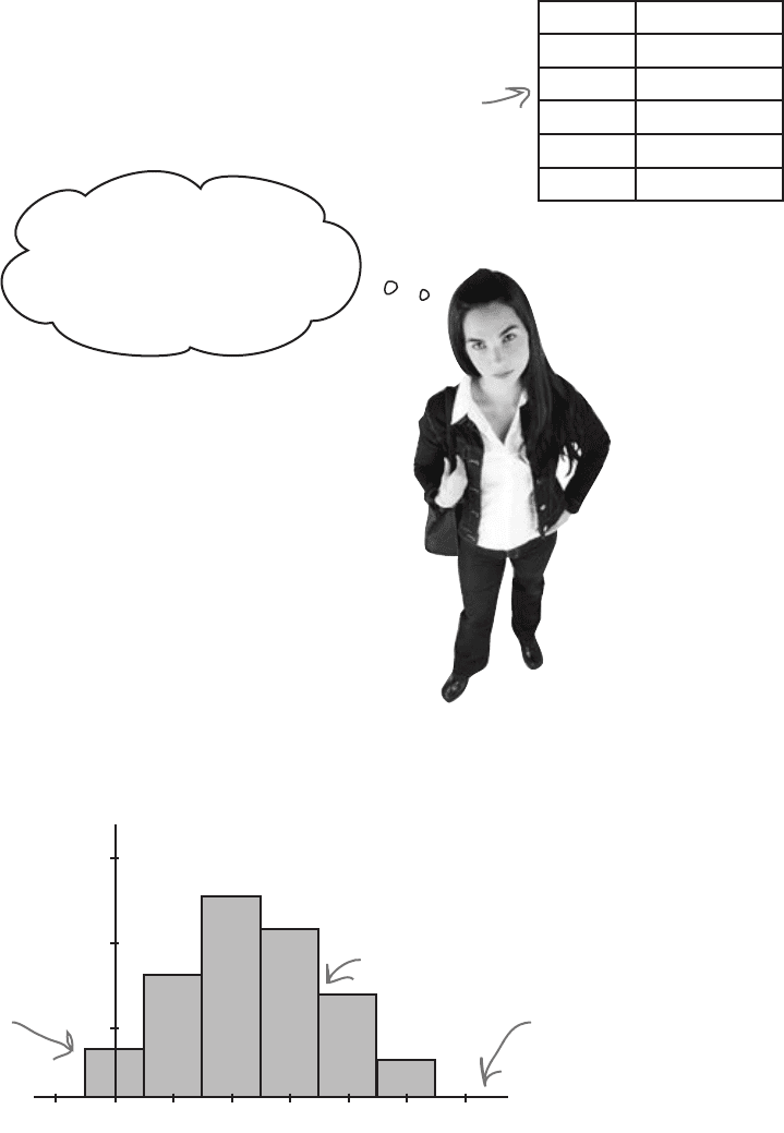
So what impact does this have on the chart for Manic Mango?
weight
length
time
breed of dog
type of dessert
categorical and numerical data
you are here 4 19
visualizing information
No. Games
Dealing with grouped data
The latest set of data from the Manic Mango CEO is numeric and,
what’s more, the scores are grouped into intervals. So what’s the best
way of charting data like this?
Score Frequency
0-199 5
200-399 29
400-599 56
600-799 17
800-999 3
The scores are
numeric and
grouped into
intervals
That’s easy, don’t we just
use a bar chart like we did
before? We can treat each
group as a separate category.
We could, but there’s a better way.
Rather than treat each range of scores as a separate category, we
can take advantage of the data being numeric, and present the data
using a continuous numeric scale instead. This means that instead
of using bars to represent a single item, we can use each bar to
represent a range of scores.
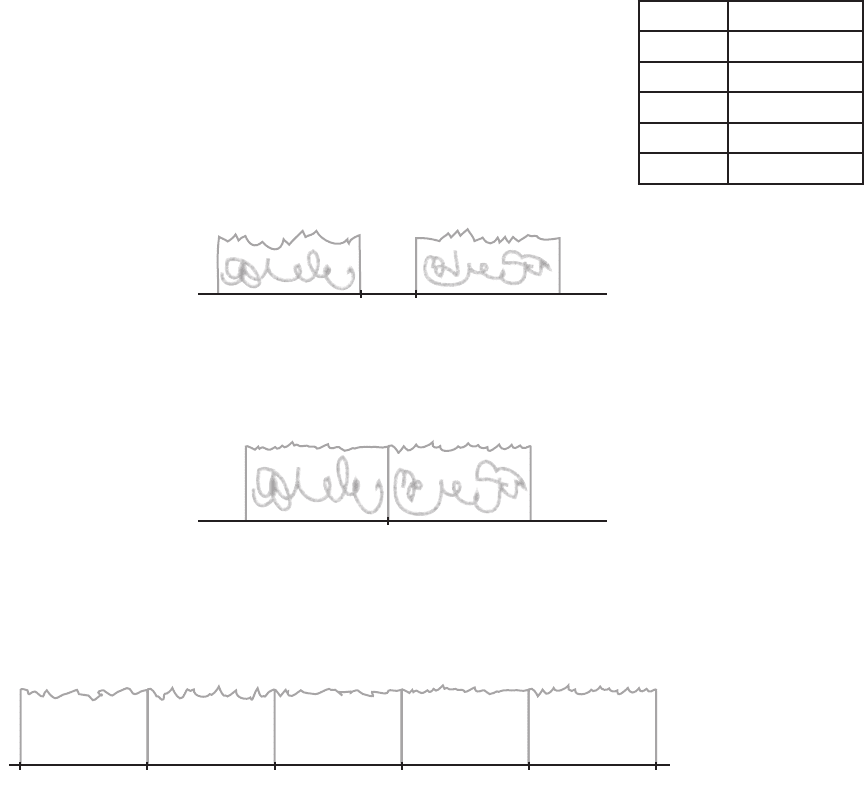
To do this, we can create a histogram.
Histograms are like bar charts but with two key differences. The
first is that the area of each bar is proportional to the frequency, and
the second is that there are no gaps between the bars on the chart.
Here’s an example of a histogram showing the average number of
games bought per month by households in Statsville:
Values are shown on a
continuous numeric scale.
There are no gaps
between the bars.
The area of each
bar is proportional
to the frequency.
frequency
2
1
3
0 1 2 3 4 5-1 6
No. Games Bought per Month
20 Chapter 1
The first step to creating a histogram is to look at each of the intervals and
work out how wide each of them needs to be, and what range of values
each one needs to cover. While doing this, we need to make sure that there
will be no gaps between the bars on the histogram.
Let’s start with the first two intervals, 0–199 and 200–399. At face value,
the first interval finishes at score 199, and the second starts at score 200.
The problem with plotting it like this, however, is that it would leave a gap
between score 199 and 200, like this:
Score Frequency
0–199 5
200–399 29
400–599 56
600–799 17
800–999 3
Histograms shouldn’t have gaps between the bars, so to get around this,
we extend their ranges slightly. Instead of one interval ending at score
199 and the next starting at score 200, we make the two intervals meet
at 199.5, like this:
Doing this forms a single boundary and makes sure that there are no gaps
between the bars on the histogram. If we complete this for the rest of the
intervals, we get the following boundaries:
0-199
200-399
400-599
600-799
800-999
Each interval covers 200 scores, and the width of each interval is 200. Each
interval has the same width.
As all the intervals have the same width, we create the histogram by drawing
vertical bars for each range of scores, using the boundaries to form the start
and end point of each bar. The height of each bar is equal to the frequency.
To make a histogram, start by finding bar widths
199 200
199.5
199.5-0.5 399.5 599.5 799.5 999.5
building a histogram