Ware C. Information Visualization: Perception for Design
Подождите немного. Документ загружается.

214 INFORMATION VISUALIZATION: PERCEPTION FOR DESIGN
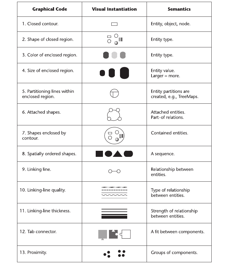
Figure 6.33 The visual grammar of diagram elements (node–link diagrams).
ARE6 1/20/04 5:02 PM Page 214
and the types of relationships. Attributes, when they are shown, are often provided in the form
of text labels attached to the boxes and lines, although occasionally dashed lines and other vari-
ations are used to denote types.
Clearly, there are ways to extend this vocabulary that are perceptually sound. Chapter 7
introduces the concept of a geon diagram as a graphical device that uses 3D objects, with surface
texture and color, to represent entities and relationships. There is a range of possibilities between
the rectangular-box-and-line diagram and fully rendered, colored, and textured 3D objects. We
can make diagram boxes that are more objectlike, with shape and texture denoting various attri-
butes, and we can depict relationships using thin tubes. Most of the different ways of repre-
senting attributes shown in Figure 6.33 are rarely used, although they are relatively easy to
implement with modern computer graphics.
The Grammar of Maps
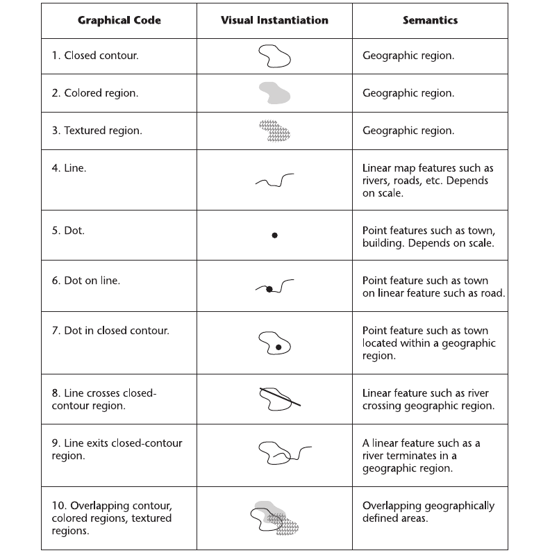
A second visual grammar can be found in the way maps are designed and interpreted. Only three
basic kinds of graphical marks are common to most maps: areas, line features, and point fea-
tures (Mark and Franck, 1996). Figure 6.34 illustrates this basic grammar of maps and shows
how these three elements can work in isolation and in combination.
1, 2, 3. Geographical areas are usually denoted by closed contours, tinted areas, or
textured areas. Often, in a map, all three methods can be used; for example, lines to
represent county boundaries, color-coding to represent climate, and texture to represent
vegetation.
4. Geographical linear features represent either boundaries or elongated geographical regions.
The difference between geographical areas and linear features is sometimes related to
scale. At a small scale, a river will be represented by a thin line of constant width; at a
larger scale, it can become an extended geographical area.
5. Dots or other small symbols are used to represent point features, although whether or not
something is a point feature depends on the scale. At a large scale, an entire city may be
represented by a single dot; at a small scale, a dot might be used to show the locations of
churches, schools, or tourist attractions.
6. A dot on a line means that the entity denoted by the point feature is on, or attached to,
the entity denoted by the linear feature. For example, a city is “on” a river.
7. A dot within a closed contour means that the entity denoted by the point feature lies
within the boundaries of the area feature. For example, a town is within a province.
8. A line crossing a closed-contour region means that a linear feature traverses an area
feature. For example, a road passes through a county.
9. A line that ends in a closed-contour region means that a linear feature ends or starts
within an area feature. For example, a river flows out of a park.
10. Overlapping contour regions denoted by contour, color, or texture denote overlapping
spatial entities. For example, a forested region may overlap a county boundary.
Static and Moving Patterns 215
ARE6 1/20/04 5:02 PM Page 215
216 INFORMATION VISUALIZATION: PERCEPTION FOR DESIGN
Figure 6.34 The visual grammar of map elements.
Maps need not be used only for geographical information. Johnson and Shneiderman
(1991) developed a visualization technique they call a treemap, for displaying information
about the tree data structures commonly used in computer science. Figure 6.35 shows an
example of a tree data structure presented in treemap form and in a conventional node–link
diagram.
ARE6 1/20/04 5:02 PM Page 216
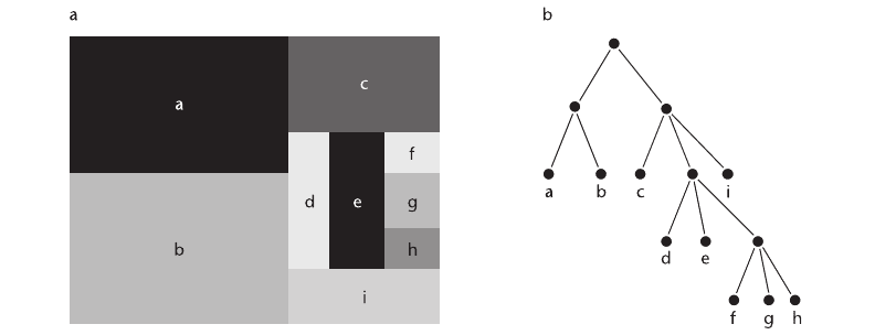
The original treemap was based on the following algorithm. First the rectangle is divided
with a vertical partition according to the number of branches from the root of the tree. Next,
each subrectangle is similarly divided, but with horizontal partitions. This process is repeated to
the “leaves” of the tree. The area of each leaf on the tree corresponds to the amount of infor-
mation that is stored there.
The great advantage of the treemap over conventional tree views is that the amount of infor-
mation on each branch of the tree can be easily visualized. Because the method is space-filling,
it can show quite large trees containing thousands of branches. The disadvantage is that the hier-
archical structure is not as clear as it is in a more conventional tree drawing, which is a special-
ized form of node–link diagram.
Patterns in Motion
To this point, we have mainly discussed the use of static patterns to represent data, even though
the data is sometimes dynamic—as in the case of a vector field representing a pattern of moving
liquid or moving gas. We can also use motion as a display technique to represent data that is
either static or dynamic. The perception of dynamic patterns is not understood as well as the
perception of static patterns. But we are very sensitive to patterns in motion and, if we can learn
to use motion effectively, it may be a good way to display certain aspects of data.
We start by considering the problem of how to represent data communications with
computer animation. One way of doing this is to use a graphical object to represent each
packet of information and then to animate that package from the information source to its
destination.
Static and Moving Patterns 217
Figure 6.35 (a) A treemap representation of hierarchical data. Areas represent the amount of data stored in parts of
the tree data structure. (b) The same tree structure, represented using a node–link diagram.
ARE6 1/20/04 5:02 PM Page 217
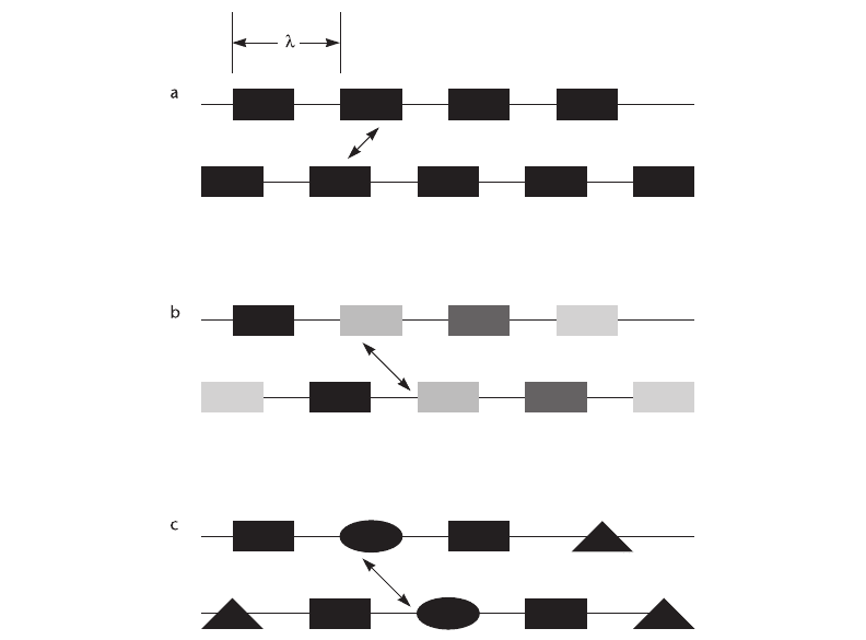
First we consider the simplest case—data represented by a series of identical and equally
spaced graphical elements, as shown in Figure 6.36. In this case, there is a fundamental limita-
tion on the throughput that can be represented. In a computer animation sequence, the basic
process is a loop that involves drawing the animated object, displaying it, moving it, and then
redrawing it. When this cycle is repeated fast enough, a sequence of static pictures is seen as a
smoothly moving image. The limitation on perceived data throughput arises from the amount
that a given object can be moved before it becomes confused with another object in the next
frame—this is called the correspondence problem.
If we define the distance between pattern elements as l, we are limited to a maximum dis-
placement of l/2 on each frame of animation before the pattern is more likely to be seen as
moving in the reverse direction from that desired. The problem is illustrated in Figure 6.36(a).
218 INFORMATION VISUALIZATION: PERCEPTION FOR DESIGN
Figure 6.36 If motion is represented using a regular sequence of identical and equally spaced elements, there is a
strict limit on the throughput that can be perceived. This limit can be extended by varying the sizes and
shapes of the graphical elements.
ARE6 1/20/04 5:02 PM Page 218
When all the elements are identical, the brain constructs correspondences based on object prox-
imity in successive frames. This is sometimes called the wagon-wheel effect, because of the
tendency of wagon wheels in Western movies to appear to be rotating in the wrong direction.
Experiments by Fleet (1998) suggest that the maximum change per frame of animation for motion
to reliably be seen in a particular direction is about l⁄3 for the basic representation shown in
Figure 6.36(a). Given an animation frame rate of 60 frames per second, this establishes an upper
bound of 20 messages per second that can be represented.
There are many ways in which the correspondence limitation can be overcome by giving the
graphical elements a different shape, orientation, or color. Two possibilities are illustrated in
Figure 6.36(b) and (c). In one, the gray values of the elements are varied from message to message;
in the other, the shapes of the elements are varied. Research with element shapes suggests that
correspondence of shape is more important than correspondence of color in determining per-
ceived motion (Caelli et al., 1993). In a series of experiments that examined a variety of enhanced
representations like those illustrated in Figure 6.36(b) and (c), Fleet (1998) found that the average
phase shift per animation frame could be increased to 3l before correspondence was lost. Given
an animation frame rate of 60 frames per second, this translates to an upper bound of 180 mes-
sages per second that can be represented using animation.
Of course, when the goal is to visualize high traffic rates, there is no point in representing
individual messages in detail. Most digital communications systems transfer millions of data
packets per second. What is important at high data rates is an impression of data volumes, the
direction of traffic flow, and large-scale patterns of activity.
Form and Contour in Motion
A number of studies have shown that people can see relative motion with great sensitivity. For
example, contours and region boundaries can be perceived with precision in fields of random
dots if defined by differential motion alone (Regan, 1989; Regan and Hamstra, 1991). Human
sensitivity to such motion patterns rivals our sensitivity to static patterns; this suggests that
motion is an underutilized method for displaying patterns in data.
For purposes of data display, we can treat motion as an attribute of a visual object, much
as we consider size, color, and position to be object attributes. We evaluated the use of simple
sinusoidal motion in enabling people to perceive correlations between variables (Limoges et al.,
1989). We enhanced a conventional scatter plot representation by allowing the points to oscil-
late sinusoidally, either horizontally or vertically (or both) about a center point. An experiment
was conducted to discover whether the frequency, phase, or amplitude of point motion was the
most easily “read.” The task was to distinguish a high correlation between variables from a low
one. A comparison was made with more conventional graphical techniques, including using point
size, gray value, and x,y position in a conventional scatter plot. The results showed that data
mapped to phase was perceived best; in fact, it was as effective as most of the more conventional
techniques, such as the use of point size or gray value. In informal studies, we also showed that
motion appears to be effective in revealing clusters of distinct data points in a multidimensional
Static and Moving Patterns 219
ARE6 1/20/04 5:02 PM Page 219
data space (see Figure 6.37). Related data shows up as clouds of points moving together in ellip-
tical paths, and these can be easily differentiated from other clouds of points.
Moving Frames
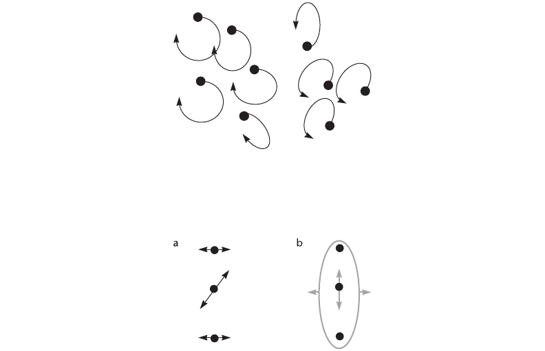
Perceived motion is highly dependent on its context. Johansson (1975) has demonstrated a
number of grouping phenomena that show that the brain has a strong tendency to group moving
objects in a hierarchical fashion. One of the effects he investigated is illustrated in Figure 6.38.
In this example, three dots are set in motion. The two outer dots move in synchrony in a hori-
zontal direction. The third dot, located between the other two, also moves in synchrony but in
an oblique direction. However, the central dot is not perceived as moving along an oblique path.
Instead, what is perceived is illustrated in 6.38(b). An overall horizontal motion of the entire
group of dots is seen; within this group, the central dot also appears to move vertically.
A rectangular frame provides a very strong contextual cue for motion perception. It is so
strong that if a bright frame is made to move around a bright static dot in an otherwise
220 INFORMATION VISUALIZATION: PERCEPTION FOR DESIGN
Figure 6.37 An illustration of the elliptical motion paths that result when variables are mapped to the relative phase
angles of oscillating dots. The result is similar elliptical motion paths for points that are similar. In this
example, two distinct groups of oscillating dots are clearly perceived.
Figure 6.38 When dots are set in synchronized motion, as shown in (a), what is actually perceived is shown in (b).
The entire group of dots is seen to move horizontally, and the central dot moves vertically within the
group.
ARE6 1/20/04 5:02 PM Page 220
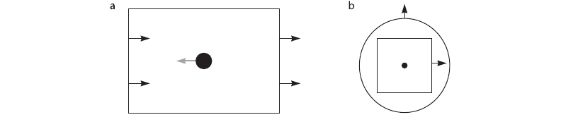
completely dark environment, it is often the static dot that appears to move (Wallach, 1959).
Wallach also showed that the effect works in a hierarchical fashion. Thus, the perceived motion
of the static dot in Figure 6.39(b) is strongly influenced by the motion of a surrounding square
frame, but it is much less influenced by the motion of the circle outside the square.
Computer animation is often used in a straightforward way to display dynamic phenomena,
such as a particle flow through a vector field. In these applications, the main goal from a per-
ceptual point of view is to bring the motion into the range of human sensitivities. The issue is
the same for viewing high-speed or single-frame movie photography. The motions of flowers
blooming or bullets passing through objects are speeded up and slowed down, respectively, so
that we can perceive the dynamics of the phenomena. Humans are reasonably sensitive to motion
ranging from a few millimeters per second to a few hundred millimeters per second for objects
viewed at normal screen distances. Generally, the data animator should aim for motion in the
midrange of a few centimeters per second. (See Chapter 2 for some of the basic issues related to
motion sensitivity.)
The use of motion to help us distinguish patterns in abstract data is at present only a research
topic, albeit a very promising one. One application of the research results is the use of frames to
examine dynamic flow field animations. Frames can be used as an effective device for highlight-
ing local relative motion. If we wish to highlight the local relative motion of a group of parti-
cles moving through a fluid, a rectangular frame that moves along with the group will create a
reference area within which local motion patterns can emerge.
Another way in which motion patterns are important is in helping us to perceive visual space
and rigid 3D shapes. This topic is covered in Chapter 8 in the context of the other mechanisms
of space perception.
Expressive Motion
Using moving patterns to represent motion on communication channels, or in vector fields, is a
rather obvious use of motion for information display, but there are other, more subtle uses.
There appears to be a vocabulary of expressive motion comparable in richness and variety to
the vocabulary of static patterns explored by the Gestalt psychologists. In the following sections,
Static and Moving Patterns 221
Figure 6.39 (a) When a stationary dot is placed within a moving frame in a dark room, it is the dot that is perceived to
move in the absence of other cues. (b) The effect is hierarchical.
ARE6 1/20/04 5:02 PM Page 221

some of the more provocative results are discussed, together with their implications for data
visualization.
Perception of Causality
When we see a billiard ball strike another and set the second ball in motion, we perceive that
the motion of the first ball causes the motion of the second, according to the work of Michotte
(translated 1963). Michotte’s book The Perception of Causality is a compendium of dozens of
experiments, each showing how variations in the basic parameters of velocity and event timing
can radically alter what is perceived. He conducted detailed studies of the perception of interac-
tions between two patches of light and came to the conclusion that the perception of causality
can be as direct and immediate as the perception of simple form. In a typical experiment, illus-
trated in Figure 6.40, one rectangular patch of light moved from left to right until it just touched
a second patch of light, then stopped. At this point, the second patch of light would start to
move. This was before the advent of computer graphics, and Michotte conducted his experiments
with an apparatus that used little mirrors and beams of light. Depending on the temporal rela-
tionships between the moving-light events and their relative velocities, observers reported
different kinds of causal relationships, variously described as “launching,” “entraining,” or “trig-
gering.”
Precise timing is required to achieve perceived causality. For example, Michotte found that
for the effect he called launching to be perceived, the second object had to move within 70 mil-
liseconds of contact; after this interval, subjects still perceived the first object as setting the second
object in motion, but the phenomenon was qualitatively different. He called it delayed launch-
ing. Beyond about 160 milliseconds, there was no longer an impression that one event caused
the other; instead, unconnected movements of the two objects were perceived. Figure 6.41 pro-
vides a reproduction of some of his results. For causality to be perceived, visual events must be
synchronized within at least one-sixth of a second. Given that virtual-reality animation often
occurs at only about 10 frames per second, events should be frame-accurate for clear causality
to be perceived.
If an object makes contact with another and the second object moves off at a much greater
velocity, a phenomenon that Michotte called triggering is perceived. The first object does not
seem to cause the second object to move by imparting its own energy; rather, it appears that
contact triggers propelled motion in the second object.
222 INFORMATION VISUALIZATION: PERCEPTION FOR DESIGN
Figure 6.40 Michotte (1963) studied the perception of causal relationships between two patches of light that always
moved along the same line but with a variety of velocity patterns.
ARE6 1/20/04 5:02 PM Page 222

More recent developmental work by Leslie and Keeble (1987) has shown that infants at only
27 weeks of age can perceive causal relations such as launching. This would appear to support
the contention that such percepts are in some sense basic to perception.
The significance of Michotte’s work for data visualization is that it provides a way to increase
the expressive range beyond what is possible with static diagrams. In a static visualization, the
visual vocabulary for representing relationships is quite limited. To show that one visual object
is related to another, we can draw lines between them, we can color or texture groups of objects,
or we can use some kind of simple shape coding. The only way to show a causal link between
two objects is by using some kind of conventional code, such as a labeled arrow. However, such
codes owe their meaning more to our ability to understand conventional coded language symbols
than to anything essentially perceptual. This point about the differences between language-based
and perceptual codes is elaborated in Chapter 9. What Michotte’s work gives us is the ability to
significantly enrich the vocabulary of things that can be immediately and directly represented in
a diagram.
Perception of Animate Motion
In addition to the fact that we can perceive causality using simple animation, there is evidence
that we are highly sensitive to motion that has a biological origin. In a series of now-classic
studies, Gunnar Johansson attached lights to the limb joints of actors (Johansson, 1973). He then
produced moving pictures of the actors carrying out certain activities, such as walking and
Static and Moving Patterns 223
Figure 6.41 From Michotte (1963). When one object comes into contact with another and the second moves off, the
first motion may be seen to cause the second if the right temporal relationships exist. The graph shows
how different kinds of phenomena are perceived, depending on the delay between the arrival of one
object and the departure of the other.
ARE6 1/20/04 5:02 PM Page 223