Susan Weinschenk, PhD. 100 things every designer needs to know about people. 2011
Подождите немного. Документ загружается.


WHAT MOTIVATES PEOPLE
128
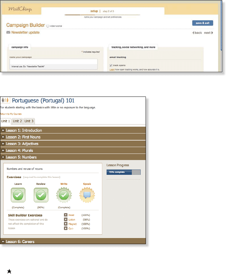
FIGURE55.2 MailChimp shows your progress in creating an e-mail campaign
FIGURE55.3 Livemocha shows your progress at a glance
Courtesy of Livemocha (www.livemocha.com).
You can earn points by completing your training, as well as by helping other people
learn a language you already know. The points can be accumulated and redeemed for
access to premium learning exercises (Figure55.4).

129
55 PEOPLE ARE MOTIVATED BY PROGRESS, MASTERY, AND CONTROL
FIGURE55.4 You can accumulate points at Livemocha by completing your lessons and
helping others
Every time you sign on to Livemocha, you see a dashboard that shows your progress
(Figure55.5).
FIGURE55.5 Livemocha shows you a dashboard as a way
to motivate you to move forward
Mastery can never actually be reached
In Drive, Daniel Pink says that mastery can be approached, but never really reached.
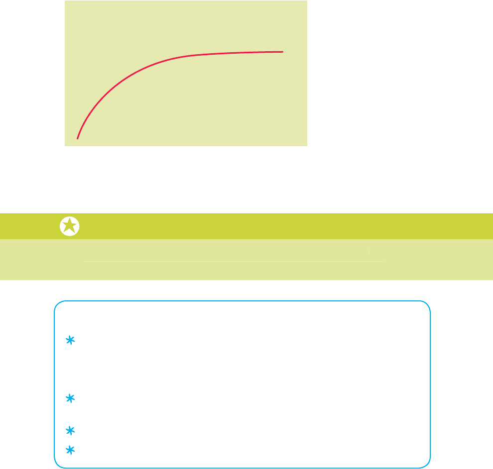
Figure55.6 (on the next page) shows what this constant getting closer but never reach-
ing looks like on a graph. The graph is known as an asymptote. You can get better and
better, but you don’t really reach an endpoint. This is one of the factors that makes mas-
tery such a compelling motivator.
In
D
rive,
D
anie
l
P
in
k
says t
h
at mastery can
b
e approac
h
e
d
,
b
ut never rea
ll
y reac
h
e
d
.
F
ig
ure55.
6
(
on the next page
)
shows what this constant getting closer but never reach
-
i
n
g
looks like on a
g
raph. The
g
raph is known as an as
y
mptote. You can
g
et better and
better, but you don’t really reach an endpoint. This is one of the factors that makes ma
s
-
tery suc
h
a compe
ll
ing motivator.
5
5

WHAT MOTIVATES PEOPLE
130
Level of Mastery
Time
FIGURE55.6 According to Daniel Pink, mastery is an asymptote—
it can never be fully reached
Watch a video about Daniel Pink’s ideas
Daniel Pink has a great animated video about the ideas in his book, Drive. You can
watch the animated video at: http://www.youtube.com/watch?v=u6XAPnuFjJc
Takeaways
If you want to build loyalty and have repeat customers (for example, repeat visitors to
your Web site), you’ll need to have activities that people inherently want to do (such as
connecting with their friends, or mastering something new), rather than just activities
for which people are getting paid.
If people have to do a task that’s boring, you can help motivate them by acknowledg-
ing that it’s boring and then letting them do it their own way.
Look for ways to help people set goals and track them.
Show people how they’re progressing toward goals.
Daniel Pink has a
g
reat animated video about the ideas in his book, Driv
e
. Y
ou
ca
n
watch the animated video at: http:
//
www.
y
outube.com
/
watch?v=u6XAPnuF
j
Jc

131
56 PEOPLE’S ABILITY TO DELAY GRATIFICATION (OR NOT) STARTSYOUNG
56 PEOPLE’S ABILITY TO DELAY
GRATIFICATION (OR NOT)
STARTSYOUNG
You want to buy that Kindle, but you’re thinking maybe you should wait a while. Maybe you
should see if the price comes down later this year, or maybe you should pay down your
credit card debt before you spend money on a new gadget for yourself. Do you wait or not?
Whether you’re the type of person who can delay gratification or not, chances are
high that you’ve been this way (a delayer or not a delayer) since you were a young child.
Starting in the late 1960s and early 1970s, Walter Mischel conducted a series of stud-
ies on delayed gratification. Years later he followed up with the original people in his
study. He found that when the people in the study who were able to delay gratification
became teenagers, they were more successful in school, received higher test scores on
the SAT, and were better able to cope with stress and frustration. He followed them into
adulthood and the dierences continued. On the other side, the children in the original
studies who could not delay gratification as preschoolers were more likely to have prob-
lems as adults, including drug abuse.
Watch a video about Mischel’s experiment
Here’s a video with an update on Walter Mischel’s experiment, called the Marshmallow
Experiment: http://www.youtube.com/watch?v=6EjJsPylEOY
Ozlem Ayduk from the University of California, Berkeley, is bringing these same indi-
viduals back to the lab. The researchers are using fMRI brain imaging to get a better look
at the parts of the brain that are active in delayed gratification. As I write this book, her
research is not yet completed and published.
Takeaways
Some people are good at delaying gratification and others are not.
People who are not good at delaying gratification will be more suggestible to images
and messages of scarcity (for example, “only three left in stock” or “only available till
the end of the month”).
Here’s a video with an u
p
date on Walter Mischel’s ex
p
eriment, called the Marshmallow
Experiment: http://www.youtube.com/watch?v=6EjJsPylEOY
56

WHAT MOTIVATES PEOPLE
132
57 PEOPLE ARE INHERENTLY LAZY
It might be exaggerating a bit to say that people are inherently lazy. But research does
show us that people will do the least amount of work possible to get a task done.
IS LAZY ANOTHER WORD FOR EFFICIENT?
Over eons of evolution, humans have learned that they will survive longer and bet-
ter if they conserve their energy. You want to spend enough energy to have enough
resources (food, water, sex, shelter), but beyond that you are wasting your energy if
you spend too much time running around getting or doing more stu. Of course, ques-
tions about how much is enough, and whether we have enough stu yet, and how long
should the stu last (and on and on), still vex us, but putting the philosophical questions
aside, for most activities, most of the time, humans work on a principle called satisficing.
SATISFY PLUS SUFFICE EQUALS SATISFICE
Herbert Simon is credited with coining the term satisfice. He used it to describe a deci-
sion-making strategy in which the person decides to pick the option that is adequate,
rather than optimal. The idea of satisficing is that the cost of making a complete analysis
of all the options is not only not worth it, but may be impossible. According to Simon we
often don’t have the cognitive faculties to weigh all the options. So it makes more sense
to make a decision based on “what will do” or what is “good enough” rather than trying
to find the optimal or perfect solution. If people satisfice rather than optimize, there are
implications for the design of Web sites, software, and other products.
DESIGN WEB SITES FOR SCANNING, NOT READING
In his book Don’t Make Me Think (2005), Steve Krug applies the idea of satisficing to the
behavior you can observe when someone comes to your Web site. You’re hoping the visi-
tor will read the whole page, but, as Krug says, “What they actually do most of the time (if
we’re lucky) is glance at each new page, scan some of the text, and click on the first link
that catches their interest or vaguely resembles the thing they’re looking for. There are
usually large parts of the page that they don’t even look at.” Krug talks about Web pages
being like billboards. You have to assume that people are taking a quick glance.
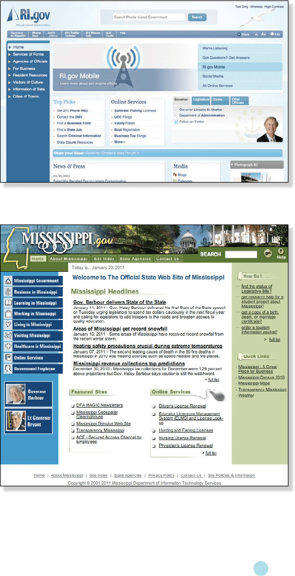
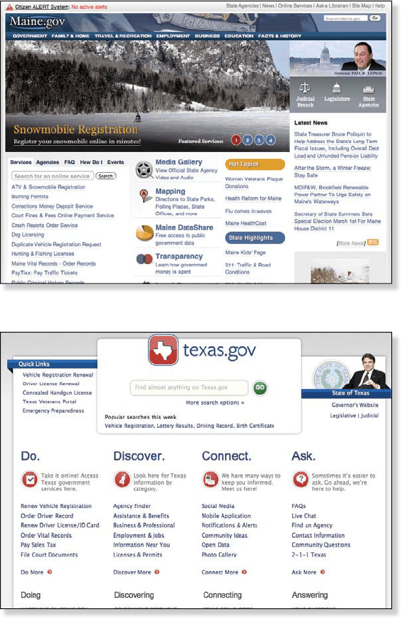
Keeping this idea in mind, look quickly at the following four screenshots of the home
pages of several state government Web sites in the U.S. Imagine that you’re making a trip
to the state, and you’re looking for tourism information. Don’t study any of the pages, just
glance briefly at Figure57.1, Figure57.2, Figure57.3, and Figure57.4.

133
57 PEOPLE ARE INHERENTLY LAZY
FIGURE57.1 Rhode Island state Web site
FIGURE57.2 Mississippi state Web site
5
7

WHAT MOTIVATES PEOPLE
134
FIGURE57.3 Maine state Web site
FIGURE57.4 Texas state Web site
With this quick look you might get the feeling that the Maine and Texas Web sites will
require less work than the others. You make a decision that a particular Web site will be
easy to use based on the impression the site provides in one or two seconds of viewing.
The Maine and Texas sites have more white space and a larger font size. Plus the Texas

135
57 PEOPLE ARE INHERENTLY LAZY
site puts Search literally front and center. These factors make it seem like it will be easy
enough or good enough to find the information you’re looking for. The first impressions
about satisficing can be critically important in determining whether someone stays at the
Web site or not.
Takeaways
Assume that people will get things done with the least amount of work possible. That
may not always be the case, but it’s true more often than not.
People will satisfice, that is, look for the good-enough solution rather than the optimal
solution.
5
7

WHAT MOTIVATES PEOPLE
136
58 PEOPLE WILL LOOK FOR SHORTCUTS
ONLY IF THE SHORTCUTS ARE EASY
Do you use keyboard shortcuts when you’re typing on the computer? Do you use some,
but not others? Why do you do that?
People will look for ways to do something faster and with fewer steps. This is espe-
cially true if it’s a task they’re doing over and over. But if the shortcut is too hard to find,
or if a habit is ingrained, then people will keep doing it the old way. This seems paradoxi-
cal, but it’s all about the perceived amount of work. If it seems like too much work to find
a shortcut, then people will stay with their old habits (they are even satisficing about
satisficing).
PROVIDE DEFAULTS
Defaults reduce the amount of work needed to complete a task. When you provide
defaults, for example, filling in the person’s name and address automatically on a Web
form, then there is less work to finish the form. But there are some potential problems
with defaults. One is that people don’t always notice defaults, and so may end up
accepting a default without meaning to. Here again, the answer lies in the amount of
eort. If it takes a lot of work to change the result of accepting “wrong” defaults, then
think twice about using them in your design.
When defaults create more work, not less
Recently I bought a pair of shoes for my online daughter. The next time I went to the
Web site, it was to buy a pair of shoes for myself. But the default shipping address was
the last address used—my daughter’s, not mine. I didn’t notice that the shipping address
had filled in with a default that was not my home address. My daughter was surprised to
get a pair of shoes she hadn’t asked for. In this case, having a default operating meant a
lot more work for both my daughter and me.
Takeaways
Provide shortcuts as long as they are easy to learn, find, and use, but don’t assume
that people will always use them.
Provide defaults if you know what most people will want to do most of the time, and if
the result of choosing a default by mistake does not cause costly errors.

137
59 PEOPLE ASSUME IT’S YOU, NOT THESITUATION
59 PEOPLE ASSUME IT’S YOU,
NOT THESITUATION
A man is walking down a busy city street on his way to an appointment, and he sees
what looks like a college student drop a folder of papers. The papers scatter on the
ground and the man glances over but keeps on walking. What do you think? Why didn’t
the man stop to help with the papers?
If you answer “Well, he’s a self-absorbed person who doesn’t usually help out strang-
ers on the street,” then chances are likely that you have just made a fundamental attri-
bution error. People have a tendency to give personality-based explanations for other
peoples’ behavior more weight than situational factors. Alternatively, instead of explain-
ing the person’s behavior in the story above as being due to his “self absorption,” you
might ascribe his behavior to the situation, for example, “He’s late for a critical meeting
with the bank and doesn’t have time to stop today. In other circumstances he would have
stopped.” But in reality you don’t apply that situational motivation to him. You assume it’s
not the situation, but his personality that is causing his behavior.
BUT FOR YOU, IT’S SITUATIONAL
On the other hand, if you’re analyzing and explaining your own behavior and motiva-
tions, then you will tend to think the opposite of what you attribute to others. In other
words, you assume that your motivation and behavior are based on a reaction to the
situation, not to personality factors. If you didn’t stop and help the person pick up the
papers, you would say it was because you were late for your meeting and didn’t have
time to stop, or some other situation-based explanation.
Research on the fundamental attribution error shows the following:
In cultures that value individualistic behavior (like the U.S.), it’s common to
ascribe other people’s behavior to personality. The fundamental attribution
error is common in these cultures.
On the other hand, in individualistic cultures people tend to ascribe their own
behavior to situational factors more than personality factors.
In cultures that value collectivist behavior (China, for example), people make the
same fundamental attribution error, but not as often as in individualist cultures.
Most of the research has to do with individuals deciding whether their actions are
influenced by their personality versus situational factors. It seems that they are. People
attribute the decisions of an “other group” to the individual member’s attitudes, but attri-
bute the decisions of their own group to the collective group rules.
5
9
