Owen Jones. The Grammar of Ornament
Подождите немного. Документ загружается.

T
Owen Jones. The Grammar of Ornament. London, 1856.
cary collection, rochester institute of technology
T
Owen Jones. The Grammar of Ornament. London, 1856.
cary collection, rochester institute of technology
T
Owen Jones. The Grammar of Ornament. London, 1856.
cary collection, rochester institute of technology
T
Owen Jones. The Grammar of Ornament. London, 1856.
cary collection, rochester institute of technology
view 1868 color plates
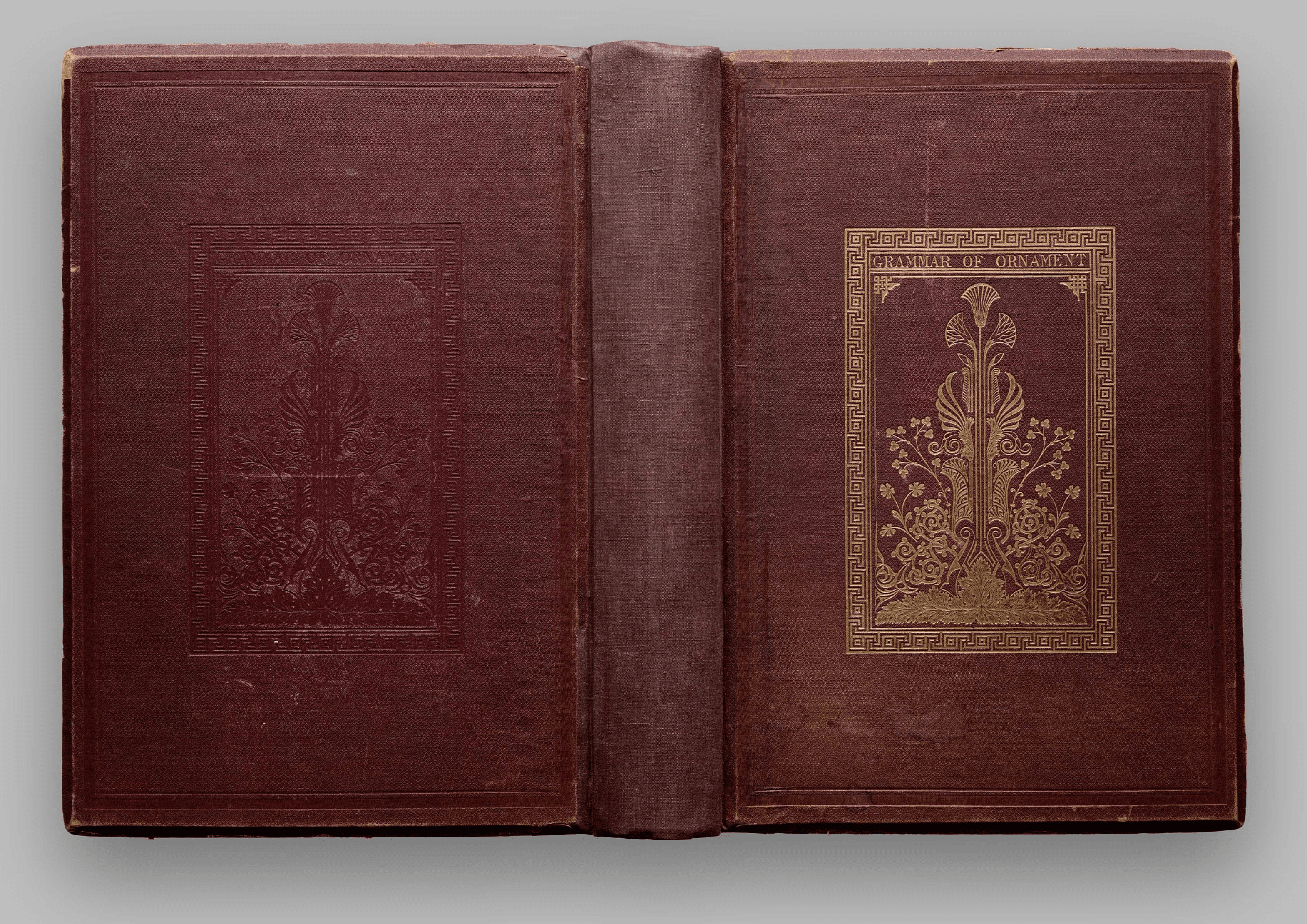
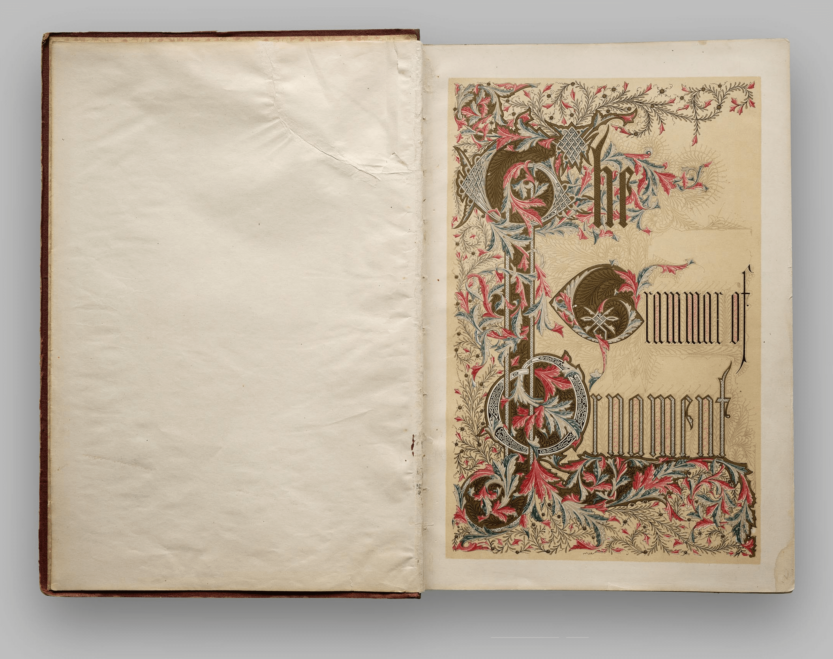
THE
GRAMMAR OF ORNAMENT
BY
OWEN JONES.
ILLUSTRATED BY EXAMPLES
FROM VARIOUS STYLES OF ORNAMENT.
ONE HUNDRED AND TWELVE PLATES.
LONDON:
PUBLISHED BY DAY AND SON, LIMITED,
GATE STREET, LINCOLN’S INN FIELDS.
T
Owen Jones. The Grammar of Ornament. London, 1856.
cary collection, rochester institute of technology
PREFACE TO THE FOLIO EDITION.
I
T
would be far beyond the limits of the powers of any one individual to
attempt to gather together illustrations of the innumerable and ever-varying
phases of Ornamental Art. It would be barely possible if undertaken by a
Government, and even then it would be too voluminous to be generally useful.
All, therefore, that I have proposed to myself in forming the collection which I
have ventured to call the Grammar of Ornament, has been to select a few of
the most prominent types in certain styles closely connected with each other, and
in which certain general laws appeared to reign independently of the individual
peculiarities of each. I have ventured to hope that, in thus bringing into
immediate juxtaposition the many forms of beauty which every style of ornament
presents, I might aid in arresting that unfortunate tendency of our time to
be content with copying, whilst the fashion lasts, the forms peculiar to any
bygone age, without attempting to ascertain, generally completely ignoring, the
peculiar circumstances which rendered an ornament beautiful, because it was
appropriate, and which, as expressive of other wants when thus transplanted, as
entirely fails.
It is more than probable that the first result of sending forth to the world
T
Owen Jones. The Grammar of Ornament. London, 1856.
cary collection, rochester institute of technology
this collection will be seriously to increase this dangerous tendency, and that
many will be content to borrow from the past those forms of beauty which
have not already been used up ad nauseam. It has been my desire to arrest
this tendency, and to awaken a higher ambition.
If the student will but endeavour to search out the thoughts which have
been expressed in so many different languages, he may assuredly hope to find
an ever-gushing fountain in place of a half-filled stagnant reservoir.
In the following chapters I have endeavoured to establish these main facts,—
First. That whenever any style of ornament commands universal admira-
tion, it will always be found to be in accordance with the laws which regulate
the distribution of form in nature.
Secondly. That however varied the manifestations in accordance with these
laws, the leading ideas on which they are based are very few.
Thirdly. That the modifications and developments which have taken place
from one style to another have been caused by a sudden throwing off of some
fixed trammel, which set thought free for a time, till the new idea, like the old,
became again fixed, to give birth in its turn to fresh inventions.
Lastly. I have endeavoured to show, in the twentieth chapter, that the
future progress of Ornamental Art may be best secured by engrafting on the
experience of the past the knowledge we may obtain by a return to Nature
for fresh inspiration. To attempt to build up theories of art, or to form a style,
independently of the past, would be an act of supreme folly. It would be at
once to reject the experiences and accumulated knowledge of thousands of
years. On the contrary, we should regard as our inheritance all the successful
labours of the past, not blindly following them, but employing them simply as
guides to find the true path.
In taking leave of the subject, and finally surrendering it to the judgment of
the public, I am fully aware that the collection is very far from being complete ;
there are many gaps which each artist, however, may readily fill up for himself.
My chief aim, to place side by side types of such styles as might best serve
as landmarks and aids to the student in his onward path, has, I trust, been
fulfilled.
It remains for me to offer my acknowledgment to all those friends who have
kindly assisted me in the undertaking.
In the formation of the Egyptian Collection I received much valuable
assistance from Mr. J. Bonomi, and from Mr. James Wild, who has also con-
tributed the materials for the Arabian Collection, his long residence in Cairo
having afforded him the opportunity of forming a very large collection of
Cairean Ornament, of which the portion contained in this work can give but
an imperfect idea, and which I trust he may some day be encouraged to
publish in a complete form.
I am indebted to Mr. T. T. Bury for the plate of Stained Glass. From
Mr. C. J. Richardson I obtained the principal portion of the materials of the
Elizabethan Collection ; from Mr. J. B. Waring, those of the Byzantine, and I
am also indebted to him for the very valuable essays on Byzantine and Eliza-
bethan Ornament. Mr. J. O. Westwood having directed special attention to
the Ornament of the Celtic races, has assisted in the Celtic Collection, and
written the very remarkable history and exposition of the style.
Mr. C. Dresser, of Marlborough House, has provided the interesting plate
No. 8 of the twentieth chapter, exhibiting the geometrical arrangement of
natural flowers.
My colleague at the Crystal Palace, M. Digby Wyatt, has enriched the
work with his admirable essays on the Ornament of the Renaissance and the
Italian periods.
Whenever the material has been gathered from published sources, it has
been acknowledged in the body of the work.
The remainder of the drawings have been chiefly executed by my pupils,
Mr. Albert Warren and Mr. Charles Aubert, who, with Mr. Stubbs, have
reduced the whole of the original drawings, and prepared them for publication.
T
Owen Jones. The Grammar of Ornament. London, 1856.
cary collection, rochester institute of technology
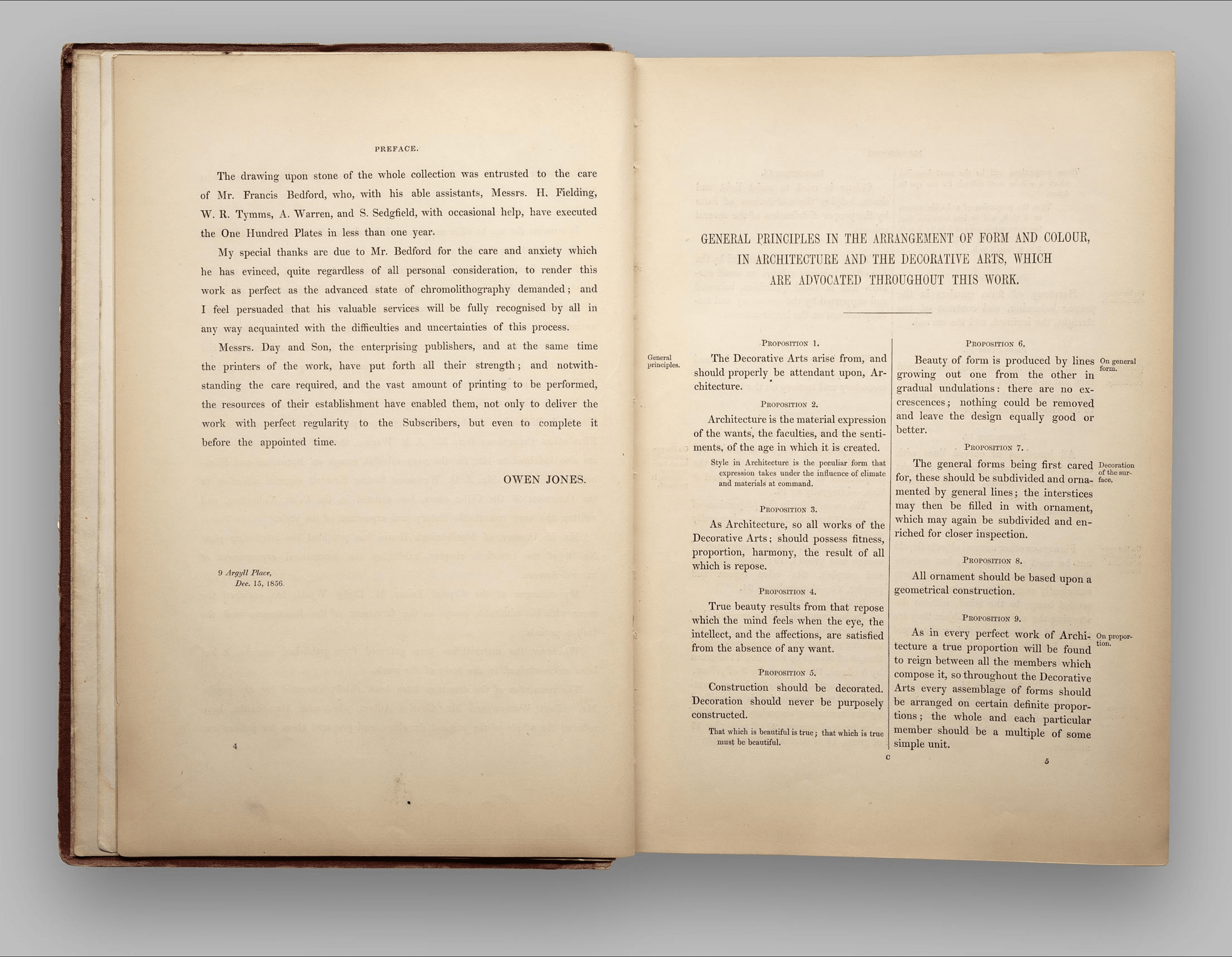
The drawing upon stone of the whole collection was entrusted to the care
of Mr. Francis Bedford, who, with his able assistants, Messrs. H. Fielding,
W. R. Tymms, A. Warren, and S. Sedgfield, with occasional help, have executed
the One Hundred Plates in less than one year.
My special thanks are due to Mr. Bedford for the care and anxiety which
he has evinced, quite regardless of all personal consideration, to render this
work as perfect as the advanced stage of chromolithography demanded ; and
I feel persuaded that his valuable services will be fully recognised by all in
any way acquainted with the difficulties and uncertainties of this process.
Messrs. Day and Son, the enterprising publishers, and at the same time
the printers of the work, have put forth all their strength ; and notwith-
standing the care required, and the vast amount of printing to be performed,
the resources of their establishment have enabled them, not only to deliver the
work with perfect regularity to the Subscribers, but even to complete it
before the appointed time.
OWEN JONES.
9 Argyll Place,
Dec. 15, 1856.
GENERAL PRINCIPLES IN THE ARRANGEMENT OF FORM AND COLOUR,
IN ARCHITECTURE AND THE DECORATIVE ARTS, WHICH
ARE ADVOCATED THROUGHOUT THIS WORK.
P
ROPOSITION
1.
The Decorative Arts arise from, and
should properly be attendant upon, Ar-
chitecture.
P
ROPOSITION
2.
Architecture is the material expression
of the wants, the faculties, and the senti-
ments, of the age in which it is created.
Style in Architecture is the particular form that
expression takes under the influence of climate
and materials at command.
P
ROPOSITION
3.
As Architecture, so all works of the
Decorative Arts, should possess fitness,
proportion, harmony, the result of all
which is repose.
P
ROPOSITION
4.
True beauty results from that repose
which the mind feels when the eye, the
intellect, and the affections, are satisfied
from the absence of any want.
P
ROPOSITION
5.
Construction should be decorated.
Decoration should never be purposely
constructed.
That which is beautiful is true ; that which is true
must be beautiful.
Gen eral
principles.
P
ROPOSITION
6.
Beauty of form is produced by lines
growing out one from the other in
gradual undulations : there are no ex-
crescences ; nothing could be removed
and leave the design equally good or
better.
P
ROPOSITION
7.
The general forms being first cared
for, these should be subdivided and orna-
mented by general lines ; the interstices
may then be filled in with ornament,
which may again be subdivided and en-
riched for closer inspection.
P
ROPOSITION
8.
All ornament should be based upon a
geometrical construction.
P
ROPOSITION
9.
As in every perfect work of Archi-
tecture a true proportion will be found
to reign between all the members which
compose it, so throughout the Decorative
Arts every assemblage of forms should
be arranged on certain definite propor-
tions ; the whole and each particular
member should be a multiple of some
simple unit.
On general
form.
Decoration
of the sur-
face.
On propor-
tion
T
Owen Jones. The Grammar of Ornament. London, 1856.
cary collection, rochester institute of technology
Those proportions will be the most beautiful
which it will be most difficult for the eye to
detect.
Thus the proportion of a double square,
or 4 to 8, will be less beautiful than
the more subtle ratio of 5 to 8 ; 3 to 6,
than 3 to 7 ; 3 to 9, than 3 to 8 ;
3 to 4, than 3 to 5.
P
ROPOSITION
10.
Harmony of form consists in the
proper balancing, and contrast of, the
straight, the inclined, and the curved.
P
ROPOSITION
11.
In surface decoration all lines should
flow out of a parent stem. Every orna-
ment, however distant, should be traced
to its branch and root. Oriental practice.
P
ROPOSITION
12.
All junctions of curved lines with
curved or of curved lines with straight
should be tangential to each other.
Natural law. Oriental practice in ac-
cordance with it.
P
ROPOSITION
13.
Flowers or other natural objects should
not be used as ornaments, but conven-
tional representations founded upon them
sufficiently suggestive to convey the in-
tended image to the mind, without de-
stroying the unity of the object they are
employed to decorate. Universally obeyed
in the best periods of Art, equally violated
when Art declines.
P
ROPOSITION
14.
Colour is used to assist in the devel-
opment of form, and to distinguish
objects or parts of objects one from
another.
On harmony
and contrast.
Distribution.
Radiation.
Continuity.
On the con-
ventionality
of natural
forms.
On colour
generally.
PROPOSITION 15.
Colour is used to assist light and
shade, helping the undulations of form
by the proper distribution of the several
colours.
PROPOSITION 16.
These objects are best attained by the
use of the primary colours on small sur-
faces and in small quantities, balanced
and supported by the secondary and ter-
tiary colours on the larger masses.
PROPOSITION 17.
The primary colours should be used
on the upper portions of objects, the
secondary and tertiary on the lower.
PROPOSITION 18.
(Field’s Chromatic equivalents.)
The primaries of equal intensities will
harmonise or neutralise each other, in the
proportions of 3 yellow, 5 red, and 8
blue,—integrally as 16.
The secondaries in the proportions of
8 orange, 13 purple, 11 green,—integrally
as 32.
The tertiaries, citrine (compound of
orange and green), 19 ; russet (orange
and purple), 21 ; olive (green and
purple), 24 ;— integrally as 64.
It follows that,—
Each secondary being a compound of
two primaries is neutralised by the re-
maining primary in the same proportions:
thus, 8 of orange by 8 of blue, 11 of green
by five of red, 13 of purple by 3 of yellow.
Each tertiary being a binary com-
pound of two secondaries, is neutralised
by the remaining secondary : as, 24 of
olive by 8 of orange, 21 of russet by 11
of green, 19 of citrine by 13 of purple.
On the pro-
portions by
which har-
mony in
colouring is
produced.
P
ROPOSITION
19.
The above supposes the colours to be used in
their prismatic intensities, but each colour has
a variety of tones when mixed with white, or
of shades when mixed with grey or black
When a full colour is contrasted with
another of a lower tone, the volume of
the latter must be proportionally in-
creased.
P
ROPOSITION
20.
Each colour has a variety of hues, obtained by
admixture with other colours, in addition to
white, grey, or black : thus we have of yellow,
—orange-yellow on the one side, and lemon-
yellow on the other ; so of red, —scarlet-red,
and crimson-red ; and of each every variety of
tone and shade.
When a primary tinged with another
primary is contrasted with a secondary,
the secondary must have a hue of the
third primary.
P
ROPOSITION
21.
In using the primary colours on
moulded surfaces, we should place blue,
which retires, on the concave surfaces ;
yellow, which advances, on the convex ;
and red, the intermediate colour, on the
undersides ; separating the colours by
white on the vertical planes.
When the proportions required by Proposition 18
cannot be obtained, we may procure the balance
by a change in the colours themselves : thus,
if the surfaces to be coloured should give too
much yellow, we should make the red more
crimson and the blue more purple, — i.e. we
should take the yellow out of them ; so if the
surfaces should give too much blue, we should
make the yellow more orange and the red more
scarlet.
P
ROPOSITION
22.
The various colours should be so
blended that the objects coloured, when
viewed at a distance, should present a
neutralised bloom.
P
ROPOSITION
23.
No composition can ever be perfect
in which any one of the three primary
colours is wanting, either in its natural
state or in combination.
P
ROPOSITION
24.
When two tones of the same colour
are juxtaposed, the light colour will
appear lighter, and the dark colour
darker.
P
ROPOSITION
25.
When two different colours are juxta-
posed, they receive a double modification ;
first, as to their tone (the light colour
appearing lighter, and the dark colour
appearing darker) ; secondly, as to their
hue, each will become tinged with the
complementary colour of the other.
P
ROPOSITION
26.
Colours on white grounds appear
darker ; on black grounds lighter.
P
ROPOSITION
27.
Black grounds suffer when opposed
to colours which give a luminous comple-
mentary.
P
ROPOSITION
28.
Colours should never be allowed to
impinge upon each other.
P
ROPOSITION
29.
When ornaments in a colour are on a
ground of a contrasting colour, the orna-
ment should be separated from the ground
by an edging of lighter colour ; as a red
flower on a green ground should have an
edging of lighter red.
On the con-
trasts and
harmonious
equivalents
of tones,
shades, and
hues.
On the posi-
tions the
several
colours
should oc-
cupy.
On the law
of simulta-
neous con-
trasts of
colours, de-
rived from
Mons. Chev-
ruil.
On the
means of in-
creasing the
harmonious
effects of
juxtaposed
colours.
Observa-
tions derived
from a con-
sideration of
Oriental
practice.
T
Owen Jones. The Grammar of Ornament. London, 1856.
cary collection, rochester institute of technology
P
ROPOSITION
30.
When ornaments in a colour are on
a gold ground, the ornaments should be
separated from the ground by an edging
of a darker colour.
P
ROPOSITION
31.
Gold ornaments on any coloured
ground should be outlined with black.
P
ROPOSITION
32.
Ornaments of any colour may be sepa-
rated from grounds of any other colour
by edgings of white, gold, or black.
P
ROPOSITION
33.
Ornaments in any colour, or in gold,
may be used on white or black grounds,
without outline or edging.
P
ROPOSITION
34.
In “self-tints,” tones, or shades of the
same colour, a light tint on a dark
ground may be used without outline ;
but a dark ornament on a light ground
requires to be outlined with a still darker
tint.
P
ROPOSITION
35.
Imitations, such as the graining of
woods, and of the various coloured
marbles, allowable only, when the em-
ployment of the thing imitated would not
have been inconsistent.
P
ROPOSITION
36.
The principles discoverable in the
works of the past belong to us ; not so
the results. It is taking the end for the
means.
P
ROPOSITION
37.
No improvement can take place in
the Art of the present generation until
all classes, Artists, Manufacturers, and
the Public, are better educated in Art,
and the existence of general principles is
more fully recognised.
On imita-
tions
LIST OF PLATES.
C
HAP
. I. Ornament of Savage Tribes.
Plate. No.
1 1 Ornaments from Articles belonging to various Savage Tribes, exhibited in the United Service and
British Museums.
2 2 Ditto ditto ditto.
3 3 Ditto ditto ditto.
C
HAP
. II. Egyptian Ornament.
4 1 The Lotus and Papyrus, types of Egyptian ornament.
5 2 Ditto ditto with Feathers and Palm-branches.
6 3 Capitals of Columns, showing the varied applications of the Lotus and Papyrus.
6* 3* Ditto ditto ditto.
7 4 Various Cornices, formed by the Pendent Lotus.
8 5 Ornaments from Mummy Cases in the British Museum and the Louvre.
9 6 Geometrical Ornaments from Ceilings of Tombs.
10 7 Ornaments with Curved Lines from Ceilings of Tombs.
11 8 Various Ornaments from Ceilings and Walls of Tombs.
C
HAP
. III. Assyrian and Persian Ornament.
12 1 Painted Ornaments from Nineveh.
13 2 Ditt ditto.
14 3 Carved Ornaments from Persepolis, and Sassanian Ornaments from Ispahan and Bi-Sutoun.
C
HAP
. IV. Greek Ornament.
15 1 The various Forms of the Greek Fret.
16 2
17 3
18 4 Ornaments from Greek and Etruscan Vases in the British Museum and the Louvre.
19 5
20 6
21 7
22 8 Painted Greek Ornaments from the Temples and Tombs in Greece and Sicily.
T
Owen Jones. The Grammar of Ornament. London, 1856.
cary collection, rochester institute of technology