Garcia Joe. Mastering the Watercolor Wash \ Гарсия Джо. Освоение акварельной отмывки
Подождите немного. Документ загружается.

Materials and Supplies
All watercolor artists tend to use the
same materials. Personal experience
will dictate individual differences in
supplies. Beginning watercolor artists
should be selective in what they pur-
chase. Try not to buy more than is
needed. A 1-inch (25mm) flat and
nos. 4 and 8 rounds will start and fin-
ish almost any painting. Three or four
tubes of paint, a couple of sheets of
22" x 30" (56cm x 76cm) professional-
quality watercolor paper and you are
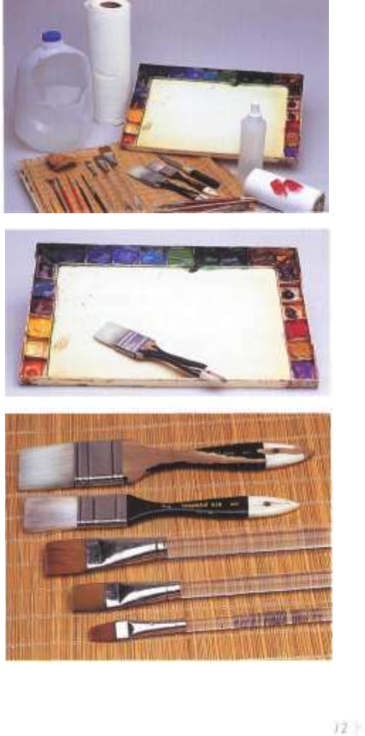
Art Materials
Brushes, palette,
water container,
paper towels or
tissues.
Palette
Any smooth, flat sur-
face will make a good
palette. 1 like to use
the John Pike Palette
shown here with a
1-inch (25mm)
Langnickel flat.
Brus hes—Flats
Listed from bottom
to top: Winsor &
Newton Series 995,
'/2-inch,
3
/4-inch
(19mm) (12mm),
1-inch (25mm);
Langnickel Series
845, 1-inch
(25mm), l'/:-mch
(38mm).
ready to start. Purchase the three pri-
mary paint colors: red, yellow and
blue, which will mix into a wide range
of colors. A good book on color will
explain warm and cool, color mixing,
transparent and opaque, and color per-
manency.
Exchange ideas with fellow artists.
Ask what equipment they use and
why. What is their philosophy and
approach to painting? This may influ-
ence what equipment you want to use.
Becoming discouraged is less likely
when you do not have to overcome
poor-quality materials. My studio and
traveling equipment are very similar,
except in quantity.
Palette
Anything flat will work for a palette.
A white dish, butcher's tray or cookie
sheet will do the job, but a traditional
covered palette is best. It will have
separate wells or reservoirs to hold
individual colors. This helps keep col-
ors from becoming contaminated by
adjacent colors when the palette is
sealed, and the cover keeps the pig-
ments moist. The John Pike or Robert
E. Woods palettes are good examples.
I personally use the Pike palette. Its
heavy construction does not damage
easily.
Brushes
I like to use flats for washes and rounds
for detail work. I can cover large areas
quickly and with more control when
using flats. Good brushes hold their
shape and can carry a lot of wet pig-
ment. I use both sable and synthetic
brushes. The synthetics work fine and
cost much less. The brushes I use are:
IK-inch (38mm), 1-inch (25mm),
3
X-inch (19mm) and /4-inch (12mm)
flats. I use the 1-inch (25mm) and
X-inch (19mm) flats, and nos. 2, 4, 6
and 8 rounds most often. There are
many good manufacturers of brushes.
Robert Simmons, Winsor & Newton
and Grumbacher produce quality
brushes. I use Kolinsky sables for my
natural brushes. The Fritch scrub
brushes work well for lifting, but oil
bristle brushes serve the same purpose.
Paper
There are numerous brands of paper
available. Fabriano, Arches and Kili-
manjaro are just a few of the choices.
Paper comes in three textures: hot-
pressed, which is very smooth; cold-
pressed, which is lightly textured; and
rough, which is heavily textured.
Choice depends on style, subject and
technique. Cold-pressed paper is good
to start with. Paper also comes in vari-
ous weights. I most often use 140-lb.
(300gsm) or 300-lb. (640gsm) Arches.
The weight or thickness is based on a
ream, or five hundred sheets of paper.
A standard-size sheet of watercolor
paper in the United States is 32" x 40"
(81cm x 102cm). As an example, five
hundred sheets of cold-pressed medi-
um-weight Arches paper will weigh
140 pounds (300gsm). It is strong,
durable and can withstand my rough
technique of painting.
Paper stretching should be men-
tioned. It is a process of soaking the
paper and attaching it to your drawing
board. Butcher's or brown paper tape,
staples or clamps can be used for this
purpose. The soaked paper expands,
and as it dries, it will shrink back to its
original size, leaving a very flat surface.
I often paint very wet-into-wet and I
have found that stretched paper will
re-expand and wrinkle. Because of this
problem, I now make my own water-
color board, which is described on
page 14.
Paints
Paints come in numerous brands. Start
with the best. Use professional-quality
paints and you will have fewer prob-
lems. I use Winsor & Newton, Hol-
bein and Da Vinci paints. How you
arrange the colors on your palette
is not as important as how you use
them. When I first started painting I
arranged them by convenience. The
colors I used most often were across
the top, and those used less frequently
along the sides. Over the years, this
has gradually changed—now I arrange
the warm colors on the left, blues and
greens (cool colors) across the top and
earth colors on the right. Whatever
palette arrangement you choose, stay
with it. It saves time and prevents
mixing the wrong paints. The colors I
keep on my palette are: Permanent
Red Medium, New Gamboge, Per-
manent Rose, Alizarin Crimson,
French Ultramarine Blue, Cobalt
Blue, Olive Green, Sap Green, Win-
sor Green, Burnt Sienna, Brown
Madder, Sepia, Burnt Umber and
Raw Sienna. I use tube colors and
keep the reservoirs filled.
Odds and Ends
I keep a lot of odds and ends available
when I paint, things I might need for
convenience or to create a texture.
For example: pencils (2H, 3H, no. 2),
a craft knife or single-edge razor blade,
matches (used to heat the top of
a tube of paint that is stuck tight), a
palette knife and salt for texture, and
Pelikan Graphic White. The list could
go on with sponges, sandpaper, etc.,
but you get the idea. The important
thing is to find what works for you.
Paper towels or tissues, 3M painter's
masking tape and a large water con-
tainer are necessities. Some artists use
two containers; one to wash the brush
and one to rinse. Clean water and
brushes are important.
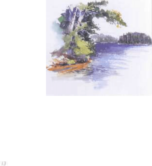
Lake Katherine, Hazelhurst, Wisconsin
Watercolor in 80-lb. (170gsm) cold-pressed
Liberte watercolor sketchbook
9" x 11" (23cm x 28cm)

Making the Watercolor Board
Mini-Demonstration
I like to paint on a surface that will
remain flat no matter how much water
I use. At times I flood the paper with
water. Even 300-lb. (640gsm) paper
will get a slight buckle. My solution to
this problem is to make my own water-
color board. It does not save time or
money, but it allows me to use the
exact surface I want. I also do not have
to contend with any wrinkling or
buckling. It is imperative to use acid-
free or pH-neutral mounting board
and glue. I like to make several boards
of various sizes. When I do not feel
like painting it gives me a project to
do. I use scrap rag mat board left over
from framing for the smaller sizes. For
larger paintings I use a very heavy
mounting board.
Step / ~ Gather the Materials
Gather all the necessary equipment. You do not want to start and
have to stop to look for something at a critical moment. Be prepared.
Materials
Acid-free glue (Seal
Vacuglue or Yes Glue
work well)
Brayer or ink roller
(optional)
Bricks or books for
weights
Bristle brush for glue
application
140-lb. (BOOgsm)
cold-pressed Arches,
any size
Pre-cut mounting
board. I" (3cm)
larger than watercolor
paper (Rag mat board
scraps, Crescent
3XAF mounting
board or Alpharag
Artcare board by
Bambndge can be
used for mounting)
3M painter's tape
Step 2 ~ Glue Application
Carefully brush a thin layer of glue on the back of the watercolor
paper using the bristle brush. The mounting board should be a mini-
mum of 1" (3cm) larger than the watercolor paper. Turn the glued sur-
face over and center it on the mounting board. With your hand or
brayer smooth out the paper. This will remove any air bubbles and
flatten excess glue.
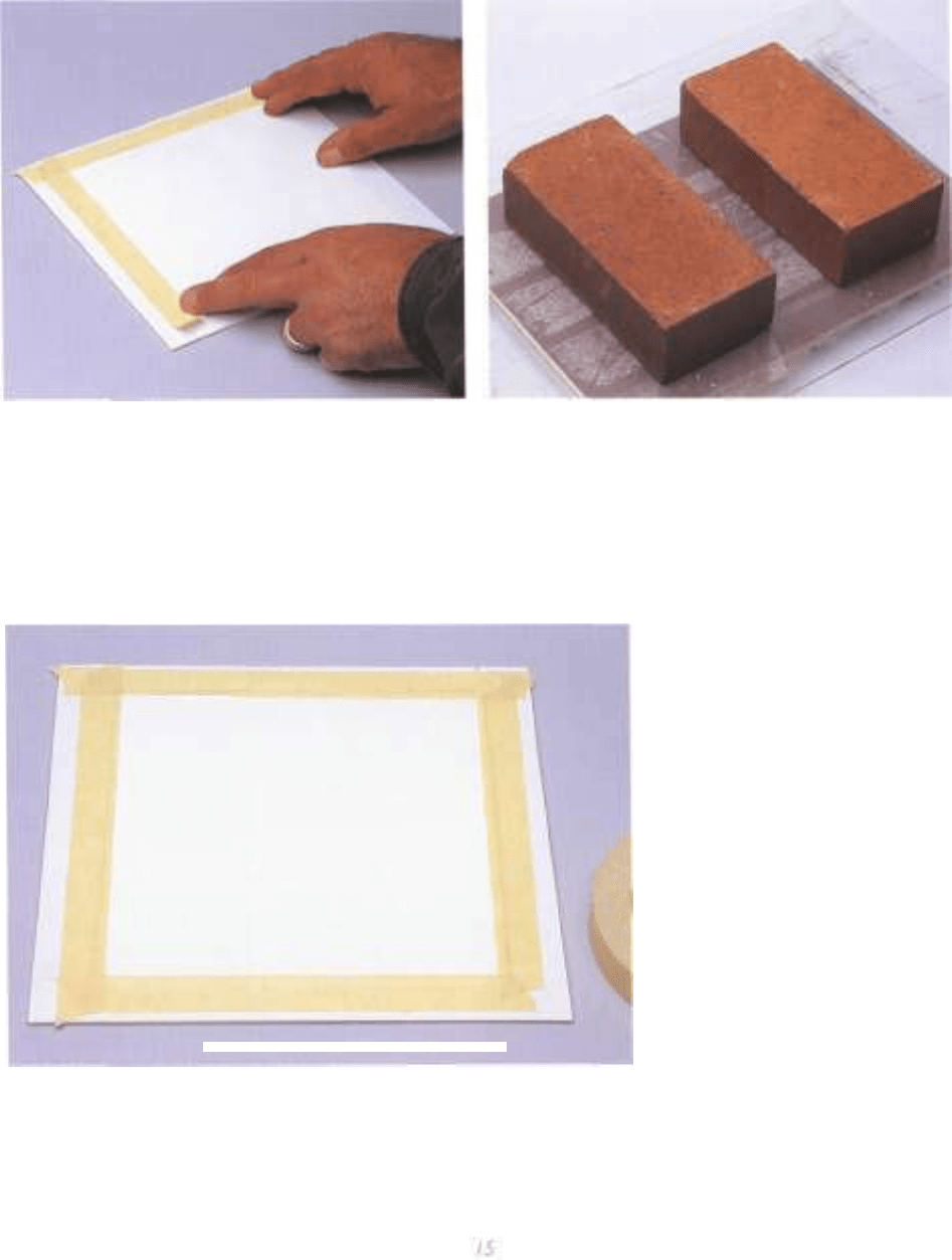
Step 3 ~ Taping
Tape the paper to the mounting board. Use 3M painter's masking
tape, which holds very well and resists water running under the edge
of the tape. Tape about !/i6" (2mm) to Vs" (3mm) into the paper to
keep the paper from curling while the glue is drying.
Step 4 ~ Weighting Boards Down
Prepare six to ten boards of the same size (you might want to prepare
three or four different sizes). Make one or more stacks of the newly
prepared boards and weight them down. Put a piece of old Plexiglas
over the stack. Use bricks, books or something heavy to keep the
boards flat. Small prepared boards can be used ten to fifteen minutes
after gluing. Larger sizes should be left overnight to dry.
Final
NX/hen the glue has dried remove the weights.
The boards are now ready for painting. Leave
the masking tape on until the painting is
completed. When the tape is removed you
will have a nice, clean white border, which
allows space for the mat to be attached to the
painting.
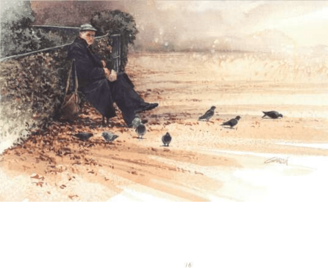
Sketching on Location
The Jardins du Palais-Royal are found
in the inner courtyard of the Ministry
of Culture in Paris, France. On this
crisp December day very few people
strolled about enjoying the setting.
A Frenchman had an entourage of
dozens, if not a hundred, pigeons.
A perfect painting! I used the pencil
sketch to capture the moment. This
helps me develop the idea and think
about the composition. My first idea
was a vertical format, as that is what
I saw through the camera. After finish-
ing the sketch I could see the possibili-
ty of a horizontal format. I used the
placement of pigeons to move the eye
across the composition. The use of
color helped develop the idea. I elimi-
nated some of the hungry little sub-
jects and let the Frenchman be the
focal point or center of interest. I may
paint a similar painting in the future
with more emphasis on the back-
ground.
I always have the sketches and photos
for future reference.
I used transparent wet-into-wet
washes to start the painting. Salt was
used for the texture. Flat washes and
directional brushstrokes helped devel-
op movement across the ground. The
colors in this area are Burnt Sienna,
Raw Sienna and Cobalt Blue. The
darker background has more Cobalt
Blue added.
Jardins du Palais-Royal
Watercolor on 300-lb. (640gsm)
cold-pressed Kilimanjaro
9" x 14" (23cm x 36cm)
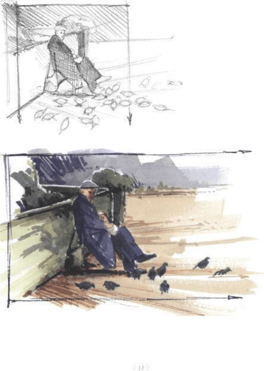
Jardins du Palais-Royal Pencil Sketch
Bond drawing pad
6" x8" (15cm x 20cm)
Jardins du Palais-Royal Color Sketch
Liberte watercolor sketchbook
5" x8" (13cm x 20cm)
Pen-and-ink Washes
Mini-Demonstration
Sketching does not always have to be
thought of as the preliminary step to
a painting. It can also be the final art-
work. I prefer to sketch in permanent
ink because I cannot erase or try to
make corrections. I feel this gives the
work a spontaneity and crispness that
I lose with pencil. Plus, it does not
smudge!
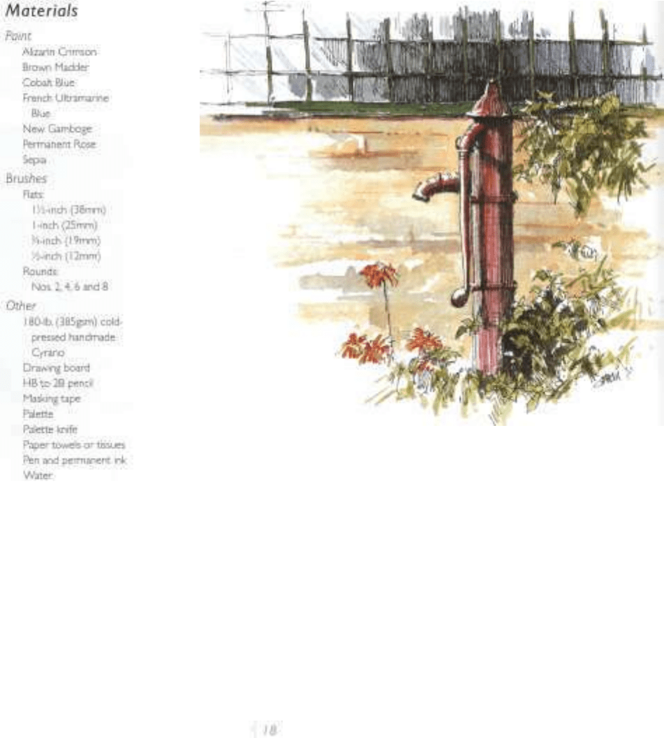
Sketches Can Be Finished Works of Art
Give Me a Hand was sketched at a working farm, bed-and-breakfast in Killeagh, Ireland.
The old pump was still functioning and used to water plants, chickens, cats and various
animals wandering about I started with pencil but switched to ink because the pencil
did not have the dark values I wanted. All the washes are dry brush.The wall is painted
with Raw Sienna, Burnt Sienna and Cobalt Blue. I used Alizarin Crimson to paint the
pump. I consider this a finished piece of art that can be framed.
Qive Me a Hand
Watercolor on handmade 180-lb.
(385gsm) cold-pressed Cyrano
9" x 7" (23cm x 18cm)
'
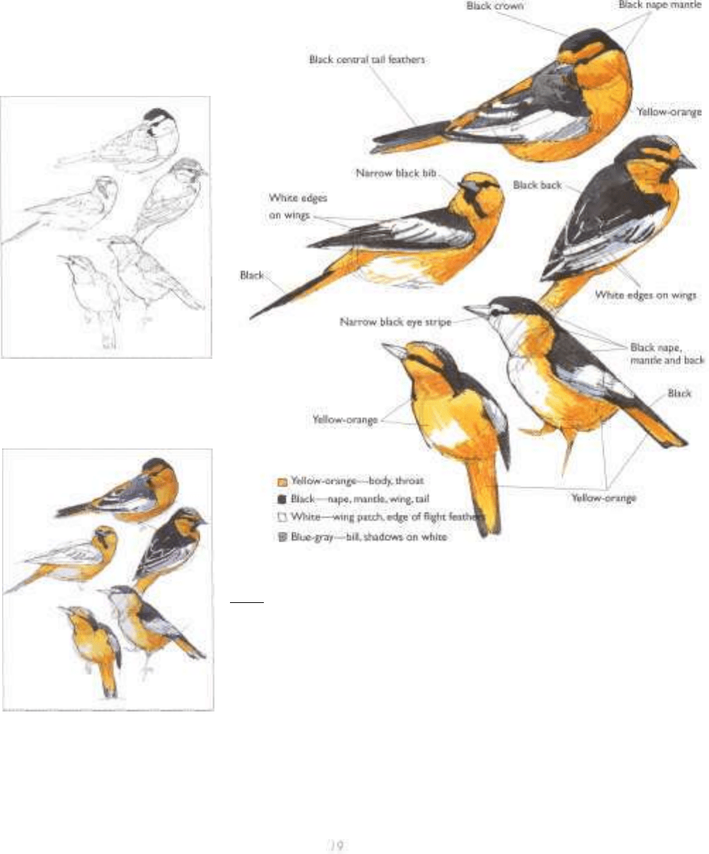
Northern Oriole
Northern Oriole was started with a fin-
ished painting in mind. I know which
washes I will use to get the appropriate
textures.
Step / ~ Complete an Ink Drawing
Start with a loose ink drawing. Use perma-
nent ink that will not run when a wash is
applied.
Step 2 ~ Paint the Birds
Paint the yellow part of the bird with dry-
brush washes of New Gamboge and Perma-
nent Rose. Paint the dark patterns with
French Ultramarine Blue, Brown Madder
and Sepia.
I
Step 3 ~ Final
Add finishing details to the birds. Notice the contrast created by the rich dark black of die ink,
the bright yellow and orange washes, and the white of the paper. By establishing the dark areas
with the ink first I save time by not having to create many layers.
Northern Oriole
Watercolor on 180-lb. (385gsm)
cold-pressed handmade Cyrano
7" x9" (18cm x 23cm)

How to See Areas- -Using Sketches and Ink Washes
An area is a flat surface or space. That
definition does not explain how to see
or paint that area. Also, a line drawing
may not supply enough information to
comfortably start a painting. Before
you begin, paint some value studies.
The use of values will help define the
subject by looking at the light and
dark areas. The use of line is kept to a
minimum. Pencil or ink washes work
well for this sketching technique.
With graphite I can soften areas with a
cotton swab or a burnishing stump. Of
the two choices, I like the ink washes
best. They tend to be less messy and
are similar to doing a small painting.
All that is needed is a little ink or a
tube of Sepia, a couple of brushes, a
small plate and paper. Color is often
intimidating and this is one way to
break the ice.
Autumn Marsh—the Migration is a
painting of the Blackwater Wildlife
Refuge in Maryland. I used a quick
pencil sketch to understand the tree
and marsh area. Because of all the veg-
etation, the sketch helped me look at
simplified areas. In the final painting
I extended the area off to the left. I
could use the sky to indicate the pat-
terns of flying birds.
Painting Marshlands Autumn Marsh—the Migration
The marsh is started with a wet-into-wet wash of New Gamboge. Raw Sienna. Alizarin Watercolor on 300-lb. (640gsm)
Crimson. Burnt
Sienna
and
Cobalt
Blue.
I
allowed
these
colors
to run
together
After
^'^T'f
1
Klllmanjaro
6 x 9" (15cm x 23cm)
this area dried, I used washes or glazes of the same colors to darken the values.The sky
was painted using a gradated wash of Cobalt Blue. When this dried I gently drybrushed
in the clouds.The trees and reflections were the last areas to be painted.The value
studies were a great help. I had all the problems solved before I started!
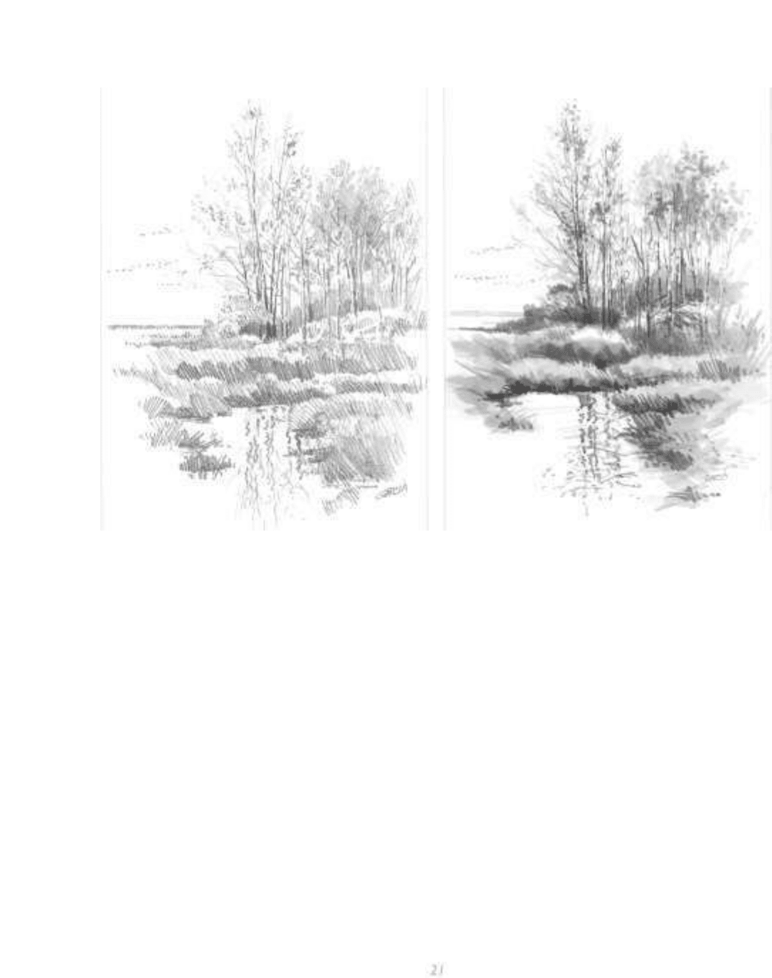
Penc/7 Sketch
The pencil sketch of Autumn Marsh—the Migration was done
using HB and 2B pencils. I sanded the points to get a chiseled
edge.This helps fill in the area more quickly and has a nice tex-
tural quality. I used different values to indicate the separate areas
of vegetation.
Ink Wash
The ink-wash sketch of Autumn Marsh—the Migration is like
doing a small black-and-white painting. What makes this fun is
that you do not have to worry about color If the values are
correct, that painting will work.You can use washes to darken
the values.These studies will often be more successful than the
finished painting. Start with a very loose pencil sketch. Squint at
what you are pamtmg.This will help eliminate color so you see
only shapes. Now start painting the light values and darken areas
as you go along. Minimum equipment is required and maximum
essons can be learned.
