Gamma E., Helm E., Johnson R. Design Patterns: Elements of Reusable Object-Oriented Software
Подождите немного. Документ загружается.


Design Patterns
Reuse on this level leads to an inversion of control between the application and the software on which it's
based. When you use a toolkit (or a conventional subroutine library for that matter), you write the main body of
the application and call the code you want to reuse. When you use a framework, you reuse the main body and
write the code it calls. You'll have to write operations with particular names and calling conventions, but that
reduces the design decisions you have to make.
Not only can you build applications faster as a result, but the applications have similar structures. They are
easier to maintain, and they seem more consistent to their users. On the other hand, you lose some creative
freedom, since many design decisions have been made for you.
If applications are hard to design, and toolkits are harder, then frameworks are hardest of all. A framework
designer gambles that one architecture will work for all applications in the domain. Any substantive change to
the framework's design would reduce its benefits considerably, since the framework's main contribution to an
application is the architecture it defines. Therefore it's imperative to design the framework to be as flexible and
extensible as possible.
Furthermore, because applications are so dependent on the framework for their design, they are particularly
sensitive to changes in framework interfaces. As a framework evolves, applications have to evolve with it. That
makes loose coupling all the more important; otherwise even a minor change to the framework will have major
repercussions.
The design issues just discussed are most critical to framework design. A framework that addresses them using
design patterns is far more likely to achieve high levels of design and code reuse than one that doesn't. Mature
frameworks usually incorporate several design patterns. The patterns help make the framework's architecture
suitable to many different applications without redesign.
An added benefit comes when the framework is documented with the design patterns it uses [BJ94]. People
who know the patterns gain insight into the framework faster. Even people who don't know the patterns can
benefit from the structure they lend to the framework's documentation. Enhancing documentation is important
for all types of software, but it's particularly important for frameworks. Frameworks often pose a steep learning
curve that must be overcome before they're useful. While design patterns might not flatten the learning curve
entirely, they can make it less steep by making key elements of the framework's design more explicit.
Because patterns and frameworks have some similarities, people often wonder how or even if they differ. They
are different in three major ways:
1. Design patterns are more abstract than frameworks. Frameworks can be embodied in code, but only
examples of patterns can be embodied in code. A strength of frameworks is that they can be written
down in programming languages and not only studied but executed and reused directly. In contrast, the
design patterns in this book have to be implemented each time they're used. Design patterns also explain
the intent, trade-offs, and consequences of a design.
2. Design patterns are smaller architectural elements than frameworks. A typical framework contains
several design patterns, but the reverse is never true.
Pag 31
de 358
Gamma – Helm - Johnson – Vlissides
3. Design patterns are less specialized than frameworks. Frameworks always have a particular application
domain. A graphical editor framework might be used in a factory simulation, but it won't be mistaken
for a simulation framework. In contrast, the design patterns in this catalog can be used in nearly any kind
of application. While more specialized design patterns than ours are certainly possible (say, design
patterns for distributed systems or concurrent programming), even these wouldn't dictate an application
architecture like a framework would.
Frameworks are becoming increasingly common and important. They are the way that object-oriented systems
achieve the most reuse. Larger object-oriented applications will end up consisting of layers of frameworks that
cooperate with each other. Most of the design and code in the application will come from or be influenced by
the frameworks it uses.
How to Select a Design Pattern
With more than 20 design patterns in the catalog to choose from, it might be hard to find the one that addresses
a particular design problem, especially if the catalog is new and unfamiliar to you. Here are several different
approaches to finding the design pattern that's right for your problem:
1. Consider how design patterns solve design problems. Section 1.6 discusses how design patterns help
you find appropriate objects, determine object granularity, specify object interfaces, and several other
ways in which design patterns solve design problems. Referring to these discussions can help guide your
search for the right pattern.
2. Scan Intent sections. Section 1.4 (page 8) lists the Intent sections from all the patterns in the catalog.
Read through each pattern's intent to find one or more that sound relevant to your problem. You can use
the classification scheme presented in Table 1.1 (page 10) to narrow your search.
3. Study how patterns interrelate. Figure 1.1 (page 12) shows relationships between design patterns
graphically. Studying these relationships can help direct you to the right pattern or group of patterns.
4. Study patterns of like purpose. The catalog (page 79) has three chapters, one for creational patterns,
another for structural patterns, and a third for behavioral patterns. Each chapter starts off with
introductory comments on the patterns and concludes with a section that compares and contrasts them.
These sections give you insight into the similarities and differences between patterns of like purpose.
5. Examine a cause of redesign. Look at the causes of redesign starting on page 24 to see if your problem
involves one or more of them. Then look at the patterns that help you avoid the causes of redesign.
6. Consider what should be variable in your design. This approach is the opposite of focusing on the
causes of redesign. Instead of considering what might force a change to a design, consider what you
want to be able to change without redesign. The focus here is on encapsulating the concept that varies, a
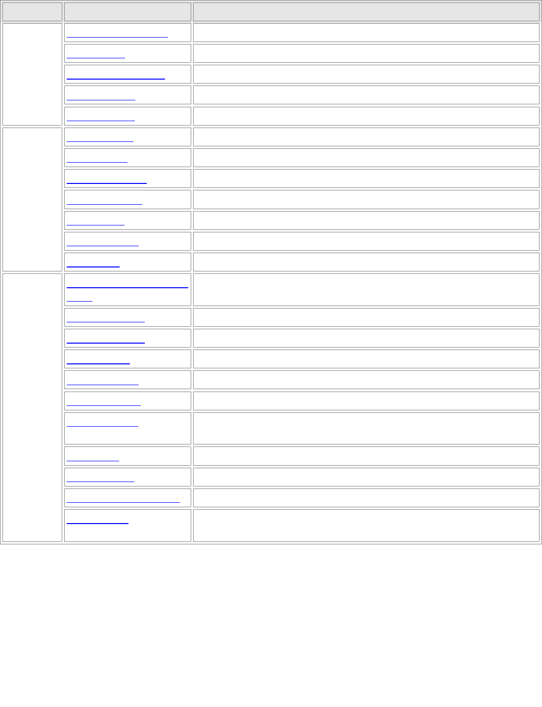
theme of many design patterns. Table 1.2 lists the design aspect(s) that design patterns let you vary
independently, thereby letting you change them without redesign.
Página 32
de 358
Design Patterns
Purpose Design Pattern Aspect(s) That Can Vary
Creational
Abstract Factory (68) families of product objects
Builder (75) how a composite object gets created
Factory Method (83) subclass of object that is instantiated
Prototype (91) class of object that is instantiated
Singleton (99) the sole instance of a class
Structural
Adapter (108) Interface to an object
Bridge (118) implementation of an object
Composite (126) Structure and composition of an object
Decorator (135) responsibilities of an object without subclassing
Facade (185) Interface to a subsystem
Flyweight (195) storage costs of objects
Proxy (207) how an object is accessed; its location
Behaviora
l
Chain of Responsibility
(173)
object that can fulfill a request
Command (182) when and how a request is fulfilled
Interpreter (191) grammar and interpretation of a language
Iterator (201) how an aggregate's elements are accessed, traversed
Mediator (213) how and which objects interact with each other
Memento (221) what private information is stored outside an object, and when
Observer (229) number of objects that depend on another object; how the dependent
objects stay up to date
State (238) states of an object
Strategy (246) an algorithm
Template Method (254) steps of an algorithm
Visitor (259) operations that can be applied to object(s) without changing their class
(es)
Table 1.2: Design aspects that design patterns let you vary
Pag 33
de 358

Gamma – Helm - Johnson – Vlissides
How to Use a Design Pattern
Once you've picked a design pattern, how do you use it? Here's a step-by-step approach to applying a design
pattern effectively:
1. Read the pattern once through for an overview. Pay particular attention to the Applicability and
Consequences sections to ensure the pattern is right for your problem.
2. Go back and study the Structure, Participants, and Collaborations sections. Make sure you understand
the classes and objects in the pattern and how they relate to one another.
3. Look at the Sample Code section to see a concrete example of the pattern in code. Studying the code
helps you learn how to implement the pattern.
4. Choose names for pattern participants that are meaningful in the application context. The names for
participants in design patterns are usually too abstract to appear directly in an application. Nevertheless,
it's useful to incorporate the participant name into the name that appears in the application. That helps
make the pattern more explicit in the implementation. For example, if you use the Strategy pattern for a
text compositing algorithm, then you might have classes SimpleLayoutStrategy or TeXLayoutStrategy.
5. Define the classes. Declare their interfaces, establish their inheritance relationships, and define the
instance variables that represent data and object references. Identify existing classes in your application
that the pattern will affect, and modify them accordingly.
6. Define application-specific names for operations in the pattern. Here again, the names generally depend
on the application. Use the responsibilities and collaborations associated with each operation as a guide.
Also, be consistent in your naming conventions. For example, you might use the "Create-" prefix
consistently to denote a factory method.
7. Implement the operations to carry out the responsibilities and collaborations in the pattern. The
Implementation section offers hints to guide you in the implementation. The examples in the Sample
Code section can help as well.
These are just guidelines to get you started. Over time you'll develop your own way of working with design
patterns.
No discussion of how to use design patterns would be complete without a few words on how not to use them.
Design patterns should not be applied indiscriminately. Often they achieve flexibility and variability by
introducing additional levels of indirection, and that can complicate a design and/or cost you some performance.
A design pattern should only be applied when the flexibility it affords is actually needed. The Consequences
sections are most helpful when evaluating a pattern's benefits and liabilities.
Página 34
de 358

Design Patterns
Pag 35
de 358
Gamma – Helm - Johnson – Vlissides
A case of Study: Designing a document
editor
This chapter presents a case study in the design of a "What-You-See-Is-What-You-Get" (or "WYSIWYG")
document editor called Lexi.
1
We'll see how design patterns capture solutions to design problems in Lexi and
applications like it. By the end of this chapter you will have gained experience with eight patterns, learning
them by example.
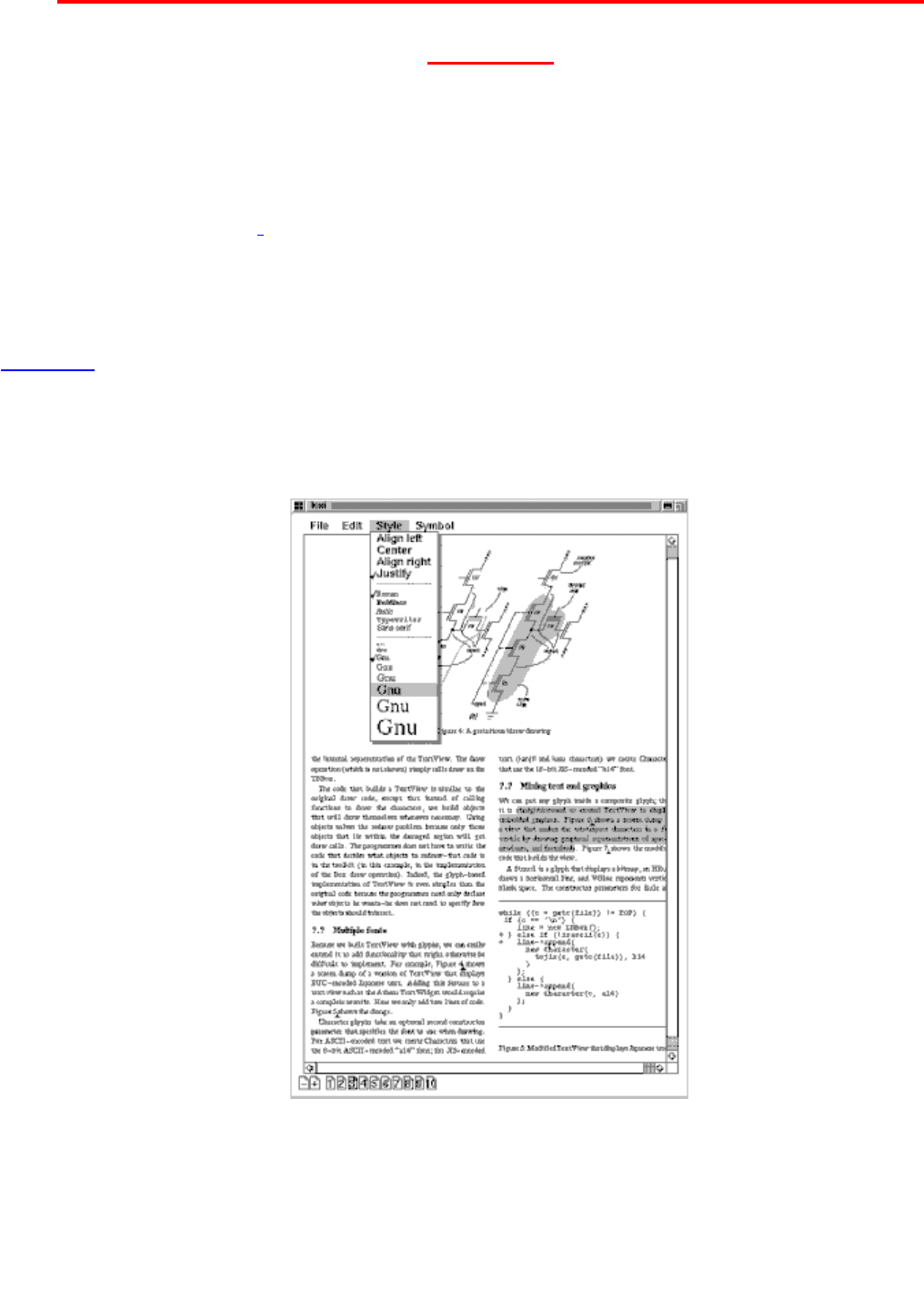
Figure 2.1 depicts Lexi's user interface. A WYSIWYG representation of the document occupies the large
rectangular area in the center. The document can mix text and graphics freely in a variety of formatting styles.
Surrounding the document are the usual pull-down menus and scroll bars, plus a collection of page icons for
jumping to a particular page in the document.
Figure 2.1: Lexi's user interface
Página 36
de 358

Design Patterns
Design Problems
We will examine seven problems in Lexi's design:
1. Document structure. The choice of internal representation for the document affects nearly every aspect
of Lexi's design. All editing, formatting, displaying, and textual analysis will require traversing the
representation. The way we organize this information will impact the design of the rest of the
application.
2. Formatting. How does Lexi actually arrange text and graphics into lines and columns? What objects are
responsible for carrying out different formatting policies? How do these policies interact with the
document's internal representation?
3. Embellishing the user interface. Lexi's user interface includes scroll bars, borders, and drop shadows
that embellish the WYSIWYG document interface. Such embellishments are likely to change as Lexi's
user interface evolves. Hence it's important to be able to add and remove embellishments easily without
affecting the rest of the application.
4. Supporting multiple look-and-feel standards. Lexi should adapt easily to different look-and-feel
standards such as Motif and Presentation Manager (PM) without major modification.
5. Supporting multiple window systems. Different look-and-feel standards are usually implemented on
different window systems. Lexi's design should be as independent of the window system as possible.
6. User operations. Users control Lexi through various user interfaces, including buttons and pull-down
menus. The functionality behind these interfaces is scattered throughout the objects in the application.
The challenge here is to provide a uniform mechanism both for accessing this scattered functionality and
for undoing its effects.
7. Spelling checking and hyphenation. How does Lexi support analytical operations such as checking for
misspelled words and determining hyphenation points? How can we minimize the number of classes we
have to modify to add a new analytical operation?
We discuss these design problems in the sections that follow. Each problem has an associated set of goals plus
constraints on how we achieve those goals. We explain the goals and constraints in detail before proposing a
specific solution. The problem and its solution will illustrate one or more design patterns. The discussion for
each problem will culminate in a brief introduction to the relevant patterns.
Document Structure
Pag 37
de 358

Gamma – Helm - Johnson – Vlissides
A document is ultimately just an arrangement of basic graphical elements such as characters, lines, polygons,
and other shapes. These elements capture the total information content of the document. Yet an author often
views these elements not in graphical terms but in terms of the document's physical structure—lines, columns,
figures, tables, and other substructures.
2
In turn, these substructures have substructures of their own, and so on.
Lexi's user interface should let users manipulate these substructures directly. For example, a user should be able
to treat a diagram as a unit rather than as a collection of individual graphical primitives. The user should be able
to refer to a table as a whole, not as an unstructured mass of text and graphics. That helps make the interface
simple and intuitive. To give Lexi's implementation similar qualities, we'll choose an internal representation
that matches the document's physical structure.
In particular, the internal representation should support the following:
Maintaining the document's physical structure, that is, the arrangement of text and graphics into lines,
columns, tables, etc.
Generating and presenting the document visually.
Mapping positions on the display to elements in the internal representation. This lets Lexi determine
what the user is referring to when he points to something in the visual representation.
In addition to these goals are some constraints. First, we should treat text and graphics uniformly. The
application's interface lets the user embed text within graphics freely and vice versa. We should avoid treating
graphics as a special case of text or text as a special case of graphics; otherwise we'll end up with redundant
formatting and manipulation mechanisms. One set of mechanisms should suffice for both text and graphics.
Second, our implementation shouldn't have to distinguish between single elements and groups of elements in
the internal representation. Lexi should be able to treat simple and complex elements uniformly, thereby
allowing arbitrarily complex documents. The tenth element in line five of column two, for instance, could be a
single character or an intricate diagram with many subelements. As long as we know this element can draw
itself and specify its dimensions, its complexity has no bearing on how and where it should appear on the page.
Opposing the second constraint, however, is the need to analyze the text for such things as spelling errors and
potential hyphenation points. Often we don't care whether the element of a line is a simple or complex object.
But sometimes an analysis depends on the objects being analyzed. It makes little sense, for example, to check
the spelling of a polygon or to hyphenate it. The internal representation's design should take this and other
potentially conflicting constraints into account.
Recursive Composition
A common way to represent hierarchically structured information is through a technique called recursive
composition, which entails building increasingly complex elements out of simpler ones. Recursive composition
gives us a way to compose a document out of simple graphical elements. As a first step, we can tile a set of
Página 38
de 358
Design Patterns
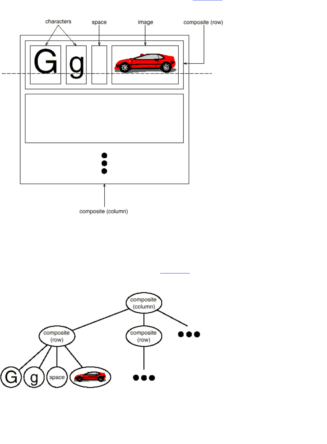
characters and graphics from left to right to form a line in the document. Then multiple lines can be arranged to
form a column, multiple columns can form a page, and so on (see Figure 2.2).
Figure 2.2: Recursive composition of text and graphics
We can represent this physical structure by devoting an object to each important element. That includes not just
the visible elements like the characters and graphics but the invisible, structural elements as well—the lines and
the column. The result is the object structure shown in Figure 2.3.
Figure 2.3: Object structure for recursive composition of text and graphics
Pag 39
de 358
Gamma – Helm - Johnson – Vlissides
By using an object for each character and graphical element in the document, we promote flexibility at the finest
levels of Lexi's design. We can treat text and graphics uniformly with respect to how they are drawn, formatted,
and embedded within each other. We can extend Lexi to support new character sets without disturbing other
functionality. Lexi's object structure mimics the document's physical structure.
This approach has two important implications. The first is obvious: The objects need corresponding classes.
The second implication, which may be less obvious, is that these classes must have compatible interfaces,
because we want to treat the objects uniformly. The way to make interfaces compatible in a language like C++
is to relate the classes through inheritance.
Glyphs
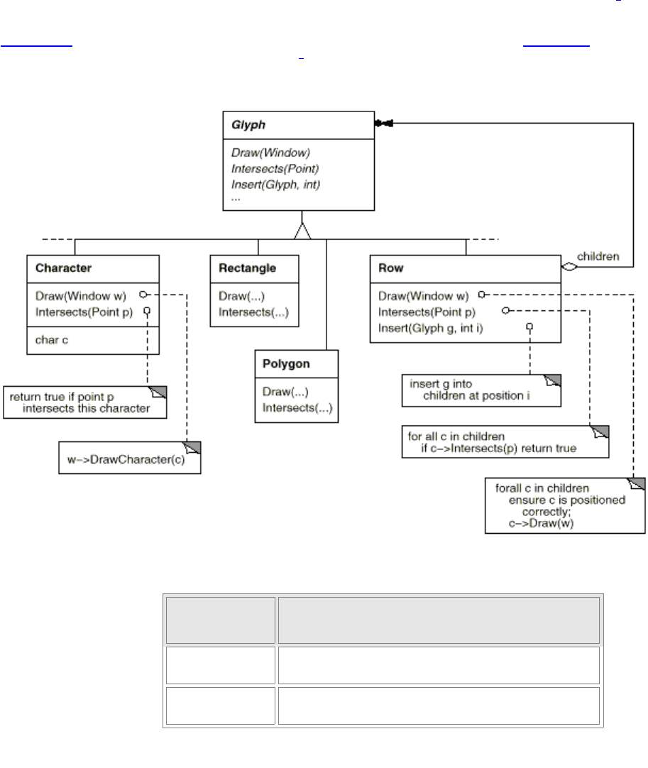
We'll define a Glyph abstract class for all objects that can appear in a document structure.
3
Its subclasses define
both primitive graphical elements (like characters and images) and structural elements (like rows and columns).
Figure 2.4 depicts a representative part of the Glyph class hierarchy, and Table 2.1 presents the basic glyph
interface in more detail using C++ notation.
4
Figure 2.4: Partial Glyph class hierarchy
Responsibilit
y
Operations
appearance
virtual void Draw(Window*)
virtual void Bounds(Rect&)
hit detection
virtual bool Intersects(const
Point&)
Página 40
de 358
